

Everyone talks about legal innovation in terms of AI, automation, and compliance but no one mentions the real blocker: bad UX.
Legal tech isn’t failing because the tech isn’t smart enough. It’s failing because the interface still feels like paperwork in digital form. Lawyers need clarity, flow, and tools that think like they do.
In this article, we reveal 6 overlooked UX/UI design principles that turn complex legal platforms into smooth, usable tools backed by real examples from the field. Let’s fix what everyone else is missing.
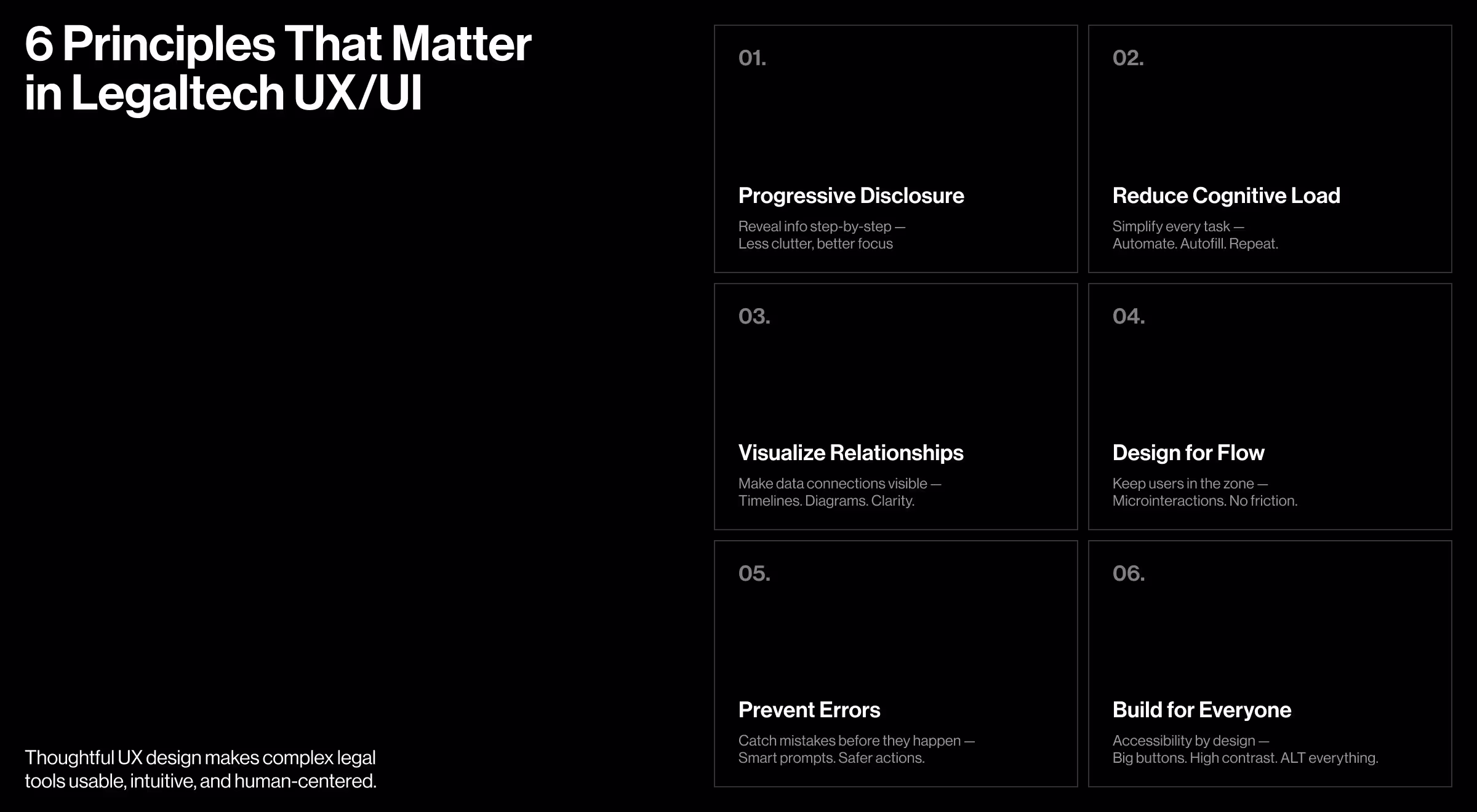
Key Takeaways
- Progressive disclosure keeps interfaces clean by revealing only relevant information when needed.
- Simplifying workflows through automation helps legal professionals save time and reduce cognitive load.
- Visualizing relationships between data points makes complex legal information easier to understand.
- Designing for flow ensures that users stay focused and always know the next action to take.
- Microinteractions prevent errors and guide users with timely, contextual feedback.
- Inclusive legaltech interface design makes legal tech accessible and effective for users of all abilities.
Must-Have Legaltech Interface Design Principles in Legal Tech with Examples
The legal tech market is expected to grow from USD 35.4 billion in 2025 to USD 72.5 billion by 2035, at a CAGR of 7.6%. And that growth comes with new UX/UI expectations. Legal professionals don’t have time for clunky interfaces or guesswork.
The legal industry is also undergoing significant changes: from AI to legal process automation. In 2025, AI and legal tech are streamlining routine tasks, enhancing access to justice, and reshaping the lawyer’s role. Tools like large language models and predictive analytics improve efficiency, while law firms take on greater responsibility for AI compliance and ethics.
As client expectations grow, law firms must embrace automation and intuitive tools to stay ahead. But tech alone won’t cut it. Great UX/UI design is what transforms complexity into clarity, making legal solutions faster, smoother, and more impactful.
1. Use Progressive Disclosure Architecture
The main goal of progressive disclosure is to reduce cognitive load. It works by showing users only the most relevant and essential information first, and then revealing more details or advanced options as needed. Progressive disclosure design usually includes:
- Contextual menus
- Expandable sections
- Sliders
- Snippets
- Hamburger menus
- Card-based layouts
Our working memory can process around 4-7 chunks of information at once, with each chunk fading after 20-30 seconds.
That’s why overwhelming users with too much data upfront is not what you want. Instead, guide them step by step — starting with the basics and gradually revealing more.
For example, when designing a dashboard for Encyro, we’ve prioritized a clean layout, simple navigation, and labeling to help users easily find the information they need.
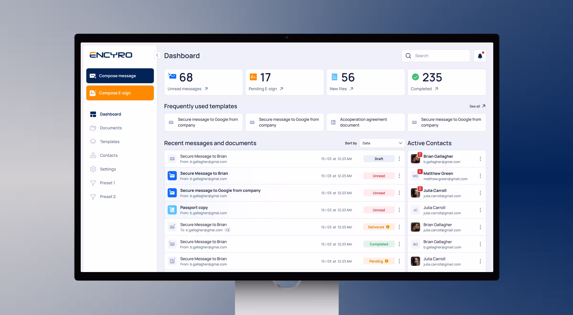
To not overload the user, instead of showing the list of all document templates, we’ve created a menu with the frequently used ones. Also, card-based layouts on top give an overview of document statistics, so users can easily track important metrics at a glance. This progressive disclosure UX/UI resulted in +50% faster document handling and improved workflow efficiency.
💡Key Insight: Prioritize the tasks your users solve with the help of your product, and make them easily accessible.
2. Remove Unnecessary Steps and Decrease Cognitive Load
Lawyers must juggle multiple tasks simultaneously, prepare legal documents, manage contracts, stay up-to-date with the latest regulations, and effectively communicate with clients. Think about how your product can increase the efficiency of legal professionals and their billing hours.
Analyze your users' customer journey and identify tasks that require a significant amount of time and increase cognitive load. Can you remove or simplify them? You can do it by:
- Auto-filling repetitive client information
- Providing custom reusable templates
- Including ready-made widgets for making contracts and filling in reports
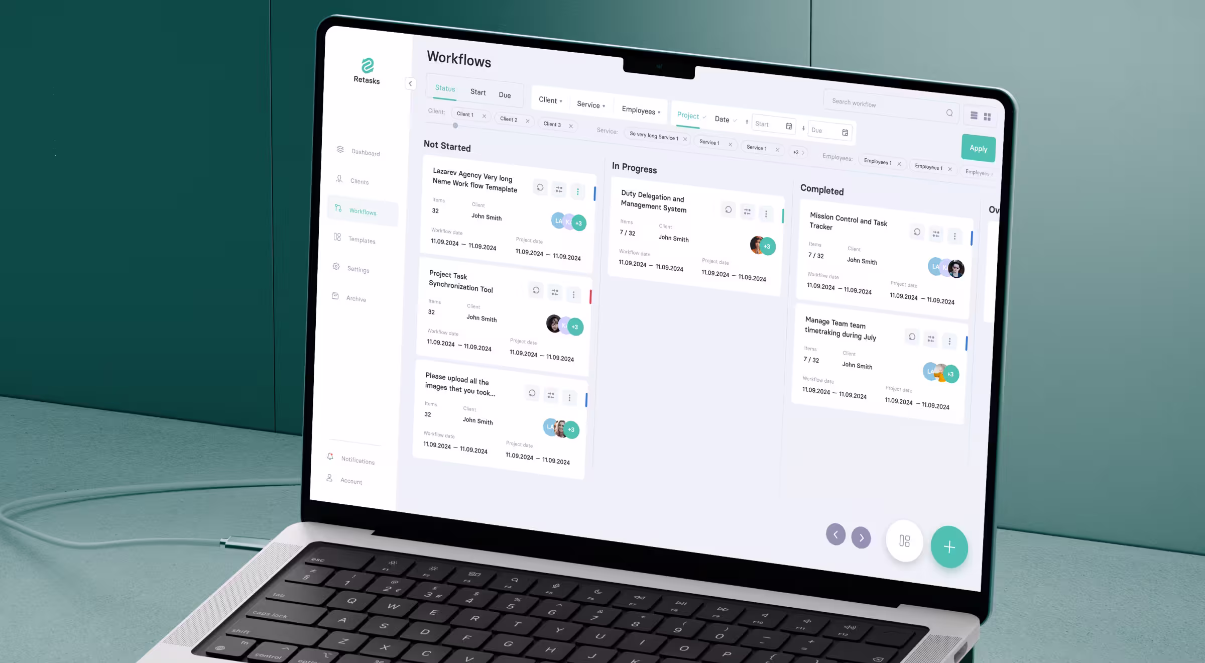
For example, when working on the UX of Retasks, our main goal was to create recurring workflows to automate routine tasks and save time. We’ve introduced recurrent workflows with automatic task status updates, so users don’t have to move tasks to different stages manually. Additionally, there is an option to set dependencies between various workflows and schedule them accordingly.
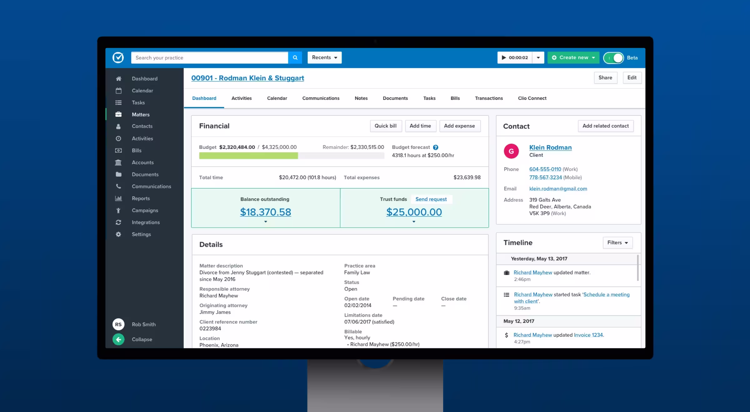
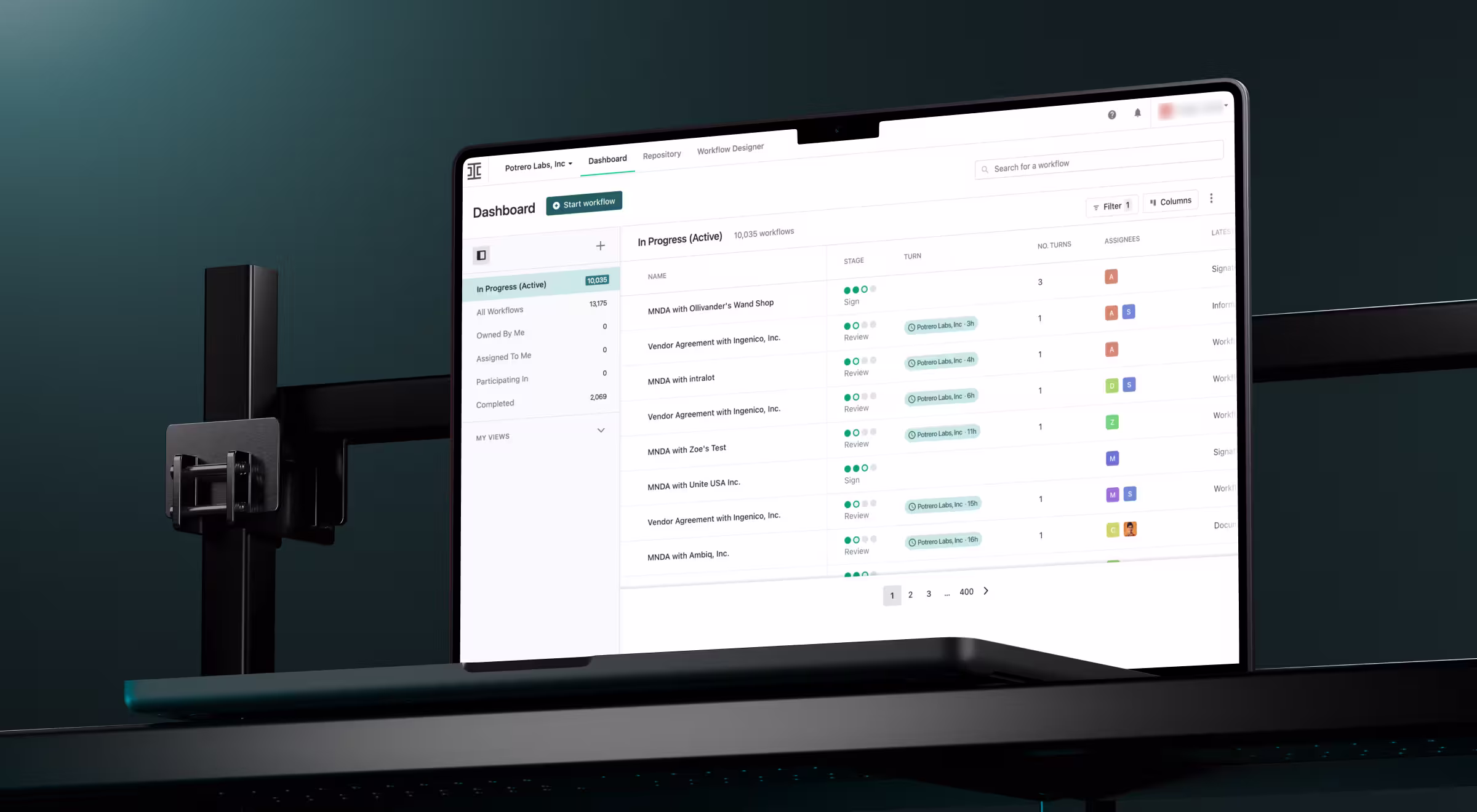
Another example is Clio – a legal software that uses advanced document automation to reduce non-billable work by turning documents into reusable templates that can be easily customized and auto-filled with case information.
“Always think about how you can make each interaction with your product easier, decreasing cognitive load and helping your users achieve their goals faster.”
{{Ostap Oshurko}}
3. Use Data Relationship Visualization
According to the Law of Uniform Connectedness, elements that are visually linked are perceived as related. That’s why visual grouping is one of the most effective ways to show context and relationships between items.
Since legal professionals deal with a large volume of data, data visualization helps avoid confusion between cases, documents, individuals, and deadlines. Data visualization may include:
- Network diagrams
- Timeline views
- Hierarchical displays
- Graphs and charts
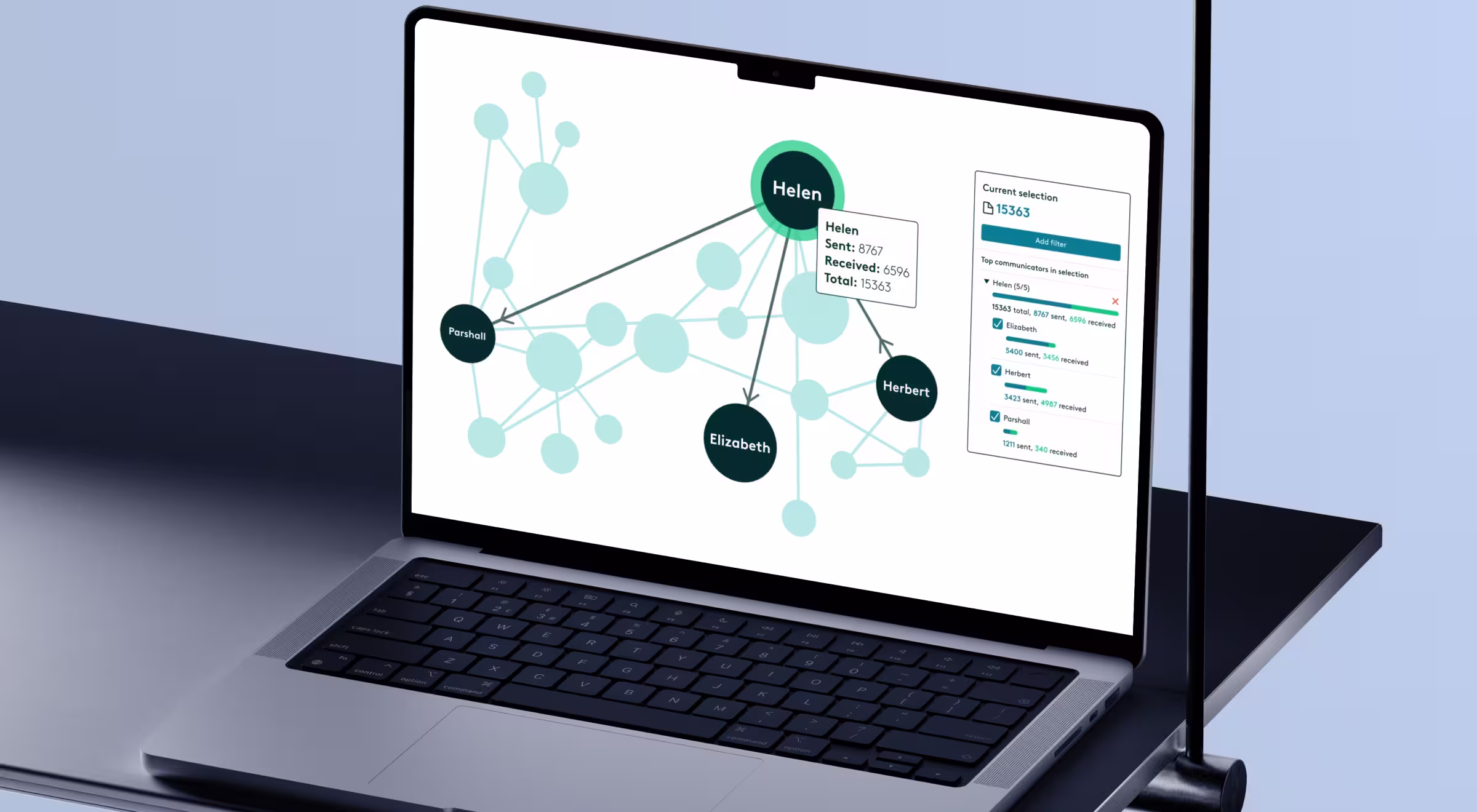
A great example of data relationship visualization is a Communication Visualizer by Everlaw. It automatically analyzes your cases and all domains, parties, and individuals involved. Then, it visualizes and displays the major players and their communication patterns via graphs.
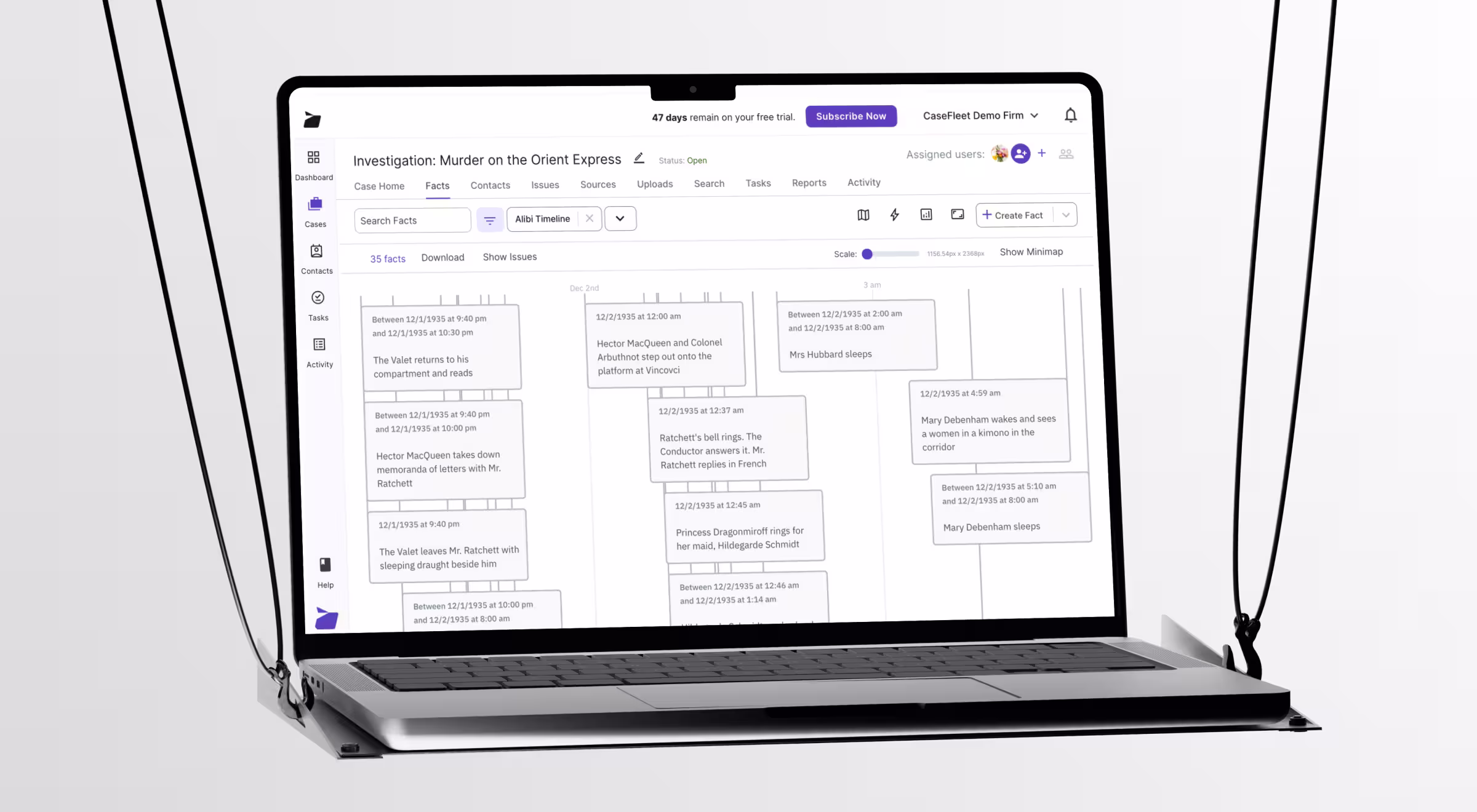
Another example is Casefleet, which features a timeline maker to help users understand how facts, witnesses, dates, and documents are linked to each other. It helps lawyers connect entities with facts and organize them into a big picture.
4. Design for Flow
Do you know that feeling when you're so absorbed in a task that nothing can distract you?
That deep state of focus where time seems to disappear is called flow.
If you want your users to be fully immersed in your product, create conditions where they always know what to do next and how to do it exactly. Make this process intuitive and distraction-free, guiding the user with microinteractions and instructions.
For example, Ironcadapp provides guided product tours and demos to help you become acquainted with the product and reduce decision fatigue.
5. Prevent Errors with Microinteractions
Legal mistakes can be costly, so design should prevent errors before they happen and provide clear recovery paths.
One of the best ways to prevent mistakes is to send gentle prompts when the user's behavior differs from the usual patterns.
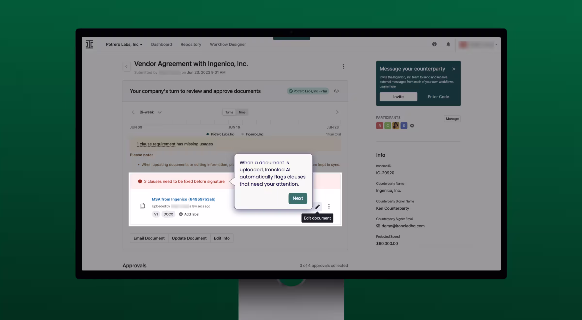
For example, you can send notifications when the billing rate for this client differs from the standard, when there are overlapping meetings in the calendar, or when the user wants to delete an important document. The way Clio does.
6. Design for Diversity
Inclusive design caters your product to a broad spectrum of users, giving everyone a sense of belonging and a seamless user experience. To design with inclusivity in mind, follow these key principles:
- Large interactive elements
- Enough contrast between text and background colours
- Keyboard navigation
- Visual feedback for interactions
- ALT text for images
- Transcripts and captions for videos
- No disruptive animations
For example, Ironcladapp has a clean interface with enough contrast between text and background, as well as large interactive elements.
“Designing for inclusivity is a must-have in any industry. As not everyone’s abilities are the same, make sure your product is accessible and valuable to users of all abilities.”
{{Anna Demianenko}}
Let’s Build User-Centric Legal Tech Products That Make a Difference
The growth of the legal tech market boosts the efficiency of lawyers and breaks down barriers to justice and legal services. That’s why focusing on a clean and intuitive UX/UI and understanding your audience's needs will make your product stand out.
At Lazarev.agency, we provide legaltech UX/UI design services with a user-first approach. All of our designs are based on UX research, continuous user analysis, surveys, and field studies to deliver a product that speaks directly to your audience.
Want to build something new or improve your existing product? Let’s talk.


.webp)


.avif)


