

Picture this scenario. You log in to a training portal on your first day at a new job. The dashboard is a maze. Buttons hide behind dropdowns. You can’t tell if the “Onboarding 101” course is two lessons or twenty. Ten minutes later, you’ve closed the tab.
That’s the reality for millions of learners worldwide. And it’s not because the content is bad. It’s because the user experience of the learning management system (LMS) is broken.
In this guide, we’ll break down the principles, processes, and real-world tactics that turn LMS UX from a usability headache into your competitive advantage.
Key takeaways
- Clarity beats clutter. Intuitive navigation and visible progress keep learners focused and engaged.
- Design for mobility. Mobile and offline access drives adoption beyond the desktop.
- Engagement is engineered. Gamification, social proof, and personalized features sustain motivation.
- UX drives UI. Let learner-first flows dictate the visual layer.
What is LMS UX and why does it matter?
A learning management system (LMS) is a platform that delivers, tracks, and manages training. Think of it as your company’s private Coursera, hosting compliance modules and AI bootcamps.
A great LMS user experience feels like a guided conversation: you always know where you are, what’s next, and why it matters. Platforms like Talent LMS and 360Learning nail this by making navigation intuitive, tracking progress visibly, and minimizing mental effort so nothing interrupts the learning process.
Why does it matter? Bad LMS UX is one of the primary reasons corporate training fails. Confusing navigation wastes cognitive energy and undermines knowledge retention. As a result, learners disengage.
“Even the best content can’t rescue a clunky interface. If users feel like they are burning mental energy just hunting for the ‘Next’ button, they’re just lost.”
{{Oleksandr Holovko}}
Core elements of great learning management system design
A learning platform’s success doesn’t hinge on a single feature. On the contrary, it’s the sum of multiple small, thoughtful interactions. Below are the core elements of intuitive UX that transform a static learning management platform into a dynamic environment people want to use.
Feature #1. Effortless navigation
If a learner has to stop and wonder, “Where do I click next?”, you’ve already lost them. Orientation in LMS design is about creating an environment where users know where they are, where they’ve been, and where they’re headed. You can achieve an intuitive user experience by focusing on:
- Always-visible course menus and outlines.
- Breadcrumbs and “You are here” indicators.
- Logical module names.
🟢 Example: iSpring Learn clearly shows your current slide, time spent, and remaining content removing orientation anxiety.
Feature #2. Clear progress tracking
Humans are wired to seek closure. Visualizing progress turns that instinct into a motivator, nudging learners forward with each completed step.
Consider transitioning your progress bar names from “I’ll finish later” to “Just one more module”. Integrate the following to turn course completion milestones into learning stimuli:
- Progress bars, timers, and completion percentages.
- Minimal but consistent visual indicators.
- Milestones that trigger rewards or encouragement.
Feature #3. Responsive design
Learning today happens everywhere: during a lunch break, on a commute, or from a sofa on Sunday morning. The LMS must meet learners where they are. Think of:
- Responsive layouts from desktop to mobile devices.
- Offline downloads for travel and limited connectivity.
- Device syncing so learners pick up exactly where they left off.
🟢 Example: Udemy Business saw better engagement metrics when its mobile app allowed offline course downloads, turning commutes into productive study time.
Feature #4. Let learners focus on essentials
Every unnecessary menu, banner, or pop-up is a thief of attention. Distraction-free LMS design focuses the learner’s mind on the material while still keeping essential tools one click away.
- Hide secondary menus until hovered or tapped.
- Minimize non-essential notifications in lesson mode.
- Keep easy access to core actions like notes or help.
Feature #5. Gamified learning journeys that drive participation
Engagement in an LMS is always deliberately designed. Gamification transforms the platform from a content repository into an interactive experience that rewards progress and fosters motivation.
Key characteristics include:
- Achievement recognition through skill showcases or certifications.
- Social features like leaderboards, follower systems, or peer comparison.
- Virtual rewards, points, or tokens linked to learning milestones.
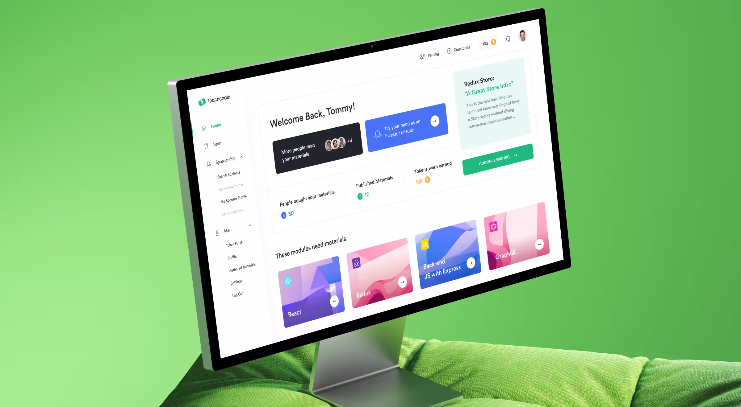
🟢 Example: In Teachchain, student profiles display course modules completion progress, skills, and tracked token usage. These elements turn learning achievements into visible, shareable status symbols that encourage ongoing participation.
LMS UX best practices and design rules
Great learning management system design starts with strategic fundamentals that make learning effortless and engaging.
These best practices act like guardrails, ensuring that no matter how your content evolves, the platform remains intuitive and motivating. Ignore them, and even the best training material will gather digital dust. Follow them, and you’ll create a system learners want to return to.
Six steps to a platform learners love

High-performing LMS UX can’t be improvised. Each stage should align with your product strategy to reduce uncertainty, validate decisions, and improve learner outcomes. Skipping steps means designing in the dark and paying for it later in low adoption.
- Research. Gather data from learners, trainers, and admins. Identify pain points in current systems (e.g., unclear navigation, low mobile use) and map them to business goals.
- Map user needs and product journeys. Develop a detailed product roadmap with clear steps and decision points.
- Prototype and test. Build low-fidelity wireframes to test core interactive elements with real users before investing in full visuals. Validate that learners can complete key tasks without guidance.
- Iterate. Use test results to remove barriers, simplify navigation, and clarify the language of user interface design. Re-test until completion rates improve.
- Integrate engagement tools. Add gamification features, progress tracking, and personalized nudges only after core usability is proven.
- Measure and optimize: Post-launch, track metrics like time-to-first-course, completion rates, and session length. Use analytics and feedback to run continuous UX improvements.
Let’s build an LMS users keep coming back to
When it comes to edtech, good enough is invisible. And invisible doesn’t get used. A mediocre LMS might tick the compliance box, but it won’t inspire adoption, improve retention, or deliver ROI.
At Lazarev.agency, we treat LMS UX as a business tool. Our experts engineer platforms that pull learners in, keep them engaged, and make every interaction count.
The next move is yours. You can keep fighting uphill with poorly designed systems that frustrate your users, or you can partner with a team that’s built LMS experiences people rave about.
If you’re ready to launch an LMS your learners want to use, start your project today. Let’s make your online training platform the one they remember.


.webp)


.avif)


