
When people browse on smaller screens, decisions happen fast.
Responsive web design services make your product easy to parse and easy to act on:
- tap targets that feel right,
- focused copy and stable layouts,
- one codebase for many screen sizes.
User experience stays clear, brand story stays consistent, and your mobile traffic starts to convert at pace!
Key takeaways
- Responsive web design is recommended by Google and supports mobile-first indexing, Core Web Vitals, and long-term organic traffic growth.
- A responsive website helps you meet users on mobile devices, tablets, and desktops with one codebase, making your digital presence easier to maintain and scale.
- Good responsive design improves user engagement and conversion rates by simplifying content hierarchy, touch targets, and performance on smaller screens.
- “Responsive” spans research, UX, UI, performance budgets, QA across devices, and ongoing growth design.
What is responsive web design
Responsive web design is an approach where a single website adapts its layout, content, and interactions to different screen sizes using flexible grids, fluid images, and media queries.
Responsive web design means a website that can adapt to any screen. The same page stays usable on phones, tablets, and desktops by adjusting its layout with CSS (flexible grids, fluid images, and media queries). This allows a single experience to fit different viewports.
In practice, responsive design starts with mobile-first layouts, then breakpoints are added when the content needs more space. Google recommends this pattern as the easiest to implement and maintain. It keeps a single codebase, reduces duplication, and aligns with the way Google evaluates pages today — with the mobile version as the baseline for crawling and ranking.
🔍 Poor responsive decisions hurt rankings and usability fast. Responsive web design companies help you spot partners who understand Google’s mobile-first reality.
Why invest in responsive web design services now?
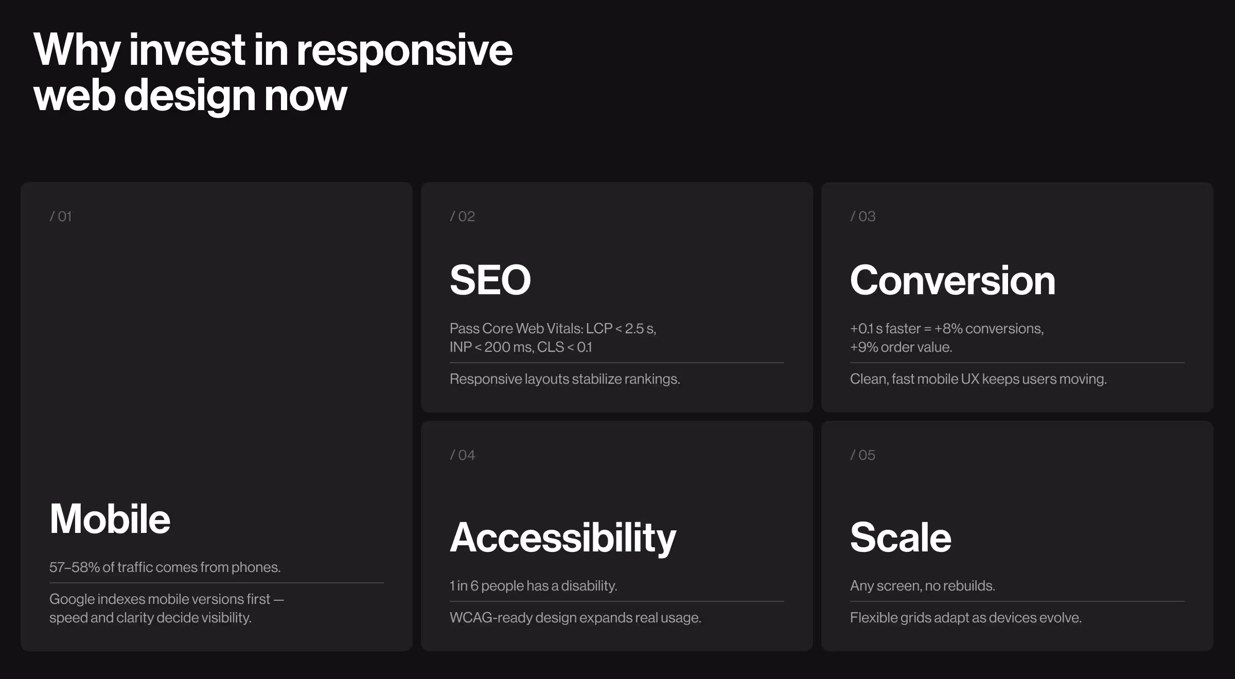
Reason 1. Reach the audience that arrives on mobile first
Most traffic is mobile today (≈57–58% worldwide in 2025), so your first impression often happens on a phone.
Google also finished the move to mobile-first indexing in July 2024. So if your content isn’t reachable on a phone, it won’t be indexed well, which means the mobile version now is the baseline for crawling and ranking.
Modern users become more impatient on small screens: load time rises from 1s to 3s and bounce probability jumps by about 32%. Only good speed and clarity will prevent them from leaving.
A good responsive website aligns with that reality and supports your search engine strategy.
Reason 2. Support SEO with real UX metrics
Search engine optimization today leans on Core Web Vitals — metrics for loading, interactivity, and visual stability. In March 2024, Google replaced First Input Delay (FID) with Interaction to Next Paint (INP).
Designing responsive layouts with performance in mind helps your pages meet these thresholds and maintain visibility.
Reason 3. Increase conversion rates by removing mobile friction
On small screens, crowded headers, tiny tap targets, and heavy images kill intent fast. Faster, cleaner journeys convert better: a Deloitte/Google study across 30M sessions found that improving mobile speed by 0.1s lifted conversion rate by ~8% and average order value by ~9%, while reducing bounce.
Paired with Google’s speed data on bounce risk, the case is straightforward: responsive design plus performance work leads to more sign-ups and sales.
Reason 4. Expand reach with better accessibility
Designing responsively with accessibility in mind reduces risk while improving UX:
- Roughly 1 in 6 people live with a disability. Accessible, responsive patterns expand who can actually use your site.
- WCAG applies on mobile, and W3C recommends responsive techniques (flexible grids, fluid images, media queries) to meet those guidelines on small screens.
- Google’s Lighthouse checks mobile usability and flags buttons that are too small or too close together. Make tap targets big enough and spaced so a thumb can hit them without errors.
- In the U.S., the DOJ’s ADA guidance expects accessible websites for businesses open to the public.
✅ Accessible, responsive design reduces legal risk while expanding reach and improving usability for all users on mobile devices.
Reason 5. Use future-proof foundations
New devices and screen sizes will keep arriving. Responsive patterns (flexible grids, fluid images, media queries) are designed to adapt without a rebuild, so you can keep improving without needing to split codebases.
🔍 Need a practical checklist on mobile-first patterns, tap targets, typography scaling, and performance budgets that pairs well with responsive work? Read our article: “Mobile design: the ultimate guide to creating experiences”.
How we deliver tailored solutions
Our responsive web design services follow a mobile-first workflow that aligns UX audit, performance optimization, and conversion-focused design.
At Lazarev.agency, responsive web design services are part of a broader workflow that aligns product, marketing, and engineering:
- We review your current responsive site, traffic sources, and search engine performance. We map the jobs users try to do on different devices and identify friction in the journey.
- We simplify the site’s content and navigation so people find what they came for fast.
- We prototype core flows, validate on mobile devices, and tune spacing, typography, and tap targets for smaller screens.
- We build a component library and document responsive states so your development team can ship confidently.
- We test across real hardware and browsers, set image rules, and check the new experience against Core Web Vitals.
- Post-launch, we track user engagement and conversion rates, then iterate.
“Responsive design works as a business system. We start with goals, then scale layouts for speed, clarity, and conversion.”
{{Kirill Lazarev}}
Case study: 11Sight
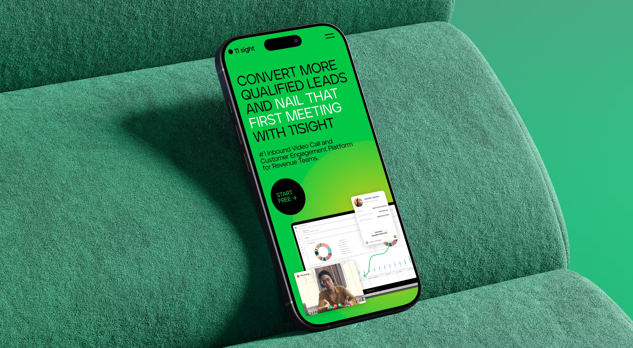
For 11Sight, responsive redesign improved lead quality, engagement, and sales velocity across devices.
11Sight was a one-click video call platform for B2B sales. The team came to us with a clear brief: rebuild the site around a modern design system and a sharper digital experience to improve conversions and click-through rates. In short, explain the product clearly, reduce friction in trial flows, and keep the story tight across screen sizes.
What we did for 11Sight:
- created a story-led, responsive website with a documented system of components;
- embedded a “talk to us” video-call widget so visitors could try the product in 1 click;
- built a transparent pricing page with an interactive selector;
- added an affiliate page to widen reach;
- used focused animations to guide attention.
Outcome:
- 3x more qualified leads,
- 2x more customer engagement,
- 50% shorter sales cycles,
- 30% more deals closed.
The work earned a Red Dot Award (Corporate & Business Websites), an Awwwards Honorable Mention, and was highlighted by DesignRush. Across listings, the 11Sight project has collected 10+ industry recognitions.
See the full 11Sight case study for more context!
What you get with responsive web design services from Lazarev.agency
- Clarity on mobile. Readable copy, focused forms, and CTAs that work on smaller screens.
- Speed as a feature. Performance budgets and image policies that support Core Web Vitals.
- Stronger SEO posture. One URL per page, aligned with Google’s recommendation for responsive design and mobile-first indexing.
- A system you can scale. A responsive design system and developer notes that help you deliver tailored solutions faster.
- Lower total cost. One site to maintain, easier QA, and cleaner analytics.
If you’re planning a redesign or need to create websites that perform on every device, let’s talk! Our team will scope responsive web design that fits your roadmap and budget.


.webp)


.avif)