Shipping clarity is hard. Which UI patterns separate leaders from products that are just good enough?
This piece collects real UI examples from well-known products and adds one thing the gallery posts miss: why each choice works.
Use it as a fast scan to spot patterns you can lift into your next release and improve user interface design for mobile and web apps without bloating the feature list.
Key takeaways
- UI wins are specific: one crisp decision per screen beats ten “nice-to-haves”.
- Hierarchy first, styling second: typography and spacing do most of the heavy lifting.
- Accessibility, performance, and responsive design are part of usability.
- Microinteractions should confirm, guide, or relieve anxiety.
Foundations matter for consistent decisions
Before we dive into our selection of the best website interface examples, let's cover the basics first.
Strong modern UI design is a repeatable judgment backed by shared references. When teams align on usability heuristics (visibility of system status, error prevention, and more), reviews get faster and design debt stays lower.
On Apple platforms, the Human Interface Guidelines clarify navigation, controls, and system behaviors so patterns feel native instead of improvised.
For cross-platform work, Material Design explains layout, hierarchy, and spacing — use it to set typographic rhythm and information priority before polishing visuals.
And to broaden reach and reduce risk, ground every decision in WCAG 2.2 — the current web accessibility standard that includes clear guidance and updates beyond 2.1.
🔍 For a curated look at teams who rely on these principles to ship reliable interfaces, explore the top UI UX design companies for startups.
Good user interface design examples in 10 case breakdowns
Notion — minimal canvas with opinionated structure (web & desktop)
Notion is a collaborative workspace for notes, docs, databases, and wikis used by teams to organize work.
- What you see: a neutral canvas, consistent typography, and restrained chrome that let users focus on content. The site and app reinforce a single clear path per page: write, organize, or share.
- Why it works: the design system enforces consistency so content, not the interface, becomes the landmark. The layout gives a reliable grid; spacing tokens keep the page readable on desktop and mobile devices.
- Takeaway: prefer semantic components and strict spacing scales to keep complexity legible. Good user interface design turns structure into guidance, which keeps users engaged during long editing sessions.
Duolingo — feedback you can feel (mobile)
Duolingo is a mobile-first language learning app that teaches through short exercises and streak-based progress.
- What you see: micro interactions, progress cues, haptics, and sound that confirm actions. A bright, vibrant colors palette aids recognition without hurting usability.
- Why it works: timely feedback lowers error cost and keeps new users motivated. The app uses intuitive navigation and a clean search bar for finding skills.
- Takeaway: tie motion to state changes. Add one interaction that confirms success or warns early, then measure whether users find lessons faster and the overall experience improves.
Spotify — focused “now playing” and continuous context (mobile)
Spotify is a music and podcast streaming service with personalized playlists and on-demand playback across devices.
- What you see: a tuned now-playing bar, clear categories, and persistent controls. For a streaming service, this design pattern keeps the device-level actions (play/pause/skip) always available.
- Why it works: persistent context lowers navigation cost; controls are thumb-reachable on small screens.
- Takeaway: keep primary actions visible as people browse. Prioritize the target audience’s frequent tasks; surface a clear path for discovery and access to saved content.
Slack — task-oriented navigation (desktop & web)
Slack is a team communication platform for channels, direct messages, and integrated workflows.
- What you see: a sidebar that prioritizes unreads, mentions, and search. The homepage view highlights what needs attention now.
- Why it works: information scent is strong; people can jump to action states quickly. The interface groups work by intent — DMs, channels, activity — so users easily find the next step.
- Takeaway: group navigation by what users are trying to do, not just by content type. This aligns design patterns with the design process and keeps customers moving.
Shopify Admin — design system as product (web/SaaS)
Shopify Admin is a merchant dashboard for managing products, orders, analytics, and storefront settings in Shopify.
- What you see: Polaris components and tokens embedded throughout the admin UI. Tables, forms, and cards share typography, spacing, and interaction rules.
- Why it works: a shared vocabulary speeds creating new screens and guarantees consistency across web design surfaces. Designers and engineers prototype faster with built-in tools and guidance.
- Takeaway: invest in tokens (spacing, color, type) and UI design patterns before adding new UI parts. This is design excellence applied to day-to-day functionality.
Google Maps — hierarchy for the moment you’re in (mobile)
Google Maps is a mapping and navigation service providing real-time directions, place search, and transit info.
- What you see: progressive disclosure — primary route info up front, details one tap away. Filters, trip type, and alternatives stay close but secondary.
- Why it works: attention sits on the most time-sensitive data; the rest stays nearby. Intuitive labels help users navigate stressfully in motion.
- Takeaway: surface what matters “right now,” push everything else to the next step. That’s how you create an easy to use interface when the context is dynamic.
Revolut — clear money tasks (mobile banking)
Revolut is a consumer fintech app offering accounts, cards, transfers, and money management in multiple currencies.
- What you see: prominent quick actions and readable limits. The interface keeps fees, status, and balance explicit, which reduces anxiety.
- Why it works: financial tasks demand clarity; high-contrast layout and logical categories minimize friction.
- Takeaway: pair high-salience actions with transparent states. Design for users who need to make a decision quickly, then save confirmations in-app for auditability.
Tesla App — device-level controls made legible (mobile)
Tesla App is a companion app that lets Tesla owners monitor and control their vehicle and energy products.
- What you see: lock, charge, and climate centered; secondary settings tucked away. The page mirrors the actions you perform most on the device.
- Why it works: the app aligns layout with real-world intent. Users access essential controls in one tap; the rest is discoverable without noise.
- Takeaway: map the layout to frequency. When platform constraints vary (car vs phone), keep the interaction model stable.
11Sight — B2B video engagement | Lazarev.agency
11Sight is a B2B video engagement platform for instant browser-based calls and lead capture on websites.
What you see is a conversion-oriented website redesign plus a new design system:
- The story-driven home and product pages alternate clearly labeled blocks.
- The product page uses an FAQ-style layout to explain features with original visuals.
- An affiliate program page highlights benefits with bold infographics.
- Pricing is transparent with an interactive component that nudges visitors toward the most valuable plan.
- A video-call widget invites prospects to “try it now” through 11Sight’s own platform.
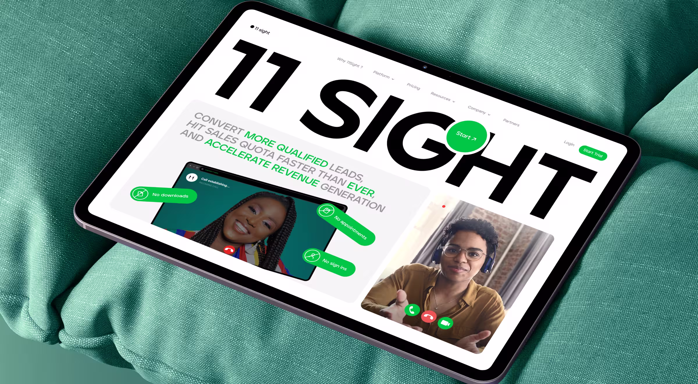
- Why it works: The flow reduces friction between learning and trying. Clear narrative sections, consistent components, and well-placed CTAs keep visitors moving from explanation → evaluation → live demo without losing context.
- Business impact: The redesign earned a Red Dot (Corporate & Business Web Sites), recognized for combining storytelling, technical content, and animation to convey product value.
- Takeaway: For B2B SaaS, bind storytelling, an on-page demo, and pricing clarity into one path so visitors can understand the offer, test it, and choose a plan in one session.
🔍 Read our full case study here.
Accern Rhea — enterprise AI research | Lazarev.agency
Accern Rhea is an AI-powered research platform that surfaces finance-relevant data and signals for analysts.
What you see is an AI-first research tool for financial analysts, VC investors, and ESG specialists built around a hybrid interface:
- Prompt-driven inputs paired with dynamic widgets and charts.
- A report-creator mode with split-screen “research → report”.
- An upgraded command-line-style input (search files, set notifications, schedule emails and calls).
- A dataset “Lenses” plus file uploads to provide context.
- Email alerts deliver updates on tracked topics.
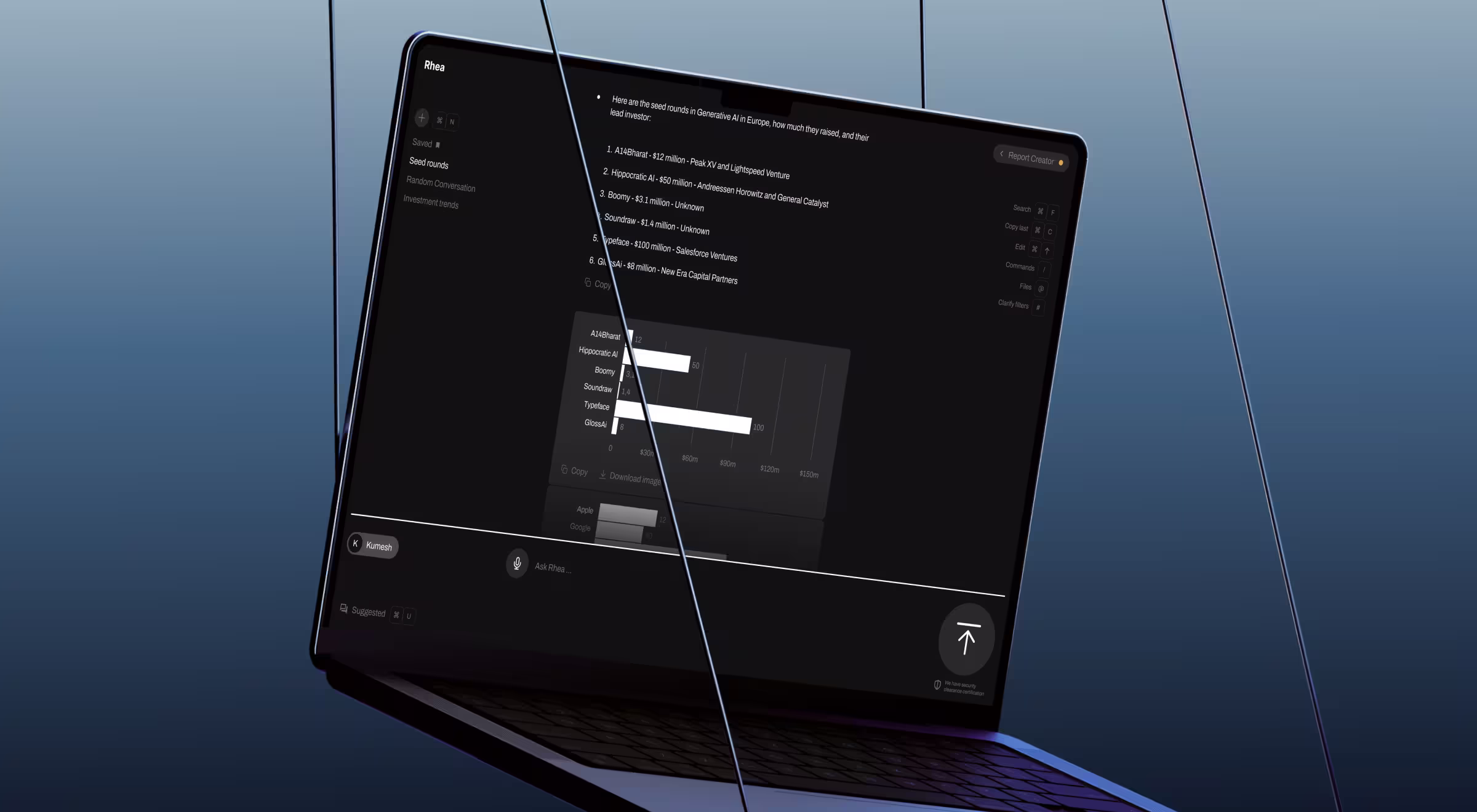
- Why it works: Instead of a chat-only UI, the system adapts results to the task — surfacing references, visuals, and controls inline — and helps refine unclear prompts with clarifying suggestions. The split-screen mode keeps analysis and reporting in one place, cutting tool-switching.
- Business impact: Rhea is a catalyst in Accern’s journey from Series B to an 8-figure acquisition, with $40M+ raised over the partnership.
- Takeaway: In data-heavy finance workflows, pair natural-language inputs with widgetized results and an on-the-spot report builder so insights move straight into a shareable draft without tab juggling.
🔎 If you want a full breakdown of Rhea’s product thinking, see our article “AI UX design principles at work: how we helped Accern build Rhea” or read our full case study.
Modern UI design patterns you can reuse
What to steal from the above good user interface design examples:
- Progressive disclosure beats busy screens: ship one clear decision per step. It improves usability and shortens the design process by making intent obvious.
- Strong user interface graphic design uses type scale, spacing, and contrast to set hierarchy before color. This boosts visual appeal without sacrificing functionality.
- Confirmation beats confusion: motion and microcopy should explain state changes. Micro interactions help users understand what happened and why.
- Accessibility broadens the funnel: design for keyboard, color contrast, and touch targets from day one. Responsive design ensures the same clarity across desktop, mobile, and web apps.
- Don’t hide search: if your platform has lots of content, a persistent search bar and good suggestions help users find items fast and save time.
🔍 If you want to understand why these patterns work so reliably, our article on UI design principles breaks down the foundations behind strong interfaces.
Turn best UI design decisions into business outcomes
The best UI design balances beauty with business logic, turning user attention into action. The patterns above show how these UI examples translate into reliable outcomes: quicker comprehension, fewer errors, and a smoother path from homepage to value.
If you’re ready to ship these lessons into your product, partner with our UX/UI design services team — or simply contact us for end-to-end research, UI craft, and growth-driven delivery.


.webp)