

Ever shipped a feature that looked flawless in Figma — only to watch real users stall at the first tap?
That gap between sleek mock-ups and market traction closes when every phase of the UX design process stacks evidence on top of insight.
In the article ahead, you’ll walk through 8 UX design steps from stakeholder alignment to post-launch iteration, backed by Lazarev.agency’s Streamingbar and SolarDrive case data.
Key takeaways
- Evidence beats guesswork. An 8-phase UX design process turns early hunches into data, guiding teams from stakeholder alignment to post-launch iteration.
- Artifacts keep everyone aligned. Each phase ships something tangible like a North-Star statement, journey map, clickable prototype, or KPI dashboard, so progress and risk stay visible.
- Discovery saves money, validation saves face. Streamingbar’s deep research nixed 154 low-value features, while in-prototype usability tests exposed flow blockers before code.
- Proven business impact. SolarDrive’s workflow-first redesign doubled daily installs by unifying five scattered tools, showing how disciplined IA and continuous measurement turn UX into revenue.
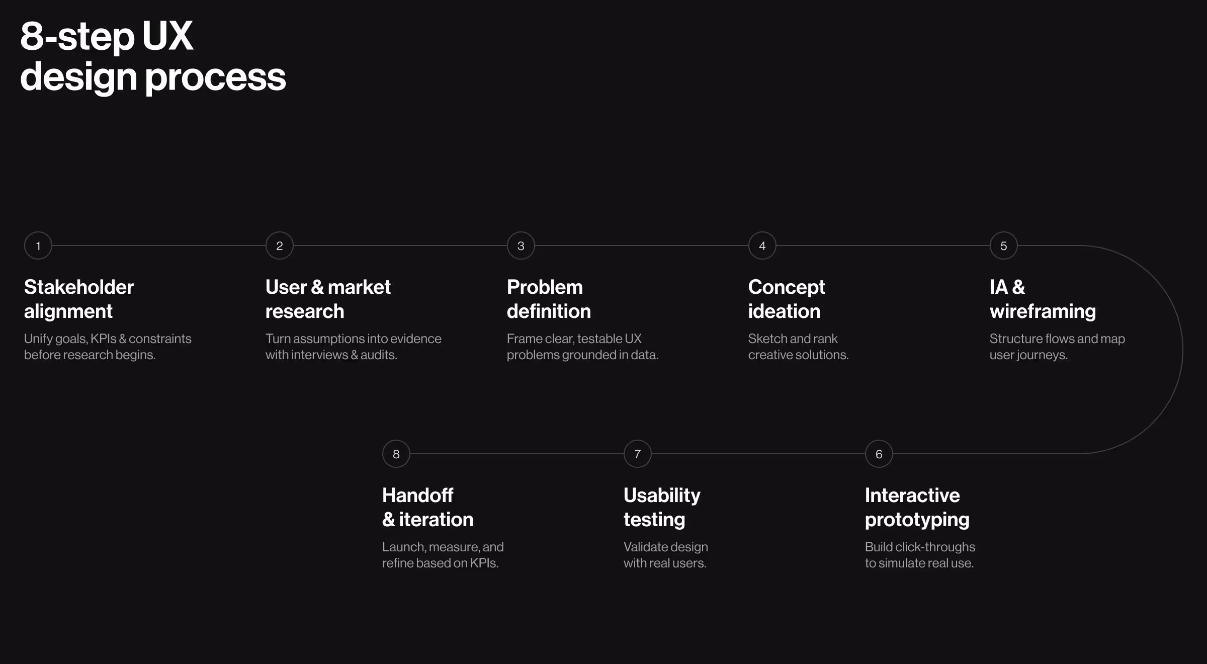
Discover — foundations of the UI/UX design process
Before pixels, we need proof.
The research phase uncovers business goals, constraints, and users’ needs, so every later decision is grounded in data and not opinions. As Nielsen Norman Group reminds us, without early user research, even the slickest interface is just an expensive guess.
Step 1. Stakeholder alignment
Early workshops surface KPIs, tech limits, and project scope in one place. A clear north-star statement guards the budget when ideas start to snowball.
- Goal: Surface business objectives, constraints, and success metrics before research begins.
- Tools: Remote kickoff workshop, Miro stakeholder map, OKR tree.
- Deliverables: North-Star statement, risk ledger, decision log.
❓Ask your team: Which KPI proves success, and who owns it?
Step 2. User & market research
Conducting user research turns assumptions into facts. Combine stakeholder interviews, focus groups, and web analytics to map pain points and industry trends.
- Goal: Validate assumptions with real users and competitors.
- Tools: User interviews (Lookback), survey (Typeform), competitor teardown (Heuristics sheet).
- Deliverables: Proto-personas, research report, opportunity matrix.
✅ Case in action: Streamingbar — turning “subscription fatigue” into a single, social discovery flow
While working on the Streamingbar project, Lazarev.agency’s UX design team began by surveying 20 target viewers, auditing 6 rival apps, allocating 40 mandatory features for implementation, and ranking 164 feature ideas down to 10 testable hypotheses — a research sprint that cut weeks of guesswork.
Insights shaped 4 design bets:
- A unified cross-platform search
- A lightweight social layer (shared watch-lists and “friends-watching” feed)
- An advanced metrics dashboard that feels like “Spotify Wrapped for film”
- And a bright, cohesive brand identity
Early Figma click-path tests trimmed several unnecessary taps from the median “find and play” journey, raising completion rates in A/B tests — proof that deep discovery turns UI/UX design process into prioritized backlogs and faster validation downstream.
Define & ideate — shaping the UX development process
Insights now flow into clearly articulated problems, then into creative directions the whole design team can judge on merit.
Step 3. Problem definition
Affinity mapping clusters raw notes; a pain-gain matrix ranks issues. Defining the project in one sentence keeps user expectations central and prevents scope creep in your UX development process.
- Goal: Turn insights into a single, testable problem statement that stops scope creep.
- Tools: Affinity map, How-Might-We framing, impact-effort matrix.
- Deliverables: Prioritized pain points, validated HMW list.
❓Ask your team: What evidence backs this problem, and what happens if we ignore it?
🔍 Pro tip:
When you draft a problem statement, attach two data hooks:
- A leading metric you can measure immediately (e.g., “drop-off at add-to-cart step exceeds 35%”).
- A validation trigger that forces action if the metric moves (e.g., “if drop-off stays >25% after one sprint, reopen ideation”).
This pair turns the statement into a falsifiable hypothesis team can track realtime.
Step 4. Concept ideation
Crazy 8s, lightning demos, and design thinking methods generate potential solutions fast. Rank sketches by impact/effort, then storyboard top contenders.
- Goal: Generate and rank solution concepts.
- Tools: Crazy 8s, Lightning Demos, SCAMPER.
- Deliverables: Sketch gallery, concept scorecard.
❓ Ask your team: Which idea kills the biggest risk fastest?
Step 5. Information architecture & wireframing
A solid information architecture turns scattered ideas into navigable flows. Start with low-fidelity wireframes; jump to high fidelity only when paths feel natural.
- Goal: Translate winning concepts into a navigable structure.
- Tools: Card-sorting (OptimalSort), sitemap in Octopus, low-fi wireflows (Figma).
- Deliverables: IA map, task-level wireframes.
✅ Case in action: SolarDrive — doubling daily installs by unifying five disjointed workflows
Process mapping uncovered multiple duplicate data re-entries that, together with other bottlenecks, cost each employee about 2.4 hours daily.
The redesign folded several SaaS tools into one platform:
- A simulated project for onboarding
- Kanban boards that auto-sort tasks by priority and location
- A single-page interactive timeline displaying all project milestones
- And an all-in-one inbox for email, SMS, and in-app notes
Within one quarter, the unified IA doubled client capacity while keeping headcount flat. It proved that architecting flows around real user pain beats adding more software.
Prototype & validate — stress-testing ideas early
Skipping validation is where most projects burn money. Prototypes expose friction early, and usability testing gives the team hard numbers instead of gut feel.
Step 6. Interactive prototyping
Use Figma or other prototyping tools to build click-through journeys that mimic the real product. Include every key task so user flows stay intact.
- Goal: Create a tangible artefact users can click before code.
- Tools: Figma interactive prototype, Storybook token preview.
- Deliverables: Click-through prototype, UI kit v0.
❓ Ask your team: Does the prototype cover the riskiest user journey end-to-end?
Step 7. Usability testing & validation
Maze tests, moderated sessions, and heat-maps reveal where users pause, rage-click, or abandon. Combine qualitative user feedback with analytics to rank fixes.
- Goal: Collect behavioral evidence that the design works.
- Tools: Maze unmoderated tests, SUS survey, session recordings (Hotjar).
- Deliverables: Usability report, prioritized fix list, exit-criteria scoreboard.
❓ Ask your team: Which insight would force us back to ideation?
If real users can’t finish a flow in 60 seconds, the design phase isn’t done, no matter how elegant the UI components look.
Build, launch & iterate — closing the UX design cycle
Validation, the latest of 8 UX phases, gates green-light development. Clear specs, paired reviews, and a living design system keep quality stable while the codebase scales.
Step 8. Handoff, launch, measure & iterate
Designers and engineers pair in Zeplin or Storybook, so no detail is lost. Post-launch, dashboards track user behavior against baseline KPIs to spot new pain points and fuel the next iterative process.
- Goal: Ship validated designs, track KPIs, and feed learnings back into the next sprint.
- Tools: Zeplin, Jira tickets with embedded specs, Mixpanel dashboards, feature flags.
- Deliverables: Production-ready components, accessibility audit, experiment plan.
❓ Ask your team: Which metric will trigger the next iteration, and who owns it?
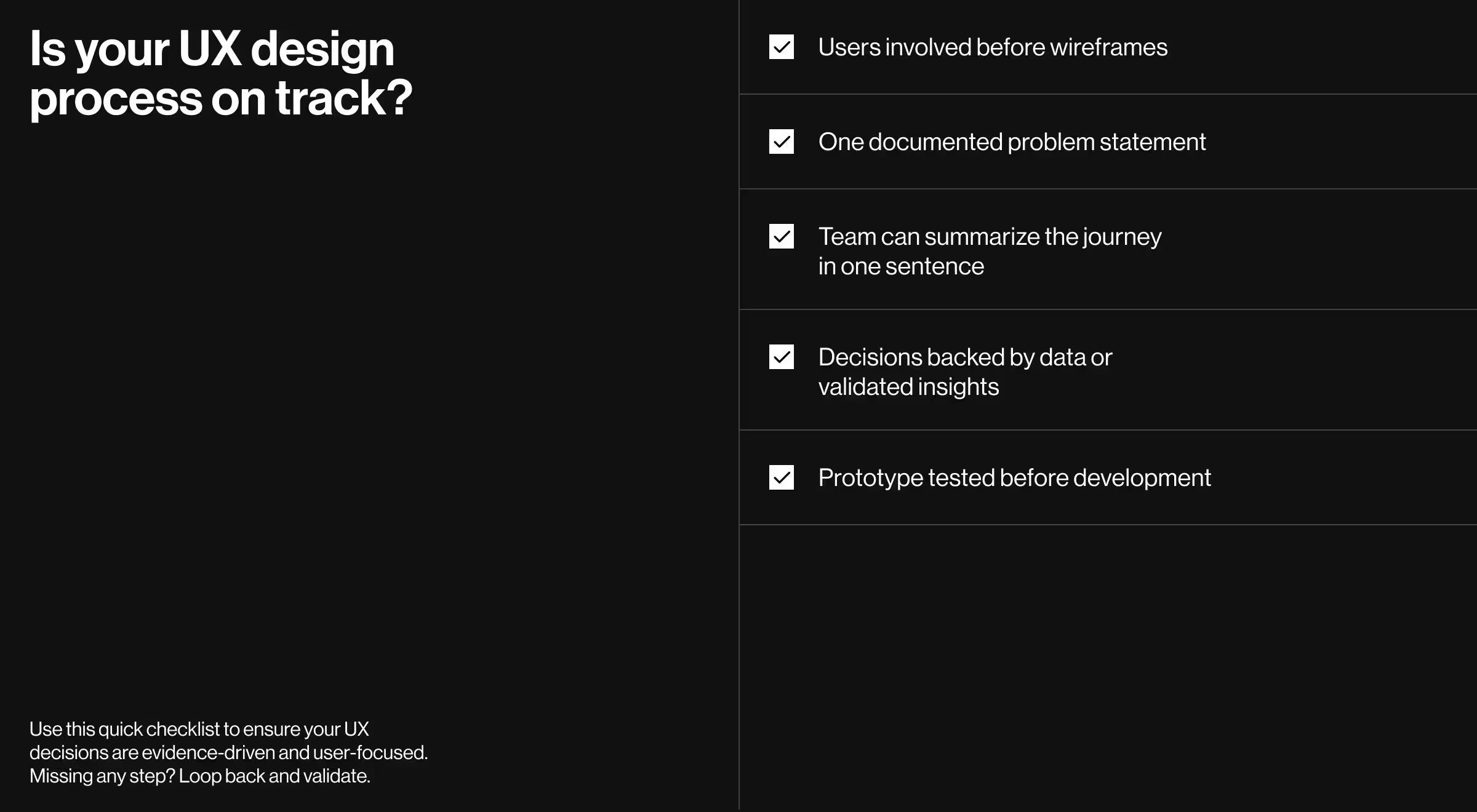
UX design process quick checklist
Where “expectation vs. reality” fits in the UX design process
Even seasoned product teams walk into a typical UX design process with rosy assumptions — tight deadlines, fixed budgets, zero surprises. Reality often pushes back.
Laying the two columns side-by-side exposes hidden risk early, grounds stakeholder conversations in facts, and shows how an evidence-driven design team can redirect effort before schedules and morale nose-dive.
Use the matrix below as a quick litmus test for ongoing UX projects: if your roadmap drifts into the “Common reality” column, loop back to the matching step in the 8-phase cycle and realign with user expectations and business KPIs.
Reality checkpoints below help teams spot drift mid-sprint:
Share the table in sprint kick-offs or status reviews. It keeps the entire development team prioritized on measurable user experience gains rather than subjective aesthetics.
Why an 8-step UX design process involves more than screens
Processes beat heroics. Each phase feeds the next with insight, reducing risk and compounding value.
When every artifact flows through the eight steps above, teams stop guessing and start building momentum. From market research to user stories, the cycle keeps target users at the center and lets teams scale without losing clarity.
Need a strategic partner who’s obsessive about evidence?
Explore our UX research services or jump straight to a contact form — your next release is one conversation away!


.webp)


.avif)


