How civic engagement app design simplified political data and boosted user participation
About the project
Challenge:
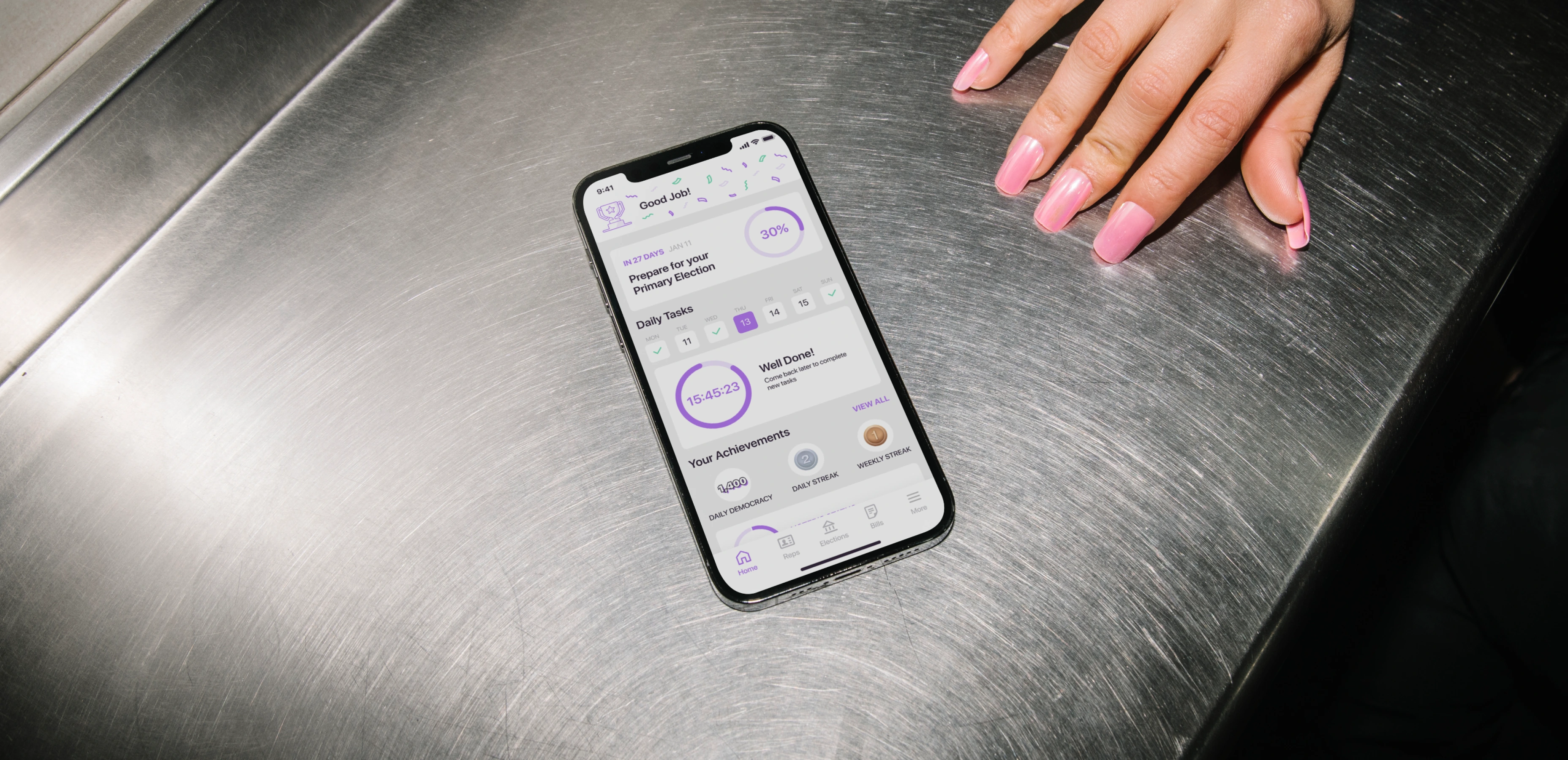
Activote empowers U.S. citizens with information about candidates, past achievements, and election insights, aiming to integrate democracy into daily life. However, outdated design and confusing UX prevented users from fully engaging with the app. The team turned to Lazarev.agency to apply civic engagement app design principles, transforming overwhelming political data into a clear, interactive, and empowering user experience.
Emotional Design
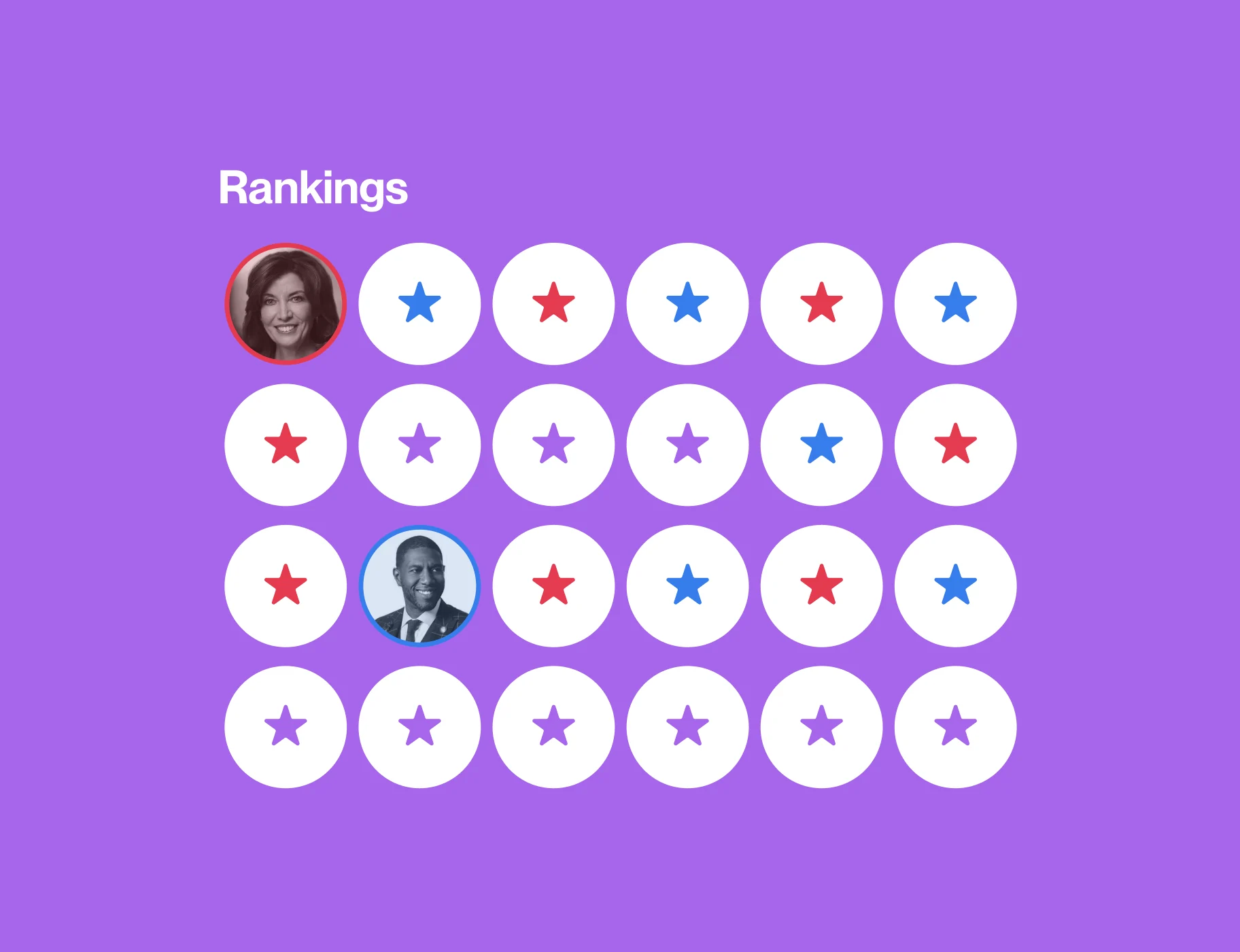
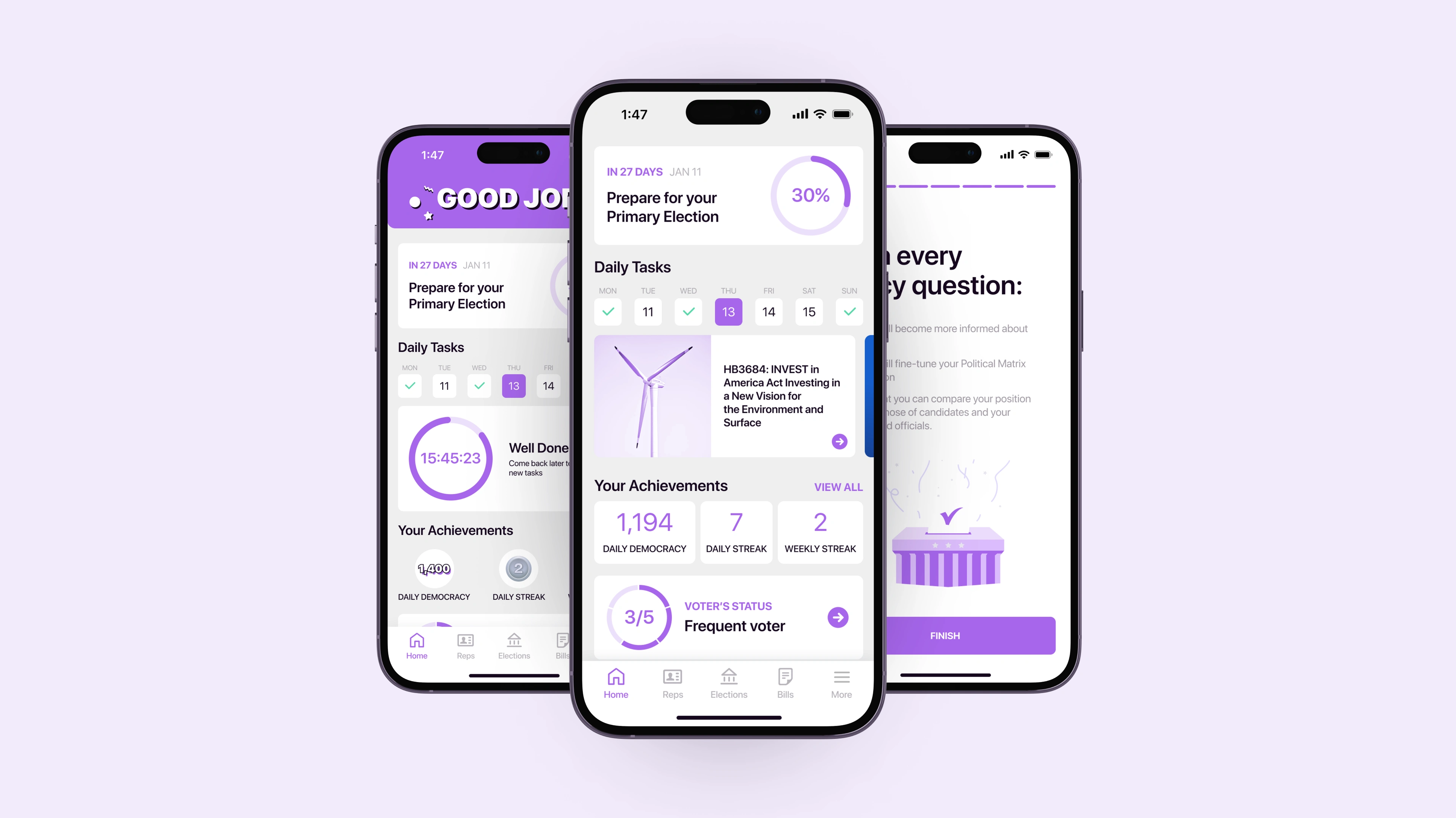
To transform, once data-heavy and complex, Activote into an accessible tool for people to become politically aware citizens, we put a premium on emotional design. The team considered users' cognitive responses, opting for a purple color scheme instead of traditional red and blue, which are often associated with political parties. To enhance user engagement, we introduced micro-interactions such as confetti cascading across the screen upon completing tasks. Plus, we incorporated interactive charts, achievements, rankings, and other features to provide a more enriching UX.
Reviving engagement through gamification
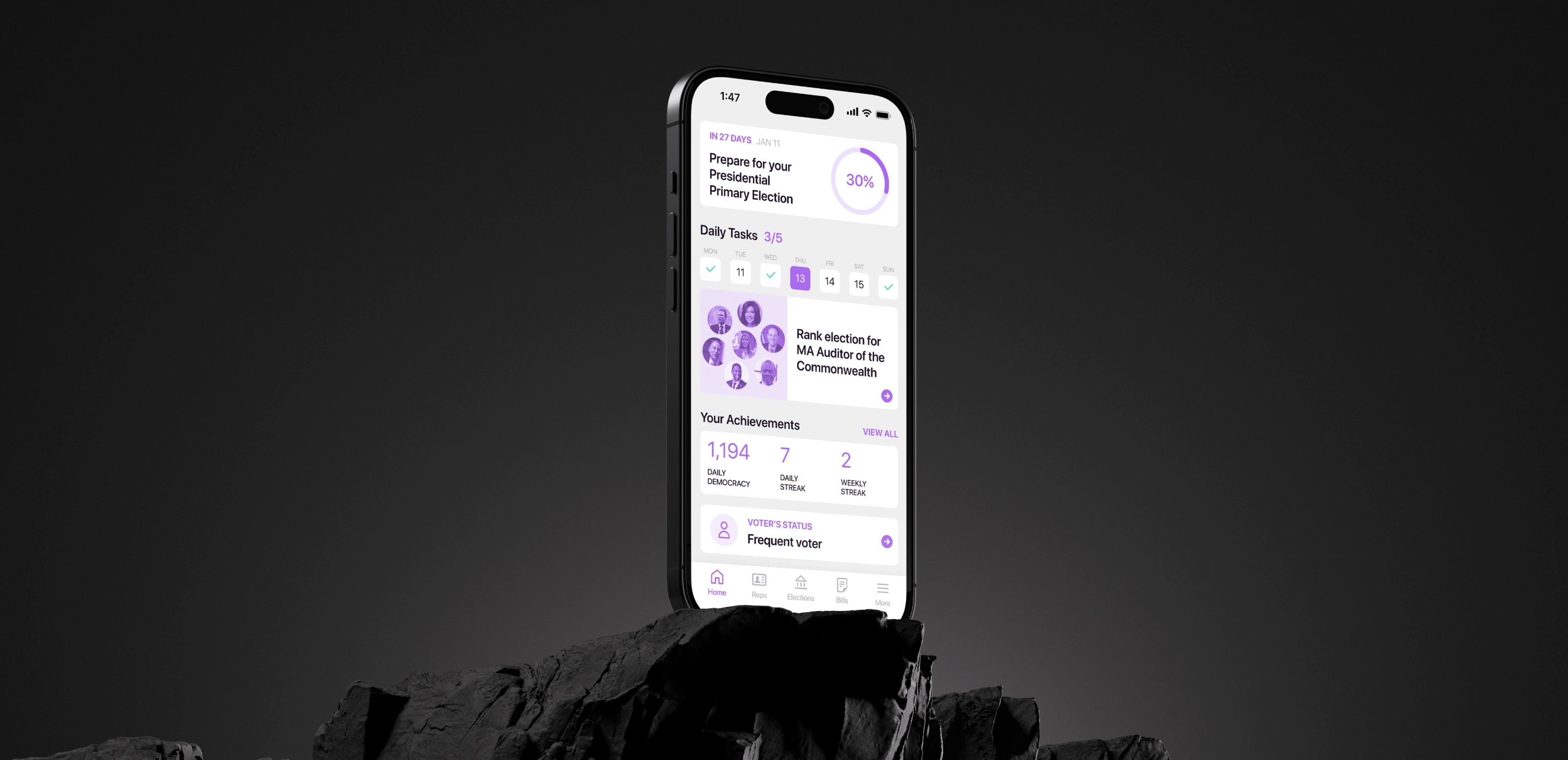
To maintain user engagement even during non-election periods, we integrated an awards widget, presented in a statistical format, in line with our client's vision. However, clicking on this widget unlocks achievement badges, earned by completing tasks. Users can share them on social media, expanding the app's reach to a broader audience and potentially drawing in new users.
Emotional website design: how to build digital products that users feel
Streamlined onboarding for improved user retention
Prior to redesign, many users spent 15 minutes within the app but never returned. This was primarily due to the extended onboarding, which led to user frustration.
As a solution, we reimagined this process, reducing the number of onboarding steps. Designers also highlighted new or unfamiliar features and ensured the training content was concise and non-intrusive.
Revitalizing the Activote homepage
The Activote team emphasized a total homepage transformation as the existing one lacked intuitive navigation and failed to engage users, resulting in high bounce rates. Understanding the home screen’s importance in cultivating a daily user habit, we didn't settle for minor adjustments. Instead, we significantly elevated this crucial touchpoint, ensuring it captivates users from the very start.
Empowering civic engagement
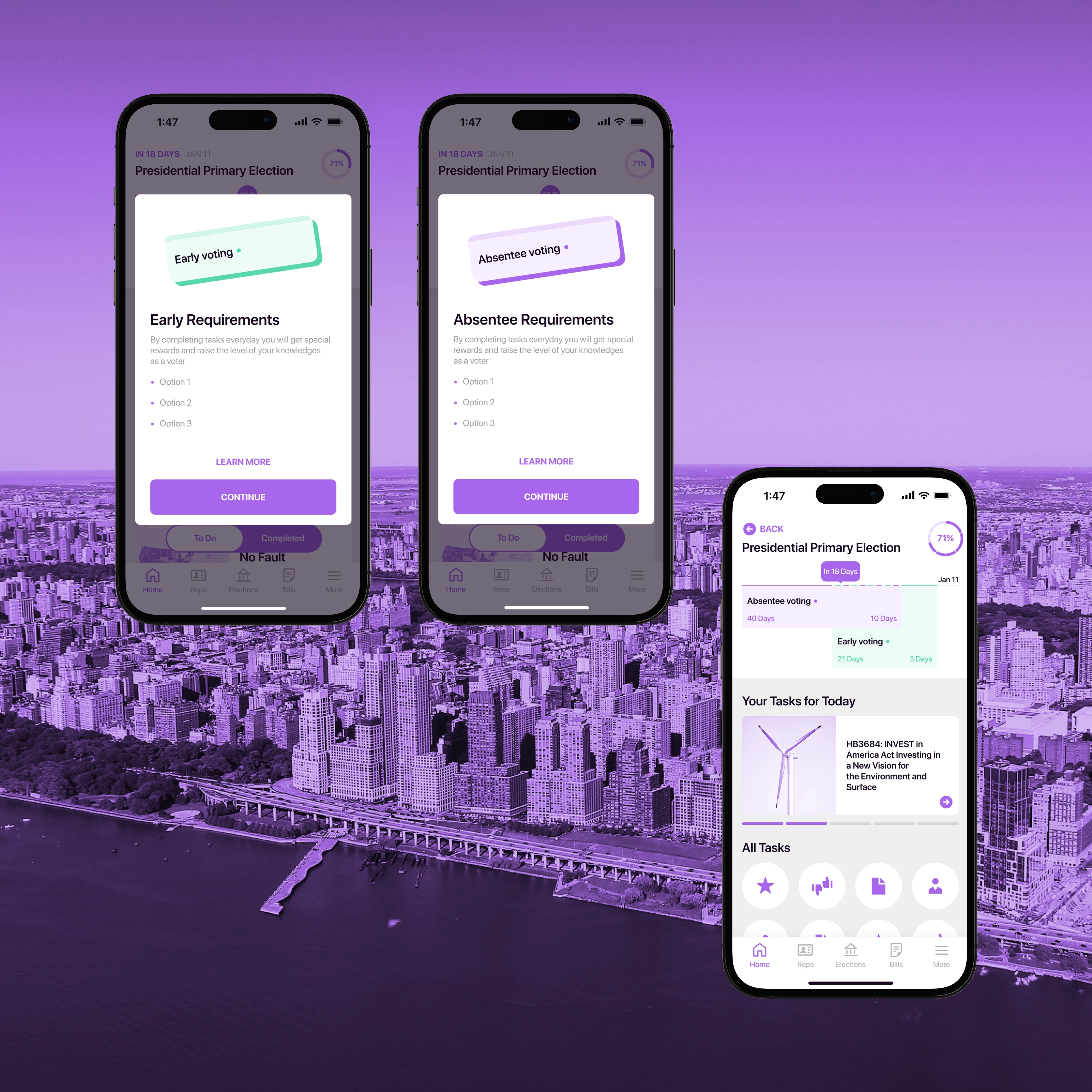
To promote alternative voting methods and encourage civic participation, we've designed the Vote Ready page, offering users a concise overview of their election preparedness. It includes an interactive timeline displaying the election date and highlights vital states: Absentee voting and Early voting. Clicking on these states provides users with informative pop-up windows outlining specific participation requirements.
Designing interactive quizzes
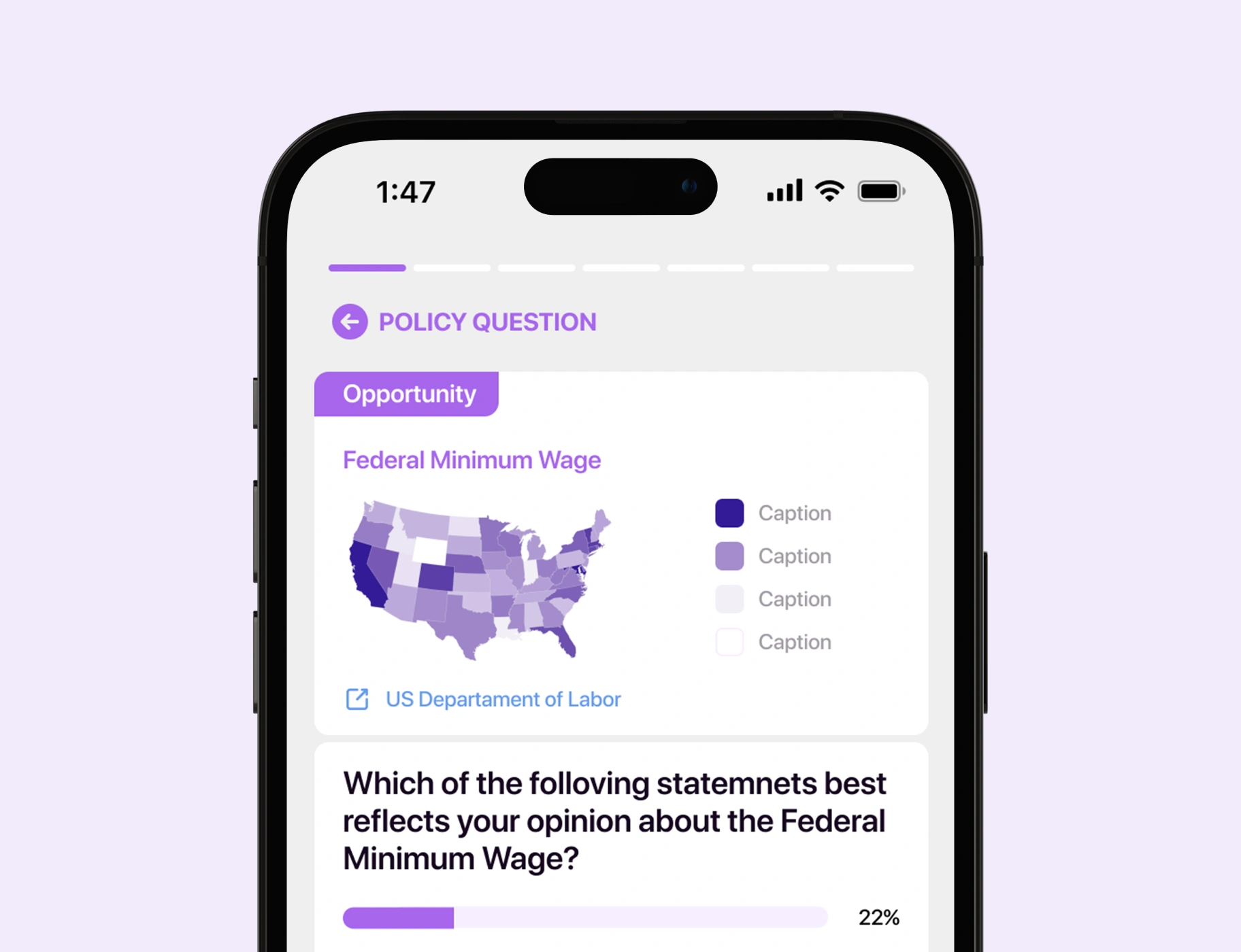
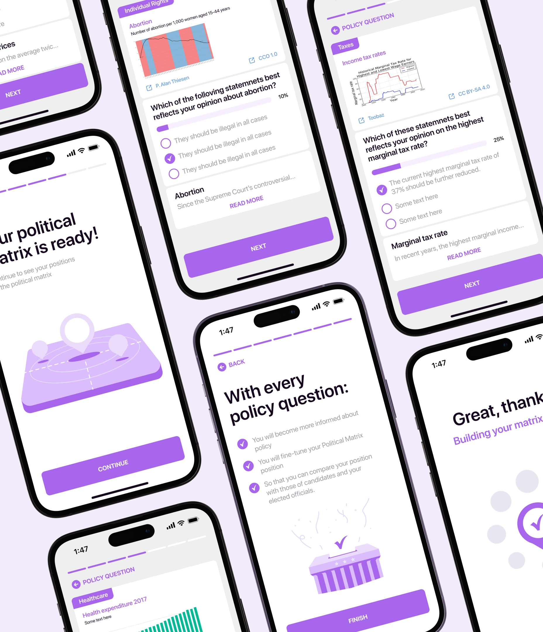
In the app's early version, the quizzes were confusing and lacked an educational touch. So, we've worked on their quality and length. The team added real-time feedback by showcasing the percentage of user responses after each question, answers in diverse formats, and explanations post-answers to elevate the educational value.
Upon quiz completion, we constructed a political matrix, positioning users within different political ideologies and parties. It helps them understand their political leanings and perspectives on key matters.
Frequently asked questions
Common questions
about this topic
What problem was Activote trying to solve before the redesign?
Activote's outdated design and confusing UX kept people from engaging with the political information the app already held. Many users spent 15 minutes inside the app and never came back, largely because onboarding ran too long. The homepage lacked intuitive navigation and produced high bounce rates.
How did the Activote redesign improve user retention?
Lazarev.agency cut the number of onboarding steps in Activote's app, highlighted new or unfamiliar features, and kept training content concise and non-intrusive, addressing the extended onboarding behind the 15-minute-and-gone pattern. The homepage was rebuilt as a daily habit surface, not adjusted at the margins, because the home screen decides whether someone opens the app again tomorrow.
How does Activote keep users engaged between elections?
Activote holds attention during non-election periods through an awards widget presented in a statistical format, built by Lazarev.agency to the client's vision. Clicking it unlocks achievement badges earned by completing tasks, and users can share those badges on social media, which extends the app's reach to potential new users.
How did Lazarev.agency make dense political data usable inside Activote?
Lazarev.agency gave Activote a Vote Ready page with an interactive timeline showing the election date plus absentee and early voting states, each opening a pop-up with specific participation requirements. The quizzes were rewritten for educational value with real-time response percentages, varied answer formats, and post-answer explanations, and completing one builds a political matrix positioning the user among political ideologies and parties.
More cases like this
Related cases you
might find useful
Voice AI video editor app design: how we shipped Elva's brand, onboarding, and agentic editing flow
Lazarev.agency designed Elva, a voice-first AI video editor — brand, UX, UI, onboarding, monetization — as one launch. Webby Winner, Best Visual UI in AI.
How our redesign made Abu Dhabi University's depth clear for applicants and students
Abu Dhabi University had depth, but its digital experience hid it. Lazarev.agency redesigned the platform around the needs of applicants, students, and faculty, transforming a fragmented ecosystem into a unified digital campus where information, services, and opportunities are easier to find and act on.
How we helped a premier fine wine retailer boost add-to-basket rate by 65% with a mobile-first redesign
Explore how Hedonism Wines boosted add-to-basket rates 65% with mobile-first redesign & improved UX.
Let's talk about your AI adoption challenge
Tell us where adoption stalls. You’ll hear back from a senior product and UX lead with a practical action plan.