When Lazarev.agency’s clients a lace-and-leather boutique (Mariemur) and an AI learning platform (HiTA AI) both lift revenue with the same design playbook, you know the rules are universal.
Want to learn first-hand insights on how to increase conversion rates on your website?
Below, we show how a handful of conversion-driven tactics developed by our team reshape website user experience no matter the vertical.
Key takeaways
- One page, one job. A single clear offer outperforms “browse everything.”
- Show the payoff first. Numeric benefit ahead of specs raises engagement.
- Design for thumbs & light motion. Tiny Lottie loops beat heavyweight hero videos on mobile.
- Surface trust where hesitation happens. Badges, social proof, and micro-help erase doubt in-flow.
Does website user experience really matter in 2025?
Search engines, voice assistants, and mobile devices have shrunk the distance between a first click and a buying decision. When a page loads, users interact with just a handful of user interface cues before judging credibility.
A January 2025 outlook from the Nielsen Norman Group notes that organizations treating website user experience as a measurable asset “weather downturns better and rebound revenue faster than peers.”
That finding pushes UX designers and product leads to hard-wire user research, usability testing, and clear information architecture into every sprint, because great customer experience design now directly drives business growth.
Two Lazarev.agency’s projects show how disciplined UX design turns pain points into profit:
- Mariemur, a luxury e-commerce brand whose broad catalogue eroded customer satisfaction. Analytics showed a 73% drop-off between home and product pages. By curating 120 items into a single-offer landing, backed by emotion-first visual design, we optimized the user journey, doubled user engagement, and strengthened brand loyalty.

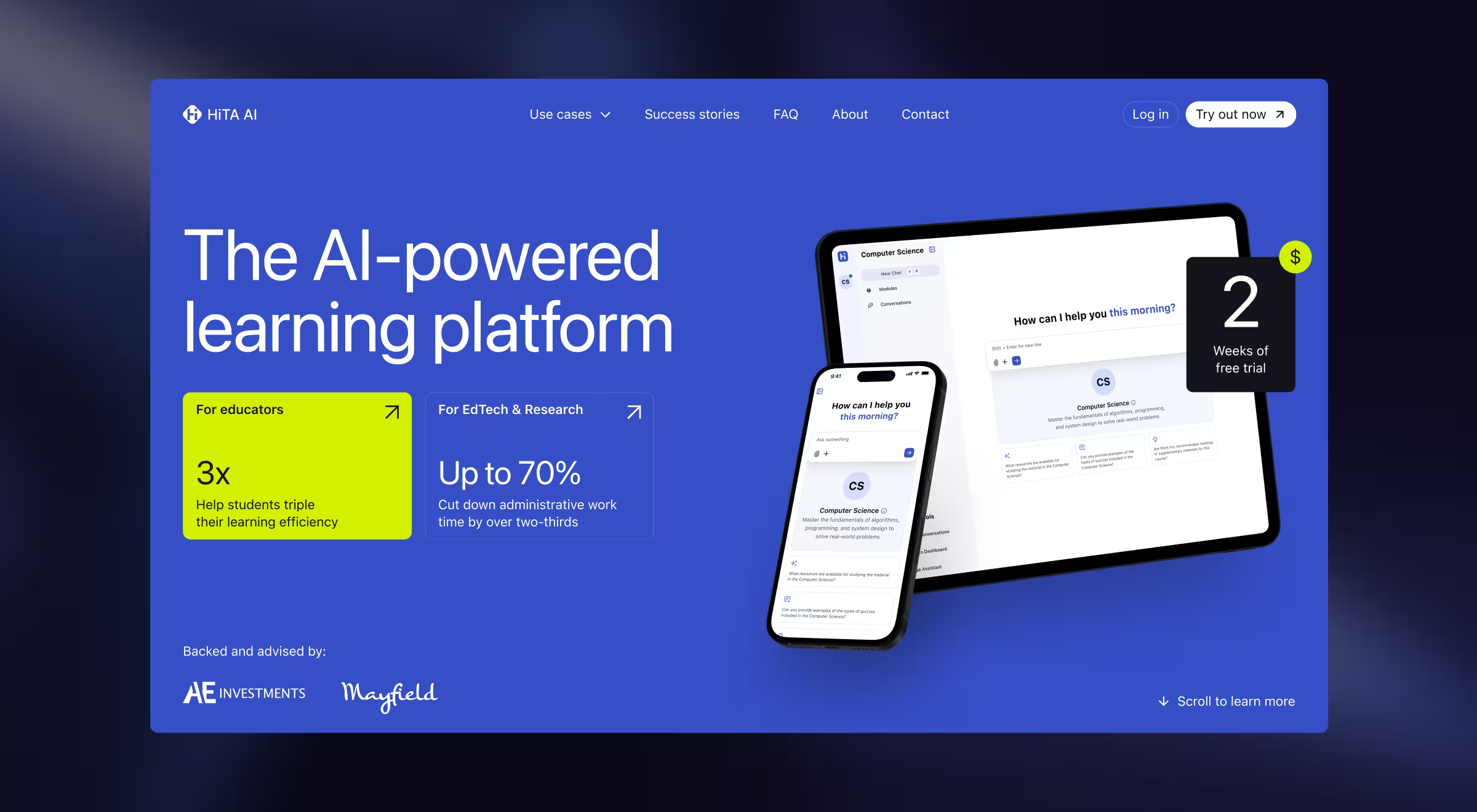
- HiTA AI, an ed-tech platform helping students learn faster. The team struggled to express value to a diverse target audience and lacked a roadmap. We combined deep market research with a benefit-first promo page and rapid user testing. Clearer messaging lifted trial sign-ups and armed the customer service team with a story that fuels future releases.

Across both cases, focused interaction design, lightweight UI design, and data-led UX improvements created a positive experience that lets website visitors glide through content, trust the offer, and buy with confidence. Up next, we break down three principles on how to improve website user experience.
Principle 1. One page = one purpose
Visitors judge fit inside four seconds; multiple objectives dilute that moment.
- Mariemur trimmed 120 SKUs across 14 categories down to four curated sets on a single landing page; engagement jumped 50% and the 73% drop-off evaporated.
- HiTA AI opens with one promise — “Help students learn 3× faster”, plus a sticky start free trial CTA, keeping every scroll pointed at sign-ups.
What is web UX at its best? It’s when clarity beats catalog depth. When a screen feels like a dressing-room mirror, specs can wait.
{{Ostap Oshurko}}
🔍 Pro tip: After you strip the page to a single goal, run a 24-hour scroll- and click-map. Any element above the fold that draws < 5% clicks gets moved down or removed — micro-audits keep every pixel working for your KPI.
Principle 2. Lead with tangible value
Users skim for ROI. Position benefits before features and watch engagement climb.
🔍 Pro tip: Write every H2 as a promised outcome and prove it in the first 3 sentences.
Principle 3. Thumb-first & motion-smart design
More than half of modern traffic lands on mobile. Interfaces must respect thumb reach and load budgets.
- Mariemur swaps heavy video for 18 KB Lottie “silk” loops — all performance bars stayed green on real-device tests.
- HiTA AI keeps motion ultra‑light: a single “Scroll to learn more” cue nudges thumbs down‑page without adding video weight or jank.
Luxury buyers and SaaS admins look different, yet the chemistry of trust is identical: concise copy, visible ROI, and micro-interactions timed to delight.
{{Ostap Oshurko}}
When “What is web UX?” is no longer a question, it's time to move on to its measurability.
How to make your UX measurable
Slow page speed sends website visitors searching for the back button; a 250 ms lag is enough for web users to abandon a checkout. That’s why measuring user experience must live in every sprint. Blend 3 data streams:
- Behavioral analytics (scroll maps, event funnels) expose how users navigate and where user interaction stalls.
- Usability testing and lightweight user experience questionnaires surface hidden pain points, especially when you tailor surveys to one flow and let the customer service team tag recurring issues.
- Ongoing user feedback loops (interviews, in-app polls) give qualitative color to the numbers, revealing unmet customer needs before they dent customer satisfaction.
Schedule a monthly UX measuring checkpoint:
- Compare fresh data to baseline KPIs.
- Flag any drop in conversion rates.
- Log every tweak for next-cycle validation.
For a luxury lingerie store and an AI learning platform, the winning UX rules stayed the same: focus the narrative, lead with quantifiable value, respect mobile constraints, and dissolve doubt in-flow. Apply these principles and shrink paths to purchase, lift trust, and see measurable conversion gains.
Want to know how to improve website user experience even more?
Curious how these insights could reshape your own site? Ask the professionals.
Our website-design team aligns every pixel with the business KPI that matters to you.
Explore Lazarev.agency’s website design services and schedule a discovery call to map UX design directly to your growth targets.


.webp)


