

Reviewed by: Lazarev.agency Product Strategy Team
Last updated: December 2025
Case studies referenced: Payoneer (fintech), Blockbeat (AI-powered crypto media)
Experience design is the practice of shaping how a product feels to use across the entire journey so users reach value faster, feel in control, and choose to come back. When done right, it turns complex AI, fintech, and Web3 products into experiences that feel clear, trustworthy, and worth returning to.
Key takeaways
- Experience design = UX + UI + emotion + context + behavior + trust.
- It focuses on time-to-value, clarity, and confidence, not just features and screens.
- It matters most where products are powerful but complex: AI tools, fintech products, Web3 platforms.
- The Lazarev.agency framework:
- Find friction in real user behavior
- Map emotional pacing and cognitive load
- Compress the time-to-value window
- Clarify hierarchy, layout, and microcopy
- Personalize flows based on context
- Scale the logic with design systems
- In practice, experience design led Payoneer to cut decision fatigue and support load, and helped Blockbeat turn noisy feeds into focused signals that users actually follow.
- Experience design is a strategic lever for retention, adoption, and trust.
What is experience design?
Experience design is the practice of shaping how a product feels to use. It blends UX, UI, emotion, context, and behavior into a cohesive journey where every interaction feels intuitive, meaningful, and worth returning to.
At its core, experience design integrates six layers:
- UX (logic): how users move through flows
- UI (clarity): how information appears and guides action
- Emotion: how the product reduces anxiety and builds confidence
- Context: how behavior shifts by user type, device, or moment
- Behavior: how micro-interactions influence decisions
- Trust: how consistency, predictability, and transparency sustain long-term use
Experience design = UX + UI + emotion + context + behavior + trust.
And in 2026, when users leave products after a single misstep, experience design matters because it compresses time-to-value and makes complex tools feel instantly usable before users decide to swipe away.
What does experience design actually mean in practice?
Experience design is a mindset rooted in intention. It means thinking in systems where every interaction feels purposeful, intuitive, and aligned with how people actually think and act.
While UX zeroes in on usability, this broader approach asks something else:
“What does the product feel like to use and why does that feeling matter?”
It accounts for:
- Micro-interactions and feedback loops
- Visual hierarchy and UI consistency
- Emotional pacing (how the interface guides attention and reduces cognitive load)
- Contextual behavior shaped by user type, frequency, or intent
“We saw users returning to older versions, not because they preferred the look but because they could complete a task faster.”
{{Ostap Oshurko}}
Experience design vs UX vs UI: what’s the difference?
Experience design often gets confused with UX or UI, but it operates on a wider altitude. UX solves usability. UI shapes perception. Experience design connects both and adds the emotional, behavioral, and contextual layers that determine whether users stay.
The table below breaks down the distinctions clearly:
🔍 Check out a detailed overview of the differences between product experience design, UX, and UI in our guide.
Why digital experience design matters more than ever
In an ecosystem flooded with tools, platforms, and SaaS clones, differentiation happens at the experience level. Especially in AI, FinTech, and Web3, where backend power is no longer enough. Years of well-designed products have raised the bar:
- Modern users are spoiled with great choices and short on time.
According to PwC, 32% of customers will stop doing business with a brand they love after just one bad experience, highlighting the importance of immediate value delivery. - Users don’t want to read instructions. And they rarely explore just for fun.
Research by the Nielsen Norman Group indicates that users typically read only about 20% of the text on a web page, preferring to scan rather than engage with detailed instructions. - If your product isn’t instantly clear and rewarding, users will swipe past it without a second thought.
A study by Lifewire found that only 50% of users consult the user manual, with many opting for quick online searches or tutorials instead, underscoring the need for intuitive design.
“You don’t lose users because the product is bad. You lose them because it demands too much. The moment it takes effort, they’re gone.”
{{Oleksandr Koshytskyi}}
So, great experience design:
- Compresses the time-to-value window
- Makes complex tools feel accessible
- Solves pain points
- Builds repeat behavior through trust and ease
- Turns emotion into retention
How will experience design shape products in 2026?
User expectations in 2026 will be shaped by AI-powered design, multimodal interfaces, and an industry-wide intolerance for friction. Experience design becomes the differentiator because it controls how fast users understand value and whether they trust the product enough to return.
The key trends driving this shift:
- AI sets the first impression. If system behavior feels unclear, users lose trust instantly.
- Clarity becomes a competitive edge. Products win when the path to value is obvious within seconds.
- Multimodal interactions expand the UX surface. Voice, shortcuts, and agentic actions demand new experience logic beyond screens.
- Emotional load becomes measurable. Interfaces must feel cognitively light and predictable to keep users engaged.
- Trust becomes the core UX metric. Transparent system behavior and predictable patterns determine retention.
- Personalization becomes mandatory. Static flows fail; adaptive experiences and anticipatory design match user context and intent.
In 2026, the experience is the product. It’s how users decide whether to stay, return, or move on.
🔍 For the full picture of what's changing in 2026, read our deep dive on the future of web design.
How experience design works: the Lazarev.agency framework
Experience design is a structured way of shaping how a product behaves, communicates, and earns trust. At Lazarev.agency, an AI product design agency, we use a proven methodology that blends behavioral psychology, UX logic, and visual clarity to create experiences users instantly understand and naturally want to return to.
Below is the framework we apply across startups, scale-ups and enterprises.
1. Identify friction through real user behavior
Before designing anything, we observe how users actually move, stall, or drop off. We look for: hesitation points, branching decisions, support-triggering moments, and task loops that take longer than they should.
✅ Outcome: A precise map of friction that directly influences retention.
2. Map emotional pacing and cognitive load
Every interface creates an emotional rhythm. High-stress moments, unclear paths, or overloaded screens create anxiety. We model this pacing to understand where users lose confidence and where they need clarity or reassurance.
✅ Outcome: Interactions feel calm, predictable, and cognitively light.
3. Rework flows to compress the time-to-value window
Users decide within seconds whether a product “feels right.” We restructure flows to minimize effort, reduce steps, eliminate dead ends, and highlight the fastest path to success.
✅ Outcome: Tasks that feel effortless, even when the logic underneath is complex.
4. Enhance clarity through hierarchy, spacing, and microcopy
Design communicates long before users start reading. We refine visual weight, typography, layout, and action-oriented microcopy to guide attention exactly where it needs to go.
✅ Outcome: Interfaces users can navigate without instructions and without second thoughts.
5. Build contextual personalization into the experience
Not every user needs the same information at the same time. We adapt flows, content, and UI states based on user type, intent, or frequency of use.
✅ Outcome: A product that feels responsive, intelligent, and relevant to each user.
6. Reinforce consistency through scalable design systems
Once the experience works, we make it repeatable. Design systems ensure that every screen (current or future) shares the same logic, pacing, and visual language.
✅ Outcome: A unified product ecosystem that feels stable, trustworthy, and easy to evolve.
Common experience design problems and how to spot them
Most products don’t lose users because of missing features. They lose them because of invisible friction layered into the experience. Our research from NN/g, Baymard Institute, and Forrester resources shows that poor clarity, high cognitive load, and broken mental models are among the top drivers of abandonment. Below are the most common symptoms teams overlook and what they actually signal.
1. High support tickets → Hidden friction
A spike in support requests usually indicates unclear flows or stalled decision points. Users instinctively reach out when:
- steps feel ambiguous
- outcomes aren’t predictable
- system behavior doesn’t match expectations
✏️ What it means: Users can’t progress on their own. The experience, not the feature, is failing.
2. Users skip onboarding → Value isn’t immediately visible
Users will abandon onboarding if it feels long, irrelevant, or overly instructional. When onboarding is skipped, it suggests:
- the core value isn’t obvious
- instructions are too text-heavy
- the experience demands too much upfront effort
✏️ What it means: The product isn’t communicating “why it matters” early enough.
3. Bounce after first session → Cognitive overload
Users leave when the initial interaction feels mentally taxing. This happens when:
- screens contain too many competing elements
- the interface requires reading instead of scanning
- key actions aren’t visually differentiated
✏️ What it means: Users burn cognitive energy before they see value.
4. Misused or abandoned features → Broken mental models
When users repeatedly misuse features, we can attribute this to mismatched mental models: how users think the system works versus how it actually works. This occurs when:
- labels don’t match intent
- buttons imply the wrong outcome
- features behave inconsistently across screens
✏️ What it means: Users can’t predict system behavior, which erodes trust.
5. Low engagement across key workflows → Weak emotional pacing
If users complete tasks but don’t return, the issue is emotional. Signals include:
- flat interaction rhythm
- no sense of progress
- tasks feel effortful even when they’re short
✏️ What it means: The product doesn’t reward use or create momentum.
6. Frequent “dead ends” → Poor journey continuity
When users reach screens with no clear next action, this is a primary cause of drop-offs. Common signs:
- lack of forward paths
- no recommended next steps
- no contextual actions tied to behavior
✏️ What it means: The experience lacks flow, and users are left to guess what comes next.
🔍 If you're struggling with similar “what now?” moments in your product, our bounce rate optimization guide outlines proven fixes.
These patterns appear across industries, but the root problem is always the same:
the product asks users to work harder than they should.
Understanding these signals sets the stage for the Payoneer and Blockbeat transformations where eliminating friction became the fastest path to clarity, confidence, and adoption.
How we used experience design to reduce friction at scale for Payoneer
It’s one thing to define experience design. It’s another to apply it — at scale, with real users and real stakes.
We’ll break down two contrasting products and explore how we reshaped their flows, logic, and emotional pacing, turning complexity into clarity, and functionality into momentum.
Solution #1: Fixing the friction in Payoneer’s customer experience
Experience design starts with user empathy. And empathy begins with watching what users actually do and why:
- Where they slow down
- Where they hesitate
- Where they give up
That’s exactly what we did with Payoneer, a leading fintech provider serving businesses in over 190 countries.
Their existing system was robust, packed with options, features, and custom logic. But users weren’t navigating it well. Tasks that should’ve taken seconds stretched into minutes. Support tickets were piling up. The problem was friction.
"When users struggle, they don’t blame the interface. They blame the brand. That’s the hidden cost of poor UX."
{{Oleksandr Koshytskyi}}
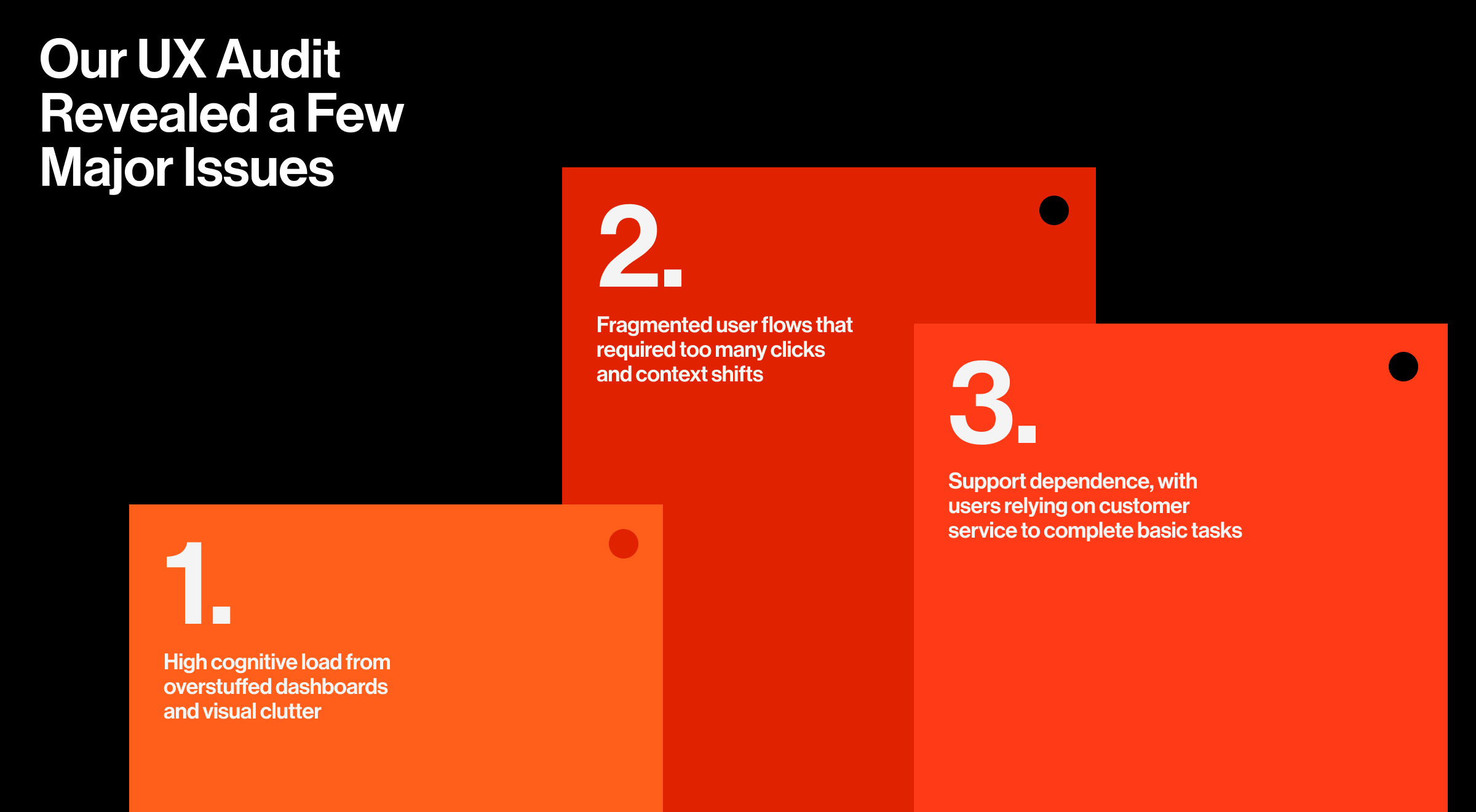
Our UX audit revealed a few major issues:
- High cognitive load from overstuffed dashboards and visual clutter
- Fragmented user flows that required too many clicks and context shifts
- Support dependence, with users relying on customer service to complete basic tasks
🔍 Findings like these are typical in audit baselines, and the next step is prioritizing them by severity and impact. In our guide on how to turn UX audit findings into product wins, we explain how we rank issues and build a roadmap that actually ships.
Solution #2: Reworking complexity into clarity
Our approach to Payoneer’s product relaunch focused on making its complexity feel simple and enjoyable. We kept the depth, but reshaped it through hierarchy, visual weight, and screen-to-screen momentum.
That meant:
- Showing what matters now, hiding what doesn’t
- Reworking flows to reduce steps and eliminate dead ends
- Clarifying microcopy to prevent confusion at the point of action
The result was a product experience design that reduced support load, increased user self-sufficiency, and strengthened brand perception through ease of use.
We also helped the Payoneer team implement a scalable design system, improving cross-team velocity and visual consistency across markets.
Solution #3: Making everyday tools instantly useful
The redesigned home screen now delivers immediate utility: balances, currency options, recent transactions, and a built-in calculator are all right there. It's brand-reinforcing: no clicks, no hunting, just clarity.
"We treated the home screen like a command center. If the user opens the app to check something, chances are it’s one of three things. So we made sure all three were immediately visible."
{{Oleksandr Koshytskyi}}
Key visual decisions, including the careful use of Payoneer's existing color palette, created a UI that's instantly recognizable while being significantly more usable. It made navigation faster, the main screen noticeably easier on the eyes, and reduced support requests.
Alongside redesigning Payoneer’s core screens, we developed a flexible UI system built to scale. We defined visual hierarchies, spacing rules, and reusable components that ensured every screen felt consistent and intuitive. The dark theme, multi-currency balance cards, and interactive widgets weren’t just one-offs; they were part of a shared visual language.
🔍 Moves like multi-currency cards, dark themes, and reusable components all rest on a strong foundation. Our article on UI design principles explains how to build that foundation.
Solution #4: Introducing voice assistant
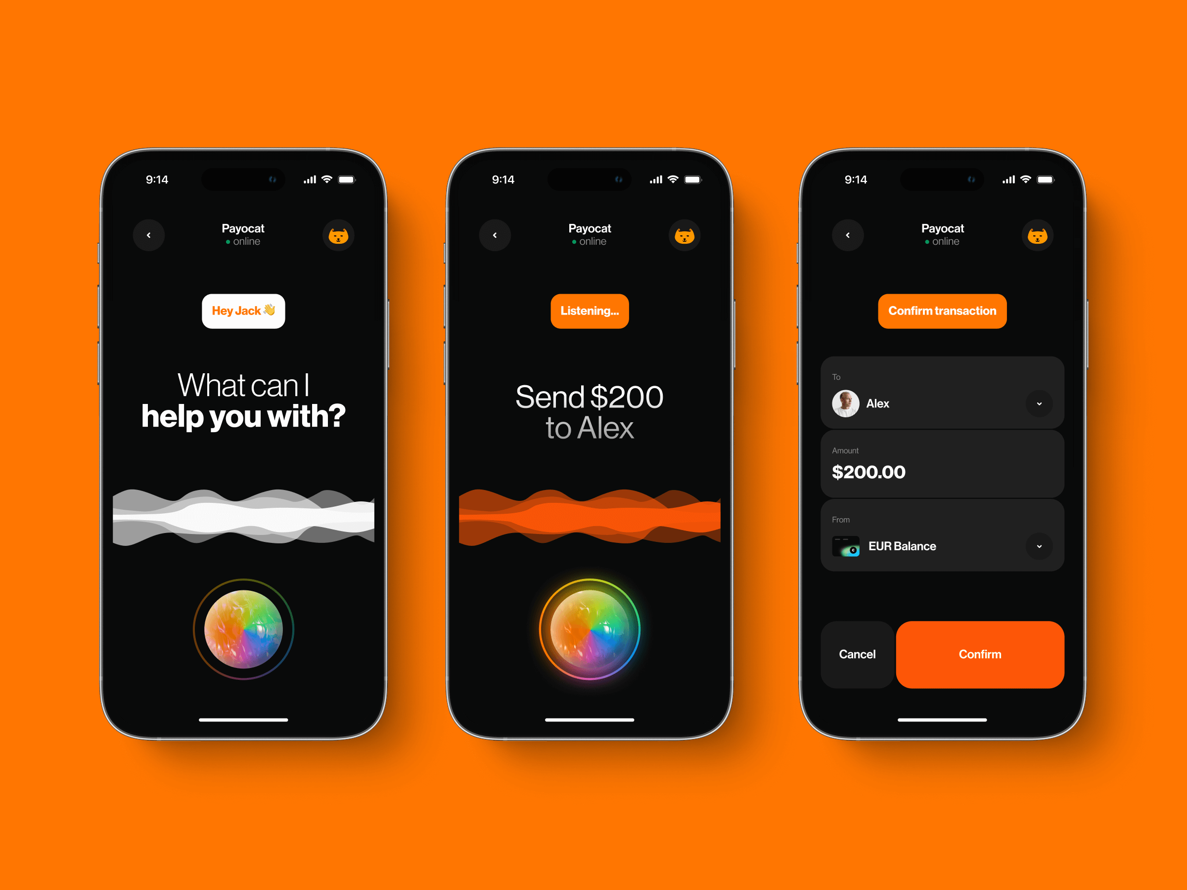
According to PWC research, 71% of consumers would rather use voice than physically type when searching. To reduce friction even further, Lazarev.agency integrated a built-in voice assistant into the Payoneer platform.
Whether checking a balance, initiating a transfer, or navigating across sections, users can now speak instead of click. The assistant handles queries, routes users to the right place, and enables quick actions for frequent tasks.
This feature proved especially helpful for multitaskers and mobile users, letting them complete core actions without digging through menus. In usability tests, task completion times dropped by up to 23% for frequent flows.
🔍 Voice assistance is just one expression of a bigger movement toward conversational patterns. Our article on conversational UI breaks down why these interfaces help users act faster and with more confidence.
Solution #5: Who said fintech can’t be fun?
To make the Payoneer experience more inviting, Lazarev.agency introduced a full-blown in-app game, centered around a custom mascot: 😺 Payocat.
The goal was to increase retention and encourage repeat visits through something playful, brand-aligned, emotional, and rewarding.
The game had simple rules: collect as many Payoneer coins as possible while dodging obstacles. The more coins users collected, the greater the discount they received on Payoneer services.
In other words, gameplay translated directly into value.
The game struck the right balance between lighthearted and strategic. It reinforced the brand personality, gave users a reason to come back, and turned a finance app into something a little more human.
"People remember how a product made them feel. With Payocat, we gave Payoneer a heartbeat."
{{Anna Demianenko}}
🔍 For more examples of fintech UX patterns that make complex products feel human, see our fintech app design x-ray.
How we used experience design to fight news fatigue for Blockbeat
Blockbeat, an AI-powered crypto news aggregator, came to us with a challenge most news platforms share: user fatigue.
Their AI engine was powerful, surfacing the most important crypto news in real time. But the user experience couldn’t keep up. They were missing key insights, skipping headlines, and dropping off faster than the platform could adapt.
The crypto design space is intense. Feeds refresh by the second. And Blockbeat’s original UX offered users little help separating what mattered from what didn’t. It was fast, yes, but not focused.
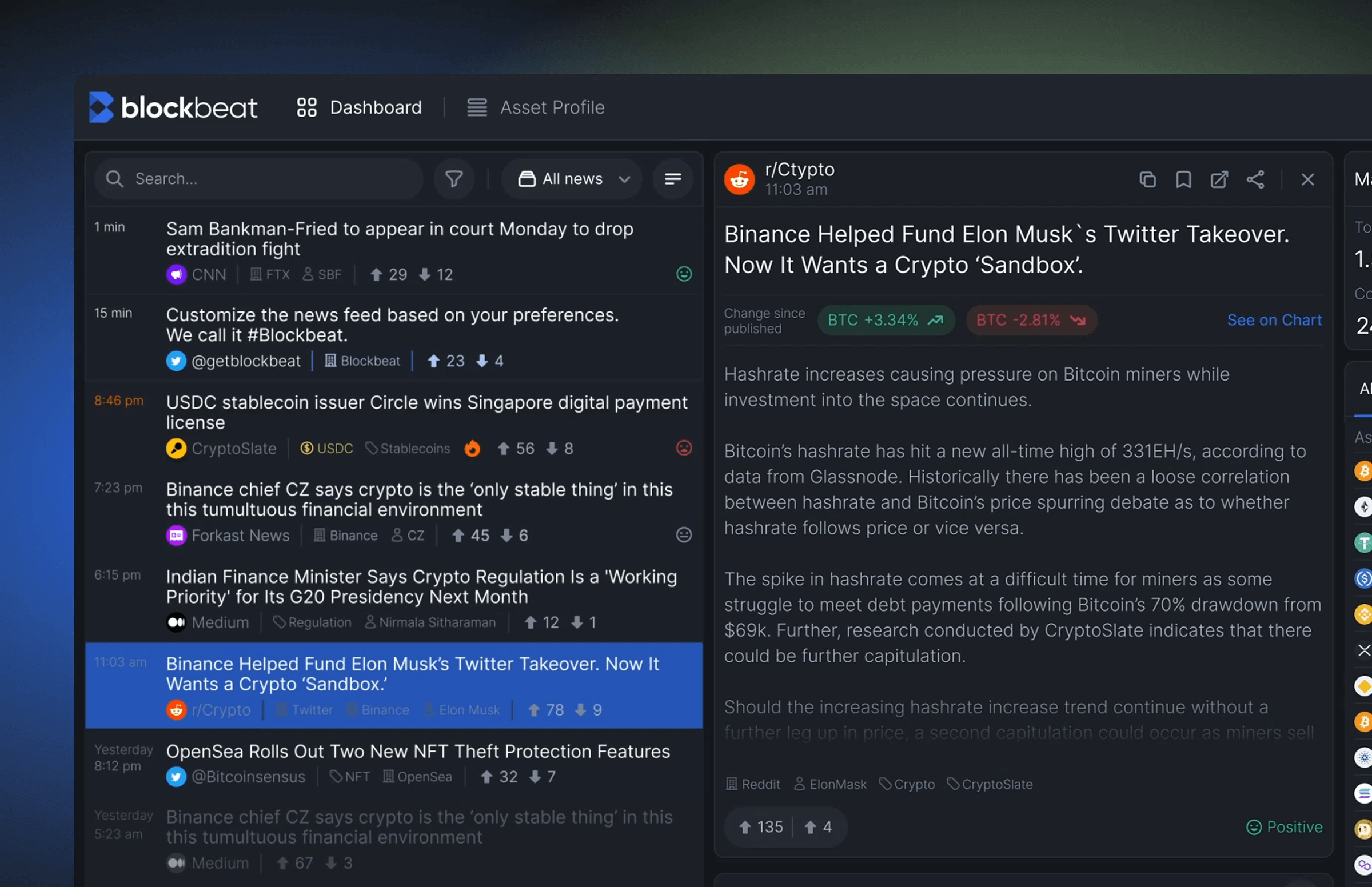
Solution #1: Prioritizing signal
We restructured the way information was presented, transforming a raw stream of news into clear, ranked signals. Instead of firehose feeds, users now saw clusters of stories tied to trends, industries, and coins they followed. Each signal had context: source trustworthiness, relevance score, and timestamp.
To support this, we designed:
- A layered UI that separated noise from signal
- Dynamic filters that adapted to user preferences
- Quick-glance cards showing sentiment and market implications
"In crypto, timing is everything, and you need to know why it matters right now."
{{Ostap Oshurko}}
Solution #2: Gamification to drive retention
Unlike the game-based mechanic in Payoneer, Blockbeat focused on rewarding behavior that sustained platform engagement. Reading articles, customizing alerts, saving insights — each interaction contributed to a user’s activity score.
We introduced:
- A crypto dashboard element tracking earned points from core activities
- Milestone badges tied to discovery actions (e.g. "First Portfolio Setup")
- Soft incentives for returning daily or interacting with trending signals
These were subtle UX nudges, a move rooted in interactive experience design, where behavior change is achieved through structure.
Solution #3: Designing for newcomers and crypto veterans alike
Blockbeat's audience ranged from casual investors to hardcore traders. Our interface had to cater to both without fragmenting the experience.
We solved this through:
- Default views were simplified; deeper metrics opened on demand
- Contextual tooltips and onboarding flows for new users
- Predictable patterns that let pros act fast, and beginners learn quickly
Solution #4: UI to support information flow
Visual rhythm was everything. We leaned into whitespace, restrained color usage, and modular layout logic to prevent overload. Signals felt curated, not dumped.
Micro-interactions guided attention without overstimulation. Tagging systems and floating filters allowed for flexible control. Everything was designed to move with the user.
🔍 For more examples of how engagement loops, trust cues, and navigational clarity improve crypto retention, explore our in-depth breakdown of crypto app design.
What experience design actually delivers as concrete outputs
Behind every smooth interface and intuitive flow is a set of structured deliverables that shape how a product thinks, behaves, and communicates. At Lazarev.agency, experience design is a system of strategic outputs that help teams reduce friction, accelerate understanding, and design for real user behavior.
Here’s what we deliver as part of an end-to-end experience design engagement:
- UX audits. A data-driven assessment of friction, cognitive load, task failures, and behavioral drop-offs across the product.
- Journey mapping. A complete visualization of user goals, actions, emotions, and context and where value breaks down or gets lost.
- Behavioral pattern analysis. Insights into how users actually behave: decision loops, hesitation points, dead ends, and ignored UI elements.
- Flow restructuring. Rebuilt task flows that shorten paths, remove unnecessary steps, and compress the time-to-value window.
- Emotional pacing strategy. A design approach that manages cognitive load, rhythm, and moments of clarity to keep users confident and moving forward.
- Scalable UI systems. Reusable components, hierarchy rules, spacing guidelines, and visual logic that ensure consistency across screens and future features.
- AI interface logic design. Patterns for agentic behaviors, recommendations, data explanations, and system transparency that help users trust and understand AI-driven actions.
- Gamification strategy. Behavior-led engagement mechanics that reward productive actions without distracting from the core value of the product.
- Multimodal interaction models. Voice, shortcuts, micro-interactions, and context-aware triggers that extend the experience beyond static screens.
Together, these deliverables form a cohesive product experience — one that feels intentional, intelligent, and aligned with how users actually think and act.
Experience design is a strategic lever
Products win when they feel effortless. When they guide rather than overwhelm. When they turn complex logic into movements users trust without thinking.
That’s the role of experience design.
It bridges intention and interaction. It transforms power into usability. It shapes the emotional rhythm that keeps users returning instead of drifting away.
The companies we worked with lacked clarity, flow, and momentum. Experience design closed that gap. It revealed where value was getting lost, reshaped how decisions were made in the interface, and created systems that scaled with the product rather than against it.
When done right, experience design doesn’t just support the product. It becomes the engine of retention, adoption, and long-term loyalty. It reduces support load, increases user confidence, and gives stakeholders something far more reliable than assumptions — measurable behavioral change.
If you’re building a product that needs to communicate its value faster, reduce friction, or help users feel in control, the right experience design can shift the trajectory.
Ready to create a digital product users don’t just try but return to?
Let’s talk about the experience you’re building.


.webp)


.avif)


