How Fitfully's redesign made live data the reason users come back
Project:
the project
Design that makes a fitness platform worth subscribing toÂ
Fitfully is a live fitness platform: point your camera, and it tracks and scores your workout as you move. Members train with professional coaches live or on demand, watch their progress build, and get sessions matched to their goals.
If you build in fitness or wellness, you know the hard part is not getting the first download. It is the second workout and the tenth. Content goes generic fast, a live class with no real-time feedback feels like free video, and a heavy sign-up loses people before a habit forms. For a subscription business, a member who drops in week one never pays back what you spent to acquire them.
Fitfully came to Lazarev.agency for a platform design built around retention. We put live data and friendly competition inside the class itself, gave members a progress record worth protecting, and shortened sign-up so people start training in minutes.Â
Here's how our design earns that next session, starting the moment a member presses play.
The Project’s
Discovery Phase
Put live effort on screen to keep members in the room
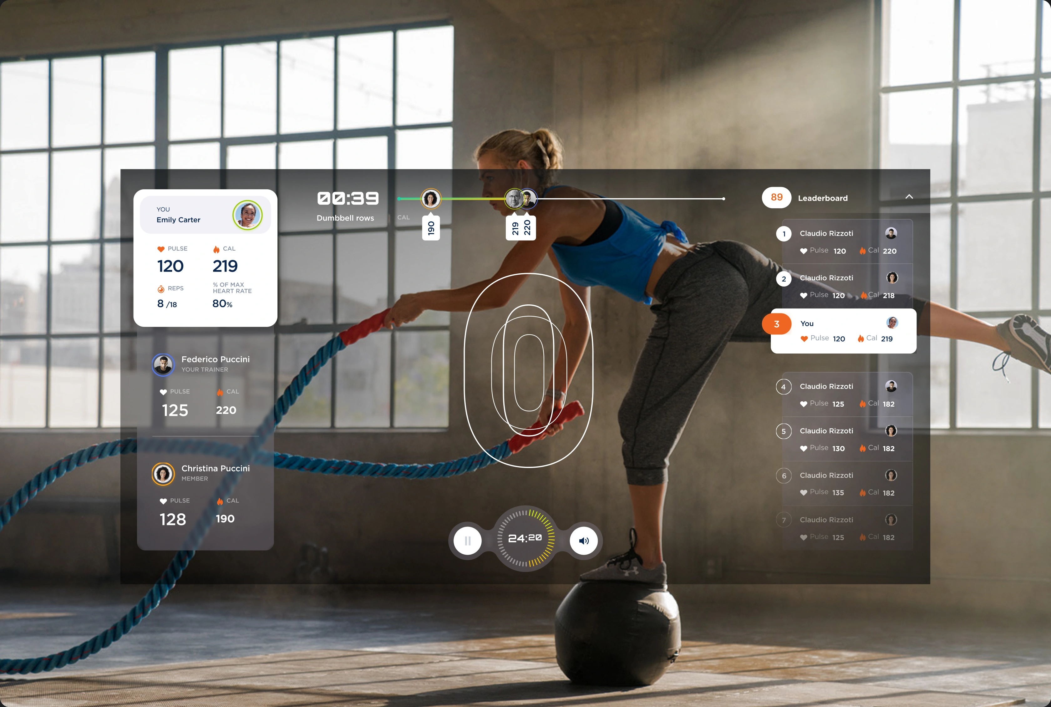
A live class with no live feedback is hard to tell apart from free video, and members who feel like spectators disengage. We designed Fitfully's class screen to keep effort visible the whole time, displaying each member's pulse, calories, reps, and percent of max heart rate.Â
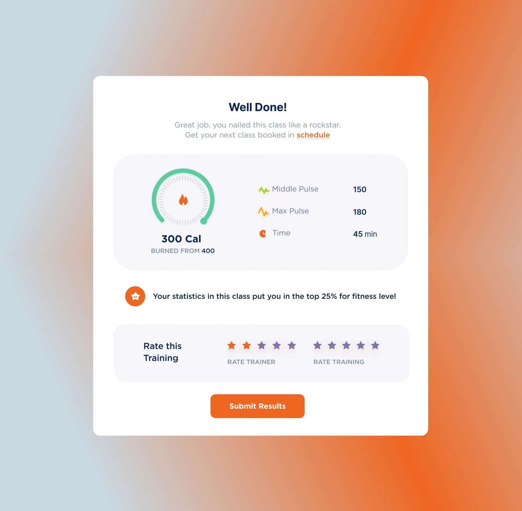
Members watch their effort register as it happens and see where they stand against others, so a workout becomes a competitive event worth showing up for. When the class ends, a summary recaps the session and points straight to booking the next one, making repeat attendance the easy next move.
Built a progress record members want to protect
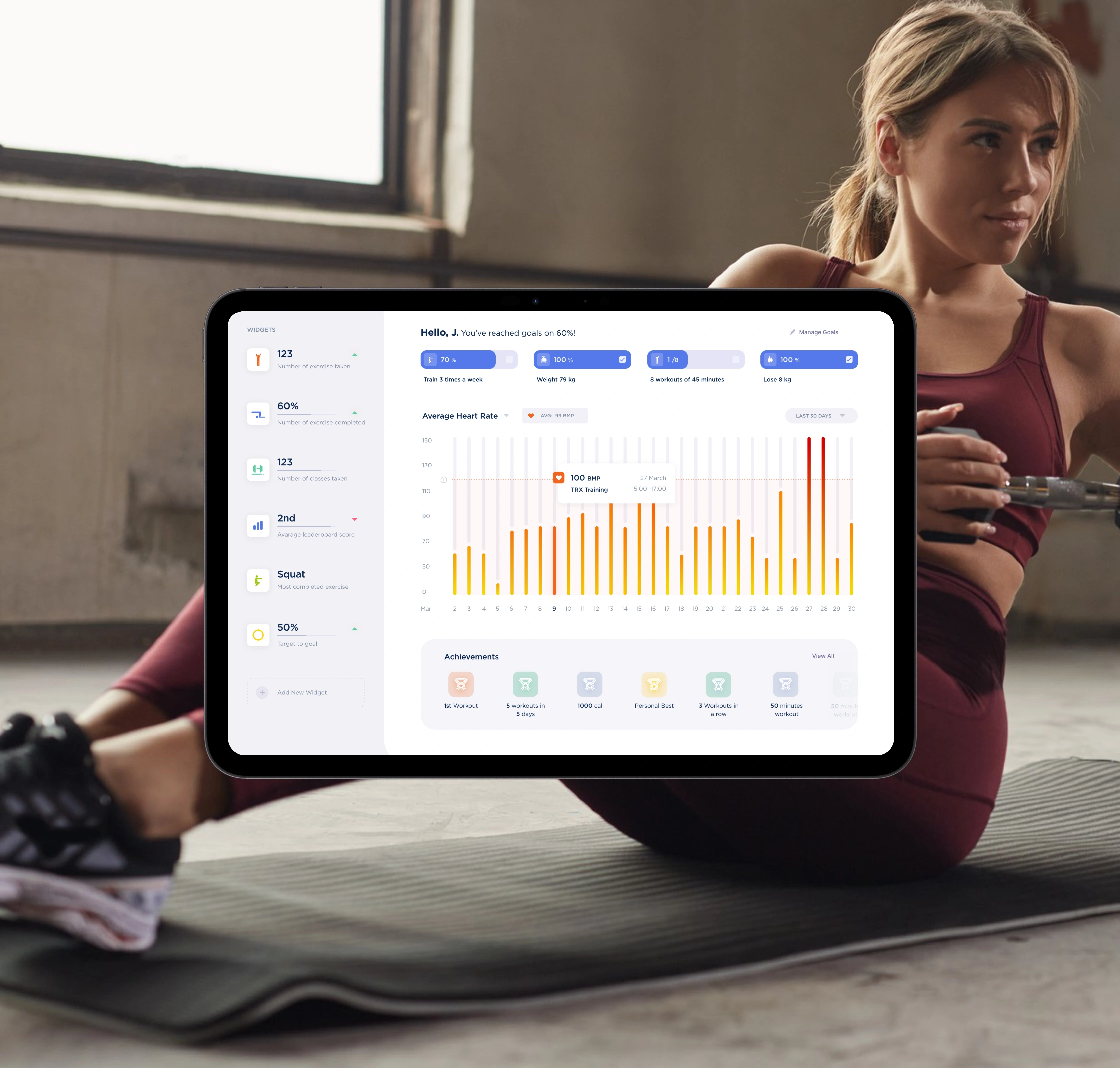
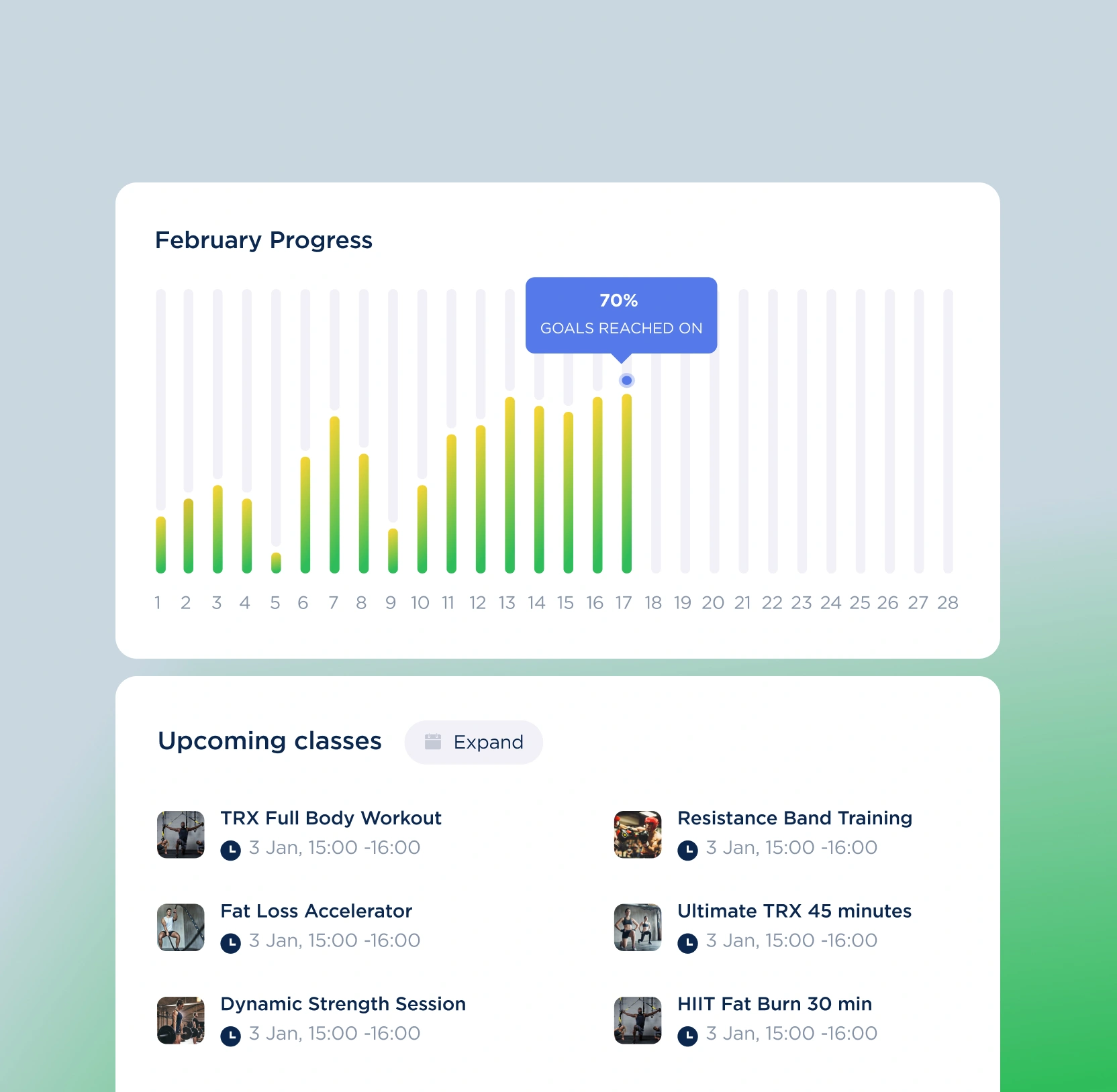
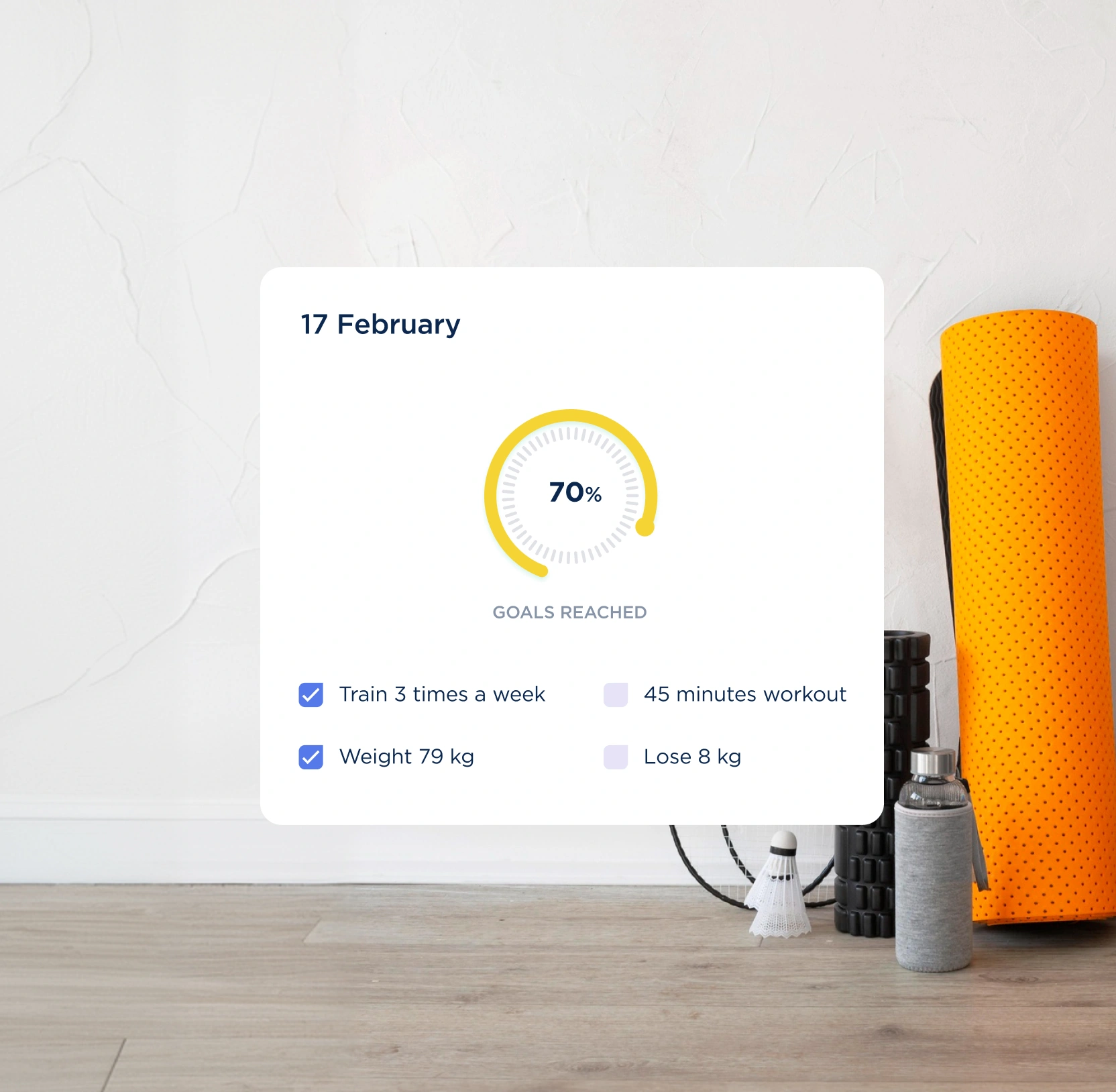
We designed Fitfully's progress space to make momentum impossible to miss: daily goals with a completion gauge, a month-long progress chart, heart-rate trends across the last 30 days, achievement badges, and a dashboard members can arrange around the numbers they care about.Â
Streaks, personal bests, and goals inching toward done give people a concrete reason to keep going, and the next class sits one tap away on the same screen.
Developed trainer profiles and an on-demand content library
When picking a class takes too long, members settle for whatever is easy to find or close the app.Â
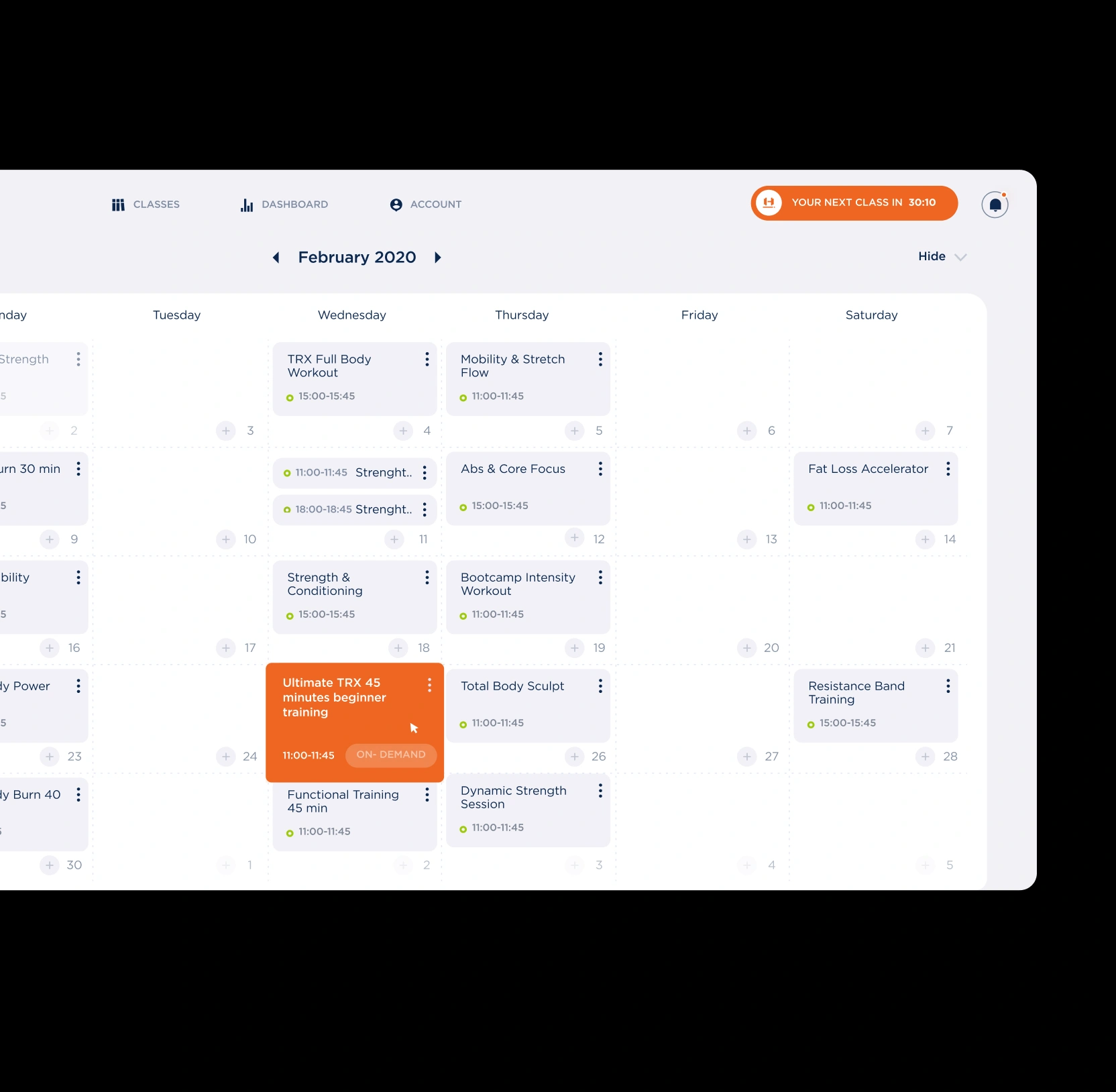
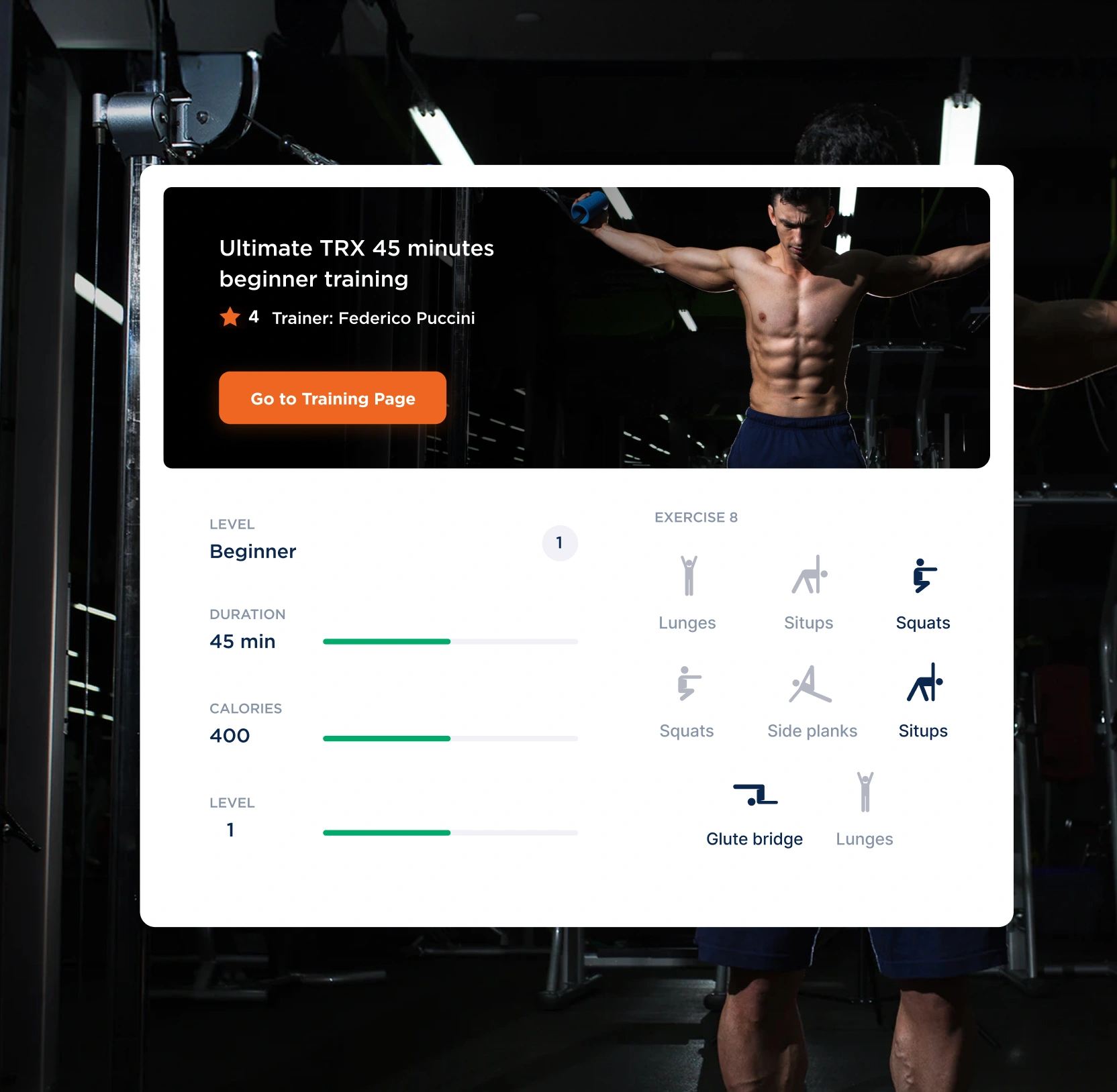
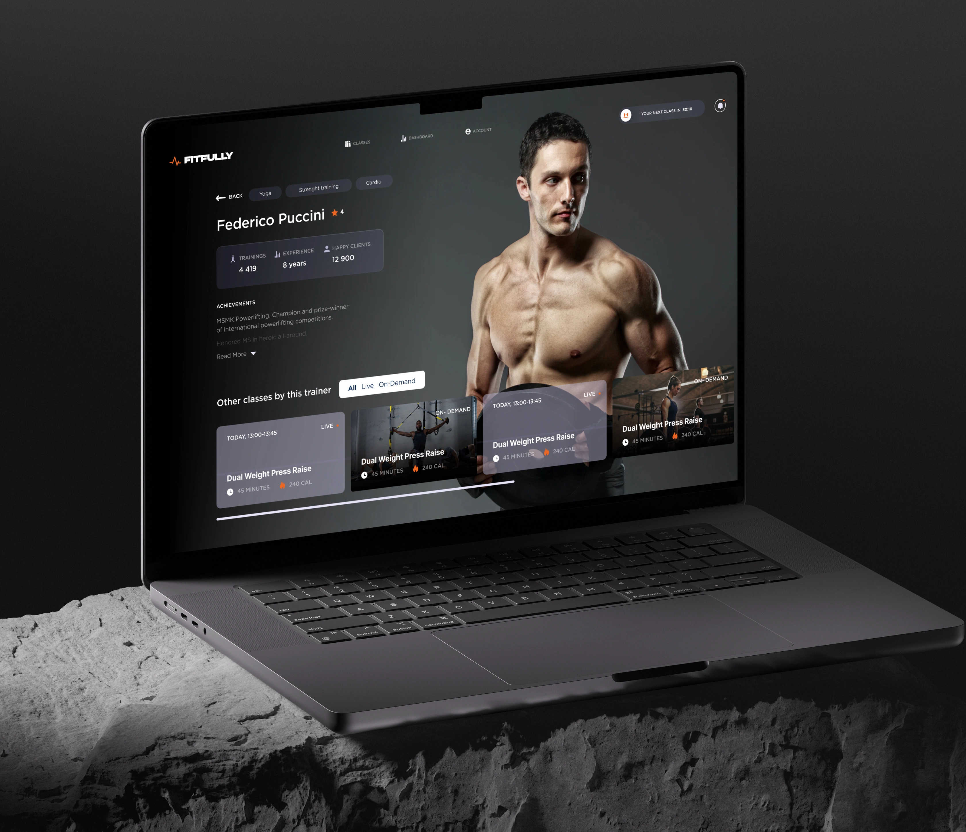
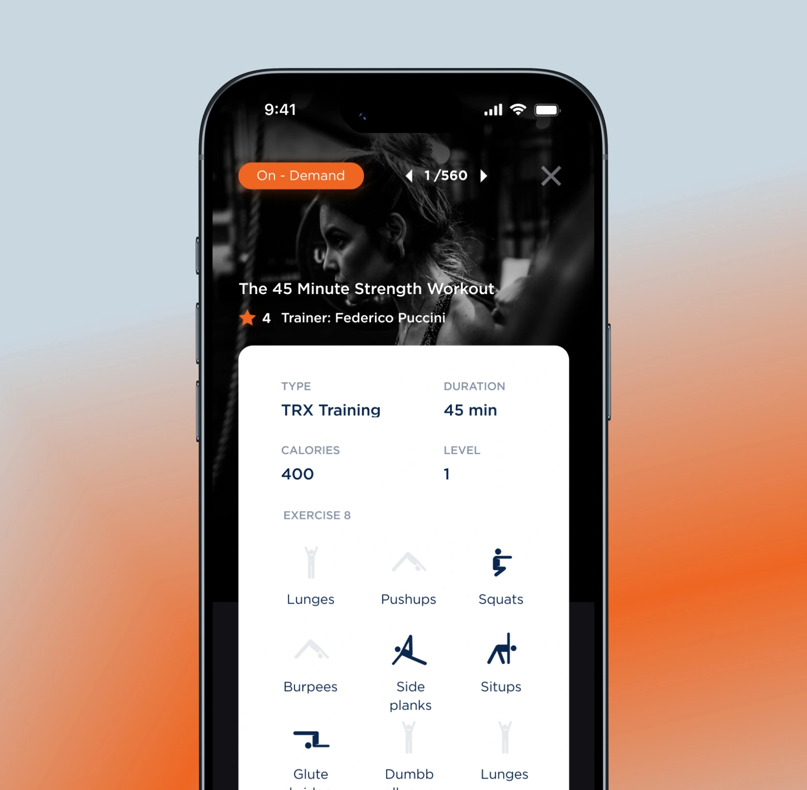
We designed Fitfully's trainer profiles and content library to make the choice fast and the trainer worth following. Profiles lead with experience, client numbers, and competition record, while each class shows its type, duration, calorie burn, level, and full exercise list before a member commits. A filter for live or on-demand, browsing by category, and a calendar to book ahead mean there is always an obvious next session.
Got new members to a booked first class fast
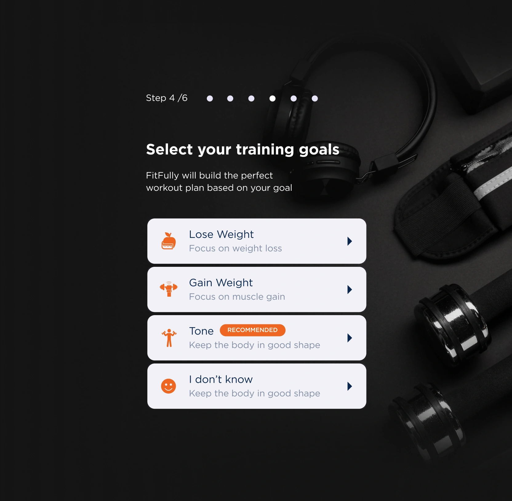
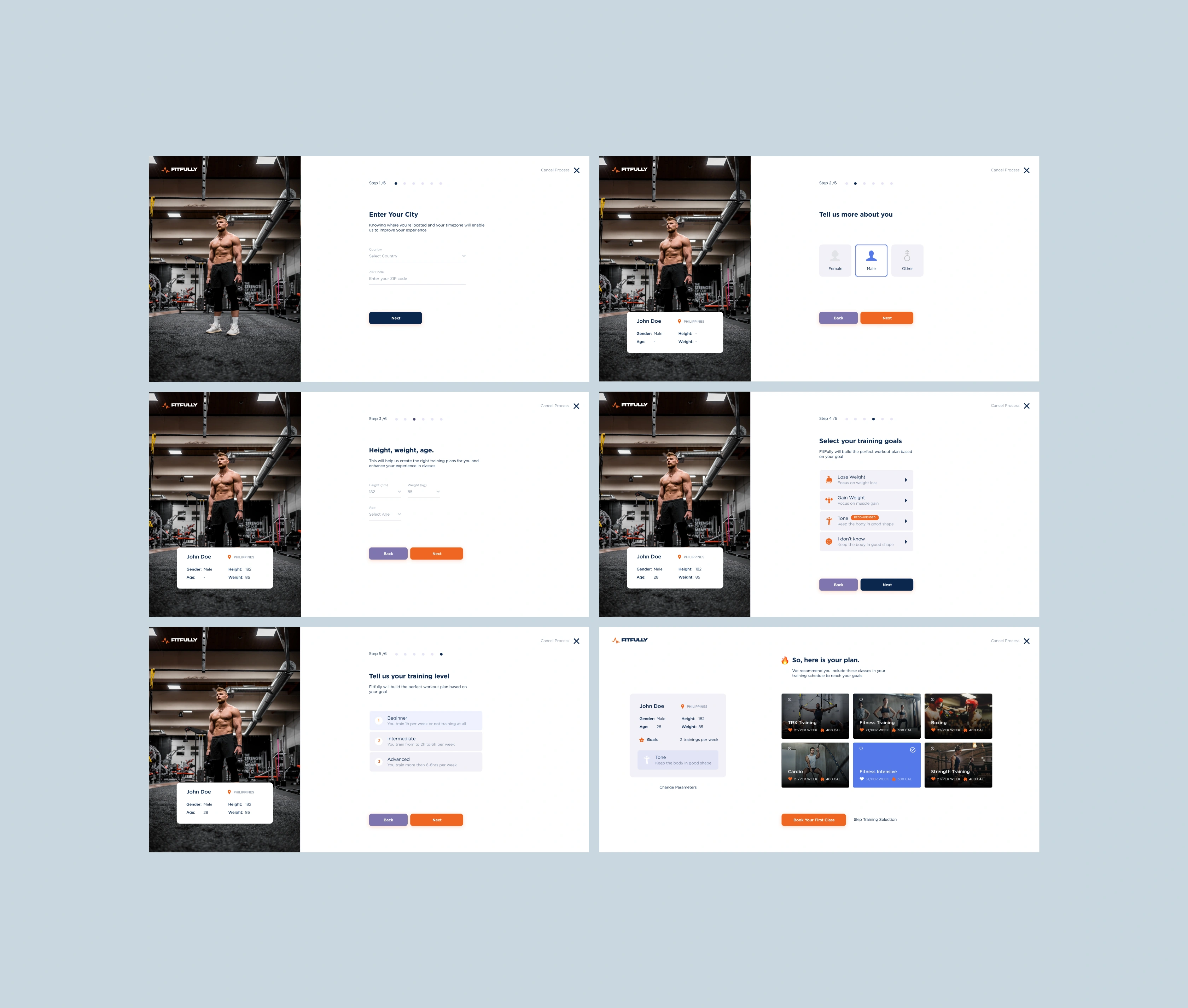
We designed Fitfully's onboarding so every answer visibly shapes the plan a member gets at the end. Six clearly numbered steps gather location and time zone, body details, a goal, and a training level, with a profile card filling in as the member goes and a short note explaining why each field is asked.Â
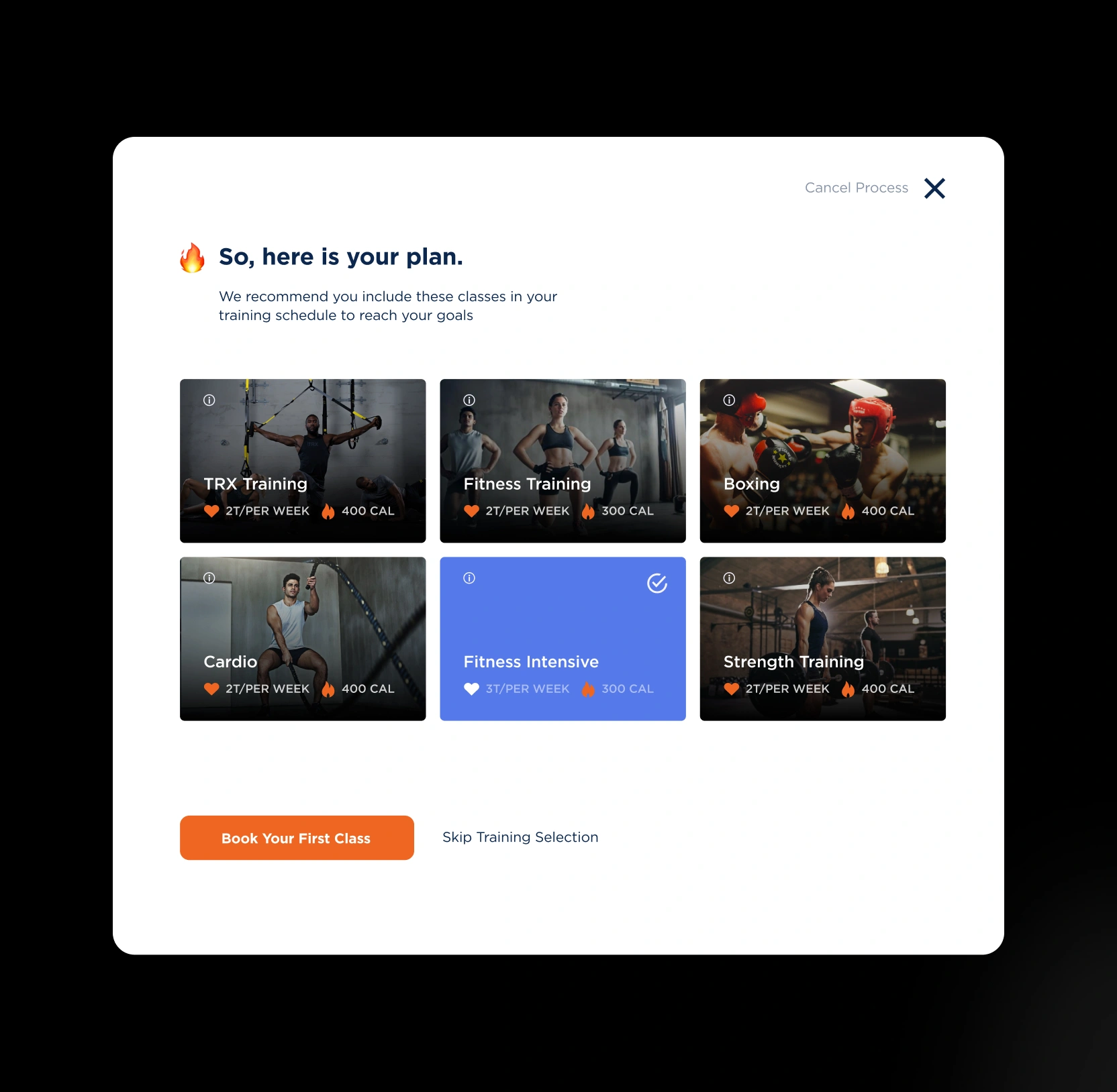
The flow ends on a personalized plan and a Book Your First Class button, so sign-up finishes inside the product. Members reach their first workout quickly and arrive with a plan built around them, the strongest start a subscription habit can have.
AI & ML
Lazarev. agency offers comprehensive digital design services. Discover our range of related expertise supported by impactful case studies.
More Scaleups Cases
FAQ
Will a redesign move retention, or only look better?
A redesign earns its keep by changing behavior. We design around the moments where members decide to stay or leave: the first class, the empty-handed week, the search for the next session. Every screen here was built to make the next workout the easy choice, because for a subscription product, repeat use is the number you live on.
Can you cover the whole platform, live, on-demand, and across devices, in one engagement?
Yes. Fitfully spans a live class interface, a progress dashboard, trainer profiles, an on-demand library, a booking calendar, and a six-step sign-up, all designed to hold together on phone, tablet, and desktop. A fitness platform gets opened in more conditions than almost any product, so we design for the screen sizes and settings your members really use.
We already have an app. Can you redesign while keeping what works?
We begin from your existing product and data. The goal is to reshape what members see and how they move through it, working within your current tech where it serves you and flagging early where a change pays for itself. You get a path that fits your roadmap.
How do you keep sign-ups short when you need real data to personalize?
We treat onboarding as an exchange: each question visibly shapes the plan a member gets at the end, so the form feels like progress toward a workout. Clear step counts show how much is left, short notes explain why a field matters, and the flow ends on a ready-to-book plan. You collect what personalization needs while fewer people drop before their first class.
How do you make competition motivating for beginners as well as veterans?
A leaderboard lifts some members and discourages others, so the design lets people measure progress against themselves as much as against the room. Personal bests, streaks, and a visible standing give a beginner a reason to return while staying within reach. Competition becomes a pull-back to the platform.
What does working with Lazarev.agency on a project like this look like?
We work in the open, sharing thinking as it develops, so you always see the reasoning behind a screen. Each part of the platform is designed against a clear business question, who you keep, what you sell, where members drop, and tied to the result it should drive. You see how a design decision connects to revenue before it ships.