

We talk to software more than we talk to people some days. The bank’s chatbot knows our balance better than we do, and that productivity assistant finishes our sentences (sometimes too confidently).
And yet most still sound like… Well, software.
A great chatbot user interface changes that. It turns data into dialogue and logic into rapport.
In this guide, our design team breaks down 33 chatbot UI examples across industries, each debunking the stereotype of cold, automated interaction. You’ll see how tone, layout, and emotional design shape human-AI rapport and what you can borrow for your next product.
Key takeaways
- The line between “UI” and “conversation” is fading. The best bots now act like adaptive dashboards.
- Tone consistency is usability. A chatbot that changes mood mid-flow breaks trust faster than a bug.
- Leading AI UX design agencies like Lazarev.agency treat anticipatory UX as the new accessibility. Chatbots that surface the next likely step (e.g., quick replies, suggested intents) reduce effort for all users.
Why you should take the conversational AI game seriously
Conversational interfaces are quietly becoming the new operating layer of business.
Just look at the numbers. They don’t describe a fad. They mark a fundamental shift in how people and products communicate.
- The conversational AI market reached $11.58 billion in 2024 and is set to exceed $41 billion by 2030.
- McKinsey backs it up with a more sobering twist: almost every company invests in AI, but only 1% believe they’ve reached maturity.
With the latter point, the bottleneck isn’t talent. It’s leadership. Employees are ready to use AI, whereas executives just aren’t steering fast enough.
Meanwhile, the potential payoff is huge: $4.4 trillion in additional productivity from AI use cases already on the table. And in the next three years, 92% of companies plan to increase their AI investments.
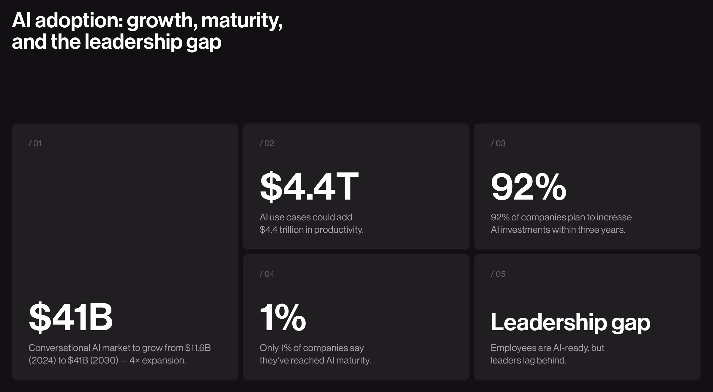
So what’s missing between potential and payoff? Often, it’s design. And specifically, chatbot UI design.
“A powerful conversational model can understand you, reason with you, even anticipate what you need next,” says Oleksandr Koshytskyi, our Design Team Lead at Lazarev.agency. “But without a smart interface, it still feels mechanical. That’s where design earns its keep.”
33 chatbot UI examples to use as industry patterns
Below, experts from Lazarev.agency, a top AI design agency, analyzed 33 chatbot UIs across six categories — productivity, support, finance, health, e-commerce, and creative tools — to decode what makes them effective.
You’ll see how they look, why they work, and how you can adapt their logic to max out on a chatbot digital transformation for your next project.
AI agents as productivity assistants
Chatbots aren’t just for customer service anymore. They’ve slipped into our daily workflows by co-writing emails and sorting our chaotic tasks into organized to-dos.
Below are six examples that reimagine what productivity feels like when AI design disappears into the background.
1. ChatGPT
📋 Use case: A general-purpose conversational AI capable of reasoning and generating content across domains.
💻 UI strengths:
- Monochrome interface where text is the hero.
- Suggested prompt bubbles (“Brainstorm startup ideas”, “Summarize a meeting”) encourage exploration without overwhelming the users.
- Invisible switch between text, image, and voice input within the same viewport.
🟢 UX insight: ChatGPT’s design is intentionally unbranded. The absence of ornamentation is its strategy. The pacing and micro-delays build anticipation, which, in turn, subtly humanizes machine dialogue.
✅ Chatbot UI take from Lazarev.agency: ChatGPT shows that anticipatory design means pre-empting what the user needs.
2. Claude Chatbot
📋 Use case: A conversational AI assistant optimized for safe, context-rich interactions such as summarization, writing, and multilingual translation.
💻 UI strengths:
- A soft color palette creates visual calm, ideal for reading extended outputs.
- Responsive layout adapts to mobile and desktop devices without breaking conversational flow.
- Prominent safety reminders (“Claude can make mistakes”) establish credibility through transparency.
🟢 UX insight: Claude borrows visual cues from note-taking apps rather than customer service bots. It’s a deliberate move to evoke trust. By signaling humility (“I might be wrong”) instead of perfection, it converts vulnerability into reliability.
✅ Chatbot UI take from Lazarev.agency: Design confidence doesn’t mean certainty. Trust grows when a system acknowledges its limits.
3. Notion AI Chatbot
📋 Use case: A built-in productivity assistant for brainstorming and organizing thoughts without leaving Notion’s workspace.
💻 UI strengths:
- Clean layout with white space that feels like a writing app.
- Smart contextual prompts (“Brainstorm ideas”, “Summarize this page”) integrated right below the user input box.
- Soft iconography (pen, lightbulb) subtly suggested the next action.
- Input field mirrors Notion’s block-based design, maintaining consistent brand identity.
🟢 UX insight: By embedding AI directly into the user’s workflow, Notion removes context switching. Its prompt-first approach lowers the mental barrier of “getting started,” which is usually the hardest part.
✅ Chatbot UI take from Lazarev.agency: Put AI inside the creative moment.
4. Meta AI Chatbot
📋 Use case: A cross-platform assistant integrated into Instagram, WhatsApp, and Messenger for everyday help and entertainment.
💻 UI strengths:
- Consistent visual structure across all Meta apps.
- Conversational prompts (“Imagine an aquarium”, “Plan a dinner”) spark curiosity and invite exploration in casual language.
- Media-rich integration allows users to search, generate images, or fetch posts inline without leaving the chat.
🟢 UX insight: Meta’s biggest design feat is ubiquity without confusion. The assistant feels like a natural extension of the app you’re already using.
✅ Chatbot UI take from Lazarev.agency: When designing omnichannel AI, prioritize cognitive consistency. Users shouldn’t have to relearn your interface to re-engage with your tool.
5. Otter.ai Chatbot
📋 Use case: AI-powered meeting assistant for real-time transcription, summarization, and action-item extraction.
💻 UI strengths:
- Clear navigation tabs (“Summary”, “Transcript”, “Comments”) break heavy meeting data into digestible chunks.
- Collaborative context bubbles show what’s assigned, discussed, and summarized, which is perfect for aligning team members.
- Follow-up shortcuts like “What are the next steps?” make the flow action-oriented.
🟢 UX insight: Otter.ai’s design succeeds by treating AI as a colleague. Every design choice reinforces shared understanding instead of solo note-taking.
✅ Chatbot UI take from Lazarev.agency: In B2B, structure equals empathy. When you organize information well, you’re giving users their time back.
6. Accern.Rhea (by Lazarev.agency)
📋 Use case: AI-driven research assistant for financial analysts and VCs that merges natural language input with data dashboards.
💻 UI strengths:
- Dual-mode interface: freeform prompt field + structured “Report Creator” GUI.
- Built-in dataset management and integrated visualization inside the chat viewport.
- Real-time AI suggestions (“Summarize seed rounds”, “Generate PDF report”) accelerate repetitive workflows.
🟢 UX insight: Accern.Rhea replaces the question-answer model with dialogue-as-data manipulation. Instead of answering queries, the UI lets users steer the dataset. It’s almost like the chat itself becomes a command line.
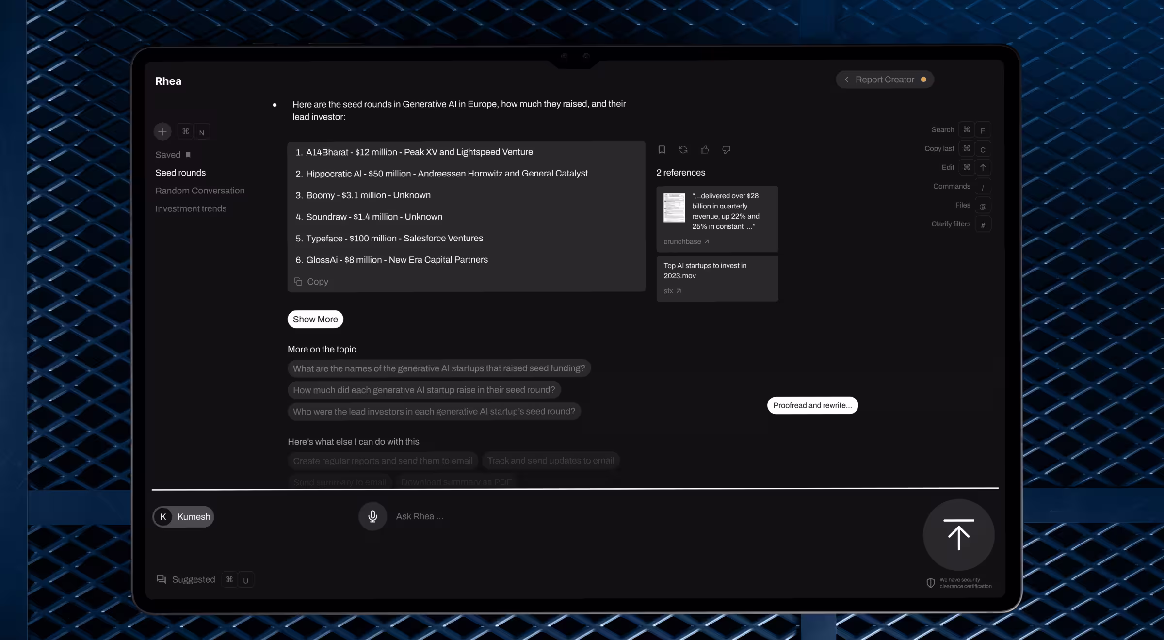
✅ Chatbot UI take from Lazarev.agency: For expert tools, conversational AI UI should act as an intelligent control panel.
Customer support chatbots
Support chatbots often live where emotions run high. Think payment errors, broken links, and delayed orders. The design challenge here is to stay calm and human.
The best examples nail that balance. Through predictable flows, emotional design, and just enough personality, they prove that “support” doesn’t have to feel robotic.
7. HubSpot (HubBot)
📋 Use case: Customer support and CRM onboarding assistant helping new users set up and navigate HubSpot’s platform.
💻 UI strengths:
- Clean side-panel layout aligns with HubSpot’s dashboard.
- Message pacing mimics human rhythm. Sentences are short, polite, and jargon-free.
- Transition to live chat is smooth, with no context breaks.
🟢 UX insight: HubBot anticipates confusion before it escalates and provides multiple exit points without dead-ends.
✅ Chatbot UI take from Lazarev.agency: Good support chatbots manage user emotions. Remember to design for reassurance.
8. Tidio
📋 Use case: All-in-one live chat platform for small businesses offering real-time customer service across web and social channels.
💻 UI strengths:
- Unified interface blends social DMs, email, and website chat into one thread.
- Customizable color palette lets brands match the bot to their identity.
- Smart greetings detect repeat visitors and adjust tone dynamically.
🟢 UX insight: Tidio demonstrates that small teams need emotional continuity.
✅ Chatbot UI take from Lazarev.agency: Even automation can feel personal if timing and visuals align with user expectations.
9. Drift
📋 Use case: B2B conversational marketing bot designed to qualify leads and schedule demos.
💻 UI strengths:
- Dynamic branching creates personalized journeys based on visitor intent.
- Progress indicators show how close you are to booking time with sales.
- Integrates scheduling tools directly inside the chat window.
🟢 UX insight: Drift translates sales into a story. Its humor and pacing reframe conversion as conversation.
✅ Chatbot UI take from Lazarev.agency: When the stakes feel commercial, let personality carry persuasion.
10. HelpCrunch
📋 Use case: Unified customer support bot integrating chat, email, and knowledge base interactions.
💻 UI strengths:
- Instant suggestions based on keywords (“You might mean this article...”).
- Fallback mode clearly differentiates human from bot messages.
- Inline rating (“Did this solve your issue?”) encourages swift feedback.
🟢 UX insight: HelpCrunch excels in closure. Users always know what just happened and what’s next. This reduces uncertainty, a key UX pain point in support contexts.
✅ Chatbot UI take from Lazarev.agency: Transparency outperforms perfection. Design for users to feel guided.
11. Landbot
📋 Use case: Visual chatbot builder that turns forms into interactive conversations.
💻 UI strengths:
- Bubble-based branching diagrams appear in-line as part of the chat.
- Color-coded steps help users track position in multi-stage flows.
- Onboarding includes a “Build your first bot” tutorial inside the chatbot itself.
🟢 UX insight: Landbot treats visibility as trust currency. By showing its logic tree, it turns transparency into comfort.
✅ Chatbot UI take from Lazarev.agency: Expose the machinery to demystify automation and build credibility.
12. Wix Chatbot
📋 Use case: AI assistant for helping business owners set up websites and manage bookings.
💻 UI strengths:
- Step-based checklist (“4/5 tasks done”) displayed mid-conversation.
- Structured replies for navigation (“Update hours”, “Add services”).
- Integrated tooltips explaining unfamiliar features inline.
🟢 UX insight: Wix transforms complex setup into small victories. Its progress-based UX fosters motivation through visible completion cues.
✅ Chatbot UI take from Lazarev.agency: Progress equals emotional reward. Visualize it early and often.
13. PayPal Customer Support Chat
📋 Use case: Resolving common account and transaction issues through guided conversation.
💻 UI strengths:
- Uses decision-tree flow with “Yes/No” confirmations for clarity.
- Notifications about agent availability prevent false expectations.
- Fallback links to the help center and community forums appear contextually.
🟢 UX insight: PayPal’s UX success is empathy through predictability. It doesn’t try to sound human. It sounds competent, and that’s enough.
✅ Chatbot UI take from Lazarev.agency: Professional tone is emotional design too. Sometimes, reassurance is the only personality a user needs.
Financial and banking chatbots
Money is emotional. It’s tied to security and trust, which makes financial chatbot design one of the most sensitive UX challenges.
These chatbots succeed because their interfaces balance precision with warmth, numbers with narrative, and always let users feel in control.
14. Nutmeg Bot
📋 Use case: Investment management assistant that helps customers review portfolios, understand products, and navigate support without human agents.
💻 UI strengths:
- Menu cards (“My Account”, “Transfers”, “FAQs”) guide users throughout.
- Light color palette and occasional emojis reduce the stiffness typical of finance apps.
- The quick “Was this helpful?” prompt closes the loop in chat and eliminates the usual support black hole.
🟢 UX insight: Nutmeg understands that confidence in money tools comes from perceived competence.
✅ Chatbot UI take from Lazarev.agency: In finance UX, tone is a feature. Ensure you sound like a steady advisor, and users will lean in instead of brace themselves.
15. Cleo Chatbot
📋 Use case: Personal finance coach with a sassy personality that helps users budget and reflect on their spending habits.
💻 UI strengths:
- Conversational quizzes and challenges that turn spending reviews into playful rituals.
- Personalized summaries shown as swipeable cards for quick scanning.
- Subtle haptic feedback (mobile) and animation cues to emphasize achievements or warnings.
🟢 UX insight: Cleo transforms guilt into motivation. By anthropomorphizing finance through humor, it lowers emotional resistance.
✅ Chatbot UI take from Lazarev.agency: If your product delivers hard truths, wrap them in wit. Emotionally intelligent copy drives retention more than analytics ever will.
16. GoHenry Chatbot
📋 Use case: Educational finance bot for children and parents teaching budgeting and saving habits.
💻 UI strengths:
- Bright color scheme, friendly robot avatar, and oversized buttons ideal for small-screen use.
- Mission-based tasks (“Earn badges by completing money missions”) gamify learning.
- Quick-reply bubbles use conversational simplicity suited for younger users.
🟢 UX insight: GoHenry’s interface blends educational UX with entertainment psychology. Smart reward loops, clarity, and narrative context create emotional learning.
✅ Chatbot UI take from Lazarev.agency: When teaching through design, replace explanation with interaction. Engagement is education.
17. Bank of America’s Erica
📋 Use case: AI-powered banking assistant that helps users pay bills and get financial insights.
💻 UI strengths:
- Text bubbles mimic messaging apps.
- Contextual visual aids (mini charts, transaction cards) keep data scannable.
- Soft entry animations and subtle shadows add a tactile sense to the experience, making it more dynamic.
🟢 UX insight: Erica’s neutrality is its key strength. The UX never surprises, which is the most reassuring trait for a finance tool to have.
✅ Chatbot UI take from Lazarev.agency: Professional doesn’t mean boring. Design for calm predictability is the UX equivalent of a steady heartbeat.
Health, education, and emotional intelligence chatbots
When the product’s goal is care or learning, UX design is equivalent to empathy in action.
These bots demonstrate that emotional intelligence can be engineered. They simplify health decisions, encourage reflection, and keep users company in moments that feel private or vulnerable.
18. Flo Chatbot
📋 Use case: Women’s health assistant that tracks cycles, predicts fertility windows, and offers tailored health advice.
💻 UI strengths:
- Rounded cards and a muted pink palette evoke a sense of softness and safety.
- Prompts like “I see you’ve logged cramps — want to explore possible causes?” create personalized entry points.
- Short paragraphs and calm pacing lower cognitive load.
🟢 UX insight: Flo translates healthcare UX into everyday language. It prioritizes emotional relief and guides users gently from information to action.
✅ Chatbot UI take from Lazarev.agency: Empathy is a rhythm. Control pacing as carefully as you choose colors.
19. Youper AI Chatbot
📋 Use case: AI-driven mental-health companion using CBT principles to guide users through reflective dialogue.
💻 UI strengths:
- Voice input and journaling-style text layout mimic therapy sessions.
- Prompts like “Would you like to unpack that?” provide depth without pressure.
- The progress dashboard visualizes emotional patterns over time.
🟢 UX insight: Youper’s UI doesn’t treat feelings as data. Its design rewards honesty by making it visually safe to share.
✅ Chatbot UI take from Lazarev.agency: Emotional design means designing for vulnerability. Your interface should listen before it speaks.
20. Bloom Chatbot
📋 Use case: Educational chatbot that helps learners grasp new finance-related topics through short, interactive lessons.
💻 UI strengths:
- Animated mascot acts as a consistent emotional anchor.
- Gradient backgrounds create an energetic rhythm and a sense of anticipation.
- Built-in visual progress bar shows mastery growth.
🟢 UX insight: Bloom blends fun and focus. The interactivity satisfies users’ need for agency in learning.
✅ Chatbot UI take from Lazarev.agency: Transform content delivery into an ongoing process of co-creation. Let users build their understanding instead of receiving it passively.
21. Replika Chatbot
📋 Use case: AI companion that builds long-term, emotionally adaptive relationships with users.
💻 UI strengths:
- Personalized memory recall gives a sense of continuity (“You mentioned feeling better last week.”).
- Adaptive tone that mirrors the mood detected from language cues.
- Soft gradients, centered text, and light breathing animations mimic human attention.
🟢 UX insight: Replika’s design transforms consistency into attachment. The sensation of “being remembered” is what sustains trust.
✅ Chatbot UI take from Lazarev.agency: Long-term engagement in emotion-driven products depends on memory design. Continuity feels like care.
E-commerce and retail chatbots
In retail, design speed equals revenue. The best e-commerce chatbots convert hesitation into purchase decisions.
These bots are decisively helpful. They cut the path between intent and checkout to as few clicks as possible while preserving brand personality.
22. Domino’s e-commerce chatbot
📋 Use case: Voice- and text-enabled ordering assistant for repeat customers.
💻 UI strengths:
- Simple conversational prompts like “Reorder my last pizza” appear instantly.
- Real-time progress tracker.
- Color contrast mirrors the brand palette for improved recognition.
🟢 UX insight: Domino’s turns convenience into theater — users watch their meal’s journey unfold. Micro-feedback loops feed both anticipation and satisfaction simultaneously.
✅ Chatbot UI take from Lazarev.agency: Show progress. Transparency makes waiting feel like part of the experience.
23. Home Depot Retail Chatbot
📋 Use case: AI shopping assistant helping users find products and DIY guides.
💻 UI strengths:
- Rich media cards with images, specs, and prices in a single view.
- Inline recommendations (“You might also need screws for this bracket”).
- Neutral beige/gray tones keep focus on content imagery.
🟢 UX insight: Home Depot’s chatbot nails what we call contextual commerce. It teaches while it sells. By merging guidance and purchase, it reduces drop-off.
✅ Chatbot UI take from Lazarev.agency: Design conversation as consultancy. The more relevant the advice, the faster the checkout.
24. Klarna Chatbot
📋 Use case: AI shopping concierge that recommends, compares, and tracks products.
💻 UI strengths:
- Carousel-style cards with photos, ratings, and “Shop Now” CTAs.
- Subtle satisfaction feedback (“Was this helpful?”) loops personalization data.
- Consistent contrast ratio for accessibility in dark mode.
🟢 UX insight: Klarna turns choice paralysis into guided discovery.
✅ Chatbot UI take from Lazarev.agency: Information hierarchy is persuasion. The clearer the layout, the easier the sale.
25. GOAT Assist Chatbot
📋 Use case: Customer support bot for sneaker orders, returns, and authenticity checks.
💻 UI strengths:
- Sleek dark themes with high contrast aligns with streetwear culture.
- Pre-filled contextual responses for quick selections (“Wrong size”, “Damaged item”).
- Inline FAQ links prevent context-switching.
🟢 UX insight: The control-through-constraint principle seems to lie at the core of GOAT’s UX philosophy. Fewer typing opportunities reduce effort and errors while maintaining user agency.
✅ Chatbot UI take from Lazarev.agency: Simplicity is speed. In commerce, less input means more output.
Real estate, SaaS, and enterprise chatbots
Enterprise-grade chatbots live in complex systems. They serve professionals who value accuracy over amusement and expect interfaces to assist in managing elaborate workflows.
These examples show how conversational AI can make decision-making in data-dense environments look and feel smooth.
26. Redfin
📋 Use case: Real estate discovery assistant helping users search for homes, refine criteria, and schedule viewings.
💻 UI strengths:
- Predictive search suggestions appear mid-typing to reduce effort.
- Visual listing cards with price, neighborhood, and thumbnail photos make comparisons easy.
- Sticky filter chips (“3-bed”, “pet-friendly”) stay visible during chat scroll.
🟢 UX insight: Redfin understands that in real estate, every second spent on irrelevant listings costs engagement. Its conversational filtering feels natural and lets users think in goals rather than parameters.
✅ Chatbot UI take from Lazarev.agency: Design conversations in plain language.
27. VT.news AI Chatbot (by Lazarev.agency)
📋 Use case: Conversational journalism assistant that helps readers analyze media bias and summarize multi-source stories.
💻 UI strengths:
- Three-column bias visualization (Left / Center / Right) contextualizes responses.
- AI-generated summaries condense 130,000+ news sources into bite-sized clarity.
- Topic-specific prompts (“Show me both sides”) invite deeper exploration.
- Dark mode palette reduces eye strain during long reading sessions.
🟢 UX insight: VT.news challenges readers’ perception of the displayed information. The chatbot uses visualization to expose bias.
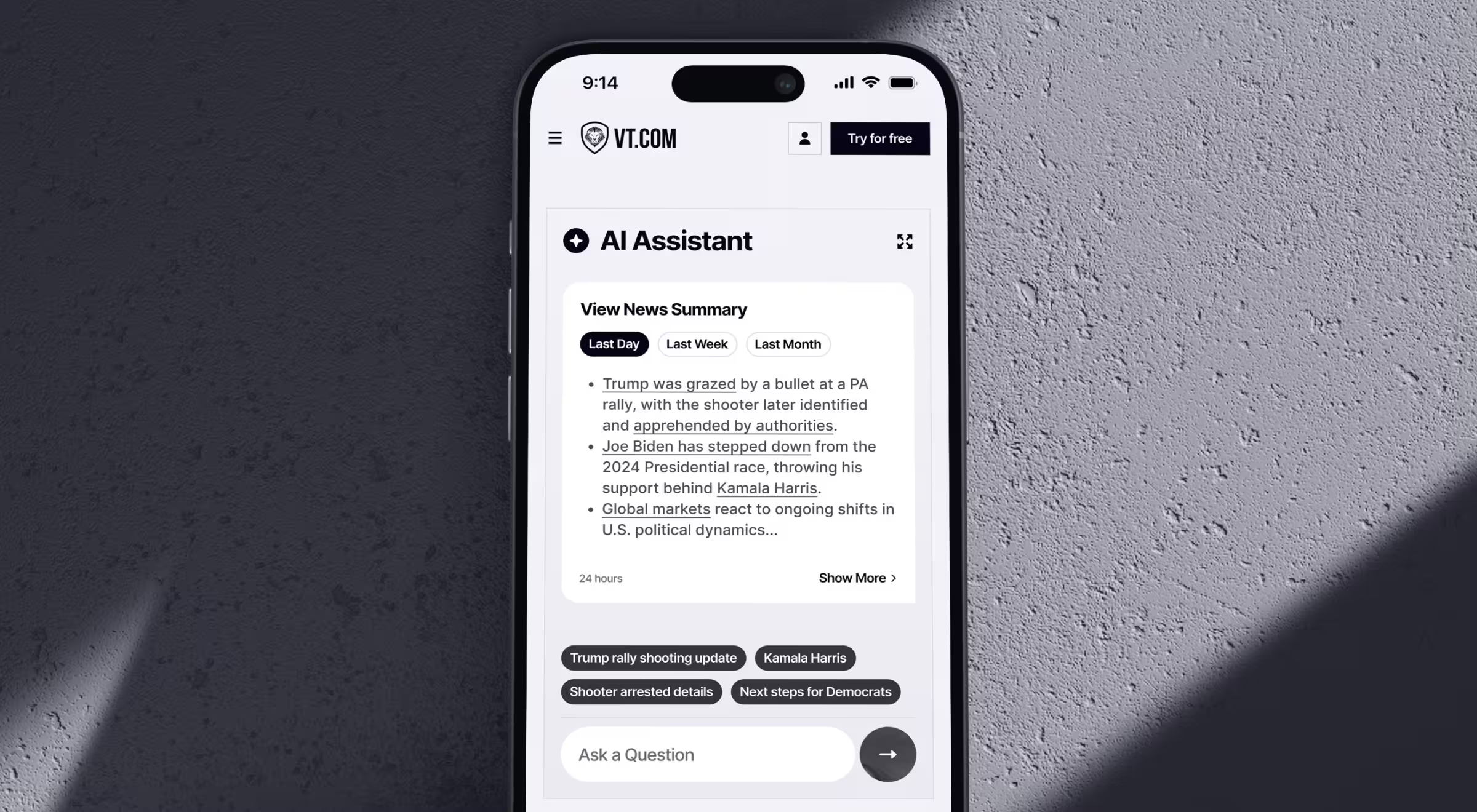
✅ Chatbot UI take from Lazarev.agency: When designing for truth-seeking, neutrality is a design element. Show your sources as clearly as your answers.
28. Pika AI Chatbot (by Lazarev.agency)
📋 Use case: AI-powered search engine redefining discovery through conversational interaction.
💻 UI strengths:
- Chat panel anchored under the search bar for constant context.
- Vivid accent colors direct attention without overwhelming.
- Responsive mobile design ensures a consistent experience across devices.
🟢 UX insight: Pika makes search feel like dialogue. By placing the chatbot within the familiar search layout, it upgrades an everyday habit instead of reinventing it.
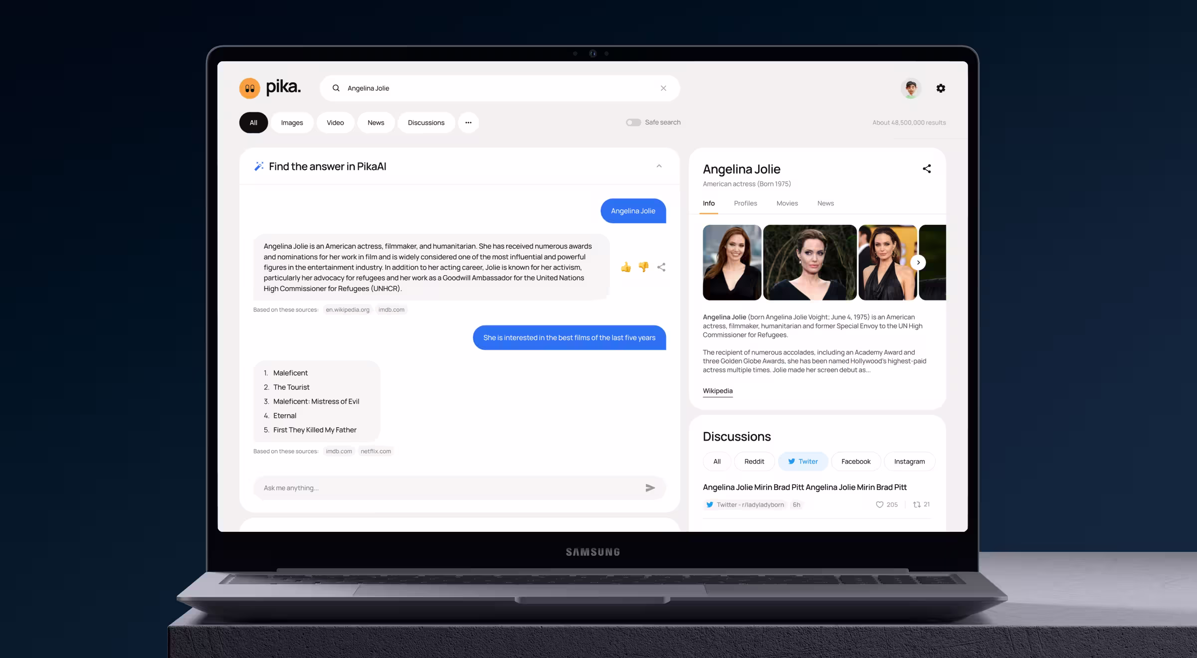
✅ Chatbot UI take from Lazarev.agency: Don’t disrupt user expectations, evolve them. Meet users where they already think.
29. Slackbot
📋 Use case: Productivity assistant embedded within Slack that automates reminders, notifications, and quick help.
💻 UI strengths:
- Command shortcuts (/remind, /topic) make execution lightning-fast.
- Contextual tooltips reduce the need for onboarding.
- Integrates seamlessly with threads, files, and voice messages.
🟢 UX insight: Slackbot’s brilliance lies in invisibility.
✅ Chatbot UI take from Lazarev.agency: The highest form of usability is forgettability. Design tools that vanish into habit.
Creative and experimental chatbots
These chatbots prove that conversational design doesn’t have to look like a chat window.
They push boundaries by mixing animation, multimodality, and playfulness to show that emotion and expression can be core usability features.
30. Dot AI
📋 Use case: Creative conversational companion that helps users ideate, reflect, and explore new topics.
💻 UI strengths:
- Image recognition enriches conversations with context-based responses.
- Open-ended prompts (“What’s inspiring you today?”) invite exploration.
- Soothing voice and typing cadence mimic thoughtful dialogue.
🟢 UX insight: Dot doesn’t try to answer questions fast. Instead, it strives to understand why you’re asking them. The design is intentionally calm, which helps users slow down and think.
✅ Chatbot UI take from Lazarev.agency: Not every interaction needs closure. Design for wonder: it’s what keeps users coming back.
31. MyInterview Chatbot
📋 Use case: Conversational hiring assistant simplifying candidate pre-screening for enterprises.
💻 UI strengths:
- Language selection upfront to reduce cognitive barriers.
- Personalized follow-ups (“Would you like to share a short video answer?”) humanize automation.
- Balanced formality, professional yet approachable tone.
🟢 UX insight: By handling procedural steps like a conversation, MyInterview reframes hiring from interrogation to dialogue.
✅ Chatbot UI take from Lazarev.agency: Empathy in enterprise UX is precision in tone.
32. Character.AI
📋 Use case: A creative sandbox where users build and chat with fictional or historical personas.
💻 UI strengths:
- Minimalist layout spotlights character avatars and tone variation.
- Distinct personality labels (“Sarcastic”, “Friendly”) signal conversation style.
- Public discovery feed transforms personal experiments into community play.
🟢 UX insight: Character.AI’s power lies in letting users become creators. This participatory UX keeps engagement sky-high through co-authorship.
✅ Chatbot UI take from Lazarev.agency: Give users authorship. Designing tools that let them co-create sustains attention far longer than passive interaction.
33. Pi (Inflection AI)
📋 Use case: Empathetic, conversational AI designed for supportive dialogue, reflection, and personal coaching.
💻 UI strengths:
- Rounded chat bubbles and warm orange gradients evoke intimacy.
- Typing animations mirror human hesitation.
- Lightweight microcopy: short sentences, clear emotions.
🟢 UX insight: Pi’s mastery is in tone precision. It uses brevity as empathy, giving users the sense of being heard without verbal overload.
✅ Chatbot UI take from Lazarev.agency: Empathy doesn’t scale through verbosity. It thrives through rhythm, tone, and restraint.
Key principles of good chatbot UI design
Every successful chatbot UI obeys a few invisible laws. Call them human heuristics for machine conversation.
They’re the unspoken principles guiding how AI should behave when it steps into a human’s cognitive space.
Design the next chatbot people want to talk to
If you’ve made it this far, you’ve probably noticed a pattern. The best chatbot UIs don’t try to sound human.
They predict instead of wait and guide instead of interrupt. And when they get tone and context right, the conversation just flows.
That’s the real craft of AI UX, which means building interactions that feel intelligent because they respect the user’s attention.
At Lazarev.agency, an AI-driven design agency, we treat chatbot design as strategy.
So whether you’re designing a fintech assistant, a healthcare companion, or the next big creative tool, start with how it should talk. And we’ll help it say the right things.
Explore our AI UX portfolio and get in touch to design the next chatbot people want to talk to.


.webp)


.avif)


