

Most enterprise software struggles with user adoption despite significant investment. The difference between successful enterprise applications and expensive failures often comes down to thoughtful user experience design.
When your enterprise application serves users effectively, it becomes a competitive advantage. When it frustrates users, it becomes a costly liability that impacts productivity, increases training costs, and reduces return on investment.
Consumer apps can sometimes survive on good looks alone. Enterprise software must prove its worth with every click.
Key Takeaways
- Poor enterprise UI design costs organizations millions annually through lost productivity and abandoned software investments.
- Successful enterprise product design balances complexity with usability through thoughtful information architecture and design systems.
- Ongoing user research isn't a luxury; it's the difference between software people use and software people avoid.
- Enterprise UX design ensures seamless experiences across enterprise applications while reducing support burden.
Why Most Enterprise Software Design Fails And How to Fix It
Enterprise software has a well-earned reputation for being clunky, confusing, and frustrating. But here's the truth: bad enterprise UX isn't inevitable. It's just been normalized.
Most enterprise design fails for predictable reasons. Users get trapped in labyrinths of tabs and dropdowns. Workflows that should take seconds consume minutes. Valuable features stay hidden beneath cryptic labels that only make sense to the developers who created them.
When designing for enterprise users, the stakes are higher than consumer software. Enterprise users have no choice but to use these software tools for their daily work, making good enterprise UX essential for productivity.
"The most expensive enterprise software is the one your teams refuse to use. The second most expensive is the one they use incorrectly because the design makes proper usage unclear."
{{Kirill Lazarev}}
The Real Cost of Poor Enterprise Application Design
When enterprise UX fails, the consequences go beyond mere inconvenience.Think about it this way:
- Financial drain: Organizations invest heavily in software tools that employees actively avoid using. You're essentially paying for digital shelf-ware.
- Productivity loss: Workers waste time figuring out user interfaces rather than doing their actual jobs. Every confusing click is money down the drain.
- Training headaches: Complex legacy systems require extensive training that needs constant refreshing. Your teams spend more time learning the tool than using it effectively.
- Security risks: Confusing workflows lead to dangerous workarounds that bypass security measures. When software tools are hard to use correctly, people find ways to use them incorrectly.
Understanding user behavior is crucial here. End users will always find the path of least resistance, even if it means compromising security or efficiency.
Let's be clear: enterprise product design isn't about winning design awards. It's about creating software tools that make complex work simpler.
Enterprise UX vs. Consumer UX: Key Differences
Understanding the fundamental differences between enterprise and consumer UX helps clarify why specialized approaches are necessary:
5 Enterprise UX Principles That Drive Adoption and ROI
Creating successful UX/UI design for enterprise software requires a different design process than consumer software.
Here are the core principles that separate useful software tools from expensive shelf-ware.
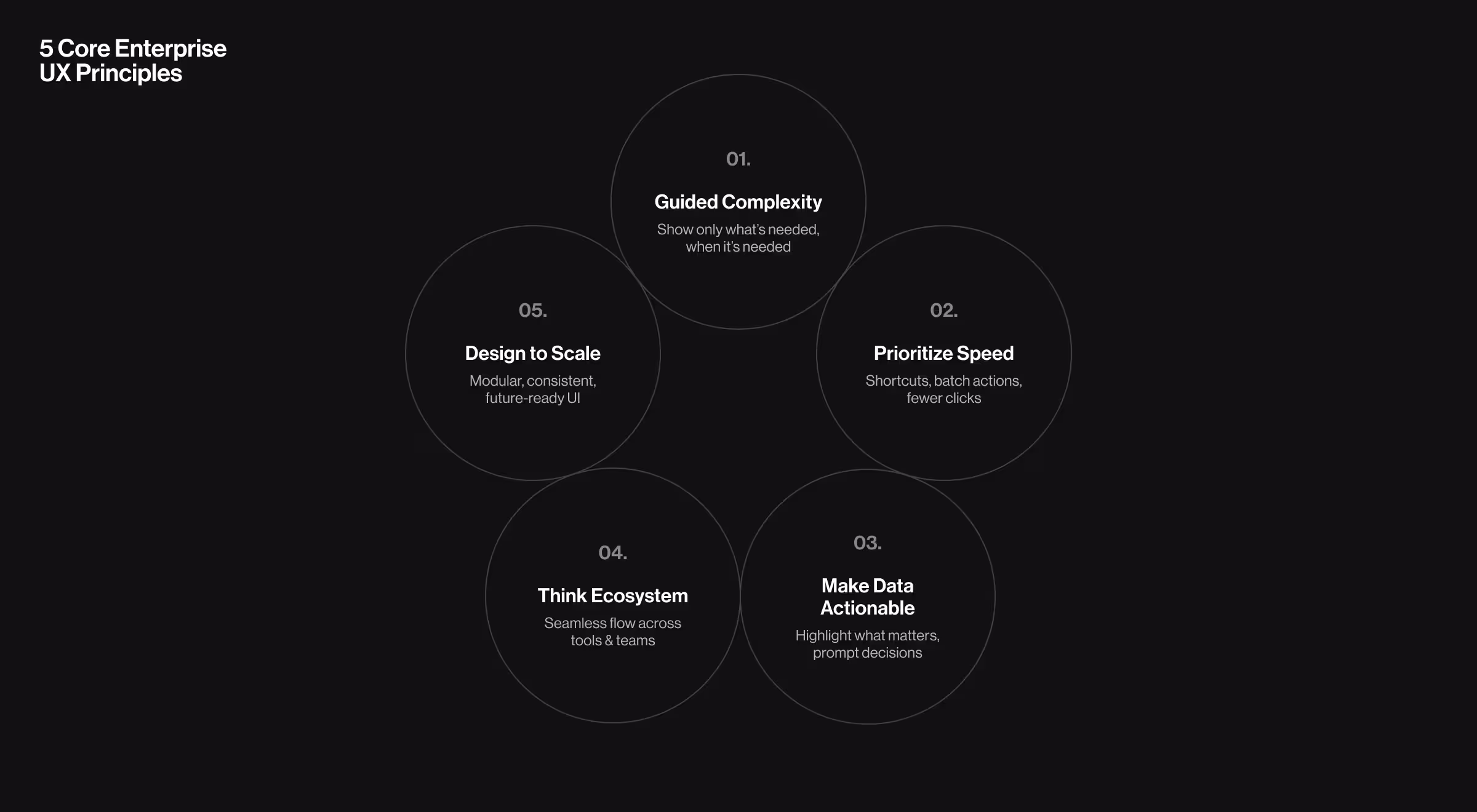
1. Design for Complexity Without Confusion
Enterprise applications handle complex business processes. Your job isn't to make them simple. It's to make them understandable.
"Good enterprise UX design doesn't eliminate complexity. It organizes it. We need to respect the depth of enterprise workflows while creating a clear path for users."
{{Anna Demianenko}}
Think of it like those "easy" assembly instructions that come with furniture. The difference between rage-inducing diagrams and helpful guidance is organization, not simplification.
The design process is still complex, but good instructions make it manageable.
Successful approaches include:
- Progressive disclosure of information when needed
- Contextual guidance at decision points
- Smart defaults that speed up common tasks
- Consistent patterns that build muscle memory
2. Prioritize Efficiency Over Novelty
While consumer apps might benefit from delightful animations and innovative user interfaces, enterprise software design must prioritize efficient task completion.
For enterprise users who spend entire workdays in your application, small efficiency gains compound into massive time savings.
That flashy carousel that looks great in a demo? It becomes torture by the fifteenth time someone sees it.
Efficiency strategies that actually work:
- Keyboard shortcuts for power users (who will become your biggest advocates)
- Batch operations for repetitive tasks
- Personalized dashboards showing relevant information
- Minimal clicks for frequently performed actions
Enterprise users value speed and reliability over visual flair. Remember, in enterprise UI design, boring is beautiful when it saves time.
3. Make Data Actionable
Enterprise applications manage enormous datasets. The challenge isn't just displaying data; it's turning that data into decisions.
Ever seen an executive dashboard that displays fifteen KPIs without clarifying which need attention? That's data without direction.
Successful enterprise application UX transforms data into action through thoughtful visualization and prioritization. This requires conducting UX research and design research to understand how different user types interact with data.
Key approaches:
- Visualization that highlights exceptions and outliers
- Contextual filtering that reveals relevance
- Alerts that prompt action when needed
- Customizable views for different user roles
The best enterprise product design doesn't just answer "what's happening?" It answers "what should I do about it?"
Good enterprise UX design ensures that valuable insights are accessible to end users without overwhelming them with unnecessary information.
4. Unify Experiences Across Touchpoints
Enterprise applications rarely exist in isolation. They're typically part of a broader ecosystem of applications used throughout an organization.
"The best enterprise application design acknowledges the broader ecosystem. Your product isn't an island, it's one piece of your users' workday puzzle."
{{Anna Demianenko}}
Consider this: enterprise users don't see "systems." They see tasks. When they need to update customer information, they don't think, "I need to use the CRM system." They think, "I need to update customer data."
If that process spans multiple enterprise apps with different user interfaces, you've created a fragmented experience.
Ecosystem considerations:
- Consistent terminology across systems
- Seamless transitions between applications
- Mobile-friendly interfaces for on-the-go work
- API-first thinking for integration possibilities
Enterprise UX designers must consider how their design solutions fit within the larger enterprise space and existing internal solutions.
5. Design Systems for Scale and Evolution
Enterprise application design must accommodate growth in both users and functionality. Building scalable design systems prevents painful redesigns later.
Think of it this way: consumer apps might pivot quickly, but enterprise software evolves gradually, accumulating features and users over years.
What seems manageable with 10 features becomes overwhelming at 100.
A comprehensive design system includes:
- Modular architecture that supports expansion
- Consistent UI components and patterns
- Performance optimization for growing data
- Flexible permissions for complex organizations
Ever noticed how the "temporary solution" your company implemented five years ago is now mission-critical infrastructure? Enterprise UX needs to plan for that future from day one.
Design systems become especially important when designing enterprise software that needs to integrate with legacy systems while maintaining a modern user interface.
Enterprise UX Design Challenges and Solutions
Common enterprise UX challenges require specific strategic approaches:
Enterprise Product Design Principles in Action: Payoneer Platform Redesign
When Payoneer approached our enterprise design team, they were facing challenges familiar to any enterprise UX team.
Complex multi-step workflows. Overwhelmed customer support. User abandonment due to process friction.
The financial platform's original onboarding process required users to navigate through over 12 steps across mobile apps and web interfaces. Users faced a 5-step mobile signup, then got redirected to complete 7 additional web-based registration steps.
High abandonment rates and frustrated users who turned to competitors for simpler solutions.
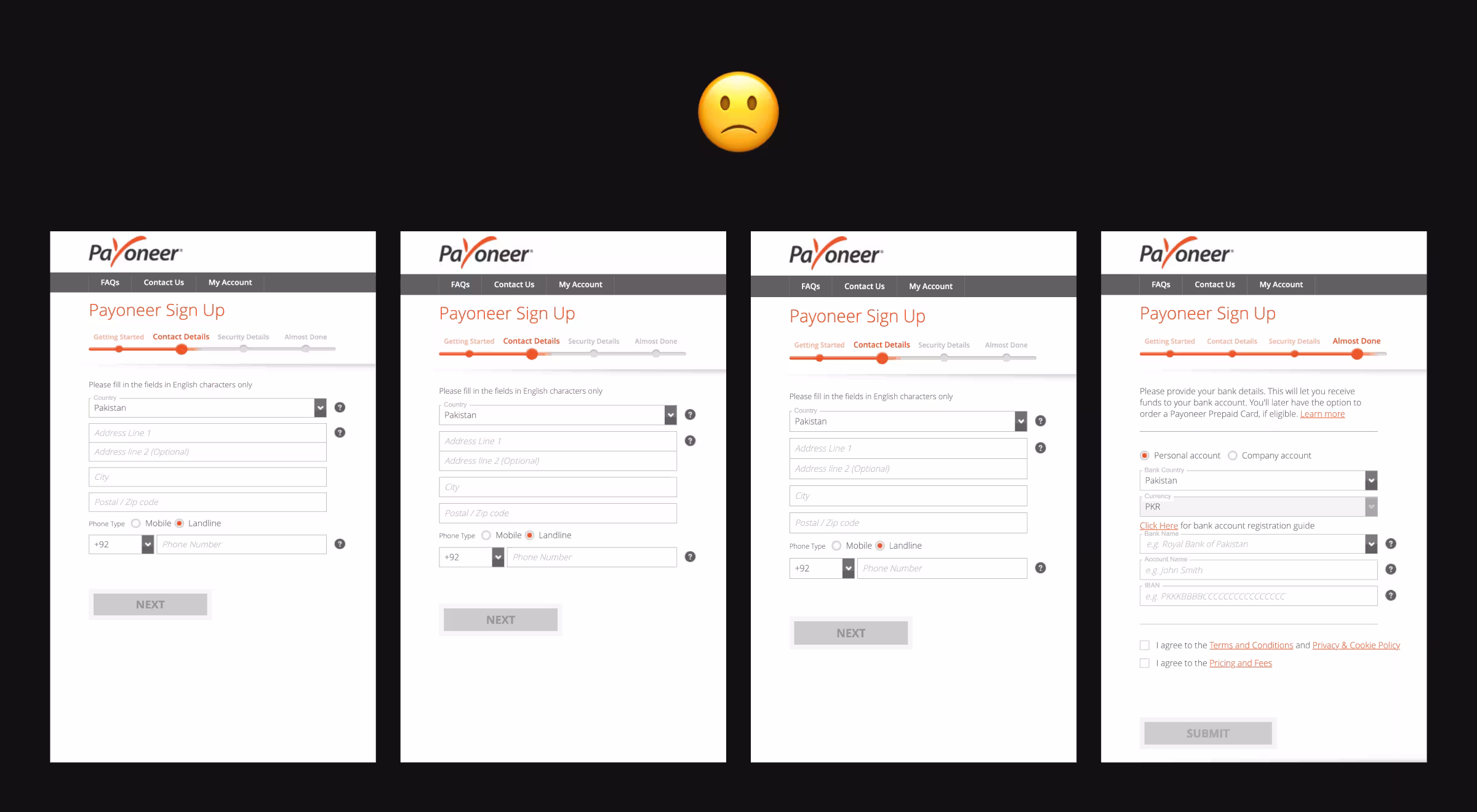
The Enterprise UX Challenge
Fintech solutions we worked mirror those we see across enterprise software:
- Complex workflow fragmentation: Critical processes split across multiple interfaces and systems, creating confusion and drop-off points.
- Overloaded support systems: Poor UX drove up support ticket volume as users struggled with basic tasks that should have been intuitive.
- Limited scalability: The app supported only 10 major currencies, forcing users to maintain external solutions and reducing platform engagement.
Our Systematic Approach
We applied the same methodology we use for complex enterprise systems:
- Deep discovery and competitor analysis: Our team analyzed key fintech players to identify UX patterns that enable smooth user experiences while managing regulatory complexity.
- User journey mapping: We documented the entire user experience across touchpoints, identifying friction points that enterprise software commonly faces.
- Progressive complexity management: Instead of simplifying the inherently complex financial processes, we organized them logically with clear guidance at each step.
- System integration thinking: We designed solutions that unified the fragmented experience across mobile and web platforms.
Key Solutions That Apply to Enterprise UX
- Streamlined onboarding flow: We reduced the multi-platform registration chaos into a coherent, guided experience that respected regulatory requirements while minimizing user effort.
- AI-driven support integration: Recognizing that complex systems generate support needs, we designed an AI voice assistant to handle common queries and intelligently route complex issues to human support.
- Enhanced analytics and reporting: We added comprehensive financial analytics to keep users engaged within the platform rather than seeking third-party solutions.
- Gamification for engagement: We introduced the reward system to make complex financial management more engaging and less intimidating.
The principles we applied here translate directly to enterprise software design.
Respect complexity while organizing it clearly. Reduce support burden through better UX. Create unified experiences across multiple touchpoints.
Real-World Enterprise UX Success: Learning from Notion and Airtable
Two enterprise applications demonstrate how thoughtful UX design can make complex functionality accessible to entire organizations:
Notion: Simplifying Document Complexity
Notion transformed enterprise documentation by applying progressive disclosure principles to complex content creation. Instead of overwhelming users with formatting options, Notion introduces features contextually through their block-based system.
Key UX Decisions:
- Block-based editing makes complex document structures feel intuitive
- Slash commands provide powerful functionality without cluttering the interface
- Template system reduces setup time for common workflows
- Unified workspace eliminates app-switching between docs, databases, and wikis
Enterprise Impact: Teams report faster onboarding and higher adoption rates compared to traditional documentation tools, largely due to the familiar, gradual learning curve.
Airtable: Making Databases User-Friendly
Airtable solved a classic enterprise UX challenge: making powerful database functionality accessible to non-technical users. They achieved this by maintaining spreadsheet familiarity while adding database capabilities.
Key UX Decisions:
- Spreadsheet interface leverages existing user knowledge
- Visual field types (attachments, checkboxes, ratings) make data entry intuitive
- Multiple view options (grid, calendar, gallery) serve different use cases
- Color coding and filtering help users navigate complex data sets
Enterprise Impact: Organizations use Airtable for project management, CRM, and inventory tracking without requiring database training for team members.
Both applications demonstrate core enterprise UX principles: respect user mental models, introduce complexity gradually, and prioritize task completion over feature showcasing.
Enterprise UX Design Process: How to Get It Right
Successful enterprise UI design follows a structured design process that balances business objectives with user needs.
Here's how our UX design team approaches these complex challenges.
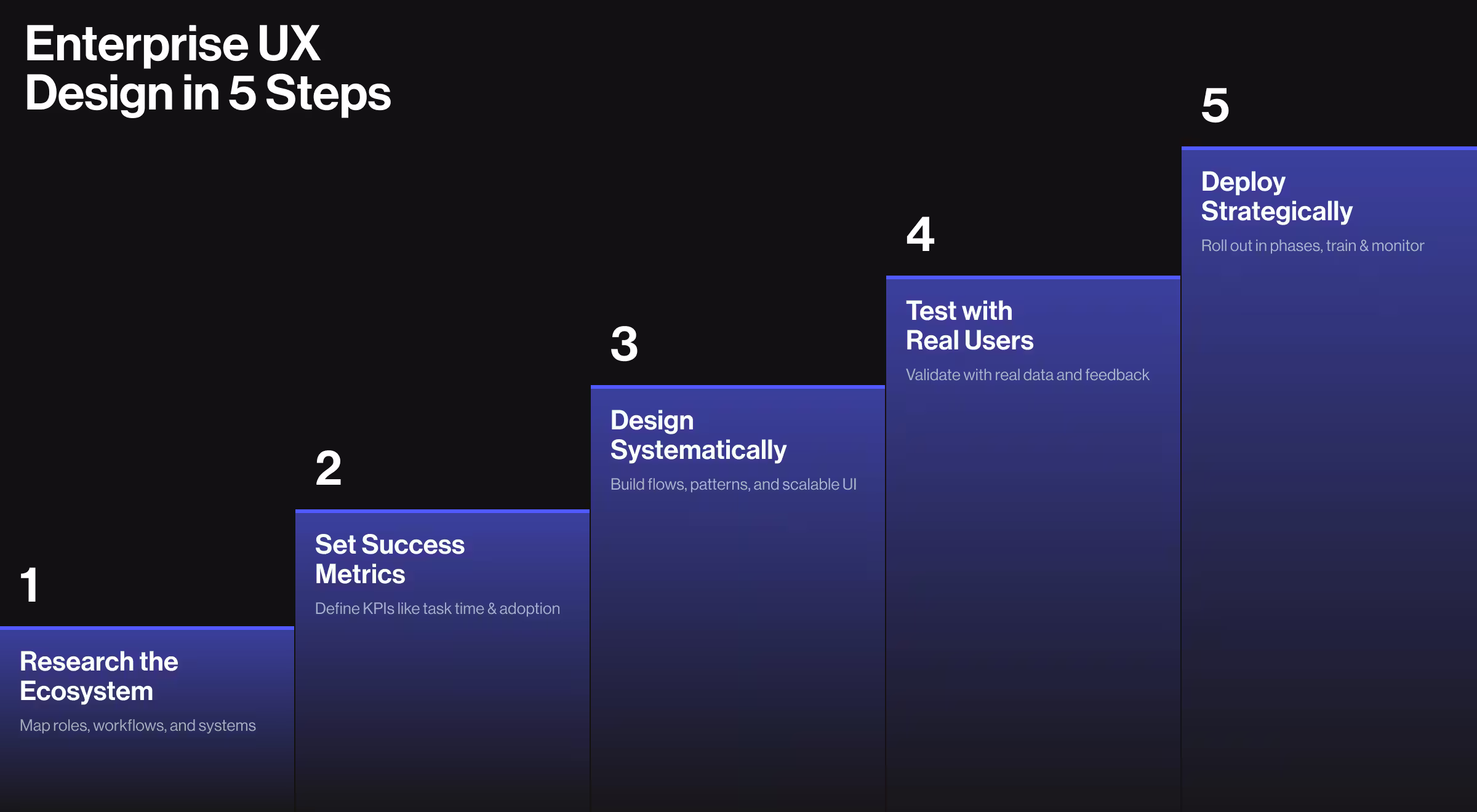
1. User Research: Understand the Ecosystem
Enterprise applications exist within complex organizational environments. Before designing enterprise software, thoroughly understand:
- Different user roles and their primary goals
- Existing workflows, including pain points
- Integration requirements with other systems
- Organizational constraints and requirements
🔍 Pro Tip: Include both power users and occasional users in your user research. The person who uses your system eight hours daily has dramatically different user needs than the monthly report-puller. Both perspectives matter.
Partnering with experienced UX research specialists can accelerate the discovery process and uncover insights that internal teams might miss, especially when dealing with complex enterprise environments.
2. Strategy: Define Clear Success Metrics
Establish quantifiable success metrics early. This isn't just good business; it's self-preservation.
Without clear metrics, enterprise UX projects can drift into endless stakeholder wish lists driven by business objectives rather than user needs.
Define specific targets for:
- Task completion times
- Error rate reductions
- Training time decreases
- User satisfaction improvements
- Adoption rate targets
These metrics provide clear direction and help you demonstrate ROI after implementation. They're also your best defense against the dreaded "can you just add one more thing" syndrome that plagues enterprise projects.
3. Design: Create a Systematic Approach
Enterprise application design requires systematic thinking. One-off creative solutions create inconsistency that confuses users and slows development.
Good design systems thinking includes:
- Developing comprehensive design systems that scale
- Creating detailed user flows for complex processes
- Building prototypes that test real scenarios
- Establishing consistent patterns for similar interactions
Think of this as creating a visual and interaction language for your application. Once enterprise users learn it in one area, they can apply that knowledge everywhere.
4. Test: Validate with Users
Enterprise UX must be rigorously tested before deployment. This isn't optional; it's the difference between success and expensive failure.
Effective testing with enterprise users includes:
- Usability sessions with representative users
- Testing with realistic data volumes
- Measuring performance against metrics
- Iterating based on user feedback
You'd be amazed how many million-dollar enterprise deployments launch without anyone watching actual users try to accomplish basic tasks. Don't be that company.
5. Implement: Deploy Strategically
Enterprise rollouts need careful planning. Remember: you're not just deploying software; you're changing how people work.
Successful implementation includes:
- Phased deployments to minimize disruption
- Targeted training for different user groups
- User feedback collection during early adoption
- Analytics monitoring to spot improvement opportunities
Think of launching enterprise software like moving to a new office. Do it too abruptly, and everyone gets disoriented. Take it gradually, with plenty of adjustment time, and you'll build comfort and confidence.
Enterprise Product Design: Common Pitfalls to Avoid
Even experienced UX designers can fall into these enterprise UX traps:
Designing for Stakeholders, Not Users
We've all been there. The CEO wants a dashboard that shows their pet metrics. The sales team insists on a feature no customer has requested.
In the end, features that look great in boardroom presentations and terrible in daily use.
Always balance stakeholder requirements with user research. The executive who demands a feature might never actually use it.
Feature Creep Without Information Architecture
"Just one more option" is the battle cry of enterprise software bloat.
Adding features without a coherent organizational strategy creates user interfaces that feel like someone emptied a junk drawer onto the screen.
Each new feature should have a logical place in your information hierarchy. If you can't find where it belongs, that's a red flag.
Ignoring Performance Under Real Conditions
Beautiful user interfaces that lag under real-world conditions will frustrate users faster than an ugly interface that's snappy.
Enterprise applications handle massive data sets, and performance is a UX fundamental when designing enterprise software.
Test with realistic data volumes from the start. That sleek animation that looks great with 10 records might bring browsers to their knees with 10,000.
Neglecting Mobile and Remote Access
"We'll add mobile later" is enterprise design's favorite procrastination technique.
Treating mobile as an afterthought creates disjointed experiences for increasingly mobile workforces. With the enterprise application market valued at $320.4 billion in 2024 and growing fast, it’s clear that users now demand seamless, anywhere access as a baseline, not a bonus.
How to Choose the Right Enterprise UX Design Partner
The right design partner can make the difference between software that transforms your business and an expensive implementation failure.
When evaluating potential partners for enterprise application UX, look beyond the slick portfolio. Beautiful Dribbble shots don't necessarily translate to functional enterprise systems.
Instead, focus on:
- Enterprise-specific experience: Consumer app expertise doesn't automatically transfer to enterprise environments. Ask about their experience with complex workflows and system integration.
- Research capabilities: Good enterprise UX starts with understanding users, not pushing pixels. How do they conduct research? What methods do they use?
- Technical understanding: They should be able to discuss APIs, data structures, and technical constraints intelligently. Design that ignores technical realities creates beautiful fiction, not usable software.
- Project management approach: Enterprise projects require coordination across multiple stakeholders and teams. How do they manage this complexity?
- Metrics focus: They should tie design decisions to business outcomes. Ask how they measure success beyond "it looks better."
Remember: the best enterprise design partners will ask tough questions about your business goals before they start suggesting visual solutions.
Next Steps: Transforming Your Enterprise User Experience
Ready to transform your enterprise applications from necessary evils to productivity multipliers?
Whether you're modernizing legacy systems or building new enterprise tools, contact us for a consultation. We believe that even the most complex enterprise software can become intuitive, efficient, and maybe — just maybe — something your users actually enjoy working with.


.webp)


.avif)


