When healthcare website design truly serves users, it moves beyond polished screens and starts shaping behavior. That is precisely what happened when Lazarev.agency rebuilt WellSet, a holistic mental‑health studio offering live and on-demand classes:
- We designed an intuitive wellness hub.
- Reimagined the platform for a wellness-focused experience.
- Crafted engaging and personalized wellness content.
- Built tools for connection and management within the wellness community.
- Made a visually calming and supportive, mobile-friendly environment for users.
After launch, the platform recorded a 75% jump in user engagement and a 30% boost in customer retention, while active accounts climbed past 500 000 and funding topped $3.1 million. Want to know the details?
{{WellSet}}
Key takeaways
- Accessibility first. Collapsing scattered resources into a single wellness hub cut cognitive load and increased session depth.
- Personalization that respects privacy. A lightweight rules engine recommended classes based on stress‑level check‑ins, lifting repeat usage.
- Branding with purpose. A calm color palette and unobtrusive healthcare logo design choices signaled trust without feeling clinical.
- Mobile responsive design keeps critical actions reachable on small screens.
Occasional visitors, vanishing motivation
Mobile wellness apps fight churn. Industry studies show retention can plummet to 3.9% after 6 months. WellSet felt that pressure.
The team needed a flow that would keep employers, employees, and direct consumers coming back before stress and distractions reclaimed their attention. A flow that will:
- Encourage prospective users to try a class within 30 seconds
- Keep visitors informed about progress without exposing sensitive data
- Work flawlessly on any device, from widescreen desktops to mobile phones
A unified wellness hub
Our first decision was to consolidate live classes, on‑demand videos, and progress stats into one entry point. According to Nielsen Norman Group, users read only about 20% of the words on a web page, so navigation labels and visuals had to carry the weight. We’ve:
- Reordered the IA around user roles instead of content types.
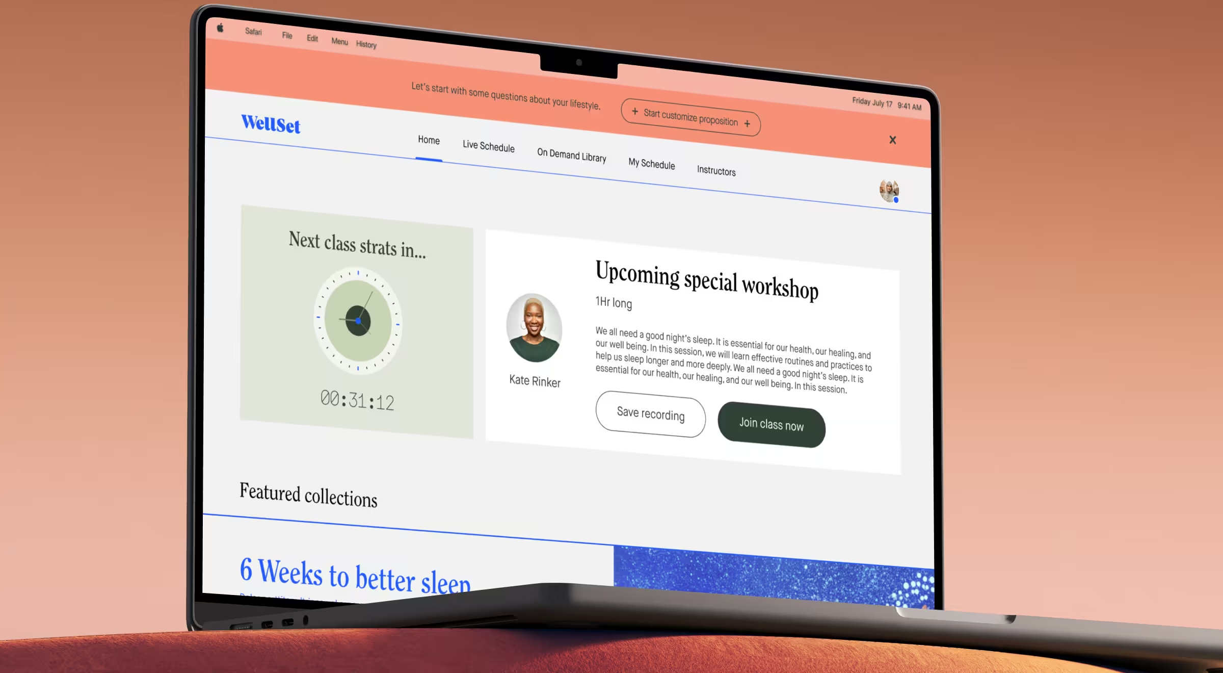
- Added immediate “Next class” timers to create urgency.
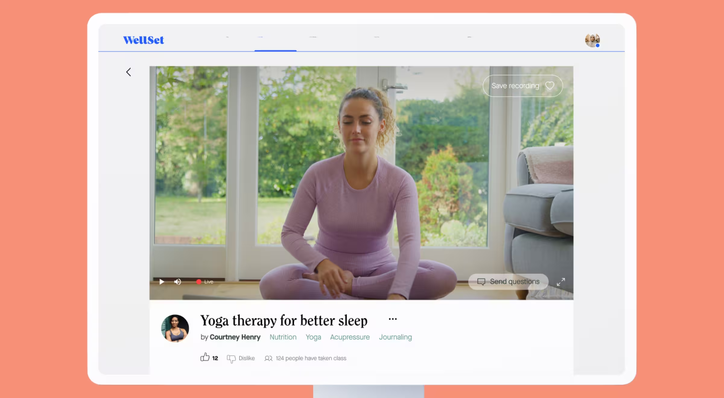
- Surface critical actions (“Join”, “Save recording”) above the fold.
As a result, page‑to‑class conversion rose, feeding the 75% engagement surge.
This blueprint proves that healthcare UX design is somewhat less about aesthetics and more about frictionless entry for every stakeholder group.
Personalization as a habit builder
WellSet’s approach to personalization is deliberately light-touch, the platform shows users exactly what will help them next, without prying into private health data.
Key tactics:
- Goal-based playlists on the dashboard. Visitors land on ready-to-use collections such as “Deepen My Sleep” and “Anxiety-Relief Toolkit,” so even first-time website visitors can start a relevant class in one click.
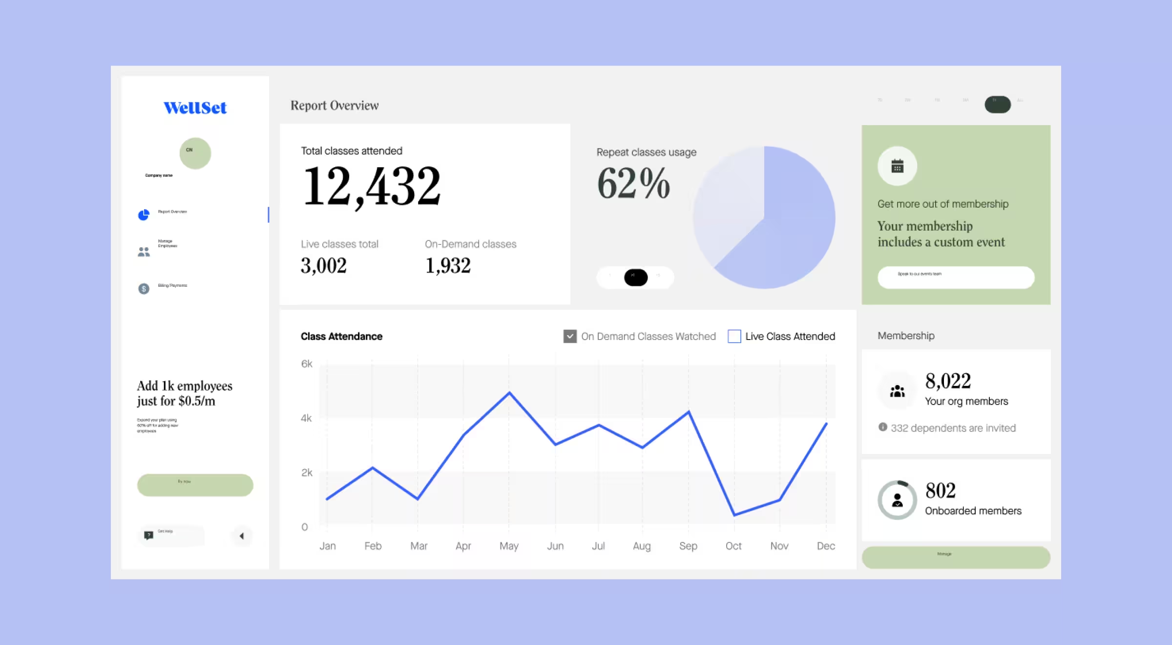
- Progress counters that feel achievable. A metrics panel surfaces cumulative “minutes moving” and “minutes learning,” turning abstract effort into concrete wins and encouraging return visits.
- Sticky engagement proven by data. Members had already come back for at least one additional class, evidence that simple, transparent nudges can build routine in healthcare web design.

This UX design in healthcare delivers personalization that feels helpful rather than invasive – exactly the balance successful healthcare website design demands.
Medical UX design that’s guiding users instead of lecturing them
Complex terminology can alienate stressed minds. Through concise microcopy and context‑sensitive tooltips, we practiced medical UX design that clarifies actions without jargon.
- Plain-language actions. Buttons read “Join class,” “Add to schedule,” or “Save recording,” so visitors know the exact next step without decoding jargon.

- Countdown cues. A live banner “Next class starts at 00:09:34” keeps attention on the upcoming session and nudges timely participation.

- Progress at a glance. The dashboard surfaces totals like “1,238 minutes moving” and “567 minutes learning”, turning effort into visible momentum that motivates return visits.
Together, these choices show how medical UX design can use everyday language and glanceable metrics to guide potential users through healthy routines without lecturing them.
Healthcare logo design and visual calm
The WellSet mark is a simple blue word-only logo, shown consistently across desktop and mobile headers. Its clean Serif letterforms and single accent color support a calm, approachable look without distracting from class content.
An understated choice that fits the platform’s wellness focus and illustrates thoughtful healthcare logo design.
UI healthcare patterns that drive habit formation
Let’s see how thoughtful UI healthcare patterns can guide users back day after day while keeping the interface light and approachable:
- Whitespace that breathes. Core screens like Live Schedule, On-Demand Library, and Collections leave generous margins around cards and buttons, so users can scan class titles and times without visual clutter. This clean canvas helps busy website visitors decide in seconds which session fits their day.
- One-tap primary actions. Large “Join class” and “Add to schedule” buttons sit directly near each listing, eliminating extra taps and encouraging commitment on both desktop and mobile responsive layouts.
- Consistent iconography. Reusable icons for “Live,” “Save recording,” and category tags appear across the wellness hub and admin dashboards, reinforcing patterns users already recognize from consumer health apps and building trust through UI healthcare familiarity.
- Component-driven scalability. The same card, badge, and list components power employee-onboarding pages and consumer experiences, making future A/B tests or layout tweaks possible without visual drift, an essential habit-building tactic in medical web design.
Healthcare web design tips from WellSet
- Front‑load value. Place real class previews above fold.
- Shorten routes. One‑click joins beat multi‑step enrollment flows.
- Show social proof early. Instructor ratings add credibility.
- Cache smartly. Pre‑fetch the next lesson on Wi‑Fi to cut mobile lag.
- Clarify cost. An upfront $22 subscription beats buried pricing.
These healthcare web design tips work because they target key moments where doubt creeps in.
Design thinking in healthcare
True design thinking in healthcare starts long before pixels hit the screen. On WellSet, the team began by mapping the real-life moments that make or break a daily wellness habit: the rush between meetings, the spike of anxiety before bed, the satisfaction of finishing a class. Every interface choice was stress-tested against those moments and refined until it felt effortless.
“As soon as you stop treating design like decoration and start treating it as behavior architecture, the product tells you what it needs next."
{{Oleksandr Koshytskyi}}
That mindset kept the WellSet roadmap honest: hypotheses were validated with real member feedback, adjustments were made while code was still malleable, and each release stacked neatly onto a scalable product foundation.
In the end, UX design served as both a research method and a growth engine, proving that thoughtful, user-driven iteration is the quiet force behind every successful healthcare website design and stands as a living blueprint of design thinking in healthcare done right.
Healthcare product design beyond the browser
Forward-compatible healthcare product design reduces rework whenever new screens join the roadmap. WellSet delivers the same experience on desktop and mobile: class cards, countdown timers, and progress rings keep the identical hierarchy and styling on both layouts.
By relying on a single set of reusable components stored in one design library, the team ships an update once and sees it reflected everywhere – proof that disciplined healthcare product design scales without adding extra design debt.
Cross‑device consistency through healthcare app design
WellSet’s responsive screens carry the same calming gradients, countdown timers, and progress-ring streak banners onto mobile breakpoints, showing how healthcare app design thinking can power a browser-based product. By applying the tap-target sizes, icon logic, and color-accessibility checks, the team refines on native projects. Users who jump from laptop to phone encounter an identical hierarchy of actions.
This consistency mirrors Lazarev.agency’s broader experience in healthcare app design, where keeping patterns stable across surfaces is proven to lift task completion and trust.
Using healthcare mobile app design templates
Even when a product launches as a responsive web experience, early prototypes often start with healthcare mobile app design templates that already embed HIPAA-friendly consent flows, large tap targets, and WCAG-conformant color ratios. Teams can jump-start ideation with publicly available kits such as:
- Adobe’s free Health Industry UX Kit – mobile and tablet layouts for appointment scheduling and lab results
- UI8’s Healthcare Doctor App – 70+ iOS screens for telehealth, vitals, and chat
- or the new Medly Figma UI Kit – multi-platform components for bookings and medication reminders
Reusing healthcare mobile app design templates like these accelerates compliance checks and leaves designers free to focus on the brand nuances and user journeys that truly differentiate a product.
Accessibility-first user interface design for healthcare applications
VoiceOver support, reduced‑motion toggles, and high‑contrast modes made the cut because user interface design for healthcare applications must serve older and neurodiverse audiences.
“Modern wellness platforms win when data feels human. Design should remove mental friction so that healthy actions become the default.”
{{Oleksandr Koshytskyi}}
PwC reminds us that 32% of customers abandon a beloved brand after a single bad experience. WellSet avoided that fate by aligning every click with user calm and clarity. A well‑documented user interface design for healthcare applications spec helps devs ship features without guessing.
Ready to reimagine your healthcare experience?
If your team is mapping the next phase of digital care, from brand refresh to full‑scale healthcare website design overhaul, Lazarev.agency can help translate wellness goals into measurable business outcomes. Let’s talk.


.webp)


