
From the outside, the business looks solid. Traffic’s there, and the sales narrative holds up. But then there’s the website. While users land, a moment comes when they pause and leave. Technically, nothing is broken. Yet, nothing is pulling them in either.
That’s the invisible ceiling. When a website only presents information instead of responding to how people think and make decisions, performance plateaus.
That’s where interactive website design steps in as a trusted problem-solver. When interaction is intentional, navigating websites feels intuitive. When it’s missing, even strong products struggle to move users forward.
This article shows how to fix that. We’ll dive into the science of interactive website design, which elements have proven to work, and how to choose the right interactions for your product.
Key takeaways
- Interaction is a system. High-performing interactive website design blends UX logic, performance, and intent.
- The best interactions reduce thinking. Interaction works when it lowers cognitive load and speeds up decisions.
- Personalization and context beat one-size-fits-all UX. Adaptive interfaces drive repeat usage, engagement, and conversions across industries.
- Choosing the right interaction is a strategic decision. Research, clear hypotheses, and iteration matter more than adding every interactive feature available, and that’s where leading AI UX design partners like Lazarev.agency are of great value.
What’s the science behind interactive website design?
Strategic interactive design plays on two fronts at once.
On the technical side, it’s a disciplined system built on clean information architecture, fast loading speed, and more than ever before, AI-powered design.
On the visual side, that logic becomes tangible. It shows up as responsive layouts, personalized UI, and clear visual cues. Remove any one of these, and interaction collapses.
How do you know you’ve cracked the interactive website design code?
Cue: engaging with your digital product should feel like observing an artwork and taking exactly what you need from the experience. Because it’s personal — it’s yours.
“Users should never think about what’s going on in the background. All they need is to experience the flow. That’s what we call UX optimization done right.”
{{Anna Demianenko}}
This isn’t big talk. These principles have been validated long enough to become industry common sense:
- Ease of use is a driver of repeat engagement. According to Google, 79% of people are likely to revisit or share a mobile site if it’s easy to use.
- Context-aware interactions move revenue. Responsive designs deliver 11% higher conversion rates compared to non-responsive sites.
- Before users read a word or click a button, their first impression signals whether a platform is worth their time. And around 94% of first impressions are design-related, Forbes informs.
The science behind interactive design is simple to state yet challenging to execute: minimize cognitive load, support user confidence, and respond to intent. Businesses across industries rely on it because when interaction is proper, it amplifies the benefits of digital transformation.
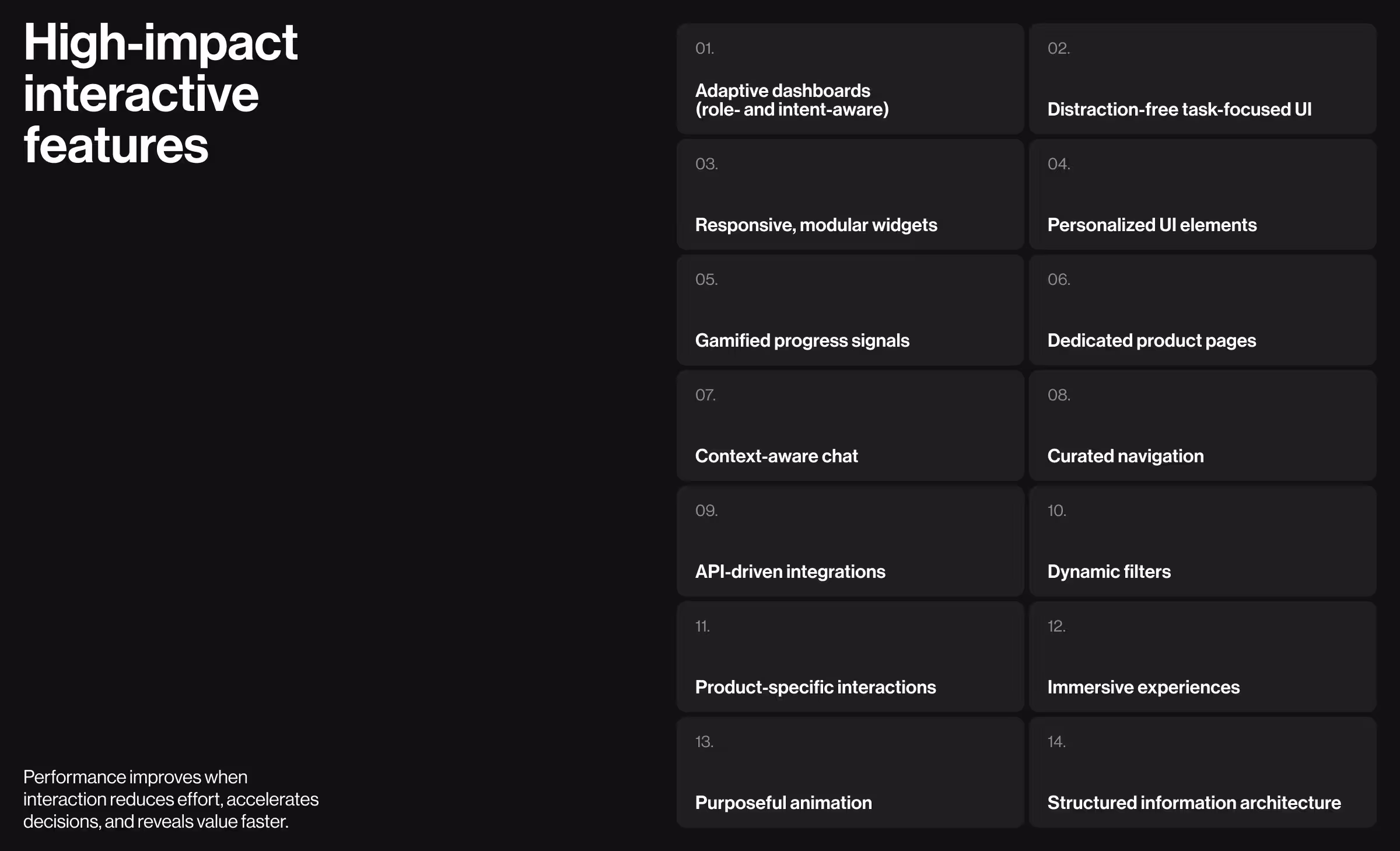
What features of interactive website design consistently boost performance?
Interactive website design only delivers results when interaction serves a purpose.
Based on hands-on work across AI, fintech, SaaS, and enterprise digital platforms at Lazarev.agency, the following interactive web design elements have consistently driven engagement and measurable performance gains.
1. Customizable and AI-powered dashboard design
Generic experiences no longer pass the sniff test. When a product treats everyone the same, users notice and leave.
Future-ready digital products must feature customizable, AI-powered dashboards that adapt to the roles and goals of their target audience. The interface aligns with what you’re trying to do right now, not what made sense three clicks ago.
- Possible variations in digital products: Modular dashboards with configurable widgets, AI-powered insights surfaced when they matter, and context-aware data views.
- When this feature makes sense for you: If users rely on data to make repeated, high-stakes decisions and need control without technical pressure.
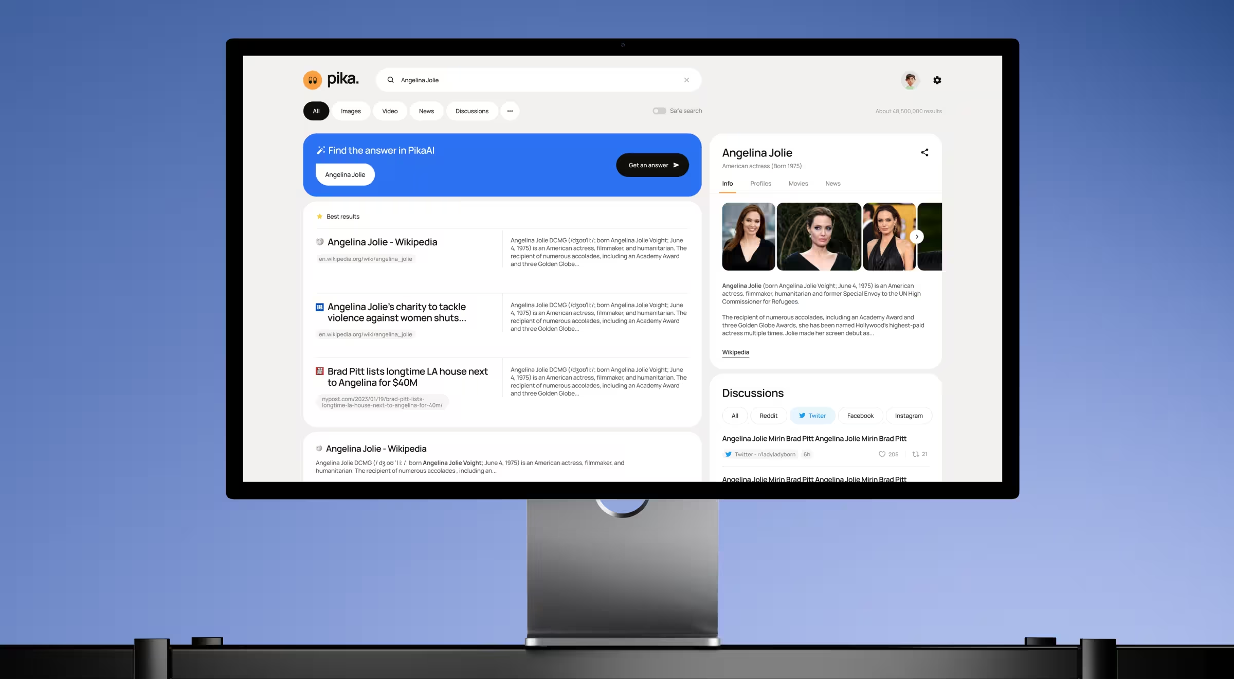
- Practical example from Lazarev.agency: In the Pika AI project, we designed a customizable, AI-powered search dashboard with dynamic reconfiguration of search results based on user queries. The redesigned interface selects the most relevant content widgets and presents them in a block-based layout optimized for fast scanning.
💡Learn more about how to develop a strategic dashboard UX design to boost your business performance.
2. Distraction-free UI
A distraction-free interface removes visual clutter and de-prioritizes secondary actions. The goal here is to let users focus on one task or decision at a time.
- Possible variations in digital products: Minimal layouts, controlled color palette use, and intentional content hierarchy.
- When this feature makes sense for you: When task completion outweighs site exploration.
- Practical example from Lazarev.agency, one of the best interactive design agencies: In the FCF flight search platform, we designed a distraction-free UI to strip away noise while keeping advanced functionality within reach. Core actions such as search, filters, and results have been prioritized, with secondary information surfacing progressively. The result is a calm yet engaging experience where users know where to look and what to do next.
3. Responsive widgets
🔍 Data insight: According to Statista, mobile devices accounted for over 62% of global website traffic in 2025. Mobile crossed the 50% mark back in 2020 and hasn’t looked back since.
This default way people access the web changes what good design means.
Responsive widgets and layouts support users who expect the freedom to move between devices. They don’t think in terms of desktop or mobile. They think in terms of where they are, what they need, and how quickly they can get to it.
At Lazarev.agency, a leading responsive web design company, we endorse a mature approach to responsive web design that adapts to both screen size and context of use. A commuter skimming updates on a phone has different needs than an analyst working across multiple panels on a large screen. The interface should recognize that and respond accordingly.
- Possible variations in digital products: Modular widgets and layouts that resize, rearrange, or collapse intelligently across desktop and mobile.
- When this feature makes sense for you: If your users switch devices or rely on real-time access on the go.
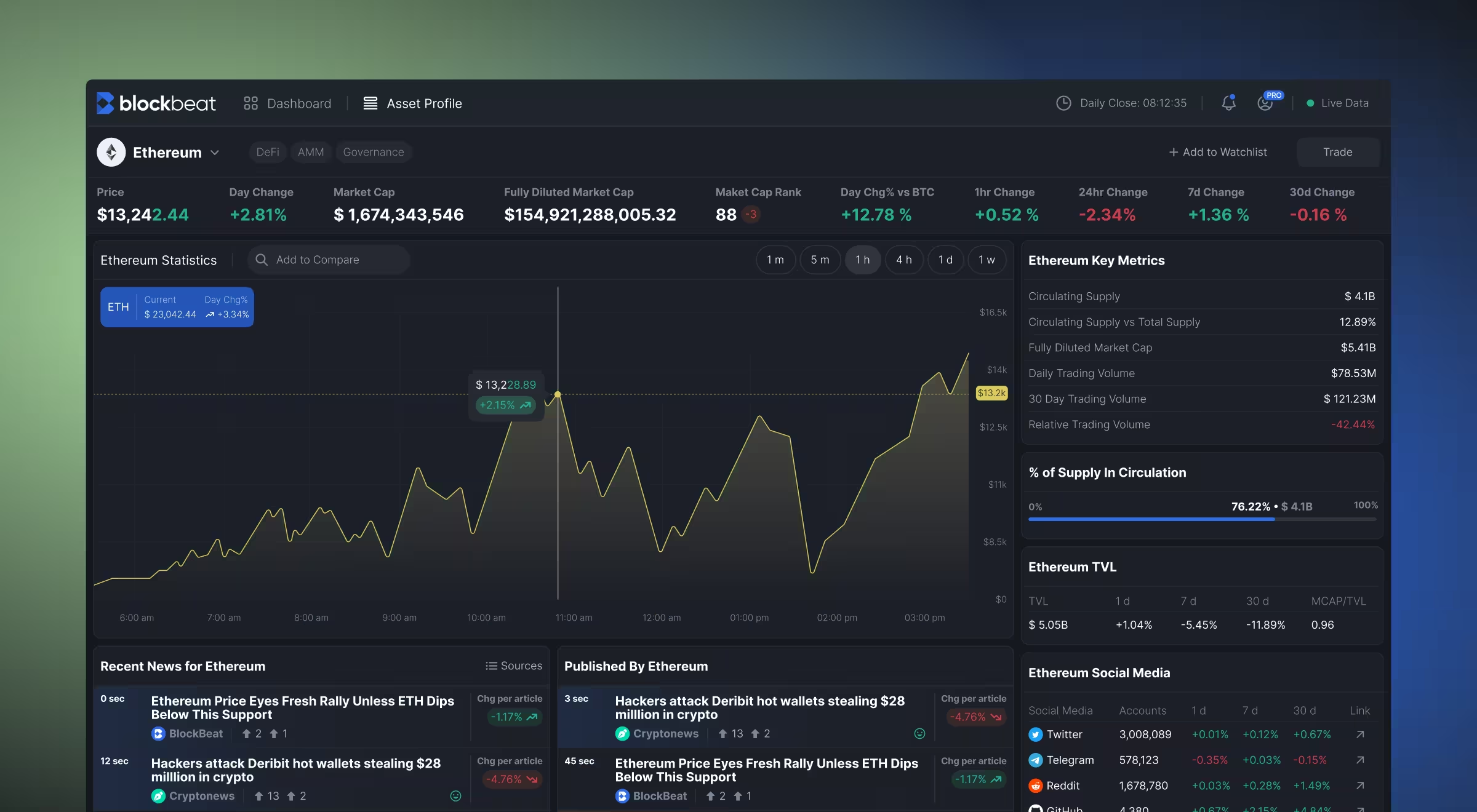
- Practical example from Lazarev.agency: In Blockbeat, responsive widgets support traders across devices and usage cases. The dashboard comprises modular blocks that reorganize based on screen size and interaction mode. On desktop, users can view live news, market statistics, and watchlists side by side. On mobile, those same widgets stack and collapse into focused views. This keeps market data clear and usable whether traders are at their desk or on the move.
4. Personalized UI elements
🔍 Data insight: McKinsey reports that 71% of consumers expect personalized interactions.
Personalized user interface adapts what users see based on their preferences and history. Done well, it replaces one-size-fits-all screens with interfaces designed intentionally for each individual.
- Possible variations in digital products: Custom news feeds highlighting topics you care about, personalized watchlists, and saved views/dashboards tailored to individual users.
- When this feature makes sense for you: Personalized UI pays off when repeat usage and long-term engagement are key business goals. If your users are meant to return and stay, this feature is worth investing in.
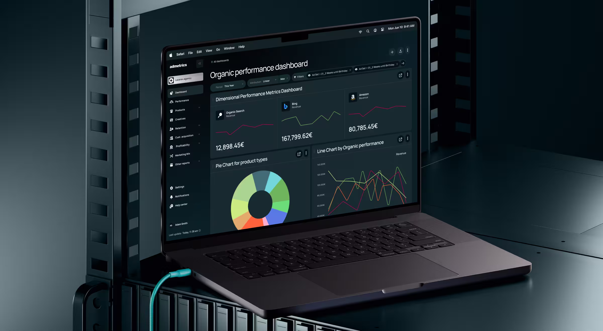
- Practical example from Lazarev.agency: In the AdMetrics platform, personalized UI helps users focus on what matters to them. Dashboards are role- and workflow-specific, so each user sees only the metrics relevant to them. Attribution views, performance tables, and AI-driven insights adapt to past behavior and stated preferences.
5. Gamified interaction elements
Gamification is a secret ingredient of a great customer experience. Think of progress signals, rewards, or challenges that increase user engagement while keeping the experience meaningful.
- Possible variations in digital products: Streaks, milestones, or performance indicators embedded directly into workflows.
- When this feature makes sense for you: If user engagement depends on habit formation or frequent return visits.
- Practical example from Lazarev.agency: For Blockbeat, gamified interaction elements facilitated habit-building for active traders. We introduced rewards and stats tracking to reflect user activity. As a result, users get clear progress signals that encourage frequent return visits without distracting from serious trading decisions.
6. Dedicated product pages
As one of the key growth strategies in e-commerce, dedicated product pages guide users through assessing your offering, comparing options, and making informed decisions.
- Possible variations in digital products: Structured flows with interactive sections, feature highlights, and contextual CTAs.
- When this feature makes sense for you: If your product needs explanation before commitment, a well-designed page can bridge the gap between interest and purchase.
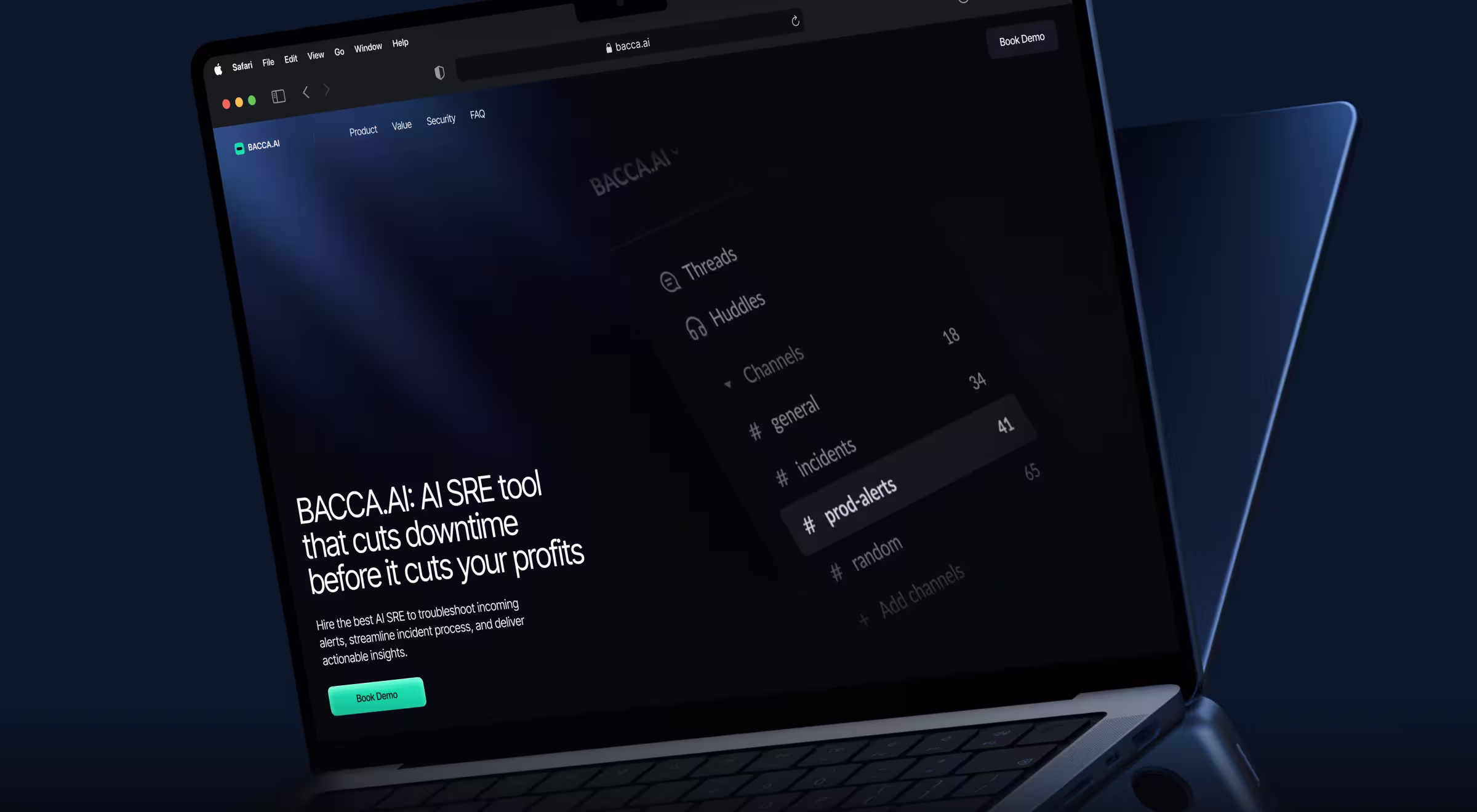
- Practical example from Lazarev.agency: When redesigning Bacca AI’s website, we restructured the page as a step-by-step narrative linking technical capabilities to business outcomes. Interactive sections, visual cues, and contextual CTAs helped diverse audiences (CTOs, engineers, and executives) explore the product at their own pace and depth.
7. Interactive chat features
Chatbot digital transformation has permeated and reshaped industries across the board. A future-proof web design is nearly unimaginable without interactive chat features strategically woven into your digital product.
- Possible variations in digital products: Context-aware chat interfaces that answer questions, surface interactive content, and guide onboarding.
- When this feature makes sense for you: If users need reassurance, explanation, or guidance at critical moments, interactive chat can provide support exactly when it matters.
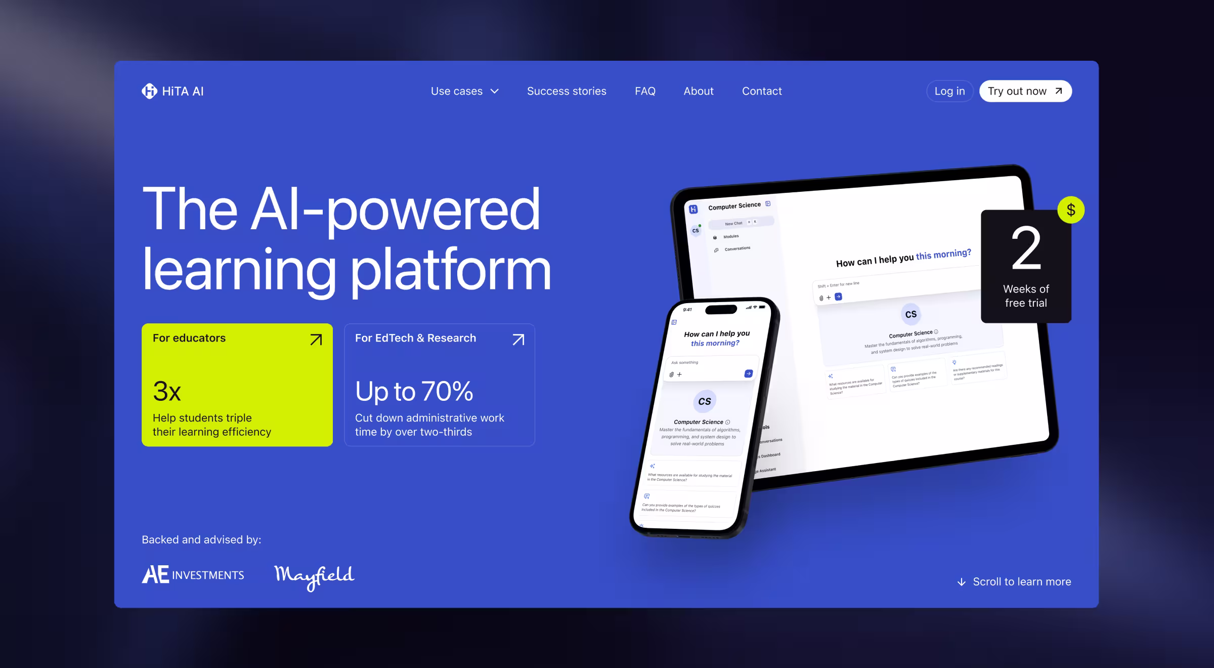
- Practical example from Lazarev.agency: For HiTA, we designed an interactive chat as a decision-support layer. Our team embedded an AI Assistant into the landing page to enable visitors to ask questions, explore real use cases, and get guidance while evaluating the product. The chat adapts to different user scenarios and helps each audience understand value without leaving the page.
💡 For more insight, explore our Lead Designer’s take on 33 chatbot UI examples, showing the mastery of the art of human-AI interaction.
8. Curated web navigation
Curated web navigation is about control with intention. You decide what users see first, what can wait, and what doesn’t need attention at all.
Navigation is shaped around user intent and priority. The interface points users in the right direction and erases distractions along the way.
- Possible variations in digital products: Dynamic navigation structures that highlight relevant sections while hiding unnecessary options and context-aware menus.
- When this feature makes sense for you: If your platform serves multiple user types or use cases.
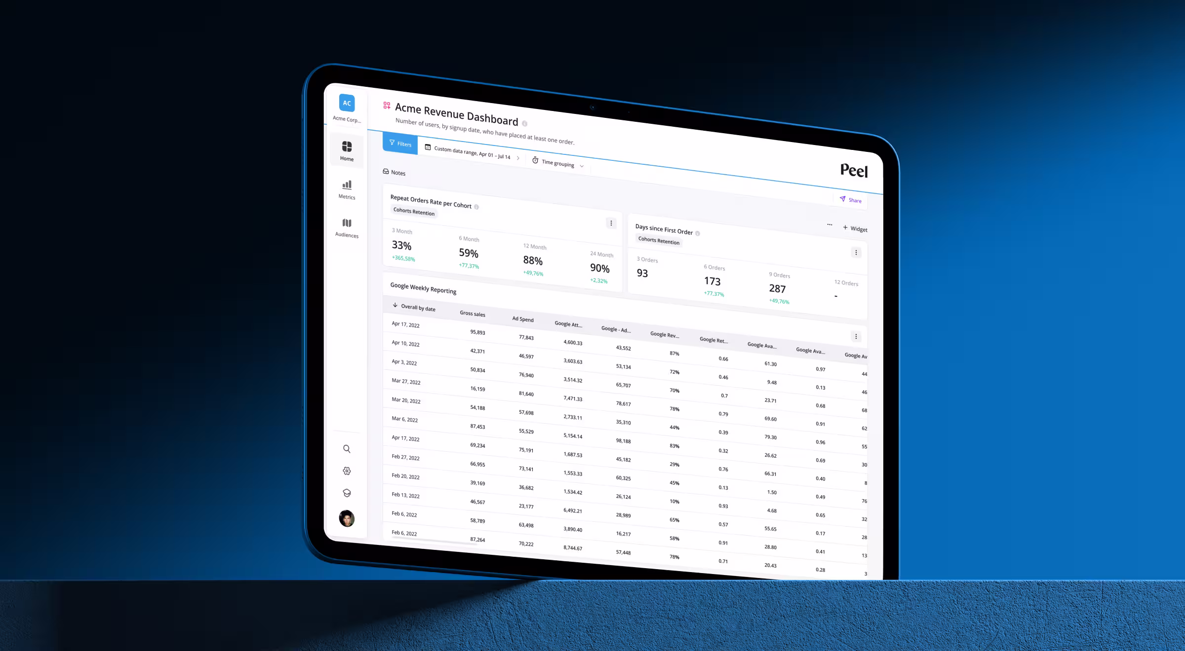
- Practical example from Lazarev.agency: When Peel started growing, navigation became its biggest bottleneck. Users were getting lost, and key features were hiding in plain sight. Our team regrouped core analytics into a few intent-driven sections and pushed secondary tools settings out of the path.
9. API-driven integrations
🔍 Data insight: Google found that when page load time increases from 1 to 10 seconds, the probability of a mobile visitor bouncing jumps by 123%.
Behind many sluggish pages sits fragmented data (think multiple tools queried one after another and poorly managed backends). Stack enough of such unsynchronized actions together, and users feel it immediately.
This is where application programming interface (API) integration earns its place in the architecture. It allows products to pull, push, and synchronize data across tools. When done well, data flows in parallel, updates happen in real time, and the interface stops stalling.
- Possible variations in digital products: Data ingestion from third-party platforms without manual refreshes, real-time updates, and cross-system workflows.
- When this feature makes sense for you: If your product depends on external data sources or needs to slot into an existing website ecosystem.
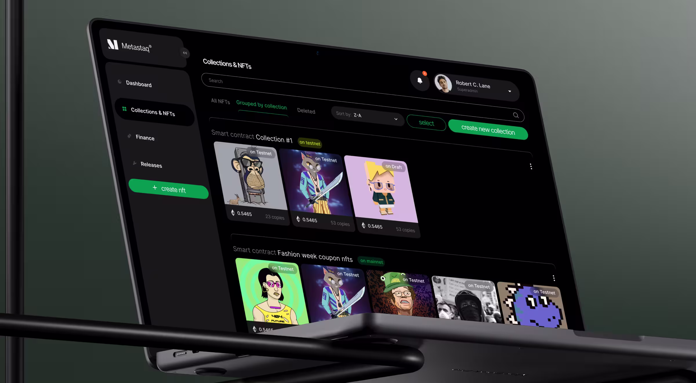
- Practical example from Lazarev.agency: API-driven integrations were foundational to turning Metastaq into a fully operational Web3 hub. The interface connects directly to blockchain networks, wallets, smart contracts, and NFT marketplaces. Thus, brands can mint, manage, and distribute NFTs without technical overhead. Transaction data, NFT collections, wallet balances, and billing details stay synchronized, so teams can operate complex Web3 systems from a unified dashboard instead of juggling multiple tools.
10. Dynamic filters
Dynamic filters let users refine large datasets or inventories. Exploration feels responsive and under the user’s control. The interface reacts immediately to every choice.
- Possible variations in digital products: Interactive, multi-criteria filtering systems and real-time result updates for complex searches.
- When this feature makes sense for you: When users need speed and precision while navigating large volumes of information.
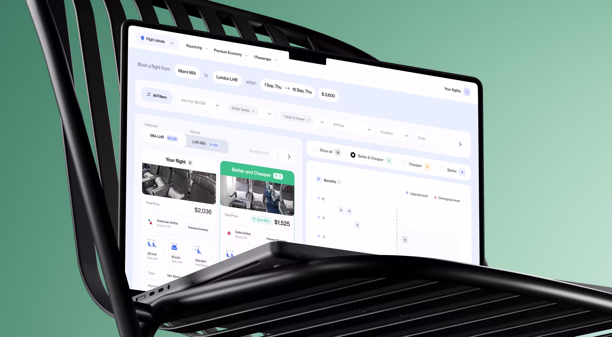
- Practical example from Lazarev.agency: With FCF, dynamic filters were the backbone of the search experience. Long result lists were replaced with multi-criteria controls for price, duration, comfort, layovers, and in-flight amenities. Each selection updates the results immediately. Users reach the right flight faster and stay focused.
11. Product-specific interactive elements
These are interactions designed specifically around the product’s core function.
- Possible variations in digital products: Custom workflows, tailored tools like simplified invoicing flows or analytics interactions built around a single task.
- When this feature makes sense for you: When your product solves a niche or complex problem.
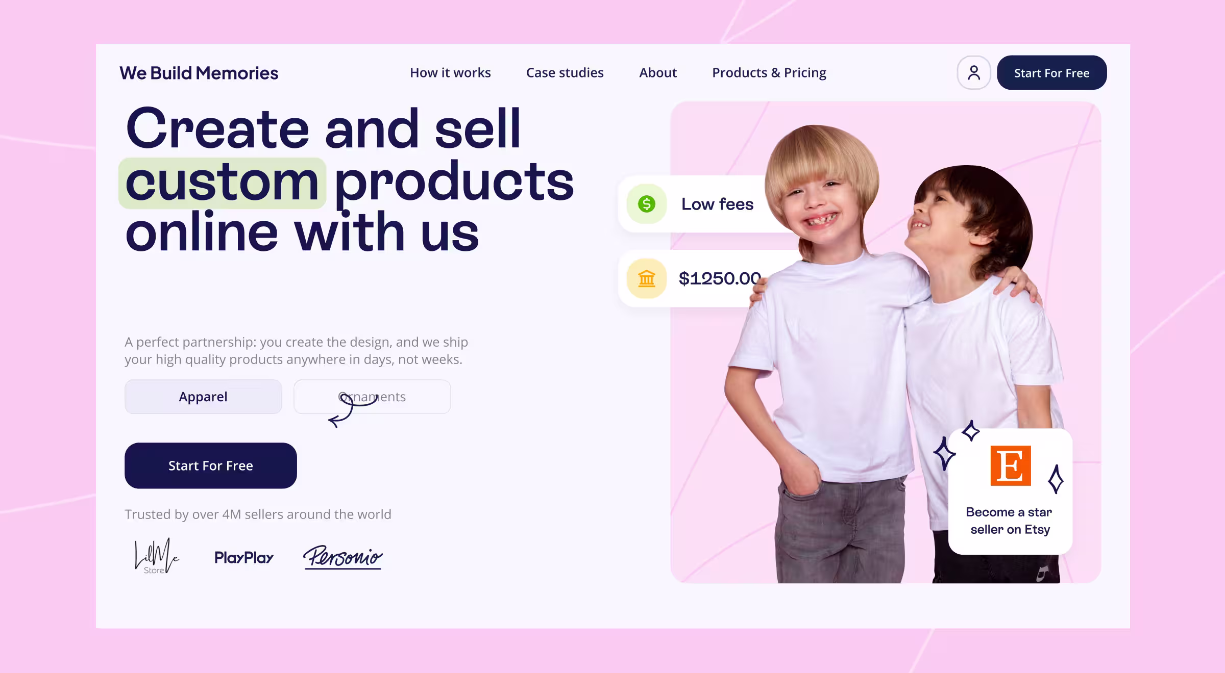
- Practical example from Lazarev.agency: With We Build Memories, we designed custom interaction flows to help resellers create, price, and fulfill personalized products. Product previews, pricing logic, and order management work as one system. Each interaction supports faster go-to-market and fewer errors. That purpose-built logic reduced user churn and lifted conversions.
12. Immersive experience
Immersive UX aligns interaction with the product’s industry or environment. The interface doesn’t just explain the product. It reflects how the product is used and what it stands for.
- Possible variations in digital products: Interfaces reflecting industrial, technical, or spatial context through interaction and motion.
- When this feature makes sense for you: When differentiation and emotional engagement matter as much as function.
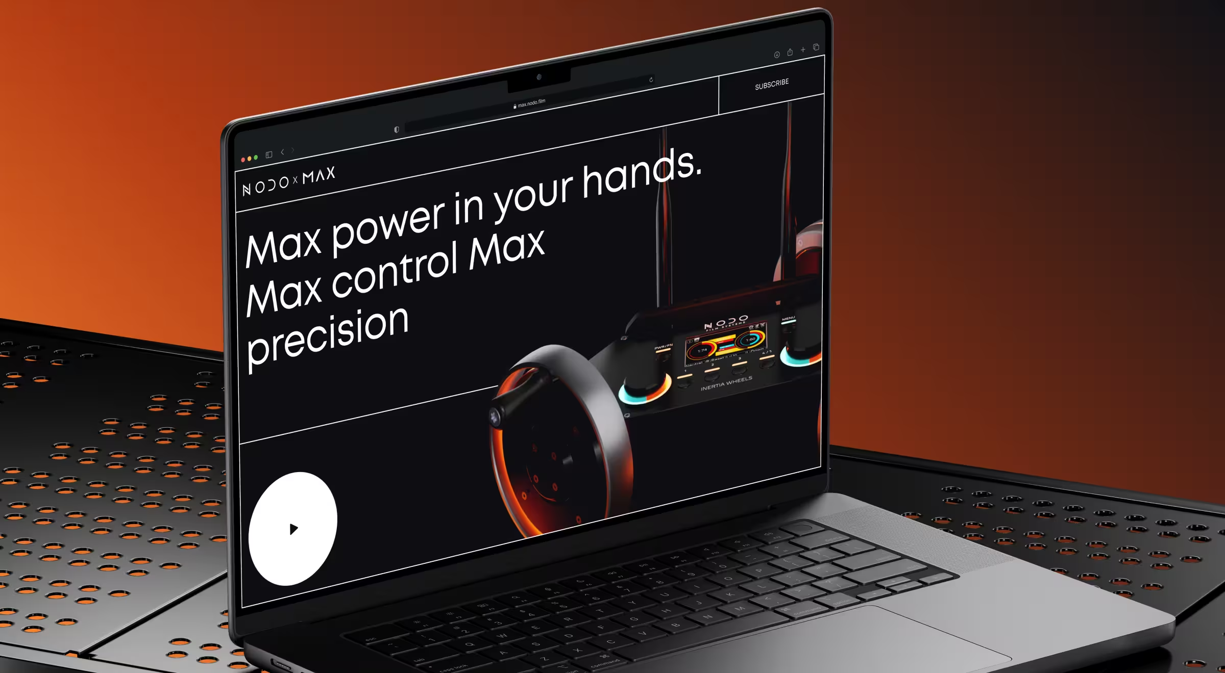
- Practical example from Lazarev.agency: With NODO Film Systems, we designed a story-driven website that mirrors the high-end nature of NODO’s camera control technology. Motion and 3D visuals collide so visitors can feel the product. The site unfolds like a hands-on demo and reflects the film industry’s obsession with precision. Within the first month, the website generated 160 waitlist sign-ups for Inertia Wheels MAX, 41% of them from completely new customers, and increased NODO’s email audience by 8%.
13. Animated UI
Animated UI uses motion to explain structure, hierarchy, or transitions.
- Possible variations in digital products: Purposeful animations that reinforce the product’s value proposition or guide attention.
- When this feature makes sense for you: When the elaborate nature of your product needs a visual medium to be explained.
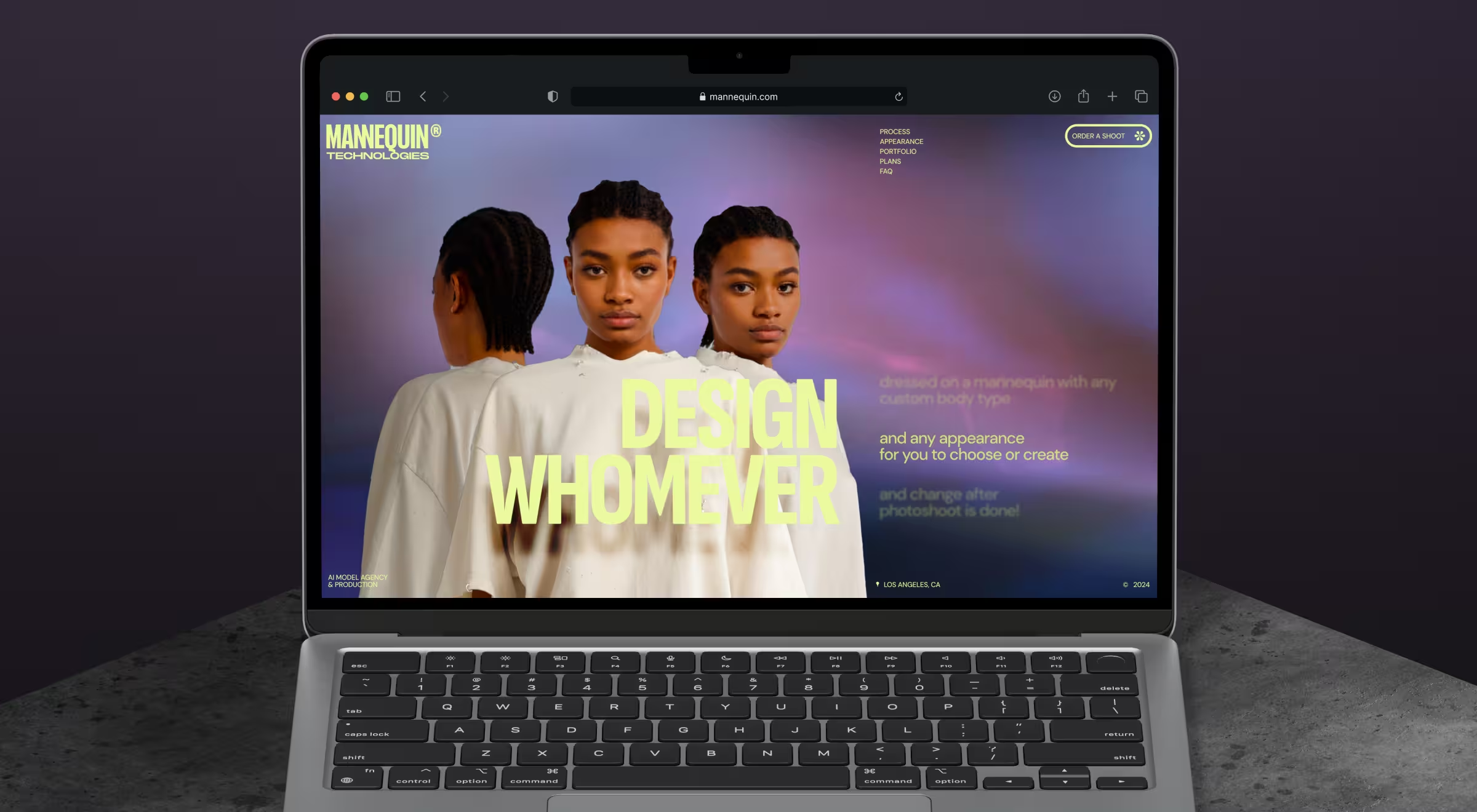
- Practical example from Lazarev.agency: In Mannequin, animated UI explains how real garments adapt to AI-generated models across markets. We used parallax scrolling transitions, storyboard-style section changes, and subtle animations to show the technology at work. Movement guides attention, reveals hierarchy, and makes it immediately clear what’s real, what’s AI, and how the system works.
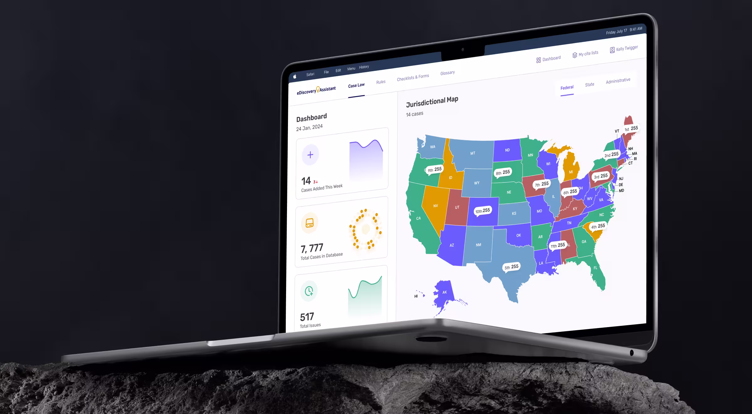
14. Structured information architecture
Structured IA organizes content so interaction feels predictable and intuitive.
- Possible variations in digital products: Clearly layered content systems with logical grouping and progressive disclosure.
- When this feature makes sense for you: When your product handles multiple information layers or elaborate workflows.
- Practical example from Lazarev.agency: With eDiscovery Assistant, we reorganized thousands of court decisions, rules, checklists, and glossaries around lawyers’ professional mindset. Content was grouped logically, and progressive disclosure allowed users to go from overview to detail in a few clicks. As a result, research time dropped by 75%, relevant cases became accessible in under 2 minutes instead of 45, and the redesigned platform supported a $400K recovery for a client.
Which interactive design elements will work best for your product?
Not all interactive sites need dashboards, animations, chat, filters, and gamification stacked on top of each other.
The hidden challenge in interactive design is choosing the right interaction for your users, your market, and your product maturity.
Fortunately, there is a practical way to narrow down interactive elements that will work best for your business. Below is a framework we use to make grounded design decisions.
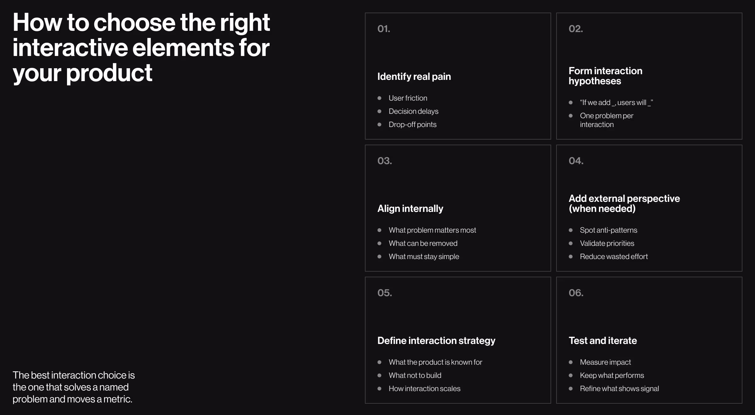
1. Start with user and market research
Before sketching interactions, get clarity on two fronts:
- User research: Identify real pain points and decision bottlenecks. Where do users hesitate? Where do they drop off? What do they repeatedly ask for? Collect user feedback through interviews, session recordings, usability tests, and support tickets.
- Market research: Consider how leading products in your niche solve similar problems to understand what has already become baseline and where interaction is used as a competitive advantage.
🔍 For a deeper dive, check out our article on what makes UX research and market research different.
⚡Pro insight: Interaction should respond to a problem you can clearly name. If you can’t articulate the pain, you don’t need the feature (yet).
2. Translate insights into interaction hypotheses
Once patterns are clear, turn them into simple hypotheses:
- H1: If we add guided filters, users will find relevant results faster.
- H2: If we personalize dashboards, repeat users will engage more often.
- H3: If we introduce micro-feedback, users will feel more confident completing actions.
⚡Pro insight: This step matters because it views interaction as an intentional framework.
3. Run focused internal design sessions
If you have in-house design capability, use it strategically. Focused design workshops work better than endless comments scattered across team inboxes.
The goal here is alignment:
- What problems are we solving?
- Which interactions support those problems?
- What can we simplify or remove?
⚡Pro insight: Good interaction decisions often come from subtraction.
4. Bring in external design specialists
At a certain point, especially with data-heavy, AI-driven, or multi-user products, an outside perspective pays off fast. Outsourced design partners can:
- Spot interaction anti-patterns early.
- Pressure-test your assumptions.
- Help prioritize features based on impact.
⚡Pro insight: This is about borrowing pattern recognition from teams that have seen similar problems play out dozens of times.
5. Set a clear interaction strategy aligned with your product vision
Every interactive element should answer one question: How does this support the product vision?
A clear strategy defines:
- What kind of interaction should your product be known for (guidance, speed, control, immersion).
- What not to add, even if it looks impressive.
- How interaction scales as the product grows.
⚡Pro insight: Without a clear strategy, interaction becomes inconsistent, and users feel it.
6. Test, learn, and iterate
Interactive website design is an evolving system. Always test assumptions with:
- A/B experiments.
- Feature-level analytics.
- Qualitative feedback.
⚡Pro insight: Keep what performs well and refine what shows promise.
Ensure interactive design works in your favor with the right web design partner
Interactive website design must be intentional. When interactions are chosen through research, strategy, and testing, they accelerate business growth and make your product feel like a system that truly understands its users.
At Lazarev.agency, this is exactly what we do through a focused set of services built around outcomes:
- Digital product design to crystallize your product’s unique value proposition.
- AI consulting services that make intelligence usable.
- Website redesign for products that need a tangible performance boost.
- Responsive web design services built for real-world usage.
If you want to see these principles in action, get in touch. We’ll help you choose the right design solutions for your product and turn them into interactive experiences that drive results.


.webp)


.avif)