

Think UX doesn’t drive sales? Think again. When exploring how to increase online sales, most businesses bet on product launches, discounts, or chasing new audiences. But there’s a smarter, lower-risk move they often miss: UX design.
Nail the experience, and you can turn more visitors into loyal buyers without slashing prices or reinventing your product line.
Key takeaways
- Better UX alone helped our clients drive up to $1B in sales.
- Swapping clutter for videos and clean design makes products easier to understand and faster to buy.
- Tiny UX tweaks like faster load times and price alerts turn browsers into buyers.
How redesigns drove sales for our clients
Amazon once calculated that a mere 100 ms delay in page load could shave off 1% of its revenue. But what about businesses that don’t have Amazon’s scale? Can a stronger UX really move the needle for them, too?
Short answer: absolutely. Here’s proof from our recent projects:
- Riptide pulled in $500,000 in sales just one month after redesign.
- Upfeed saw a 4x boost in B2B lead conversions.
- Fujiwara Yoshi, a Japanese restaurant, tripled its revenue.
In all these cases, there were no changes made to the core business strategy, product, or pricing. It was only the UX design that got fine-tuned.
Let’s break down what made these transformations stick.
Top design strategies to increase online sales
Riptide case
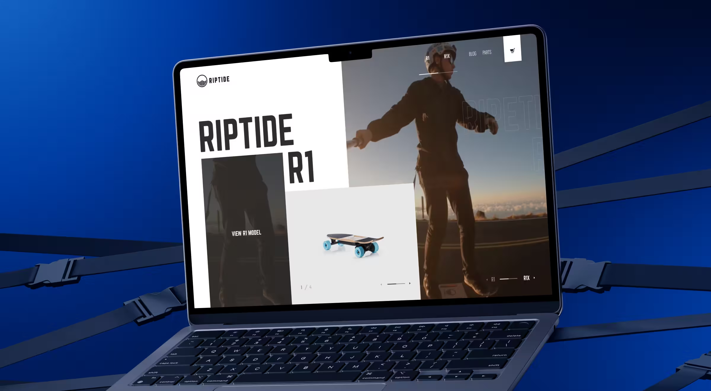
Riptide, an e-commerce platform, came to us just before kicking off their New Year’s sale. With online shopping booming during the pandemic, they knew their digital experience needed a serious upgrade. Their electric skateboards had all the right features, but sales were still lagging. So, we helped them reimagine the online customer journey, and it paid off. Over the Christmas season alone, Riptide moved $500,000 worth of scooters.
Here’s what we suggest doing:
Use videos to showcase the product
One of the first things we did for Riptide was swap out static product shots for motion videos. Seeing the skateboards in action instantly grabbed attention and showed off their capabilities far better than any photo could.
And this doesn’t just apply to skateboards. Research from TechSmith found that 83% of customers prefer video over audio or text when learning about a product. Motion draws the eye. A quick video at the top of the page answers questions on the spot (“Can this board handle my tricks? Looks like it can.”), and helps viewers picture themselves using the product.
When people relate to what they see, they’re more likely to hit “Buy” and leave positive reviews afterward. That’s why product videos remain one of the most effective tools for driving online sales.
Visualize more
Most e-commerce homepages try to say everything at once and end up overwhelming visitors. We see simplicity as a core sales strategy.
We restructured Riptide’s product pages, leading with strong visuals supported by concise, purposeful text. Less noise, more impact.
Break checkout into small steps
Long forms scare people off, even if they’re sold on the product. At checkout, that hesitation can mean lost revenue.
So for Riptide, we redesigned their flow to ask for just one or two fields per step. This approach sped up purchases and kept users moving forward, one easy click at a time.
Redbrain case
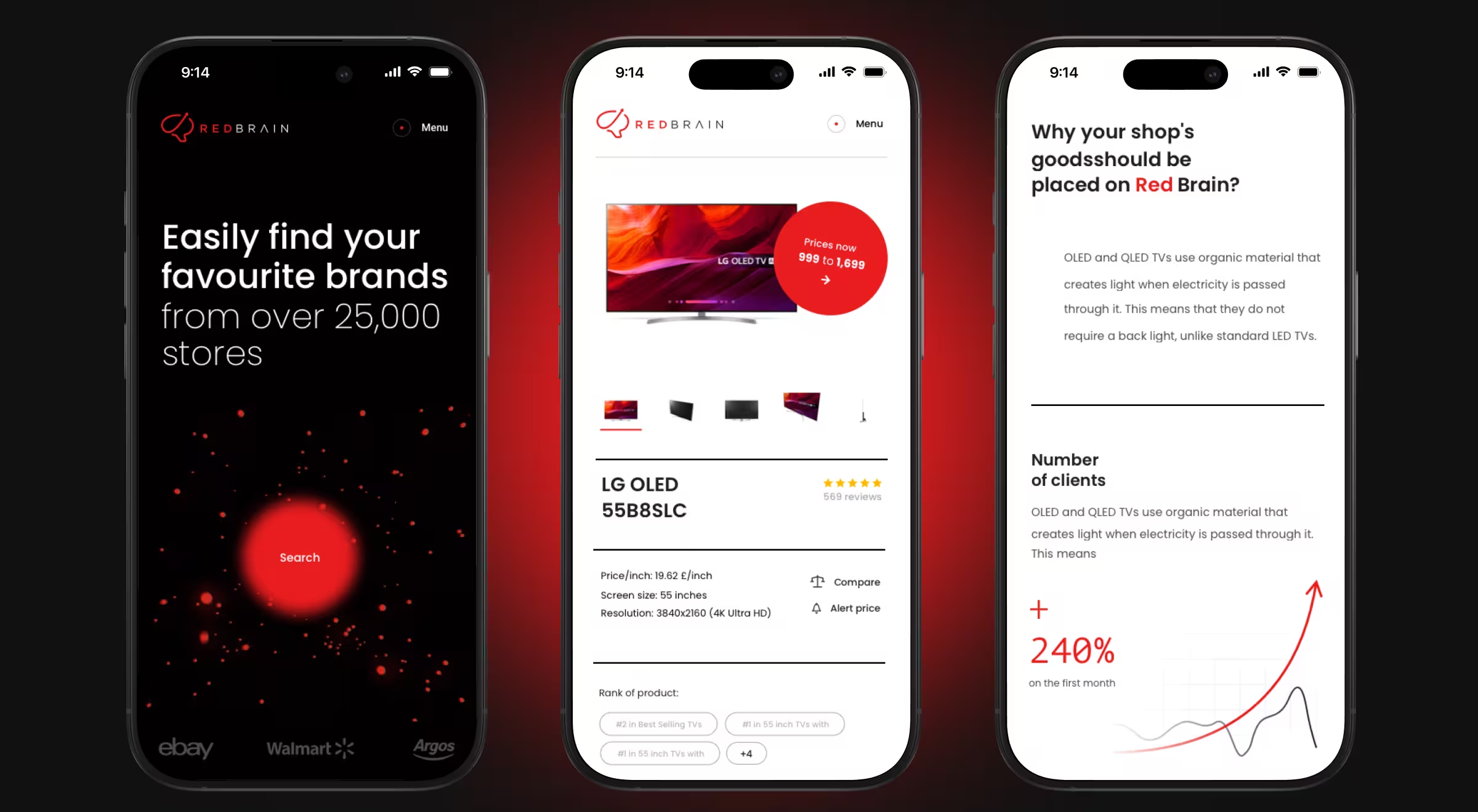
Redbrain connects shoppers to the best deals. But to turn one-time buyers into loyal fans, they needed more than just great prices. Loyalty programs and social engagement were doing their part, but it wasn’t enough.
So they brought us in to build an online hub that could supercharge customer retention and boost sales. After the redesign, Redbrain crossed $1 billion in incremental sales.
Here’s what you need to focus on:
Optimize for mobile
A lot of people are shopping from mobile devices, which makes mobile optimization a must for everyone thinking of how to improve sales. Our first step was to craft a responsive design for the Redbrain platform.
The redesigned, mobile-friendly experience drove higher conversions from smartphone users compared to desktop users. Beyond the numbers, a smooth mobile journey builds trust showing customers the brand is serious about delivering a reliable, user-friendly shopping experience wherever they are.
Feature one offer at a time
Many e-commerce sites overload visitors with endless hot offers, and end up pushing them away. When too many options compete for attention, users get overwhelmed and bounce without buying.
For Redbrain, we flipped the script. Their product pages now spotlight a single, tailored offer at a time, aligned with their smart shopping mission. We also added price history and forecasts, so customers can decide exactly when to buy. More clarity, greater confidence, and increased conversions.
Enable discount notifications
Everyone loves the thrill of catching a time-limited deal. To spark more of those moments and boost sales, we built a Price Alerts feature for Redbrain. Shoppers can activate alerts for any product and get notified as soon as the price drops or a sale kicks in.
Discount notifications like these are surprisingly rare in e-commerce, even though they’re among the most intuitive ways to increase online sales. By rolling them out, Redbrain gained a clear competitive edge and moved more discounted products than ever. Plus, promoting these alerts through social channels helped drive even stronger engagement and discovery.
What else does it take to increase online sales?
For Riptide and Redbrain, we ran deep UX audits and multiple testing rounds to see what resonated with their audiences. Every business is different, and its UX should be, too.
But what if you’re just getting started, with no budget or time for exhaustive testing? Are there quick wins to boost sales?
While there’s no universal blueprint for how to improve sales through UX design, we’ve seen certain strategies deliver solid results time and again, for businesses of every size. If you can only prioritize a few changes, these are worth your focus.
And remember: smart UX doesn’t just drive more purchases; it can also lift your average order value through thoughtful upselling and cross-selling.
Put key actions into buttons and headings
Don’t make visitors hunt through menus for what you want them to do. Whether it’s “Buy Now,” “Request a Demo,” or “Get a Quote,” these actions should stand out in your navigation or as obvious, accessible buttons.
Add more white space
White space draws attention to the most important elements, whether that’s your product image, a CTA button, or a price. Crowded pages dilute attention, making people confused and more likely to bounce.
By the way, the term “white space” is somewhat misleading. Actually, the space on your website can have any other color. As long as it’s blank, it still qualifies as white space.
Autofill the forms
No one likes typing the same details over and over, especially on mobile. Things like city or state can easily be auto-filled using your visitor’s IP address. It’s a small touch, but it makes the checkout feel smoother and faster.
If you feel your current design isn’t pulling its weight, even small changes like this can help. And if you want a clear view of what to fix and where to start, a professional UX audit can reveal exactly that.
Speed up your site
Online, speed is everything. Even a slight delay can cost you the sale. That’s why your site should load in under 2-3 seconds. Start with a lightweight, responsive design. Use modern frameworks, compress your images, and clean up bloated code.
“Performance is part of your brand. If your site feels slow, people assume your product is slow too.”
{{Oleksandr Holovko}}
Don’t forget visual clutter can slow things down too. The white space mentioned above not only improves load time but also gives users a calmer, more focused experience.
If you’re a SaaS business, this might look like an onboarding flow that loads instantly and feels effortless to complete. The faster the experience, the lower the bounce rate and the higher your conversions.
Final thoughts + checklist
Increasing online sales doesn’t always require big campaigns, new products, or aggressive discounts. Sometimes, the answer is already right in front of you — in the way your website works, feels, and guides people to take action.
Great UX design is about helping your customers move forward without hesitation. Whether that means loading faster, making a purchase flow easier, or simply giving people a reason to trust you, design has the power to do all of it.
Every tweak you make adds up. And if done right, it doesn’t just look better. It sells better.
So, if you’re looking for a place to start, here’s a quick checklist of design principles proven to drive sales:
✅ Mobile-first, responsive layouts
✅ Fast page load times (under 2–3 seconds)
✅ Clear, visible calls-to-action
✅ Product videos instead of static images
✅ Blended visuals with concise, focused text
✅ Step-by-step progress-based checkout
✅ Discount and price-drop notifications
✅ Smart upselling and cross-selling
✅ Ample white space to direct attention
✅ Trust signals like reviews and security badges
Take a look at your current site. Which of these are you already doing well, and where could small changes unlock bigger results? The answer to higher sales might be just a few clicks away.


.webp)


.avif)


