When you think of e-commerce success stories, Nike is one of the companies that instantly comes to mind. Sure, Nike is a household name. But what truly sets it apart isn’t the product alone. It’s the highly personalized digital experience that feels both effortless and intentional.
In this article, we discuss popular e-commerce sites that get UI/UX design right, break down the fundamentals of results-driven design for retail, and share a practical case of effective website revamp by Lazarev.agency.
This guide is for online retailers launching their e-commerce stores and founders, designers, and managers of established online brands ready to scale.
Key takeaways
- E-commerce is the new retail standard: Online retail is growing, with e-commerce sales expected to surpass $4.3 trillion by 2025.
- Personalization boosts performance: AI-powered recommendations, dynamic product previews, or any other form of personalization turns high-intent visitors into loyal buyers.
- Frictionless mobile UX wins: With 80% of retail traffic coming from mobile users, responsive design is non-negotiable for conversions.
Why smart e-commerce design matters for your online brand
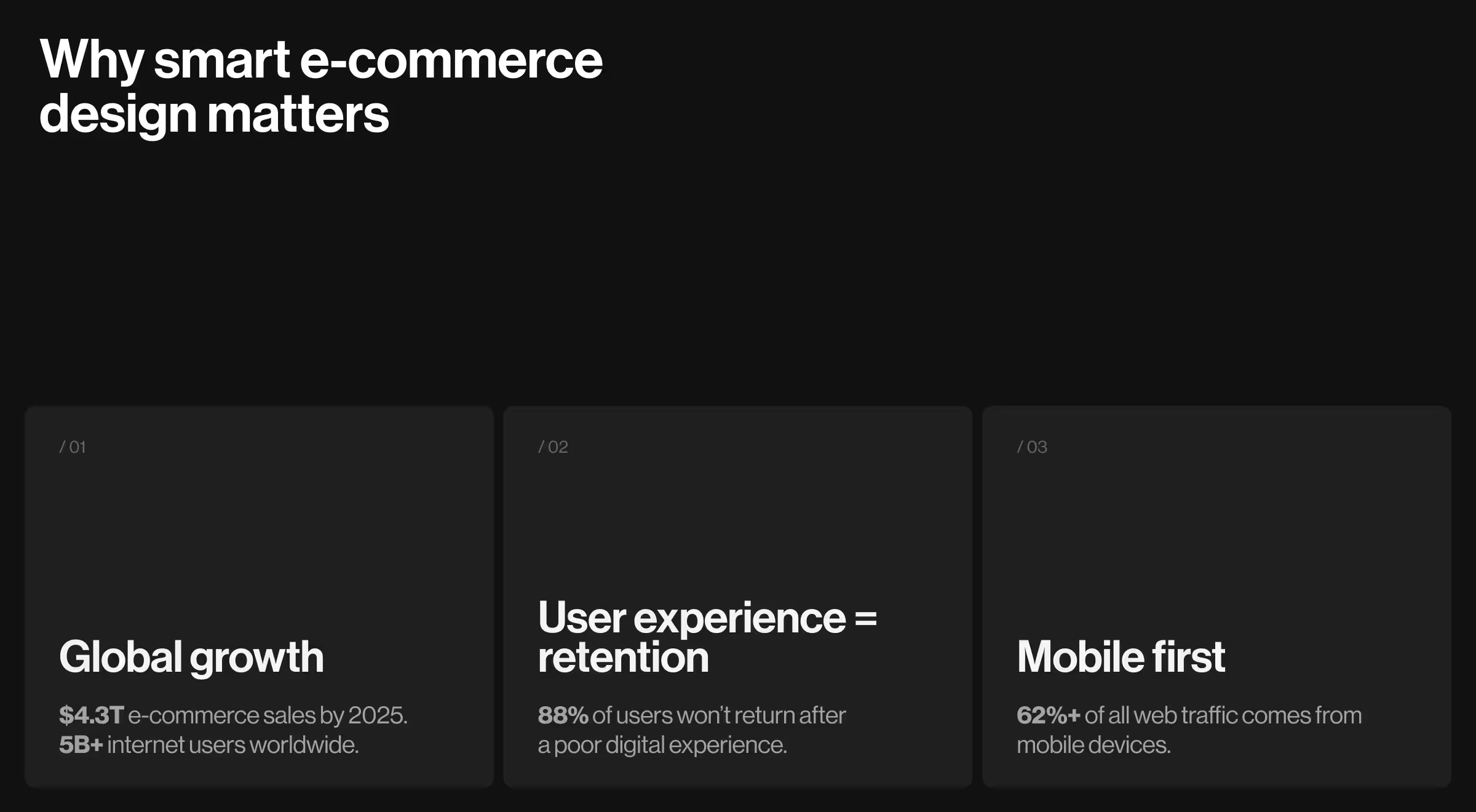
The global retail industry shifts online at light speed, with e-commerce sales expected to surpass $4.3 trillion by 2025. In the years ahead, the figure is likely to advance. With over 5 billion internet users worldwide, building user-friendly and innovative e-commerce sites is key to winning customer loyalty in online retail.
Innovative e-commerce websites define business success. And there’s data to back this up.
- Poor digital experience = lost clients: 88% of users won’t return to the website after a frustrating experience.
- Optimization for mobile drives leads: Over 62% of global web traffic comes from mobile devices.

UX strategies from top 10 innovative e-commerce websites
Great e-commerce experiences are never accidental. Smooth navigation, persuasive design, and smart branding all play their part. Here’s our take on who’s nailing it right now.
While some platforms lead in specific UX categories, each site reflects unique design solutions in how it guides visitors, displays products, and conveys brand values.
Gymshark
Gymshark’s UX strategy blends energetic branding and functional design. Below are a few principles the brand implements.
- Media-rich interface to foster engagement.
- Hover-enabled product tiles to boost browsing interactivity.
- Sticky gender filters and curated collections to tackle friction in product discovery.
- Coherent PDPs to offer detailed descriptions, fit guides, pricing, and customer reviews without overwhelming the screen.
Gymshark’s digital presence reflects the principle that aesthetics support performance. Bold typography and high-contrast visuals mirror the brand values and fitness-driven vision. A sharp visual hierarchy encourages users to transition from exploration to action in a matter of seconds.
“What’s quietly impressive is the brand’s integration of digital ecosystem elements like the training app. However, personalization still feels surface-level. Deeper AI integration based on user behavior and identified preferences could strengthen Gymshark’s UX.”
{{Anna Demianenko}}
Allbirds
Allbirds merges minimalist style with discipline, driving a relaxed, product-first experience. Here’s what sets it apart.
- Visually uncluttered background achieved by generous white spaces and soft color schemes to encourage browsing.
- Spot-on navigation with main product categories (shoes, apparel, and bestsellers) accessible within one to two clicks.
The site’s strength is its strong value-driven messaging around sustainability. However, the limited personalization features hinder the platform’s scalability. From a UX perspective, deeper data-driven customization would refine the user experience and boost conversion.
Allbirds delivers a smooth shopping experience. The layout supports intuitive scanning, and access to payment gateways is friction-free. It’s a site optimized for clarity over conversion gimmicks.
Tonal
Tonal positions itself as a high-tech fitness solution platform, and its website reflects that ambition.
- Sleek UI: Sections like Smart Technology and Membership Benefits are laid out with modular precision.
- Linear product discovery flows: Users can explore benefits through animated UI, interactive demos, and scroll-triggered transitions.
- Persuasive social proof: Dissemination of social proof, a common trait among successful e-commerce examples, is evident across multiple formats. Customer videos, press excerpts, and quantified progress stats all create credibility through variety.
Nike
Nike is one of the best e-commerce websites with a well-designed modular UX. Here’s why:
- Structured navigation: Users have the option to shop by activity, demographic, or brand collection with equal ease.
- Clear visual hierarchy: The interface accommodates deep inventory through a clear visual hierarchy without compromising scanability.
- Intentional information architecture: Consistent layout grids, collapsible filters, and progressive disclosure patterns contribute to a frictionless navigation.
- Clear localization: Global region selectors are intuitive and accessible, and language shifts don’t interrupt product discovery.
Personalization surfaces through tools like the Running Shoe Finder, which uses decision-tree logic based on AI-powered recommendations. Product detail pages integrate media (videos, athlete stories, and customer feedback) to create a hybrid of commerce and content.
MADE
MADE’s interface feels like an interactive magazine. Each landing page functions like a catalog spread. Room-based navigation, catalogue-like layouts, rich visuals, and content-driven hierarchy all contribute to a more curated experience.
MADE encourages deeper engagement by combining product carousels with contextual filters. It’s a strategic move bestowing creative flexibility upon website visitors.
Site’s navigation relies on such key elements as:
- Self-explanatory menu items
- Consistent filters
- Clearly labeled CTAs
- Cross-category paths
- Helpful UX modules like Favourites List and Recently Viewed
MADE pays thoughtful attention to logistics. Shipping costs, delivery timelines, and promotional bundles are easy to track down. While microinteractions are minimal, the site’s strength lies in reducing browsing friction without compromising aesthetic appeal.
Warby Parker
Warby Parker is an eyewear brand that excels in combining sleek design with augmented reality (AR) to let customers enjoy a curated try-on experience online.
Below are the key innovative features that set this website apart.
- Curated virtual try-on: It allows users to see frames on their faces, which, in turn, tackles purchase hesitation.
- Clean navigation: The easy-to-find product categories enhance product discoverability.
Zappos
Zappos’ functional layout and vibrant calls-to-action integrate utility into a highly approachable vibe of the company’s digital presence.
- Robust filters: Users can explore products by size, style, brand, and price.
- Detailed product pages: Extensive reviews and Q&A sections boost buyer confidence.
- Personalized experience: Dynamic search suggestions anticipate user intent and accelerate product discovery.
Glossier
Glossier is an example of community-driven branding done right. The site leverages user reviews, social proof, and minimalistic design to build a loyal customer base.
- Intuitive navigation: The site highlights bestsellers and new arrivals, which makes shopping feel more curated.
- User generated content (UGC): The platform uses UGC as social proof of its community engagement.
- Mobile-first design: Responsive design ensures a smooth shopping experience on any device.
Reformation
Reformation is a fashion brand that integrates sustainability into every part of its customer journey. Its e-commerce experience blends environmental transparency and thoughtful microinteractions to resonate with eco-conscious and fashion-forward shoppers.
- Carbon footprint per item: Each product displays its environmental impact (e.g., water saved) to testify to the brand’s sustainability promise.
- Smart size guidance: Shoppers see model height, fit notes, and personalized sizing tips, reducing uncertainty and returns.
- Microcopy with personality: Product and cart pages include playful, branded language that keeps the tone light but informative.
"Reformation’s UX proves that sustainability and style don’t have to compete. It’s a best-in-class example of how ethical values can be communicated through interface design."
{{Oleksandr Koshytskyi}}
Sephora
Sephora is a leading beauty retail platform that makes navigating its vast inventory easy with properly integrated UX/UI features.
- Interactive virtual try-on: Users can leverage virtual try-on functionality before committing to a purchase.
- Comprehensive filters: With filters like ingredients, cruelty-free options, and product benefits, users can narrow down their sought-after options and find the right items much quicker.
- Rich editorial content: The website boasts multiple expert tutorials, proving that educational content is feasible for e-commerce.
What the top e-commerce brands taught us about great UX

The above analysis of some of the best e-commerce platforms shows that building a high-converting e-commerce site is a matter of thoughtful design, strategic planning, and expert execution.
An online retail platform has as little as a few seconds to make a lasting impression. In an ecosystem where options are abundant, businesses must offer value straight away.
💡Key insight: An average user spends less than a minute browsing a website. This means every design element must communicate value. A site featuring a clear value proposition can hold users’ attention much longer.
But here’s the reality: there isn’t one magic feature that guarantees success. What sets top innovative e-commerce sites apart is a smart blend of strong design principles and innovative tech geared toward delivering the best user experience.
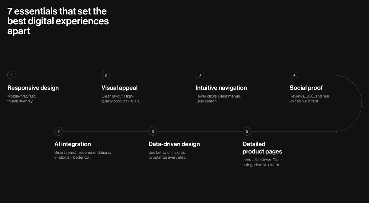
Below is a curated list of key elements that distinguish the best e-commerce websites.
Feature 1. Responsive design
Mobile users drive sales. In 2025, close to 80% of all retail traffic came from smartphones. Moreover, the majority of e-purchases come from mobile devices as well. If you overlook mobile optimization for your e-commerce site, you turn potential customers away and miss out on great sales opportunities.
A responsive e-commerce site needs to feel right on every device. Focus on thumb-friendly CTAs, adaptive loading speeds, and swift transitions between pages to streamline the e-commerce journey across devices.
Feature 2. Visual appeal
Aesthetic preferences differ across users. Still, some steps are infallible in boosting the visual appeal of your online store.
- Premium-quality visuals: High-quality photos on a minimalistic background let customers focus on the product.
- Disciplined color scheme: Consistent colors and fonts create a clean look. It’s always safe to aim for a visual rhythm that supports browsing without distraction.
Feature 3. Intuitive navigation
When it comes to a site’s navigation, the goal is to help users find what they need with minimal effort.
“You don’t lose users because the product is bad. You lose them because it demands too much. The moment it takes effort, they’re gone.”
{{Oleksandr Koshytskyi}}
The navigation hierarchy should be clear. Keep the menu, on-site search bar, filters, website footer, and checkout page straightforward. Minimize the number of clicks it takes to reach any product or page.
Remember: the fewer the steps to complete a desired action, the better the user experience.
Feature 4. Social proof
Design can’t fake trust. It can amplify it. User-generated сщтеуте (UGC), testimonials, and feedback from existing customers build credibility. Encourage your target audience to share their feedback across social media platforms and feature their insights on your website as social proof.
Feature 5. Detailed product description
Constructing a product page that’s both informative and uncluttered is a common UX challenge. Well-designed product pages often feature the following elements:
- Extensive range of high-quality product photos
- Interactive 360° product views and zoom-in functionality
- Clear product categories and breadcrumbs
Feature 6. Data-driven insights
When data drives the design, every interaction becomes an opportunity to grow. A data-informed e-commerce site learns from its users. Integrating analytical e-commerce solutions from Google Analytics, Hotjar, and Mixpanel helps track bounce rates, scroll depth, user click patterns, and conversion drop-offs.
Feature 7. AI integration
AI takes e-commerce to the next level by making every interaction with your website smarter.
“AI gives us a powerful opportunity to design more inclusive, intuitive products — but only if we build it responsibly.”
{{Oleksandr Koshytskyi}}
Looking for ways to leverage AI solutions to enhance user experience, streamline operations, and boost online sales? These are the key areas worth strengthening with AI, as seen in many innovative e-commerce examples:
- Personalized product recommendations
- AI-powered search and filtering
- Dynamic pricing
- Automates customer service using chatbots and virtual assistants
How Lazarev.agency redesigned Redbrain’s UX
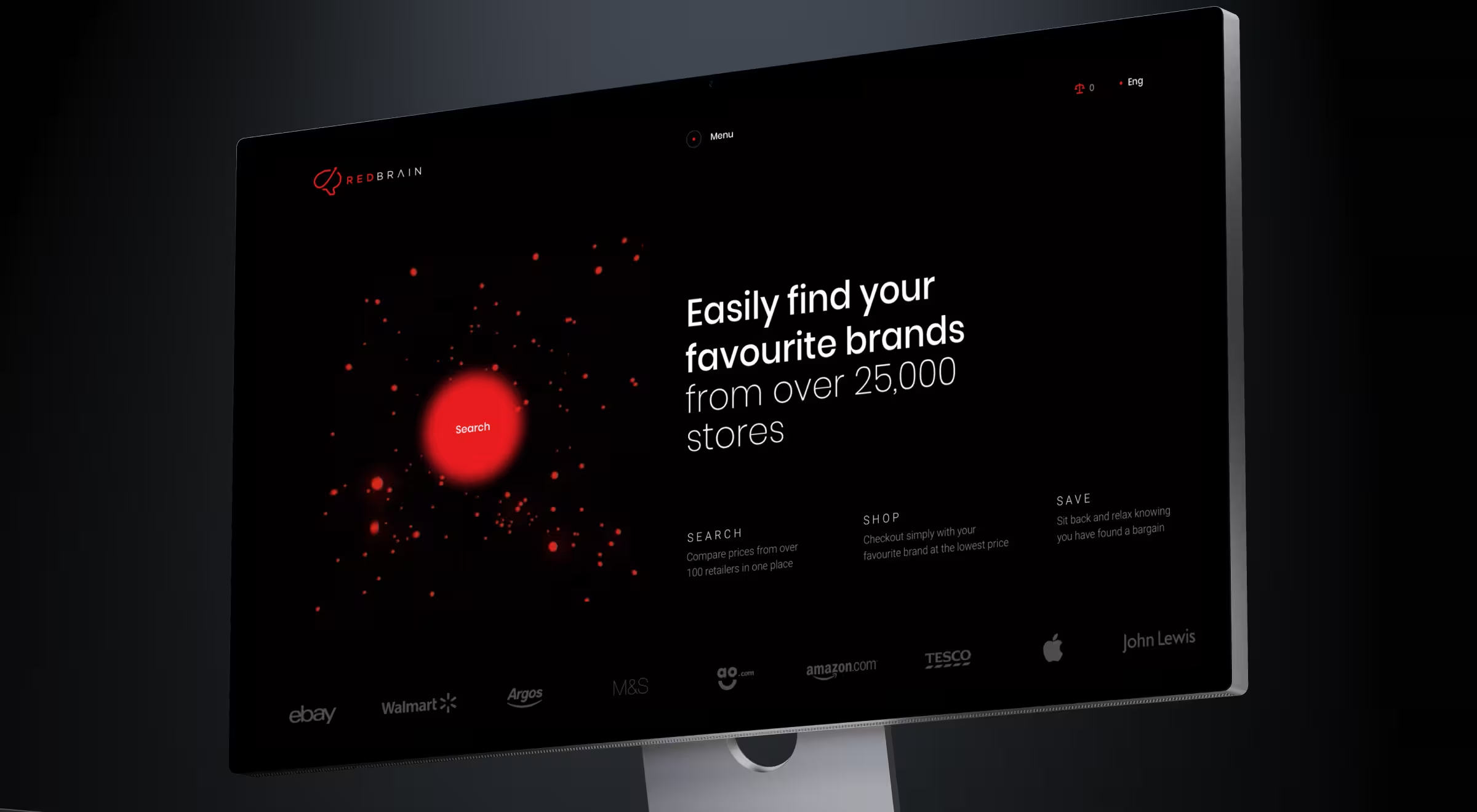
Lazarev.agency translated design thinking into actionable strategy for Redbrain — a retail tech startup striving to become a matchmaker between online retailers and their target audience.

Here’s what our team did:
- Enabled search-led navigation
- Designed a deal-driven homepage
- Made the catalog design more personalized
- Focused on responsive design
- Integrated price alerts and comparisons as interactive UX features
Let’s take it one step at a time.
Aligning user intent with retail performance was the key objective of our collaboration. From the outset, our team recognized that Redbrain’s brand value lies in connecting high-intent shoppers with competitive retail offers. That said, Lazarev.agency helped design a discovery-driven platform that simplifies decision-making while amplifying conversion.
The starting point was optimizing the search experience. Our team implemented bold visual cues, like a bold red accent around the Search button, to draw attention and guide visitors toward exploring the product catalog. Homepage modules now feature retailer deals, with a special focus on discounts and trending products to trigger engagement from the first interaction.
“Personalization lies at the core of Redbrain’s new catalog interface. Advanced filters and adaptive product sorting functionality enable users to narrow down their options and focus on items that align with their preferences most. A key innovation here is the dynamic sizing of preview tiles. Now, products most relevant to a user’s search intent appear larger, thus driving attention and clicks.”
{{Anna Demianenko}}
On the product page, content and commerce become one. Anchored imagery, persistent price offers, and actionable features like Price Alerts and side-by-side comparisons reinforce Redbrain’s dedication to intelligent shopping. Plus, prioritizing responsive design ensured native performance across mobile, tablet, and desktop.
Ultimately, our team’s digital solutions advanced Redbrain into a high-converting ecosystem where retail opportunity meets evolving user expectations.
Have an e-commerce project in mind?
The right e-commerce platform is key to driving online sales. At Lazarev.agency, we know how to optimize your funnels, boost customer satisfaction, generate leads, and optimize your website’s functionality and aesthetic appeal.
Contact Lazarev.agency for custom solutions tailored to your business needs and goals. Let’s build a strategy that converts and sets your e-commerce store apart.


.webp)


