Modern product teams can’t afford guesswork.
SolarDrive, USA’s nationwide solar‑installation provider, was juggling 5 disjointed platforms until duplicate data entry alone burned 2.4 hours of every employee’s day. Lazarev.agency rebuilt the workflow around a single platform, slashing waste and doubling daily client capacity within one quarter.
Wanna know how?
Here’s the 6‑phase UI design process and the UI development discipline behind it that made things possible.
Key takeaways
- Evidence > aesthetics. Each phase ships a testable artifact, so metrics steer scope.
- Design system first. Token‑driven components let devs ship faster and maintain consistency across releases.
- User flows are currency. Mapping the end‑user’s interaction prevents scope creep and aligns every sprint.
- Spot risks early, slash rework. Watch‑outs at every phase, flag hidden costs before they snowball.
What is the UI design process?
The UI design process is a structured framework for turning business and user needs into usable, visually coherent interfaces. It guides how teams move from problem discovery to polished interaction design balancing function, clarity, and aesthetics.
In essence, UI design defines how users interact with a digital product. It ensures that every button, color, and layout choice helps people complete their goals easily and intuitively, while maintaining visual consistency and brand identity.
The six phases most mature teams follow
While teams adapt the details to their product and organization, an effective UI process typically unfolds across six iterative stages:
- Discovery — align on goals, define success metrics, and gather user insights.
- Information architecture — organize navigation and data flow so users always know where they are.
- Wireframing — explore layouts and interaction logic before committing to visuals.
- Visual design — apply grids, typography, and color systems to create hierarchy and consistency.
- Prototyping and validation — simulate real interactions, test usability, and refine based on feedback.
- Handoff and continuous improvement — prepare assets for development and monitor performance post-launch.
Each phase informs the next in a continuous feedback loop — discovery clarifies goals, testing validates assumptions, and metrics drive ongoing iteration. The process evolves with the product, ensuring design remains grounded in evidence rather than intuition.
Why it matters
A disciplined UI design process transforms creative work into operational advantage. It allows teams to move faster, reduce friction, and maintain quality as the product scales.
When applied consistently:
- Interfaces stay predictable, even as complexity grows.
- Design and engineering stay aligned through shared systems.
- Every design decision contributes to measurable outcomes like conversion, retention, or efficiency.
Ultimately, the goal of the UI design process is to make digital experiences intuitive, scalable, and measurable so that design directly supports business growth.
UI vs UX design process — how they work together
While UI and UX are closely connected, their processes focus on different layers of the same goal: creating digital products that are both useful and usable.
Understanding where each begins and ends helps teams structure collaboration, prevent overlap, and maintain design consistency as products scale.
The UX process defines what to build and why
The UX design process centers on understanding user behavior, context, and motivation. It asks questions like:
- What problems are users trying to solve?
- What information or actions do they need first?
- What stands in the way of their goals?
UX designers translate these insights into flows, wireframes, and content hierarchies that define the logic of interaction.
Their process often includes:
- Research — user interviews, analytics, and field studies.
- Synthesis — creating personas, user journeys, and problem statements.
- Structure — information architecture and low-fidelity wireframes.
- Validation — testing assumptions before any visual design begins.
The outcome of UX design is a functional skeleton — the blueprint for how a system should behave.
🔍 Read more about UX design process here.
The UI process defines how users interact with it
The UI design process takes that blueprint and turns it into a tangible experience. It decides how actions appear, how feedback is delivered, and how each element visually guides the user through a task.
Its process includes:
- Visual hierarchy and layout — determining placement and emphasis.
- Design systems and components — ensuring consistency and scalability.
- Microinteractions and states — providing feedback and preventing user error.
- Accessibility and responsiveness — ensuring usability across devices and abilities.
In essence, UI design gives form to the function UX defines.
The overlap — one continuous loop
The best teams treat UI and UX as a single iterative process.
UX informs UI through user understanding and structure; UI validates UX by revealing how those ideas perform in real interaction.
Prototypes, usability tests, and post-launch analytics form a feedback loop where design continuously improves based on data and behavior.
Teams that work this way avoid the classic silo problem — where UX hands off wireframes and UI “paints over” them. Instead, both roles collaborate from discovery to delivery, ensuring that strategy, interaction, and aesthetics all serve the same outcome: clarity, efficiency, and emotional resonance.
Does a lean UI design process really boost growth? Forrester, Deloitte, and McKinsey say yes
Independent research from three leading firms confirms that mature UI design processes translate into hard‑number business wins:
- Forrester, 2024: Customer‑obsessed companies see 41% faster revenue growth and 51% higher retention than their peers.
- Deloitte, 2025: Shoppers who enjoy positive experiences spend 140% more and stay loyal for five years longer than those with negative interactions.
- McKinsey, 2018: Design‑centric firms achieve nearly double the revenue growth of industry competitors.
Which leads us to the conclusion: teams that systematize UI early outpace rivals in growth, time‑to‑market, and product stickiness, turning UI design into a strategic advantage.

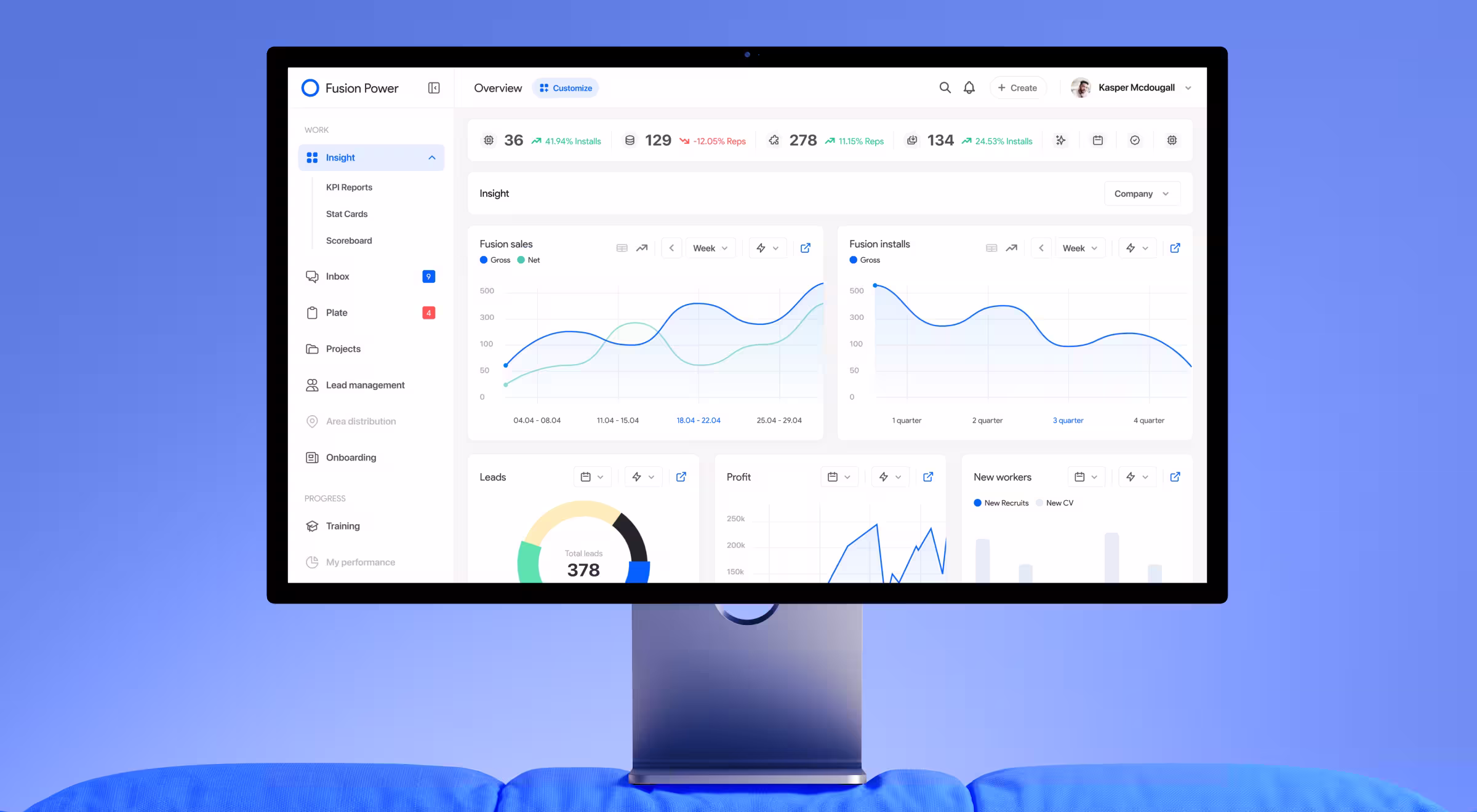
SolarDrive’s team approached us with three critical pains:
- Fragmented communication. Permit discussions and site‑survey updates bounced between email threads, messengers, and SMS. We built an Inbox that pulls every message into one place and lets the team filter by project or workflow stage.
- Slow onboarding. New hires needed a week to learn five different dashboards.
- Revenue drag. Duplicate entries and status calls capped daily installs.
Our remedy: one design system powering a unified platform, backed by a six‑step design process that marries strategy and execution.
Step-by-step UI design process with tips from Lazarev.agency
1. Discovery. Align goals and reality
Field interviews and process mapping revealed duplicate data re‑entry costing each employee about 2.4 hours every day. Field shadowing fed user research with real pain points.
We framed user interviews around the Jobs‑to‑Be‑Done lens to tie every pain point to a desired outcome.
✏️ Pro tip: Run a pre‑mortem survey 48 hours before kickoff. It flushes out “what could kill this?” fears early — an internal trick our design team swears by.
🔍 Watch out: Stakeholders debating scope in sprint 2 = revisit goals before code rewrites snowball.
2. Information architecture. Map the flow
Process mapping logged the same 2.4 h/day loss.
Redesign merged five tools into one platform featuring a simulated onboarding project, boards that auto‑sort tasks by priority & location, a single‑page interactive timeline, and an all‑in‑one inbox.
▶️ Tools used: Card‑sorting (OptimalSort), sitemap in Octopus, low‑fi wireflows in Figma.
✅ Outcome: One screen shows permits, tasks, and system status in real time.
🔍 Watch out: Over‑nesting nav trees. If users need a mini‑map, flatten the IA.
3. Wireframing. Risk reduction at low fidelity
Low‑fi Figma wires let the team create wireframes and test location‑aware filters with installers on iPads under glare, vital for a field‑heavy digital product.
✏️ Pro tip: Label UI components by intent (“Status/Error”) to avoid mismatched UI elements later in code.
🔍 Watch out: Ignoring edge cases (e.g., permit‑hold). Catch them now, not post‑launch.
4. Visual design. Work with concept and UI design development
An atomic design system with tokens previewed in Storybook keeps components consistent as the product scales.
“Every repeated token is compound interest: consistency today yields velocity tomorrow. When visual language is systematic, the interface vanishes and the business model takes center stage.”
{{Kirill Lazarev}}
🔍 Watch out: Polishing gradients before hierarchy. Form follows function and readability.
5. Prototype & validation
Click‑through prototypes covered the full “lead → install” flow. Usability sessions flagged a confusing label and prompted a fix before the dev sprint.
Figma’s new AI layout suggestions helped the team generate variant screens in minutes, speeding up iteration without diluting designer intent.
✏️ Pro tip: Pair each usability metric with business impact — execs fund fixes that tie to revenue.
🔍 Watch out: Living by SUS scores alone. Combine survey sentiment with task‑time data for depth.
6. Handoff & continuous improvement
Designers paired with engineers in Zeplin or Storybook; post‑launch dashboards now track user behavior against baseline KPIs.
A three‑minute Loom walkthrough accompanied each Zeplin spec, so devs could revisit design rationale on demand.
🔍 Watch out: Treating handoff as “done.” Until metrics hit targets, design owns the outcome.
Lean timeline — 5‑week example

What to watch out for across the process
Even a dialed‑in UI design process can drift off course if small warning signs slip past busy teams. The table below distills the 3 risk signals we see most often when scaling SaaS and ops‑heavy products like SolarDrive, plus the quickest way to steer the project back on track.
Think of these red flags as real‑time checkpoints. Spot one, loop back to the phase indicated, adjust scope or assets, and move forward before technical debt starts to compound.
Common mistakes in the UI design process
Even teams with strong design talent can lose efficiency when the process drifts off track.
Most issues don’t stem from poor visuals. They stem from weak communication, missing validation, or design debt compounding over time. Below are five recurring mistakes that derail otherwise well-run UI projects and how to prevent them.
1. Skipping user validation
Design decisions made without early feedback often look clean but fail in context. When usability testing is postponed until the end, teams discover friction only after development begins doubling rework and cost. Even lightweight validation, such as five-user click tests or internal pilot sessions, reveals misalignments before they reach production.
2. Over-designing too early
Pixel-perfect mockups before layout logic is proven waste cycles and blur priorities. A mature UI process starts lean: low-fidelity wires, content placeholders, and clear flows. Visual refinement comes only after the team validates structure and behavior. This sequencing keeps creativity productive rather than ornamental.
3. Ignoring technical constraints
Designers who craft outside the bounds of real data, API limits, or front-end frameworks create friction downstream. Tight collaboration with engineers during prototyping avoids expensive surprises later. Shared tools, component libraries, and short review loops ensure what’s beautiful is also buildable.
4. Letting component inconsistency spread
Untracked variations in spacing, color, or button states quietly build UI debt — and every sprint adds interest. A maintained design system, tokenized variables, and version control keep interfaces coherent across features and teams.
5. Treating launch as the finish line
Shipping isn’t the end of design; it’s the start of observation. High-performing teams pair every release with behavioral analytics, A/B tests, and qualitative feedback. Iteration based on live data turns design from a one-off project into a measurable growth engine.
🔍 Ready to scale instead of fix? Most UI failures are procedural. When validation, collaboration, and iteration are built into your design process from day one, growth becomes the default. Let’s make that your new baseline.
Tools that power our UI design process
Choosing the right tools is what turns design theory into operational efficiency. Each phase of our UI design process — from discovery to handoff — runs on a carefully selected stack built for speed, accuracy, and cross-team transparency. These tools help us prototype faster, test earlier, and deliver interfaces that move seamlessly from concept to code.
How tools shape the workflow
A well-chosen toolchain acts as connective tissue between research, design, and development. It minimizes translation errors, automates documentation, and keeps designers, product managers, and engineers working inside the same visual language.
Below is a breakdown of the platforms we rely on and why each matters in the UI design process and post-launch.
Why this matters
Integrating these tools into a single workflow keeps every decision traceable and every deliverable consistent. Designers prototype, developers implement, and stakeholders validate inside one shared ecosystem — no screenshots, no version chaos.
The result:
- Faster iterations thanks to connected data and visual versioning.
- Stronger design-to-dev fidelity with automated specs and component syncs.
- Continuous learning as analytics flow back into the design cycle.
By treating tools as an extension of the process, we ensure that creativity and precision move in lockstep from the first sketch to the final pixel.
UI design process checklist
A disciplined UI design process is a management tool. This checklist helps product teams and founders ensure each stage of design translates into measurable progress.
Use it to audit your current workflow or as a readiness framework before engaging an external design partner.
✅ UI design process essentials
Before design begins
- Define success metrics that link to business goals — adoption, retention, or efficiency.
- Align product, engineering, and marketing teams on shared outcomes.
- Conduct brief user discovery sessions to validate assumptions.
During design and prototyping
- Validate core flows with at least five representative users before visual refinement.
- Prioritize structure and hierarchy before styling or motion.
- Document every reusable element in a design system from day one.
- Maintain accessibility compliance (contrast, keyboard navigation, readable typography).
During handoff and development
- Embed designers directly into development sprints to minimize translation errors.
- Provide annotated specifications and rationale.
- Pair each UI component with a clear behavioral description (hover, error, success).
After launch
- Review key metrics two weeks post-launch — task completion rate, time on task, or conversion.
- Collect user feedback via heatmaps and usability sessions.
- Log recurring UI tickets to inform the next iteration cycle.
Scale faster with a proven UI design process
After 6 phases of evidence‑driven work, SolarDrive doubled its daily client capacity and reclaimed 2.4 hours per employee, every single day. Those wins were the direct result of a repeatable framework that aligns business goals, airtight design systems, and real‑time user feedback.
If your SaaS or operations platform is bleeding hours or confusing customers, Lazarev.agency can consult you on how to create UI that combines aesthetic and minimalist design with real‑world metrics.
Whether you’re scaling a design project from MVP to enterprise or need a roadmap to unify scattered UI components, our experts turn complex tasks into optimized flows fast.
Let’s talk and see where a disciplined UI design development approach can take your product next.


.webp)


.avif)