
You're browsing a gorgeous app. The animations are chef's kiss, the colors are on point, everything looks Instagram-worthy. But somehow, you can't find what you're looking for. You're clicking around like a lost tourist asking for directions.
Sounds familiar, right? Welcome to the world of pretty products with trash information architecture. Unfortunately, most teams are obsessing over making things look good while completely ignoring the invisible framework that actually makes products usable.
Information architecture is literally the difference between users loving your product or rage-quitting after 30 seconds. Think of it this way: Design without structure is just decoration. Information architecture is what transforms those pretty screens into experiences that actually make sense.
Key takeaways
- Information architecture directly impacts your bottom line, we've seen 28% drop-off reduction in two weeks just by fixing structural issues.
- Bad IA costs way more than bad UI, fixing structure problems after launch requires 3x more dev time than getting it right from the start.
- AI products are totally dependent on solid IA, your chatbot is only as smart as your content organization.
- Users will expose your IA problems in minutes: tree testing and card sorting reveal structural disasters before you waste money on pretty designs.
What is information architecture?
Okay, let's clear the air. Website information architecture or simply IA goes way beyond those boring site maps your PM keeps asking for.
Information architecture is the strategic blueprint for how users access, navigate, and understand your digital product. It's the invisible foundation that determines whether users can actually accomplish what they came to do.
Think of physical spaces for a hot second. A well-designed mall has clear zones — food court, department stores, specialty shops. You know where to find what you need. Good IA does the same thing for digital products.
The real components of modern IA
Why information architecture gets ignored and why that's really expensive
Let's be real about why teams skip proper IA work.
"We already have a sitemap" — Well, a sitemap shows page relationships, not how users actually think and behave. Real IA digs into user mental models and search patterns.
"We'll fix it in the next sprint" — This is like saying you'll add a foundation after building the house. Restructuring after development costs 3x more than planning upfront.
"Users will figure it out" — No, they won't. Users don't adapt to bad structure. They bounce to your competitors who actually understand how to organize information.
The cost of bad IA
When information architecture sucks, everything else suffers:
- Development nightmare: Teams build features in the wrong places, then spend months refactoring.
- User frustration: High bounce rates, terrible reviews, users complaining they "can't find anything."
- Scaling problems: Every new feature breaks existing user flows.
- SEO disaster: Search engines can't properly index messy content organizations.
The real impact of solid information architecture
Good IA creates measurable improvements across every metric that actually matters. Let's break down how proper information architecture principles transform user experience.
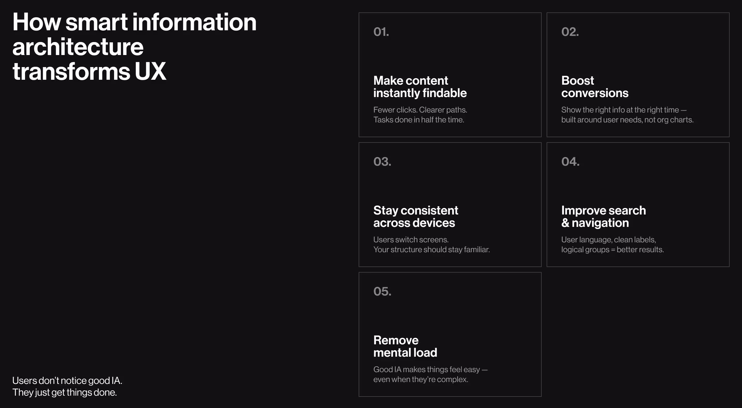
Making content discoverable
Users follow predictable patterns when they're trying to complete tasks. Smart IA anticipates these patterns and removes friction points before users even notice them.
Before IA optimization users click through 6-8 screens to do basic stuff —> After IA optimization same tasks happen in 3-4 clicks max.
Conversion flow magic
Information architects understand that users need different information at different decision points. Organizing content around user needs (not business departments) dramatically improves conversion rates.
Case study time: One of our clients, Riviera City, had it all — location, layout, pricing. But the site didn’t communicate that value. We spotted a key insight: users visited 20+ times before reaching out.
That told us the digital experience wasn’t sealing the deal. We redesigned it to spark desire and reward return visits, blending intuitive UX with emotional appeal. As a result after 3 months of IA work, user engagement and activation rates jumped significantly and finally the site sells by making people want to live there.
Cross-platform consistency
Good IA creates logical content hierarchies that work across devices and interfaces. Users develop mental models on desktop that transfer seamlessly to mobile.
Search that doesn't suck
Information architecture directly impacts how users find content through search bars and filters. Proper content categorization and labeling systems improve both internal search results and SEO performance.
Key IA elements that boost findability:
- Clear categories using actual user language (not corporate jargon).
- Focused navigation that prioritizes what users actually do.
- Logical content grouping that matches how users think.
- Consistent labeling across all site pages and navigation links.
✅ Key idea: Users don't care about your org chart. They care about solving their problems without having to think about it.
Our information architecture design process at Lazarev.agency
We've refined our IA approach through 120+ international projects. Our process saves development time and eliminates those expensive "wait, we need to restructure everything" moments. Let’s see how we approach IA design, with a closer look at how it helped Tratta rebuild user trust and increase product adoption.
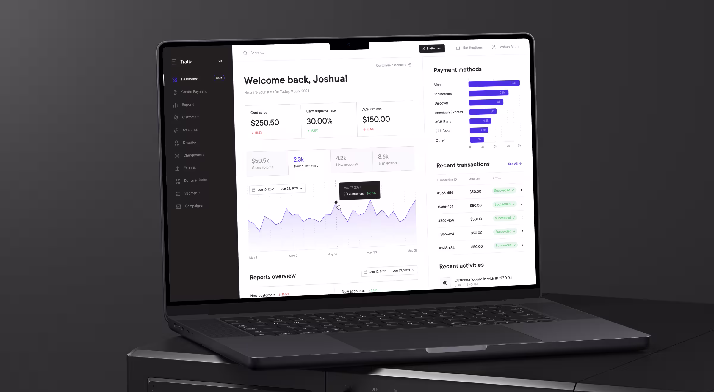
Discovery and user research phase
Tratta came to us with a powerful new tool: Collect – a platform for individual debt settlement. But there was a catch. Users were getting lost in navigation, stuck in forms, and dropping off before completing key flows. The product reflected the company’s internal logic.
Through stakeholder interviews, behavioral analytics, and 1:1 user testing, we discovered a major misalignment. The platform assumed users understood financial terminology and structured processes from the start. But in reality, users were overwhelmed and unsure where to begin.
We flipped the perspective — from internal workflows to user intent. “I want to reduce my debt” became the core organizing principle.
For this we used various information architecture tools and techniques:
- Card sorting platforms — OptimalSort, Miro.
- Tree testing tools — Treejack and custom setups.
- User interview platforms — Zoom, Loom for recording, and in-person sessions.
- Analytics tools — Google Analytics, Hotjar, FullStory for behavior data.
⚡️ Result: In the first 6 weeks post-relaunch, Tratta saw a major decrease in user drop-off on the onboarding flow and support tickets dropped significantly.
Content modeling and organization systems
We mapped all core content types across the product, including repayment offers, debt summaries, negotiation threads, and help center topics. Then, we structured them to reflect multiple mental models — not just a single hierarchy. For example, we classified “settlement plans” as:
- By action: Create a plan, edit, track status.
- By outcome: Reduce interest, avoid penalties.
- By situation: Behind on payments, unsure what to do.
This approach gave users multiple entry points, matching their unique context and mindset at any given time.
Global navigation and local navigation design
Global navigation handles site-wide wayfinding. Local navigation helps users explore specific content areas. Both need to work together without creating cognitive overload.
We design utility navigation for account management and support functions separately from main product navigation. This prevents hamburger menus from becoming junk drawers.
Testing and validation
Before UI design even began, we validated every IA decision through:
- ✅ First-click testing on top-level navigation labels.
- ✅ Scenario-based user flows simulating debt resolution paths.
- ✅ Mental model alignment interviews to check comprehension.
- ✅ Usability testing with real users in high-stress scenarios.
You don't need expensive tools to do good IA work. We've solved complex problems with sticky notes, Google Sheets, and Zoom calls. The methodology matters more than the tools.
This front-loaded validation prevented costly post-launch changes and gave Tratta's team full confidence heading into visual design and development.
“With Tratta, we transformed a confusing debt tool into a calm, outcome-driven experience. That’s the power of intentional Information Architecture — and why we never treat it as just another deliverable.”
{{Ostap Oshurko}}
How to spot bad IA and fix it before users notice
Bad information architecture creates predictable user behavior patterns. Here's your diagnostic toolkit and what you can do to save the situation:
Information architecture + AI = power couple
Plot twist: AI-powered interfaces make information architecture even more critical. Machine learning algorithms need well-structured data to provide relevant responses.
Chat-first UIs need structured content
Conversational interfaces rely on organized content hierarchies to understand user intent and provide accurate responses. Poor IA leads to irrelevant chatbot responses and frustrated users.
Voice interfaces are totally dependent on logical hierarchies
Voice UIs can't rely on visual navigation cues. Users must navigate entirely through logical information structures. This makes clear labeling systems and intuitive content organization absolutely essential.
Personalization requires strong foundational structure
AI personalization algorithms work by understanding user behavior patterns within existing information structures. Without solid IA, machine learning systems can't identify meaningful user segments or preferences.
The AI-IA connection: Good information architecture provides the structured data foundation that AI systems need to deliver intelligent user experiences. It's not optional anymore.
Give information architecture the respect it deserves
Information architecture is your strategic UX design that directly impacts business outcomes. Good design without good IA is like a beautiful book with no table of contents. Users get lost, frustrated, and eventually bounce to competitors who actually understand how to organize information.
Your customers may not see good information architecture, but they feel it. When everything just works, when users can find what they need without thinking about it, when the interface feels intuitive — that's good IA doing its job.
Want to see how information architecture can transform your digital product? Our UX research services are designed to turn user confusion into intuitive experiences. Let's talk strategy and start building products users actually understand.


.webp)