
A flawless mock-up can look like a sure bet until analytics tools reveal spike after spike in user behavior you never expected: aborted checkouts, mis-taps on mobile, rage-click whirlpools.
But numbers alone won’t save you, though: only when quantitative data (click paths, error logs, funnel drop-offs) meets qualitative data (session replays, micro-surveys, lab notes) do you gain the actionable insights that turn guesswork into growth.
In this guide, we unpack 10 UX analysis methods that product teams can plug into any sprint. You’ll see:
- When to use each method, and the UX analytics tools that let you capture the right data from day one.
- How companies translated user behavior into higher conversion, lower error rates, or double-digit Customer Satisfaction Score lifts.
- A merger framework that shows UX researchers and product managers how to synthesize raw data, identify patterns, and feed them back into the design cycle.
Whether you’re refining a checkout, launching a SaaS dashboard, or debugging a mobile flow, the playbook below will help you track user journeys, surface hidden pain points, and build experiences your target users actually finish.
Key takeaways
- Quantitative data (like error rates, funnels) only reveals what happens. True insight comes from combining it with qualitative tools (like replays and surveys) to learn why.
- Each UX method serves a distinct purpose — success rate tracks usability, heatmaps reveal attention zones, and CSAT captures emotional response in the moment.
- Real-world case studies prove small UX tweaks (e.g. CTA placement, upload flows) can cut errors by 30%+ or boost satisfaction by 50%.
- A continuous loop of measurement, testing, and refinement drives better UX than isolated audits or once-a-quarter surveys.
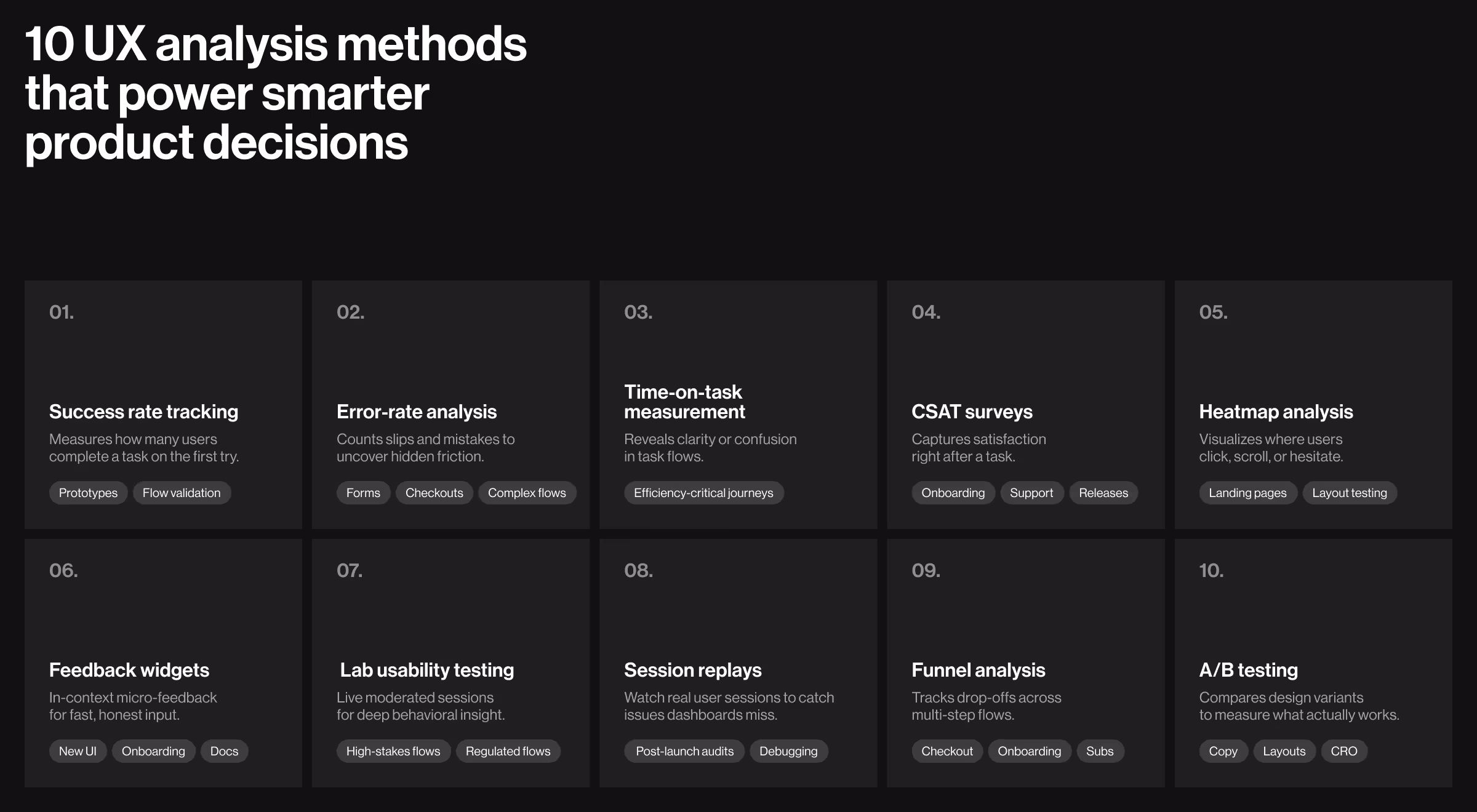
1. Success rate tracking
Research by Nielsen Norman Group shows success rate is the “UX bottom line.”
Success rate tells you how many real users finish a task on their first try — a quick pulse on whether a flow is truly user-friendly or still hiding pain points. Product managers pull the metric during prototypes and again after release to see if fixes stick and user retention climbs.
- What it is: Percentage of users who complete a task exactly as intended.
- When to use: Early prototype validation and post-release smoke tests.
- Tools: Maze task funnels, UXtweak Success Rate, Google Analytics event tags.
✅ Case to watch: Register to vote by GOV.UK
The live dashboard shows a 93% completion rate for online applications in June 2025, proving the flow keeps citizens engaged all the way to “Submit”.
2. Error-rate analysis
Lower error counts correlate with higher customer satisfaction scores — Nielsen Norman Group lists error rate among the four core usability pillars.
Count how many slips users make: wrong field format, double-click on a disabled button, aborted checkout, and you expose friction the success rate alone can’t see. Teams run the study when forms get longer or compliance rules get stricter.
- What it is: Average number of slips or mistakes per task.
- When to use: Complex forms, checkout steps, compliance flows.
- Tools: Zeko error logger (former Formisimo), FullStory rage-clicks, Mixpanel error events.
✅ Case to watch: Image-Upload Tool by GOV.UK
The GOV.UK publishing team spotted frequent mistakes when civil-service authors uploaded images (wrong file type, dimensions, misplaced markdown IDs). After optimizing the flow through a dedicated upload tab, inline cropping, and clearer guidance, error rates fell by 33%, freeing editors to publish content faster and with fewer reworks.
🔍 Pro tip: Track both total errors and unique error types; the latter isolates systemic UI issues.
3. Time-on-task measurement
Published on Medium recent deep dive shows shorter “time-on-task” often correlates with higher retention.
The clock starts when users begin and stops when they complete a key step. A shorter median time usually signals clearer IA and tighter copy; a sudden rise flags hidden blockers in the user flow on mobile devices.
- What it is: How long a typical user needs to finish a defined task.
- When to use: Efficiency-critical journeys (e.g., quote builders, POS).
- Tools: Lookback timers, Hotjar session timer, PostHog step durations, Mixpanel micro-conversions
✅ Case to watch: Shopify’s One-Page Checkout
When Shopify collapsed its 3-step checkout into a single page, log capture showed the median customer spent 36% less time on task (from 3.2 minutes to 2.0 minutes) while maintaining the same conversion rate. The trimmed seconds translate straight into higher completion on mobile — proof that measuring time-on-task highlights friction you can then shave away.
4. CSAT surveys
Brands with top-quartile CSAT enjoy up to 25% higher retention.
A one-question “How satisfied are you with…?” pops up right after task completion. Since it captures emotion in the moment, CSAT is ideal for measuring user satisfaction on shipping milestones or onboarding exits.
- What it is: One-question Customer Satisfaction score gathered right after task completion.
- When to use: Beta cuts, release trains, and high-touch service flows.
- Tools: Delighted CSAT, Typeform inline pop-up, Pendo in-app poll.
✅ Case to watch: Slack Support Teams
After rolling out Slack Huddles for real-time screen-sharing, the support org’s post-ticket survey showed CSAT climbing from 60% to 90% in under a quarter. The always-on, conversational channel lets agents solve issues faster and collect richer user feedback, proving that micro-workflow tweaks can move satisfaction metrics more than polished UI alone.
5. Heatmap analysis
Heatmaps can reveal which elements move revenue.
They visualize where users click, scroll, and hover, letting designers identify patterns in user behavior without running a single interview. Best deployed on landing pages and first-time dashboards to see if hero CTAs draw the eye.
- What it is: Visual overlay showing where users click, tap, scroll, or hesitate.
- When to use: Landing-page redesigns, above-the-fold layout debates.
- Tools: Contentsquare heatmaps, Hotjar scrollmaps, CrazyEgg confetti.
✅ Case to watch: DragonGC by Lazarev.agency
Working on DragonGC, our team has spotted cold zones around its primary “Book a demo” CTA. Moving the button above thumbnail cards immediately pushed more visitors into the purchase flow, confirming the new layout attracts sharper intent.

6. Feedback widgets
Great products hinge on evidence, but empathy with users is also crucial for conducting effective UX analysis. Widgets let you analyze micro-copy friction before NPS drops.
Always-on widgets gather “thumbs-up/down” or short comments as users engage with a fresh UI. Because the prompt sits in context, it surfaces micro-copy issues and onboarding gaps long before NPS declines. Rapid, in-context user feedback fills the gap between quarterly usability testing rounds and gives UX researchers qualitative data that numbers alone miss.
- What it is: Always-on inline widgets that collect bite-sized comments.
- When to use: Post-onboarding screens and new-feature rollouts.
- Tools: Userpilot Resource Center, Intercom Product Tours, Pendo guide badge.
✅ Case to watch: Atlassian Design System
Every doc page ends with a “Was this page helpful? Yes / No” widget. The docs squad triages that steady stream of micro-feedback in Git issues, turning raw comments into weekly copy and nav tweaks — proof that lightweight widgets yield actionable insights faster than quarterly surveys.
7. Lab usability testing
Usability testing lets you fix usability issues before launching the product.
Moderated sessions in a controlled space help UX teams watch body language, hear thinking-aloud commentary, and collect eye-tracking heat-spots — depth you can’t get from remote screens. Use it for high-stakes flows such as KYC or B2G portals.
- What it is: Moderated sessions in controlled environments.
- When to use: High-stakes flows (identity verification, complex B2G tasks).
- Tools: Tobii Pro Fusion screen-based eye tracker, Lookback for live moderated sessions, plus in-house UX-lab rigs (HD cams, one-way glass, recorders).
✅ Case to watch: User research by GOV.UK
The UK government requires digital teams to conduct moderated usability tests (typically 5–6 sessions a day, 30–60 minutes each) and fix the issues they reveal before a service can pass its formal assessment. The policy shows how structured lab work turns qualitative data into actionable insights, preventing expensive rework once thousands of citizens start using the service.
👉 Check out our article about the UX research in healthcare if you need even more research-related insights!
8. Session replays
Replays uncover issues quantitative dashboards miss.
Pixel-perfect recordings let analysts track user behavior after launch, spot rage-clicks, and tie anomalies back to code commits. Ideal for hunting edge-case bugs your QA never sees.
- What it is: Pixel-perfect recordings of real sessions that expose hidden friction.
- When to use: Post-launch behavior audits, anomaly investigation.
- Tools: FullStory, LogRocket, Userpilot Replays.
✅ Case to watch — Userpilot
In a heuristic review, Userpilot’s UX team flagged a dashboard button that looked “off,” but they needed proof. Filtering session-replay recordings to users who touched that element showed a pattern of mis-clicks and back-tracks — clear qualitative evidence the placement caused confusion. After moving the button and shipping the change, follow-up replays confirmed smooth, error-free paths through the flow, turning raw screen footage into actionable insights without a single survey.
9. Funnel analysis
Pairing funnels with UX data analysis lets teams prioritize the biggest revenue leaks first.
Visualizing drop-offs across multistep journeys shines a light on where users complete tasks and where they bail. Pair funnel data with cohort filters to see if certain user segments struggle more than the average user. Prioritizing the worst-leaking step first often delivers bigger ROI than adding new features — classic 80/20 for quantitative UX data.
- What it is: Step-by-step drop-off tracking across a multipage journey.
- When to use: Checkout, onboarding, subscription flows.
- Tools: Mixpanel Funnels, Amplitude PathFinder, PostHog explorer.
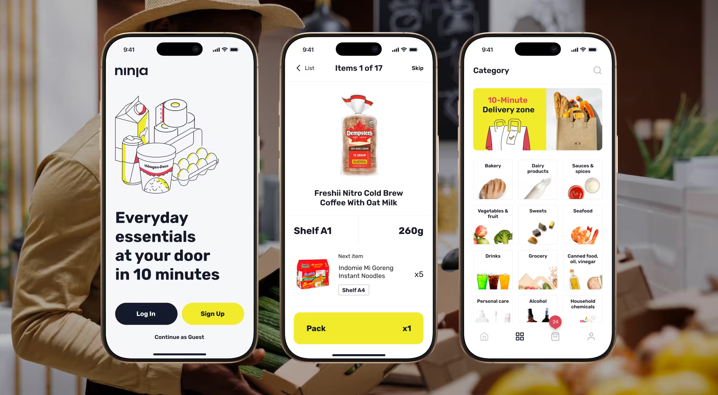
✅ Case to watch: Ninja Delivery by Lazarev.agency
Ninja Delivery recorded 30K+ completed orders in its first year. Funnel tracking pinpointed abandonments at the address-pin step, guiding the UI tweak that kept its 20% WoW growth on track.
10. A/B testing
Controlled A/B experiments help increase conversion and revenue, and they foster a culture of data-driven decision-making. NN/g’s 2024 overview shows how disciplined testing links design changes to clear business gains.
Controlled experiments pit two versions against each other, so teams base decisions on statistics, not opinions. Use it for copy, layouts, or pricing — anything where a small lift compounds over millions of views.
- What it is: Controlled experiments that pit two variants against each other.
- When to use: Copy tweaks, layout shifts, pricing experiments.
- Tools: Optimizely Web, VWO.
✅ Case to watch: “Start now” button experiment by GOV.UK
The GOV.UK design team tested alt-labels for the green Start now CTA on three high-traffic tasks (Overseas Passport, Child-Maintenance Calculator, Getting Married Abroad).
Two-week split tests revealed that swapping “Start now” for “Next” lifted click-through by +5.1% on passport applications, while the same change on “Getting married abroad” actually cut clicks by 13.6%, a perfect lesson in context-specific user behavior.
Crucially, follow-up analytics showed no rise in abandon rate, proving the better-performing variant drove actionable insights without luring users into dead ends.
How to combine methods for deeper insight
To turn raw numbers and user narratives into clear action, stack each technique in the sequence below — an evidence-driven loop that marries qualitative and quantitative UX data for sharper insights.
- Start qualitative, layer quantitative. Success rate + heatmaps show where friction lives; UX analysis tools like FullStory tell why.
- Sequence for cost. Begin with remote screenshares, escalate to lab sessions only if metrics stagnate.
- Triangulate. When CSAT dips but error rate stays flat, session replays often reveal hidden confusion.
- Loop fast. Treat every metric as a falsifiable hypothesis. If thresholds miss, cycle back to ideation. Continuous loops help you UX analyse evolving user behavior without waiting for a major redesign.
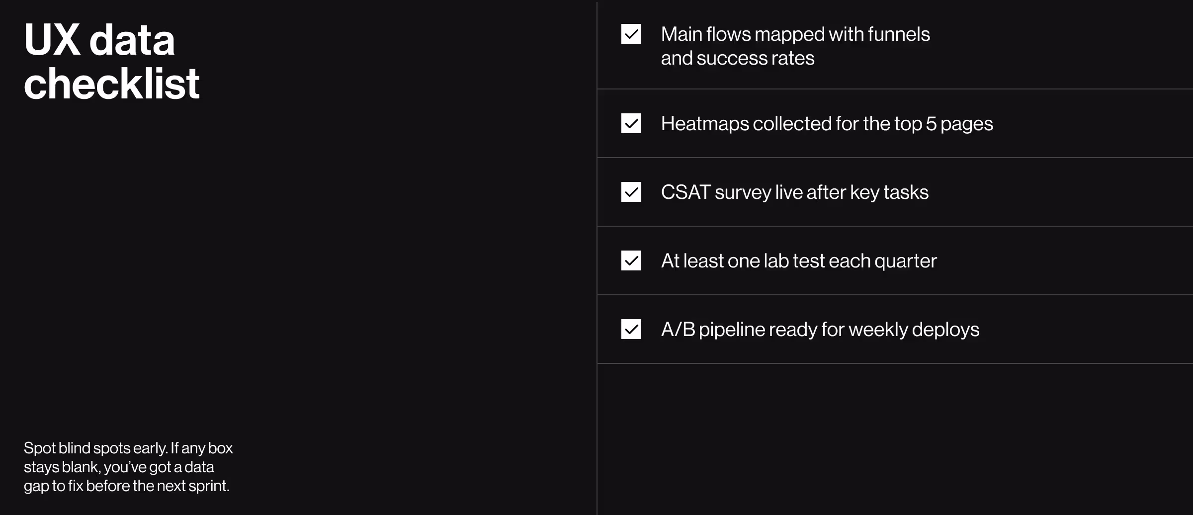
UX data analysis checklist for founders & PMs
Run your product through this UX analysis checklist — if any box stays blank, you’ve got a data gap to close before the next sprint:
Make your metrics move
Metrics are multipliers. A disciplined set of 10 UX design steps gains real power when you measure what matters, act on findings, and repeat. Start small, instrument wisely, and let the data steer the next sprint.
Let’s turn your numbers into momentum!
See how our UX research & strategy team turns raw product data into design wins that ship on time and drive revenue.


.webp)