
Luxury e-commerce lives or dies on impressions.
First impressions, to be precise. Modern shoppers decide whether a site is worth their time in 50 milliseconds — barely the blink of an eye.
So, apart from polishing the visuals, an ecommerce website redesign should aim to remove every ounce of friction between curiosity and checkout for your online store to thrive.
When a fine wine, whisky and spirits boutique from London asked Lazarev.agency to rethink its online shop, only 10% of revenue came from digital orders, and cart abandonments hit triple digits on weekends.
The brief was straight: “Turn the site into our best-performing boutique.”
Key takeaways
- “Buy Now” over “Add to Cart.” One decisive button trims a full step and captures impulse purchases, especially on mobile.
- Real scarcity, real timers. Countdown banners and live stock numbers drive urgency only when honest; fake clocks kill trust.
- Express checkout everywhere. Apple Pay, Google Pay, and PayPal reduce form filling and halve dropout on high-priced bottles.
- Gift bundles for high-value vouchers. Curated sets simplify decisions and push average order value up without discounts.
- AI-assisted search. Semantic suggestions like “bold reds under £50” guide exploration for shoppers who are still unsure or just want something special.
Why a UK fine wine retailer’s existing website needed more than visual polish
McKinsey's latest 2025 report on "zero friction tolerance" predicts continued growth in demand for speed in online experiences.
Despite a 5-star in-store reputation, a leading fine wine retailer website felt like a catalogue. Shoppers bounced at payment, mobile navigation hid filters, and premium gift cards defaulted to £50, undervaluing spend-ready customers.
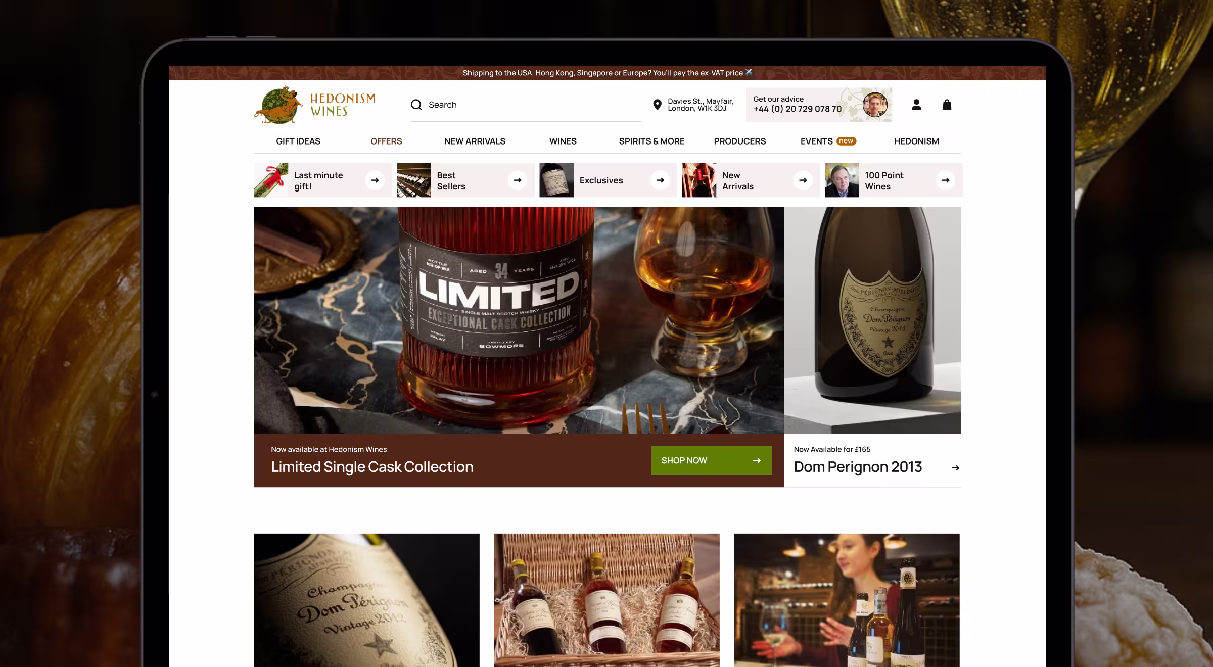
A leading fine wine retailer in London leadership saw a wider industry trend: conversational search and one-tap payments reset user expectations, while traditional product pages lag behind.
“People will pay £300 for a Rioja if their journey to purchase feels as smooth as tapping a ride-share.”
{{Kirill Lazarev}}
UX decisions that drove change
Here’s the lean playbook that made a wine retailer ecommerce website redesign actually ring the till.
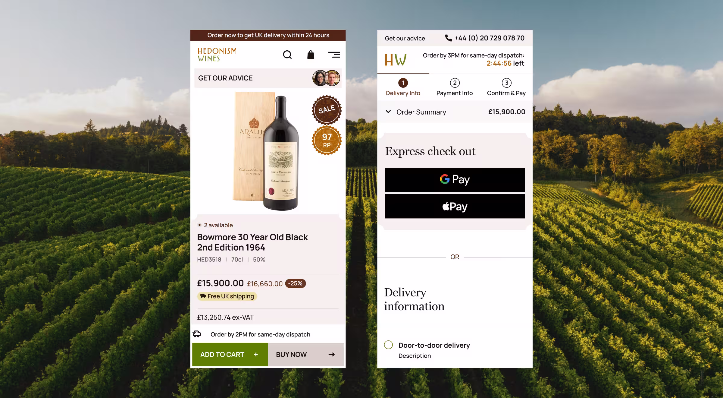
1. “Buy now” for decision-ready shoppers
The team placed a violet “Buy Now” button beside the primary photo, skipping the cart step entirely. For visitors who still want to build a basket, the classic “Add” icon sits quietly to the right — secondary, not hidden. Early heat maps showed thumb reach improved, making one-handed buys realistic.
2. Ethical timers and live stock badges
Limited allocations (“6 bottles left”) appear only when the warehouse API confirms low inventory. For seasonal sets, a genuine 48-hour timer counts down to a midnight cut-off. Shoppers feel urgency without gimmicks, which is critical for a brand that trades on trust as much as terroir.
3. Express checkout as the new default for e-commerce website design
Desktop and mobile header bars now surface Apple Pay and Google Pay logos immediately after “Buy now” is tapped. Billing, delivery, and contact data pre-fill, shrinking a seven-field form to one biometric confirmation — a huge UX win.
4. Gift bundles that respect voucher value
The smallest digital voucher was raised from £50 to £250, reflecting the average in-store spend. Landing pages personalize product grids to the voucher denomination, eliminating sticker shock and turning “gift cardholders” into full-price customers.
5. AI-powered discovery
A semantic search bar suggests tasting notes (“velvety finish”), serving occasions (“summer barbecue”), or dietary flags (“vegan-friendly”) — no grape knowledge required. Behind the scenes, click patterns feed a lightweight ML model that reprioritizes suggestions weekly.
“Luxury shoppers decide in a heartbeat; Express Checkout lets the site keep pace with that impulse. A couple of taps and your bottle is secured — that’s the shopping experience they pay for.”
{{Anna Demianenko}}
Framework other luxury stores can reuse
Traditional wine sites bury options behind drop-downs. With data-driven design we flip the flow:
- Start with everyday language. Search reads “date-night red under £40” and returns five items plus “Buy now”.
- Minimize data capture. The store records query and click, nothing more — GDPR safe (EU data-privacy law), PCI fine (card-payment security standard).
- Replace full redesigns with modular swaps. Bottle cards, rating chips, and price tags share design tokens; moving a CTA is a config change, not a sprint.
This modular approach acts as an ecommerce website revamp in miniature, focused on checkout and discovery rather than a ground-up rebuild.
“When search runs the stack, every micro-tweak scales. Slide the booking prompt closer to the tasting note and watch the conversion shift in real time.”
{{Anna Demianenko}}
Outcomes so far
Early session replays paint a clear picture: shoppers who once bounced at the “Add to cart” step now glide straight to biometric-confirmed payment. Removing three taps feels trivial on paper, yet every recorded flow shows the same UX win. Some other benefits include:
1. Shorter paths to purchase naturally increase user engagement and keep shoppers in flow. The two-tap journey (“Buy now” → Apple Pay) has become the default on mobile. Heat-map clusters that used to stall on shipping forms have shifted to a clean diagonal, proving that luxury buyers value ease as much as rarity.
2. Higher average order value. Gift-bundle landing pages work like a sommelier’s pre-curated tray: the £250 voucher now acts as a soft anchor, guiding shoppers toward bottles they might have overlooked. Designers report that users scroll less and add faster, because the price context feels “already decided” rather than negotiated.
3. Trust preserved, brand intact. Real-time timers and live stock badges do more than create urgency; they reassure visitors that the store respects transparency and honesty. In usability interviews, buyers called the low-stock label “helpful, still not pushy”.
“High-ticket checkout works when three signals align: fluency, curation, and credibility. Remove the form-filling, frame choice with value anchors, keep data honest — that’s the architecture of confidence.”
{{Anna Demianenko}}
Taken together, these shifts confirm that even a lighter UX-focused ecommerce website revamp targeting checkout essentials can raise perceived value, convert intent without extra clicks, and protect credibility in a market where trust is as prized as the product.
Ready to close the gap between luxury browsing and luxury buying?
If your webshop still treats checkout like an afterthought, a UX-focused webshop redesign can eliminate dead clicks and raise ticket size without discounting.
Let’s talk about an ecommerce website redesign that applies these data-backed patterns to your own catalogue and proves that thoughtful UX is as valuable as the products you sell.


.webp)