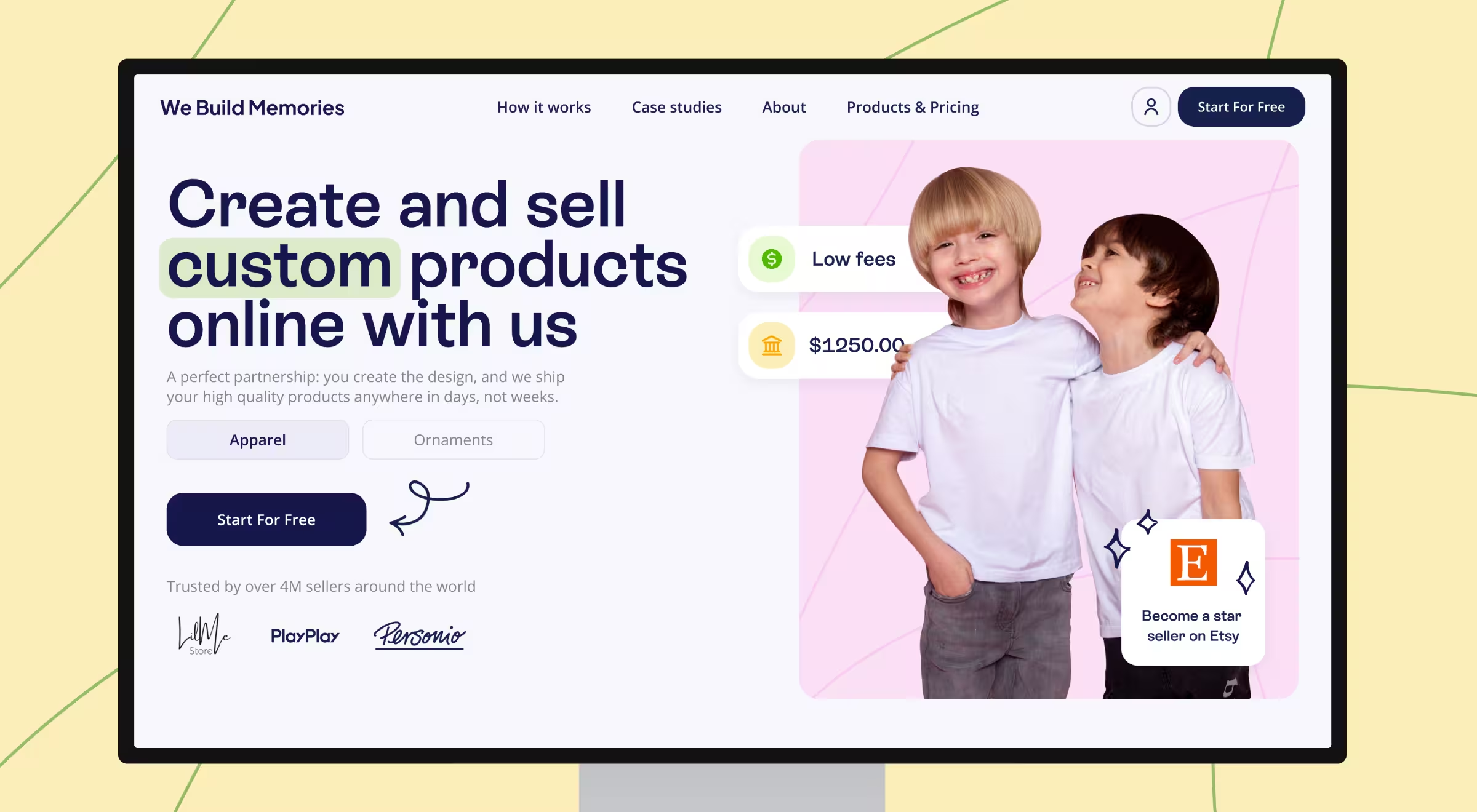
With an upgraded digital identity and e-commerce experience, one of the leading Etsy vendors now reaps the benefits: increased revenue, lower churn, and improved client engagement.
We Build Memories, a top-five Etsy seller specializing in custom baby apparel and holiday ornaments, teamed up with Lazarev.agency to modernize its brand and e-commerce platform. The transformation paid off: a 15% increase in revenue and a 30% drop in churn followed, driven by improved usability and a refreshed digital identity.

Business built on sentiment, held back by dated design
With $2.8 billion in annual revenue, Etsy is a crowded marketplace where visibility means the difference between growth and getting overlooked. We Build Memories reported struggling with branding that no longer resonated with its young parent audience and a clunky customization flow that made purchasing feel like work. The problem could have resulted in lost market share.
The company required a user experience that aligned with the brand’s joyful nature and a backend that supported its expanding B2B ambitions.
That’s when Lazarev.agency stepped in with a tailored approach to boosting the brand’s online presence. And the outcomes prove that such a partnership has been strategic.
Results
With a frictionless product customization flow and a new order dashboard, users could create, preview, and track orders with ease. And these design enhancements led to measurable improvements across core business metrics:
- Revenue grew by 15% due to enhancements in user experience that made navigation more intuitive.
- User churn dropped by 30%, attributed to a platform redesign that increased engagement.
- Average session duration rose by 25%, reflecting greater visual appeal and smoother interaction.
- Conversion rates climbed by 20% following an overhaul of the product customization process.
Each of the enlisted outcomes reinforced the impact of aligning UX strategy with brand identity and operational clarity.
How Lazarev.agency reimagined the brand
Lazarev.agency took a strategic approach to refine frontend experience and backend operations. Here’s a breakdown of what the team did:
- Aligned approachable design solutions with the brand vision: We redefined the entire visual foundation and focused on a soft color palette to reflect the company’s authentic vision.
- Simplified customization flows: The team redesigned the personalization process for clarity and ease, making product customization both fun and effortless.
- Ensured equal access via smart design: A responsive and accessible platform ensured intuitive use for every visitor, regardless of device or level of familiarity with the website.
- Built a robust backend dashboard: We implemented tools for full order tracking, fulfillment visibility, and streamlined daily operations. Now, customers have full visibility into the order progress and delivery status.
“Our partnership wasn’t about cleaning up the UI. We helped We Build Memories reconnect with their customers through design that’s joyful, fast, and deeply intuitive.”
{{Anna Demianenko}}
Design fuels retention and revenue
We Build Memories’ case study proves that even a market leader can unlock new growth through thoughtful digital transformation. Lazarev.agency’s experience-led design approach offered actionable website redesign solutions to address the company’s operational pain points, redefining the way customers interact with the brand.
🔍 Read the full case study here.


.webp)


