Your product is ready, checkout works, but orders crawl in at the pace of a polite golf clap.
Why?
Because first-time visitors judge credibility in 50 milliseconds — the blink that decides if they stay to shop or bounce forever. For small-business owners this is brutal: you juggle payroll, inventory, ads, and now you’re expected to master kerning and color psychology?
Relax. This guide shows how graphic design for small business becomes the cheapest growth lever in your stack. Backed by a “starter” framework, budget options, and a hot lingerie-brand case to demonstrate you how to turn window-shoppers into loyal buyers.
Key takeaways
- Design drives revenue. Consistent visuals lift conversions up to 23% in e-commerce studies.
- Small budgets win by focus. One killer landing page beats 20 half-done templates.
- Frameworks cut learning curves. Follow the 4-P “Brand Starter” routine: Palette, Typeface, Pattern, Proof.
- Free tools exist. Canva, Coolors, and Unsplash can carry you to Series A when used with clear rules.
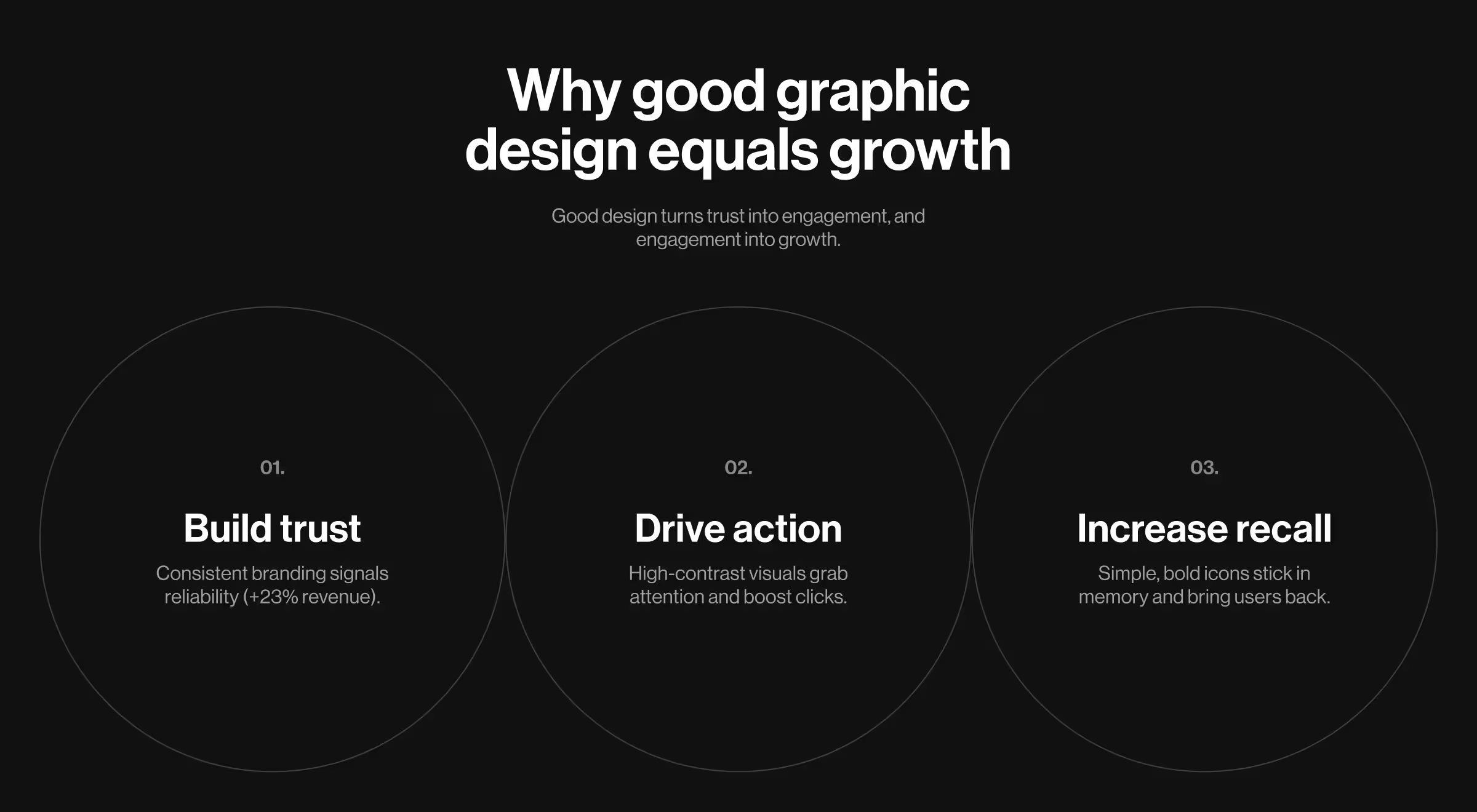
Why good graphic design equals growth
If you're wondering whether your investors really care about your digital product design — the short answer is yes.
Search, social, and marketplaces all compress buying decisions into seconds. A polish gap as small as a mismatched font or blurry logo telegraphs “risky seller,” especially in niches where refunds feel daunting. Great visuals, by contrast, cut through risk perception, signal quality, professionalism, and nudge sneaker-string budgets toward repeat sales.
- Trust first: Scrappy brands with cohesive color systems look “bigger” and more reliable — a Lucidpress study found that consistent branding can raise revenue by up to 23%.
- Scroll stop: High-contrast thumbnails boost ad CTR; large-scale research on display creatives links strong visual-contrast features to higher click-through rates.
- Recall: A simple icon plus two-tone palette imprints faster than text-heavy banners, thanks to the picture-superiority effect.
4-P brand starter framework
Pin this next to your desk — everything else builds on it:
*Yeah, we know typeface doesn’t start with P. But your fonts are as foundational as your palette, and we weren’t about to force in ‘Print’ just to keep the alliteration neat.
🔍 Pro tip: Skip animated logos until revenue justifies dev time; motion that lags by 300 ms kills brand perception faster than a static mark.
Budget breakdown: where to spend and save
⚠️ Mistake to avoid: mixing free and paid assets without re-exporting in a unified color profile can lead to muddy print results.
More free tools & templates you can use today
- Canva Brand Hub — save palette, fonts, and logo once, then auto-apply to every post or flyer.
- Adobe Color — explore trending palettes, test contrast ratios, export ASE/PNG.
- Fontjoy — AI matches headline + body fonts for instant typography harmony.
- Unsplash — high-res, royalty-free photos perfect for hero images and ads.
- Pexels — curated stock photos and videos under a permissive license.
- Remove.bg — one-click background remover, ideal for product shots.
- Feather Icons — 300+ open-source SVG icons that scale crisply on any screen.
- TinyPNG / TinyJPG — lossless image compression to keep load times under two seconds.
- Smartmockups (free tier) — place screenshots into device frames for realistic app or site mockups.
Mistakes owners repeat and how to dodge them
Before the first ad dollar leaves your wallet, run this sanity scan:
- Inconsistent fonts/colors — break trust; stick to the 4-P kit.
- Low-res logos on high-DPI screens — export SVG or 2× PNG.
- Stock overload — crowds blur unique value; shoot one custom hero image per product line.
- Long copy on the fold — mobile visitors bounce; lead with six-word promise, link deeper.
- One-off Fiverr hires — visual drift six weeks later; document every HEX/RGB code in a brand guide PDF.
10 quick-win design real examples that moved metrics
- Mariemur — 3D-like product spins plus desire-driven copy lifted on-page engagement 50% after launch.
- Australian Red Cross — Full digital redesign leads to +83% conversion rise in 6 months.
- Basecamp — visual simplification test replicated a 14% click-through lift in an independent case archive.
- Overtoom — product-page layout changes gives a +24% purchases boost.
- Dropbox — adding a one-minute explainer video improved conversions 10%, netting 10 M extra users.
- Crazy Egg — iterative A/B tweaks took signup rate from 2.3% to 3.8% (+64%).
- PUMA — personalized on-site experiences with Insider’s AI widgets boosted conversion rate 27%.
- CXL — landing page form-field reduction redesign secured a +79.3% conversion lift.
- Gymshark — faster site speed and geo-targeted storefronts boosted revenue 200% year-on-year.
- Pura Vida Bracelets — optimized checkout flow increased conversion 10% and cut cart abandonment.
Inspo from Lazarev.agency: Mariemur case study
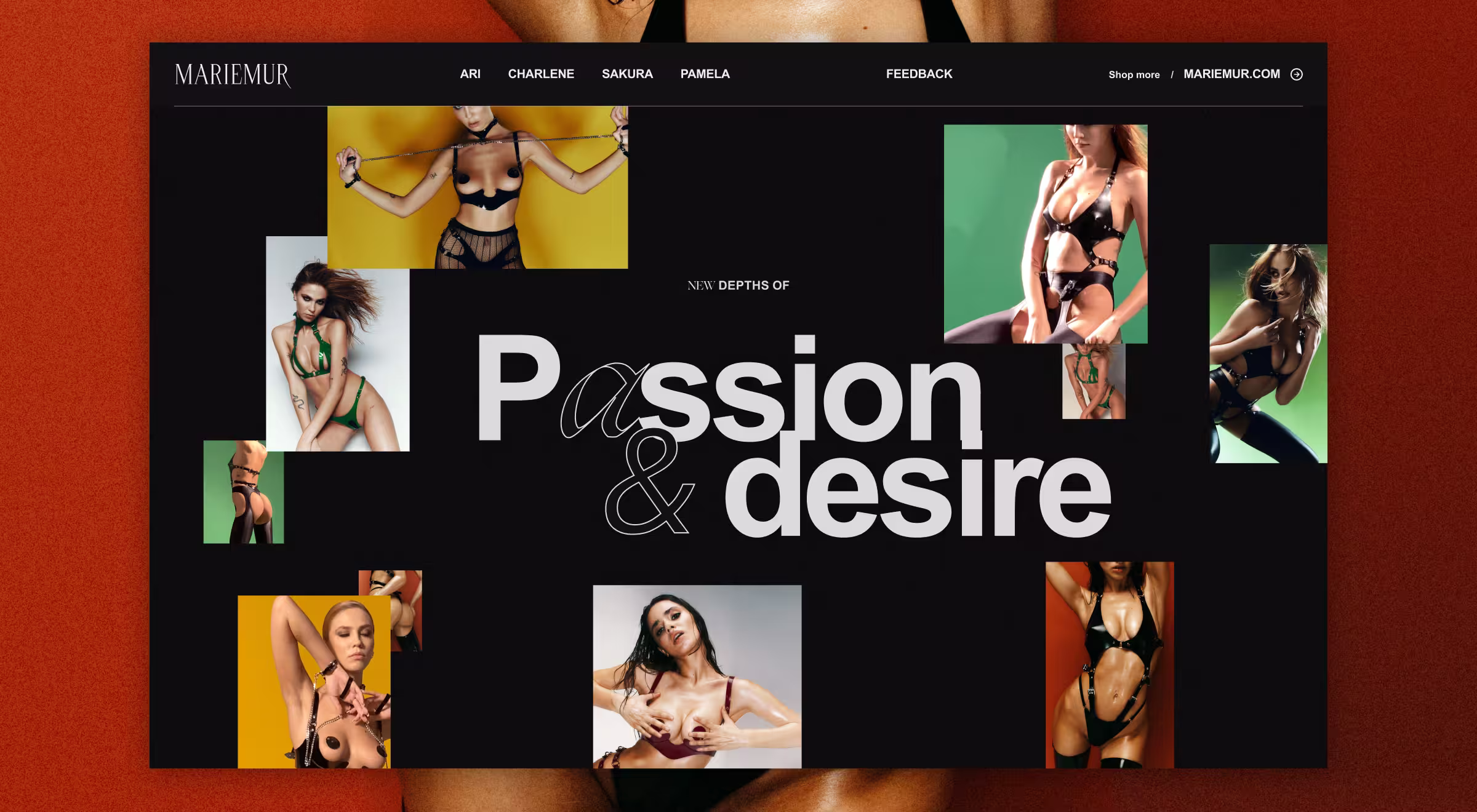
Mariemur is a DTC lingerie label with 120 products across 14 categories. Choice overload drove a 73% homepage-to-product drop-off.
Our fix — оne immersive landing page showcasing only 4 selected hero sets, rendered with 3D spins and desire-first copy. Key moves:
- 3D-like visualization made delicate straps pop on mobile.
- Emotional headlines replaced spec lists (“Passion & Desire”).
- Thumb-zone optimization for CTAs, persistent pricing elements and expanded touch targets on product cards.
Results:
- 50% higher engagement post-launch.
- 40% faster load time thanks to the image optimization.
Takeaway: Businesses win more by curating fewer SKUs with stronger storytelling than by dumping full catalogues online.
🔍 Want to read more about our experience with Mariemur? Check out our blog post on website conversion optimization.
From insight to action
You’ve got the framework, tools, and examples.
Ready to turn scrolls into sales?
Book a call with Lazarev.agency, your AI product design agency.
We’ll audit your current assets, propose a phased upgrade, and deliver pixel-perfect visuals that fit your growth targets.


.webp)