A user lands on your real estate site. In seconds, they’re calculating mortgage terms, flipping between street and interior views, and filtering listings without friction. They’re not ready to call an agent but they’re already hooked. That’s smart UX at work.
In this article, we break down the real UX features that drive that engagement. With examples from top-performing platforms, we show how design can guide users, build trust, and move them toward action without ever feeling like a hard sell.
Key takeaways
- Great UX starts by removing friction. Users need fast search, responsive layouts, and visible CTAs, or they bounce before they explore.
- Not every feature matters equally. Get the fundamentals right first: usability, clarity, speed. Then add differentiators like mortgage tools, 3D tours, smart animations to deepen engagement.
- Trust must be proven. Show real-time construction updates. Add agent bios with local knowledge. Place testimonials where decisions happen. Back everything up with data.
- Don’t forget intent. Minimalist design, consistent branding, and timely chat prompts create a path that feels intuitive today and earns loyalty tomorrow.
Top UX features for real estate website design with examples
1. Interactive calculators for financial clarity
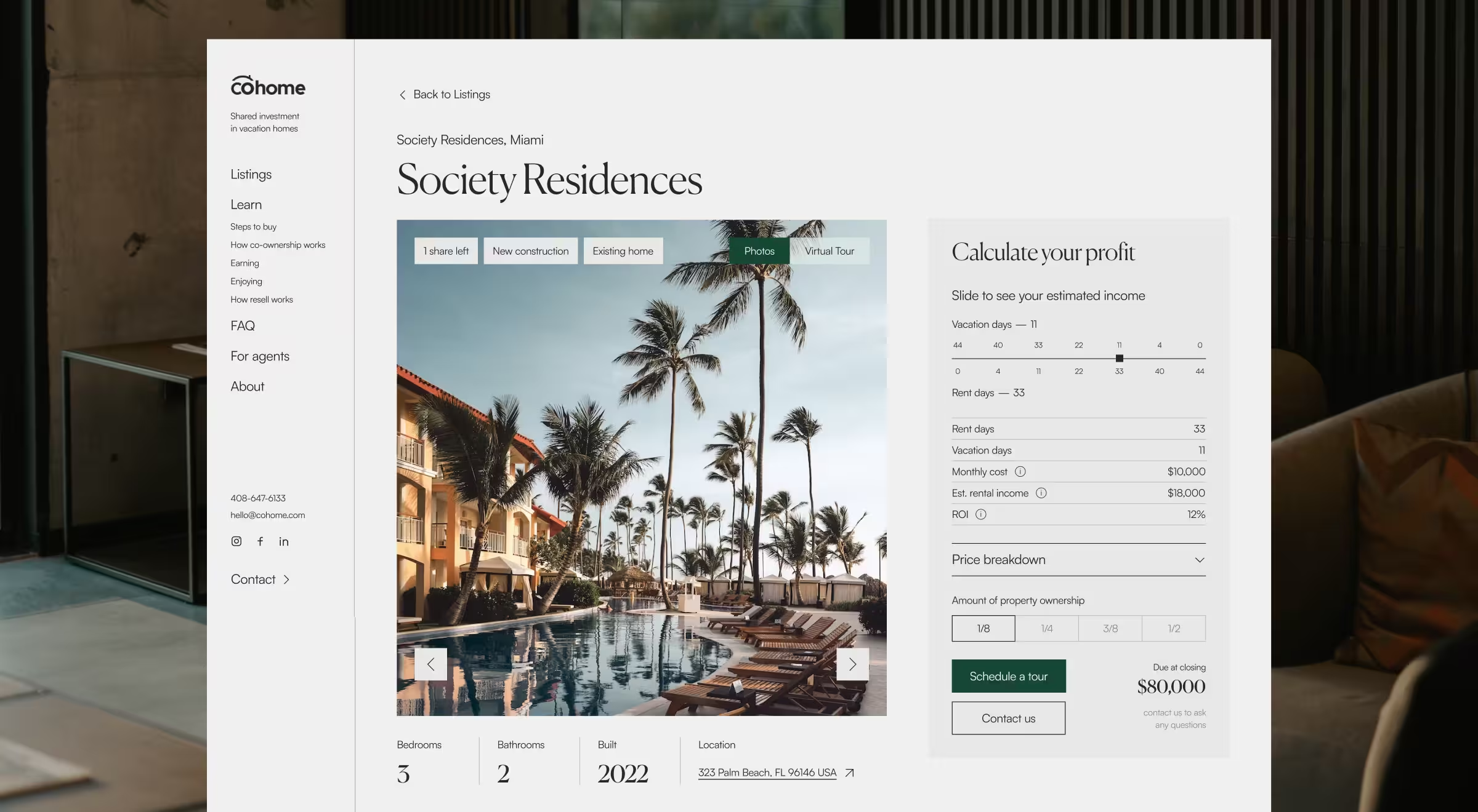
Complex financial decisions create drop-off. Smart UX removes that barrier in real estate projects. Interactive calculators when placed strategically can turn hesitation into confidence by showing clear outcomes upfront.
✅ Feature in action: We put this into practice on the CoHome website by placing the ROI calculator right in the hero section. Instead of hiding it on a tools page, we made it a first-step interaction. With just a few inputs, users could instantly see their potential returns, which boosted trust and kept them engaged.
2. Immersive 3D & visual property exploration
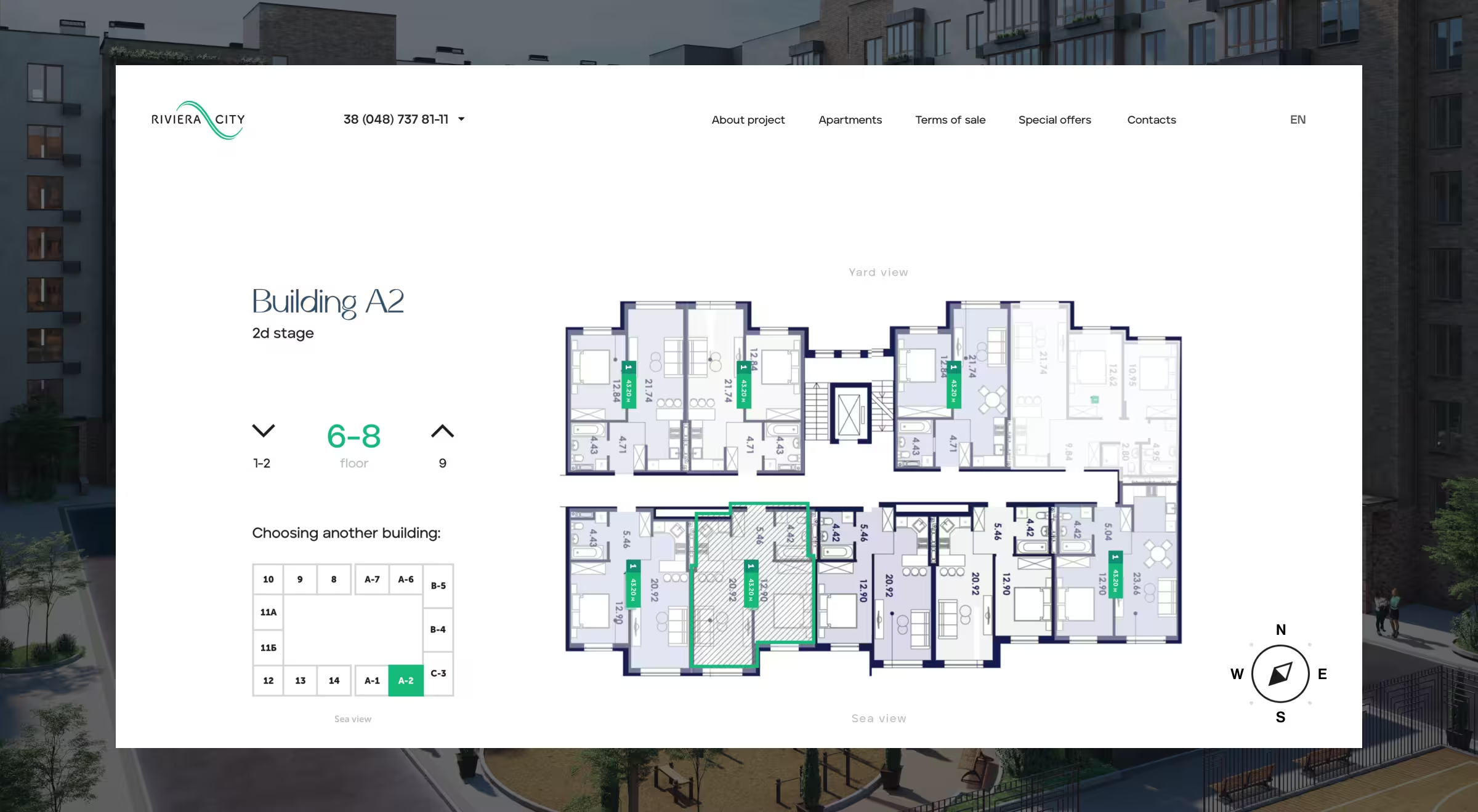
Static images aren’t enough. Today’s real estate platforms need immersive, exploratory experience design. Let users rotate a penthouse in 3D or switch from street to courtyard view. It’s how emotional connection turns into faster decisions.
✅ Feature in action: Lazarev.agency applied this in the Riviera City project by building a fully interactive 360-degree building model. Users can rotate the view, browse by floor, and highlight available units. A single toggle switches between yard and street perspectives, creating a digital experience that feels close to an on-site visit.
3. Powerful yet simple property search & filters
Home search shouldn’t feel like paperwork. Users want fast, relevant results, not endless filters. The real challenge is balance: give just enough control to refine results, without overwhelming the experience or slowing things down.
✅ Feature in action: For example, New England Real Estate Company nails this by placing a smart search bar front and center, allowing users to search by zip code, city, school district, or neighborhood.
4. Minimalist, visual-first design that prioritizes property
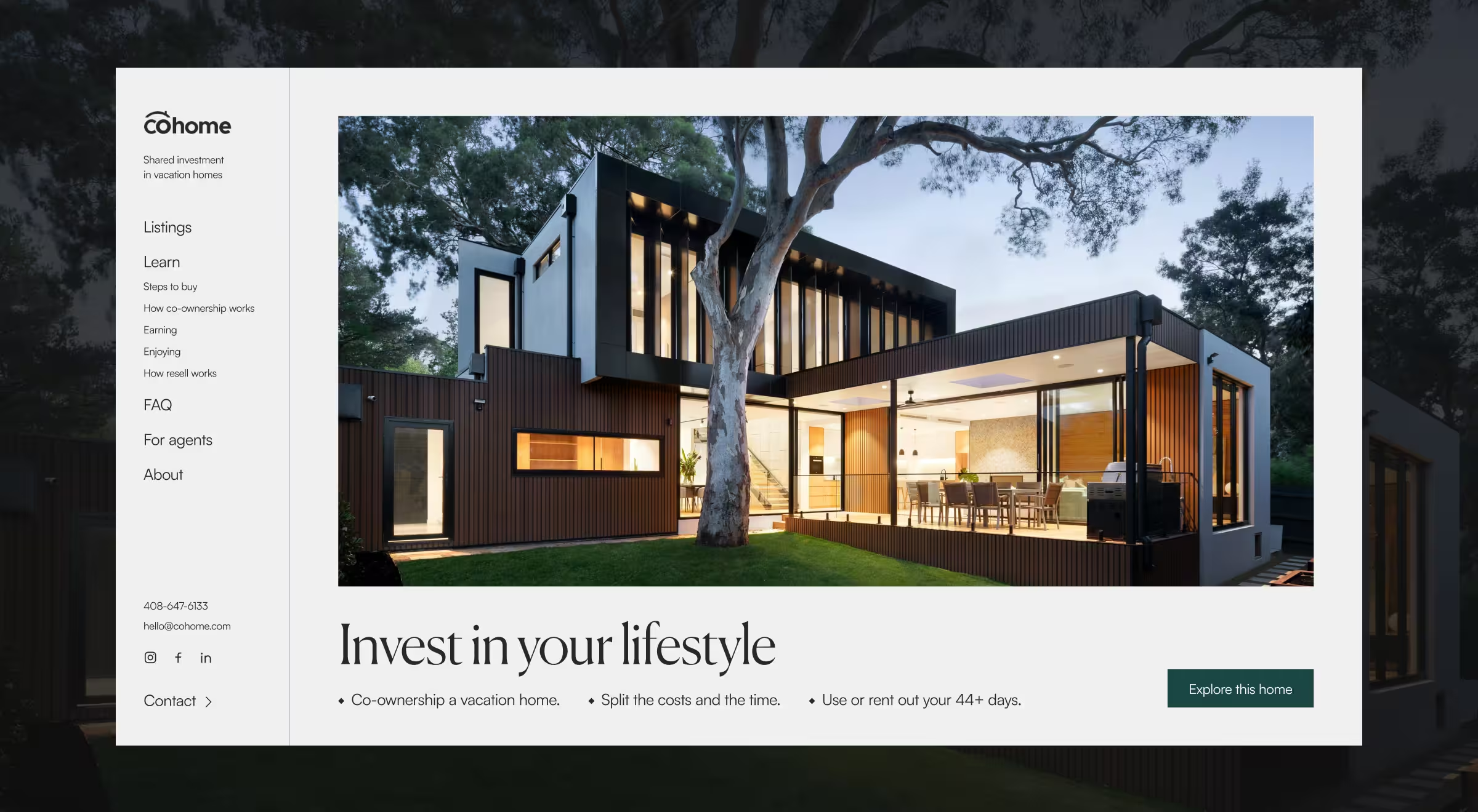
Minimalist interfaces let the property take the spotlight. With less visual noise, users focus faster, scroll longer, and make decisions with less friction. Clean design drives clarity and dwell time.
✅ Feature in action: CoHome uses a refined design system with light backgrounds, slender type, and deliberate whitespace. The result is a calm, confident interface that reflects the premium nature of the investment with a focus on the property itself.
5. Emotionally resonant storytelling & branding
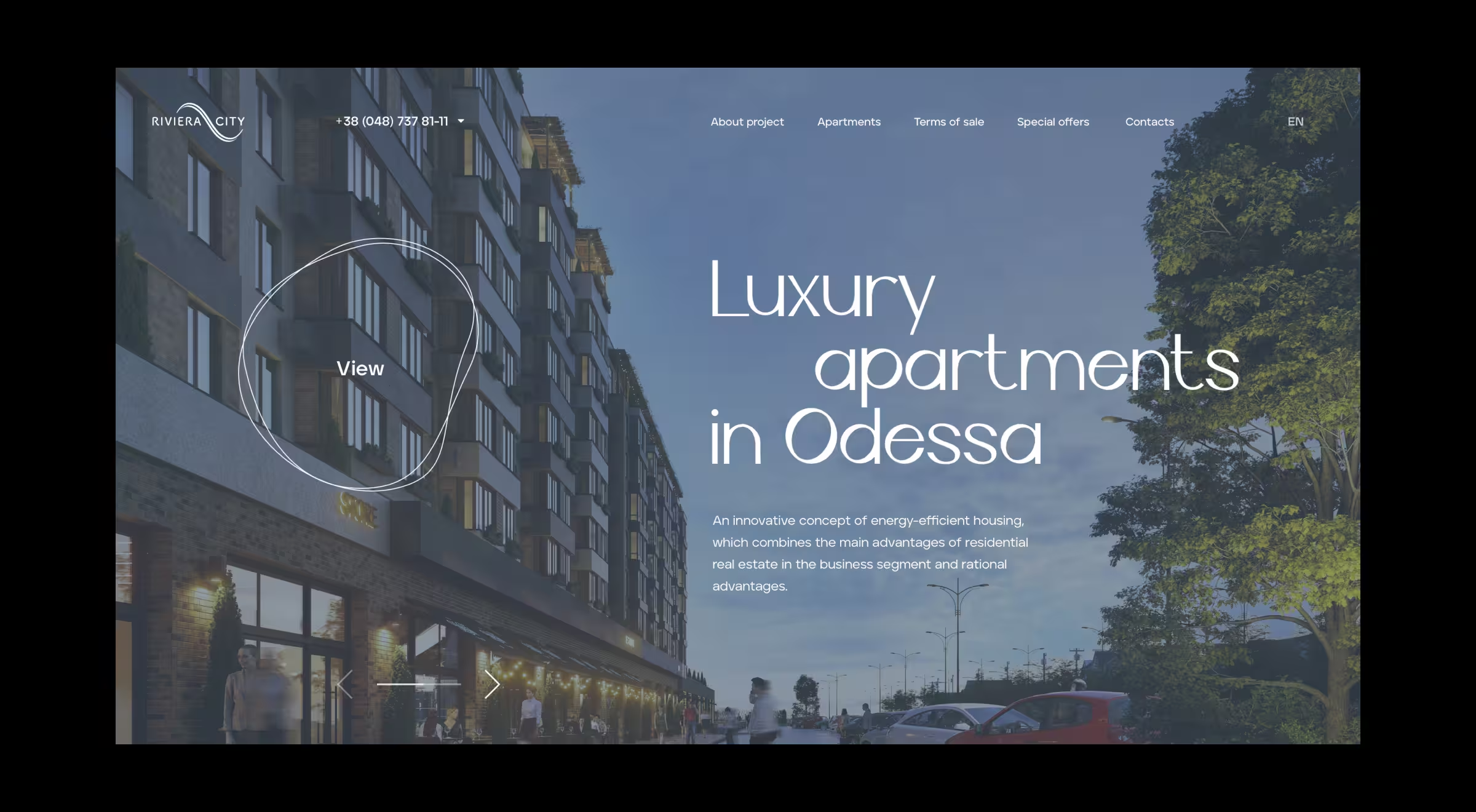
Buying property is as much about mindset as it is about money. A strong design system reflects that using intentional color, motion, and tone to build trust, spark aspiration, or create calm. It’s how a listing becomes relatable, and a product page starts to feel personal.
✅ Feature in action: In the Riviera City project, we used a clear visual language: serif typography, muted green accents, and a gentle rhythm across layouts. Together, these elements created a calm, stable atmosphere that resonated with the brand’s promise of long-term value.
6. Hyperlocal expertise & community connection
Real estate decisions are rooted in local knowledge. Buyers look for signs that you understand the neighborhood. Specifics matter: school ratings, community ties, local awards. That’s how trust is built early and naturally.
✅ Feature in action: Beach & Bartolo solves this by highlighting agent bios with deep roots in the area, plus a streak of “Best of Columbia County” awards. This helps them show they live here, know here, and are recognized here.
7. Accessible UX for all users
Designing for inclusivity means building tools that adapt to diverse user needs without compromising the overall experience. Accessibility is a competitive edge each website design for real estate agents needs.
Real estate audiences vary widely, from users with visual impairments to those with cognitive differences. Prioritizing contrast ratios, keyboard navigation, and other fundamentals early in the UX design process ensures everyone can explore, search, and engage without friction.
✅ Feature in action: NEREN’s site gets this right with a built-in accessibility widget that lets users adjust text size, spacing, contrast, and even enable a dyslexia-friendly mode. It’s integrated by UserWay, boosting usability for those who need it, without disrupting the experience for others.
8. Sticky menus, filters, and actionable CTAs
When filters, search, or contact options disappear mid-scroll, users stall. Persistent interface elements keep momentum up making it easy to refine results, ask questions, or take the next step without breaking focus.
✅ Feature in action: Avantgarde Properties tackles this professionally: the header morphs into a compact search bar as users scroll, staying useful without taking up space.
9. Mobile optimization
For many users, mobile is the only touchpoint. That means performance, layout, and interaction design need to work on smaller screens. Stripped-down mobile versions or clunky transitions cost businesses credibility and conversions.
✅ Feature in action: Riviera City delivers a truly responsive experience. The mobile site mirrors the desktop version feature-for-feature, loads the initial screen in 2–3 seconds, and supports high traffic volumes without lag. Every visual and interaction is optimized for touch without sacrificing clarity or control.
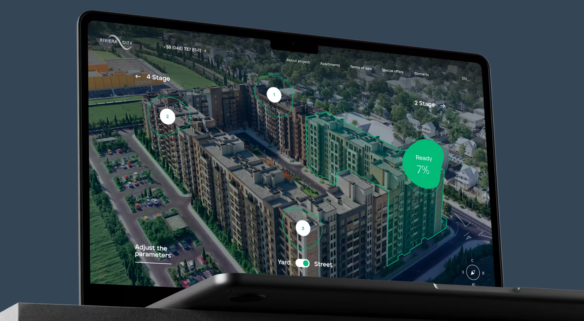
10. Transparent construction updates & developer info
When purchasing off-plan or newly built properties, users want assurance. Real-time updates, readiness indicators, and developer transparency reduce uncertainty and create trust where it matters most.
✅ Feature in action: Riviera City tackles this on two fronts. The Construction Progress page shows building sections visually, arranged by price instead of completion rate. Meanwhile, a dedicated Developer page offers access to key documents, brand history, and availability details structured for quick scanning.
11. On-brand, cross-channel consistency
Every touchpoint should speak the same language. When users move from a flyer to your site or a social post to a listing, the visuals and tone need to align. That consistency builds trust and signals you're serious about the details.
✅ Feature in action: Compass executes this with excellence. Their website design for real estate agents mirrors their black-and-white signage and geometric design language down to the typography. In this way whether users walk past a listing or land on the homepage, they know exactly who they’re dealing with.
12. Smart, contextual chatbots & contact triggers
Poorly timed chatbots interrupt while well-timed ones convert. The key is to trigger contact options based on user behavior (not time spent on page or arbitrary scroll depth).
✅ Feature in action: Take Sotheby’s as an example. Their chatbot stays hidden until a user interacts with a property gallery indicating genuine interest. Only then does the prompt appear, offering to schedule a viewing. It’s timely, relevant, and aligned with user intent.
13. Client testimonials to build social proof
In real estate, referrals still drive decisions, and testimonials are their digital form. But hiding them on a reviews page wastes potential. Placing testimonials near listings or CTAs builds credibility right where users are deciding.
✅ Feature in action: Sweet Living Realty does this with care: testimonials are embedded throughout the homepage, complete with client photos, detailed stories, and clear links to a full reviews page. It feels natural, like a friend vouching for you mid-conversation.
14. Authority & content highlights
Buyers look for signals of authority. Media mentions, public roles, blog content, or podcasts show expertise and set you apart from agents who just list properties. It’s proof you know more than what’s on the market.
✅ Feature in action: Richard Blanco, a London-based real estate agent, has launched a website with authority and content highlights concept applied. His real estate expertise is front and center, backed by his service on local housing boards and participation in TV shows.
15. Trust through performance metrics
High-stakes decisions need proof. Showing metrics like average days on market, transaction volume, or list-to-sale ratio makes your expertise tangible and shows users you deliver.
✅ Feature in action: Corcoran McEnearney uses this approach with precision. Their About page features stat blocks that are bold, scannable, and benchmarked against industry standards.
16. Motion and micro-interactions that add depth
Thoughtful motion helps users stay oriented. Micro-interactions, subtle parallax, and clean transitions guide movement, clarify actions, and make navigation feel intuitive.
✅ Feature in action: K11 ARTUS takes the concept with parallax scrolling and ambient piano sounds, creating a mood that mirrors the luxury real estate web design.
Not all UX features pull the same weight
After checking real estate agent website examples, you may consider that there are too many features your product needs right now. In fact, it doesn’t. Some features drive conversions. Others deepen engagement. A few build long-term trust. Below, we’ve mapped out how core UX features perform across three key outcomes:
- Conversion impact – Does it help users take action faster?
- Engagement boost – Does it invite exploration and interaction?
- Trust signal – Does it build credibility and confidence?
This isn't a checklist to blindly follow. Lazarev.agency’s team suggests a lens to prioritize features based on what your users value most and what your business needs to deliver.
Use it in line with your product strategy to guide design decisions, budget conversations, and stakeholder buy-in. Because in real estate, the cost of a missed interaction can be far greater than the cost of thoughtful UX.
What’s a must vs. what’s optional – expert opinion from Lazarev.agency’s lead designer
Feature lists are helpful but context is everything. What works for a luxury real estate web design might be overkill for a local rental platform. To separate strategic essentials from situational nice-to-haves, Oleksandr Koshytskyi, Lead Product Designer at Lazarev.agency, shares his ideas about prioritizing UX in real estate design:
“The most common mistake we see at Lazarev.agency is teams treating all UX features as equal. They’re not.
Start with what removes friction. If users can’t filter properties fast, view listings clearly, or reach out without hunting for a button, you’ll lose them in seconds. That’s your foundation: intuitive search, mobile responsiveness, sticky CTAs, clean layouts. These are your core product needs.
After that, you can layer in features that differentiate. Interactive calculators, 3D tours, and motion effects all have their place. We’ve seen high-end projects boost engagement with 3D exploration but only after fixing basic usability issues first.
Good UX in real estate is about sequencing. You earn the right to add polish after you’ve nailed performance, clarity, and trust. If your platform doesn’t respect the user’s decision-making process, no amount of storytelling and tech features like AI transformation will save it.”
{{Oleksandr Koshytskyi}}
Want to prioritize the right features for your real estate project?
If Oleksandr’s perspective clicks with you, you’re likely building for long-term impact. Whether you're starting fresh or leveling up an existing platform, we’ll meet you where you are.
Lazarev.agency brings proven UX patterns from top-performing real estate agent website examples and adds original solutions tailored to your product’s needs.
Let’s talk about real estate UX that respects the user and the investment.


.webp)


