

Imagine this: you blink, and in just 0.05 seconds your brain has already decided whether to trust a UX website or abandon it forever. That’s faster than lightning, faster than a heartbeat — and it’s where business fortunes are made or lost.
The best UX websites in 2025 don’t win by looking good; they win by hacking perception itself. Every pixel, every transition, every loading millisecond tilts the scales between loyalty and exit.
Let’s peel back what separates a forgettable site from a benchmark in UX, and why those micro-moments shape macro results.
Key takeaways
- UX design shapes business outcomes — 94% of users form their initial impression of a website based on its design.
- Bad UX is costly, leading to an average of 8% decline in revenue.
- $1 invested in UX leads to $100 in ROI.
Why good UX design always matters
User experience shapes every step of a visitor’s journey, from the decision to explore the website for the first time to the commitment to return as a loyal user.
If the experience falls short, whether it’s an unintuitive design or frustratingly slow loading times,users leave and rarely return.
With growing competition across industries and a clear shift to digital formats, businesses take UX as a key success differentiator. And it’s easy to see why: a well-designed UX is crucial for making a strong first impression and turning visitors into engaged users.
Here’s some data to support this.
- Users make their first impression quickly, and UX design plays a role: Users form opinions in as little as 0.05 seconds (faster than a blink!), and nearly 94% of these initial impressions are design-related. Poor web interfaces or confusing layouts drive users away, whereas intuitive design solutions keep engagement rates high.
- Just one frustration leads to major disengagement: Every third client will switch brands after a single bad experience.
- Bad digital experiences entail revenue losses: Frustrating digital experiences lead to an average of 8% drop in revenue.
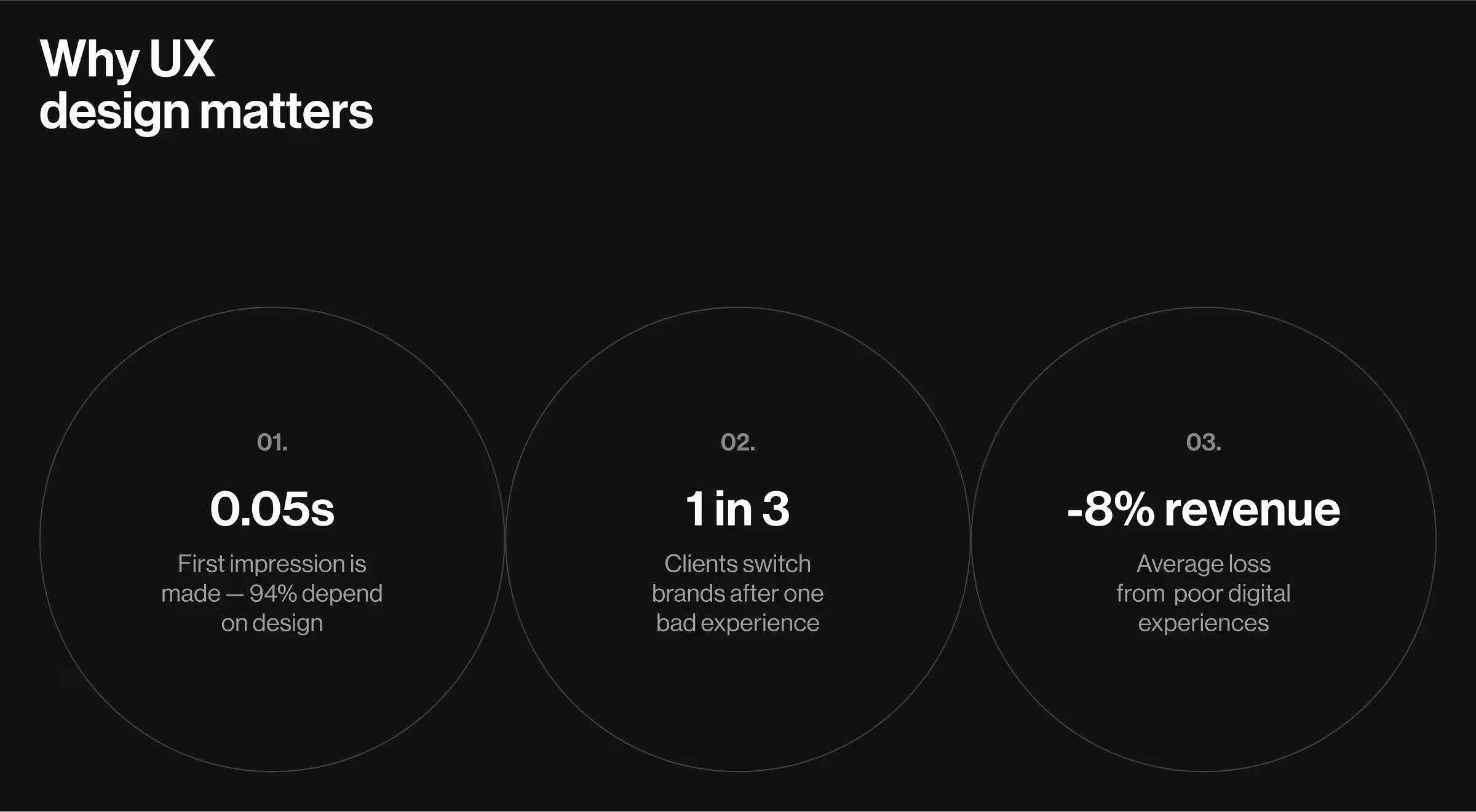
Bottom line: poor UX design means missed opportunities. On the flip side, websites with great UX build trust, boost loyalty, and lead to actual results.
💡Key insight: Investing in UX design pays off, with every $1 spent on UX potentially yielding 100x returns.
Learning from the best UX design website examples
At Lazarev.agency, we know that a visually appealing user journey doesn’t happen by chance. It’s the product of meticulous planning and strategic execution.
Commitment to design thinking is at the core of everything we do. And it hasn’t gone unnoticed. In 2024, our team’s expertise earned Lazarev.agency its second Webby Award, a recognition of excellence in digital experience.
This achievement highlights a broader market reality: across industries, businesses engage in a high-stakes race to deliver exceptional user experiences. In this race, expertise and experience are what set true leaders apart.
That’s why UX has evolved into a mark of excellence. In-depth market research, prototyping, user behavior analysis, and QA testing are just a few components of results-driven UX.
“Product design must communicate value and reliability at every touchpoint. Users need to feel immediately satisfied while businesses need to see measurable results. This requires not just visual polish, but a comprehensive value narrative throughout the entire product experience.”
{{Oleksandr Holovko}}
Here’s our curated collection of inspiring UX design solutions worth considering with our ideas on their improvements as well.
Airbnb
Airbnb’s website excels at visual storytelling and trust-building, with intuitive search, dynamic filters, and rich listing previews. Microcopy, reviews, and host profiles reduce decision anxiety. However, post-booking flows (e.g., trip management, support access) feel less polished, revealing a disconnect between inspirational browsing and functional travel logistics.
PayPal
UX solutions of PayPal are rooted in trust and legacy infrastructure, yet those strengths now present design challenges. The core flows (checkout, sending/receiving funds) remain efficient and familiar, supported by strong feedback cues and consistent visual language for high-trust interactions.
Still, tasks like updating payment methods expose weak information architecture and dated interaction models. Users are often routed through multiple tabs, modals, and support pages, breaking continuity and inflating cognitive load. There's also a lack of user-state awareness. PayPal doesn’t adapt flows for returning users, verified accounts, or common use cases.
PayPal needs UX unification across platforms, a smarter onboarding-to-engagement path, and a rethinking of legacy components. It’s a product built on trust, but to retain relevance in a post-fintech landscape, it must become as intuitive as it is secure.
Duolingo
Duolingo’s UX stands out for its gamified learning loop like daily streaks, bite-sized lessons, and immediate feedback to drive habit formation. The visual hierarchy is clean and intuitive, guiding users through progression with minimal friction. Its use of microinteractions and character-based storytelling enhances engagement without overwhelming the user.
However, the balance between free and premium tiers creates UX friction; some essential features (like mistake review) are paywalled, which can frustrate serious learners. While ideal for beginners, advanced users face limited challenges and personalization. Overall, Duolingo delivers a masterclass in engagement design but could scale depth and adaptability.
Notion
Notion excels in delivering a flexible, all-in-one workspace through a modular content system. Its drag-and-drop blocks, nested hierarchy, and real-time collaboration offer a coherent experience for individual and team workflows.
We find the UX around page linking, inline databases, and template creation particularly strong, empowering users to build custom workspaces without technical knowledge. However, discoverability suffers as functionality scales. Key features like advanced database filters or automation options are hidden behind multiple layers, creating a learning curve for new users. We also see an opportunity to improve permissions UX, where granular sharing settings lack clarity and lead to accidental oversharing.
From a business perspective, the onboarding flow could better segment users by intent (e.g., team vs personal use) to guide setup more effectively. Overall, Notion’s UX is powerful for those who commit, but its learning curve and content sprawl reveal clear areas for refinement, especially for enterprise adoption at scale.
Google Store
Keeping things neat while offering options is a classic UX challenge. One the Google Store handles with remarkable discipline. The interface adheres to Material Design principles, reinforcing clarity through grid-based layouts, generous white space, and consistent component behaviors.
Google Store features clearly segmented product categories and keeps contextual cues (like subtle hover states and iconography) at hand to help guide decisions without overwhelming the user. The PDPs (product detail pages) balance visual hierarchy and information density, presenting specs, comparisons, and reviews in digestible chunks.
Microinteractions, such as smooth transitions and dynamic updates to cart elements, subtly reinforce user control. Streamlined checkout flow with minimal form fields, progressive disclosure, and persistent cart summaries reduces drop-off. Accessibility is at the core of the website’s architecture, with sufficient contrast ratios, scalable typography, and keyboard navigation support.
While emotional engagement is minimal compared to lifestyle-led stores, Google Store’s UX strength lies in its precision: fast, focused, and functionally elegant from browse to purchase.
Spotify
Spotify takes personalization to a new level, blending data-driven precision with editorial curation to create a uniquely engaging experience. Its UX design is a masterclass in adaptive interfaces — dynamic home screens shift based on time of day, listening behavior, and trending content, reducing friction in discovery.
Spotify’s two-tier recommendation system is a strategic UX pattern. Algorithmic suggestions reflect user behavior (listens, searches, skips), while human-curated playlists inject diversity and serendipity. This balance prevents the interface from feeling overly mechanical or repetitive. Visual cues like genre-themed cards, personalized covers (e.g., “Made for You”), and contextual language reinforce the sense of individualization.
Interaction design choices such as swipeable carousels, fast-loading previews, and responsive touch zones enhance micro-discovery moments. However, library management can feel flat due to limited sorting or tagging capabilities.
Still, Spotify’s interface architecture and recommendation mechanics offer a benchmark in how to translate complex personalization into an intuitive, emotionally engaging UX.
UX strengths and gaps across leading platforms
The table below highlights the most effective UX strategies and common pitfalls across top digital platforms reviewed. Features like gamified flows and trust-building microcopy enhance the experience, yet every product still has points that need refining.
A few more practical insights on what makes a great UX design from Lazarev.agency
Collaboration with platforms across different industries has provided insights into what truly stands behind the best UX websites. Consider two UX design website examples that illustrate how prioritizing UX makes a difference.
Functionality in action: Blockbeat case
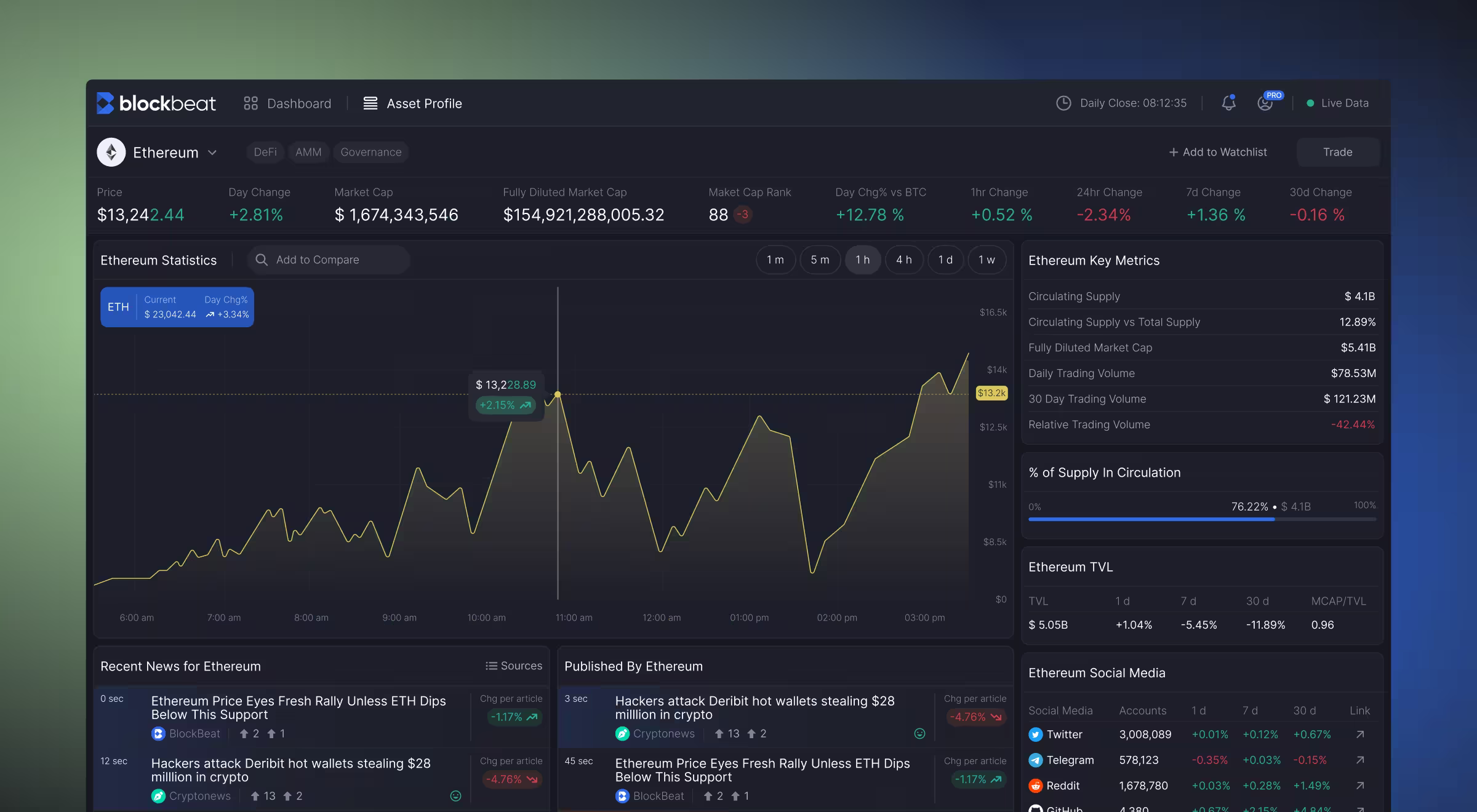
Functionality and usability form the backbone of the best UI/UX websites. Yet, keeping up with these standards becomes tricky once substantial volumes of data come into play.
That’s the exact challenge Blockbeat, a leading crypto news aggregator and trading terminal, faced. Our solution for Blockbeat centered around structuring data according to user preferences in real time to ensure the utmost personalization and responsive updates.
“In crypto, timing is everything, and you need to know why it matters right now.”
{{Ostap Oshurko}}
The crypto market goes through a lot of changes in no time. That’s why keeping the users up to date was one of the chief objectives of our collaboration. To achieve this, we made a few critical improvements:
- Introduced an interactive dashboard with a live news feed on the left, hover-activated article previews in the center, and instant market stats on the right.
- Implemented advanced filtering tools to personalize the user’s news feed.
- Designed custom watchlists reflective of individual preferences.
- Developed a responsive market stats widget to help traders gauge market sentiment and make informed decisions at a glance.
Frictionless flow and a touch of fun: global fintech case
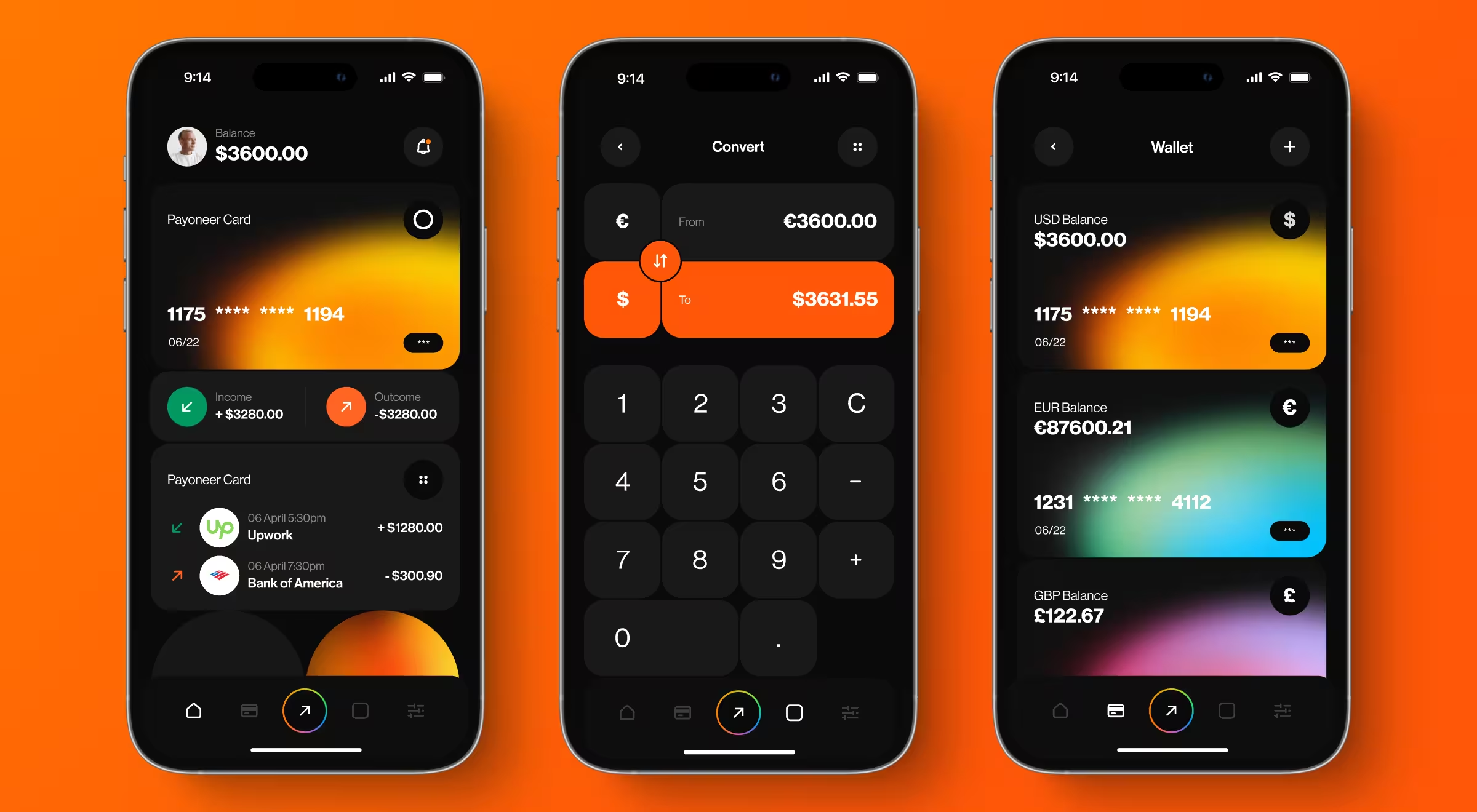
Our collaboration with a global fintech company focused on crafting a smarter, user-centered UX/UI. We updated the home screen to display key financial info — from card balances to currency details — while sticking to the same brand colors to keep the aesthetics aligned with a familiar style.
An interactive Wallet added playful functionality, with credit cards changing colors by currency. We also proposed expanding supported currencies to boost global accessibility. Additionally, our team integrated a real-time calculator directly into data entry points to simplify conversions and introduced an AI-driven voice assistant to handle common queries. Built-in analytics replaced third-party tools, helping users monitor spending without leaving the app.
Let’s develop a UX design system that drives results together
Lazarev.agency provides tailored website design services that stand out in competitive markets while driving measurable business results. With a focus on user-centered design, our team carries out comprehensive user research alongside market sentiment analysis to ensure our solutions meet specific industry demands.
With this principle in mind, we’ve helped over 500 companies position themselves as trendsetters in their fields. Contact Lazarev.agency for a custom website design that brings your product a competitive advantage. Share your unique vision, and we’ll take the lead to translate it into actionable design solutions that move your business forward.


.webp)


.avif)

