

Reviewed by: Lazarev.agency Product Strategy Team
Last updated: December 2025
Expert sources: Nielsen Norman Group, Baymard Institute, Google Web Dev (Core Web Vitals), Lazarev.agency case studies
The most actionable UX performance metrics are those that expose friction at the micro-step level and tie directly to conversion, retention, and cost to serve. Track behavioral, attitudinal, usability, and performance signals, then segment them by role, device, and channel to guide fast, meaningful product decisions.
Key takeaways
- Track fewer metrics, but treat each as a trigger for a decision.
- Focus on micro-moments — that’s where users actually fail.
- Measure in context (device, network, channel, persona).
- Map every metric to money: conversion, retention, AOV, and cost to serve.
- Use three pillars (Satisfaction, Efficiency, Growth Impact) to build an exec-level dashboard.
There’s a reason dashboards gather dust: teams overcollect, underevaluate, and rarely connect readings to decisions. Treat UX performance metrics as a compact set of signals that change what you build next.
Below, we establish a lean baseline, then map three pillars we use on B2B work, each backed by Lazarev.agency’s cases. You’ll see how to measure user experience with the right UX performance metrics, convert readings to decisions, and connect the changes to revenue.
The baseline: what to track every week
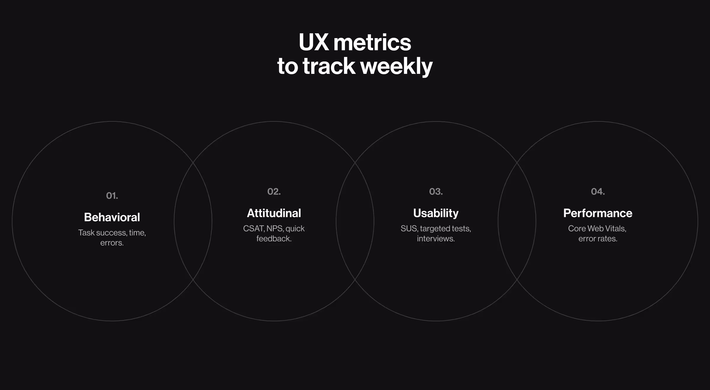
Keep a 15-minute Monday review, anchored in four families of user experience metrics:
- Behavioral metrics (what users do): task success rate / task completion rate, task completion time, session duration, back-tracks, and user error rate on each micro-step. These show user behavior where it matters and how actively users interact with your user interface.
- Attitudinal metrics (what users feel): lightweight user feedback at the initial interaction (“Was this page helpful?”), quick Customer Satisfaction Score (CSAT), net promoter score (NPS)/customer satisfaction score, plus short prompts to gather qualitative feedback. These reveal whether the flow meets user expectations, resolves pain points, and produces satisfied customers.
- Usability metrics (can users achieve the goal?): System Usability Scale (SUS), moderated/unmoderated usability testing, targeted user testing on a specific task, and user interviews to expose friction behind the numbers.
- Performance metrics (how fast and stable): Core Web Vitals in the field (LCP/INP/CLS) and flow-level error rates. Use any analytics stack (e.g., Google Analytics) to collect data and export quantitative data/numerical data for comparisons.
Two guards keep this baseline useful:
- Owners per KPI (key performance indicators) with review cadence and last delta;
- Segmentation by channel/role/device so “how many users” doesn’t drown out where users spend time and fail.
🔎 For practical ways to collect and validate these signals — analytics & log analysis, in-product events, and A/B testing; see our guide to design research methods & practices.
These are necessary, but not enough for strategic leadership decisions. Once hygiene is stable, you can decide how to measure user experience at the executive level without bloating the stack.
How to measure user experience
Use this quick sequence to make measurement actionable:
- Shift from averages to paths.
- Define goals per step, read pathing through those steps, and segment by platform and network.
- For attitudinal reads, use short prompts at the moment of effort; for qualitative depth, add interviews to extract valuable insights you can’t infer from quantitative metrics alone.
- The blend qualitative metrics + quantitative metrics keeps customer experience changes grounded in evidence.
Ownership matters: each metric lists an owner, review frequency, and the last change. When everyone can see who is on the hook and when it’s reviewed, backlogs match the numbers.
🔎 For a practical, decision-first approach to analytics, see our article on data-driven UX/UI design for B2B projects.
With segmentation and ownership set, we can compress an exec view to three tiles — UX success metrics that steer decisions.
UX success metrics: three pillars for exec dashboards
Below are the pillars we track, the usability metrics and attitudinal metrics inside each, and the design moves they unlock.
Pillar A — customer satisfaction
What to measure and why. On the first visit, track task success for reaching “how it works,” user engagement with proof blocks, and demo intent (clicks/calendar opens). Add a quick attitudinal read (“Was this page helpful?”). The pair behavioral + attitudinal exposes whether story clarity drives action.
How to count. For each channel (organic, paid, referral), track three numbers: demo intent (clicks on “Book demo” or calendar opens), quick CSAT (a one-question rating on the page), and on-page feedback (thumbs up/down or a short note on key proof/CTA blocks). Then compare results by channel and by persona.
Which design moves it unlocks. If intent lags while CSAT holds, adjust above-the-fold narrative, bring evidence earlier, and clarify CTAs.
💼 Case to watch: Bacca AI. Bacca AI sells an AI-powered SRE API with no visible interface to demo on a page. Lazarev.agency rebuilt the site to replace abstract selling with a guided storytelling-based sales conversation that moves visitors from the cost of downtime to “how it works,” proof, and clear CTAs, mirroring how decision-makers reason. The page uses short “Bacca” system messages to explain what the AI is doing (detecting, fixing, learning), which builds trust and clarifies value without jargon.

Use this pillar to show UX success metrics that leadership can actually steer: if story clarity and demo intent don’t rise together, change messaging before you change the product.
Once acquisition brings the right audience, efficiency inside flows determines whether visitors complete tasks.
Pillar B — product efficiency
What to measure and why. Broad conversion hides the real blockers. Measure user interaction on the smallest steps: e.g., choose method → Full/Partial/Plan → enter details → confirm. Track task completion time, error rates, and user errors per step.
How to count. Report step→step conversion rate, time medians, and errors by role/channel; set alerts when a step’s trend breaks. Compare copy/validation variants through usability testing to confirm which change removes friction.
Which design moves it unlocks. When a step exceeds your thresholds, fix validation order, field grouping, and microcopy before adding features. This is classic UX design leverage.
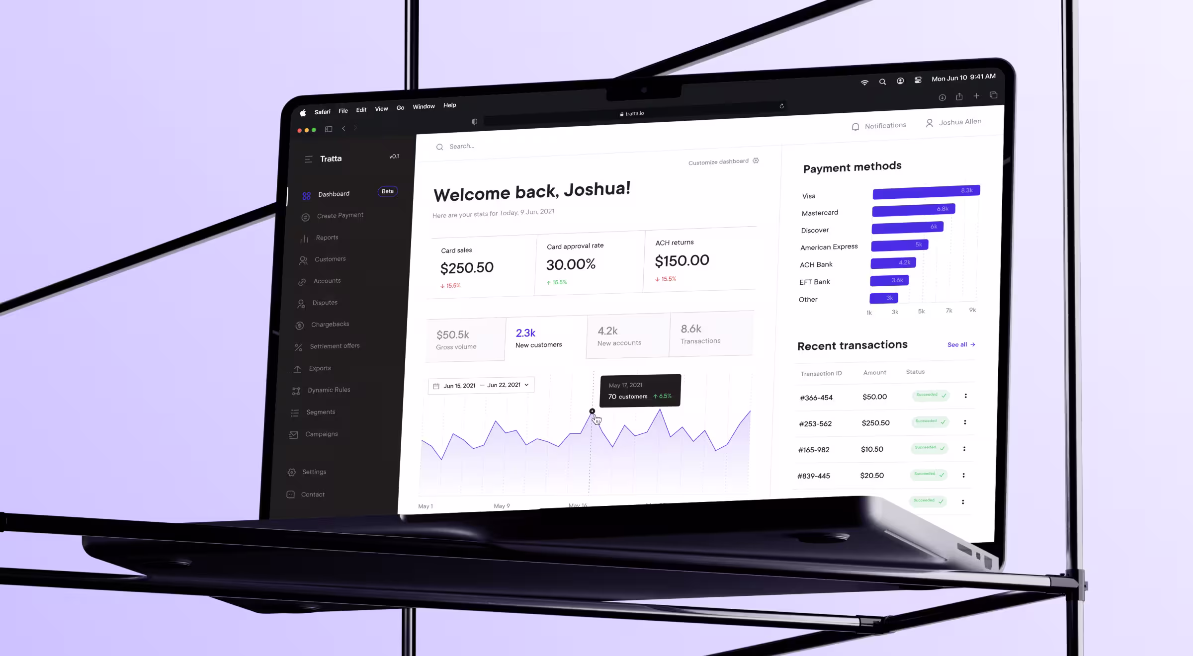
💼 Case to watch: Tratta. Tratta’s Collect platform offers Full Payment, Partial Payment, and Payment Plan Setup with a streamlined transaction path. Choice matters, so the flow supports Guest Payment (fast path) and account creation when users need plans or additional methods — two routes with different expectations and metrics. On the admin side, Console and its Reports provide role-specific oversight across transactions and data, which is exactly the granularity you want your dashboard to reflect.
UX measurement at the micro-moment level keeps teams focused on the real blockers users meet, not on abstract funnel math.
Efficiency is local; growth comes from context — how the same flow behaves across platforms and constraints.
Pillar C — growth impact
What to measure and why. Compare medians for key screens (e.g., landing/pricing/comparison/lead) across mobile vs. desktop and constrained vs. strong networks; add accessibility checks aligned to Web Content Accessibility Guidelines to protect reach and user experience optimization.
How to count. Track deltas when time users spend before the first click grows on mobile, or when back-tracks climb. Pair with System Usability Scale (SUS) samples to confirm perceived friction.
Which design moves it unlocks. If mobile lags, simplify the first screen, push secondary widgets below the fold, and elevate the one decision enabler (pricing clarity, comparison, or proof). For accessibility, log issues per template and set a steady burn-down.
💼 Case to watch: Dynascale. Dynascale sells private cloud and managed IT. Lazarev.agency rebuilt the information architecture around buyer journeys so visitors can navigate by role, challenge, or industry. Then we layered transparent pricing blocks, comparisons, and compliance indicators to answer enterprise objections. An interactive data-center map turns national reach into a lead generator, letting prospects request deployments by location. This structure provides a natural way to compare behavior by role and device and to benchmark the “first-screen” experience where it matters.

Align audits with WCAG 2.2 AA. Use W3C’s Quick Reference for success criteria and techniques.
With three pillars in place, you need a cadence that keeps signals close to decisions.
UX measurement in practice: micro-moments & early warnings
Operationalize two views: weekly deltas and real-time warnings.
- Acquisition: alert when view → demo drops on paid traffic to your landing page; investigate messaging and evidence order before tweaking forms. (Bacca’s guided narrative is a reference pattern.)
- Checkout: alert on a step’s error spike or time jump—e.g., Payment Plan selection suddenly slows or fails more often; examine validation and copy first. (Tratta’s dual payment paths make these slices meaningful.)
- Context: alert when mobile median drifts beyond your desktop baseline on key screens or when 3G lag erodes interactivity; re-prioritize above-the-fold content. (Dynascale’s role-focused pages and comparisons are ideal for this view.)
Put simply: this UX measurement keeps PMs ahead of churn and conversion risk by turning subtle pattern shifts into fast, specific design work.
Tying metrics to money
Causality beats correlation theater. Read chains instead of single points:
- Lift demo intent in the right channels → watch SDR load, SQO quality, and CAC.
- Remove checkout friction → confirm conversion rate and AOV while paid efficiency holds.
- Unclog mobile first screens → compare mobile vs. desktop CR and retention.
Close the loop by logging change, expected impact, and review date. That’s how performance metrics move beyond reporting and support user loyalty over time.
Metrics are meaningless until they hit the balance sheet
We design UX strategies where every signal maps to money: more demos booked, smoother checkouts, higher retention.
Let’s talk and make your UX performance metrics pay for themselves.


.webp)


.avif)

