Each step in the journey affects whether a shopper follows through.
And every interaction shapes intent — lose momentum, and the user may never return. Industry studies place the average ecommerce conversion rate in the low single digits, so every shaved second or click matters.
The Lazarev.agency team treats ecommerce conversion optimization as an engineering puzzle: remove friction piece by piece and let shoppers glide from curiosity to checkout.
Key takeaways
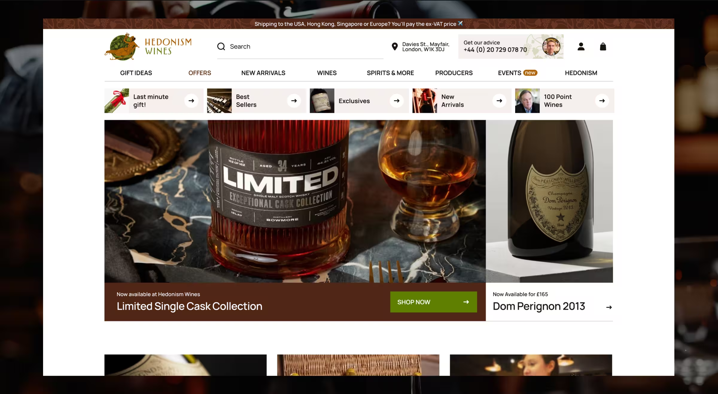
- Collapse the path to payment. A leading fine wine retailer in London dropped five taps to two with a single “Buy Now” button tied to Apple Pay.
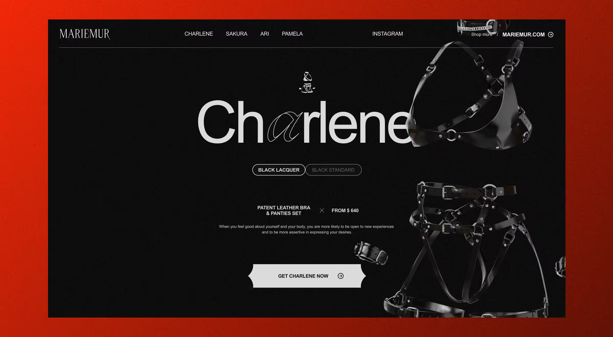
- Guide attention with an immersive teaser. Mariemur’s four-set landing screen replaces option overload and keeps newcomers exploring.
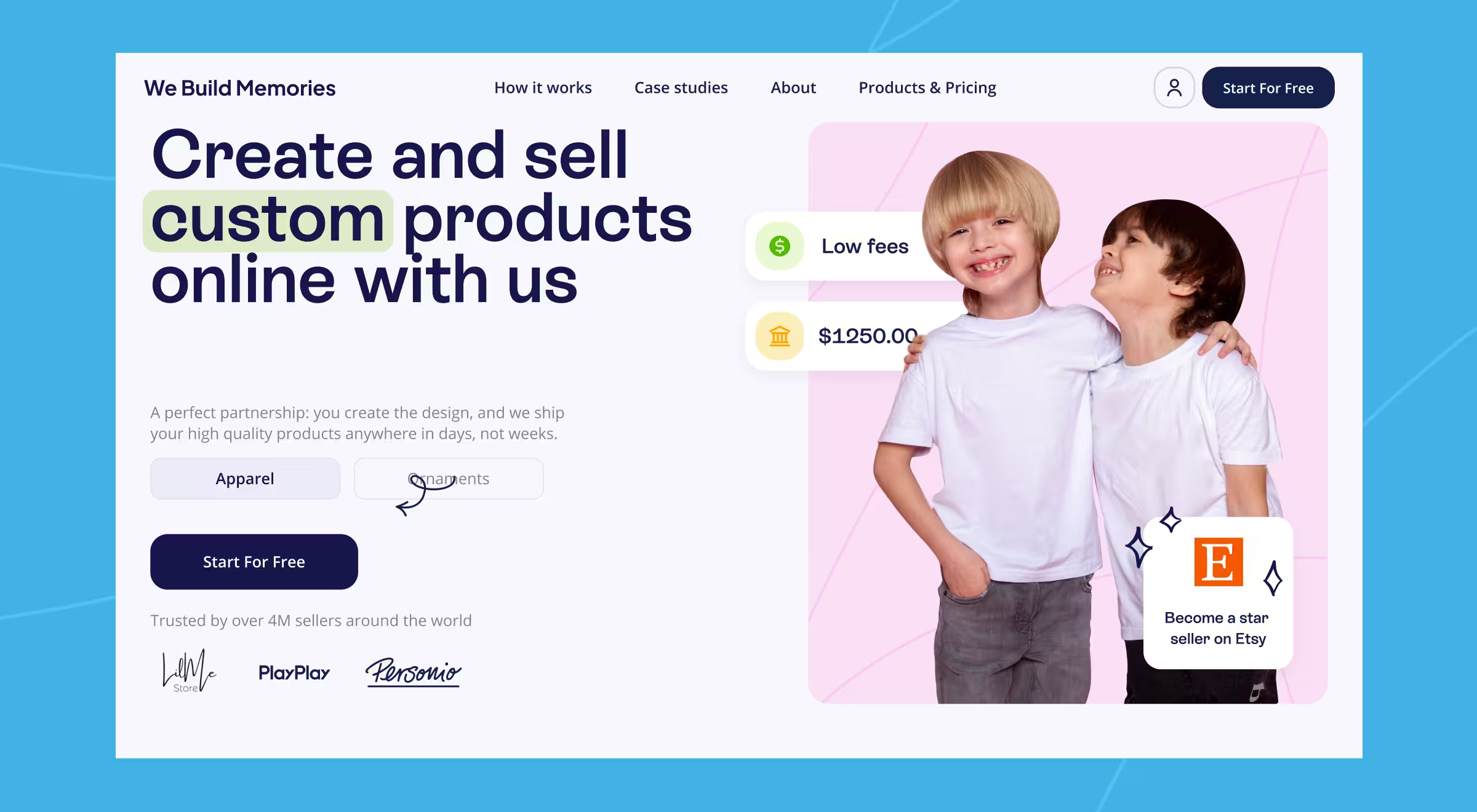
- Anchor value with real-time bundles and savings. We Build Memories lifted both conversion and average order value by surfacing ready-made kits at the decision point.
1. Compress checkout on your e-commerce site
Case: A leading fine wine retailer in London

Luxury buyers abandon carts the moment checkout drags. The redesign applies ecommerce conversion optimization directly to the payment path: a prominent “Buy Now” button triggers Apple Pay or Google Pay at once, skipping the detour through the cart and mini-cart pages.
Mobile shoppers jump from product view to biometric confirmation in two taps. A live inventory badge (“6 bottles left”) beside the button adds honest urgency, pulled directly from the stock API.
It’s a direct answer to teams asking how to increase conversion rate of ecommerce shoppers without discounting.
“You don’t fill out paperwork to sample a fine wine — payment should feel the same. One decisive gesture, and you’re the happy owner of the bottle you crave!”
{{Anna Demianenko}}
🔍 Pro tip: Add the web-native Payment Request API as a graceful fallback for browsers without Apple Pay / Google Pay. You keep the two-tap flow, capture autofill billing data, and avoid a full form even on legacy devices.
2. Use immersive landing page with high-quality images to focus attention
Case: Mariemur

Paid-ad traffic hit a wall of filters and sizing copy; bounce followed seconds later. That drop is a classic “experience gap” — see how we close it in our experience design guide.
Mariemur’s ecommerce conversion optimization move was radical in its restraint:
- Cut the copy by 87% — only set name, price, and color swatches survive; everything else is visual.
- Lead with a four-set teaser grid that fills the first viewport and funnels shoppers to a single decision per scroll.
- Add a “View in 3D” toggle on each tile; the model loads on demand, letting visitors inspect every strap and rivet without a page jump.
- Tune for thumbs and 4G: edge-to-edge cards, larger tap targets, and compressed image sets make the mobile version load 40% faster than the old desktop-first layout.
The overhaul began with an ecommerce CRO audit that flagged copy overload and mobile lag as top friction points.
“Remove the noise, and the right product will sell itself. When the screen feels like a dressing-room mirror, specs can wait.”
{{Ostap Oshurko}}
🔍 Pro tip: To balance 3D visuals with performance, we swapped traditional 3D rendering for transparent video, perfect for showcasing high-detail models without overloading the browser. The team also used GSAP for animations and WebGL for backgrounds that react to cursor movement. Color transitions between 3D models were created using layered images, which also helped avoid heavy rendering.
3. Anchor value with real-time bundles to increase conversion rates
Case: We Build Memories

We Build Memories is a top-5 Etsy seller specializing in custom baby clothing and Christmas ornaments. Etsy newcomers hesitate when margins feel abstract. The redesigned product page dissolves that doubt with an inline data-driven calculator.
- Instant earnings calculator. Two sliders: sell price & daily sales, redraw an Approximate Annual Profit badge in real time.
- Transparent cost baseline. A tag directly under the calculator states “Fulfillment price starts from $6.95”, letting sellers weigh margin without hunting T&Cs.
- Pastel success cues. Profit badges, CTAs, and helper tips adopt the site’s soft-lavender palette, so revenue highlights feel native rather than “salesy.”
- Fully client-side logic. The widget loads after first paint, draws values from one cached fee table, and needs no extra network calls — CRO with 0 performance tax.
“Margin clarity is the new discount; show it up-front and the cart grows by itself.”
{{Ostap Oshurko}}
🔍 Pro tip: Keep every math operation in the browser — fetch raw fee tables once, cache with max-age=86400, and recalc locally on slider move. The projection updates in < 16 ms, safeguarding interaction latency and user trust in equal measure.
An ecommerce conversion optimization pattern you can re-use
1. Right before desire meets price
- A leading fine wine retailer in London collapses three screens into a two-tap Apple Pay sheet.
- Why it converts: the question flips from “Can I check out?” to “Do I want it?”
2. When choice overload paralyses
- Mariemur removes 87% of product copy and spotlights four cinematic sets.
- Why it converts: attention funnels to a single, high-value tap.
3. At the point of value comparison
- We Build Memories replaces mental math with a live-profit calculator.
- Why it converts: clear margin insight nudges shoppers toward bigger baskets.
4. Recurring CRO blueprint
- Audit every click from intent to pay and collapse any step that adds no value.
- Lead with a visceral hook — human-scale imagery or live 3D earns the scroll that copy cannot.
- Surface numbers that sell — real-time stock, fee baselines, or profit deltas swap doubt for confidence.
Each of these techniques represents conversion rate optimization best practices of Lazarev.agency that can be applied to any funnel.
Next-step recommendations from Lazarev.agency’s UX design team
These tactics extend the three case lessons without rewriting your entire stack:
- Instrument micro-CX events — track thumb-reach failures, to reveal hidden friction on mobile.
- Deploy Early-Hints + preconnect for pay-sheet endpoints — let payment assets warm while HTML is still in transit.
- Build a “trust stack” above the fold — combine rating badge → money-back note → identity-proof icon in one visual column; eye-tracking shows users scan vertical lungs faster than horizontal ribbons.
- Run 48-hour design sprints on a Feature Flag — ship an isolated UX tweak to 15% of traffic; decide with live data.
Ready to close the revenue gap?
If ad spend keeps rising while checkout stalls, book a call with Lazarev.agency’s leads. We’ll:
- Run a live heuristic teardown of your funnel,
- Pinpoint the single UX block leaking the most revenue, and
- Outline a zero-downtime rollout that pays back before the next quarter-close.
Let’s remove the friction that’s costing you customers now!


.webp)


