Building an EdTech product? It’s not enough to deliver content — you have to deliver learning. That means smart UX, solid pedagogy, and design that supports outcomes at every click.
Key takeaways
- Modern learning is built on education technology — not simply improved by it.
- Design shapes outcomes. Great UX for an EdTech product boosts retention, motivation, and learner progress.
- Every audience is different. Kids, college students, and adults need tailored experiences.
- Success = engagement + measurable learning outcomes.
Why EdTech design is now mission-critical
EdTech isn’t just a trend. It’s the new infrastructure of education. What started as a supplemental layer in classrooms — think smart boards and simple LMS portals — has become the backbone of modern education. Today, technology shapes how students engage, retain knowledge, and interact with content across K–12, higher education, and workplace learning.
The turning point came during the COVID-19 pandemic, when education systems worldwide adopted online tools out of necessity. That urgency accelerated innovation and triggered massive investment: global EdTech funding hit $16.3 billion in 2018, up from $9 billion in 2017, and it hasn’t slowed since. The market is now projected to reach over $810 billion by 2033, growing at a CAGR of 13.9%.
More than just scaling up, the focus of EdTech products has shifted toward creating significant impact by aiming to:
- Support adaptive learning tailored to individual progress
- Provide real-time performance tracking for faster feedback
- Use game mechanics to boost motivation and knowledge retention
"EdTech is no longer just a supplementary tool. It has become the core engine powering how people learn worldwide."
{{Kirill Lazarev}}
EdTech shifts focus from content to comprehensive learning solutions
EdTech has outgrown its early role as a content distribution channel. In 2025, success isn’t measured by how much information a platform delivers, but by how effectively it helps students learn.
That shift from content delivery to learning experience design marks a new standard for educational products.
Modern EdTech platforms are expected to do more than videos and quizzes. They’re designed to:
- Boost engagement through intuitive interfaces and game-based mechanics
- Enhance retention rates with adaptive learning paths that adjust to each student’s progress
- Promote motivation through clear goals, visualized progress, and timely feedback
- Improve access with mobile-first experiences and seamless onboarding for diverse users
To deliver real outcomes, these platforms integrate data tracking and behavioral insights. Performance dashboards give educators the clarity they need to intervene early, adjust pacing, and personalize instruction. Meanwhile, students benefit from transparency: they can see how they’re doing and where to focus next.
While engagement is often the first metric teams track, it’s not the only one that matters. Forward-thinking EdTech design is increasingly measured by:
- Course completion rates
- Learning outcome achievement
- Improved knowledge retention over time
- User satisfaction and re-engagement rates
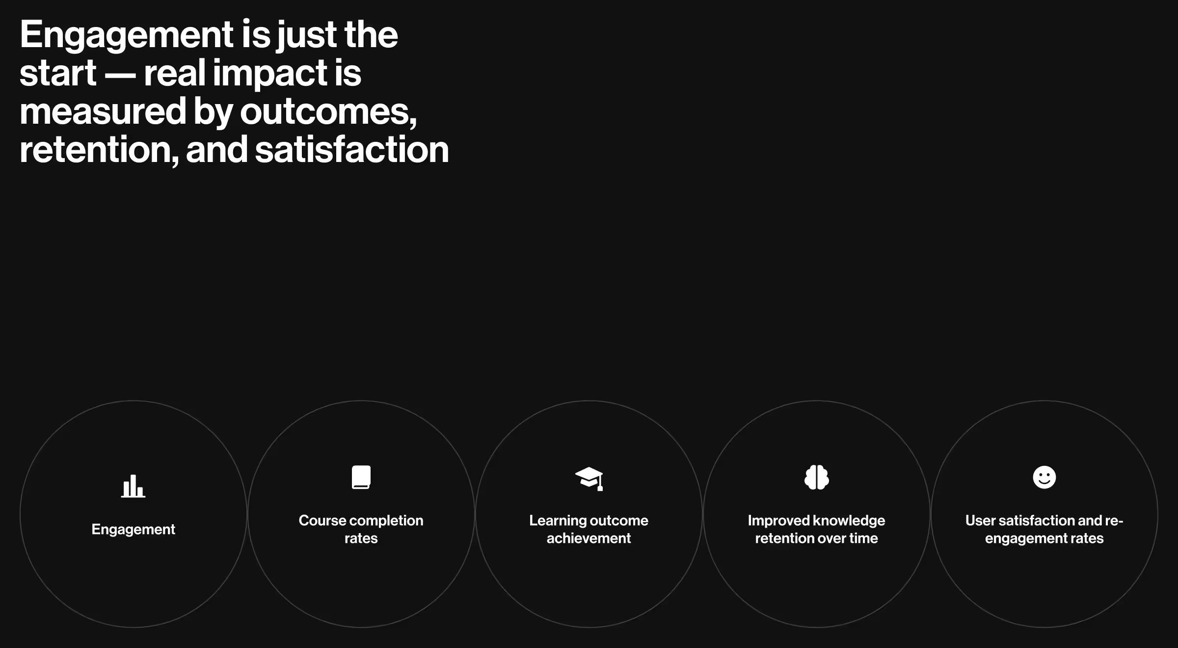
Designing for learning outcomes means thinking beyond features. It’s about building systems that support curiosity, confidence, and measurable progress — for every learner.
Core principles of great EdTech design
What separates an average EdTech product from one that truly improves learning outcomes? It comes down to applying the right principles — rooted in design research, user empathy, and real-world education needs.
General design tips
1. User-centered and research-backed
Effective EdTech design starts with how people learn. It embeds pedagogical principles into every interaction and considers both ends of the experience: the learner and the educator.
"Every design choice — from navigation to flow — should reduce cognitive load and make the learning journey effortlessly clear."
{{Oleksandr Koshytskyi}}
Take Khan Academy and ClassDojo — two standout examples of user-centered EdTech design.
Khan Academy is a strong example of user-centered design rooted in learning science. Its clean interface, structured lesson paths, and adaptive exercises make it easy for students to focus and progress at their own pace. Teachers benefit too, with tools to assign content and monitor performance helping them step in when it matters most.
ClassDojo, on the other hand, tailors the experience to younger learners and their teachers. Its playful visuals, instant feedback system, and simple communication tools support engagement, classroom culture, and family involvement, all while keeping the interface intuitive and developmentally appropriate.
2. Accessibility and equity
Equity in education begins with access. That means designing platforms that work:
- Across devices and screen sizes
- In low-bandwidth environments
- For learners with diverse needs and abilities
Mobile-first approach is now essential, so educational app design is no longer optional — it’s foundational.
3. Feedback loops and personalization
Effective EdTech turns interaction into insight. When platforms respond to how students engage and how teachers guide, they unlock faster, smarter decisions.
Think of Duolingo: its learning paths adapt in real time, adjusting difficulty, reinforcing missed concepts, and keeping learners motivated with visible progress markers. It feels intuitive because it is. Meanwhile, Kiddom equips educators with real-time data on student mastery, helping them spot trends, tailor instruction, and offer support exactly when it’s needed.
This kind of personalization is a strategic advantage. Thoughtful design turns static content into responsive experiences that support growth on both sides of the classroom.
4. Trust, simplicity, and ethical use
Modern learners are data-aware. They expect platforms that feel safe, transparent, and respectful of their privacy.
That means:
- Minimizing data friction
- Communicating how insights are used
- Avoiding dark patterns or overwhelming interfaces
These principles are requirements for creating EdTech products that serve real students, real educators, and real goals. For example, Promova — a language learning platform — asks new learners about their level, goals, and motivation during onboarding to personalize the experience from the start.
UX ideas
In EdTech, UX design fundamentally influences how effectively learners engage and succeed. The interface is the learning environment, and how it’s designed directly impacts how well students absorb, apply, and retain information.
Reducing friction and cognitive load
Imagine a learner, bright-eyed and ready to dive into new ideas, suddenly facing a maze of confusing buttons and labels. Each unnecessary click, each ambiguous instruction, acts like a roadblock, halting their progress and dampening their enthusiasm. Exceptional EdTech UX design acts as a skilled guide, smoothing this path by eliminating these obstacles and spotlighting the core elements that fuel a learner's growth.
Think of it this way:
- Streamlined onboarding: Instead of a daunting hurdle, it's like a warm welcome, gently introducing learners to their new environment.
- Consistent visual hierarchy: It's like a clear map, effortlessly guiding learners through the content step by step.
- Built-in guidance and subtle feedback: These are like encouraging whispers, offering support and reinforcing learning without pulling focus.
These aren't just nice-to-haves; they are the essential building blocks that transform a digital tool from a potential source of frustration into a reliable partner on every learner's journey toward achievement.
Mobile-first by default
With over 4 billion mobile users worldwide, EdTech products must deliver responsive, mobile-first experiences. Students expect learning to fit into their routines — not the other way around. So they expect:
- Fast load times
- Tap-friendly interfaces
- Offline compatibility for learners in low-connectivity environments
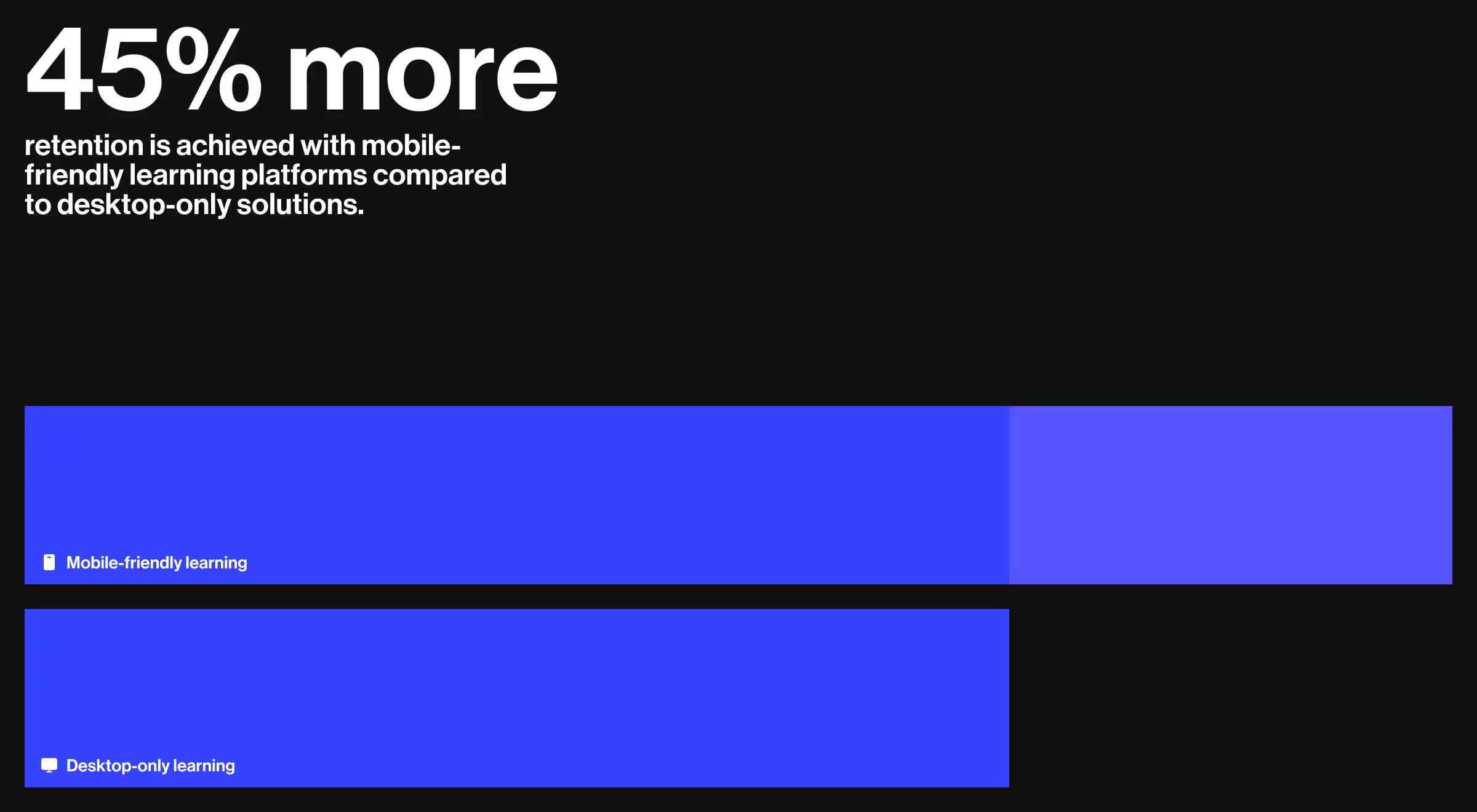
💡Pro Tip: In addition to enhanced accessibility, mobile-friendly learning platforms have demonstrated the potential to increase retention rates by up to 45% when compared to those solely available on desktop.
Dashboards and data that drive action
Educators need clarity. Dashboards should provide real-time insights on learner progress, flag potential issues, and support smarter, faster instructional decisions. Also, users want:
- Visual summaries over dense spreadsheets
- Customizable views for different teaching styles
- Alerts for underperforming or disengaged learners
Designing for emotional engagement
Learning is emotional. Students retain more when they feel safe, seen, and supported. That’s why strong EdTech UX also integrates social-emotional learning (SEL) principles — through tone of voice, interaction patterns, and feedback design.
"Thoughtful UX — like celebrating small wins or giving timely encouragement — can help learners swap stress for confidence, turning passive observers into active participants."
{{Oleksandr Koshytskyi}}
The EdTech design framework: pedagogy × UX × analytics
Great EdTech design doesn’t start with features. It starts with balance. Every successful platform stands on three pillars that form a single framework:
- Pedagogy — the instructional DNA. This is where learning objectives, cognitive load, and progression structures live. Without pedagogy, design risks becoming entertainment rather than education.
- UX/UI — the delivery mechanism. A product may have the right content, but if navigation is clunky or feedback is unclear, learners stall. UX is the invisible guide that reduces friction and keeps motivation alive.
- Analytics — the adaptive loop. Modern learning products must respond to data in real time. Analytics is the mechanism that allows teachers to intervene early and platforms to personalize the next step.
Visualize this as a triangle: if one side is missing, the entire system collapses.
- A platform with solid pedagogy but poor UX leads to high dropout rates.
- A sleek interface without learning science delivers activity, but not mastery.
- Analytics without context create noise that overwhelms rather than clarifies.
True EdTech design means all three work in sync: pedagogy defines what matters, UX makes it usable, and analytics make it adaptable. That’s the formula for outcomes that scale beyond content delivery into real learning impact.
Different audiences = different strategies
One-size-fits-all doesn’t work in EdTech. Each learner segment — whether a first grader, a college student, or a working professional — comes with unique cognitive patterns, motivational triggers, and product expectations. Great design meets them where they are.
.avif)
Critical UX flows that define EdTech success
Principles matter, but execution lives in flows. Every EdTech platform must get a handful of user journeys right. If these flows fail, no amount of features will save the product.
1. Onboarding
The first moments decide whether learners engage or bounce. For students, onboarding should feel like a guided welcome — simple, clear, and motivating. For teachers, it must also handle roster creation, class setup, and content upload without becoming an administrative burden. When onboarding works, users feel equipped to start learning.
2. Learning navigation
Confusing navigation is the number one cause of early abandonment in EdTech platforms. Learners need obvious pathways that match the learning model: linear courses, modular units, or adaptive flows that respond to progress. The best designs eliminate ambiguity and let students focus on content, not on finding their way through it.
3. Assessment & feedback loops
Assessment is about momentum. Students thrive on instant, actionable feedback that tells them how they’re doing and what to fix next. Teachers, on the other hand, need aggregated insights that highlight patterns across the class. The most effective flows connect these two perspectives in a tight, continuous loop that drives learning forward.
4. Dashboards for educators
A dashboard that simply lists numbers is a wasted opportunity. Great dashboards interpret data, surfacing trends, risks, and opportunities. They flag students who may be struggling, highlight content that isn’t landing, and free teachers from spreadsheet paralysis. In the best platforms, dashboards act as a control center for proactive intervention.
Products like Duolingo or Google Classroom succeed not because they overwhelm users with features, but because these flows are effortless. They reduce friction at critical moments, build confidence, and make progress visible — the essentials of digital learning success.
How to choose the right EdTech design partner
Designing for education isn’t the same as building an e-commerce store or a SaaS dashboard. The stakes are higher: learning outcomes, student motivation, and retention. That’s why choosing the right design partner is one of the most critical decisions an EdTech company or institution will make.
Here’s what to look for when evaluating an agency:
- Domain experience
Good UX alone isn’t enough. A true EdTech partner understands instructional design, learner psychology, and classroom dynamics. They can bridge the gap between pedagogy and product. - Multi-audience expertise
Unlike most products, EdTech must serve very different users — students, teachers, administrators, and sometimes parents. Each audience needs a tailored journey. A capable partner designs systems that balance those journeys without overwhelming any one group. - Proven case studies
Look beyond polished mockups. The right partner can show measurable results: higher course completion, increased engagement, reduced teacher workload. Real impact, not just visual appeal. - Scalability
A design that works for a pilot class of 50 may collapse under the weight of 5,000 learners. The best partners build modular systems that evolve — from small rollouts to enterprise-level adoption — without starting from scratch.
A generalist agency can make a platform look good. An EdTech design partner builds systems that learners actually finish, teachers actually use, and institutions can actually scale. That’s the difference between a digital tool and a learning ecosystem.
Where to explore more: our research on top design agencies across the U.S.
If you’re comparing partners, don’t stop at portfolios. Look at how agencies perform in real markets. At Lazarev.agency, we’ve analyzed the top-performing design teams across major U.S. tech hubs — from SF to Miami — to help founders, product leads, and education teams benchmark quality before they buy.
Below are our most-read regional reviews. They’re a useful companion when shortlisting your EdTech design partner:
- National benchmark — explore what sets the Top design agencies in the US apart:
https://www.lazarev.agency/articles/top-design-agencies-in-the-us - West Coast excellence
San Francisco: https://www.lazarev.agency/articles/san-francisco-web-design-agencies
Seattle: https://www.lazarev.agency/articles/seattle-web-design-firms
Sacramento: https://www.lazarev.agency/articles/sacramento-web-design-firms
Los Angeles: https://www.lazarev.agency/articles/web-design-los-angeles
Oakland: https://www.lazarev.agency/articles/web-design-agencies-oakland
Santa Cruz: https://www.lazarev.agency/articles/web-design-santa-cruz-companies
Mill Valley: https://www.lazarev.agency/articles/web-design-agencies-in-mill-valley
Bay Area: https://www.lazarev.agency/articles/bay-area-web-design-firms - South & Southwest innovators
Miami: https://www.lazarev.agency/articles/miami-web-design-companies
Tampa: https://www.lazarev.agency/articles/tampa-web-design-companies
Houston: https://www.lazarev.agency/articles/houston-web-design-companies
San Antonio: https://www.lazarev.agency/articles/san-antonio-web-design-companies
Dallas: https://www.lazarev.agency/articles/dallas-web-design-firms
Las Vegas: https://www.lazarev.agency/articles/las-vegas-web-design-agencies
New Orleans: https://www.lazarev.agency/articles/new-orleans-web-design-companies - East Coast & Midwest leaders
New York: https://www.lazarev.agency/articles/new-york-web-design-companies
Atlanta: https://www.lazarev.agency/articles/atlanta-web-design-firms
Chicago: https://www.lazarev.agency/articles/chicago-web-design-firms
Albany: https://www.lazarev.agency/articles/top-albany-web-design-companies
Orange County: https://www.lazarev.agency/articles/orange-county-web-design-companies
Why this matters for EdTech teams
Choosing a design partner is about long-term product stability, instructional impact, and the ability to scale. These location-based analyses give you a broader view of how design agencies operate across markets, what standards they meet, and what “excellent” looks like before you commit budget and roadmap decisions to them.
If you’re assessing EdTech partners, this research is an ideal starting point. You’ll quickly see which agencies consistently ship high-quality work, which ones specialize in complex user journeys, and which ones simply look good on Dribbble but can’t support a learning ecosystem.
Quick checklist: 4 questions to ask before hiring an EdTech design agency
- Do they understand instructional design as well as UX?
If they only talk about interfaces and not learning outcomes, that’s a red flag. - Can they design for both learners and educators?
Great EdTech design serves multiple audiences without compromise. - Can they prove results, not just show screens?
Ask for metrics like completion rates, engagement lifts, or reduced teacher workload. - Will their solution scale as you grow?
The right design is built for your next 5 years.
💡 Pro tip: Bring this checklist into your vendor calls. If an agency can’t confidently answer all four, they may not be the right partner.
Proven impact, real results in EdTech by Lazarev.agency
Powerful EdTech products move beyond content delivery to actively support and enhance the way people learn and develop new skills. But designing for learners, educators, and institutions isn’t straightforward. It requires more than a clean UI and smooth interactions. We talk about structuring motivation, reducing friction, and making complex systems feel intuitive.
Below, we’ve outlined three EdTech case studies — each with a different challenge, user base, and product model. You’ll see how thoughtful UX, data-informed decisions, and scalable design systems helped these companies move faster, engage users longer, and build real educational value.
Each case reflects a core principle we apply across every project in our EdTech solutions portfolio: clarity drives outcomes
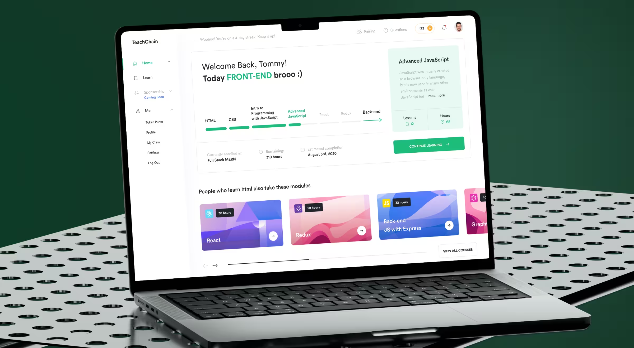
Teachchain
The challenge
Teachchain aimed to build a decentralized education platform but users were met with steep learning curves and fragmented interactions. For most learners, the product felt more like a technical demo than a usable tool. The core issue was the lack of familiarity and trust.
What we did
We focused on lowering the barrier to entry by reshaping the product around intuitive UX patterns and motivational structure:
- Replaced complexity with gamified learning flows and visible milestones.
- Introduced a real-time notification system to drive timely engagement.
- Added sponsor-student pairing and contributor dashboards to encourage connection and accountability.
- Built feedback and analytics loops for content creators to track performance.
The redesign reframed the platform as a social, rewarding experience. Result: a 120% increase in user engagement.
🔍 Check out the full case study here.
Level All
The challenge
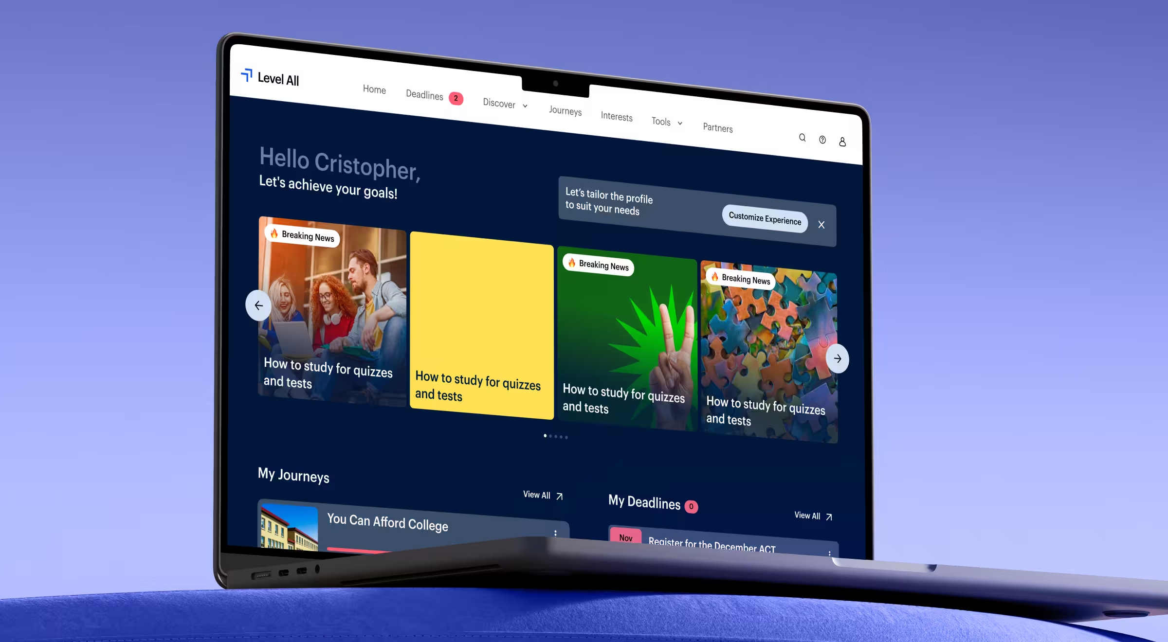
Level All had valuable content but lacked a framework for guiding students. High schoolers using the platform often felt overwhelmed or unsure where to start. Without structure, even the best content struggled to deliver impact.
What we did
We reframed the platform to act more like a digital mentor:
- Personalized content recommendations based on goals and user profiles.
- Interactive progress tracking to reinforce momentum and completion.
- A clear, consistent visual hierarchy that emphasized guidance and reduced decision fatigue.
Every design choice supported a single goal: helping students move forward with clarity and confidence.
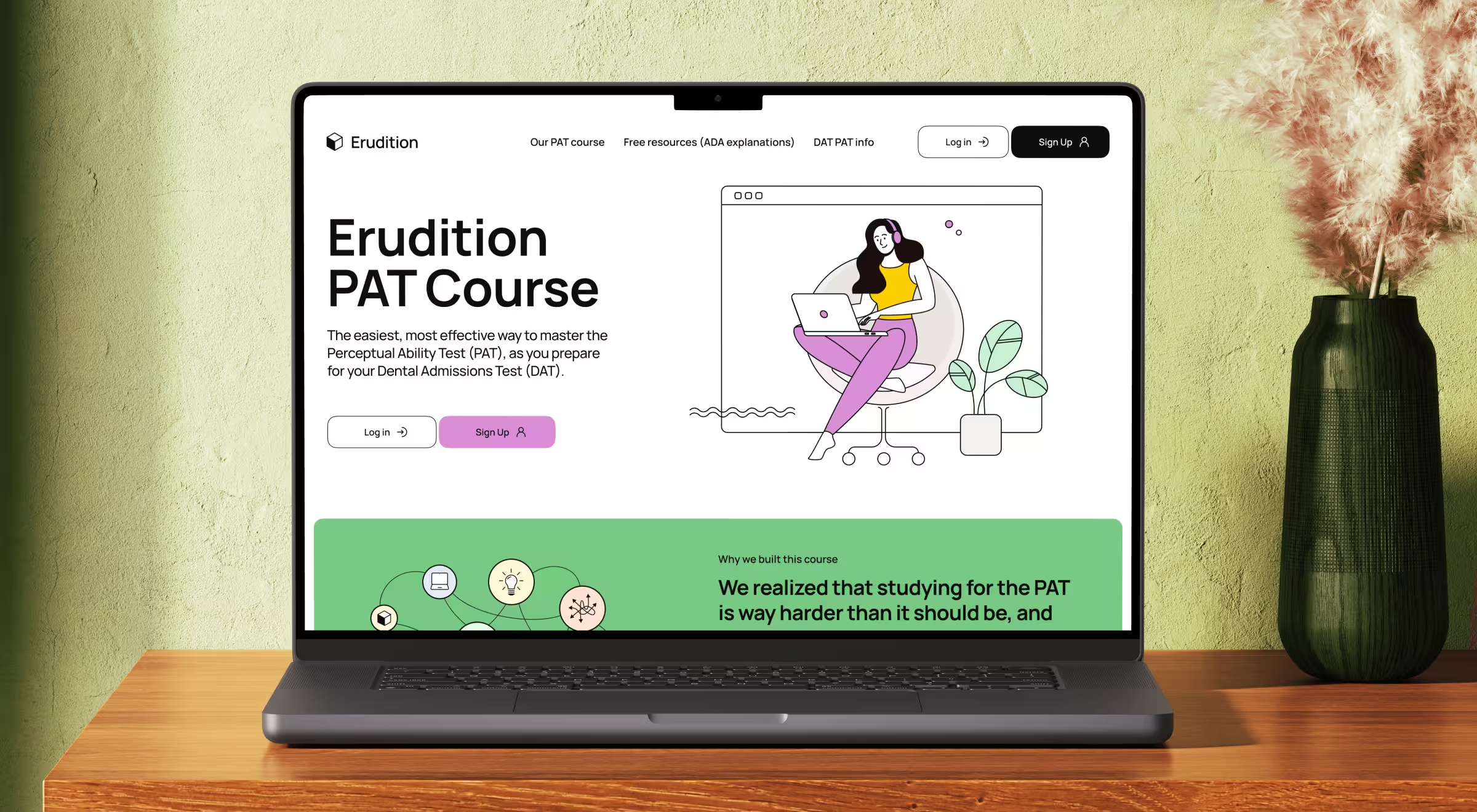
Erudition Prep
The challenge
Erudition Prep served students preparing for the DAT, especially the perceptual ability section — a notoriously difficult and abstract part of the test. The challenge was not content depth, but cognitive overload. Students needed focus, not more information.
What we did
We designed an experience that helped users stay mentally clear and in control:
- Simplified the UI to minimize distractions and guide attention to the task.
- Matched practice questions to real exam formats to build comfort through repetition.
- Implemented performance dashboards showing individual progress and peer benchmarks.
The goal was to make it manageable, measurable, and less intimidating.
The future of EdTech design
EdTech is shaping what classrooms will become. The next generation of platforms won’t simply deliver content; they’ll anticipate learner needs, adapt in real time, and make learning environments as dynamic as the students who use them.
1. AI-driven personalization
Static learning paths are disappearing. AI will soon act as a personal tutor, adjusting difficulty, pacing, and reinforcement instantly. For students, that means fewer dead-ends and more momentum. For educators, it means data that highlights where to step in.
2. Immersive learning (AR/VR)
Virtual reality chemistry labs. Augmented history lessons where students walk through ancient cities. Immersive design makes abstract concepts tangible and allows learners to experiment without limits of time, space, or resources. The challenge for designers will be making these experiences accessible.
3. Predictive analytics
Instead of dashboards that show what happened, the next wave will show what’s about to happen. Predictive design will flag when a student is likely to disengage, or when a teacher may need to adjust pacing. Done right, these systems shift education from reactive to proactive.
4. Ethical & inclusive design
As EdTech expands, so do its responsibilities. Equity means more than device compatibility — it means ensuring low-bandwidth access, bias-free algorithms, transparent data use, and interfaces that support every learner, regardless of ability or background. Trust will be the new competitive edge.
📌 The takeaway: EdTech design isn’t static. Products must evolve as quickly as learners do. The winners won’t just have sleek interfaces. They’ll build adaptive, inclusive, and predictive ecosystems that redefine how learning happens in the first place.
Let’s build EdTech that learners actually want to use
Instead of merely pushing content into a screen, designing for education involves shaping the processes of learning, engagement, and growth in individuals.
At Lazarev.agency, the best San Francisco web design agency, we help EdTech products craft experiences that feel intuitive to a 7-year-old, motivating to a college student, and worth the time of a working adult. No recycled templates. No guesswork. Just research-backed design built around your learners.
Building something new? Let’s talk.


.webp)


