

A Web3 design system works when it mirrors the real steps that teams take to launch digital assets. Metastaq centers on a practical lifecycle (create, mint, and release), so product designers can codify components, states, and microcopy around actual jobs.
That approach reduces technical jargon in the interface, keeps interactive elements predictable, and gives new users a stable path across wallet connections, smart contracts, and distribution choices.
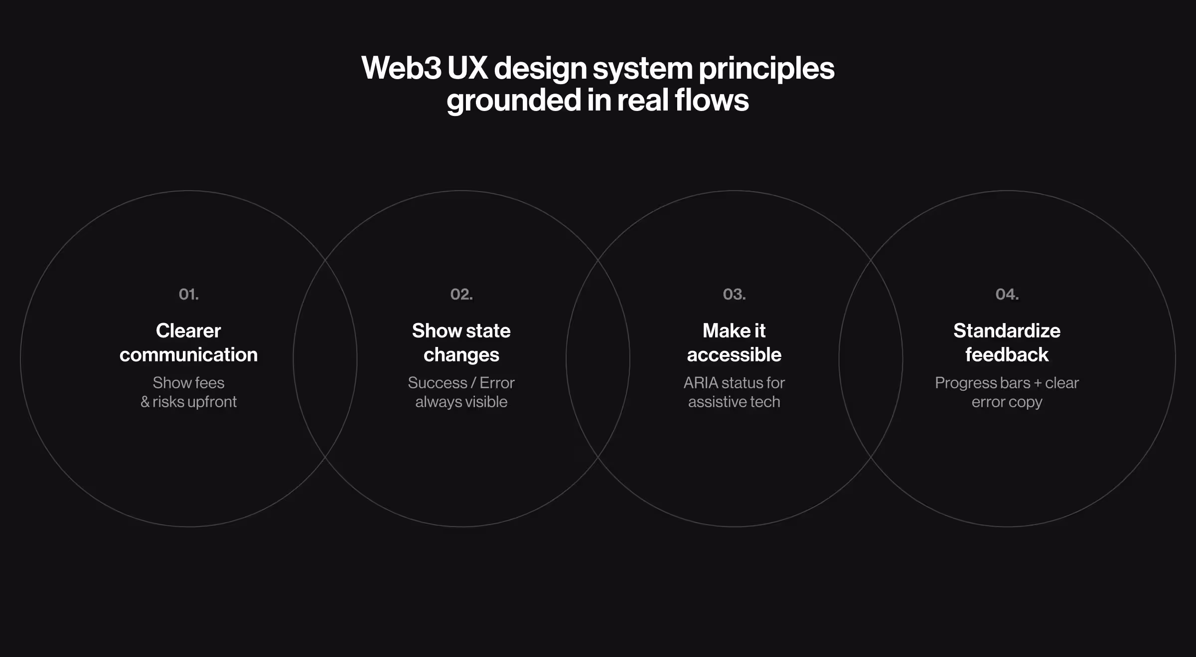
Key takeaways
- Use the product flow as the spine: setup → creation → minting → release. Components and copy map to each step and stay consistent across devices.
- Design the dashboard as a control surface: elevate high-frequency widgets, clarify transaction statuses, and surface collaboration signals.
- Offer multiple ways to distribute digital assets (store page, marketplace, API, dynamic QR) with a shared blueprint of inputs and outputs.
- Govern roles, states, and naming in one place so decentralized applications remain predictable for internet users and teams.
Why Web3 needs a system grounded in real flows
Wallet connections, confirmations, Ethereum gas fees, and chain conditions shape trust in transactional UX. On Ethereum, the fee is charged per operation and is paid even when a transaction fails, so the interface must set expectations before commitment.
When state changes aren’t surfaced (for example, pending → success/error), people miss critical feedback. WCAG Status Messages require that status updates be programmatically conveyed without changing focus; ARIA role=status is a common way to announce these updates to assistive tech.
A Web3 design system should standardize progress and error communication. Use Material progress indicators for long-running steps, and follow NN/g error-message guidelines so copy stays clear, respectful, and actionable. Together, these practices reduce cognitive load and keep outcomes legible as traffic grows.
Metastaq’s flow — the spine of the Web3 design system
Metastaq is a B2B Web3 platform for brand teams that launch NFT programs end-to-end. It centers on a practical lifecycle and supports multiple distribution methods (store page, marketplace, API, dynamic QR).
The outline below follows that lifecycle and shows how the Web3 design system maps each step to components, states, and copy.
1. Setup and roles
Teams connect a wallet, invite collaborators, and assign permissions. Role-aware screens define what a user can see, edit, or publish, and become part of the system’s design tokens and variants.
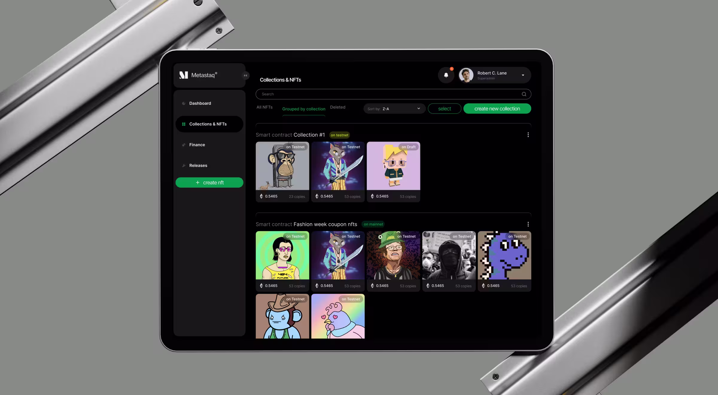
2. No-code creation
Creators upload assets, set properties, and prepare releases without touching the tech stack. Drafts and approvals turn into repeatable patterns that keep work moving across devices. For details on structuring dashboard data and what to prioritize for creation flows, see our article on NFT dashboards.
3. Minting and smart contracts
Minting exposes essential steps of blockchain technology while keeping copy user-friendly. The interface names stages, shows step-by-step status changes (for example, pending → success/error), designers can later trace in the UI.
🔎 A deeper breakdown of the creation and minting flow is covered in our Metastaq process write-up.
4. Release methods
Teams choose how to distribute: a branded page on the website (store builder), a marketplace listing, an API key for embedding into other technologies, or a dynamic QR that routes buyers to a purchase flow. Each method follows the same blueprint (inputs, validation, outputs), so the platform doesn’t fragment as it scales.
Dashboard grammar for Web3 user interfaces
The dashboard acts as a control room for the platform and aligns with Web3 design system constraints:
- High-frequency widgets (releases, collections, wallet) get priority placement.
- Compact KPIs and logs keep transactions visible without overwhelming the interface.
- Collaboration signals show assignees, drafts, and approvals to reduce back-and-forth.
- Clear actions on every block (label → value → next step) support as many people as possible.
This grammar helps designers maintain structure and create interactive elements that scale across pages and roles.
Pattern library for creation
Creation flows translate into a reusable library:
- Uploaders and validators that handle files and formats.
- Property editors for collecting data and traits.
- Draft states and approvals that guide handoffs between designers and stakeholders.
- Role-aware controls that adapt capabilities without duplicating screens.
💡 Pro tip: Tie microcopy to states. When a wallet connects or a transaction submits, use consistent language about confirmations and timing. Clear copy keeps the experience user-friendly for people new to the decentralized web.
Release blueprints: multiple ways to distribute digital assets
A release blueprint defines the required:
- inputs: collection, supply, pricing;
- controls: schedule, access;
- and outputs: live page, marketplace entry, API key, QR.
With that structure, a team can switch channels without redesigning from scratch. This is where a Web3 design system shows its value: one structure, multiple launch paths.
States, tokens, and copy: building trust
States become tokens you can govern: connected/disconnected wallet, pending/success/error transactions, draft/approved/published releases. Align component states with naming in the library so UI behavior stays consistent across the web, apps, and devices.
🔎 See NN/g: Content in Design Systems for guidance on labels, messages, and microcopy.
Security guidance belongs to the system as well: clear errors, recovery steps, and user education around wallet and transaction states, with sensitive operations handled by the wallet provider.
Governance and evolution
Define owners for proposals, naming, and deprecations. Keep tokens, components, and microcopy in a single source, and connect it to repos so the platform and the library don’t drift. Align component composition and naming with Atomic Design to keep a shared language as the system scales.
The same framework adapts to new technologies without breaking existing flows. Web3 design system governance turns everyday decisions into practices the whole team can follow.
Where we can help next
If your team is formalizing a design system for Web3 UI design, we can translate your flow into governed components, connect the dots to your tech stack, and shape a product roadmap for patterns that support growth.
Metastaq shows how a focused lifecycle turns complexity into a usable interface. The same approach applies to decentralized applications that manage wallets, transactions, and branding across channels.
Ready to turn creation → mint → release into governed components with Lazarev.agency, top San Francisco design agency?
Let’s talk about turning your flow into a system that supports multiple releases, clearer states, and stronger trust signals for your target audience.


.webp)


.avif)


