

When too many visitors leave after one screen, every click gets more expensive.
Bounce Rate Optimization (BRO) protects Customer Acquisition Cost (CAC), upgrades your pipeline quality, and makes web traffic work harder.
Below we decode how Google Analytics reads bounce, how to diagnose it with web analytics tools, and which design moves reduce early exits. All illustrated with projects Lazarev.agency, an AI product design company, has in the portfolio, so you can learn on real examples if you want fewer wasted clicks and more qualified conversations.
Key takeaways
- Diagnose before you fix. Segment your website’s bounce rate by user intent, channel, device, and page type; pair it with user engagement and conversion events.
- Align the first screen and narrative with intent to cut early exits. Remove path ambiguity with role-based IA and next-step cues.
- Use familiar patterns and light personalization to keep scanning mobile users engaged instead of bouncing.
- Track bounce alongside Cost Per Action (CPA) and conversion, and iterate in focused 30-day cycles (one high-value page → two fixes → measure).
What bounce rate means today and why GA4 changed the conversation
In Google Analytics 4 (GA4), bounce rate measures sessions that are not engaged. Practically, it’s the inverse of engagement rate.
Historically, in older Universal Analytics, it pointed to single page sessions — visits with only one page view where a visitor lands and leaves the same page.
Read bounce together with other metrics that show progress. Benchmarks are directional: an average bounce rate varies by landing pages, blog posts, device mix, and channel. A high bounce rate on a help article can be fine (fast resolution); the same number on a paid landing can signal mismatch.
Context that matters. Bounce is not a direct ranking factor in search rankings. Still, it can influence how search engines interpret content relevance indirectly through user behavior signals and site content quality. Focus on relevance and user experience rather than “gaming” a single metric.
Diagnose first: segment before you prescribe
Before changing UI, segment where bounce concentrates:
- By channel & query intent. Paid non-brand vs. brand; social vs. organic search results.
- By device. Mobile devices often suffer from limited viewport and scanning.
- By page type & funnel stage. Home, pricing, product, feature, landing pages, blog posts — each particular page has a different job.
- By audience. New vs. returning; geo.
- By events. Define engaged behavior that matters (e.g., scroll depth to 50%, “Start trial” click, “Open pricing”, video play). This is how to reduce bounce rate in Google Analytics with less guesswork — configure meaningful engaged events and analyze exit rate next to conversions.
💡 Pro tip: Build a lightweight “bounce × business” view: bounce rate + engaged sessions + primary conversion + CPA for the same set of pages. This prevents chasing a low bounce rate that doesn’t move revenue.
How to decrease bounce rate: high-impact design fixes with case proofs
1. Align the first screen with intent (and carry a narrative)
Visitors decide in a glance whether they’re in the right place. For B2B flows, narrative-driven pages outperform feature dumps.
💼 Case to watch: Bacca AI (B2B SRE tool).
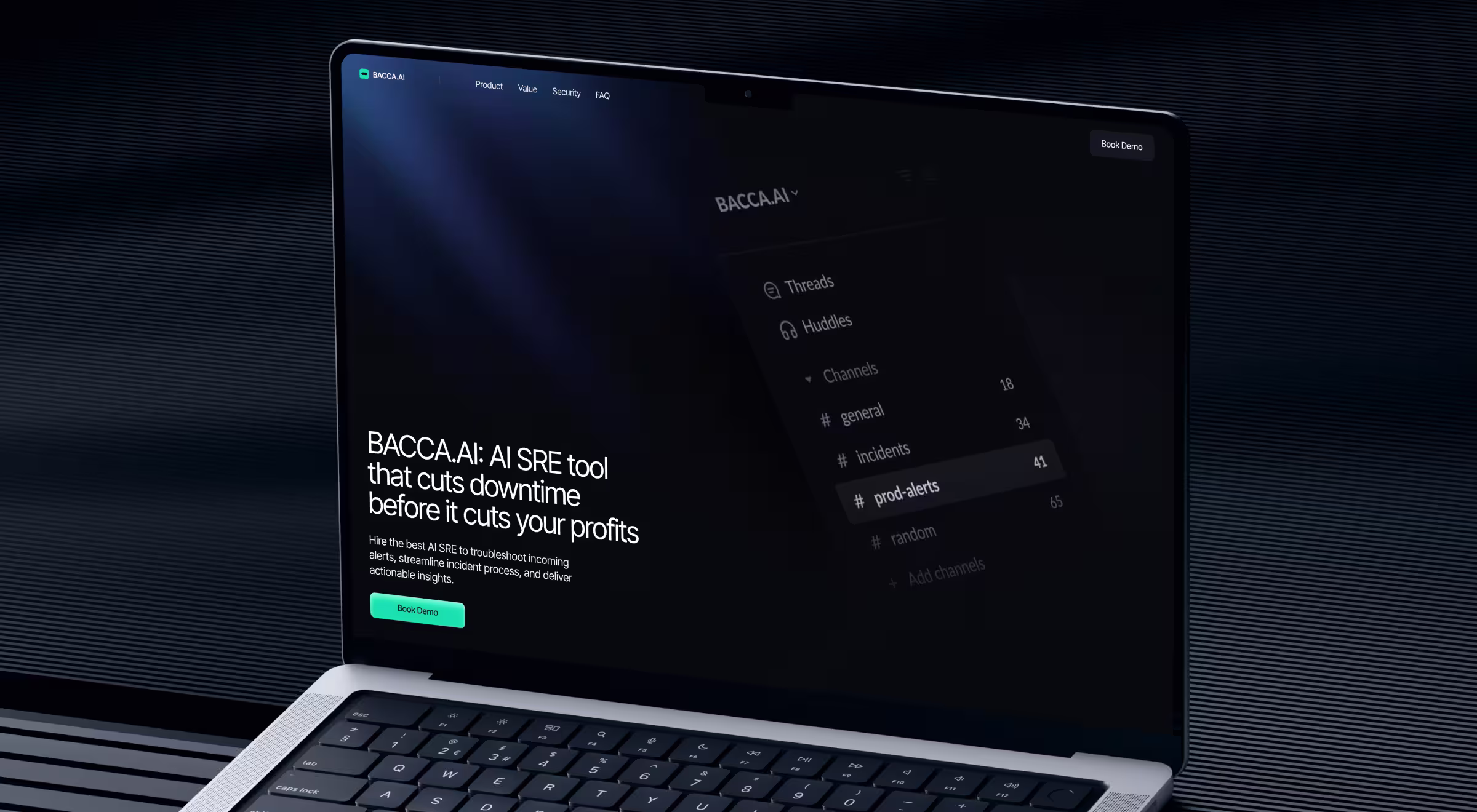
Problem. First-time visitors met technical phrasing and feature lists that didn’t map to an urgent business problem, which fuels quick exits.
Solution. The page opens with the cost of downtime to set stakes, then walks through a simple arc — problem → proof → “what you’ll get.” Each section does one job: name the pain in business terms, show evidence (logos, scenario snapshots), and give a single next step. Copy trades jargon for outcome language; CTAs mirror the stage, so the path forward is obvious.
Business impact. This structure reduces early exits by giving decision-makers what they came for (risk framed in dollars, proof within sight, one action to take). The result is more engaged sessions that feed demo starts and lower CAC on paid traffic — exactly the point of bounce rate optimization.
🔧 Operationalize it: write a “first 5 seconds” checklist — does the H1 name the job-to-be-done, do subheads preview value/next steps, is the primary CTA above the fold, and is there a proof cue (logo, metric, quote) visible without scroll?
2. Structure user journeys with the always-clean next step
Users bounce when they can’t map the site to their mental path.
💼 Case to watch: Dynascale (enterprise provider of cloud services).

Problem. High-intent visitors struggled to map offerings to their role and risk profile; comparisons with hyperscalers were implicit. Ambiguity at the top of the funnel produced short sessions and exits.
Solution. Navigation and page modules were rebuilt around buyer journeys: Solutions / Industries / Services, with transparent pricing cues, compliance assurances, and side-by-side comparisons that answer “why this” in one view. Next-step CTAs persist so the “what now?” moment never stalls.
Business impact. Clear journeys decrease bounce rate on high-value pages, shift more visitors into qualified conversations, and protect paid CAC. Even without sharing private figures, the case positions the site as a lead-generating experience — the right outcome signal for this tactic.
🔧 Operationalize it: turn top-exit pages into decision hubs: add pathway modules (“I’m a CTO / I manage compliance / I need a migration plan”), and persist next-step CTAs in sticky regions. Use internal links to move qualified users to other pages that continue the story.
3. Meet the audience with familiar patterns
Familiarity reduces cognitive load and scanning fatigue.
💼 Case to watch: GoPingu (B2B productivity).

Problem. New users arrived with strong expectations (Kanban, lists, quick edits). If the first screen fought those expectations, sessions were short and visitors left after only 1 page.
Solution. The experience centers on Kanban-inspired boards with an alternate list view, plus in-place edits on the dashboard. Information density is tuned for quick orientation; key actions are reachable without context switching.
Business impact. Recognizable patterns minimize potential bounce by accelerating orientation, especially on mobile, which translates into more engaged sessions and a healthier funnel (activation and retention start with the first minute).
🔧 Operationalize it: prefer recognizable layouts and controls for first-time site visitors; innovate deeper in the flow after orientation is achieved.
4. Use personalization and light gamification to extend attention
Scanning becomes engagement when users can shape what they see.
💼 Case to watch: Blockbeat (crypto news + market terminal).

Problem. A fast market floods pages with updates. If users can’t focus the feed or see market context next to news, they skim and exit.
Solution. The layout pairs a personalizable feed (advanced filters, pause for deep reads) with market-stats widgets and watchlists in the same view. Users tune scope, track assets, and read without context switching.
Business impact. Giving control (filter, customize, save) reduces early exits and drives longer engaged sessions that correlate with downstream conversion in content-to-product funnels — a direct ROI tie-in for teams buying traffic.
🔧 Operationalize it: add “save for later,” watchlists, or content filters even on public pages; show small progress indicators to encourage one more interaction and keep visitors engaged.
🔎 Want a deeper dive into crypto news terminals and customizable feeds? Read our article: “Effective design principles for cryptocurrency trading interfaces.”
5. Performance & mobile UX without over-promising
Slow experiences push people away, especially on mobile devices.
- Fix the basics — page load time and load speed. Compress media, optimize images, lazy-load below-the-fold assets, and reduce slow loading times and slow page load times. A content delivery network helps with global latency.
- Make it mobile friendly — use responsive design. Test interactive latency on real devices; avoid layout shift and intrusive pop ups.
- Search hygiene — clean titles, meta descriptions, and structured data. Fix broken links; ensure relevant content and detailed product descriptions answer what visitors expect.
These steps improve website’s performance and user experience while protecting organic search.
Measure & maintain
Looking for tricks to reduce bounce rate? Use this 30-day loop:
- Pick one high-value web page with high traffic and a high bounce rate.
- Choose 2 changes from the list above (e.g., rewrite first-screen copy for intent + add role-based pathing).
- Run for 30 days and track — bounce (GA4), engaged sessions, primary conversion, and CPA. Compare with other metrics like AOV or qualified demos. Then either scale or roll back.
How to decrease bounce rate of website (step-by-step action plan)
- Map user intent to first-screen copy and CTA.
- Restructure navigation around buyer roles or jobs.
- Add internal links to guide visitors to next steps.
- Use familiar layouts and quick filters for scanning.
- Ship one personalization feature (e.g., watchlist, saved state).
- Add light gamification or progress cues to boost interaction.
- Compress and lazy-load images for faster load times.
- Minimize layout shift (CLS) and test on real devices.
- Use a CDN to improve global performance.
- Configure engaged events in GA4 (scroll, CTA, video play).
- Track bounce alongside engagement rate, CPA, and conversions.
- Run 30-day experiments: pick one page, apply two fixes, measure.
- Add internal links between landing pages and related content.
- Optimize titles, meta descriptions, and structured data.
- Write copy for humans first, then refine for SEO goals.
Glossary for bounce rate optimization
Bounce Rate (Universal Analytics) — share of single-page visits with just one interaction before leaving the site.
Bounce Rate (GA4) — redefined as the inverse of engagement rate; focuses on whether a session is engaged rather than on page count.
Engaged Session (GA4) — a session lasting at least 10 seconds, with a conversion event, or at least two page/screen views.
Engagement Rate — percentage of engaged sessions compared to all sessions; the core “stickiness” metric in GA4.
Exit Rate — percentage of sessions that ended on a given page (different from bounce, which is about single-page sessions).
Exit Page — the last page a user viewed before leaving the site; useful for spotting friction points in user journeys.
Site-Level vs. Page-Level Bounce — sitewide averages can mislead; always diagnose bounce rate at the individual page level first.
Conversion Event — a predefined action that signals progress, such as “Start Trial,” “Book Demo,” or “Add to Cart.”
Customer Acquisition Cost (CAC) — the total cost of bringing in a new customer; inflated when high bounce wastes paid traffic.
Cost Per Action (CPA) — the average cost for a user to complete a target action (sign-up, form submit, etc.); often analyzed alongside bounce.
Click-Through Rate (CTR) — the ratio of clicks to impressions on an ad, link, or CTA; strong CTR loses value if paired with high bounce.
Dwell Time — how long a visitor stays on a page before returning to search results; helps interpret bounce in terms of relevance.
Session Duration — the total length of time a user spends in one session; short durations can confirm bounce-related issues.
Core Web Vitals (CWV) — Google’s performance metrics (Largest Contentful Paint, First Input Delay, Cumulative Layout Shift) that directly affect bounce, especially on mobile.
🔍 Read our works about growth and CRO here.
Conclusion
Bounce rate optimization is only one part of growth. When a redesign aligns offering, proof, and path to action, revenue tends to follow. For instance, Riptide hit Product Hunt’s Top-10, sold out ≈$500,000 in the first 2 months, and exited successfully after a tight repositioning and launch. Use bounce to protect acquisition efficiency, use narrative and proof to drive the win.
Ready to turn wasted clicks into qualified pipeline?
Let’s audit one high-value page together, pick two fixes, and measure impact in 30 days. Talk to our team!


.webp)


.avif)

