

The competition for attention is ruthless. Every scroll or hesitation costs brands real revenue. Users no longer follow tidy paths from awareness to purchase. Instead, they zigzag between channels and decide in micro-moments. In this chaos, conversion funnel optimization has become the quiet superpower separating thriving brands from those that people forget in the blink of an eye.
Modern conversion funnels are dynamic ecosystems fueled by UX, user research, and AI. In this article, we’ll touch upon how unpredictable user behavior can become a key to structured growth, and how you can design funnels that convert and adapt.
Key takeaways
- Funnels are no longer linear. Modern users don’t move in straight lines — they loop, pause, and return. Your funnel must adapt in real time.
- UX is your biggest conversion driver. Great design boosts conversions by up to 400%.
- Partner with experts who execute. Lazarev.agency blends UX, AI, and digital transformation to turn conversion theory into growth practice.
Why a conversion funnel is no longer linear?
Remember when the conversion funnel looked neat and predictable? Awareness, consideration, conversion, retention, loyalty — a tidy diagram that made user behavior look like gravity at work.
That model worked fine when attention followed a linear pattern. But it doesn’t anymore.
Modern conversion paths function more like feedback systems. AI now tracks user behavior, predicts drop-offs, and personalizes CTAs in real time. It transforms what used to be a static journey into a dynamic loop.
And this is where UX design pulls serious weight. A strong UI can lift conversions by 200%, and a great UX by up to 400%. Even a modest 10% boost in UX budget can lead to an 83% lift in conversions — numbers too good to ignore.
That’s because intuitive design keeps people moving. Users who feel guided and understood stay longer and convert faster.
So the real question isn’t how wide your funnel is. It’s how adaptive it can become.
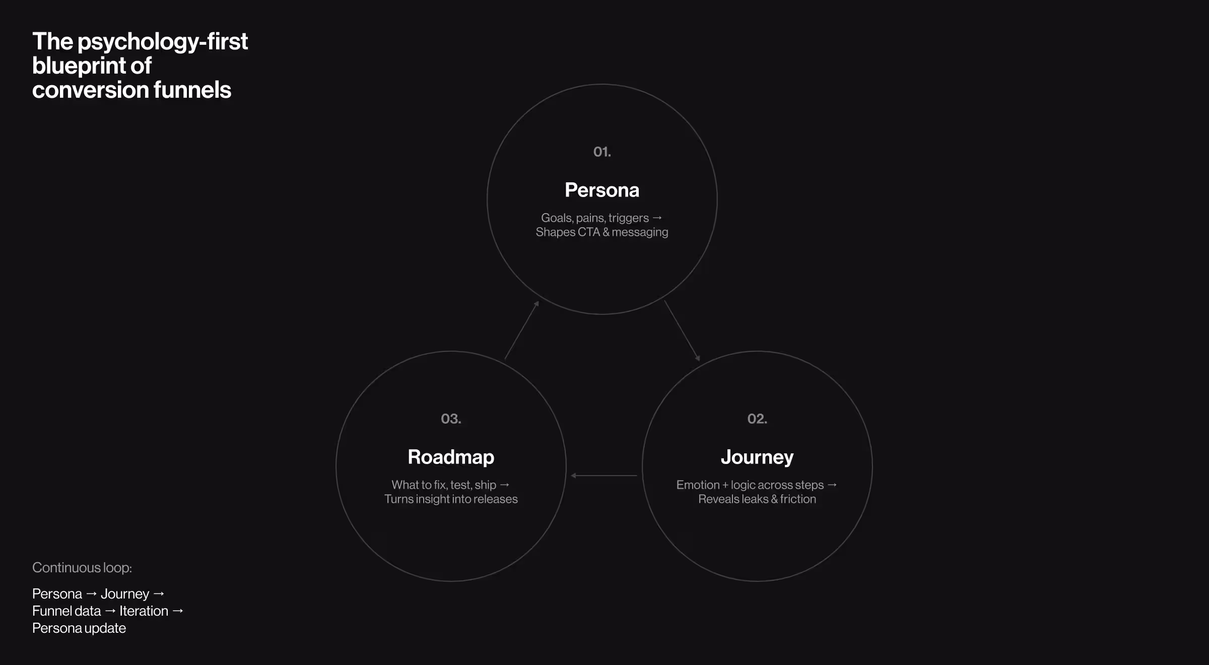
Why conversion funnel optimization starts with personas, journeys, and roadmaps
Before optimizing a funnel, you must understand who’s inside it.
High-performing funnels aren’t designed around business goals alone. Instead, they’re built around user psychology.
1. UX personas
A UX persona represents the mindset of a decision-maker. It captures goals, pain points, and conversion triggers.
When you understand what motivates users, you can design flows that anticipate their intent rather than react to it.
2. Customer journey
A user journey maps how emotion and logic evolve through interaction. And in doing so, it exposes the moments when doubt creeps in. Those are your funnel leaks.
Consider an example: search → product page → trial → email follow-up. In this customer journey map, each step should reduce cognitive load and amplify clarity. Because when friction increases, commitment drops.
3. Product roadmaps
Data from personas and journeys must inform your product roadmap — what features to improve, test, or prioritize.
Treat a sales funnel as a living system. When your roadmap evolves, so does conversion flow. The loop looks like this:
Persona → buyer’s journey → funnel data → product iteration → persona update.
That’s how optimization becomes a continuous cycle of improvement.
5 stages of a high-performance conversion funnel
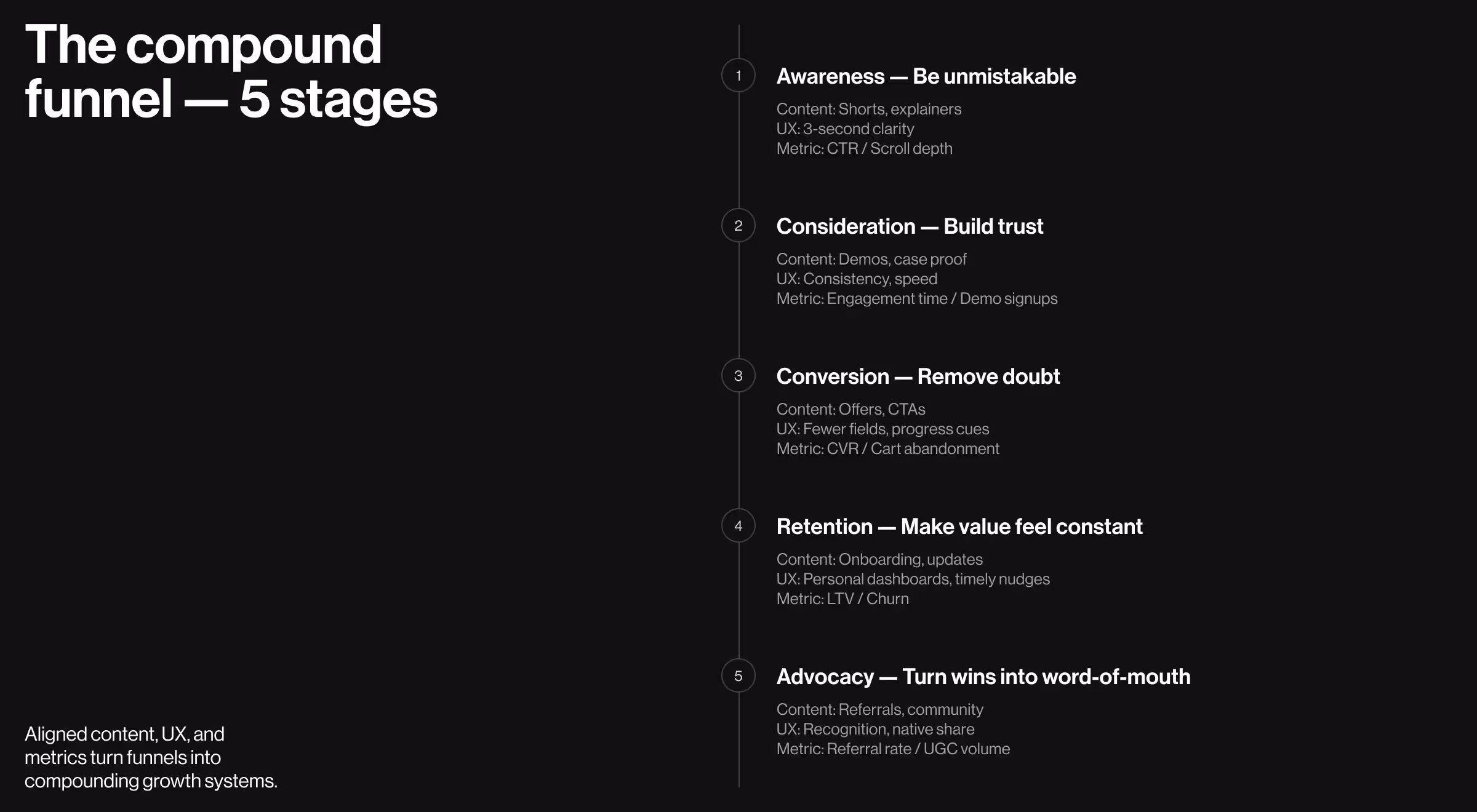
A well optimized conversion funnel compounds value through every interaction. Each stage builds on the last, while balancing trust and emotional continuity.
To make it practical, we’ve broken each stage into three dimensions that bridge marketing strategy, experience, and performance:
- Content — what users see and engage with.
- UX focus — how existing and potential buyers and users experience it.
- Metrics — how success is measured.
This structure keeps every stage actionable and testable, because when usability and data align, your funnel becomes a growth system.
1. Awareness
Goal: attract attention and communicate value.
At this stage, the challenge is relevance. Attention is cheap, whereas comprehension is rare.
- Content: blog posts, short videos, interactive explainers.
- UX focus: clarity above all — users should know what you do in under 3 seconds.
- Metrics: impressions, click-through rate (CTR), scroll depth.
- Example: Netflix’s homepage converts curiosity into intent with one focused CTA, “Try it free”.
Because early impressions anchor user expectations, clarity here shapes whether the funnel widens or collapses immediately.
2. Consideration
Goal: turn attention into trust.
At this point, users are comparing, and design silently argues your case. Poor hierarchy or slow load times can end the conversation before it begins.
- Content: demos, comparison tables, webinars, case studies.
- UX focus: visual consistency, trust signals, transparent pricing.
- Metrics: time on page, demo signups, engagement depth.
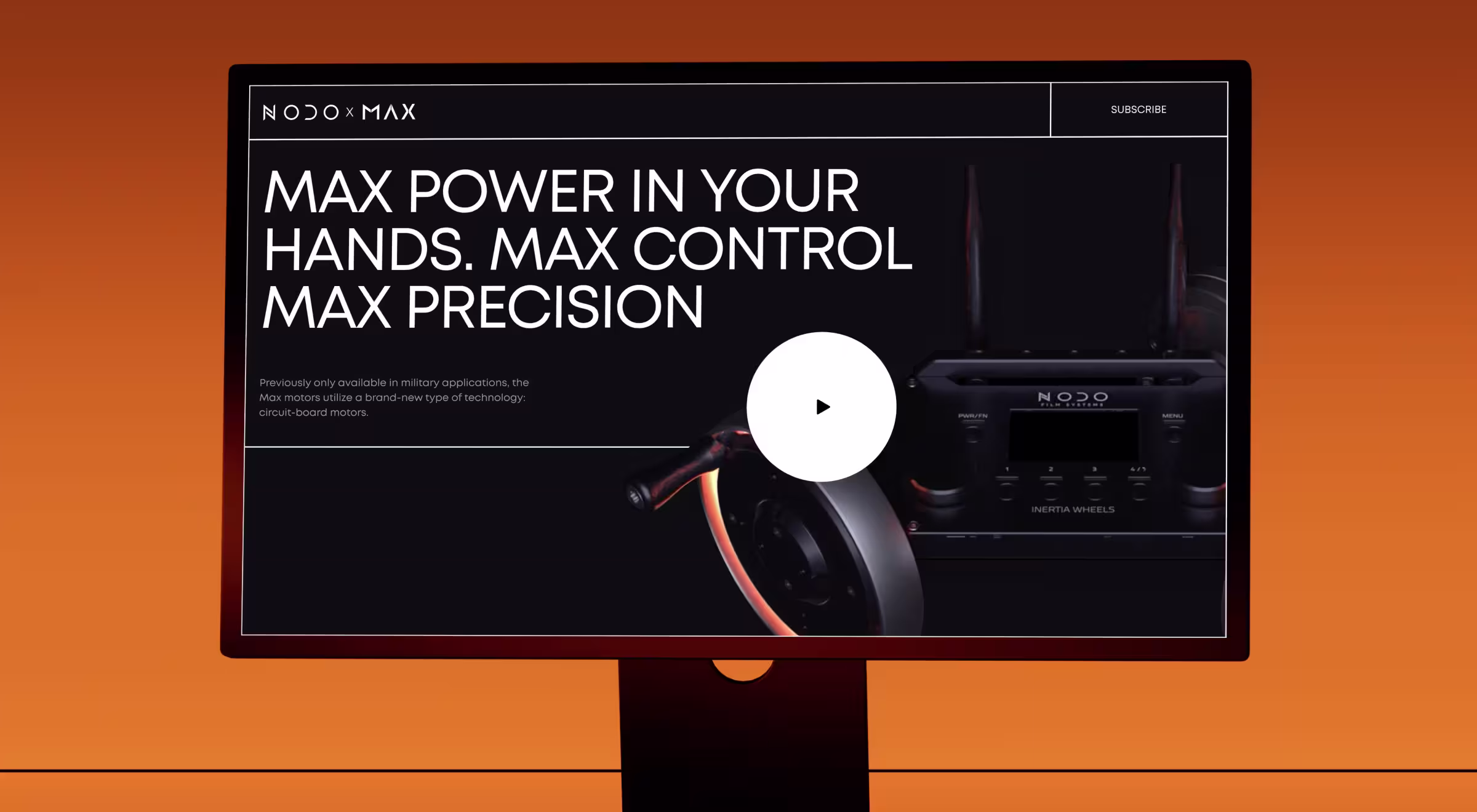
Practical insight:
“During NODO’s site redesign, our goal was to make website visitors feel the precision behind the product,” says Ostap Oshurko, Lead Designer at Lazarev.agency.
“Instead of a typical feature page, we built an immersive narrative powered by cinematic 3D visuals and contextual cues. Each scroll revealed how the Inertia Wheels MAX responds to movement — almost like holding the device in your hands.
It was functional persuasion in action. The design connected tactile emotion with technical validation. Within the first month, NODO generated 160 waitlist signups, with 41% from entirely new customers.
It just goes to show that when your mid-funnel experience communicates what words can’t, users stop comparing and start believing.”
3. Conversion
Goal: remove barriers between intent and action.
Users decide emotionally but justify rationally. Every extra form field is a negotiation with doubt.
- Content: trial offers, checkout pages, and persuasive CTAs.
- UX focus: microcopy reassurance (“No card required”) and progress indicators.
- Metrics: conversion rate (CVR), average order value, cart abandonment, and click-to-purchase ratio.
Practical insight:
“Before the redesign, SolarDrive’s workflow lived across five separate platforms,” says Danylo Dubrovsky, Senior UX/UI Designer at Lazarev.agency. “Every handoff created hesitation. You could feel the friction in every click. Our job was to erase that.
We rebuilt everything into one unified system where task management, documentation, and communication lived in a single flow. Once the new flow launched, SolarDrive didn’t just gain efficiency, they doubled the number of clients served daily and saved 2.4 hours of work per employee."
4. Retention
Goal: transform first-time buyers into returning users.
Retention depends less on novelty and more on predictability. In other words, consistent experiences signal reliability.
- Content: onboarding sequences, how-to guides, product updates.
- UX focus: personalized dashboards, contextual tips, timely reminders.
- Metrics: active users, churn rate, LTV.
- Example: Slack reinforces engagement with small UX loops, including subtle notifications and continuous feedback.
When your target audience feels progress without effort, they return instinctively, almost by habit.
5. Loyalty and advocacy
Goal: convert satisfaction into advocacy.
Loyal users are your digital marketing team at its prime. They close the funnel loop by pulling new prospects into awareness.
- Content: referral programs, loyalty rewards, community spaces, and user stories.
- UX focus: recognition (badges, milestones), social sharing built into the product experience.
- Metrics: referral rate, repeat purchase frequency, user-generated content.
Practical insight:
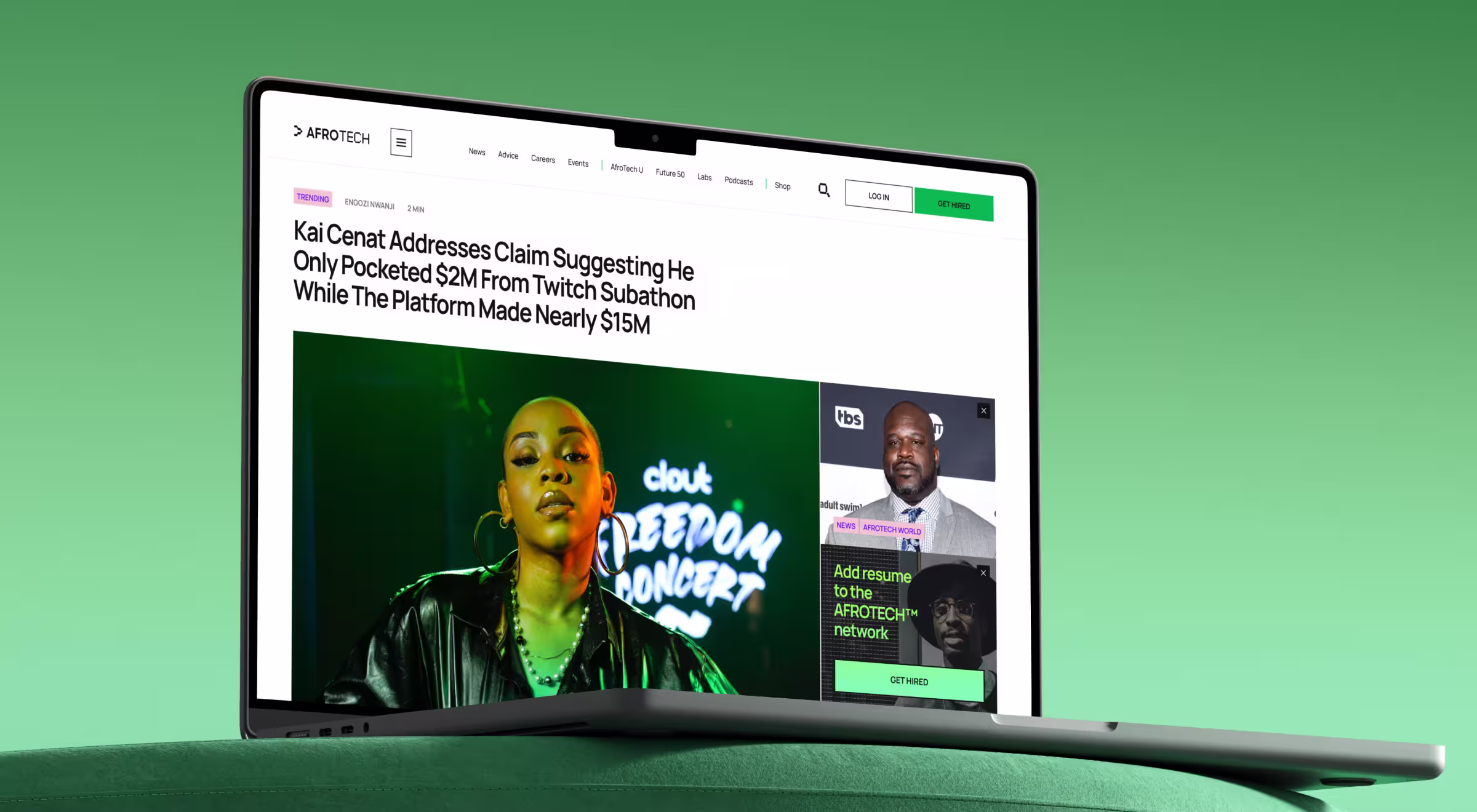
“When we redesigned AfroTech’s ecosystem,” says Anna Demianenko, Design Lead at Lazarev.agency, “we realized loyalty comes from identity. People return when they see themselves reflected in the product.
AfroTech’s platform is a community hub for Black tech professionals. Our goal was to transform passive readers into active contributors — the kind who advocate naturally because they feel ownership.
To achieve this, we built participation cues directly into the UX:
- Recognition systems for event attendees
- Personalized content feeds tied to each user’s professional interests
- Shareable story modules that made publishing feel collaborative.
The design subtly encouraged contribution. Liking an article, posting an insight, or sharing a speaker lineup became frictionless micro-actions.
Within months, AfroTech saw a significant uptick in returning users and community-driven content — proof that belonging scales faster than targeted ads.”
Psychology and metrics behind each funnel stage
When you build on intuition alone, your funnel tells you nothing. A high-performing one isn’t guessed into existence. It’s engineered from behavioral patterns backed by real data.
Psychology explains the why — why users click, hesitate, or abandon a step. Metrics show the what — what actually happens inside your funnel and where attention drops.
When you understand both, you start predicting user behavior.
Here’s a list of tools our design team recommends using for better outcomes at each stage:
- Awareness: Google Analytics 4 (GA4), Hotjar, Looker Studio
- Consideration: Mixpanel, HubSpot, Smartlook
- Conversion: Shopify Analytics, Amplitude, Optimizely
- Retention: Klaviyo, GA4 Cohort Analysis
- Advocacy: ReferralCandy, Sprout Social, Brand24
How to target users at each stage of the conversion funnel
Every stage of the conversion funnel requires a different conversation. What works in awareness repels in conversion. Below is how to tailor your marketing strategy so each stage feels intuitive.
1. Awareness: win attention
Objective: Help users recognize themselves in the problem before you introduce your product.
Approach:
- Use category-defining language that tells readers what you solve.
- Turn thought leadership into problem-led content: practical explainers, short interactive visuals, and storytelling backed by data.
🎯 Design tactic: Employ visual distinction to anchor memory. The Von Restorff effect works strongest here. Users remember what stands out.
💼 Case-in-point: When Redbrain, a retail tech startup and Google Premium Partner, approached Lazarev.agency, the challenge was digital indifference. Shoppers were scrolling past because nothing on-screen triggered exploration.
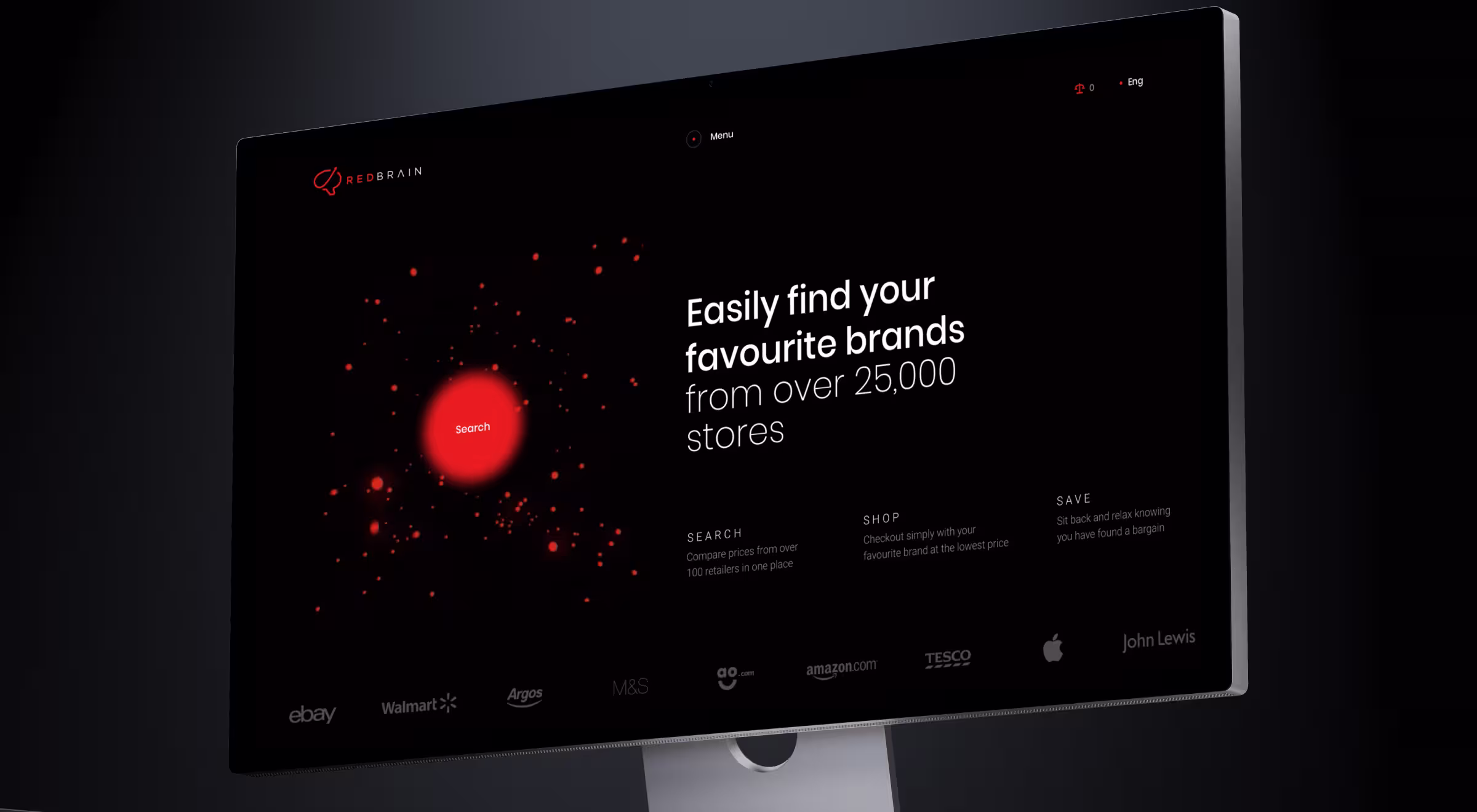
Our solution was to fuel the experience of discovery. We began with the search itself — the starting point of user intent.
To capture attention at the moment of curiosity, we built the interface around vibrant red accent zones that visually magnetize the search button. That way, users didn’t just recognize Redbrain, they began exploring it.
📈 Deliverables to focus on: Landing pages, microsites for marketing campaigns, explainer reels, and headline A/B tests that prove instant comprehension.
2. Consideration: prove your expertise
Objective: Tackle uncertainty. At this stage, users are comparing. Your brand’s credibility is silently negotiated through experience design.
Approach:
- Showcase before/after UX moments or embedded mini-demos.
- Build mid-funnel assets for rational validation: interactive ROI calculators, testimonial galleries, quick case sliders.
🎯 Design tactic: Leverage the principle of cognitive ease. A visually breathable layout signals reliability.
📈 Deliverables to focus on: Product comparison pages, customer proof blocks, explorable feature demos, interactive reports, and credibility-driven design systems.
3. Conversion: make the decision feel effortless
Objective: Guide without selling. People decide emotionally, then seek rational permission.
Approach:
- Use anticipatory UX: surface only what matters in the moment.
- Minimize interaction steps. Fewer fields, clearer progress, auto-filled forms.
- Add real-time reassurance: security badges, trial guarantees, and delivery timelines.
🎯 Design tactic: Apply commitment bias. Micro-conversions (like signing up for a free trial) make full conversion easier later.
📈 Deliverables to focus on: Optimized checkout flows, pricing configurators, pre-filled sign-up journeys, and intent-driven CTAs.
4. Retention: keep value in motion
Objective: Sustain engagement by reminding users what they gain every time they return.
Approach:
- Personalize post-purchase experiences through modular dashboards.
- Offer new value without new learning: product updates, personalized tutorials, or valuable insights.
🎯 Design tactic: Apply the reciprocity effect. Show progress, give small rewards, or preview upcoming perks to deepen attachment.
💼 Case-in-point: When GAIN, an early-stage EdTech startup, approached Lazarev.agency, they had ambition but no adoption. Teachers were interested in the concept but struggled with the tools.
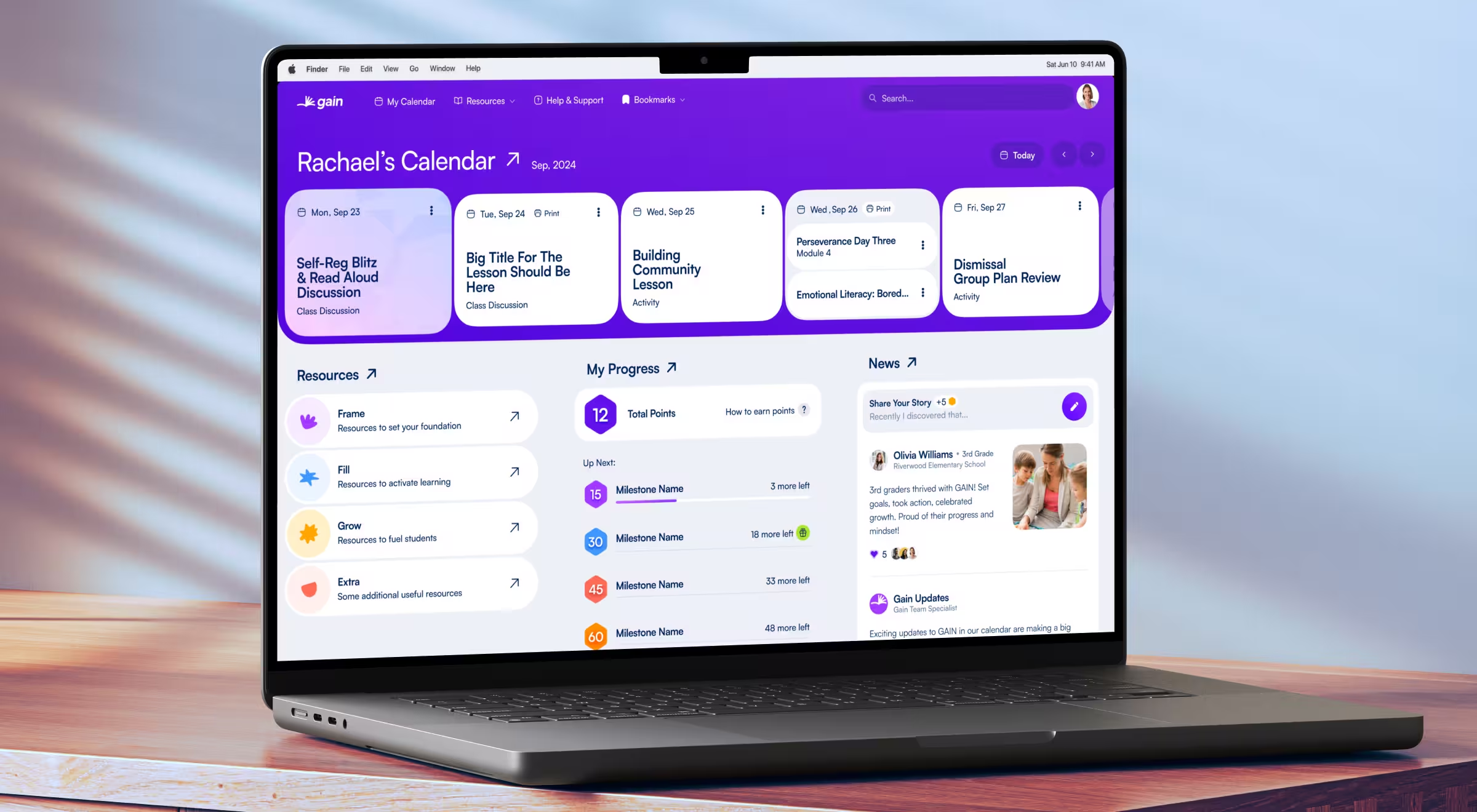
Our design team built a modular platform that mirrored real classroom dynamics. A progressive learning-journey builder lets teachers track student growth over time, while role-based dashboards keep focus only on what matters that day.
Visually, the interface projected calm. A soft color palette and subtle animations created what we call emotional UX continuity.
The impact:
→ +60% growth in daily activity within weeks of launch
→ 100% satisfaction across pilot schools
→ Rapid adoption across entire teaching networks.
📈 Deliverables to focus on: Onboarding sequences, personalized dashboards, habit loops, and contextual retention campaigns.
5. Advocacy: turn experience into social proof
Objective: Transform satisfaction into organic amplification.
Approach:
- Embed sharing into core UX moments — post-success, completion, or recognition.
- Build community spaces where users teach.
- Use co-creation as a loyalty driver: polls, beta tests, and spotlight features.
🎯 Design tactic: Leverage the endowment effect, because users value what they helped build.
📈 Deliverables to focus on: Community dashboards, referral flows, shareable templates, and reputation-based reward systems.
Widen your conversion funnel with Lazarev.agency
A modern funnel is a loop of interactions and emotional touchpoints. To widen that loop, every message must serve one purpose: amplify trust by minimizing friction.
That’s where design meets growth. At Lazarev.agency, we help brands build conversion systems that adapt to human behavior. Our approach combines UX research, interaction design, and AI insight.
Here’s how we can help your brand convert more and lose less:
- UX/UI design: Craft intuitive interfaces that guide users toward conversion naturally.
- Digital product design: Design end-to-end product experiences where funnel strategy and usability fuel tangible growth.
- AI consulting: Personalize user flows and automate engagement using behavioral data and predictive modeling.
- Digital transformation consulting: Revamp the existing systems and workflows to sell smarter and retain more customers.
Explore our portfolio to see how we’ve redesigned conversion experiences for global brands and get in touch to discuss widening yours.


.webp)


.avif)

