“Modern UI design is a race against the back button. If clarity doesn’t surface within the first seconds, conversion evaporates.”
{{Kirill Lazarev}}
When Ninja Delivery, a Waterloo-based q-commerce startup, needed a product experience that could scale fast and convert even faster, they turned to Lazarev.agency. We designed a unified UI across their customer app, courier app, and landing page to do three things: lower friction, build trust instantly, and differentiate in a saturated market.
They got 30K+ orders, 20% weekly growth, and $2.8M raised — all before their first dark store went live. What follows is a breakdown of the exact modern UI design decisions that gave the company real business results.
Key takeaways
- Bold visual language accelerates trust. A mascot‑driven visual design with vibrant yellow accents, generous whitespace, and rounded typography catches the user’s attention without sacrificing clarity.
- Three user journeys, one design system. A shared token‑based design system keeps the customer app, courier app, and marketing site visually cohesive while adapting to different screen sizes and digital platforms.
- Interface clarity fuels business metrics. Intuitive ordering, optimized courier workflows, and a clear first‑screen landing collectively drove the 20% WoW growth and 30 K order milestone.
Ninja Delivery’s key wins with modern UI design
Before we unpack the interface itself, here’s what the numbers say:
For investors, these numbers validate that well‑executed user interface design can be a powerful growth engine.
Proven UI patterns behind $2.8M and 30K orders
So what actually made Ninja Delivery’s interface convert? These are the design patterns that turned clean visuals into real revenue.
- Bold minimalism. Vibrant colors + whitespace = instant readability.
- Mascot‑led branding. Humanizes the interface and drives social shareability.
- Role‑based flows. Distinct surfaces per persona reduce cognitive switching. Smashing Magazine likewise stresses pattern‑driven design systems as the backbone of cohesive multi‑surface experiences.
- Mobile‑first visual hierarchy. Large cards, flat design, progress bars, and intuitive navigation patterns meet users where they are — on their phones. NN/g research highlights how modern mobile‑first layouts and minimalist whitespace shape today’s user‑interface patterns.
Watch a quick visual summary of the UI layouts dominating the landscape for more references.
Let’s see how these patterns show up in the actual screens and flows.
Context: why q‑commerce raises the UI bar
In hyper‑fast delivery, latency is visible: every tap, every color palette choice, every progress bar influences abandonment. The brief was explicit — create an MVP that feels effortless to customers and couriers alike while standing out in a crowded field. That directive framed every decision, from navigation hierarchy to micro‑copy.
🔍 Pro tip. On mobile apps, treat the user journey as a stopwatch: each extra gesture counts. Map user actions, then remove one step per iteration until nothing else can go.
Modern UX design research confirms the stakes: NN/g’s classic 0.1 / 1 / 10‑second rule shows how even tiny pauses break flow, while a mere 0.1‑second speed gain lifted retail mobile conversions by 8.4% in a Google‑commissioned 37‑site study.
Brand DNA: turning a mascot into UI equity
Ninja Delivery’s identity begins with a friendly ninja character — sketch‑style illustrations placed alongside bold typography and a high‑contrast yellow‑on‑white color palette. In modern UI design trends, mascots do more than decorate; they act as visual cues that anchor users in brand memory across social media platforms and mobile devices.
- Key elements of the style: rounded fonts that soften the energetic palette, minimalist approach to iconography, and flat design cards that keep the interface visually appealing without skeuomorphic distractions.
- The result is a design style that evokes emotions like playfulness and reliability — critical for attracting new users who must trust a service with their late‑night grocery needs.
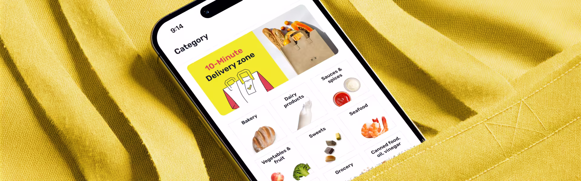
Customer app: visual appeal that converts first‑time shoppers
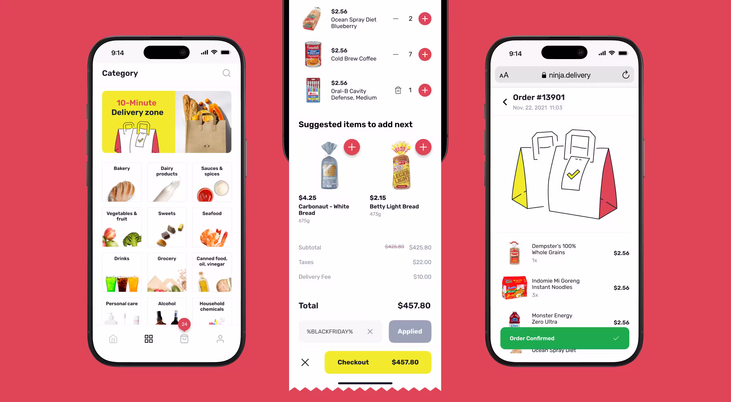
In order to craft an intuitive ordering experience for Ninja Delivery, our team focused on three modern website UI design patterns:
These choices help maintain user attention through checkout — a critical phase in any user interface flow.
Courier app: optimized for rapid task completion
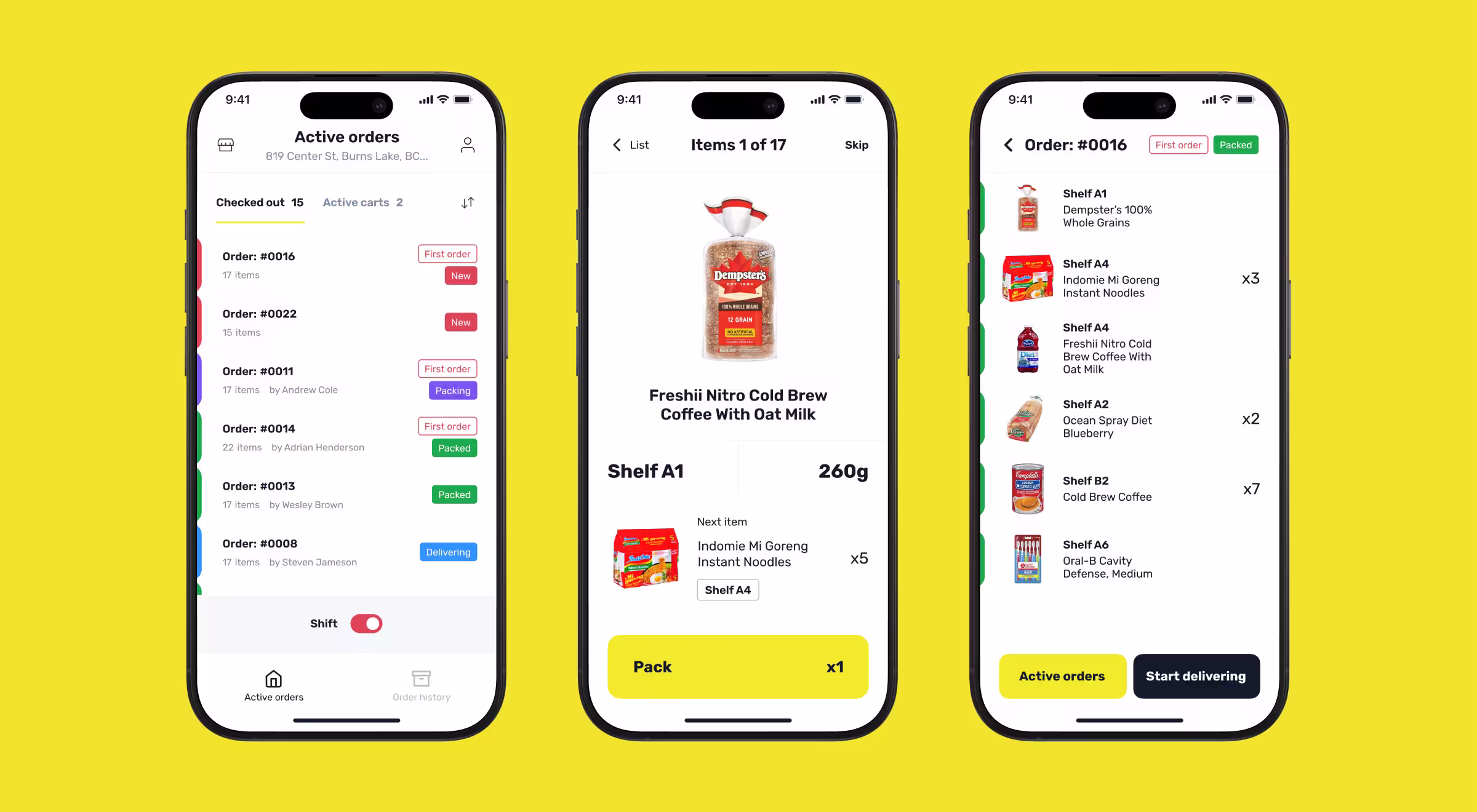
Creating an optimized solution for a courier delivery app meant designing for different environmental constraints — outdoor glare, single‑handed interactions, and constant movement. Key decisions:
- Dark‑friendly theme to improve contrast in night deliveries.
- A persistent task panel (“job card”) pinned near the thumb zone shows the current address, status, and ETA, so couriers don’t dig into notes or switch screens mid‑route.
- Color-coded status chips that align with the overall color palette, providing easily recognizable visual cues.
These interactive elements reduce cognitive load and keep users’ actions tightly aligned with delivery timelines, a prerequisite for the 10‑minute service promise.
For a deeper dive into how modern UX design patterns shave seconds off every leg of the supply chain, explore our recent logistics UX/UI design guide.
Landing page: value proposition above the fold
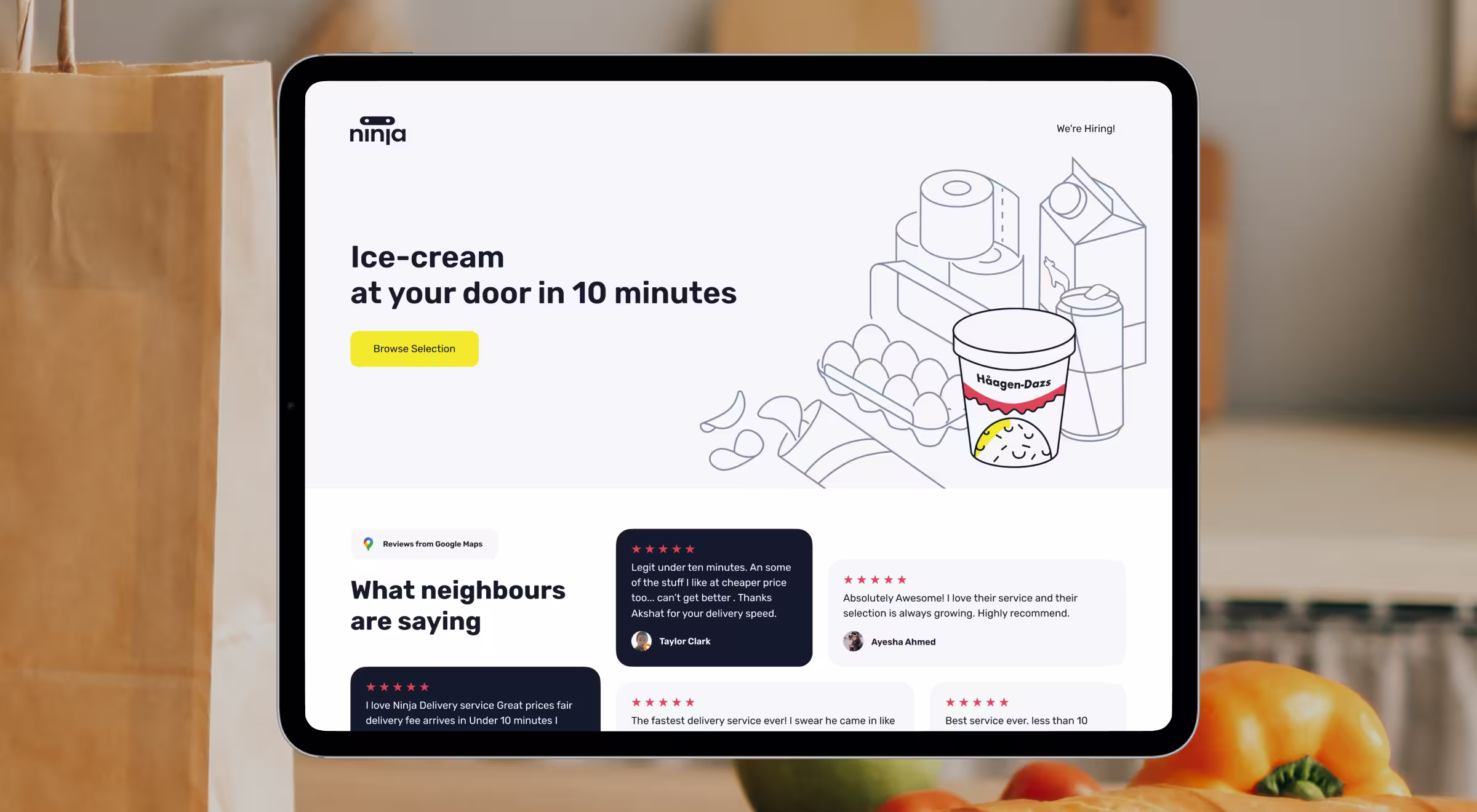
The marketing site had a mission: clarify the service at a single glance. That’s why our designers made a landing page that is clear from the first screen. Best‑practice choices:
- Bold headline with the service promise (“in 10 minutes”) supported by large product imagery.
- Consistent color scheme — the brand yellow reserved for CTAs, creating a visual hierarchy that guides users’ requests.
- Flat design blocks arrange essential content (categories, testimonials) into easily scannable sections, a modern website UI design staple. Recent research by Nielsen Norman Group highlights the same tactics for making flat layouts both readable and actionable.
Design system: tokens for speed and consistency
A token‑based design system (color, spacing, motion) allowed engineers to roll out features across personal computers, tablets, and mobile apps without pixel drift.
Consistency across digital interfaces builds muscle memory, keeping users engaged and reducing training time for new couriers.
A token‑based design system keeps the customer, courier, and marketing surfaces visually cohesive. If you want the step‑by‑step UI design process behind such systems, explore our SolarDrive framework.
When UI clarity pays for itself
Ninja Delivery’s trajectory shows that modern UI design produces measurable business lift when grounded in clear brand identity, tokenized design systems, and role‑specific patterns.
If your digital platform needs similar velocity — let’s talk!
Our UX audit services uncover gaps and prioritize high‑ROI fixes before your next funding round or launch sprint.


.webp)