
When Starbucks doubled down on mobile UX design, it rewired customer behavior. Ordering a latte became a one-thumb action. Payments disappeared into the background. Loyalty felt effortless.
That was the power of mobile user experience done right. It turned users into repeat customers and everyday interactions into revenue streams.
In this article, we’ll break down why mobile UX design is the true battleground for user trust, what separates winning apps from ones users forget, and how different industries are leveraging it to drive retention and revenue. Expect actionable comparisons, industry statistics, and invaluable insights from case studies that you can apply to your own product roadmap.
Key takeaways
- Mobile is the battleground. 60%+ of traffic and digital payments are now mobile. If your small-screen experience fails, growth stalls regardless of desktop polish.
- Retention beats traffic. Apps lose ~77% of users within 3 days if UX is off; mobile-first design is how you turn downloads into loyal, paying customers.
- Context is everything. One-handed use, glare, spotty connections, and short sessions mean you can’t treat mobile as “shrunk desktop.”
- UX ≠ UI. UX defines flows, thumb zones, and error paths; UI brings them to life visually. Mixing them up leads to pretty apps that underperform.
- Principles before patterns. Honeycomb thinking, task-first design, ergonomics, and cognitive-load reduction drive the strongest results across industries.
- Case studies prove it. From mental wellness to real estate and conferences, mobile-first UX led to higher retention, longer sessions, and clearer decisions.
- Right partner, right impact. Lazarev.agency, an AI design agency, uses mobile-first and AI-driven UX to turn mobile apps and websites into growth engines for B2B and B2C products.
What mobile UX means in numbers
Mobile is no longer a secondary channel for customer acquisition. In nearly every industry, mobile is where first impressions happen. If the experience falls short, the business impact is immediate.
A poor mobile experience frustrates users. What it also does is undermine business performance:
- 57% of users won’t recommend a brand with a poorly designed mobile presence.
- Mobile visitors are 5 times more likely not to complete tasks if the site isn’t optimized.
- As of 2025, 62% of all global website traffic comes from mobile devices, proving that mobile users now define the standard for digital presence.
Traffic, however, is half the story. Retention is what defines whether that traffic becomes business growth. The numbers are stark:
- Mobile apps lose 77% of daily active app users within 3 days if the UX is off — proof that poor mobile applications stifle retention.
- Users who return to an app weekly are 90% more likely to become long-term customers.
- Acquiring new customers costs from 5 to 25 times more than retaining existing ones.
Role of mobile UX across industries
The value of mobile UX cuts across every industry, with responsive and mobile-first design increasing retention and building user loyalty.
And that’s why mobile UX is a proven shortcut to faster business growth.
Mobile UX design vs. mobile UI design: key differences to keep in mind
It’s a mistake to treat mobile UX design and mobile UI design as interchangeable. They work together, but they solve different problems.
UX defines how users move through your app or mobile site. Think of the flows, logic, and emotional arc. UI defines how those flows look and feel: the visuals, layouts, and interactions that bring UX to life.
Below is a side-by-side breakdown to help product owners, designers, and founders internalize the differences.
Mobile UX design principles behind strong digital products
Ask any mobile web design expert, and they’ll tell you: mobile UX is the invisible scaffolding that shapes every tap, every scroll, and every decision to return or leave for good.
Below are a few mobile ux design principles that ground every successful mobile experience.
Honeycomb lens
Peter Morville’s UX Honeycomb is one of the most enduring frameworks for evaluating UX. And on mobile, each facet carries even higher stakes:
- Useful: A mobile app must solve a problem from the first screen. Ambiguity drives churn.
- Usable: Flows must be stripped of friction: fast load times, predictable mobile UX patterns, and intuitive gestures are table stakes.
- Desirable: Design should spark positive emotion. Smart micro-animations, intuitive user feedback, and visually appealing design elements turn use into attachment.
- Findable: Clear hierarchies, powerful search, and contextual shortcuts keep users from getting lost in limited screen space.
- Accessible: Mobile UX must adapt to real-world conditions: glaring sunlight, background noise, or reliance on assistive tech.
- Credible: Trust is fragile on mobile. One broken flow, one security hiccup, and adoption crumbles.
- Valuable: Every interaction should create value for both user and business. That’s the difference between vanity design and product growth.
Task-first thinking
The best mobile apps identify a primary use case and spotlight it. Shazam famously distilled its UX to one oversized button: tap to identify a song.
For fintech, this might be “check balance”. For healthcare, “book an appointment”. The principle: design the flow around the critical action, then build outward.
Ergonomics of touch
Mobile design is anatomical. Most users operate phones one-handed. That makes thumb-reach zones critical. Buttons placed too high or icons too small lead to repeated errors and frustration that compounds until users abandon the app.
Reducing cognitive load
Mobile is used in bursts, often with distractions. Reducing cognitive load means:
- Shorter forms with smart defaults.
- Visual cues instead of explanatory text.
- Progress indicators to reassure users mid-task.
- Skeleton screens that maintain trust during slow connections.
🔍 If you want to understand how mobile UX foundations translate into high-stakes contexts like fintech, health, and analytics tools, explore our deep dive into UX design examples for products that can’t afford churn.
Tools and frameworks for mobile UX design
A polished mobile experience is the result of using the right tools at the right stage of the UX design process.
“The biggest mistake I see is teams stacking tools without sequencing them. Tools aren’t magic. They work when used at the right stage. Start with analytics to uncover real behavior. Then design with systems that scale, validate through usability testing and accessibility audits, and create accurate user personas. Only then double down on retention tracking. The flow from mobile UX research → design → validation → scale is what turns toolkits into a growth pipeline.”
{{Anna Demianenko}}
Here’s how to build a practical toolkit.
1. Primary mobile UX research
Understanding how users actually behave is the foundation for continuous improvement.
- UXCam and Hotjar: Reveal user journeys with session replays, product roadmaps, heatmaps, and gesture tracking. Ideal for spotting friction points.
- Mixpanel: Tracks funnels and user flows to help teams see exactly where engagement drops.
- A/B testing platforms: Validate design changes before rolling them out broadly.
🟩 When to use: Discovery and post-launch phases to diagnose usability issues and assess the impact of the implemented design solutions.
2. Accessibility and compliance
Accessibility broadens reach and protects against risk.
- Lighthouse: Quick audits for accessibility and performance, and search engine optimization (SEO).
- Axe and WAVE: Detailed checks for WCAG/ADA compliance.
🟩 When to use: Throughout design and QA. Catching accessibility issues late costs more than fixing them early.
3. Prototyping and collaboration
Fast iteration reduces wasted investment.
- Figma + Maze: Combine design, prototyping, and user testing in one flow.
- Agile UX sprints: Compact cycles of ideation, prototyping, and user validation.
🟩 When to use: During concept validation and before development handoff.
🔍 Strong toolchains are only as good as the designers who apply them. Our guide to the 11 best app design companies highlights teams who deliver mobile products users return to.
Mobile experience in action: hands-on insights from Lazarev.agency’s team
Great mobile UX evolves around anticipating user behaviors and turning products into habits.
At Lazarev.agency, we’ve applied this philosophy across healthcare, real estate, fintech, and large-scale media platforms. Here’s how mobile-first thinking reshaped outcomes in four very different industries.
Mobile-first approach to app UX design
💡Practical insight: Retention is built mobile-first. Apps succeed when they prioritize daily, on-the-go engagement.
With Happiness, a mental wellness app, our mobile UX designers knew retention would decide success. People engage on the go, often in micro-moments. That’s why we designed a mobile-first experience centered on progress tracking.
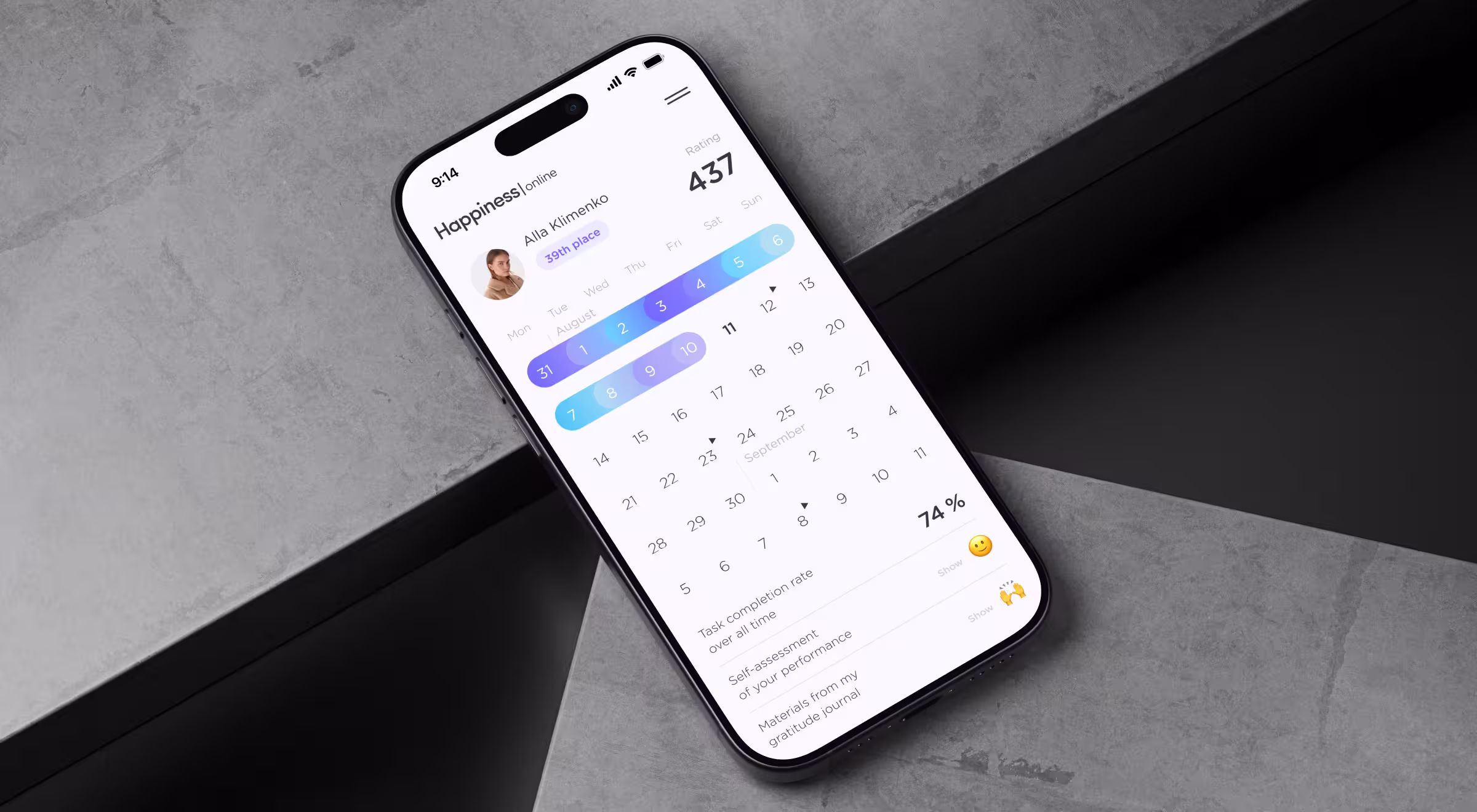
People dip into wellbeing apps in micro-moments, so the experience had to feel effortless. We placed a progress calendar at the center of the mobile interface, supported by leaderboards, badges, and immediate feedback. The introduced app UX design improvements led to a 42% boost in retention and helped turn daily engagement into a long-term habit.
Intuitive mobile experience for real estate
💡Practical insight: Lag or friction kills decisions.
Riviera City is a prime example of how mobile can be the front line of sales. Prospective buyers visited the site over 20 times before finalizing their decision.
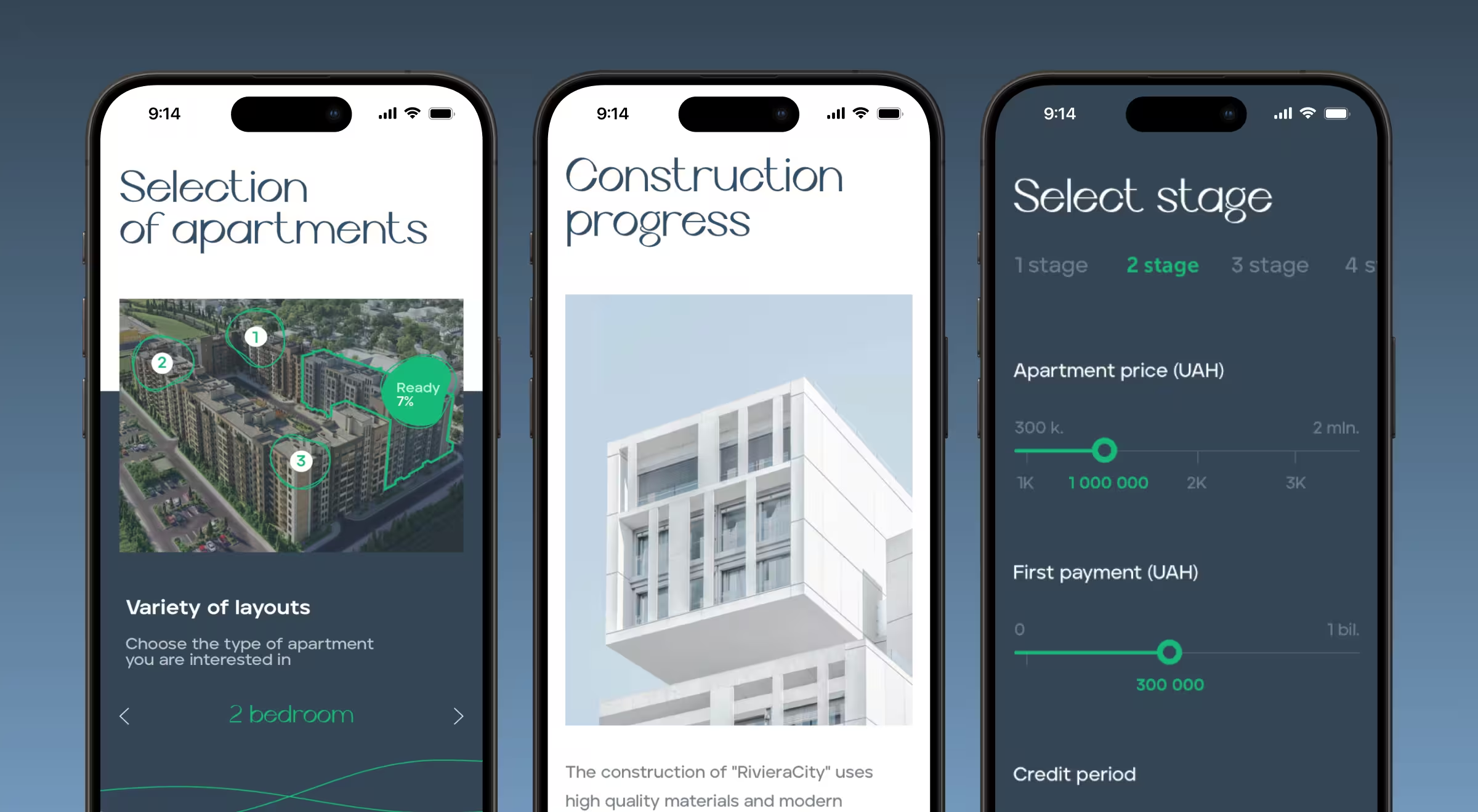
We crafted a mobile experience mirroring the desktop flow while optimizing for mobile internet performance. With 2–3 second load times, interactive 3D floor plans, and a mobile-ready sales calculator, mobile users could explore and make decisions on the go without friction.
Thanks to smart mobile optimization, we achieved smoother conversions and a stronger connection between mobile browsing and apartment sales.
Data clarity across devices
💡Practical insight: Financial data is notoriously dense, but what makes mobile UX design important for users across industries is clarity at speed.
For Quantillium, we reimagined the platform’s digital presence with a mobile-optimized design system. 3D visuals and terminal-style animations were rethought for smaller screens, ensuring they retained clarity without sacrificing performance.
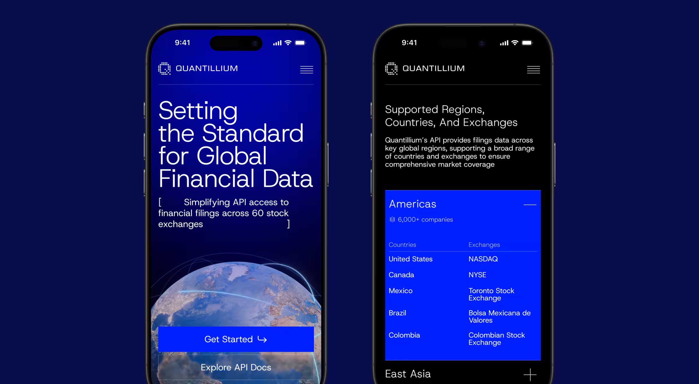
This approach delivered a 30% increase in data accessibility and a 32% boost in session duration, proving that even complex data products can thrive in mobile contexts.
Community at scale, powered by mobile
💡Practical insight: Mobile is the engine of community.
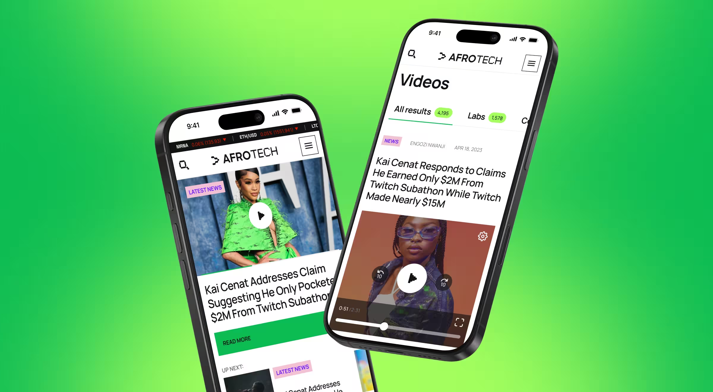
With AfroTech, the goal was to connect thousands of professionals through digital and live experiences. We developed a dedicated mobile app (AfroTech Connect) that made event navigation, networking, and user engagement effortless. Paired with the broader platform, it fueled a 25% retention lift and a 30% engagement increase, while connecting 20k+ professionals at AfroTech’s flagship conference. For users, mobile was the core community driver.
🔍 These case studies echo a broader truth: strong mobile UX is built on speed and focus. See how we apply the same principles in our breakdown of mobile site optimization practices.
Prioritizing mobile UX is a shortcut to future-proofing your business
An unintuitive mobile flow is no longer just a design flaw. It’s a revenue leak you'd better start mending now. In contrast, well-crafted mobile UX unlocks growth through higher retention and stronger conversions.
At Lazarev.agency, an AI UX design agency, we create ecosystems. Our AI and mobile-first approach has helped clients raise $500M+, grow platforms like AfroTech and Quantillium, and turn apps like Happiness into daily habits.
If you’re ready to turn mobile into your growth engine, contact us today. Let’s design the mobile experience your target audience deserves and your business needs.


.webp)