UI trends 2026 aren’t about chasing whatever looks new. They’re early signals. They show you where interfaces are gaining leverage and where products are about to lose relevance if nothing changes.
Keeping an eye on UI trends is the first step in staying competitive. Knowing which ones matter is where the real advantage lies.
In this article, our UI/UX team breaks down the UI trends shaping 2026 and explains what each one solves and where it works best. Think of it as a practical field guide for designing interfaces that make sense when software starts thinking for itself.
Key takeaways
- AI moves into the interface layer. In 2026, intelligence shapes how users interact with your product and make decisions.
- One-size-fits-all UI is officially obsolete. Adaptive layouts and self-learning systems outperform static screens consistently across performance metrics.
- Treat trust as a UI problem. Interfaces that expose logic and intent earn user confidence.
- Expertise matters when trends turn into systems. Leading external design partners like Lazarev.agency help teams avoid trial-and-error by translating trends into performance-driven interface decisions grounded in real product outcomes.
What’s going on in UI design?
AI supercharges UI design in every dimension. It’s an industry reality. Anyone serious about their digital presence has already adjusted.
Be it chatbot digital transformation or focus on anticipatory design, AI has secured its strategic grip on UI.
Not only are interfaces getting smarter and more animated, but they are also adapting to a world where AI-powered design sets the rules of product development.
And the data makes the transformation driven by AI unmistakable.
- AI skills are essential for design and development roles. Most designers and developers (more than 80%) say learning to work with AI will be essential to future success, according to Figma’s 2025 AI report.
- AI delivers productivity gains for design teams. The same report highlights that 78% of designers and developers consider AI tools critical to boosting their efficiency, which, in turn, reduces time spent on repetitive tasks.
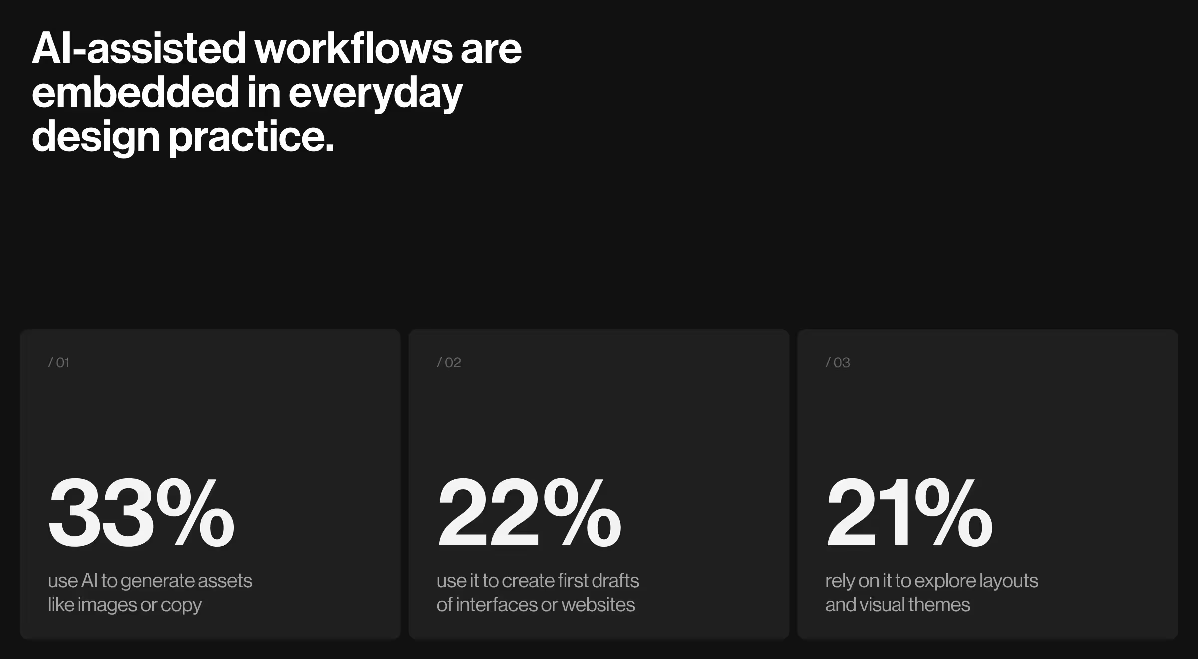
- AI-assisted workflows are embedded in everyday design practice. Recent data from Figma shows that during the design phase:
- 33% use AI to generate assets like images or copy
- 22% use it to create first drafts of interfaces or websites
- 21% rely on it to explore layouts and visual themes
- At the organizational level, AI adoption is nearly universal. McKinsey reports that almost all surveyed companies are using AI, 64% say it fosters innovation, and many are already deploying AI agents with tangible cost and revenue impact.
What do these stats mean for UI design?
The data above points to a clear set of expectations shaping UI trends:
- AI-native interfaces will treat intelligence as a baseline.
- Conversational, multimodal interaction models will lower UI barriers in complex workflows.
- Adaptive layouts will respond to user intent, expertise, and context, thus retiring one-size-fits-all flows.
- Design systems will be built for change.
At the same time, these signals expose growing bottlenecks.
- Interfaces struggle to explain why AI acts the way it does.
- Over-automation erodes user trust and sense of control.
- Systems surfacing too many “smart” options with no clear hierarchy exacerbate cognitive load.
The tension between advancing intelligence and interfaces that haven’t fully caught up is the real backdrop for UI trends 2026.
The trends that matter most focus on designing interfaces that can keep humans oriented and in control as software becomes autonomous.
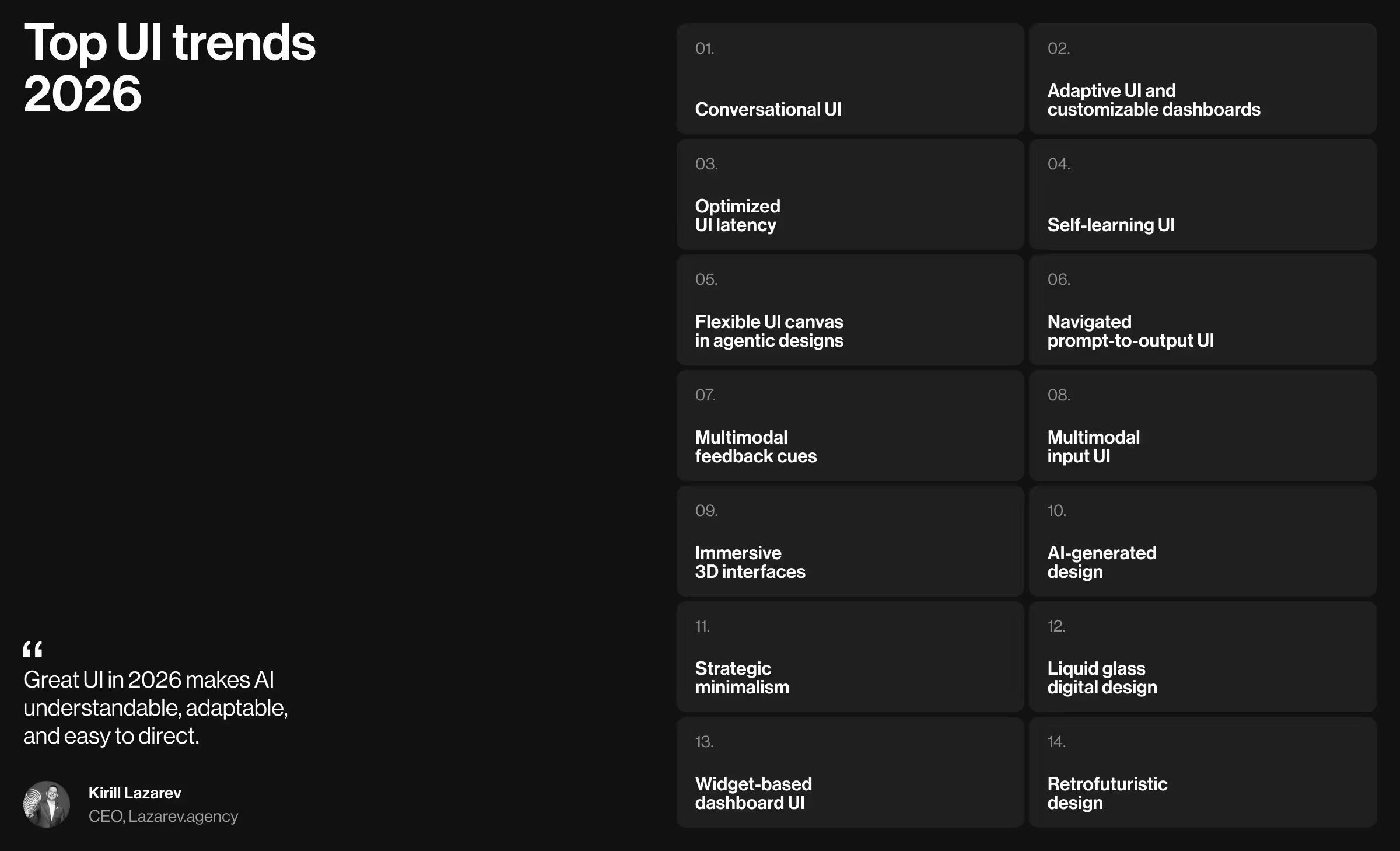
Top UI trends 2026
Our UI/UX design team compiled a list of UI trends based on where we see real momentum. Working hands-on with products across fintech, logistics, enterprise SaaS, and AI-native platforms gives us a practical vantage point: we see which interface patterns perform exceptionally well and which fade away.
What stands out going into 2026 is not just what changes, but also why. The strongest signals point in two directions:
- AI-first design mechanics reshape how interfaces behave, adapt, and communicate intent.
- Visual systems are moving beyond the flat screens, reintroducing motion and texture as functional UI elements.
Below is our breakdown of the UI trends gaining the most traction. For each, we explain why it matters, where it works best, and how to assess its relevance for your product and business.
AI-first trends
AI-first design changes the rules of digital interaction. In this model, UI is the mediator between human intent and machine logic.
When software can reason and act on its own, a passive interface is a liability. The interface must explain what’s happening and invite direction.
With that in mind, here are the AI-first UI trends worth paying attention to.
1. Conversational UI
- What it is: With conversational UI, what used to be an auxiliary chat feature becomes a chief way users navigate complex systems. Conversational UI introduces natural language as a primary control surface. Users interact through text or voice, while the interface interprets intent, keeps context, and executes tasks on their behalf.
- How it changes traditional UI: Navigation-heavy screens give way to intent-driven flows. Instead of hunting for the right filter or form, users describe what they want to achieve. Then, the interface assembles the workflow accordingly.
- Where it works best: AI-powered SaaS, analytics platforms, internal enterprise tools, and customer support systems.
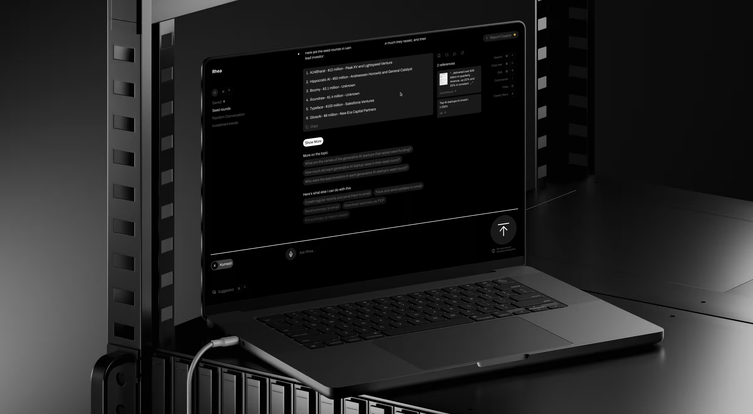
- Practical example: When redesigning Accern.Rhea, we expanded the chat input into a command line. Analysts upload files, query multiple datasets, generate reports, and surface charts or references within a single conversational flow. In response, the UI adapts widgets, tables, and controls to support each step of the dialogue.
🔍 Discover more insights from chatbot UI examples that get human–AI interaction right.
2. Adaptive UI and customizable dashboards
- What it is: Adaptive UI adjusts itself (structure + content) based on user data. Dashboards evolve and get automatically reorganized to meet users where they are.
- How it changes traditional UI: Responsive layouts take over. Information appears when it’s useful and recedes when it’s not.
- Where it works best: SaaS analytics tools, fintech platforms, enterprise systems, healthcare software, and other environments where different roles extract different value from the same data.
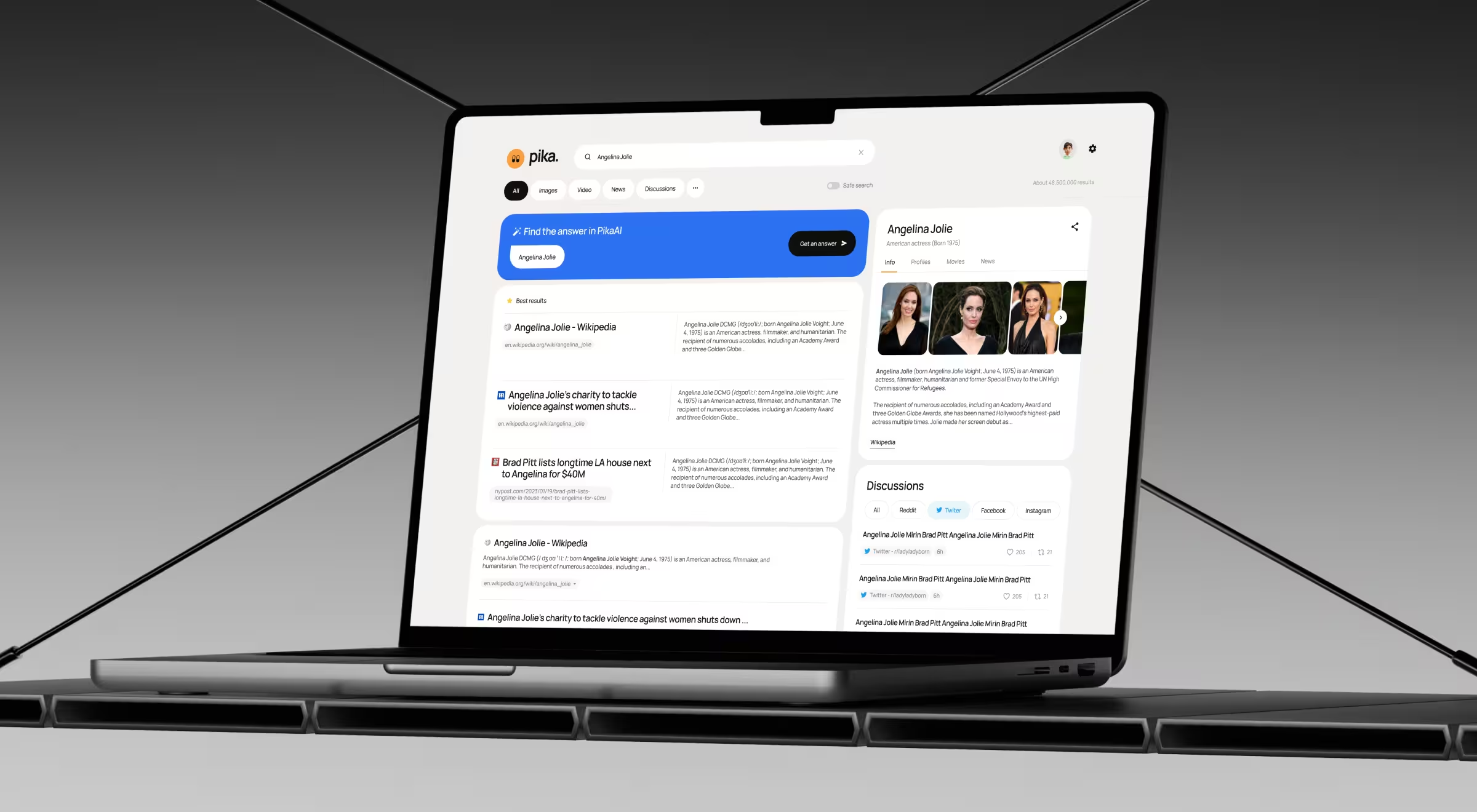
- Practical example: For Pika AI, we made the product’s interface adaptive and customizable. As users type, the system selects and orders the most relevant widgets (AI chat, summaries, content blocks) based on perceived relevance. This way, it guides the user's attention through the results page without relying on fixed dashboard layouts or manual customization.
🔍 Learn more about 5 AI dashboard design principles backed by real-life digital products.
3. Optimized UI latency
- What it is: Optimized UI latency is the deliberate control of response timing across an interface. It’s about deciding when visual feedback (or audial) appears, how progress is communicated, and how to make delays feel like steady progress.
- How it changes traditional UI: Speed isn’t a universal win anymore. Designers now tune latency to context: some interactions respond instantly, while others introduce progress cues or anticipation. Timing itself becomes an active part of the interaction design.
- Where it works best: Zero-latency excels in trading platforms, dashboards, search, and gaming, where reaction time impacts outcomes. Measured latency works best in conversational and voice-driven products where the alignment with human rhythm builds trust.
- Practical example: In a voice AI agent Vapi, micro-pauses and auditory cues make the interaction feel closer to a real conversation.
4. Self-learning UI
- What it is: Self-learning UI refers to interfaces that get sharper the more they’re used. Each interaction feeds a learning loop. This way, it allows the system to refine layouts and suggested actions based on user behavior.
- How it changes traditional UI: Hyper personalization is now the cornerstone of most UI design trends. Defaults must adapt to observed usage patterns, making the interface smarter and more personalized with each interaction.
- Where it works best: AI-powered SaaS, productivity tools, fintech platforms, and enterprise systems where workflows vary, and edge cases are the norm.
- Practical example: In Notion, the interface learns from how teams reuse blocks and apply AI commands. Over time, suggestions, shortcuts, and AI outputs align more closely with each team’s work style.
🔍 Interested in the underlying logic of self-learning UI? Explore Lazarev.agency’s take on user generated use case framework.
5. Flexible UI canvas in agentic designs
- What it is: A flexible UI canvas is a modular interface layer where AI agents operate in the open with no hidden logic behind chat replies. Instead, the canvas exposes steps and outputs, so users can see and take control over what agents are doing.
- How it changes traditional UI: The canvas becomes a living surface where workflows unfold, and users can step in to rearrange blocks or correct course. This is how UI design earns user trust.
- Where it works best: Automation tools, no-code platforms, AI research systems, internal enterprise software: anywhere users need control and confidence in how agents operate.
- Practical example: In Gumloop, the canvas acts as a live framework for agent workflows. Users can track how agents pass data and execute tasks, which makes complex automation understandable.
6. Navigated prompt-to-output UI
- What it is: This trend surfaces example prompts in the interface, right where users type. Rather than getting overwhelmed by an empty input, people see ready-made starting points that hint at what the system can do.
- How it changes traditional UI: The blank canvas problem disappears. Interfaces guide the first move by framing intent upfront.
- Where it works best: LLM-based products like AI search tools, analytics assistants, design copilots, and internal AI platforms, where users may understand the goal but struggle to articulate a request.
- Practical example: In Perplexity, suggested prompts appear next to the search bar. This small design move sparks exploration and keeps users moving, which is exactly what a smart AI interface should do.
7. Multimodal feedback cues
- What it is: Multimodal feedback cues pair voice interactions with visual signals to show that the system heard and understood you, and it’s doing something about it.
- How it changes traditional UI: Text-only confirmations often leave users wondering, “Did it freeze?”. Multimodal cues eliminate that uncertainty by clearly signaling that the system is listening and processing.
- Where it works best: Assistive tech, accessibility-focused products, AI copilots.
- Practical example: In Google Assistant, animated waveforms and color changes indicate when the assistant is listening, thinking, or acting on the received data. Those cues make voice interaction intentional.
8. Multimodal input UI
- What it is: Multimodal input lets people interact with your product without forcing intent into a single format. Text, voice, images, files, and gestures all work together to communicate with the interface.
- How it changes traditional UI: Rigid forms and strict user input fields loosen their grip. Interfaces accept messy, real-world input like an image plus a question or a voice command with a file attached. The UI shifts from “enter data correctly” to “show me what you mean”.
- Where it works best: AI search, design and creative tools, education platforms, healthcare apps, field services, and research products where context matters more than perfect phrasing.
- Practical example: In ChatGPT, users combine text prompts with images, files, and follow-up questions in a single thread. You can upload a screenshot, ask what’s wrong with it, refine the request by voice, and iterate through text without switching tools. The interface adapts to mixed inputs, which makes problem-solving feel fluid.
Visual trends
Visual UI in 2026 reflects a deliberate move away from flat minimalism toward tactile digital experience.
Here are the top trends that Lazarev.agency, a top UX/UI design agency, identifies as shaping the year ahead.
9. Immersive 3D interfaces
- What it is: Immersive 3D interfaces add depth and spatial logic to UI. Instead of flat layers, 3D objects and animation convey structure and physical qualities that users instinctively understand.
- How it changes traditional UI: Interaction feels like handling a real object (rotating, inspecting, and exploring) rather than scrolling through specs.
- Where it works best: Hardware products, film and media tech, automotive, industrial tools, gaming, premium e-commerce.
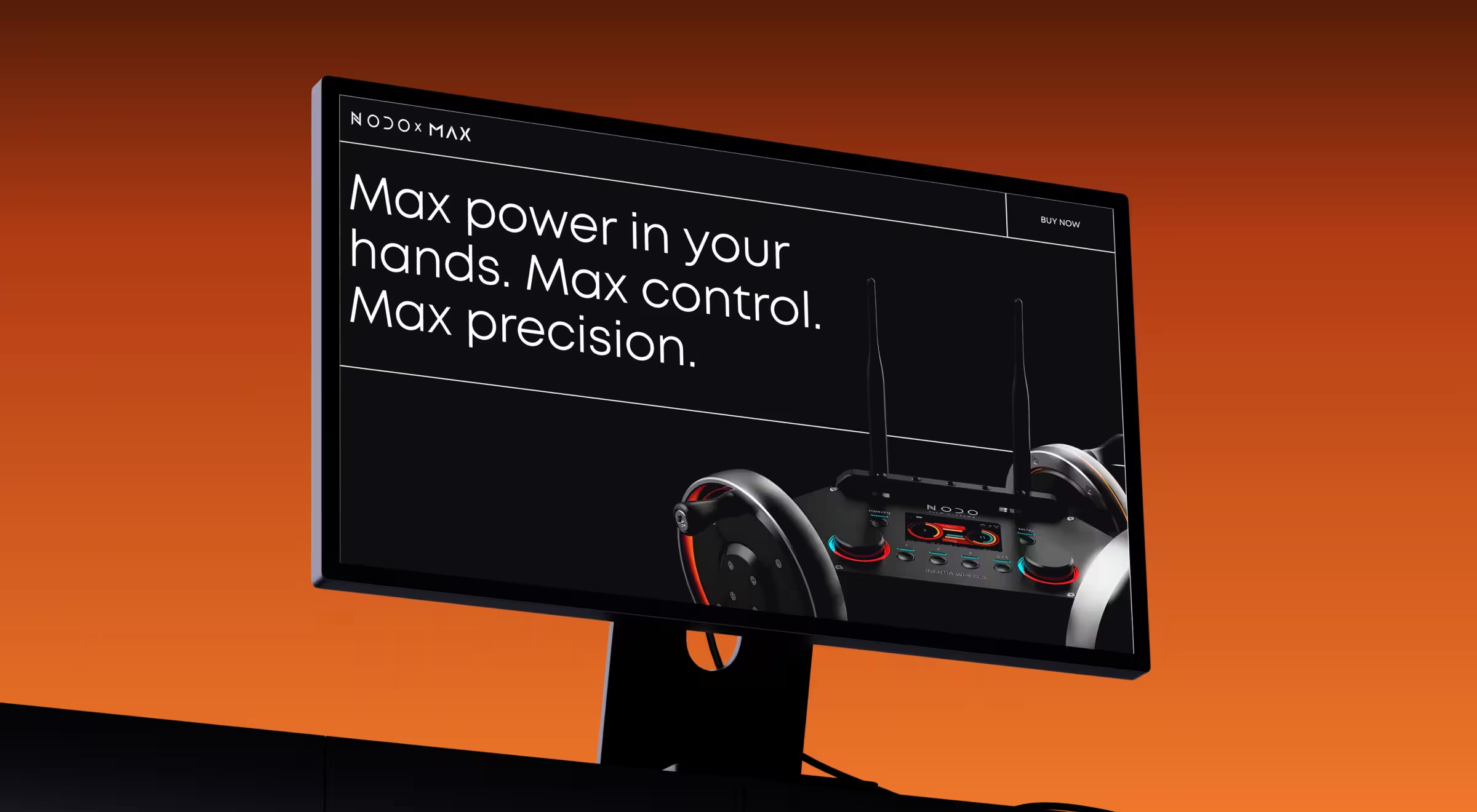
- Practical example: In the NODO website redesign, 3D showcased the Inertia Wheels MAX. Visitors could explore the product’s mechanics and tactile precision through motion and depth. This tactic made a promo page feel like a hands-on experience. Outcomes-wise, it fueled waitlist sign-ups and customer acquisition.
10. AI-generated design
- What it is: AI-generated design uses machine learning to create visuals and layouts. Instead of designing every state manually, teams define rules, then let AI handle the rest.
- How it changes traditional UI: Interfaces adjust imagery, layout, and presentation based on the user's context. Such strategic flexibility keeps the experience consistent across diverse user dynamics. And consistency is one of the core UI design principles.
- Where it works best: Fashion and retail, global e-commerce, marketing platforms, content-driven SaaS products, and any product where localization and visual relevance influence conversion.
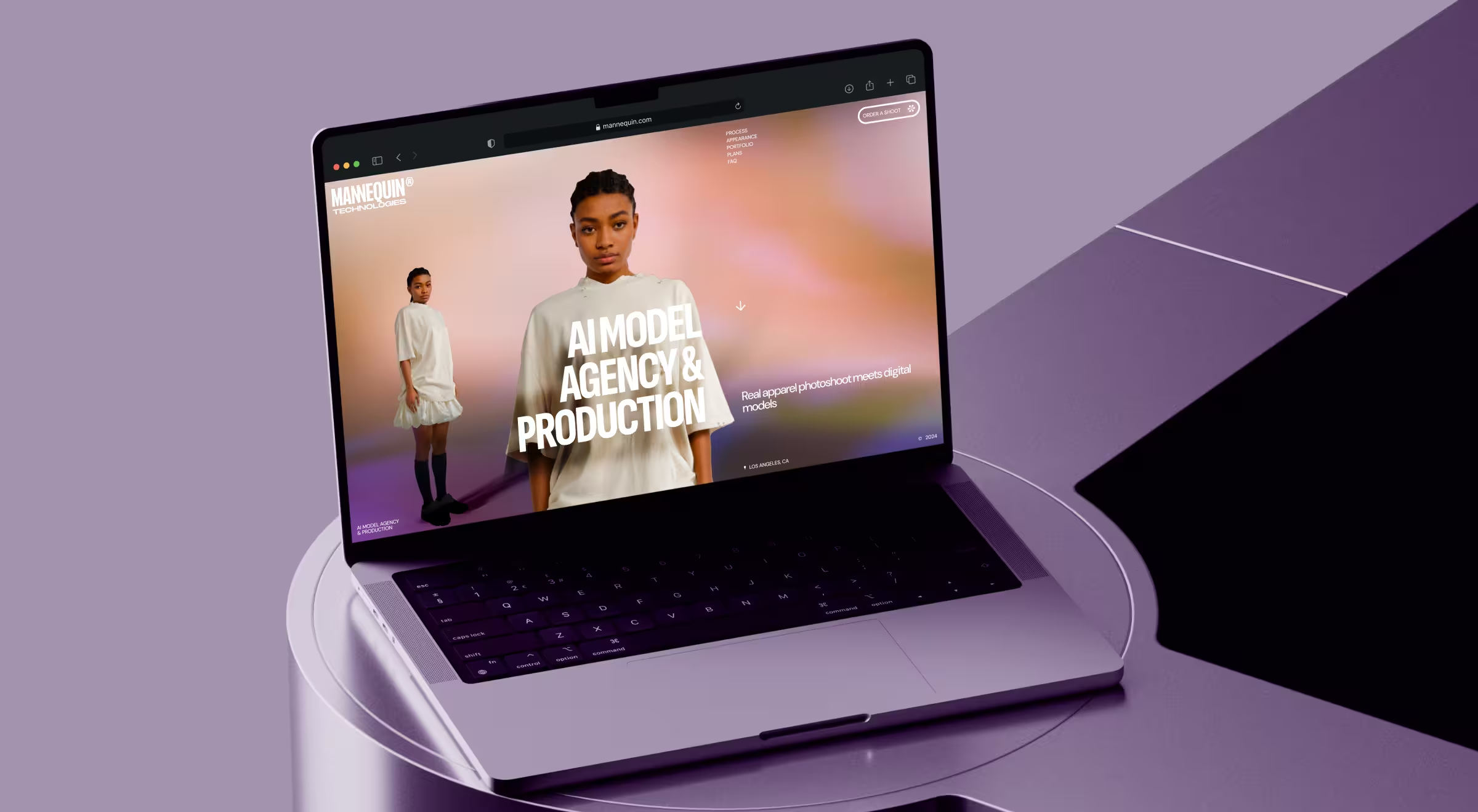
- Practical example: For Mannequin’s website redesign, Lazarev.agency crafted a story-driven UI featuring AI-generated human models wearing real garments. Motion design, bold gradients, dynamic grids, and subtle parallax effects create a 3D-like sense of depth. The result is a clear, visual narrative that makes the technology instantly understandable and positions Mannequin as a frontrunner in AI-driven fashion content.
11. Strategic minimalism
- What it is: Strategic minimalism is the practice of removing everything that doesn’t help the user move forward. All UI elements on screen have a job. If they don’t help users understand or act, they’re out.
- How it changes traditional UI: Interfaces don’t compete for attention. Hierarchy sharpens, and navigation becomes intuitive. UI is calmer, faster, and way more intentional.
- Where it works best: Fintech products, SaaS dashboards, developer tools, healthcare platforms, and enterprise software.
- Practical example: Stripe is a masterclass in strategic minimalism. Its dashboards rely on a restrained color palette and intentional use of physical space on screen to surface what matters without distractions. The result is an interface that stays out of the way while doing serious work.
🔍 Explore how we integrated the principle of bold minimalism to embrace interface clarity, fueling 20% WoW growth and 30 K order milestone for the NinjaDelivery platform.
12. Liquid glass digital design
- What it is: Liquid glass design plays with translucency and light the way physical materials do. Frosted surfaces and subtle refractions add dimension without visual heaviness.
- How it changes traditional UI: Flat design gave us discipline, but it flattened everything else. Glass-like layers restore hierarchy through light and reflections. This helps users understand what’s foreground and what can wait.
- Where it works best: Operating systems, premium consumer apps, creative tools, media platforms, and hardware-adjacent software.
- Practical example: Apple applies liquid glass design as a new visual language for its operating system. Translucent navigation bars and frosted backgrounds adapt to the background with a consistent sense of fluidity.
13. Widget-based dashboard UI
- What it is: In widget-based dashboards, each widget handles a single job and can be updated or replaced without affecting the rest of the system.
- How it changes traditional UI: Users expect information to arrive in clear, purpose-built units that adapt to context. That’s why monolithic dashboards lose ground.
- Where it works best: Fintech platforms, AI research tools, SaaS analytics, enterprise software, and internal dashboards where users juggle multiple workflows and need fast, selective access to information.
- Practical example: Microsoft Power BI gets this right. Teams assemble charts, KPIs, and reports as modular widgets, creating role-specific (and most importantly, readable) dashboards.
🔍 Modular, customizable dashboards let users shape the interface around how they actually work. Learn about the other 7 top UI practices for your digital product.
14. Retrofuturistic design
- What it is: Think cyberpunk interfaces, early sci-fi computers, and neon grids. This is how retrofuturistic design draws from past visions of the future and reinterprets them through modern UX. It blends nostalgia with speculative tech to conjure up ingenious interfaces.
- How it changes traditional UI: Uniform minimalism loosens its grip. Interfaces gain mood, narrative, and texture while preserving modern interaction patterns underneath.
- Where it works best: Gaming, AI products, creative tools, media platforms, experimental tech, and brand-led experiences.
- Practical example: Spotify Wrapped leans heavily into retrofuturistic cues with its neon palettes, oversized typography, and playful motion. The platform sticks to the analyzed trend to turn listening data into a cultural moment. The underlying UX stays simple, but the visual layer adds story and a sense of nostalgia that standard dashboards rarely achieve.
🔍 Leading startup design agencies recommend retrofuturism for new entrants: it lets unknown products look visionary from the outset, without waiting years to earn cultural weight.
How to decide which UI design trends are worth following for your product?
Trends are tempting. But following them blindly is how products end up underperforming. The smarter move is to treat trends as tools, each useful for a specific problem.
Start with the constraint that hurts most. Then choose accordingly.
Below is a simple decision framework we use in real product work.
1. If users struggle to get started → prioritize guided UI
What to look at:
- Conversational UI
- Navigated prompt-to-output interfaces
Why it matters: When users face a blank screen and hesitate, your UI has already lost momentum. Conversational entry points and suggested prompts lower the cognitive barrier and turn intent into action fast.
✍️ Actionable tip from Lazarev.agency: Start with a design system audit. If users need a tutorial before they can act, your interface is missing guided navigation.
2. If users feel overwhelmed or distracted → invest in adaptive UI
What to look at:
- Adaptive UI and customizable dashboards
- Widget-based dashboard patterns
Why it matters: Information overload erodes clarity. Adaptive layouts surface what matters now and push everything else aside.
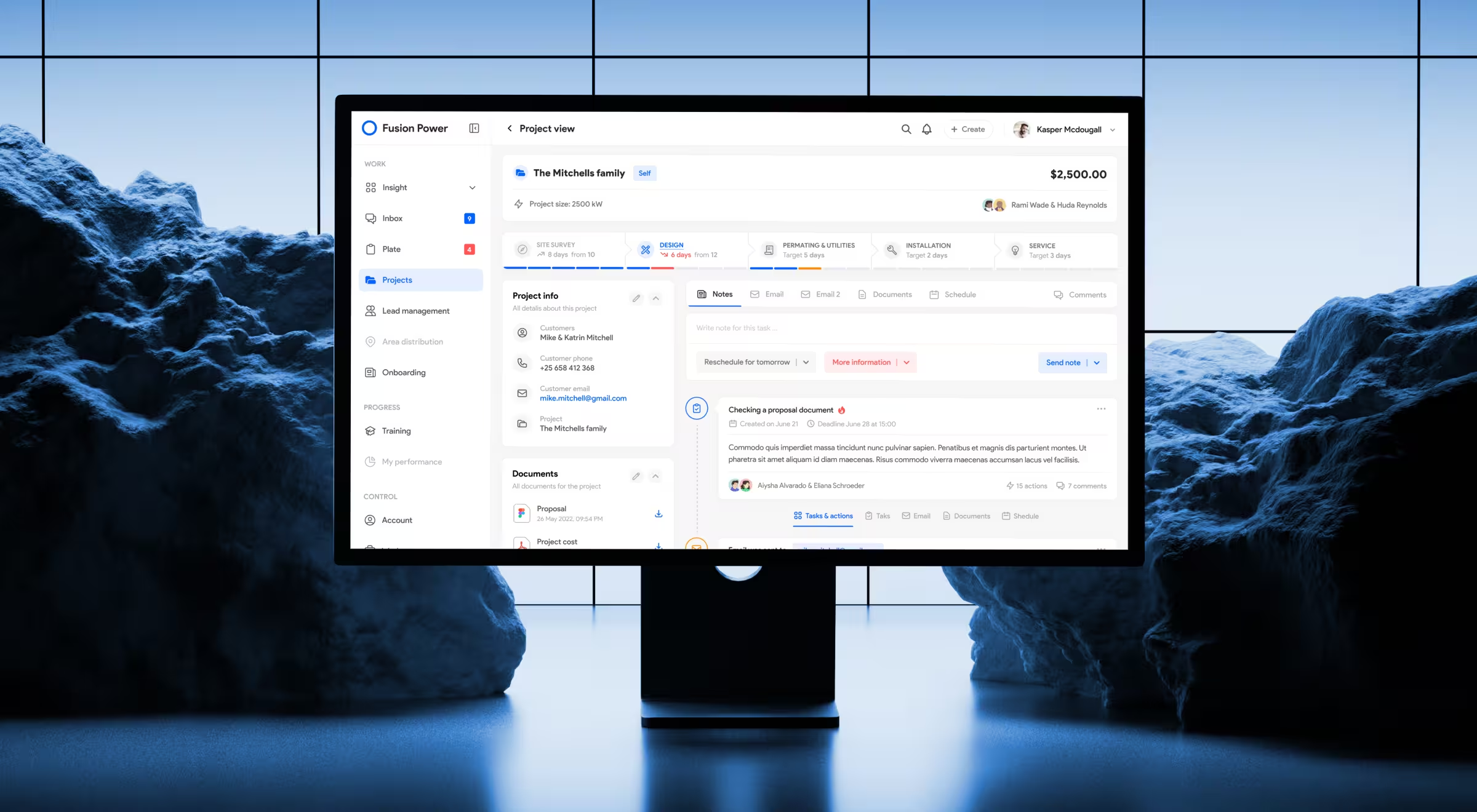
During our redesign of SolarDrive’s internal platform, we saw the value of this principle firsthand. Our design team replaced five disconnected tools with a single adaptive interface that reorganized tasks by priority and project stage. The result signaled the relevance of the upgrade: fewer handoffs and over 2 hours saved per employee per day.
✍️ Actionable tip from Lazarev.agency: Map your users by role. If everyone sees the same dashboard but asks different questions, making your product’s design adaptive should be a priority.
3. If trust in AI decisions is fragile → expose logic
What to look at:
- Flexible UI canvas in agentic designs
- Multimodal feedback cues
Why it matters: Opaque AI erodes confidence. Interfaces that show what the system is doing and why keep users oriented and in control.
✍️ Actionable tip from Lazarev.agency: If users ask “what just happened?” after an AI action, your UI is hiding too much.
4. If speed or flow breaks the experience → rethink latency
What to look at:
- Optimized UI latency
Why it matters: Instant responses work for trading and search. In conversational or voice interfaces, pacing and subtle feedback feel more human and more trustworthy.
✍️ Actionable tip from Lazarev.agency: Decide where speed is critical and where rhythm matters more.
5. If workflows vary → build for learning
What to look at:
- Self-learning UI
- Multimodal input
Why it matters: The “average user” doesn’t exist. Products that learn from real usage and accept imperfect, multimodal input adapt to edge cases and mature with their users.
✍️ Actionable tip from Lazarev.agency: Track repeated user patterns. If power users bend your UI to get work done, your system should learn from that behavior.
Leverage a well-design UI for maximum business impact
The right UI trend is the one that identifies areas for improvement way before those become areas of decay.
That’s what makes applying the right UI trends a double win. You fix what’s holding users back today and future-proof the interface with actionable UI design principles against what’s coming next.
But that only works when trends are implemented with intent and a clear understanding of trade-offs. That’s where many internal teams hit a wall.
At Lazarev.agency, we work exactly at that intersection. We help teams translate UI trends into systems that perform across AI-native products, enterprise platforms, and high-growth SaaS. We pressure-test the trends, apply them only where they matter, and measure the impact. Always.
If you’re ready to reap real product gains, let’s talk. We’ll help you decide what to evolve, what to ignore, and what to design next on purpose.


.webp)


