

Your product idea could be worth millions or it could join the 90% of startups that fail because they built something nobody wanted. But what actually could make a difference? The answer lies in how you approach product design.
Lazarev.agency team has watched brilliant entrepreneurs burn through millions building "revolutionary" products that users ignored. We've also seen scrappy startups become unicorns because they nailed their product design process from day one.
Ready to learn what separates products that scale from products that fail? Keep reading.
Key takeaways
- Strategic product design process reduces development costs by 40% and accelerates time-to-market by 35%.
- User research and testing at each stage prevents 70% of costly post-launch redesigns.
- Human-centric creative process combined with business objectives delivers products that users actually want.
- Iterative prototyping and validation ensures your final product solves real user pain points.
Why do so many companies flame out?
The brutal truth is that 42% of startups fail because they build products nobody wants. Another 29% ran out of cash trying to fix what could have been prevented with the proper product design process.
At Lazarev.agency, we've seen this pattern across 120+ international projects. So, what are the companies that succeed? They follow a systematic approach to product development that puts user needs at the center of every decision.
The real cost of skipping design process
When you skip the design product strategy process, you're borrowing against your future. Consider these industry statistics:
- Design-driven companies outperform the S&P 500 by 228% over 10 years
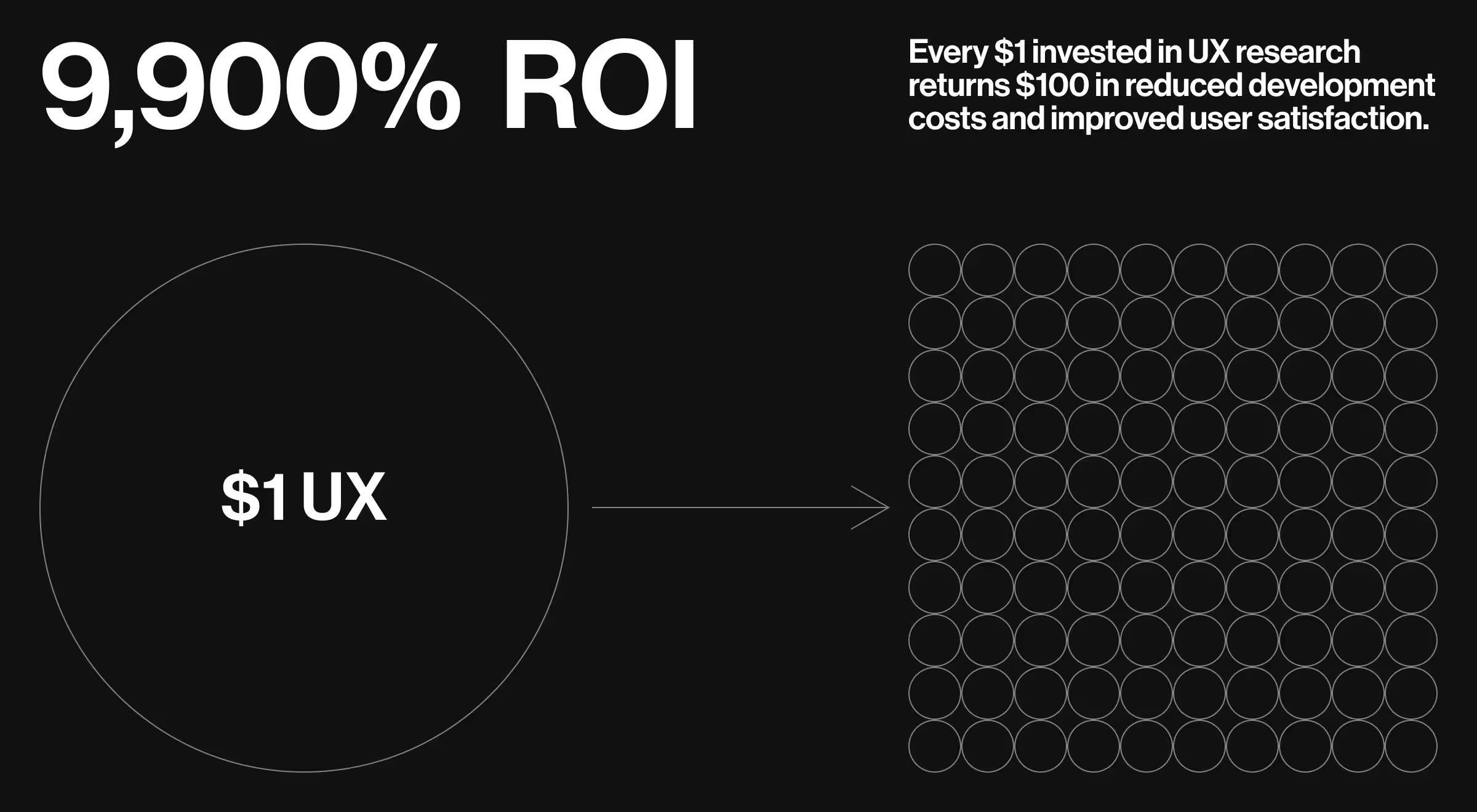
- Every $1 invested in UX returns $100 in revenue (ROI of 9,900%)
- 88% of users won't return to a website after a bad user experience
✅What works: Companies that invest in design thinking and user research during the early stages reduce their development costs by an average of 40% and launch 35% faster than competitors who rely on assumptions.
What makes product design different
Product design is a human-centric creative process that bridges user needs with business objectives. While traditional design focuses on aesthetics, product design focuses on solving real problems for real users. The product design process integrates:
- User research to understand actual needs, not assumptions
- Business analysis to ensure commercial viability
- Technical feasibility to build within realistic constraints
- Market validation to prove demand before full development
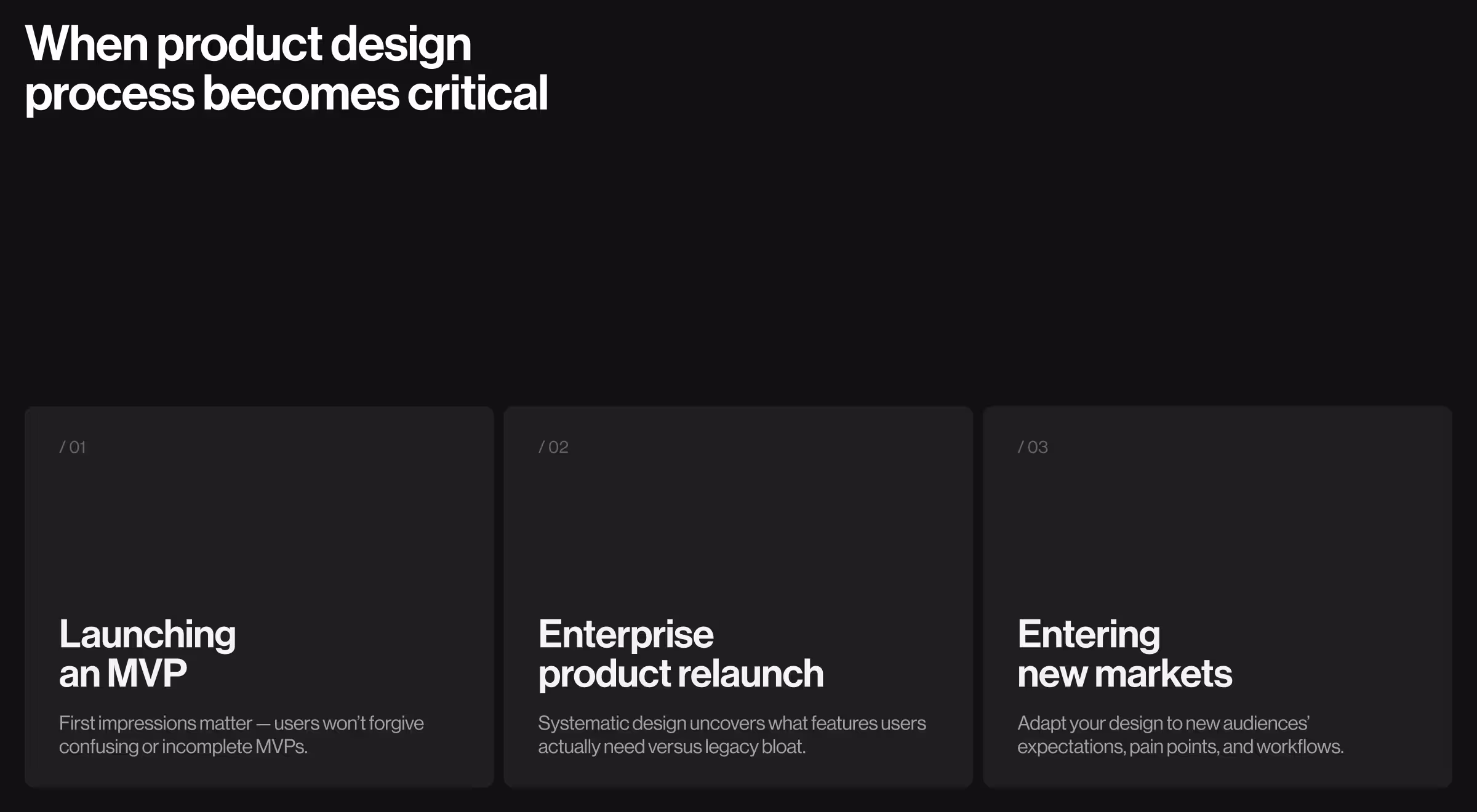
When product design process becomes critical
Three scenarios where a structured product design process becomes non-negotiable.
Launching a minimum viable product (MVP)
You have one shot to make a first impression. Users won't give you a second chance if your MVP confuses them or fails to solve their core problem.
Enterprise product relaunch
Legacy products often accumulate years of feature bloat. A systematic design process helps you identify what users actually use versus what they think they need.
Entering new markets
Different target audiences have different user expectations, pain points, and interaction patterns. Your design process must account for these variables.
The complete product design process: 8 essential steps
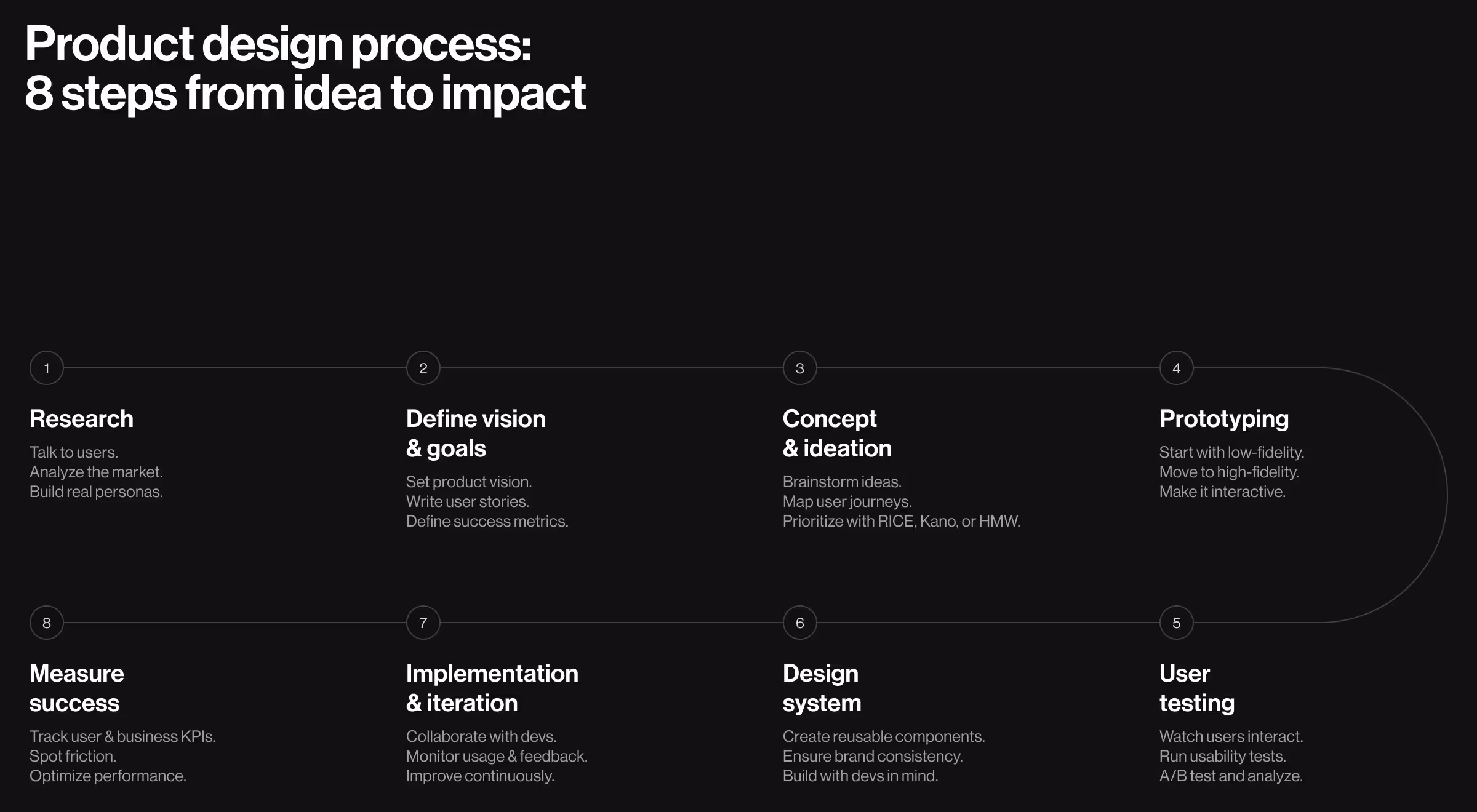
Step 1. Research phase
The research phase forms the foundation of your entire design process. Skip this step, and you're building on quicksand. Start with thorough research that combines qualitative and quantitative methods:
- User interviews: Conduct user interviews with 8-12 potential users from your target audience. Focus on understanding their current workflows, frustrations, and goals. Observe what they actually do.Can you walk me through how you currently [perform a specific task]? What tools do you use daily, and why? What’s the most frustrating part of your current process?
- Market research: Analyze your target market, competitor landscape, and market trends. Look for gaps between what existing products offer and what users actually need.
- User analysis: Create detailed user personas based on real data, not assumptions. Include demographics, behaviors, goals, and pain points.
“We've found that spending 2-3 weeks on comprehensive user and market research saves 2-3 months in development time later.”
{{Oleksandr Holovko}}
✅ Research deliverables checklist
- User personas — Include specific pain points, goals, and behaviors
- Market analysis — Identify key opportunities and threats in the space
- Competitive audit — Highlight common design patterns and gaps
- User journey maps — Expose issues and friction in the current experience
Step 2. Define product vision and business goals
Turn your research into a clear product vision that connects what users need with what the business wants. Set specific, measurable goals to guide your design.
- User acquisition targets
- Revenue objectives
- Market penetration goals
- User engagement metrics
Create user stories
Translate user needs into actionable user stories. Each story should follow the format:
"As a ________________[user type] I want ___________________[functionality] so that _____________________________[benefit]."
Good user stories help your development team understand not just what to build, but why it matters to users.
For example: "As the CEO of a fintech group, I want a real-time dashboard showing key business metrics across all products so that I can make faster, data-driven decisions without relying on weekly reports."
Define success metrics
Establish how you'll measure success for both user satisfaction and business performance. Common metrics include:
- User engagement rates
- Task completion rates
- Customer satisfaction scores
- Revenue per user
- Churn rates
🧩 Pro tip: You can use Miro or FigJam to visualize the product vision. For defining and tracking business objectives Perdoo or Weekdone support OKRs. And to measure success, tools like Mixpanel or Hotjar are perfect.
Step 3. Concept development and ideation
Now comes the creative phase where you generate ideas and explore potential solutions. Run focused brainstorming sessions with your team — include UX designers, product managers, and key stakeholders. Use simple techniques like:
- Crazy 8s: Everyone sketches 8 ideas in 8 minutes to spark creativity fast
- How might we (HMW): Turn problems into opportunities (e.g. “How might we make onboarding feel effortless?”)
- Dot voting: Let the team vote on the most promising ideas to prioritize together
- User journey mapping: Walk through the user’s experience step by step to spot gaps or friction
Evaluate ideas against user needs
Filter ideas through your research findings. Ask:
- Does this solve a real user pain point?
- Can our target users actually use this solution?
- Does it align with our business objectives?
- Is it technically feasible with our resources?
🔑Key idea: Use popular frameworks like RICE, it Kano to prioritize features for your minimum viable product. These methods help you focus on what’s most important to users and the business, so you build the right things first and avoid unnecessary complexity.
Step 4. Prototyping phase
Prototyping is where your ideas get real, something users can actually click, test, and talk about.
Start with low-fidelity prototypes
Begin with simple wireframes and low-fidelity prototypes. These help you:
- Test core functionality quickly
- Iterate on user flows without getting distracted by visual design
- Gather early feedback from potential users
Progress to high-fidelity prototypes
Once your core concepts are validated, create high-fidelity prototypes that closely resemble your final product. These should include:
- Detailed user interface design
- Interactive elements and transitions
- Realistic content and data
- Brand elements and visual design
⚡️Pro tip: Build interactive prototypes that let users experience your product flow. Tools like Figma, or Framer allow you to create prototypes that feel like real products.
Step 5. User testing and validation
This is where assumptions meet reality. User testing reveals whether your design actually works for real users.
Conduct usability testing
Run usability testing sessions with 5-8 users from your target audience. Focus on:
- Can users complete core tasks?
- Where do they get confused or frustrated?
- What do they like or dislike about the experience?
- How does the product compare to their current solutions?
Gather user feedback
Use multiple methods to gather user feedback:
- Moderated testing: Direct observation and conversation
- Unmoderated testing: Users complete tasks independently
- A/B testing: Compare different design approaches
- Analytics: Track user behavior in prototype
🧩What works: Look for patterns in user behavior and feedback. Common issues often reveal fundamental design problems that need addressing.
Step 6. Design system development
Build a design system so everything stays consistent, no matter where users land.
Establish design principles
Define clear design principles that guide decision-making:
- Simplicity over complexity
- Consistency across all touchpoints
- Accessibility for all users
- Performance optimization
Build component library
Create reusable UI components that maintain consistency while speeding up development:
- Buttons, forms, and navigation elements
- Typography and color systems
- Icons and imagery guidelines
- Layout and spacing rules
Technical specifications
Team up with your devs to make sure your design system actually works in code. Think about:
- Responsive design guidelines
- Animation and interaction specifications
- Accessibility requirements
- Performance considerations
Step 7. Implementation and continuous improvement
The final step is actually the beginning of continuous improvement based on real user data.
Collaborate with development team
Work closely with your developers while bringing the design to life.
- Regular design reviews and feedback sessions
- Quality assurance testing
- Performance optimization
- Accessibility compliance
Monitor user engagement
Track how users interact with your finished product:
- User flow analytics
- Feature adoption rates
- Error rates and support tickets
- User satisfaction surveys
Iterate based on real data
Use real user data to guide future improvements:
- Identify features that aren't being used
- Find friction points in user journeys
- Discover opportunities for new features
- Optimize for better performance
Step 8. Measure success in product design
Track metrics that matter for both user experience and business outcomes:
Common problems in product design process and how to solve them
Even with a solid process, teams encounter predictable challenges. So how to handle the most common ones?
Problem 1. Stakeholder alignment issues
The challenge. You are launching a new project and everyone’s pulling in a different direction. Marketing wants eye-catching features to wow users. Engineering pushes back, aiming for clean, maintainable code. Meanwhile, leadership wants it all – fast. You're stuck in the middle. Vision is fragmented, priorities are unclear, and deadlines are closing in. Sound familiar?
The solution. Create a shared definition of success early in the process. Use data from your research phase to build consensus around user needs and business objectives. When disagreements arise, return to user data to guide decisions.
Problem 2. Insufficient user research
The challenge. When launching new products deadlines are tight, so the team jumps into design and development. Later, they spend weeks fixing what should’ve never been built.
The solution. Treat user research as an investment, not an expense. Even limited research is better than no research. If the budget is tight, start with 5-6 user interviews and basic competitive analysis.
🎯Key insight: One hour of user research saves 10 hours of development time fixing problems later.
Problem 3. Over-engineering the solution
The challenge. When building new features, teams get excited about what’s technically possible. They build impressive tools that wow other developers, but leave real users confused and frustrated. Weeks go into polishing features no one asked for. Later, even more time is spent fixing what should’ve never been built. Just because you can build it doesn’t mean you should.
The solution. Always return to your user stories and personas. If a feature doesn't directly solve a user problem or support a business goal, cut it from the current release.
Problem 4. Ignoring technical constraints
The challenge. The concept was stunning. Sleek interactions. Beautiful motion. Visually flawless. But when it reached engineering, reality hit. The timeline doubled. The budget cracked. What looked perfect on Figma was nowhere near ready for production. This happens when design runs ahead without constraints.
The solution. Include developers in the design process from day one. Understand technical limitations early and design within those constraints. Sometimes the best design is the one that actually gets built.
Problem 5. Launching too late
The challenge. The team kept polishing. Tweak after tweak. One more round of feedback. Then another. Meanwhile, competitors launched, learned, and gained traction. By the time the “perfect” product was ready, the market had already moved on. Speed beats perfection — especially when perfection is built in a vacuum.
The solution. Embrace the minimum viable product approach. Launch with core features that solve the primary user problem, then iterate based on real user feedback.
✅Pro tip: A good product launched on time beats a perfect product launched too late. Market feedback is more valuable than internal opinions.
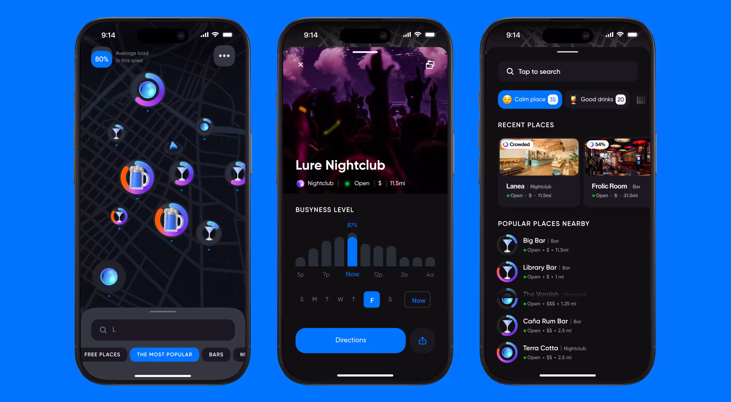
Product design process in action: Mappn case study by Lazarev.agency
Let’s walk through how the Lazarev.agency team applied our full-cycle product design process while building Mappn, a leisure app that helps users instantly find the perfect nightlife vibe through real-time crowd data, forecasting, and interactive maps.
Our process consisted of eight steps:
Research → Vision & Goals → Ideation → Prototyping → Testing → Design System → Implementation → Measurement
Research
Every strong product starts with a clear understanding of its users and the landscape. For Mappn, we began by analyzing the needs of nightlife-goers — some looking for packed, high-energy clubs; others searching for a quieter, more relaxed atmosphere.
We reviewed popular competitors like Google Maps, Tripadvisor, Skorch, and Welcome, but none offered real-time visibility into how busy a venue was. That gap became Mappn’s opportunity.
We aligned on one core user insight: people don’t just want to know where to go, they want to know what it feels like before they arrive.
Vision & goals
Using these insights, we worked with Mappn’s founders to define a tight, focused product vision: “Help users make faster, smarter nightlife decisions by visualizing crowd levels in real time.”
From this, we shaped clear functionality goals:
- Use dynamic load rings to represent real-time crowd levels
- Let users filter by mood, volume, and timing
- Include foot traffic forecasting so users can plan for future nights
- Enable easy sharing of venues, even with non-app users
Each feature directly addressed a user’s need and set the foundation for a distinctive value proposition.
Ideation
With the vision in place, we moved into concept ideation. We prioritized the map experience, building around a few essential UX principles:
- Simplicity: Show everything important — crowd level, venue type, distance, pricing
- Clarity: Use color-coded rings and emojis to reflect vibe and load status
- Engagement: Enable reactions to crowd levels and integrate them into the visual system
We also expanded the venue cards with practical data like wait times, peak hours, and photos combining the best of social and utility.
Prototyping
We transitioned concepts into interactive high-fidelity prototypes, using real map logic and venue data to simulate real-time use.
Key flows included:
- Zoomable map with live pins showing load status
- Venue detail cards with all contextual data
- Filtering and forecasting interactions
- Cross-platform preview of shared venues (no app required)
Each prototype was designed to be intuitive, mobile-first, and lightning fast.
User testing
While no formal user testing sessions were conducted during this MVP phase, many features, like emoji reactions, simplified load rings, and custom venue icons, were refined based on iterative team feedback and early user impressions.
This pragmatic validation ensured every UX choice supported quick, confident decision-making for the end user.
Design system development
A full design system wasn’t necessary at this stage, but we applied strong visual consistency across the product.
Notable design elements:
- The Mappn logo itself became a live data metaphor, using a fillable ring to indicate venue crowd level
- 3D venue icons for bars, pubs, and clubs created instant category recognition
- A rounded, modular aesthetic allowed for scalability, including possible future use of emojis and 3D illustrations for richer feedback
Implementation
Once designs were approved, we collaborated closely with the development team to bring Mappn to life across mobile and desktop.
Post-launch, several micro-adjustments were made to improve performance, visual clarity, and load times.
Measuring success in product design
With the MVP now live, metrics tracking is in progress. The team is currently defining and collecting data on:
- Engagement with forecasting and filters
- Usage patterns on mobile vs. desktop
- Share link conversion and tap-through rates
- Behavioral indicators for user satisfaction and retention
This phase will inform the next cycle of iteration, helping Mappn evolve from MVP to market-ready product.
Successful product design process cases
Case study 1: Spotify's discover weekly
Timeline: 18 months | Result: 40M weekly users, 5B tracks discovered
Process:
- Research (3 months): 847 user interviews, analyzed 2.3B listening sessions
- Problem: 76% of users felt overwhelmed by music choice
- Solution: Personalized 30-song weekly playlist released Mondays
- Testing: A/B tested playlist lengths and timing
- Launch: Distinctive purple branding, countdown timers
UX analysis: Solved choice paralysis with personalized curation. Monday releases created ritual and anticipation. Success came from turning discovery into a weekly event.
Case study 2: Airbnb's host onboarding
Timeline: 14 months | Result: 47% completion increase, 62% quality improvement
Process:
- Problem: Only 23% completion rate, 73 required fields
- Research: Shadowed 34 hosts, identified 5 friction points
- Solution: Reduced to 23 essential fields, 3-step wizard
- Testing: 7 design iterations with 156 new hosts
- Launch: Progressive disclosure with earnings visualization
UX analysis: Ruthless prioritization separated must-have from nice-to-have information. Earnings potential provided motivation during difficult steps.
Case study 3: Duolingo's streak feature
Timeline: 8 months | Result: 127% daily user increase, 89% retention boost
Process:
- Research: Studied habit formation, found 67% quit within first week
- Solution: Daily streak counter with freeze option
- Testing: 12 fire icon variations, optimal streak thresholds
- Features: Streak sharing, leaderboards, smart reminders
- Launch: Average successful streak: 34 days
UX analysis: Leveraged loss aversion psychology. Streak freezes prevented frustration while maintaining motivation. Fire emoji created emotional connection.
Ready to turn product vision into something real?
Your users deserve better than guesswork and assumptions. They deserve products built on real research, validated through testing, and optimized for their actual needs.
Curious how strategic product design can accelerate your growth? Our product design services are designed to turn your vision into products users love and investors fund. Let's discuss your project and create something remarkable together.


.webp)


.avif)


