

When AWS, Azure, and Google Cloud own the conversation, how does a mid-market provider like Dynascale convince buyers it’s the smarter choice?
It starts with understanding how competitors talk, look, and convert — to do everything deliberately better. And that’s the very essence of a competitive audit UX, in a nutshell.
As a result, Dynascale now closes corporate deals on its own terms. How?
Let's move on to insights that product and UX leaders in SaaS, cloud, and other B2B tech looking to out-design entrenched competitors will find useful.
Key takeaways
- A structured audit reveals where your product lags and where rivals overspend on features users ignore.
- Mapping heuristics to real tasks (navigation, onboarding, accessibility) turns subjective “UI opinions” into actionable gaps.
- Quick-scan matrices and visual competitive analysis make it easier to sell redesign budgets internally.
- Dynascale’s audit uncovered trust barriers (pricing opacity, vague positioning) and informed a data-center map, role-based nav, and transparent pricing without inventing new features.
What is a competitive UX audit? Why run one?
Competitive audits go beyond design critique. According to Nielsen Norman Group, competitive evaluations reveal relative strengths and weaknesses, so teams prioritize fixes with the biggest ROI.
Baymard Institute frames it as “researching major competitors to gain insight into their UX performance” and using those findings to close usability gaps or out-innovate the field.
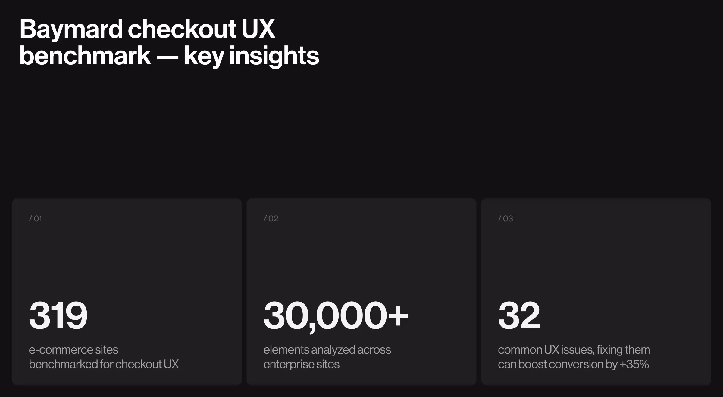
E-commerce sites lose almost half of their potential sales because users cannot use the site. Baymard Institute’s large-scale checkout study (319 sites, 30,000+ elements benchmarked) shows that fixing the average set of 32 UX issues can unlock up to a 35% jump in conversion rate for enterprise-scale e-commerce sites.
Forrester reports that a well-designed site can deliver 200% higher visit-to-order and 400% higher visit-to-lead conversion rates than poorly designed peers — tangible proof that systematic UX improvements translate into revenue.
Together, these findings underline the direct business value of a structured competitive audit UX: higher task success, lower abandonment, and measurable growth.
In practice, it’s a disciplined, methodical investigation that helps you:
Identifying direct and indirect competitors
Here are a few tips if you find it difficult to identify your direct and indirect competitors:
- Direct competitors offer the same services to an overlapping target audience — think other private-cloud vendors.
- Indirect competitors fulfill similar needs differently (e.g., hyperscalers like AWS).
- Build a living database of direct and indirect competitors; the competitive landscape shifts fast as new offerings emerge.
- Tracking what competitors do helps you avoid repeat mistakes and spark design inspiration.
- Revisit your list quarterly; market entrants or pivoting incumbents can erode your market position overnight.
Step-by-step framework for high-impact audit
- Set objectives: activation, retention, or perception shift.
- Scope rivals: 3–5 direct, 2 indirect, 1 aspirational.
- Define criteria: navigation depth, accessibility, microcopy, visual elements, mobile parity.
- Collect evidence: page screens, session recordings, benchmark metrics.
- Synthesize with a heat-map or UX competitive analysis template (traffic-light scores).
- Prioritize fixes by impact/effort; feed them into roadmap grooming.
💡 Pro tip: Pair Google Analytics funnels with Hotjar/Clarity click-maps to prove where competitors outperform and where small UX tweaks could unlock business growth.
Basic methods for conducting UX competitive analysis
- SWOT analysis — maps strengths and weaknesses against external factors, opportunities & threats, so product teams spot strategic plays early.
- Usability testing — observes real users interacting with rivals to surface hidden pain points and user expectations.
- Key user flows — benchmark sign-up, onboarding, and self-serve tasks to gauge friction vs. competitors’ UX.
- Direct & indirect competitors list — ensures you aren’t blindsided by alternative solutions that serve the same customers.
- User journey mapping — a visual competitive analysis that uncovers user journeys end-to-end, clarifying where your product must outperform.
- Comparative feature charts — highlight feature parity gaps and over-engineering risks.
- Structured user feedback loops — validate whether perceived gaps actually hurt adoption in the real world.
Tool stack for faster website design competitive analysis
- Microsoft Clarity — free session recordings & heatmaps.
- Hotjar — advanced funnels & user insights (paid).
- Maze — rapid remote usability testing.
- Lookback — moderated research with video interviews.
- Amplitude — product analytics & cohort funnels.
- Airtable + FigJam — collaborative competitive analysis template boards.
- Whimsical — swim-lane user flows and journey maps.
- CanIRank — SEO market research to validate keyword gaps.
UX competitive analysis example: Dynascale case study
Dynascale is a US-based private cloud provider running 10+ data centers all over the U.S. and catering to heavily regulated industries that demand low-latency AI workloads. But without the appropriate digital infrastructure, potential customers did not see it as a reliable enterprise-grade provider.

The challenge
- Outdated brand felt “generic server vendor,” masking years of infra expertise.
- Pricing opacity eroded trust; prospects feared hidden costs.
- Navigation mirrored internal org charts, confusing visitors.
- Lack of human-centric copy in an overly technical space.
Approach
“Narrative architecture is our way of translating raw tech into human stakes. If your story can’t pass the ‘so-what’ test, no amount of UI polish will save it.”
{{Anna Demianenko}}
Grounded in our product-first design process, we began with a full competitive UX analysis:
- Researching competitors — AWS, Azure, DigitalOcean, and on-prem MSPs, to map content hierarchy and key features.
- SWOT analysis revealed Dynascale’s edge: built-in agility and high-performance, secure solutions.
- Usability testing on the legacy site exposed drop-offs at “Get in touch” (navigation label unclear).
- User journey mapping showed three key user personas — CTO, Procurement, Ops Manager, each with distinct information needs.
Design decisions informed by the competitive research UX
Outcomes
- Enterprise prospects now self-segment, reducing sales-engineering friction.
- Early feedback shows faster “Get in touch” submissions and fewer pricing objections during discovery calls.
- The rebrand humanizes infrastructure, echoing Lazarev.agency’s approach: design around people.
🔎 Read the full case study here.
Turn your audit findings into road-map wins
A competitive audit UX is a playbook for out-maneuvering rivals and shipping designs that convert faster.
- Link each gap to a KPI (e.g., solve usability issues → cut support tickets).
- Prototype fixes fast; validate via short iterative process cycles.
- Socialize wins internally using before/after clips — executives grasp impact in seconds.
- Schedule mini-audits every six months to keep pace with an evolving competitive landscape.
Dynascale’s UX competitive analysis example shows the compounding effect of clear insight executed well. Stop guessing and start conducting competitive analysis that fuels revenue.
Need to beat the competition? Let’s talk.
Our UX audit services team distills competitor insight into design decisions.


.webp)


.avif)

