Reviewed by: Lazarev.agency Growth & UX Team
Last updated: November 2025
Relevant case studies: Riptide Skateboards (sold out $500K in inventory post-redesign), premium retail brands, DTC scaling teams
The fastest way to optimize a product page is to reduce buyer hesitation in the first viewport — by clarifying price, proof, delivery, and primary action — then layer in personalization, visuals, and UX/SEO alignment that directly lift conversion rate (CR) and Average Order Value (AOV).
Curious to get the details? Keep reading, especially if you are founders, CMOs, and e-commerce directors who want their product pages to convert better under paid-traffic pressure.
Key takeaways
- Make the first screen a “decision screen”: price, delivery, returns, variants, one CTA.
- Fix hygiene first: speed, clarity, search basics.
- Add social proof, value framing, and availability cues to lift conversions.
- Use personalization + price signals to increase AOV.
- Ship quarterly: diagnose → test → measure → scale.
Why product page optimization matters now
When a product page removes all buyer doubts and quickly shows its value, then it is easier for him to make a purchase decision.
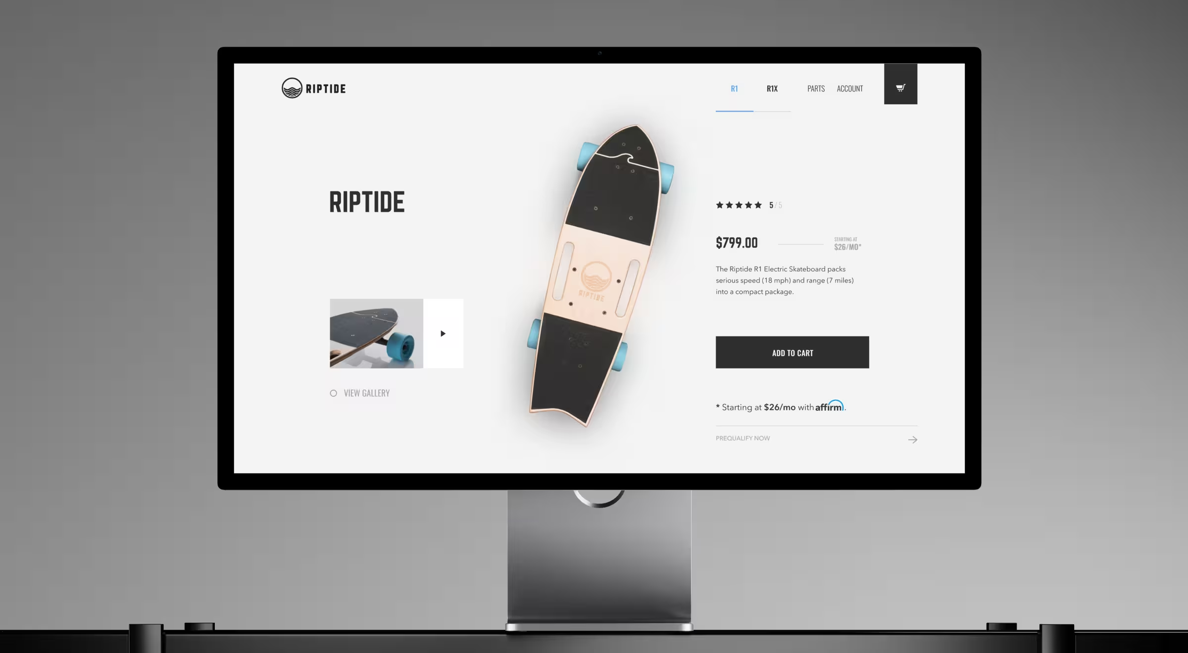
After Lazarev.agency redesigned Riptide’s experience, the brand sold out ≈$500K of inventory in 2 months, climbed into the top-10 U.S. skateboard brands, and the founders successfully exited the company.
This is a clear example of how decent PPO work leads to significant business results, rather than simply increasing the number of page views.
Fix foundational hygiene before you test anything
First things first — you’ll get more from advanced tactics and product page tests if the groundwork is solid. These items protect both conversion and discoverability in search engines.
- Page speed on mobile devices. Meet Core Web Vitals so users see value quickly. Slow loads kill momentum and search engine rankings. Use optimized images and video, and stabilize layout to avoid layout shifts.
- Clarity near the primary action. Display final price, shipping/returns, availability, product variants, and delivery promise in the buy area so the buying process stays unbroken. (Don’t bury essentials or force extra taps.)
- Search hygiene. Keep snippets, titles, meta descriptions, internal links, and structured data clean. Fix broken links, write detailed product descriptions with high quality images, and let organic search work for you instead of against you.
Once this foundation is in, your ecommerce product page optimization efforts compound instead of fighting basic friction.
High-leverage tactics of ecommerce product page optimization that map to KPIs
The goal is simple: make it easier for qualified buyers to say “yes,” and prove it in the numbers.
1. Conversion psychology → lift add-to-cart (conversion rate)
Social proof from real customers, availability cues, and clear value framing reduce hesitation. Baymard’s recent PPO research highlights wide performance gaps — many sites still underdeliver on fundamentals, leaving obvious wins on the table. Use review excerpts, UGC, and concise comparisons to remove doubt in the first viewport.
💡 Pro tip: Keep final price, shipping/returns, and availability within the CTA zone. Friction near the button kills momentum and hurts organic traffic you’ve already earned.
2. Personalization and price signals → increase AOV and margin quality

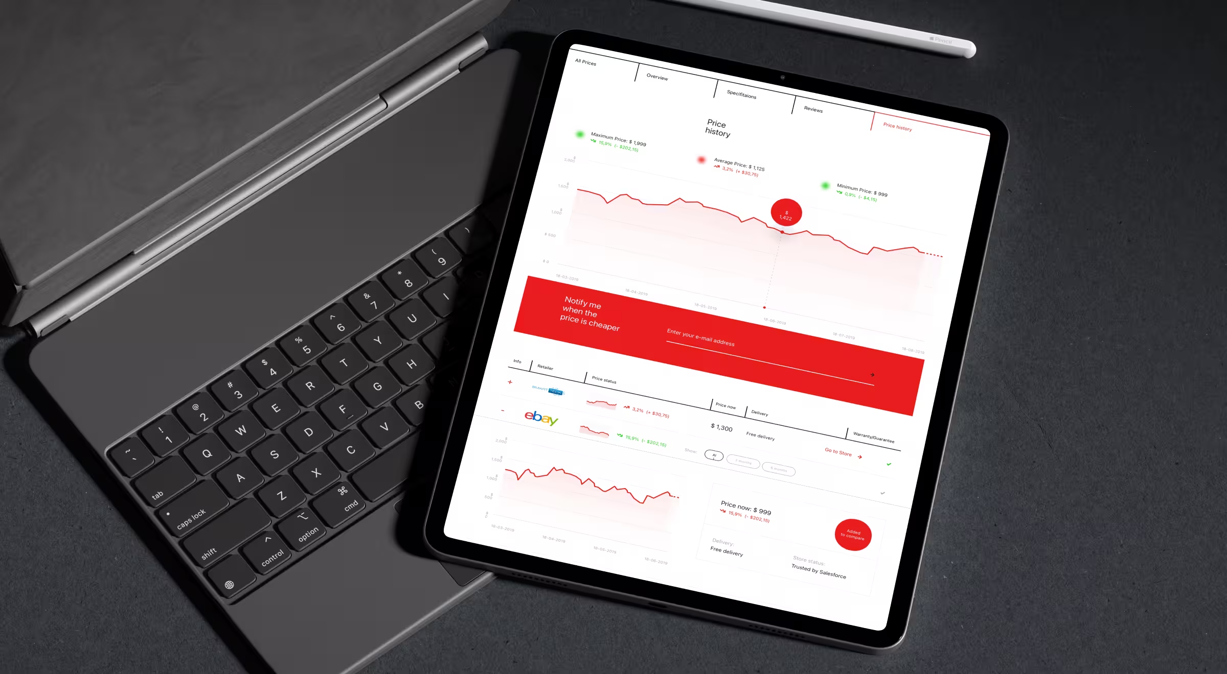
Redbrain’s product page makes comparison a key feature: price history, price forecasts, and cross-retailer comparisons sit directly on the page, with price alerts for timing-sensitive shoppers. Use this pattern for dynamic categories where timing and price context change behavior.
3. High-impact visuals and value-stacked CTAs → reduce bounce, raise CR
For tactile or big-ticket items, pair hero media with benefit-oriented CTAs and spec clarity. Riptide’s product page design leaned on fast, in-use visuals and crisp model comparisons to make performance obvious, then channeled attention to purchase.

💡 Pro tip: Treat the first viewport as a decision screen: primary image/video, clear price, delivery promise, returns, one primary action — no competing CTAs. Use optimized images or an app preview-style video when motion clarifies value.
4. UX + SEO harmony → protect CPA while scaling
Design copy for humans and structure it so search engines understand it: scannable headings, specific attributes, and semantically rich content. This keeps relevance high without bloating the page. Lean on product page best practices to avoid burying essentials like price, options, availability, and to align with search engine optimization.
5. Cross-sell / upsell modules → raise AOV reliably

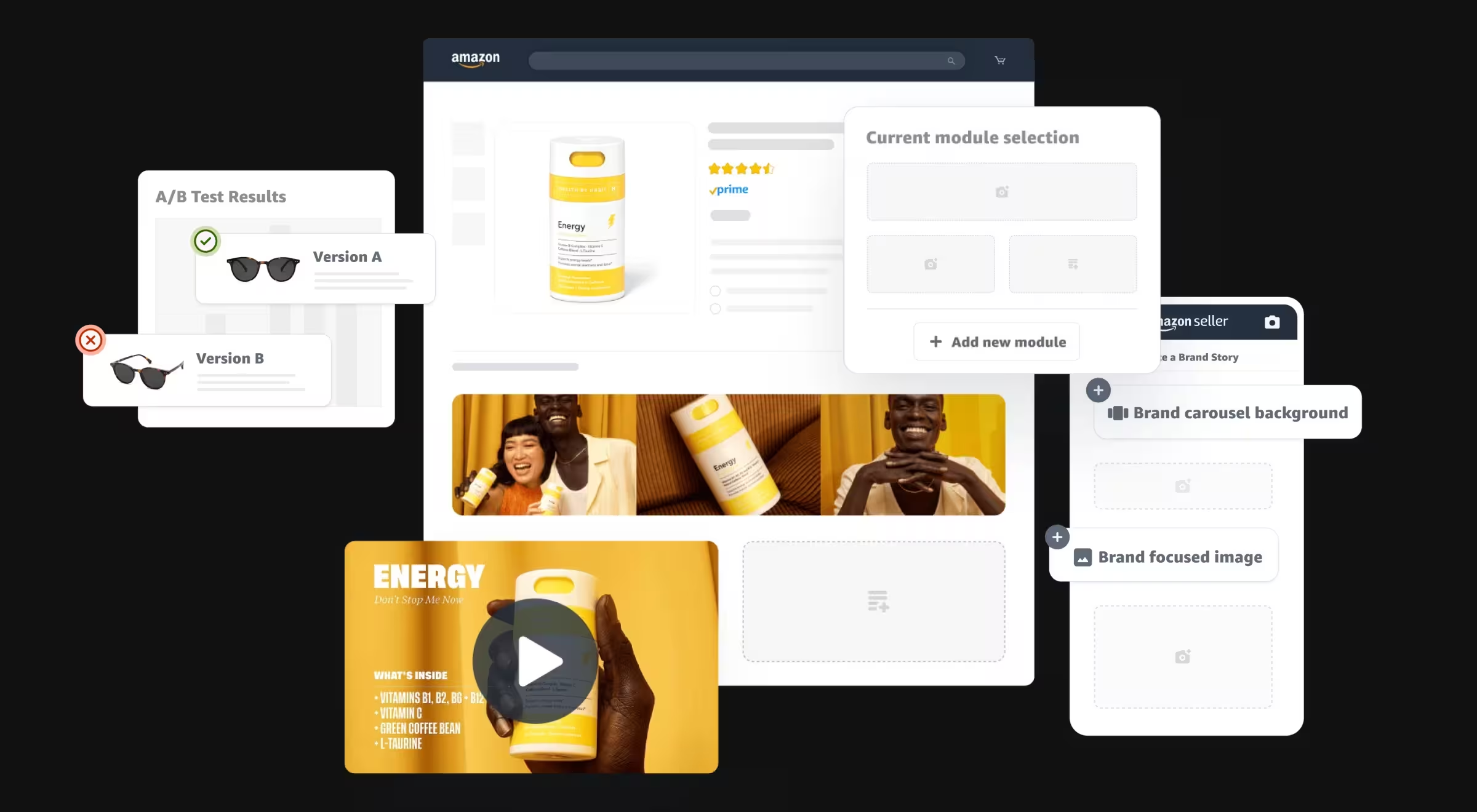
Amazon’s own guidance quantifies the upside of richer PPO content: Basic A+ up to ~8% sales lift; Premium A+ up to ~20% when implemented well. Use this as a directional benchmark for comparison charts, bundles, and “frequently bought together.”
Codify product page UX components (comparison tables, spec blocks, review excerpts) so merchandising teams can assemble high-performing layouts without reinventing the interface.
Applying PPO principles to the Apple App Store and Google Play
If your growth mix includes mobile apps, the same decision-making logic applies to the app store product page design that turns app store visitors into users.
- Apple App Store. Apple’s Product Page Optimization lets app marketers test different elements (app icons, screenshots, app preview video/app previews) against the original app store product (the default product page). You can configure up to 3 test treatments, set the traffic proportion, and review test results in App Analytics to see how a particular treatment performs. Use custom product pages to serve culturally relevant content to different target audience segments landing from ads or search results in the Apple App Store.
- Google Play. Run store listing experiments to test alternate versions of icons, screenshots, or videos; best practice is to run at least one week to balance weekday/weekend traffic. Start with one test focused on one treatment/test asset so attribution stays clean.
💡 Pro tip: Coordinate listing experiments separately from your app binary and app review timelines; tests affect listing assets, not features in a new app version. Keep app developers in the loop so releases don’t mask experiment effects — it’s a focused workflow to boost conversion from app store users. If a treatment version wins, roll it into the default product page.
Measuring and iterating tips
- Track an executive set: conversion rate, bounce, scroll depth, AOV, CPA.
- For web PPOs, run a quarterly loop (diagnose → test → measure → scale), so small wins stack into durable growth.
- For app listings, respect test duration guidance, define a desired improvement up front, and document test results before moving to the next optimization test.
- Tie insights back to organic search (search engines, search results) and ensure internal links, meta descriptions, and content quality continue to support rankings as you ship.
“A PPO is a sales script in interface form. If every line doesn’t move the deal forward, rewrite it.”
{{Kirill Lazarev}}
Let’s turn your product pages into a revenue engine
Done right, PPO compounds: tighten the first-screen story, surface relevant proof, give meaningful price context, and iterate regularly.
If you want to see where your pages leak value —
👉 Book a quick product page audit to identify two high-ROI wins you can ship this quarter.


.webp)


