
If your interface still hides key actions under 3 layers of chrome, you’re leaking conversions. UI best practices exist for a reason: they turn guesswork into predictable wins.
But more importantly, to keep the pace, they must evolve as users’ mental models do.
In this article, we have compiled 8 practical insights from our own experience, illustrated by 5 Lazarev.agency’s cases that will be useful for product managers, founders, and UX leads who own KPI-driven UI decisions.
Key takeaways
- Concrete user interface design best practices reduce cognitive load and lift trust without trendy gimmicks.
- Pair heuristics with analytics to turn subjective “looks nice” into measurable website user experience best practices.
- Real-world proof: Pika AI, Tratta, Riviera City, Teachchain, and Redbrain — each mastered rules and saw better engagement.
User interface design best practices that work in 2025
In 2025, the average user has no patience for clunky flows — attention spans are short, and switching to a rival app is friction-free. Solid user interface fundamentals are therefore more than “nice to have”; they’re a proven revenue lever. Baymard Institute’s latest benchmark across 319 e-commerce sites shows that fixing just 32 recurring usability issues can lead to a 35% jump in conversion rate.
Forms tell the same story: every unnecessary field adds cognitive load and sends abandonment soaring long before payment screens appear. In other words, neglecting core UI best practices is like leaving money on the table.
The good news is that you don’t need a ground-up redesign to gain ground. By applying the 8 actionable practices below, each illustrated with a Lazarev.agency’s case study, you can cut friction, boost trust, and translate pixels into measurable growth.
1. Put the core action one tap away
💼 Case: Pika AI — focus-first search
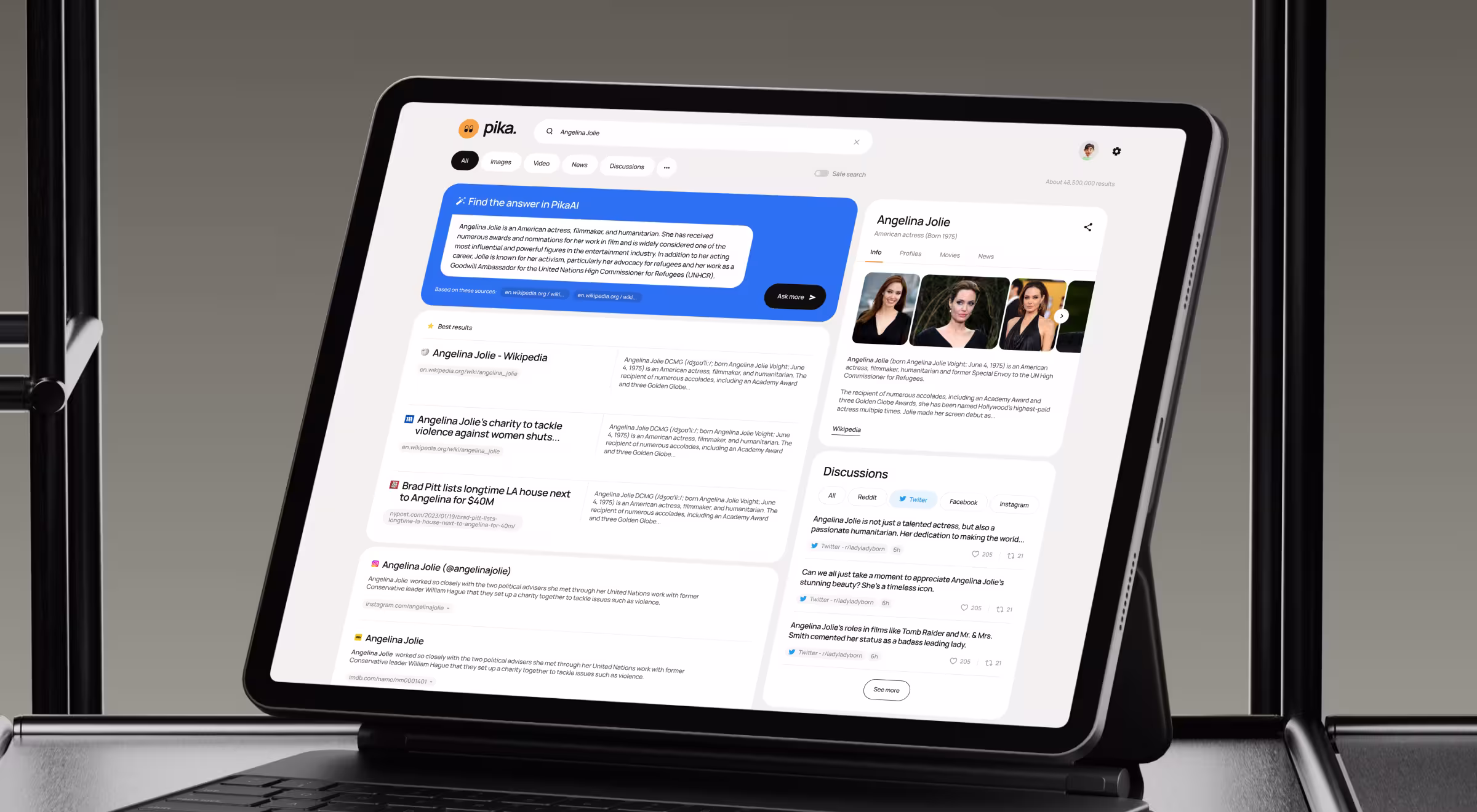
User expectations for a search product are brutally simple: type, hit Enter, refine. Pika AI’s landing view offers a single input plus AI-curated suggestions underneath — nothing else to distract user interactions. That clarity trims hunt-and-peck time and helps users navigate the SERP faster.
During early user research, our team ran five-minute guerrilla tests; most users reached relevant results on the first attempt. By centering one action button, we respected mobile users, removed unnecessary elements, and preserved a clear visual hierarchy — all hallmarks of user-centered design.
“One clear tap to value beats any feature parade.”
{{Kirill Lazarev}}
2. Let users shape dense dashboards
💼 Case: Tratta‘s “Console” — modular admin platform for collectors
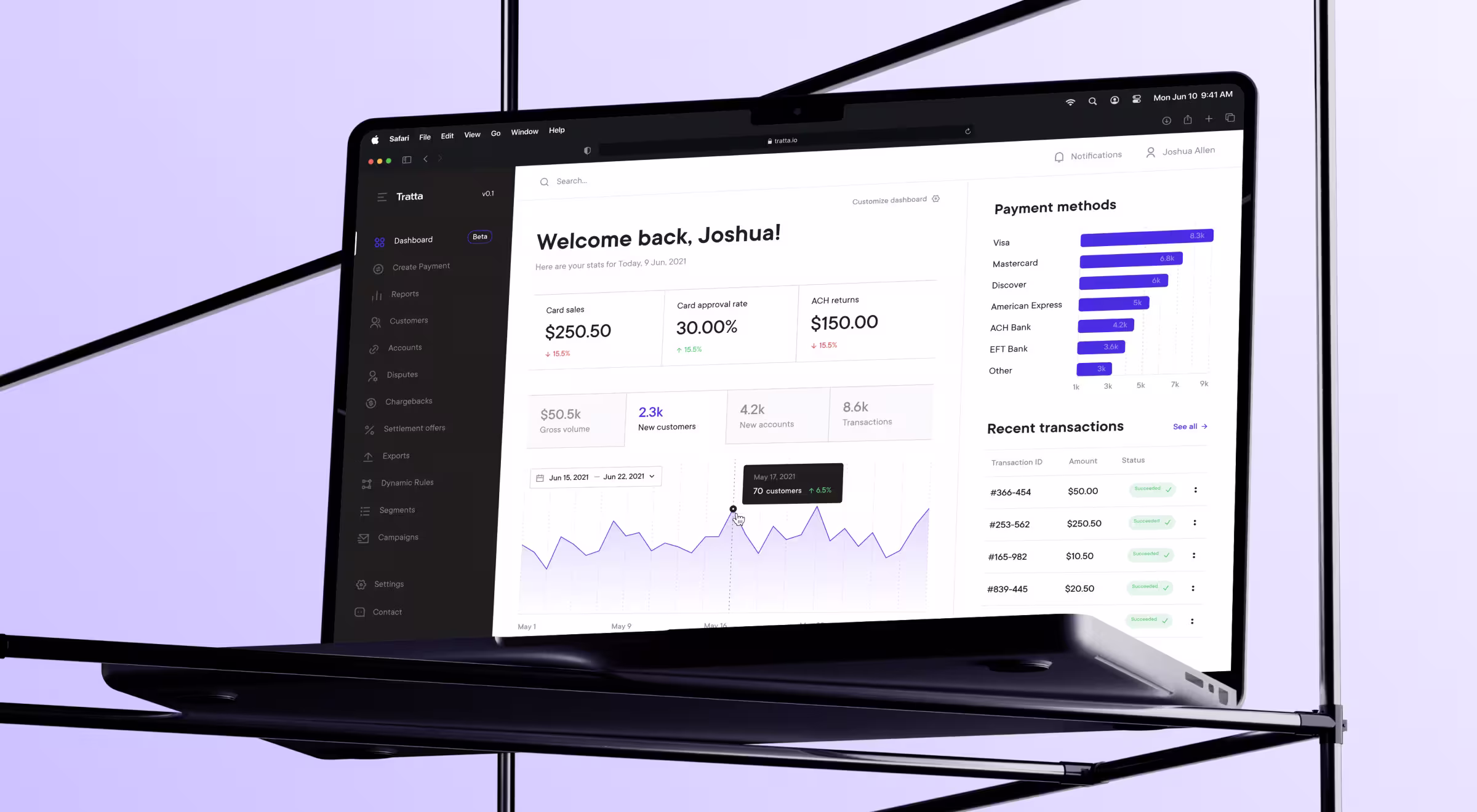
B2B tools often drown operators in tables. Tratta takes a different route with an all-in-one admin solution that brings debtor management, account balances, transactions, reporting, custom offerings, and more into a single, flexible dashboard. Users can personalize it by adding or removing features, charts, and widgets to match their workflow.
Instead of forcing a rigid layout, Tratta pairs the Console with customizable Reports (tailor columns, sort and categorize, mark favorites, download in multiple formats) and granular Settings that let collectors decide which features customers will see in the Collect portal (e.g., special offerings or discounts). The result is a console that adapts to real-world priorities without adding cognitive load.
3. Make heavy visuals feel light
💼 Case: Riviera City — 3D real-estate explorer

Immersive product tours can overwhelm if the page fights the payload. Riviera City solves this with a visual-centric, story-driven flow: visitors start from a 3D house preview with an interactive CTA, move through benefits, explore the building from every angle, and then pick an apartment before contacting sales.
What’s implemented:
- Decision helpers on selection pages — filters by view, room count, and floor level, plus high-quality 2D floor plans and 3D renditions to support confident choices.
- Interactive calculator on “Terms of Sale” — users enter price, down payment, and term to see installment details on the site or request a detailed version by email.
- Construction Progress page with diagrams — a dedicated view that visualizes progress and, when sections are sorted by price, creates a visual impression of near completion to encourage outreach.
- Developer page for trust — documentation, developer insights, and apartment availability gathered in one place.
- Mobile version mirrors desktop and is optimized for mobile internet, aiming for 2–3 s initial screen load and up to 100 simultaneous sessions.
Takeaway: Lead with a clear visual sequence (hero → explore → select → contact) and layer practical tools (filters, calculator, progress, trust page) to keep attention on decisions.
4. Motivate through feedback & milestones
💼 Case: Teachchain — gamified EdTech

Teachchain’s student profile makes progress visible: a progress bar shows module completion and overall learning time, while the profile aggregates bio, skills, stats, followers, and token usage. These cues keep the focus on advancement rather than guesswork.
We also introduced the Learn section, where students access free and paid materials, take quizzes, and move through modules. A side menu with a progress list clearly marks what’s completed and what’s next. In parallel, the sponsorship feature gives students dedicated pages to connect with sponsors, and sponsors can track impact via stats like investment, students supported, and sponsorship requests.
5. Build trust with data transparency
💼 Case: Redbrain — price-history overlay
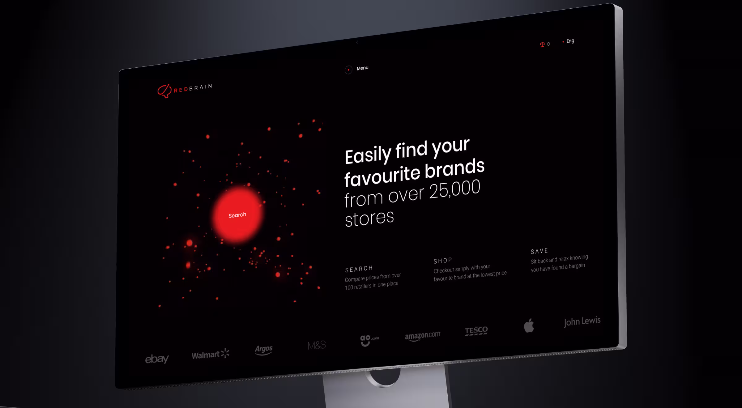
Shoppers judge deals in seconds. Redbrain’s product cards surface historical pricing and predictive drops directly in-line. By exposing data, we converted curiosity into clicks — no dark patterns required.
This design process demanded rigorous market and user research. Early mocks hid the chart behind a tab; user personas flagged the extra tap as friction. Moving it upstack satisfied trust-seeking users and preserved a consistent design across monthly visits.
🔎 Further reading: see how trust cues work in decentralized products in our Web3 design guide.
6. Minimize form friction
💼 Case: Tratta — faster billing flow
Whether checkout or newsletter, form abandonments spike when cognitive load rises. Baymard reports an average cart drop-off at 70% and cites excessive inputs among top causes. Trim fields, chunk steps, and let keyboard navigation fly.
On Tratta’s billing flow, we removed redundant address fields, cutting completion time and lifting customer satisfaction scores. The tweak passed usability testing on both desktop and mobile, illustrating how small UI tweaks can enhance usability.
7. Ensure responsive parity
💼 Case: Riviera City — responsive layout consistency
“Spatial consistency keeps interactions familiar across screens; muscle memory does the rest.”
{{Anna Demianenko}}
Each Lazarev.agency’s case uses a shared design system so UI and UX designers maintain components across breakpoints. For example, Riviera City’s apartment selector keeps identical IA on handhelds, avoiding relearn fatigue.
Tools like Figma’s auto-layout and Fluid plugin help maintain consistency, while Maze captures thumb-reach analytics. Remember: a disjointed tablet view erodes brand identity as fast as a broken logo.
8. Reveal complexity progressively
💼 Case: Tratta — dual payment paths
Power collectors need control; first-time payers want speed. Tratta offers Guest Payment for quick checkout without registration. When customers want additional payment methods, need to set up a Payment Plan with a schedule view, or owe multiple organizations, they can create an account. The navigation was reimagined with fewer required fields and a clear transaction summary, keeping the first step lightweight.
The staged model follows progressive disclosure — low friction up front with depth available after sign-up, catering to a wider audience and supporting revenue growth.
Do/don’t pattern cheatsheet
Tool stack for rapid validation
Proven tools that we usually recommend for different UI tasks:
- Prototype & visual interest: Figma, Penpot, interactive prototypes in ProtoPie
- Remote user research & polls: Maze, UXtweak, Hotjar
- Heatmaps & replay: Microsoft Clarity, FullStory
- Quant funnels: Amplitude, Google Analytics 4
- Pattern libraries: Baymard Premium, NN/g guidelines
Reveal your hidden edge
Following these eight UX design process best practices turns interfaces from pretty screens into growth engines.
Whether you’re refining dashboards, gamifying learning, or selling sneakers, disciplined UI choices pay off — just look at Pika AI, Tratta, Riviera City, Teachchain, and Redbrain.
Our UX/UI design services convert these principles into solid product wins. Let’s talk!


.webp)


.avif)