
Most of us now send more messages to AI than to our teammates. The research assistant pulls quotes from papers we never made time to open. The support bot wraps a 20-minute ticket in 90 seconds.
Yet plenty of those products still lag. A bare chat box and a wall of generated text overwhelm users. And while intelligence is doing the work, the interface around it isn't carrying its weight.
Strong AI chatbot UI design changes the game. It helps present a probabilistic output in a trustworthy enough way for users to act on. A 30-second response reads as an effort, and the demo that once confused enterprise buyers starts closing deals.
In this guide, our team of senior AI design specialists introduces 16 AI chatbot UI design patterns pulled from our work and cross-checked against what the leading AI products have converged on. If you're a Head of Product, a Head of AI, or the design lead carrying the AI surface on your back, treat this as a proven UI design playbook.
Key takeaways
- 88% of organizations now use AI, but only 6% capture disproportionate value from it. The identified gap is almost always the interface.
- 30% of generative AI projects will be abandoned, and over 40% of agentic AI projects will be canceled by 2027. The dominant cause is unclear business value, which is a UX problem before it's an engineering one.
- Design-led companies grow revenue at roughly twice the rate of their industry peers. AI products are where this gap will widen first, because the model layer is commoditizing fastest.
- What strategic AI chatbot UI design has delivered for our clients: Accern's Rhea helped raise $40M+ and reach acquisition; Suits AI secured $1M in funding after MVP launch.
Why AI chatbot UI design is its own discipline
Traditional chat UI was solved a decade ago. AI chat UI remains an open problem — and modern AI user experience design treats it as one. Three constraints make it different.
- The output is generated. The interface has to communicate entirely new concepts like confidence, attribution, and uncertainty.
- The latency is variable. A response can stream in 30 milliseconds or 30 seconds. The speed depends on the quality of the prompt, the tool calls, the model, and other variables. The challenge is for the UI to make 30 seconds feel like a work in progress.
- The system is fallible in new ways. Hallucinations, refused tasks, broken tool calls, and context-window limits form the daily texture of AI product use. Every one of them needs an explicit UX treatment.
That's why "good chat UI" doesn't transfer. The mental model shifts from pages and forms to systems of behavior at inference time. The source of truth transitions from a sitemap to model capabilities and guardrails. And the unit of design goes from a screen to a turn — input, generation, response, controls, follow-up.
The cost of underestimating these constraints is already evident in industry data:
Data insight: According to McKinsey, 88% of organizations now use AI in at least one business function, but only 6% are high performers capturing disproportionate value. Gartner projects that at least 30% of generative AI projects will be abandoned due to poor data quality and escalating costs.
The table below makes the gap between traditional and AI-native design approaches concrete.
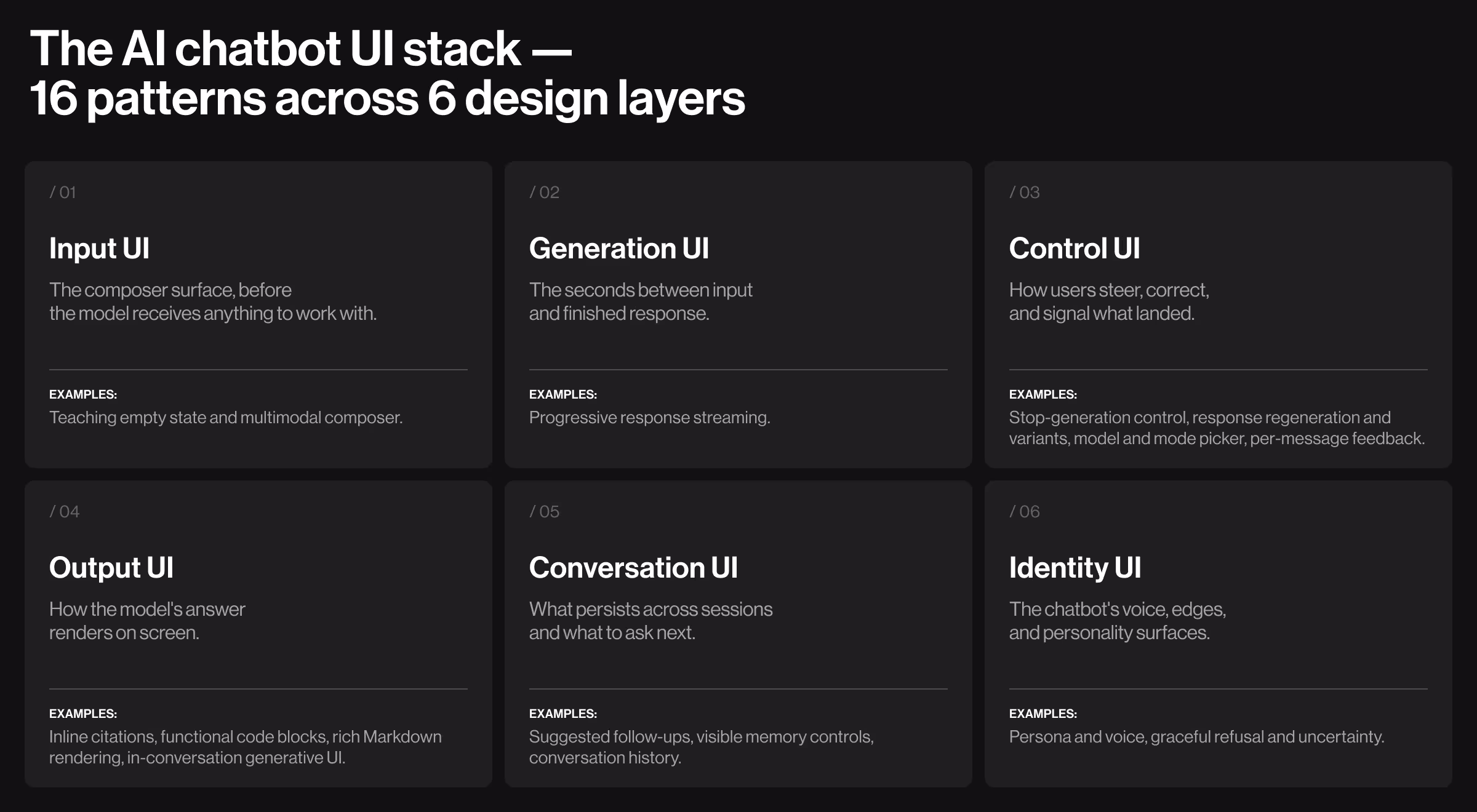
16 patterns behind the best AI chatbot UI designs
The patterns below are the working layer of the discipline. They're what teams doing real AI-native product design build and reuse, and what cosmetic teams overlook without realizing it.
Read this as a working catalog: the four or five patterns missing from your product right now are almost certainly here, along with the spec a credible design partner should be able to produce on demand.
Each pattern follows the same rhythm: what it solves, where it works best, design considerations, supporting evidence where relevant, and a practical example from a leading AI product or our own portfolio.
The list groups into six categories, including:
- Input UI
- Generation UI
- Control UI
- Output UI
- Conversation UI
- Identity UI
Use it as a 30-minute audit against your product, and as the brief for any team you're considering hiring.
Input UI
The Input UX cluster handles the moment before the model receives anything to work with. These two patterns decide whether a new user types something useful or stares at a blinking cursor and whether power users get the affordances they need or fall back to plain text.
1. Teaching empty state
What it does: Before the first prompt, it replaces the cold-start problem with prompt suggestions, example queries, and persona cues. A blank input means a blank mind for most users.
Where it works best: First-session and cold-conversation views — the moments where most AI feature drop-off happens.
Design considerations:
- Add a one-line persona statement so users know what kind of help to expect and what the product can't do.
- On mobile, drop to three chips and stack them vertically below the composer (horizontal scroll feels cheap on small screens).
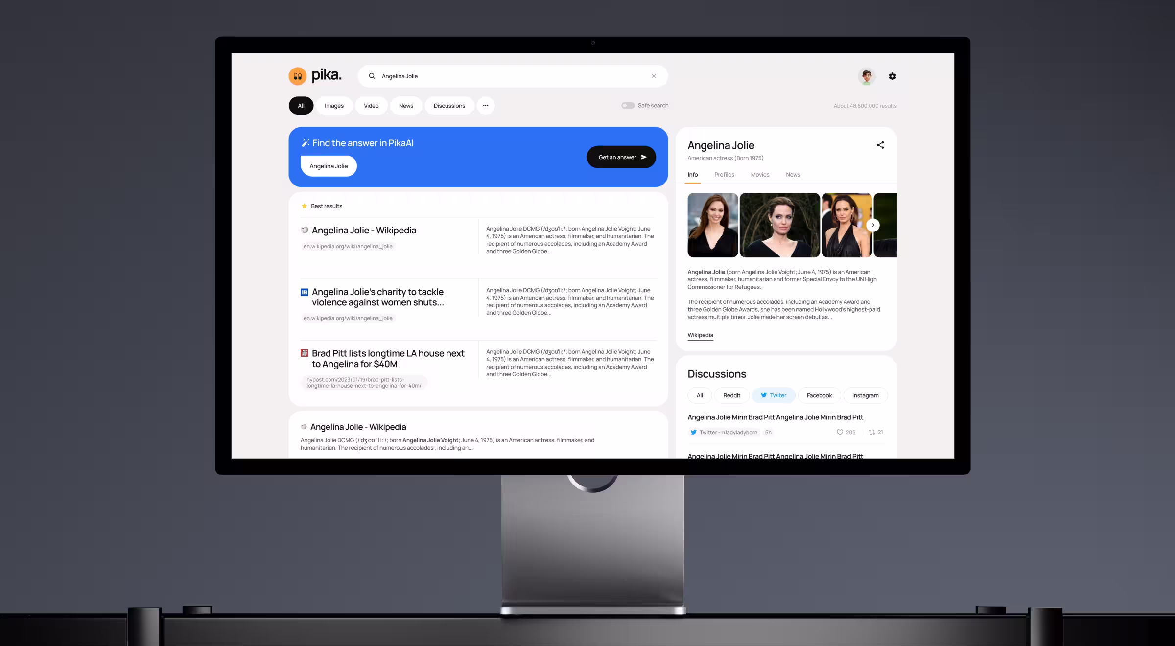
💡 Practical insight from Lazarev.agency's portfolio: On Pika AI, an AI search platform, we placed an AI chat system immediately below the search bar with familiar patterns and warm visual language. The goal was to lower the switching cost from habitual search engines without forcing users to learn a new mental model.
We applied the same logic on Suits AI, a B2B platform for creating branded AI agents — its empty state surfaces a ready-made use case library that turns a blank "build an agent" canvas into a curated set of starting points.
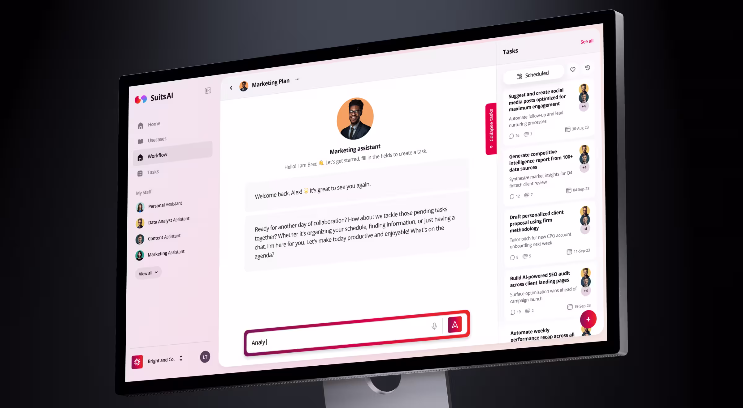
Outcomes: On Pika AI, the redesign let users keep their habitual search behavior while gradually opting into AI features. On Suits AI, the same logic helped the founders close $1M in funding right after MVP launch.
2. Multimodal composer
What it does: Treats the input field as more than a text box. Allows the use of files, images, voice, slash commands, and structured commands.
Where it works best: Research, analysis, and creative tools where complex input is the default.
Design considerations:
- Establish a clear affordance hierarchy: hint text first, icons next, keyboard shortcuts last.
- File drop and image paste are non-negotiable. Voice toggle is increasingly expected on consumer products.
- Slash commands give power users density without cluttering the surface for newcomers.
- Mobile composers need single-tap access to files and images — anything two taps deep gets ignored.
- Show a clear "drop file here" affordance during drag-over.
💡 Practical insight from Lazarev.agency's portfolio: For Accern.Rhea, an AI research tool for analysts and VC investors, we designed a multi-purpose input field to handle natural language queries and structured commands in the same place. The hybrid GUI/prompt model meant analysts could ask Rhea like a colleague or issue a structured command, without context-switching.

Outcome: Accern raised $40M+ across multiple rounds following the launch and was acquired beyond Series B.
Generation UI
Generation UX covers the few seconds between a user’s input and the final response. It’s that in-between state where nothing is fully done, but something should be happening.
3. Progressive response streaming
What it does: Renders the answer token by token, then assembles structured Markdown as closing tokens arrive, so users can read the response while the model is still writing it.
Where it works best: Conversational and long-form output where the user benefits from scanning ahead of generation.
Design considerations:
- Name each step in domain language "searching the web," "reading three sources," "running the test suite".
- Render each tool call's result inline as it returns, so the user can audit the full chain afterward.
- Distinguish recoverable failures (a search returned no results) from breaking failures (an API timed out), so the user knows whether to retry or change tactics.
Data insight: According to Nielsen Norman Group, 10 seconds is the upper limit for keeping a user's attention on a single task. Beyond that, focus drifts. Streaming pushes such a limit out because waiting time becomes a readable activity.
💡 Product example: Anthropic's Claude streams responses with progressive Markdown rendering. Tables, headings, and lists assemble in real time as the answer arrives. The user starts scanning paragraph one while paragraph three is still generating.
Control UI
Control UX is what the user does when the answer goes wrong, runs long, or needs to head a different direction. The four patterns here give users an exit ramp at every stage — stop a generation in flight, ask again for a better take, switch models for the task, and signal which responses landed. Without these, users don't steer the product; the product steers them.
4. Stop-generation control
What it does: Lets the user kill a runaway response and reclaim the turn.
Where it works best: Any product where generation regularly runs longer than two seconds.
Design considerations:
- Place stop in the same physical slot as send. Replace, don't add a new button.
- Bind a keyboard shortcut (Esc on web, Cmd+Backspace on Mac) and document it in a tooltip.
- Preserve the partial response so the user can copy it or continue from where the model stopped.
💡 Product example: OpenAI's ChatGPT turns the Send button into a Stop button mid-generation, in the same physical slot. The pattern reduces user anxiety because they always know they can abort. The lesson: the stop button is the second-most important button in any AI chat UI.
5. Response regeneration and variants
What it does: Acknowledges LLM outputs as probabilistic and gives the user a clean way to ask again or to compare two answers and keep the stronger one.
Where it works best: Creative work, research synthesis, and code where one answer can’t fully settle the question.
Design considerations:
- Use a single regenerate button for casual chat and show side-by-side variants only for high-stakes work.
- Cap variants at three. Variant overload is real, and users default to picking the longest one.
- Highlight the variant the user keeps as the active branch, so the conversation continues from a clear choice.
💡 Product example: Google Gemini offers a "Show drafts" feature. It surfaces multiple response variants side by side and lets users pick the best-fitting answer before continuing.
6. Model and mode picker
What it does: Surfaces the choice between models or modes like Search vs. Reason in Perplexity AI, Sonnet vs. Opus in Claude, or Fast vs. Deep modes in ChatGPT.
Where it works best: Power-user products where different tasks need different cost-quality trade-offs.
Design considerations:
- Set a smart default to handle the median use case well — most users won't change it.
- Provide a one-line tooltip explaining when each mode is right.
💡 Product example: Perplexity surfaces "Pro," "Reasoning," and "Deep Research" modes as labeled tabs in the composer, each with a clear use case in plain English.
7. Per-message feedback
What it does: Captures whether each response landed at the message level.
Where it works best: Products with frequent use, where the team is actively running evals and improving prompts.
Design considerations:
- Thumbs up/down is the floor. Add a "why" follow-up flow with reason categories for thumbs-down.
- Make the affordance discoverable but not intrusive: a hover-revealed icon row at the bottom of each assistant message works.
- Close the loop visibly — tell users when feedback led to a change, even at low fidelity.
💡 Product example: Microsoft Copilot includes per-response feedback with reason categories (incorrect, harmful, not useful), and the structured signal feeds directly into eval datasets.
Output UI
Output UX shapes how the model's answer lands on screen. These four patterns cover the full output stack — from the trustworthiness of factual claims to the readability of structured content to the interactivity of generated artifacts. The strongest AI products treat the response as a designed surface — one users can read, verify, copy, and act on directly.
8. Inline citations
"Trust in AI isn't won with disclaimers at the bottom of the screen. It's won by showing users exactly where each answer came from, in the moment they're reading it."
{{Kirill Lazarev}}
What it does: Links every factual claim to a source the user can verify in one click.
Where it works best: Research, legal, finance, healthcare — anywhere a wrong answer has a real cost.
Design considerations:
- Pick one citation surface (footnote chips, inline links, or hover cards) and stay consistent across the whole product.
- Distinguish "from the model's training" from "from this document" from "from the web," because users treat them very differently.
- Treat broken citation links as release blockers, because a 404 on a footnote destroys more trust than no citation at all.
💡 Practical insight from Lazarev.agency's portfolio: Rhea by Accern surfaces references, charts, footnotes, and quick-action buttons inside the conversation flow. Analysts can click a citation and pull the underlying chart into a report without leaving the chat.
9. Functional code blocks
What it does: Makes generated code copyable, runnable, syntax-highlighted, and labeled.
Where it works best: Developer tools, data tools, and any product where the answer is sometimes code.
Design considerations:
- Apply syntax highlighting and a language label every single time, even for one-line snippets.
- Keep the copy button visible at all times.
- Make the run-in-place vs. copy-out choice deliberately. Run-in-place fits dev tools; copy-out fits chat assistants.
- On mobile, allow horizontal scrolling within the code block.
💡 Product example: Cursor renders code blocks with diff previews and an inline "Apply" button so the user can move from suggestion to commit without leaving the editor.
10. Rich Markdown rendering
What it does: Renders the model's static structured output like tables, lists, headings, math, and diagrams as a designed document.
Where it works best: Research and analysis tools where the answer is most useful when structured.
Design considerations:
- Set tables to a sensible max-width and let them scroll horizontally on mobile.
- Render Mermaid diagrams inline where the model produces them — products that support this feel a generation ahead.
- Provide a plain-text fallback for unsupported elements so the response degrades gracefully.
💡 Product example: Notion AI renders Markdown blocks inside the page, so an AI-generated outline lands as a structured document.
11. In-conversation generative UI
What it does: Lets the model produce interactive, stateful widgets embedded in the response so users can manipulate the answer.
Where it works best: Tools where the answer is better shown than told.
Design considerations:
- Treat each generated widget as a first-class component with its own state.
- Make the rendered output editable, copyable, or exportable.
- Cache widget state across turns so users can refer back without re-generating.
💡 Practical insight: v0 by Vercel is the public canonical version of this design principle: the user describes a UI in chat, and v0 returns a live, editable React component inline. The pattern moves AI from "answer in chat" to "answer in interface", which is the single biggest differentiator between cosmetic AI products and ones users keep using.
Conversation UI
Conversation UX makes the product feel like a holistic workspace. These three patterns suggest what to ask next, remember durable facts across sessions, and make past conversations findable when users come back. The line between "AI tool I tried once" and "AI product I open every morning" runs through this cluster.
12. Suggested follow-ups
What it does: After each assistant response, generates 2–3 next questions so the user doesn't have to invent them mid-flow.
Where it works best: Discovery, research, and edtech workflows where users don't know what to ask next.
Design considerations:
- Pre-generate the follow-ups during the response stream so they appear together with the answer.
- Surface them as small chips below the response.
- Phrase them as questions: "How do I configure this for production?" reads as helpful; "Configure this for production" reads as the model assuming.
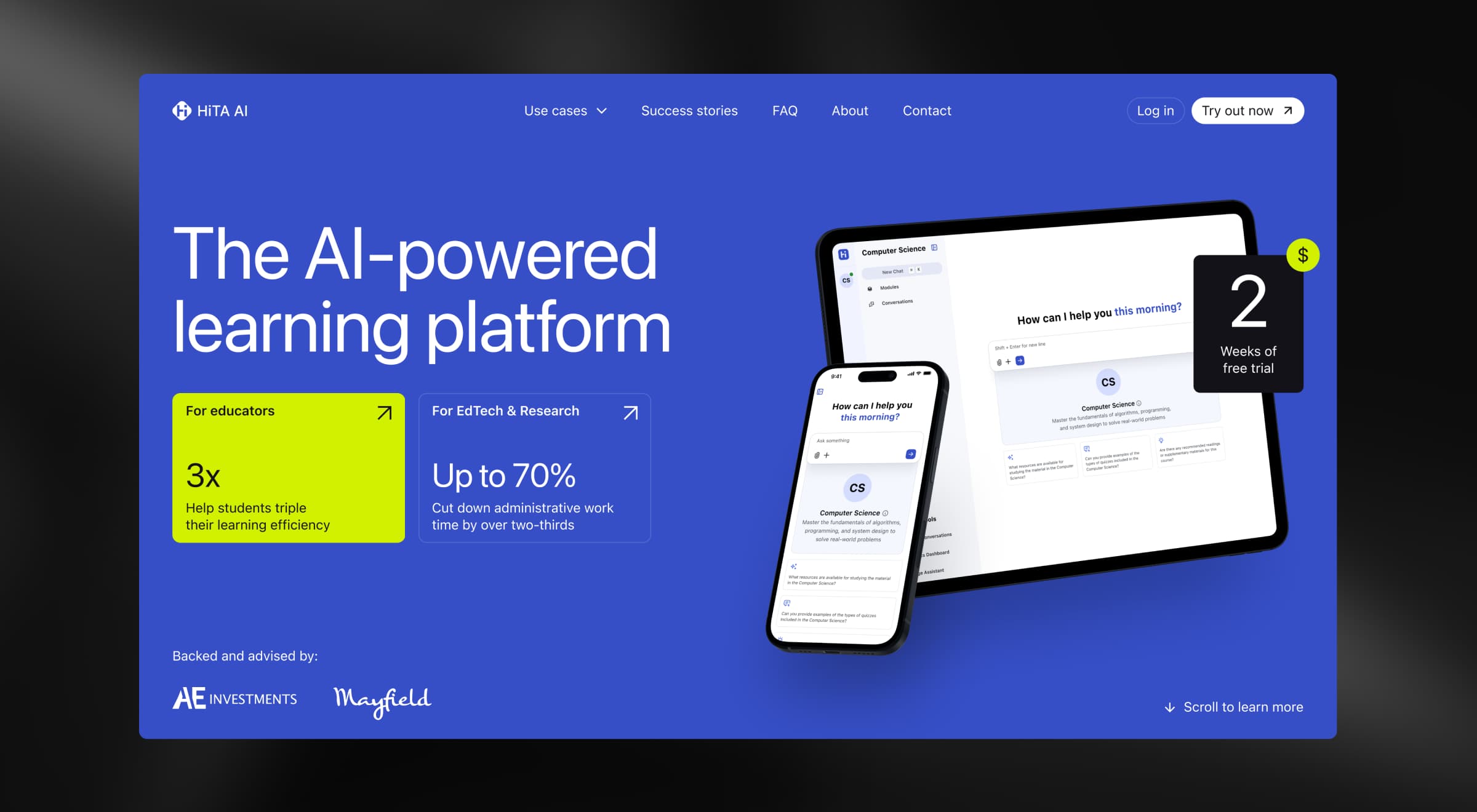
💡 Practical insight from Lazarev.agency's portfolio: For Hita AI, a learning platform for students and educators, we designed the AI Assistant chat around hints. The follow-up suggestions guide the student toward the answer instead of handing it over. The pedagogy and the UX line up: the product is more useful and harder to misuse, which is exactly the brief any educational AI client signs off on.
13. Visible memory controls
What it does: Makes the durable facts and preferences the system has stored about the user visible, editable, and forgettable. It’s the model's working knowledge of who you are.
Where it works best: Long-running assistants where the value compounds over time.
Design considerations:
- Three controls every persistent-memory product owes the user: a visible "Memory" panel to view what's stored, an inline edit, and a one-click forget.
- Notify the user with a small toast when something gets saved to memory, because silent saves feel like surveillance.
- Distinguish working memory (within a session) from long-term memory (across sessions) — they have different mental models and different privacy implications.
💡 Product example: Glean, the enterprise AI assistant, makes its workplace knowledge graph visible and user-controlled. Employees can see exactly which documents and signals shape their answers and adjust permissions inline through the Sources panel.
14. Conversation history
What it does: Keeps past session transcripts persistent, searchable, and organized so users can return to a specific conversation.
Where it works best: Long-running products where any given conversation may need to be revisited days or weeks later.
Design considerations:
- Default to a chronological list with clear titles auto-generated from the first user message.
- Add search across full conversation content.
- Allow pinning, renaming, and folder grouping for power users without forcing it on casual ones.
- Make deletion a two-step action with an undo window; lost conversations are a top support complaint.
💡 Product example: Lovable organizes user work as named projects in a left sidebar, with each project preserving its full conversation, code, and preview state across sessions.
Identity UI
Identity UX is the personality layer. These two patterns decide whether users see the product as a coherent character with clear edges, or as a generic LLM wearing a brand sticker. In a market where every product has access to similar models, identity is what makes one feel native to its users.
15. Persona and voice
What it does: Communicates the product's personality through avatar, name, micro-copy, and error voice.
Where it works best: Products where users return often enough that the AI's voice becomes part of the brand.
Design considerations:
- Audit four personality surfaces on every release: avatar, name, micro-copy, and error voice.
- Keep all four consistent — a playful avatar with sober error messages reads as broken.
- Match tone to stakes: sober for legal, finance, and medical; warmer for discovery, learning, and creative work.
💡 Product example: Linear's AI keeps a deliberately sober, engineering-grade tone because the audience is product teams who don't want a chatbot personality in their issue tracker. The voice carries through the welcome state, the response style, and the refusal copy.
16. Graceful refusal and uncertainty
What it does: Designs the interaction for the moments when the model says "I can't help with that" or "I'm not sure".
Where it works best: Compliance-sensitive domains and any product where users repeatedly hit the model's edges.
Design considerations:
- Treat refusals as first-class UI: explain what the system can't do, why, and what alternative the user has.
- Visually distinguish uncertainty from refusal: "I think this is right, but verify" is different from "I won't answer this."
- Log refusals as eval signal. Frequent refusals on legitimate queries point to a too strict of a guardrail.
💡 Product example: GitHub Copilot surfaces inline confidence cues when its suggestions are speculative, and its chat refuses out-of-scope requests with an explicit reason and a redirect to documentation.
Common AI chatbot UI design mistakes
The patterns above are the playbook. The mistakes below are how teams undo them.
Four mistakes emerge in nearly every product audit we run. The table summarizes what goes wrong, how to fix it, and the practitioner-level tip we share with clients during design reviews.
Apply AI UX design patterns to your product
Don't try to roll out all 16 in a single sprint. Start with a strategic design system audit to find the missing patterns suppressing adoption.
Then, arrange the identified gaps by adoption impact. Empty state, stop control, and citations move the activation funnel. Memory surface, model picker, and per-message feedback move retention. Generative AI and tool-use status move power-user delight. Map your AI product roadmap to the funnel stage you're trying to fix.
The table below is the sequencing reference for the work above. Read it as a planning cheat sheet once the audit has surfaced your gaps.
A winning AI chatbot design starts here
If you've worked through all 16 patterns, one thing probably stood out. The strongest AI products don't pretend to be more than they are. They show what they're doing and let users undo what they didn't ask for.
That's the craft underneath the patterns. Building AI products that feel honest turns out to be what users return to.
At Lazarev.agency, we treat AI chatbot UI as a system of behaviors at inference time. We design around the moments where probabilistic systems lose users and turn those moments into trust levers.
If your team is rebuilding a live chat surface, designing one from scratch, or auditing AI features already in production, the place to start is the gap between the patterns above and your product.
See our AI UX work and book a working session when you're ready to map the gaps.


.webp)


.avif)