
You've been asked to make the product feel AI-native. You've also been asked to do it without rebuilding the system you've already invested two years in and without breaking the components engineering relies on.
This article is a working AI UX pattern library for that exact situation. Patterns you can extend from your existing tokens and components. Patterns for the AI cases that don't have a clean answer in your current Figma library.
This article is for Design Leads, Heads of Design, Principal Designers, and founding or first product designers at B2B companies whose products are AI-heavy or going AI-heavy. If you're tired of vendors who ignore your system and want proven AI UX patterns, you're in the right place.
Key takeaways
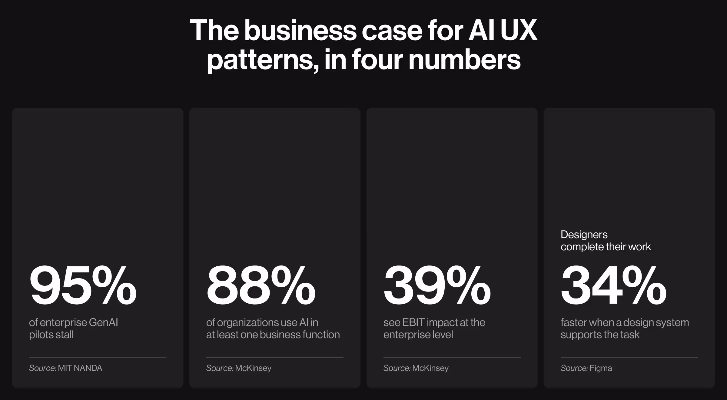
- Only 5% of enterprise GenAI pilots reach measurable P&L impact. The rest stall because users can’t read, override, or trust AI outputs. These are the problems AI UX patterns are built to solve.
- Designers complete their work 34% faster when a design system supports the task. Creating a separate AI system removes such an advantage. Extending it keeps the gain in your pocket.
- Lazarev.agency’s work on Accern Rhea supported a path from Series B to an eight-figure acquisition, with over $40M raised. Patterns like clarifying questions and adaptive widgets now shape how AI products are built across the industry.
- Lazarev.agency’s persona-driven state library for Elva, the voice-first AI video director, won the Webby Award for Best Visual UI in AI. Processing, partial, low-confidence, error, and success states all live as one motion language the team can extend without rebuilding the system.
Why a scalable AI UX pattern library is the unit of value for Design Leads
“We've seen clients reach out with impressive individual AI screens that still produce a fragmented product once the AI surfaces compound. A copilot in one squad, a recommendation card in another, an explainability tooltip in a third — three different interaction models for what should be a single conceptual pattern.”
{{Anna Demianenko}}
For Design Leads, the unit of value of AI product design is a reusable, on-system AI UX pattern library. One that extends your existing tokens and components and codifies the AI-specific decisions your team would otherwise re-litigate every sprint.
The numbers below expose what most Design Leads are walking into. The success of the pilots depends on whether anyone can read, override, and trust what the AI produces, and AI UX patterns specify how that works:
- Most AI work doesn't lead to tangible business outcomes. Only 5% of enterprise GenAI pilots reach measurable P&L impact. The other 95% stall, per MIT NANDA.
- Adoption is wide, scaling is rare. 88% of organizations use AI in at least one business function, yet only 39% see EBIT impact at the enterprise level, McKinsey reports.
- A real design system is the speed multiplier. Designers complete their work 34% faster when a design system is available for the task, according to Figma.
Here’s a one-line frame for the rest of this article: you don't need more isolated AI-powered designs. You need fewer, better, reusable AI decisions.
Proof — Accern.Rhea. In 2024, Accern returned to us to design Rhea: a research tool for financial analysts, VC investors, and ESG specialists, built on a pre-trained AI model designed for financial intelligence work. Researchers needed graphics, tables, and interactive elements alongside conversational prompts. A chat-only interface would have undersold the workflow.

What Lazarev.agency built. Six interlocking patterns formed the system:
- Hybrid GUI / prompt interface with split-screen mode. AI prompts, combined with dynamic widgets and graphics, support a research-to-report workflow within a single environment.
- Adaptive widget-based UI. References, charts, footnotes, and graphical controls surface in response to voice or text prompts.
- Adaptive natural language with clarifying questions. When a query is ambiguous, Rhea steps in with clarifying questions and suggestions.
- Multi-purpose command-line input. A single advanced command line for file search, automated email management, scheduled calls, alerts, and other workflow tasks.
- Report Creator Mode. Covers user comprehension, personalization, file management, and task assistance — the long tail of analyst workflow inside one interaction model.
- Integrated datasets and file management. Researchers select pre-configured datasets called Lenses or connect their own through Accern's NLP Platform.
Why these patterns mattered. Each one absorbs a recurring class of failure modes and spares the team from re-solving it on every AI screen. Clarifying questions move silent-failure cases into surface-level dialogue. The hybrid input model removes the false choice between deterministic GUI and conversational AI.
The result. Rhea catalyzed Accern's move from Series B to an eight-figure acquisition, with $40M+ raised across the partnership. The AI UX patterns were the product's defensible interaction model at the moment buyers were evaluating it. Equation honored, library adopted, system extended.
What counts as an "AI UX pattern" and what doesn't
A working definition: an AI UX pattern is a reusable interaction model for an AI-driven decision surface, documented with its variants, its applicable states, and its governance rules.
This definition does some real work. It excludes one-off screens and UI kits shipping pixels without decisions. Here are five pattern families doing most of the work in B2B AI:
- Assistive patterns help a user complete a task they're already doing — autocomplete, smart fill, suggestion ribbons.
- Autonomous patterns complete a task on the user's behalf with explicit approval — draft-and-review, batch processing, scheduled actions.
- Recommendation patterns propose options the user chooses from — multi-option suggestion lists, ranked alternatives, side-by-side comparisons.
- Explainer patterns surface why the AI produced what it produced — explainability tooltips, source citations, audit trails.
- Guardrail patterns signal what the AI won't do or what requires human review — refusal messages, escalation prompts, "I disagree" capture.
AI UX design surfaces: 13 examples for an AI-proof design arsenal
Each family shows up in the product as concrete surfaces. The table below is the working glossary the rest of this article assumes.
Each surface above has a canonical implementation in a popular B2B or prosumer product. The catalog below names one reference for each surface, plus the actionable insight that makes the integration worth borrowing.
1. Copilot panel
Microsoft 365 Copilot: the right-side panel in Word, Excel, and PowerPoint adapts its prompts and capabilities to whichever surface it docks against — drafting and rewriting in Word, formula generation in Excel, slide design in PowerPoint. The panel sits alongside the document, never on top of it, so the user's primary work surface stays intact.
Actionable insight. Dock the panel against the user's primary work surface and make its prompts adapt to that surface. A copilot offering the same menu everywhere reads as a generic chatbot.
2. Inline suggestion
GitHub Copilot: ghost-text completions appear in muted gray as the developer types. Tab accepts, Escape dismisses. Gmail Smart Compose and Notion AI use a near-identical grammar inside their own inputs.
Actionable insight. Use the existing input affordance (typing) and the existing keyboard grammar (Tab / Escape). New modalities and learned shortcuts sabotage adoption before the AI proves itself useful.
3. Recommendation card
Spotify Daylist: a single card surfaces an AI-curated playlist with mood metadata, a context line ("based on what you've played today"), and one primary Play action. The metadata explains the choice. The action lets users act on it without leaving the card.
Actionable insight. Every recommendation card needs one primary action and one line of explanation for why it appeared. A card without either is just a tile, and tiles get scrolled past.
4. Confidence indicator
Otter.ai transcripts: words the model isn't certain about render in lighter gray. Users hover or click to see alternative transcriptions. The visual signal is subtle enough to read past at speed and sharp enough to flag the moments that need a human edit.
Actionable insight. Use confidence to soften what the AI claims, through typography, color, or hedged language.
5. Source citation
Perplexity: every claim carries a numbered citation linking to the source. Hover or click expands the source preview without leaving the answer. ChatGPT's browse mode and Glean now ship near-identical grammar.
Actionable insight. Make every claim clickable to its source in the same view. Trust collapses if users have to leave the answer to verify it.
6. Override flow
Cursor diff view: AI-suggested code edits appear as a side-by-side or inline diff with red/green highlighting. Users accept all, accept by line, or reject. The change is visible at the same level of detail as the original code.
Actionable insight. Override has to be visible at the same fidelity as the AI output itself. A "regenerate" button is a retry. Users need to see and accept the specific change.
7. Escalation flow
Intercom Fin AI: when Fin cannot resolve a customer query, the conversation is handed to a human agent with the full transcript, the customer's account context, and a one-line summary of what Fin already attempted. The human picks up where the AI stopped.
Actionable insight. Carry the full context with the handoff — transcript, attempted resolutions. Forcing users to repeat themselves is the reason customers still prefer email.
8. Low-confidence empty state
NotebookLM: when the model cannot find a grounded answer in the user's uploaded sources, it says so explicitly: "I cannot find that information in the documents you provided." No fabricated answer, no apologetic preamble.
Actionable insight. Name the gap directly when the AI cannot answer. "I cannot find that in your sources" is the single highest-leverage trust signal in any AI product.
9. Partial-data caveat
Salesforce Einstein: when a prediction draws on incomplete data, Einstein flags it inline alongside the score — for example, "Based on 73 of 200 historical records." The prediction still shows, so do its limits.
Actionable insight. Tell users what is missing. "Based on 73 of 200 records" is more useful than a generic "incomplete data" badge.
10. Freshness indicator
Glean enterprise search: each result displays both when the source document was last modified and when Glean last indexed it. Users see at a glance whether they're reading last week's deck or this morning's update.
Actionable insight. Pair the timestamp with the scope. "Last updated 2 hours ago", without naming what was indexed, is meaningless to a user trying to decide whether to trust the result.
11. Model version badge
ChatGPT: the model selector at the top of every conversation badges the active model, e.g., GPT-5, GPT-4o, o3-mini, and old conversations preserve which model produced which response.
Actionable insight. Stamp the model on the output. Users need to know which model wrote which line, especially when results don't reproduce on a newer one.
12. Summarization view
Slack AI thread summaries: a condensed paragraph at the top of long threads links each summary point back to the original message. Time range, message count, and key participants are surfaced alongside the summary text.
Actionable insight. Make every summarized claim clickable to the source content.
13. Comparison view
Cursor diff view (revisited for comparison context): beyond override, the diff view doubles as a comparison surface — AI-edited code on one side, original on the other, the difference highlighted. Users don't have to read both versions to spot what changed.
Actionable insight. Make the difference legible at first glance. If users have to scan two versions to find what changed, the comparison view has failed its job.
Across the 13 surfaces, the assistive and explainer families have the most canonical implementations in mainstream B2B products today. The autonomous, recommendation, and guardrail families are still under-explored, which is part of why the override and escalation patterns above remain the most under-designed work in the category.
The six AI UX states your AI-native product needs
Surfaces are only half the work. Each surface in an AI UX pattern library lives or dies on its states. These are the moments when the pattern has to handle something other than the success case.
The table below names six states, the failure mode each creates when overlooked, the pattern Lazarev.agency applies, and an observable acceptance criterion.
The discipline is treating each state as part of the pattern. When a recommendation card is reviewed, the empty version, the partial version, the low-confidence version, and the error version should all be reviewed in the same meeting. Once states ship later, they ship inconsistently.
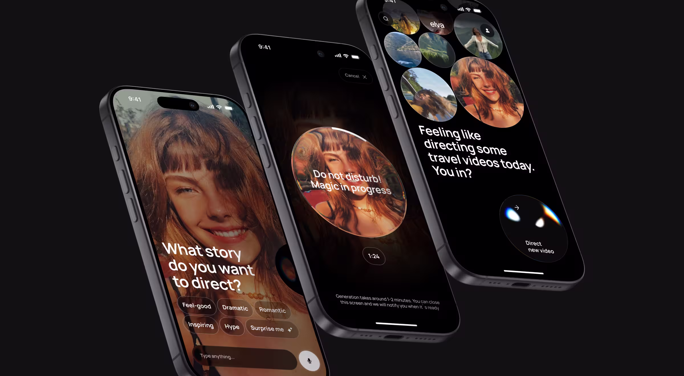
Proof — Elva. Elva is a voice-first AI video editor. Users say, "make a travel reel from last weekend", and the AI handles scene selection, cuts to rhythm, music layering, and mood matching. Because the AI itself is the only visible interface, our AI UX design team had to design every system state as part of one expressive persona.
Each row in the table above maps directly to a decision in Elva's behavioral language:
- Empty state never lands cold — smart suggestions detect content from the camera roll and propose a starting point ("Looks like a beach trip — want a travel reel?").
- Loading state is the blob persona's motion showing generation progress, with the signal differentiating "thinking" from "writing" exactly as the acceptance criterion requires.
- Low-confidence moments surface as clarifying questions when intent is ambiguous.
- Partial-data outputs travel through a draft-and-approve pattern before committing.
- Error and success stay inside the persona's vocabulary, so the system never goes dark and never feels mechanical.
The result: Every state belongs to the persona, making the persona the system.
Lazarev.agency’s extend, don't fork AI UX design principle in practice
The non-negotiable for any AI pattern work: it has to extend the system you already have. Forking creates a parallel universe your team will spend the next year reconciling.
The intake step before any new design work begins: tokens, component library, breakpoints, naming conventions, and how engineering is implementing the design in production (which is sometimes different from how Figma describes it). The AI patterns get built from those existing foundations.
Here’s the debrief of Lazarev.agency’s extend, don't fork principle, in practice:
- Inherit your color tokens. Don't introduce a parallel "AI palette" because the AI features felt like they needed one.
- Inherit your typography scale. AI surfaces use the same hierarchy as the rest of the product.
- Inherit your spacing grid. New components match the rhythm.
- Add new tokens only where the AI use case genuinely requires it.
- Document every addition with a rationale. The next person to touch the system should understand why the new token exists.
"When teams fork their design system to ship AI features, four signs of fragmentation show up early. Three different confidence indicators across squads. Two competing empty states for the same data shape. AI-specific colors appearing nowhere else in the brand. Component names breaking the team's existing conventions. Catch any of these early and they're reversible. Wait six months and the fork becomes the system."
{{Oleksandr Holovko}}
Hero proof — Pika AI. When we redesigned Pika AI as a next-generation search engine, we kept everything users already recognized. We preserved the F-pattern SERP, the search bar at the top, the block-based result layout and layered the AI chat widget below the search bar with deliberate visual prominence and color accents.
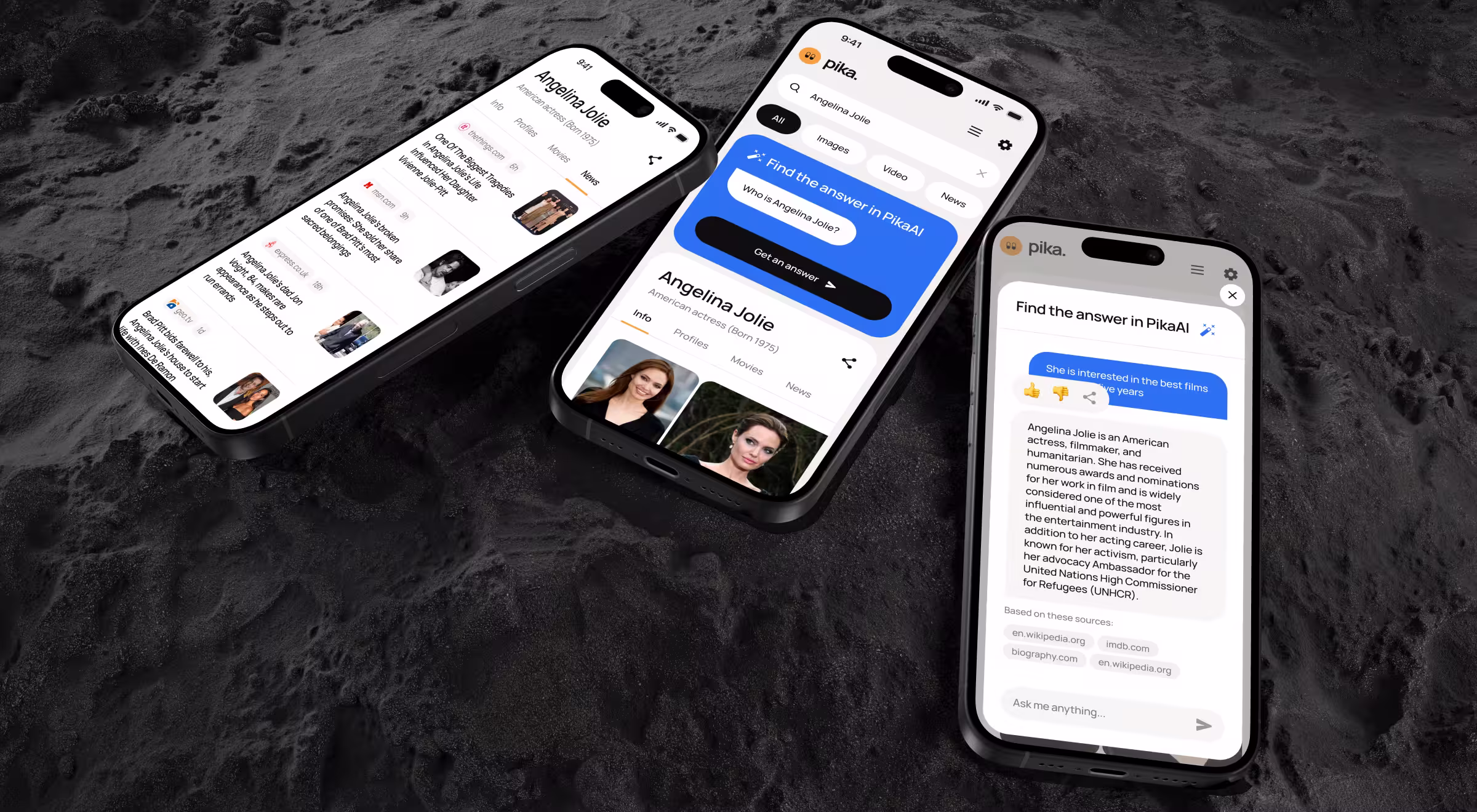
Business outcome: the same design system carried cleanly across mobile and desktop, the AI chat stayed prominent and accessible without forking the experience, and Pika AI shipped a working example of extend, don't fork.
How a real AI UX patterns engagement works: Lazarev.agency’s 5-phase approach
A pattern library lives or dies on the program around it. The audit before the design. The strategy naming the pattern families. The systemization in code. The change management after launch. Skip any of these phases, and the library leaves you with a well-documented Figma file no one on the team uses.
At Lazarev.agency, we run the program in five phases, sequenced intentionally for the product value to compound. Here’s a detailed view of what each phase offers Design Leads.
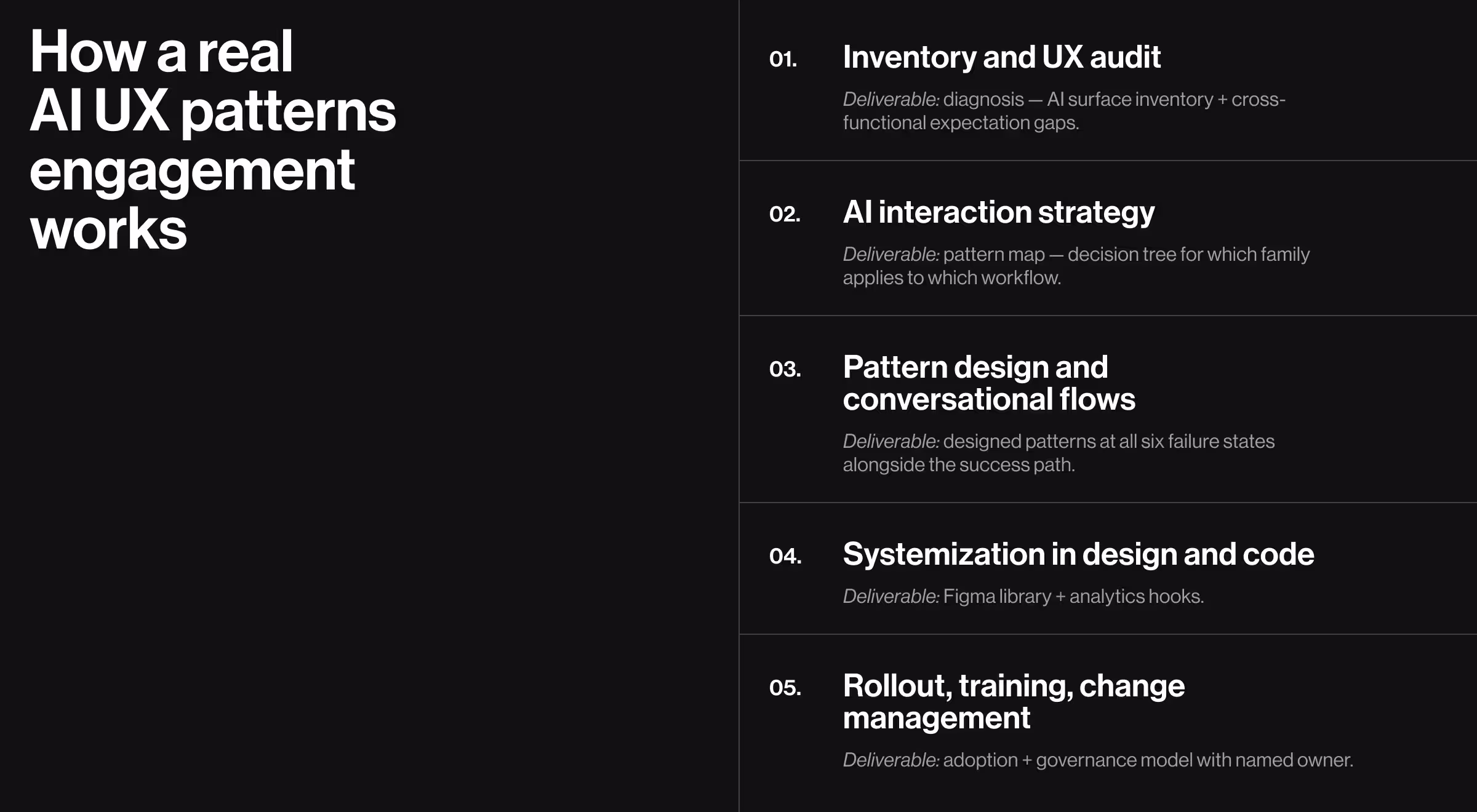
Phase 1: inventory and UX audit
The engagement opens with a UX design system audit. At this stage, every existing AI surface in the product gets scrutinized:
- where AI shows up today
- which patterns conflict or overlap
- where users, sales, and support already get confused
- how the underlying data layer is shaping (or limiting) the experience
The audit names what stakeholders across product, engineering, AI, and ops expect from the work. AI UX breaks between systems and departments. The audit's job is to surface the breakage before any pattern gets designed.
What Design Leads get out of phase 1. A diagnosis: a written inventory of every AI surface, every conflicting pattern across squads, and every cross-functional expectation gap a pattern library will need to resolve.
Phase 2: AI interaction strategy
Phase 2 turns the diagnosis into a strategy:
- which pattern families (assistive, autonomous, recommendations, explainers, guardrails) the product needs
- where conversational AI genuinely belongs and where it doesn't
- how patterns map to user roles, risk levels, and workflows
The deliverable includes decision trees mapping "I have this kind of AI surface" to "use this pattern, in this variant," plus synthetic scenario testing: representative user journeys run through the proposed patterns before any pixel ships.
What Design Leads get out of phase 2. A pattern map: a documented decision tree for which family applies to which workflow, with risk-level annotations and the cases where chat is not the right input model.
Phase 3: pattern design and conversational flows
Phase 3 is where screens, flows, and microcopy land for each pattern, including conversational design for bots, copilots, and in-product chat. Each pattern gets drawn at all six failure states (empty, loading, partial, low-confidence, error, drift) alongside the success path, in the same review cycle.
What Design Leads get out of phase 3. A working set of designed patterns: every pattern family with its states, variants, and microcopy, designed against the existing design system.
Phase 4: systemization in design and code
Phase 4 codifies the patterns into a working library:
- Figma libraries, tokens, and components for each pattern
- written usage guidelines for design and engineering
- analytics hooks so adoption is measurable
What Design Leads get out of phase 4. A library: Figma components and tokens matching your existing system's conventions, written usage guidelines, and instrumented adoption telemetry.
Phase 5: rollout, training, and change management
Phase 5 covers the artifacts that decide whether anyone uses the library:
- playbooks and workshops for PMs, designers, and engineers, scoped to a pilot squad first before any org-wide rollout
- office-hours support for the first month or two while the first squads ship from the library.
- iteration based on observed usage and feedback
AI change management is where most engagements end. For Lazarev.agency, it's where implementation begins.
What Design Leads get out of phase 5. Adoption: the first patterns shipped from the library, a before-and-after story to bring to leadership, and a governance model.
The five phases are sequential, but the value compounds backwards. A strong rollout depends on a strong systemization, which depends on a strong design, which depends on a strong strategy, which depends on a strong audit.
Work with an AI UX design partner without losing system ownership
Most external designers either need a hyper-detailed brief and become Figma hands, or they ignore your system entirely and ship something in their own visual language. Both are bad. Both are common.
The non-negotiables before hiring AI designers:
- A system intake comes first. Tokens, components, breakpoints, naming, dev reality. If the partner skips this, treat it as the answer about how the engagement will go.
- Scope boundaries are defined and held. This pattern family, these surfaces, these states.
- The design lead retains veto power on system-level decisions. New tokens, new components, naming changes — these go through you.
- The handoff includes documentation. Why this pattern, when to use it, what the variants are, and what the rationale was.
A clean handoff looks like annotated Figma components with documented states, usage rules, and rationale your team can reference six months later when someone new needs to extend the library.
See how Lazarev.agency runs an AI UX patterns engagement — scope-boundaried, on-system, design-lead-led. We layer AI patterns onto your live product without rebuilding it, and we leave behind documented Figma components your team can maintain after the engagement ends.
Reach out to our team for a personalized consultation.


.webp)


.avif)