.avif)
You drop $500K on enterprise risk-management software. IT handles deployment. Managers get trained. Everyone logs in once, hits a wall of incomprehensible data tables, and never comes back.
You just wasted half a million on a dashboard-design problem.
Mozayix lived this nightmare. They’re a business consultancy and risk-management firm helping global enterprises safeguard billions in assets — their clients trust them with critical security decisions. But their own platform was the thing managers were avoiding.
They hired Lazarev.agency, a go-to AI design agency, to fix what their engineers couldn’t: make complex enterprise software feel simple. We rebuilt the entire platform around how managers work.
In this article, we’ll share pro tips for turning a dashboard from an obstacle into an operational advantage and what that shift means for your business metrics.
Key takeaways
- Show less, communicate more. We deleted most of the elements on the old Mozayix dashboard. Managers finally found what mattered. Information hierarchy beats data volume every time.
- Static dashboards create IT dependency. Old system: email request, three-day wait for a report. New system: click, filter, drill down, and answer your own question in seconds.
- One dashboard doesn’t fit all roles. Stop forcing everyone through identical interfaces. Build role-specific views.
- Hide complexity until users need it. Simple entry points for common tasks. Advanced features behind familiar patterns.
Why your dashboard collects dust instead of data
Most enterprise design for dashboards fails for predictable reasons. We saw the same pattern in the Mozayix case and across other projects in our portfolio.
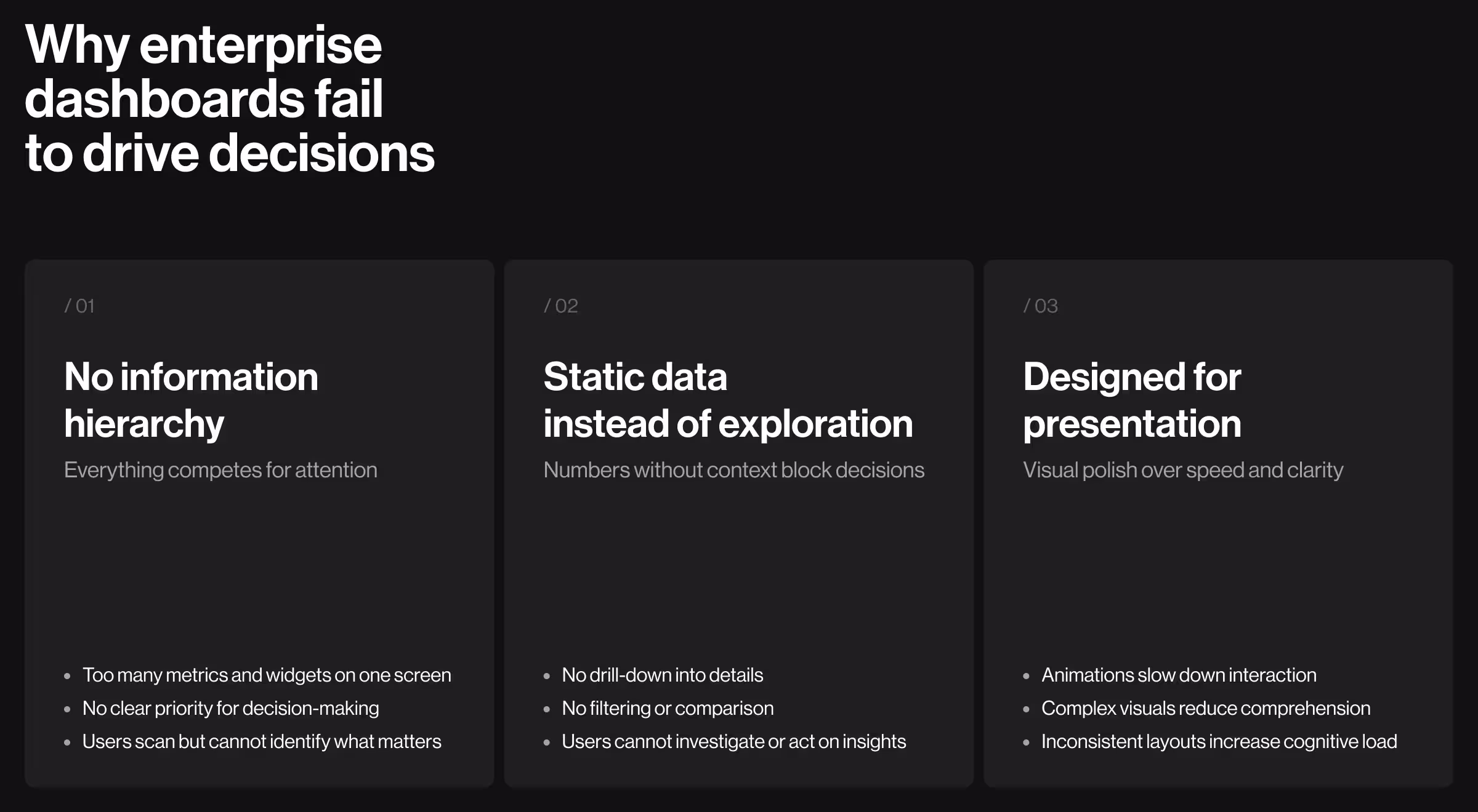
Everything screams for attention simultaneously
Open your analytics dashboard right now. Count how many metrics, charts, tables, and widgets compete for your eyes. Twelve? Twenty? Thirty-five?
Now tell us which three matter most for the decision you need to make in the next five minutes. You can’t. Because nothing has visual priority.
“Good dashboard design is 80% deciding what not to show. Most teams show everything and wonder why users can’t find anything.”
Oleksandr Koshytskyi
For Mozayix, we established a clear information architecture — four tiers, each earning its place on screen by how often a manager acts on it:
Managers started using the dashboard because scanning replaced searching.
Static displays when decisions need exploration
Your dashboard shows last month’s number: 24 incidents. Great — compared to what? Which regions drove the spike? Which threat types declined? The dashboard just stares back.
Static charts work for printed reports. Proper enterprise UX/UI has to support interactive data exploration. We rebuilt Mozayix around investigation workflows:
- Click a security event → see the individual incident with severity rating and source notes.
- Filter risk assessments → narrow by region, timeline, or responsible assessor.
- Drill into project metrics → reveal task-level detail and blockers.
- Compare periods → overlay last quarter against projections.
Design optimized for screenshots instead of daily use
Your dashboard looks incredible in the sales deck. Pretty design, smooth animations, trendy data viz.
Then managers try using it 50 times a week and everything slows down. Animations delay tasks. Aesthetic choices sacrifice clarity.
“We redesigned it for people who see this dashboard before coffee every morning. Different optimization entirely.”
Ostap Oshurko
Every design element earns its place on cognitive efficiency:
- Color-coded status indicators because the brain processes color faster than text.
- Icon-driven metric cards because symbols communicate quicker than labels.
- Spatial consistency because same location = faster recognition.
- High contrast because enterprise monitors vary wildly in quality.
- Simple charts because complex visualization slows comprehension.
The result looks professional. More importantly, it works fast.
🔎 For more UX hacks, see our full guide on AI dashboard design.
What we did to fix the Mozayix dashboard
We restructured how information flows to the user.
Built a command center to replace scattered chaos
Mozayix managers were opening five different screens to check daily status — security events in one place, projects in another, audits somewhere else, notifications wherever they had landed last.
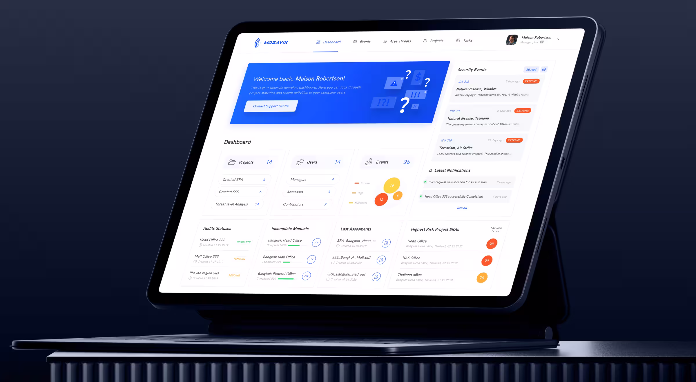
Now, one screen answers the four questions a Mozayix manager actually opens the app to ask:
🔎 Go deeper into the Mozayix risk-assessment design on the Lazarev.agency's Dribbble profile.
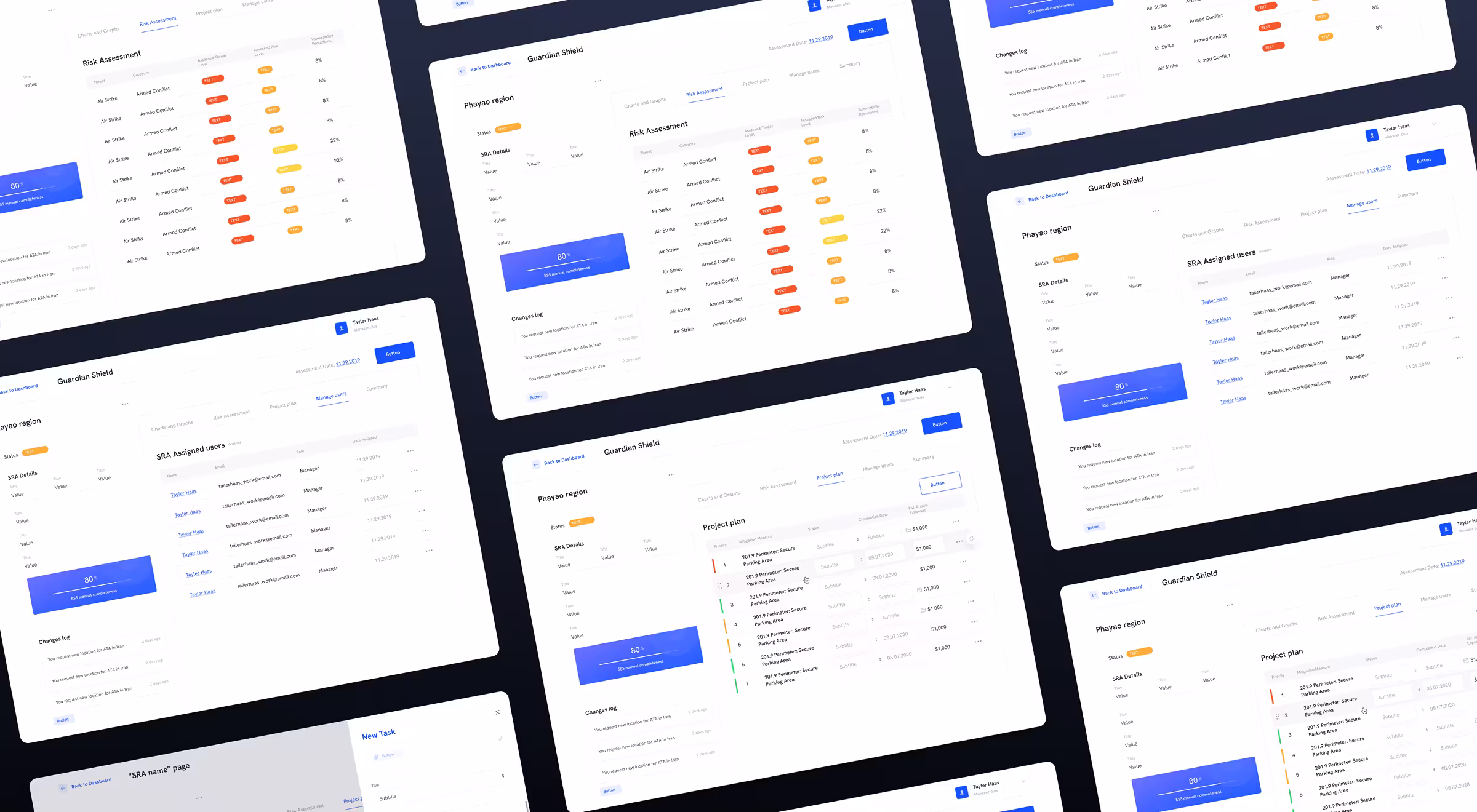
Turned data dumps into decision tools
The old Mozayix showed lots of data and left users to figure out what it meant. We added an intelligence layer so the screen reads the data for you:
- Threat severity speaks first — “Air Strike — Armed Conflict — EXTREME” chips do the work a manager used to do with a spreadsheet and a highlighter.
- Risk-level chips double as filters — tap EXTREME and the table narrows to threats that still need mitigation.
- Audit completeness is a single number — “80% SSS manual completeness” sits next to the changes log, so managers see how far an audit is and who last touched it without opening a separate report.
Presented a wall of metrics as a single risk story
Enterprise software loves cramming data into giant tables: seventeen columns, tiny text, horizontal scrolling. Good luck finding anything.
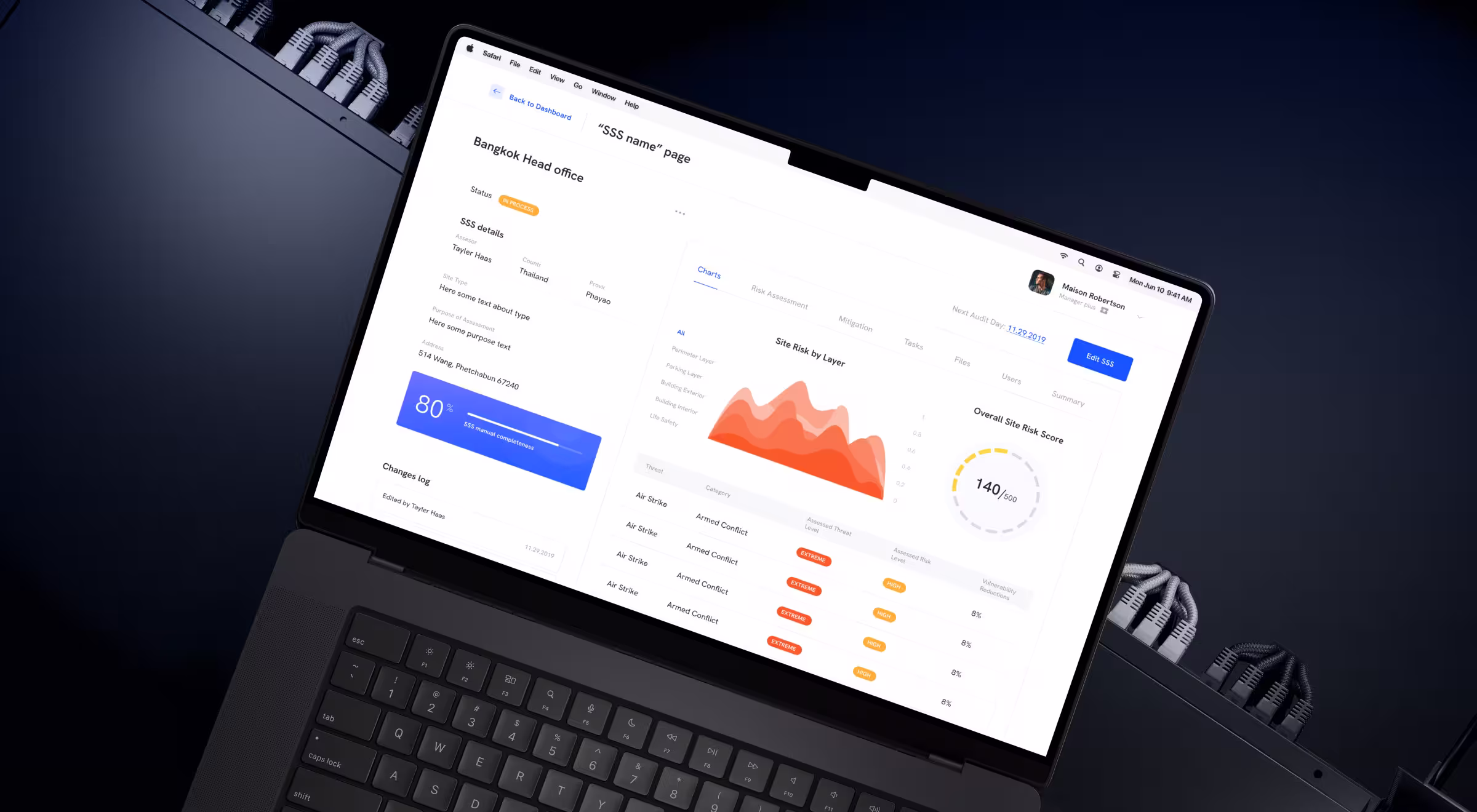
On the SSS detail page, we replaced the table-first layout with a layered read of the site’s risk:
- A Site Risk by Layer chart — Perimeter, Parking, Building Exterior, Building Interior, Life Safety — so a manager sees where the site is exposed at a glance.
- An Overall Site Risk Score gauge — “140/500” — the one number that answers “is the site OK?”.
- A focused five-column threat table — Threat, Category, Assessed Threat Level, Assessed Risk Level, Vulnerability Reductions. Severity reads as a colored chip (EXTREME / HIGH / MODERATE), not a number the manager has to interpret.
- Static SSS context on the left — assessor, country, province, address, next audit day — stays put while filters and tabs change the right side.
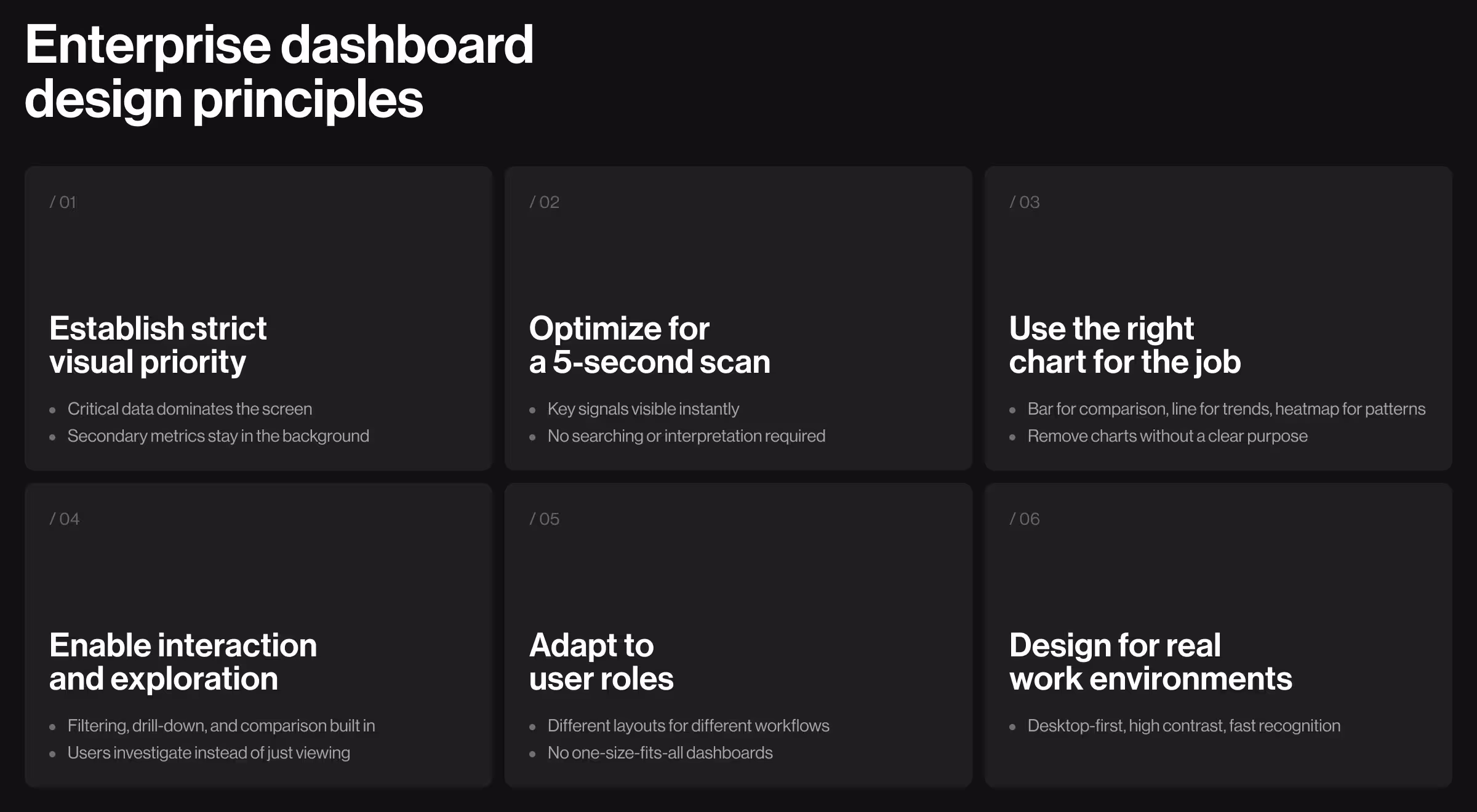
Dashboard design principles you should implement
Based on Mozayix and other enterprise projects from the Lazarev.agency portfolio:
- Reduce everything fighting for attention. Most dashboards show too much. Establish brutal priority — critical information dominates, background metrics recede.
- Design for the 5-second scan. Managers don’t read dashboards. They scan for problems, verify status, and move on. If users squint or hunt, you failed.
- Make every chart earn its existence. Bar charts compare categories. Line graphs show trends. Heatmaps reveal patterns. Pick the chart that matches the question.
- Build interaction. Let users filter, drill down, compare, investigate. Turn passive viewers into active analysts.
- Customize for roles. Stop forcing identical views on different jobs. Role-based layouts serve actual workflows instead of a generic everything-for-everyone compromise.
- Optimize for monitors. Enterprise users work on dual screens. Responsive down to tablets when needed, but desktop-first — that’s reality.
- Test with people who hate your software. Interview the managers avoiding your platform. Record their frustrations — it's the same research-first logic behind a sound product discovery process, where you study real behavior before designing. They'll tell you exactly what breaks.
🔎 Curious how to design dashboards that don’t confuse users? We broke it down in our guide on dashboard UX design.
Your dashboard is why adoption tanked. It’s time to fix it
We’ve rebuilt dashboards for enterprises managing billions in operations. We have the research to prove what drives daily usage versus what just impresses stakeholders in demos.
Building enterprise software where interface quality determines adoption? Talk to us. We’ll show you exactly where your dashboard loses users and how to fix it before you burn another quarter on features no one touches.


.webp)