"Best" is not a ranking. The best fintech app for a treasury team at a Series B startup and the best one for a teenager building a monthly budget are completely different products.
This article covers the strongest fintech apps by vertical: peer-to-peer payments, business banking, spend management, cross-border transfers, investing, and consumer banking, with one clear reason each earned its place.
The lens throughout is product quality: does the mobile app solve the right problem, for the right user, without friction? UX and aesthetics are the secondary layer. Getting the product decision right comes first.
Key takeaways
- Fee models and product experience are inseparable. Chime offers a different business model, and the product experience follows from here. The same logic applies in reverse: Brex's cashback rewards are a product feature which only works because the spend controls exist.
- Fintech apps that win long-term align their incentives with their users' goals. Ramp succeeds when its customers spend less. Betterment succeeds when its users reach their financial goals. The fintech apps which struggle long-term are those whose revenue model requires their users not to notice something.
- The gap between technically solid fintech and product-clear can flatten your revenue. Technology does not separate the fintech product from the competitors. Product clarity did. If your fintech solution is technically solid but losing users at adoption, the gap is almost always a product and design problem.
How to read the best fintech apps list
Lazarev.agency, a fintech design agency, has curated a list of standout apps (much like our wider roundup of best app design examples) to inspire your next product design. Drawing on our experience designing hundreds of fintech products, we recommend focusing on three key criteria when evaluating any fintech app:
- First: does the app solve a real workflow problem?
- Second: does the product experience match the complexity of the task, a regulatory compliance tool should feel deliberate, a peer-to-peer payment app should feel instant?
- Third: does the app have genuine traction with the audience it claims to serve?
Peer-to-peer payments
Cash App
Cash App built its product around a single interaction, sending money to another person as fast as sending a text message. The app opens directly on a number pad. Enter an amount, tap Pay or Request, find the recipient by $Cashtag, and the transfer completes in under ten seconds.
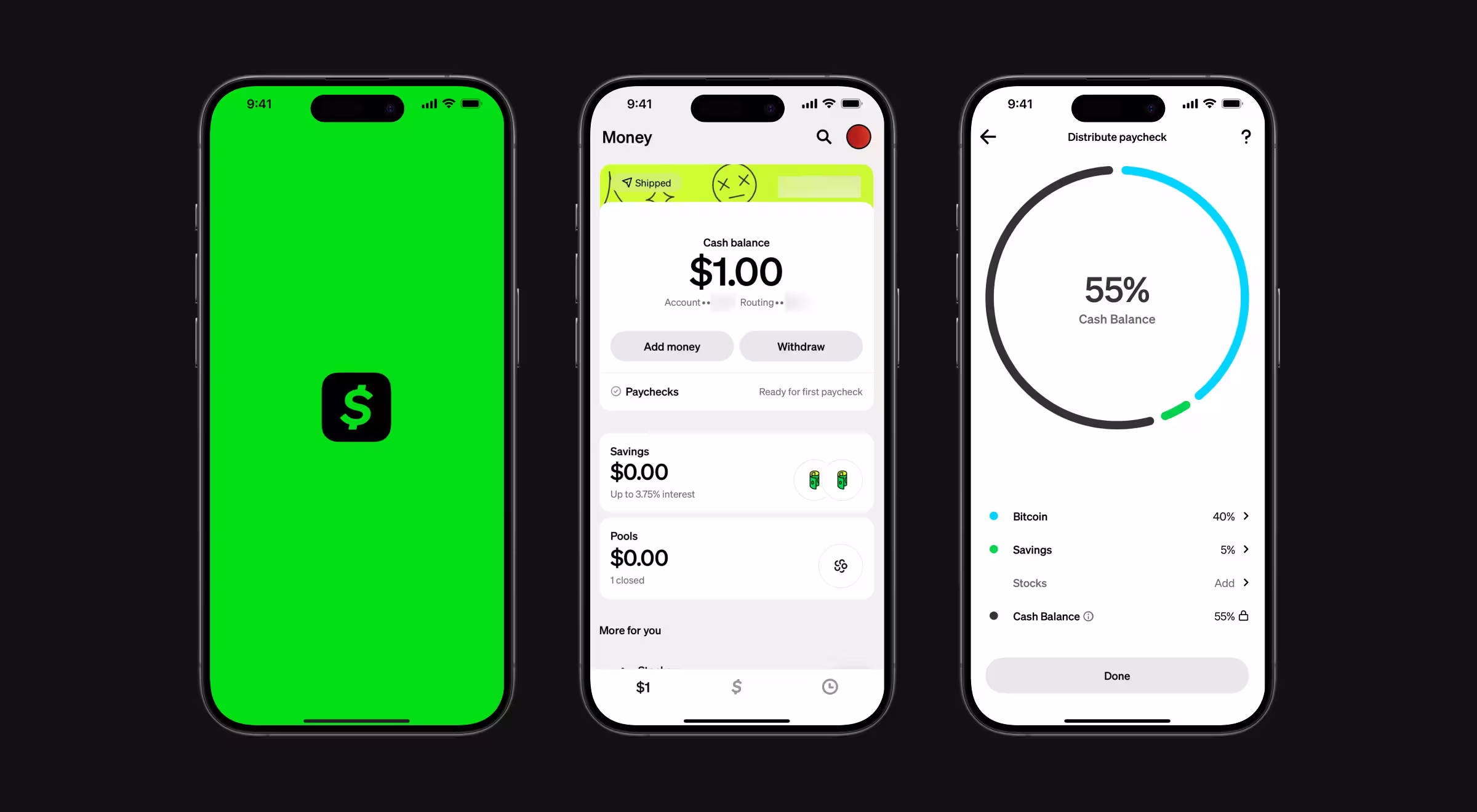
Core product decision: $Cashtag turned a financial credential into something closer to a social media username. For Gen Z and younger millennials, the product removes the psychological distance between intent and action, which is the only thing peer-to-peer payments products need to do.
Design overview: Cash App's visual identity is aggressive by fintech industry standards. A proprietary neon green, a custom typeface called Cash Sans engineered for legibility at any size, and illustrations drawn from streetwear and collectible culture.
Motion design delivers immediate physical feedback on every tap. The product doesn't look like a bank because its users don't want a bank. It ranked as one of the coolest brands among Gen Z in a 2022 brand study, a rare distinction in the fintech sector.
Lesson it teaches: Brand identity is a product decision. The way Cash App looks is inseparable from why its target audience trusts it. If your fintech mobile app looks like every other financial institution's digital interface, you are communicating that you are like everyone else, which is exactly the thing your users want to escape.
🤓 Stop guessing what users want. Learn how to validate real market demand in our hands-on guide.
Cross-border payments
Wise
Cross-border payments are expected to reach $250 trillion by 2027, yet only about 56% of services globally disclose both the cost and speed of a transfer upfront. The transparency gap, Wise, a cross-border money transfer platform, was built to close.
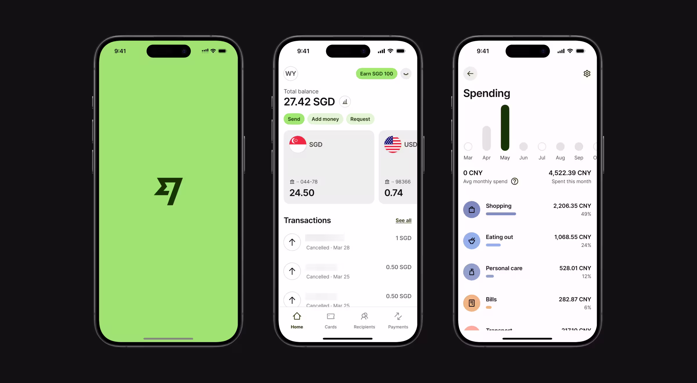
Core product decision: Wise made transparency its entire product. The home screen opens on a currency calculator. The first thing a user sees when they open the app is the cost and outcome of the transfer.
Design overview: Wise developed a custom typeface, Wise Sans, supporting hundreds of currency symbols across scripts, including Arabic, Thai, and Japanese. A personal finance app serving global users has to actually work for global users, which means the typography system has to work as hard as the payments infrastructure underneath it.
Lesson it teaches: When an entire fintech industry profits from confusion, the company that eliminates confusion wins customer trust by default. Wise built a better information architecture. Fee transparency implemented as a UX decision created more long-term loyalty than any cashback rewards program could have.
Business banking
Mercury
Mercury is a business bank account specifically for startups. Founders use it to manage operating accounts, receive wire transfers, issue debit cards to team members, connect accounting tools, and monitor account balances, all without monthly fees or minimum balance requirements.
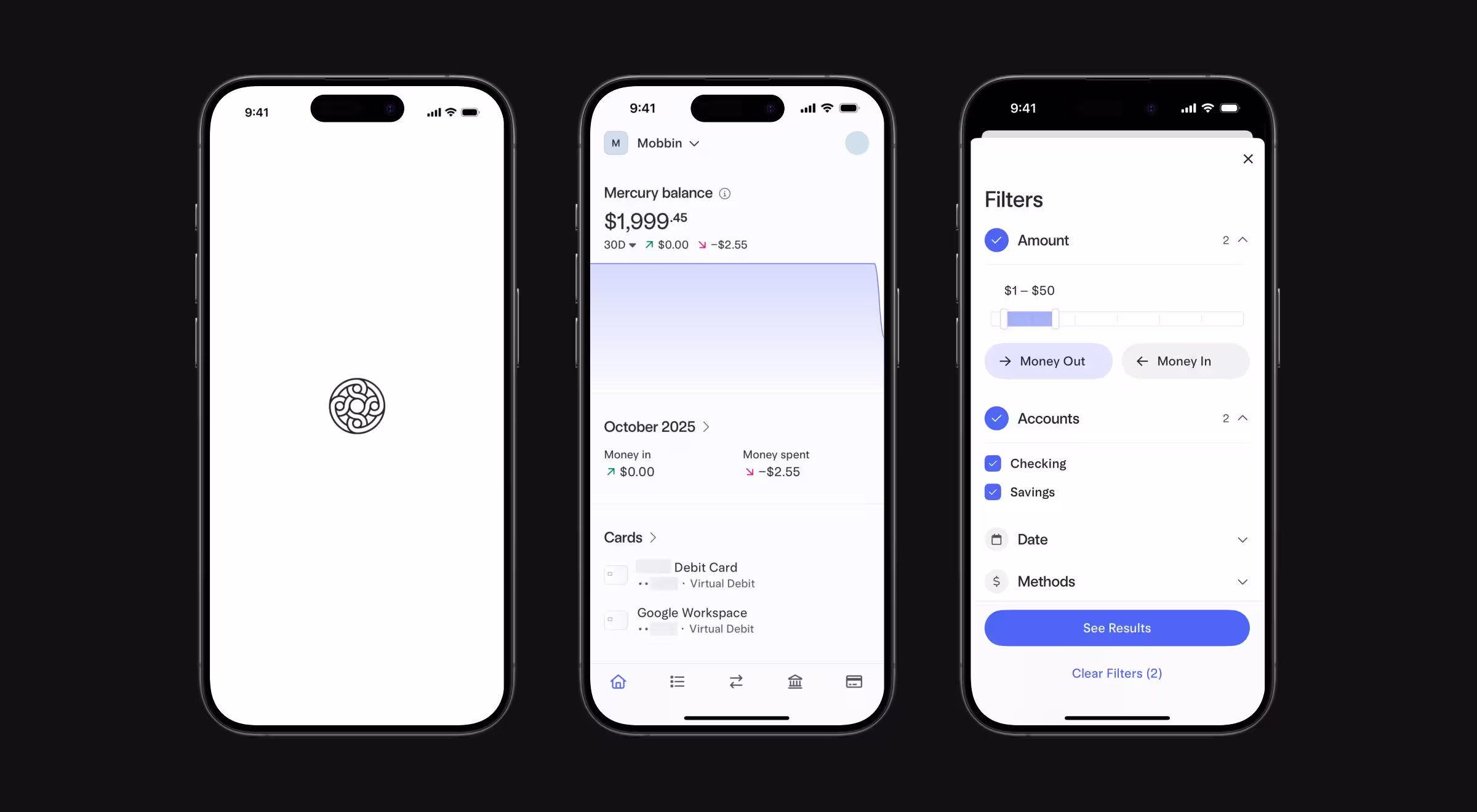
Core product decision: The product's defining feature is interface clarity. Account balance, transaction history, and team permissions are visible without layers of navigation. Mercury offers banking services for early-stage companies.
Design overview: Mercury's interface is architecturally minimal. Every element that would require a bank branch visit or a phone call in traditional banking becomes a self-serve action in Mercury's UI. For the target user, a technical founder who views banking as infrastructure, this is precisely the right call.
Lesson it teaches: Audience-specific design creates products which feel indispensable to the right user and invisible to the wrong one. Mercury is the best business banking app for early-stage founders, and it earns that position by refusing to be anything else.
"Mercury is a master class in audience definition as a design constraint. The product feels indispensable to a technical founder and completely invisible to everyone else and that is exactly right. When we work with fintech clients on B2B products, the first question we push them on is 'for whom does this feel obvious?' Mercury answered that question precisely."
{{Kirill Lazarev}}
✅ If users have to think, your UI is broken. Fix it with these UI principles.
Brex
Brex expanded from a corporate card into a spend management platform covering cards, expense management, bill pay, and business banking.
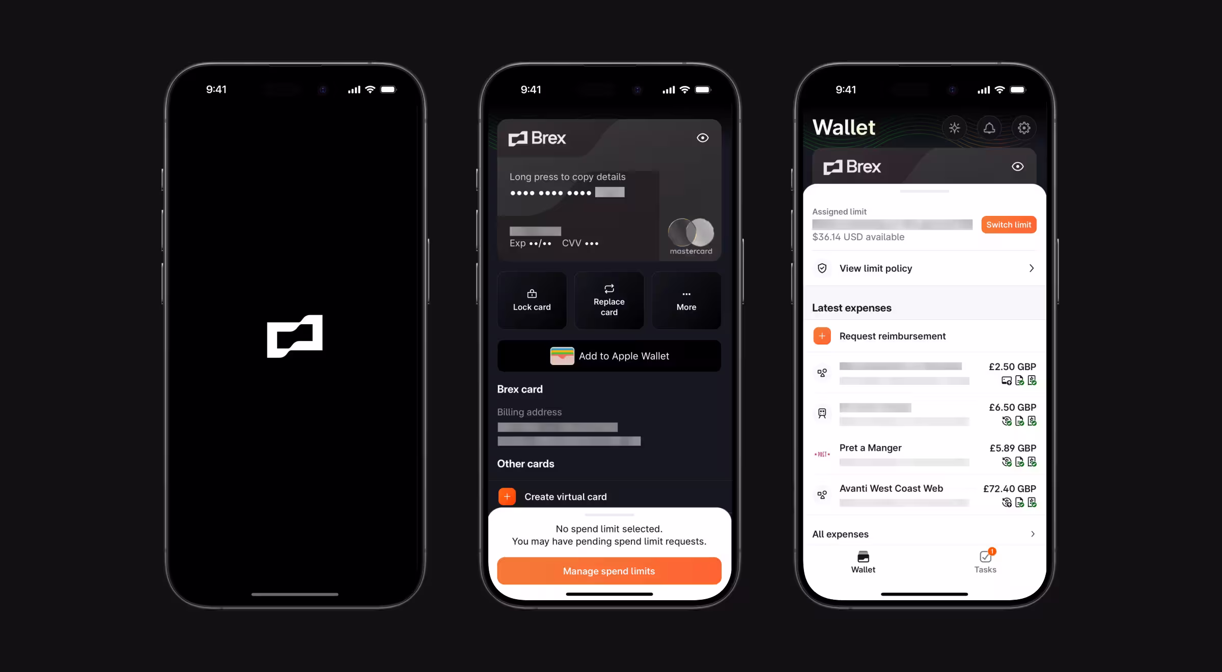
Core product decision: Brex's central design decision is policy enforcement without perceptible friction. A Brex card follows the finance team's rules automatically.
Design overview: The spend management dashboard separates cardholder experience from finance team controls without making either feel like a secondary view — a hallmark of strong financial dashboard design. Cardholders see their own transactions and limits. Finance teams see everything. The two interfaces serve completely different workflows and are designed accordingly.
Lesson it teaches: Policy and product experience are not opposites. The best fintech apps for enterprise teams make compliance invisible. If your spend management tool makes users feel controlled, the design is doing the wrong job.
📖 Read more about dashboard design principles in our article.
Spend management
Ramp
Ramp is a corporate card and spend management platform with an explicit goal of reducing company spend. The platform connects to existing bank accounts, issues cards with configurable limits, and surfaces analysis identifying redundant software subscriptions, unused licenses, and overspend relative to industry benchmarks.
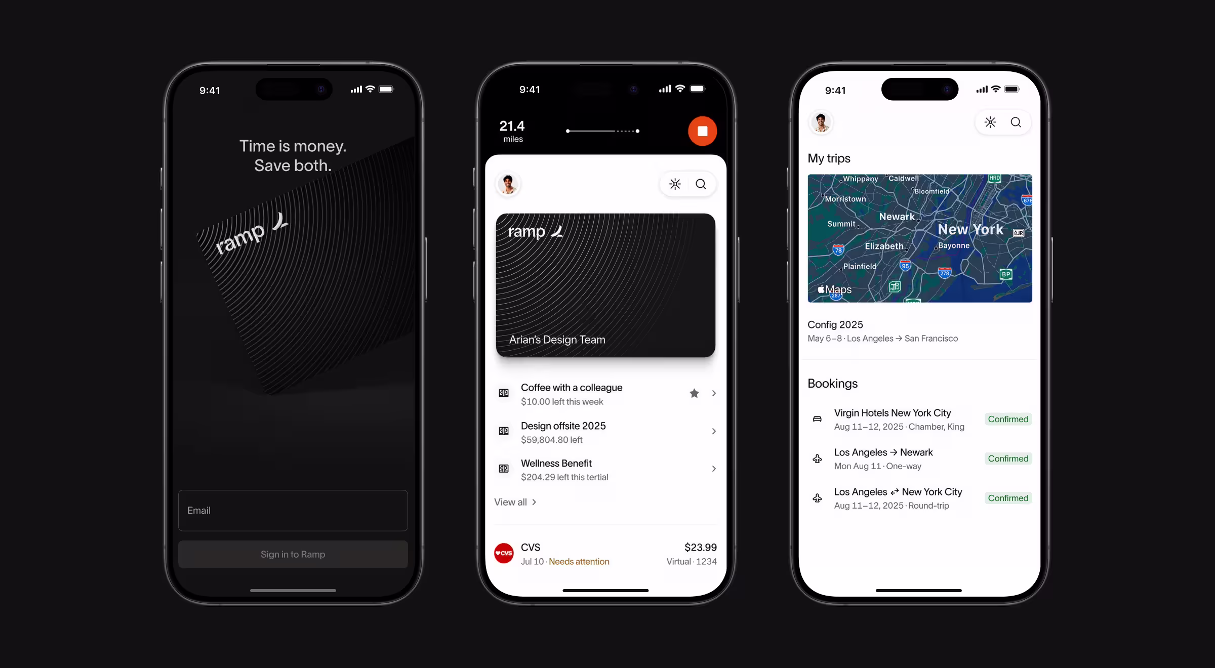
Core product decision: Where most spend management tools optimize for user engagement, Ramp inverts the incentive structure entirely. The platform surfaces opportunities to cancel tools and renegotiate contracts. For finance teams under pressure to demonstrate operational efficiency, Ramp's reporting layer does analytical work faster than a manual review of bank statements.
Design overview: Ramp's interface is built around the insight that data is most useful when it requires no interpretation. Savings opportunities are surfaced as action items. The visual hierarchy prioritizes variance, where is the company spending more than it should?
Lesson it teaches: Aligning your product's incentives with your customer's goals is a stronger retention strategy than any engagement mechanic. Ramp keeps customers because it makes finance teams look good.
"Ramp is the most interesting alignment story in fintech right now. The company makes money when you use the card, but the product actively tells you where to cut spending. That is a genuine tension, and they resolved it through design. When we advise clients on retention strategy, we keep coming back to this: nothing retains users like a transparent product, visibly on their side."
{{Oleksandr Koshytskyi}}
Investing and wealth management
Betterment
Betterment is an investment app for users who want exposure to diversified portfolios without selecting individual securities or exchange traded funds manually. Users set a financial goal and the platform allocates across low-cost index funds matched to the goal's time horizon and their risk tolerance.
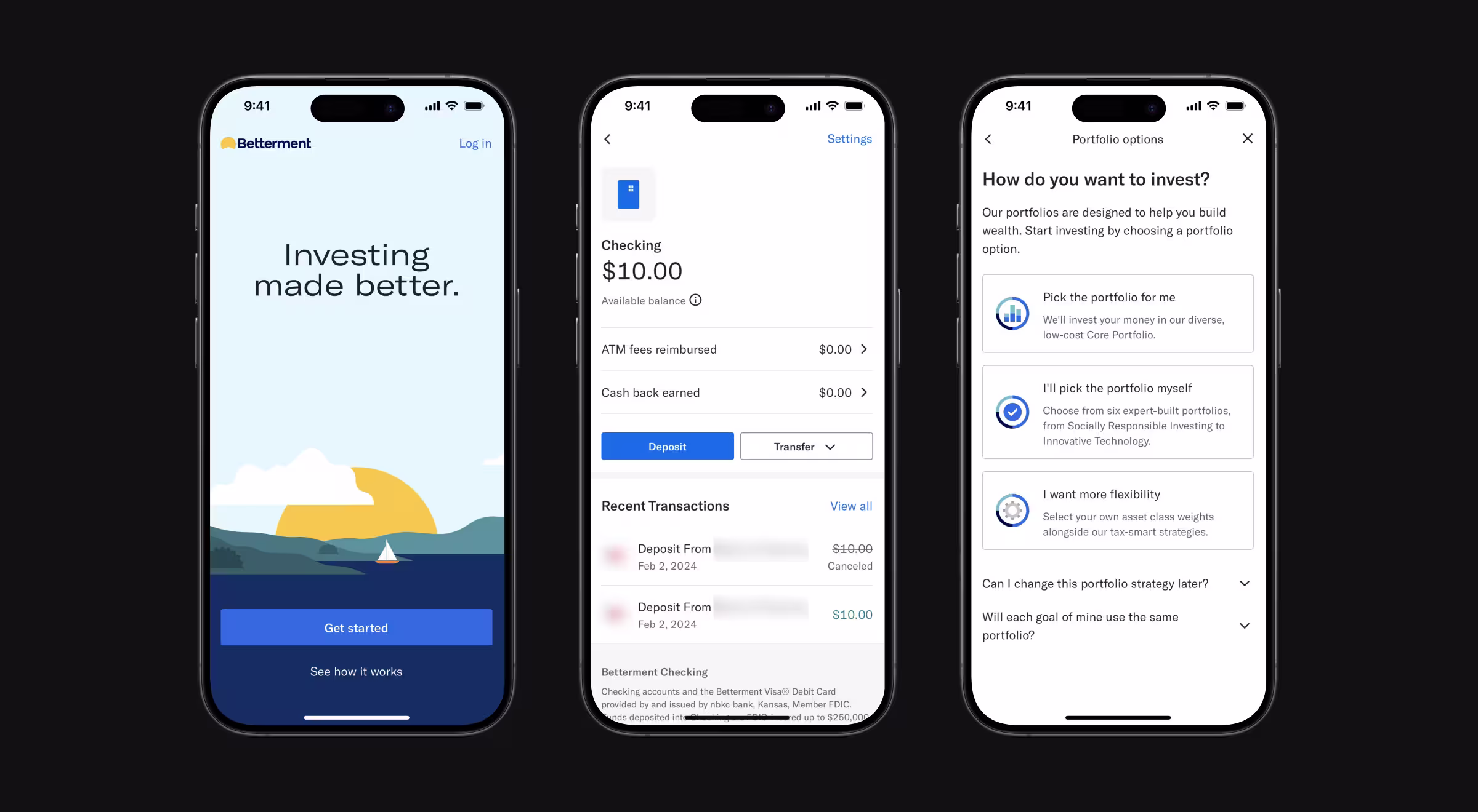
Core product decision: Betterment removes active decision-making from financial planning entirely. The product makes investing accessible to people who would otherwise leave money in a savings account because active investment decisions feel overwhelming.
Design overview: Betterment's goal-based interface is the product's most important design element. It shows them a financial goal and a progress bar. The investment decisions happen invisibly underneath. Commission fees are eliminated entirely, the cost structure is a flat annual percentage of assets under management, a transparent fee model in a category historically resistant to transparency.
Lesson it teaches: Reducing the number of decisions your user has to make is a form of product generosity. Betterment's growth came not from offering more features than competing investment apps but from offering fewer. For users without financial expertise, fewer decisions mean fewer reasons to abandon the platform.
Consumer banking
Chime
Chime is a mobile banking app built around eliminating traditional banking fees. Users get a spending account, an optional savings account with automatic round-up savings to the nearest dollar on everyday purchases, and early direct deposit access, with paychecks available up to two days before the standard clearing date.
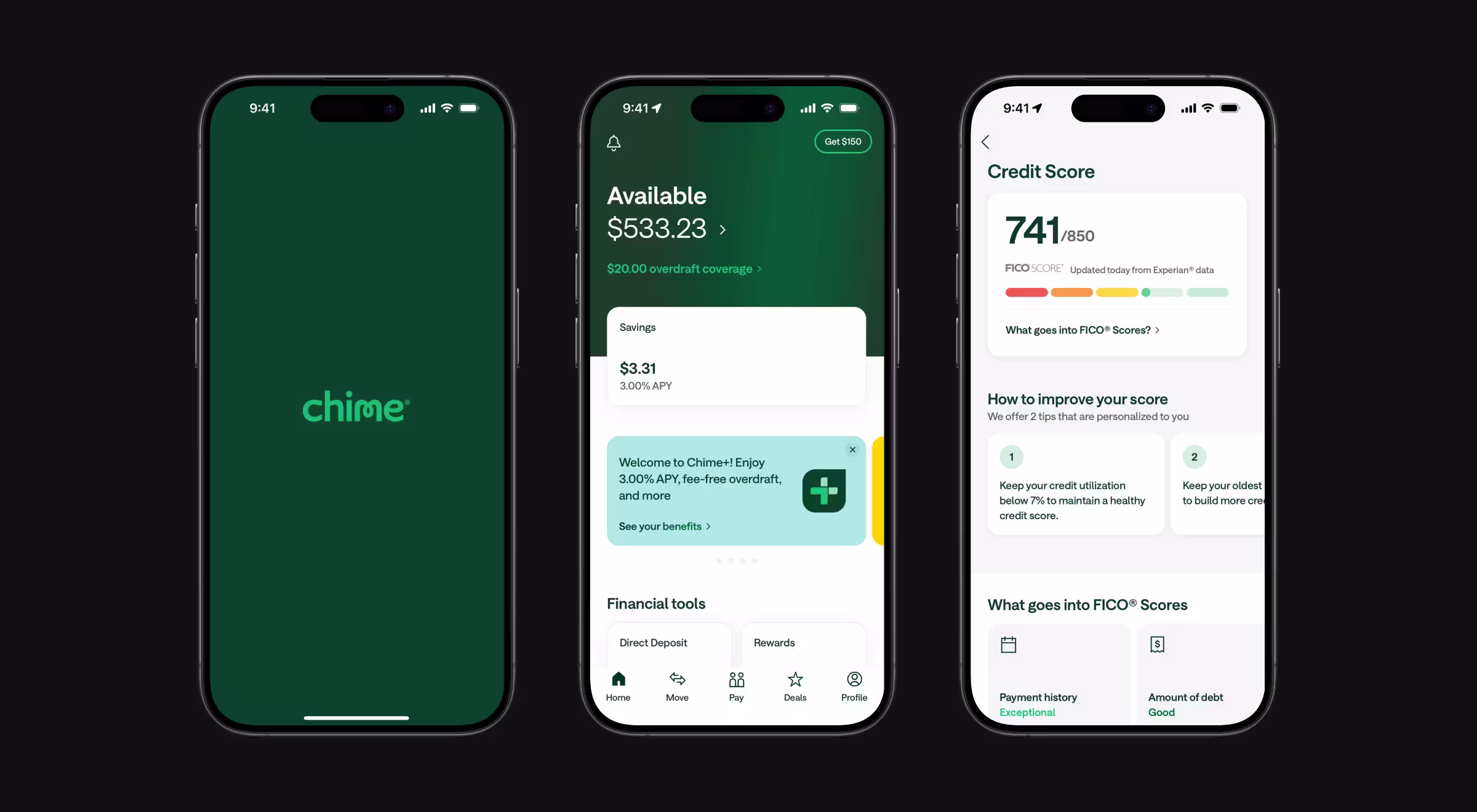
Core product decision: Chime's defining product decision is structural: remove the fee mechanics driving most consumer banking frustration. SpotMe covers eligible overdrafts up to a limit without a penalty fee. Chime's product feels like a categorically different offering.
Design overview: Chime's visual design is deliberately approachable: rounded forms, clear hierarchy. The tone throughout is the opposite of what traditional financial institutions use. Where a bank communicates authority and stability, Chime shows that it is on the same side as the user. This tonal decision reflects an accurate read of its audience: users who have felt penalized by banking services.
Lesson it teaches: Business model and product experience are the same thing. Chime eliminated the fee structure. If the product friction your users experience is structural, redesigning the interface will not fix it.
"We encounter clients who want us to fix a product, which frustrates users and the first thing we ask is whether the frustration is structural. If the fee model penalizes users for normal behavior, no amount of UI polish will fix it."
{{Kirill Lazarev}}
Kit by CommBank
Kit is CommBank's mobile banking app for children between 8 and 13. It teaches financial management through quests, visual savings goals, and chore-linked rewards without feeling like educational software.
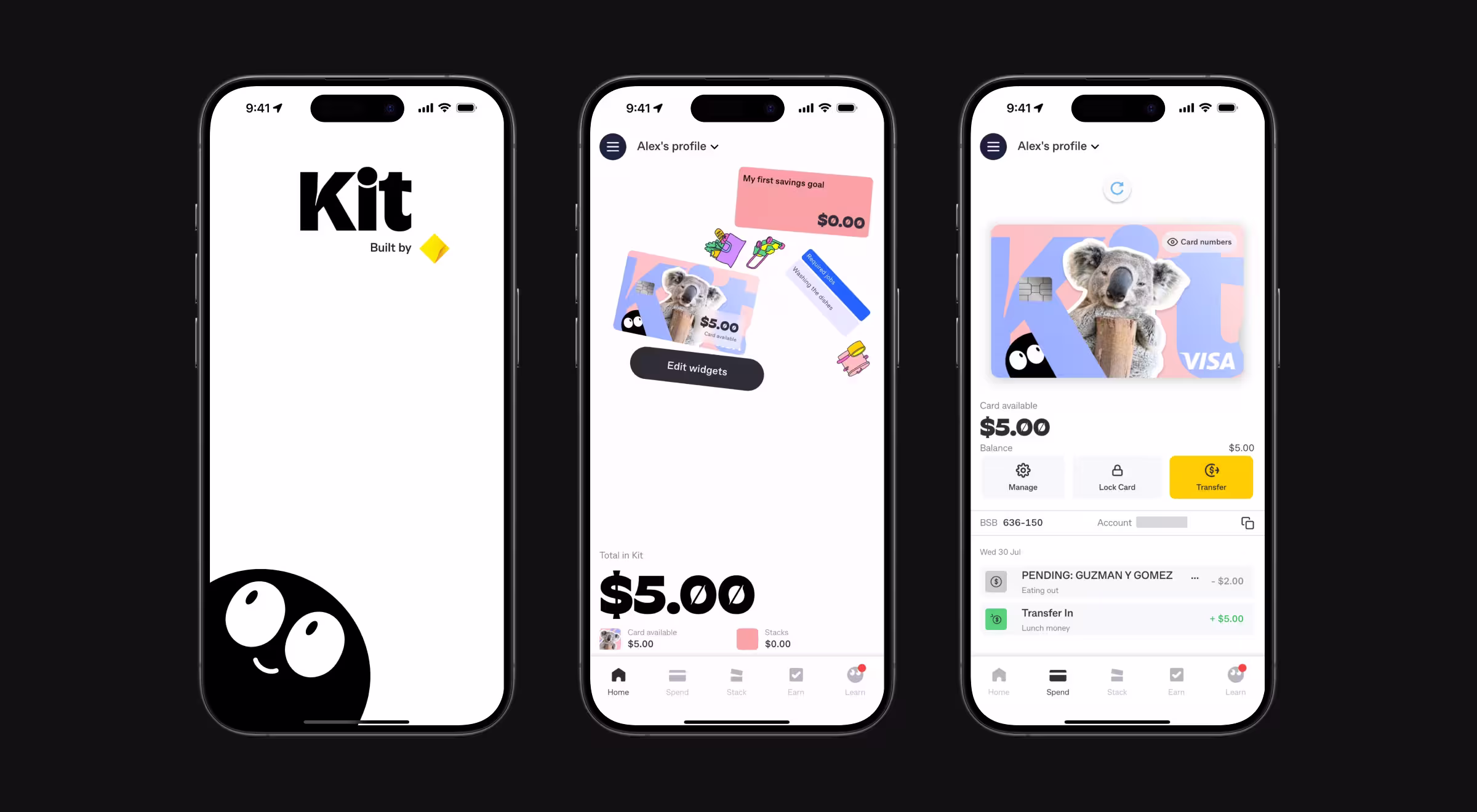
Core product decision: Kit's home screen is the product's sharpest design decision. Widgets shift and float as the device tilts, responding to the phone's gyroscope. The screen feels physical and interactive, something worth picking up and exploring.
Design overview: Savings goals appear as Stacks, animated containers where a water-rising animation shows progress toward a target. A child 40% of the way to saving for a skateboard sees a container 40% full of animated liquid. A percentage figure means little to a 10-year-old. A half-full container communicates progress instantly.
Parents access a separate interface called Boss Mode, visually restrained and functionally focused, where they set spending limits, block merchant categories, and monitor financial activity without interrupting the child's experience. Two completely different UIs running on the same underlying account data.
Lesson it teaches: User research defines what "intuitive" means, which is why a rigorous product discovery process comes before any interface decision. An interface that is intuitive for an adult finance professional is not intuitive for a 10-year-old. Kit succeeded by refusing to default to what a banking app is supposed to look like and instead designing for what its specific user actually responds to.
What the strongest fintech apps get right
Two patterns hold across all ten products.
- Solve one workflow before expanding into other financial activities. Wise transferred money internationally before adding multi-currency accounts. Cash App processed peer-to-peer payments before adding investing and cash advances. Brex issued corporate cards before adding expense management and bill pay. Expansion followed mastery, never preceded it.
- Make the regulatory compliance layer invisible to the end user without hiding it. Betterment handles SEC-regulated investment management without exposing users to the framework underneath. Wise handles currency regulations across dozens of jurisdictions without the user seeing any of it. The compliance work is real, but the user doesn't interact with it directly.
Your fintech product should earn a place on a list like this
The apps above made complex financial activities feel obvious to the right user. If your product isn't achieving the same, the design layer needs work and we're ready to look at it.
Lazarev.agency, an AI product design agency for fintech, created 500+ digital products for B2B teams who need the highest level of clarity.
We work with payments infrastructure, lending, treasury, and AI-driven financial tools, with the majority of our clients building for the US market. San Francisco and Bay Area product teams make up a significant share of our client base, and the standard there is high.
If your fintech product is technically solid but losing users at adoption, give us a call to finally solve it.


.webp)


.avif)