Most dashboards are built to inform. Financial dashboards are built to be trusted.
A marketing dashboard can afford to be slightly confusing, because no one loses money if a chart takes a second longer to understand. A financial dashboard doesn’t have such a luxury. When users second-guess or misread a signal, they delay critical decisions and, if the experience has put them down in any respect whatsoever, move their capital elsewhere.
In financial products, design is how you convey trust. Every number and every interaction either reinforces or erases it.
A well-designed financial dashboard doesn’t show everything at once. Instead, it guides users toward well-informed, confident action. It surfaces actionable insights the moment they matter and makes complex financial information feel understandable.
In this article, we explore in detail how to approach financial dashboard design so it becomes a reason for users to stay and engage more deeply with your product.
Key takeaways
- The dashboard is the product. In fintech, users operate through the dashboard. If it doesn’t guide action, the product feels incomplete.
- Data without structure creates hesitation. Dashboards shine on data, but dim when users can’t tell what matters now or what to do next.
- High-stakes environments demand predictability. When users manage money, every interaction must be reliable and interpretable. Otherwise, trust drops fast.
- Dashboard design shapes your brand identity. Choosing the right fintech design partner determines whether your product merely surfaces data or drives key decisions.
Growing importance of financial dashboard design: how it affects your product performance
“Over the last decade, fintech has evolved from a niche category into the core of the global financial system. What began as a wave of startups is now a highly competitive market of platforms fighting for user attention. Meanwhile, user behavior has shifted just as dramatically. Financial decisions that once happened offline are now made through interfaces.
Hence, treating the dashboard as a design feature is increasingly obsolete. With stakes this high, the dashboard itself is the product.”
{{Kirill Lazarev}}
Building financial dashboards is therefore not about arranging charts or displaying important metrics.
Think of it as a deliberate process of structuring financial data into a user friendly interface. It combines strategic data visualization, intentional information architecture, UI design principles, and system logic into a single environment.
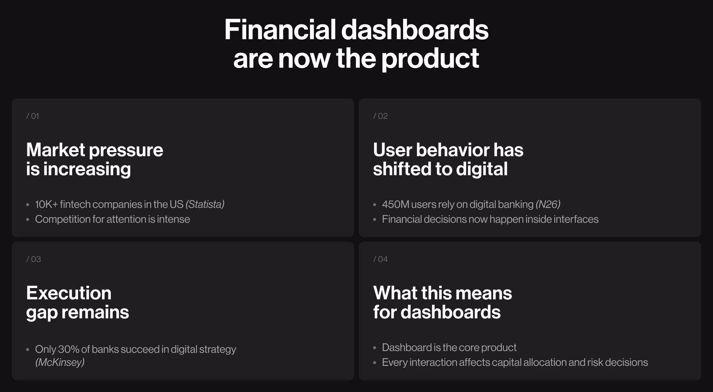
The scale of this transformation becomes clearer with the numbers:
- Statista reports that the US alone has over 10k fintech companies, signaling intense competition across the market.
- According to N26, 23% of the global population, which is around 450 million people, now use digital bank accounts.
- Findings from McKinsey research correlate digital transformation in banking with a great potential to improve user acquisition and operational efficiency, yet only 30% of banks successfully implement their digital strategy.
These numbers show the rising expectations for product experience — expectations that continue to grow with the advancement of AI tech.
This pressure is especially pronounced for financial dashboards. Unlike standard dashboards, they operate in high-stakes environments. There, users interact with the fintech products to allocate capital and manage risk. Every click has consequences.
Dashboard examples for different fintech products
Most financial dashboards look similar at first glance. There you’ve got charts, graphs, key metrics, analysis snapshots, and filters. But under the hood, how fintech products operate depends on the decisions they’re built to support.
This section exposes those differences using real product work. We draw directly from Lazarev.agency’s experience designing fintech, Web3, and AI-driven platforms.
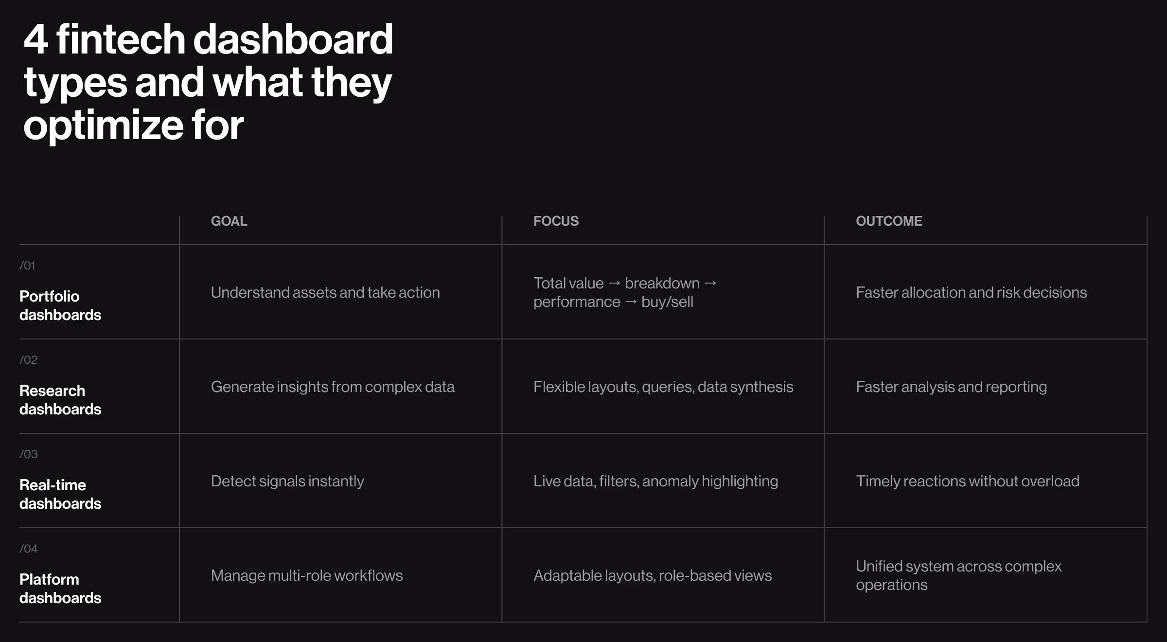
1. Portfolio and asset management dashboards
This cluster of dashboards helps users understand what they own, how it performs, and what to do next. The challenge lies in balancing breadth (multiple assets, metrics, timeframes) with clarity.
What makes them unique:
- Multi-asset visibility across accounts and instruments
- Continuous tracking of key performance indicators
- Decision-making tied to allocation and risk exposure
🧩 Design priorities:
- Clear hierarchy of total value → asset breakdown → performance trends
- Modular structure to group related data without overwhelming the user
- Immediate access to key actions (buy, sell, rebalance)
- Real-time updates to reinforce reliability
Case in point: EllipX — a European crypto-finance platform — combined exchange, wallet, and fiat operations into a single product. The core problem was its dashboard treated all data equally. Users were exposed to fragmented charts and scattered metrics, with no clear entry point for action.
Our team restructured the EllipX dashboard into a modular, widget-based system. The interface grouped key information into logical blocks (portfolio overview, asset distribution, performance insights), so users could immediately understand both their position and their next move.
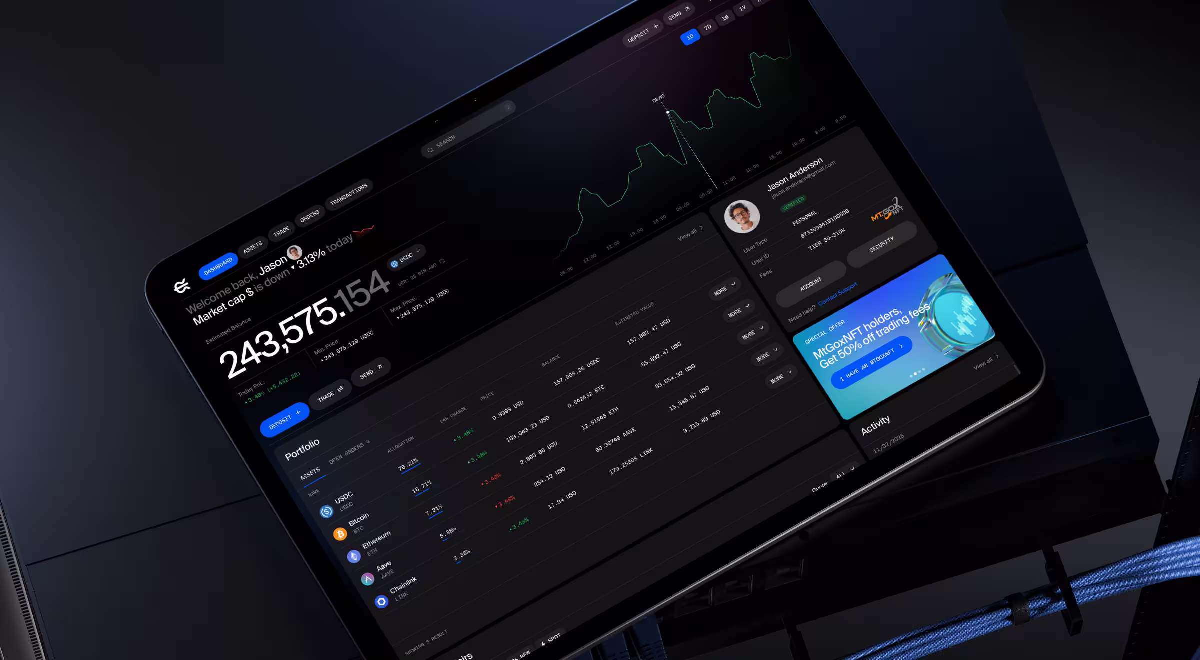
This shift introduced two critical changes:
- From passive display to active guidance — users could immediately identify what required attention.
- From density to structure — the same amount of data became easier to interpret.
As a result, the EllipX dashboard became a daily-use environment rather than a static overview, improving retention and user confidence.
2. Market intelligence and research dashboards
These dashboards support users who need to interpret large volumes of financial data. The primary target audience includes financial analysts, investors, and research teams. The key pain point for these users (and a unique task for dashboard design) is data synthesis.
What makes them unique:
- High data density across multiple sources
- Non-linear workflows (exploration, comparison, reporting)
- Need for both automation and control
🧩 Design priorities:
- Flexible layouts that support multiple workflows
- Integration of structured data (charts, tables) with unstructured inputs (queries, notes)
- Context-aware interfaces that adapt to user intent
- Smooth transition from research to output (reports, insights)
Case in point: Accern’s product Rhea relied on AI to generate financial insights, but traditional dashboard structures couldn’t support the flexibility of research workflows.
Lazarev.agency developed a hybrid interface combining prompt-driven interaction with dynamic widgets. The revamped UI featured these conceptual changes:
- The system surfaces charts, references, and controls based on user queries
- The input field was transformed into a multifunctional command line
- A split-screen layout enabled simultaneous exploration and output generation
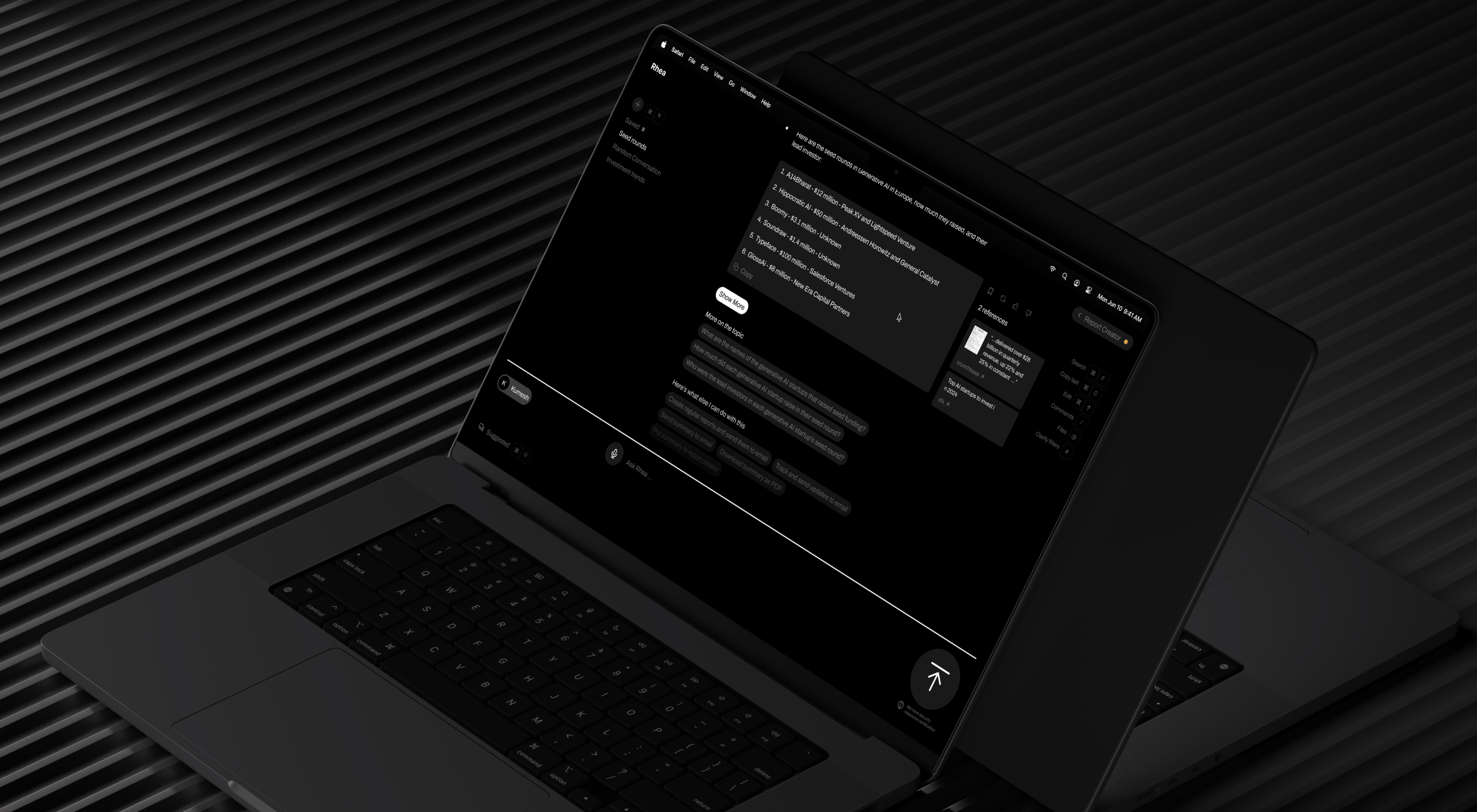
Accern.Rhea redesign fundamentally changed how users interacted with data:
- From navigation to interaction — users no longer searched for insights, they generated them.
- From static dashboards to adaptive systems — the interface evolved with each query, which is the perfect example of a user generated use case framework.
The result was a more efficient research process and a product structure aligned with how financial analysis actually happens.
🔍 Explore core principles of AI dashboard design in our Lead Designer’s expert blog.
3. Real-time monitoring dashboards
These dashboards are built for environments where timing matters. Think of trading platforms and market tracking tools. Their primary goal is to help users detect signals quickly without being overwhelmed by the abundance of data.
What makes them unique:
- Continuous data streams
- High urgency in decision-making
- Need to filter relevance in real time
🧩 Design priorities:
- Clear separation between informative signals and background data
- Live updates without disrupting user focus
- Customizable filters and views
- Visual cues to highlight anomalies or changes
Case in point: Blockbeat aggregates crypto news and market data into a high-density information environment. Without structure, users would struggle to identify relevant signals.
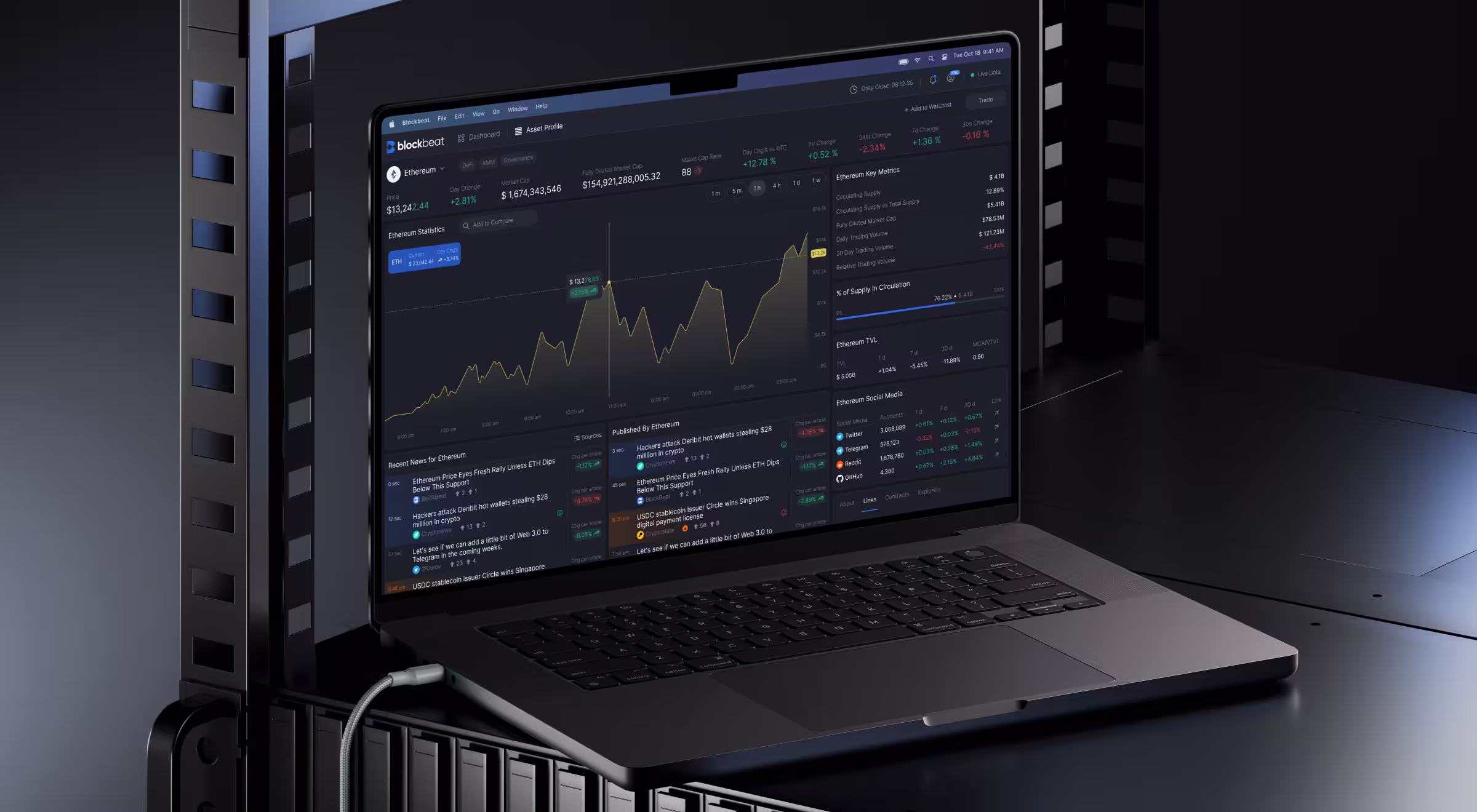
Our team organized Blockbeat’s dashboard into three coordinated zones:
- A continuously updating news feed
- A central reading and analysis area
- A sidebar with market stats and personalized watchlists
To manage information overload, we introduced:
- Advanced filtering options for personalized feeds
- A pause function to let users stop and analyze incoming data
- Customizable market stats widgets for quick interpretation
The redesign shifted the experience from reactive consumption to controlled analysis. Now, users can control how and when information enters their decision process.
4. Ecosystem or platform dashboards
These dashboards serve complex platforms with multiple user roles (developers, partners, investors). The challenge is to unify these experiences without fragmenting the interface.
What makes them unique:
- Multi-role environments (customers, operators, organizations)
- High variability in workflows and user needs
- A combination of transactional, operational, and analytical layers
🧩 Design priorities:
- Flexible architecture adaptive to different user roles
- Clear separation of workflows without duplicating systems
- Customizable dashboard components (widgets, reports, views)
- Simplified navigation across complex processes
Case in point: Tratta’s Collect platform aimed to make debt settlement understandable, but its interface yielded quite the opposite effect. Users struggled with navigation and overwhelming transaction flows.
We restructured the system across 3 key areas:
- Simplified payment flows: Introduced flexible options (full, partial, plans) and added clear transaction summaries.
- Separated user journeys: Enabled guest payments for quick actions and account-based flows for advanced use cases.
- Built a customizable admin dashboard (Console): Centralized operations (debtor management, transactions) into a flexible, widget-based system.
Additionally, reporting was redesigned to be fully customizable, giving users control over how they view and act on financial data.
Core principles of high-performing financial dashboard design
In fintech environments, users deal with time constraints and constant exposure to financial risk. Add to that the cognitive load of navigating large volumes of data, and there you have it — a context where minor friction might lead to costly mistakes.
With fintech platforms, users often feel like their critical thinking must be in full swing at all times. If your product only reinforces such an assumption, it has already missed the point.
Your product should make users feel at ease. The principles below define how to achieve strategic design architecture.
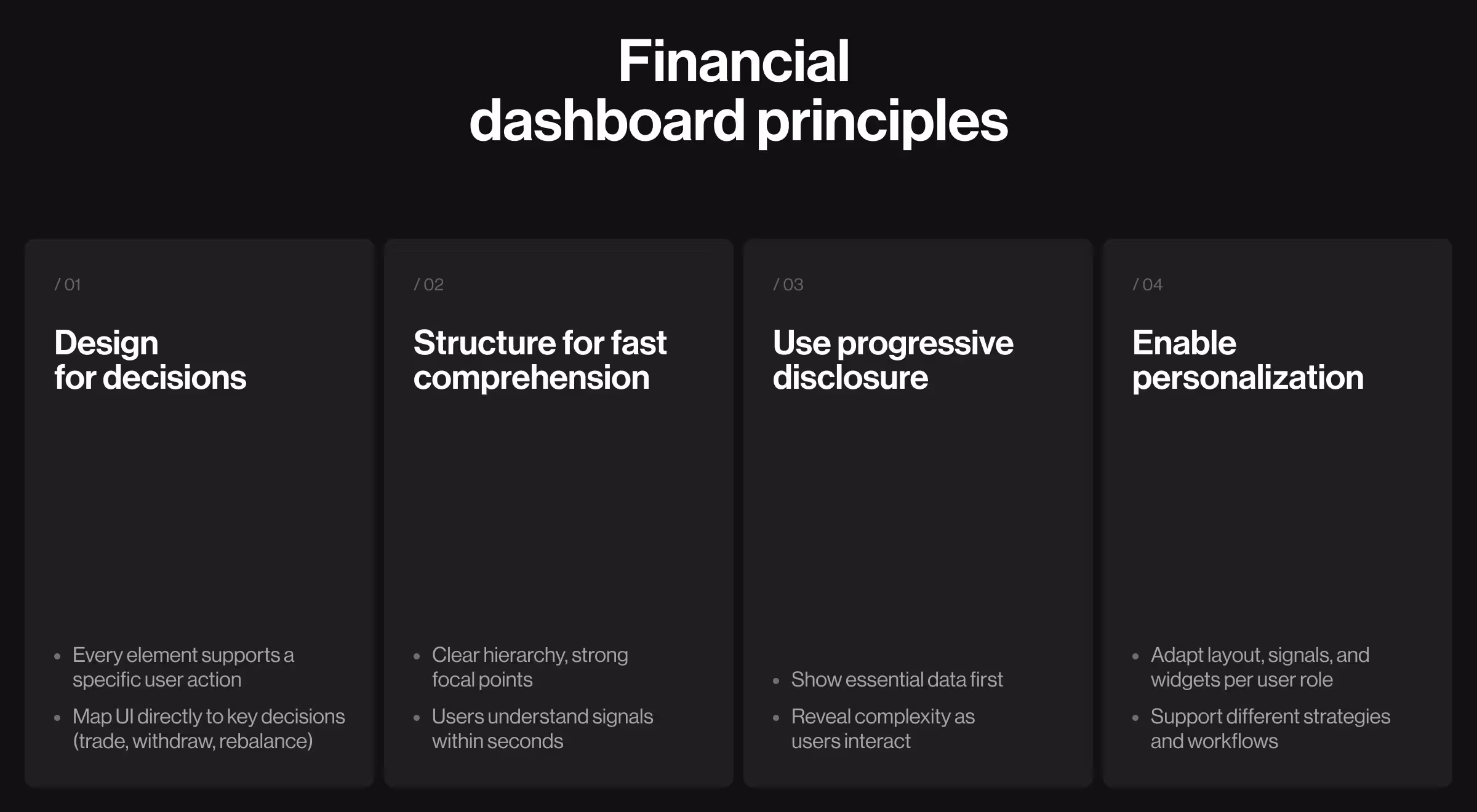
1. Prioritize user decisions
A dashboard is a decision surface. Every element must justify its existence by influencing an action.
Where this breaks:
- Trading UIs overloaded with indicators no one acts on
- Banking apps showing metrics without clear next steps
In each case, the user sees data but still has to figure out what to do with it.
How to apply it:
- Start with user research: what decisions do users make daily? Where do they hesitate or abandon actions?
- Define 3 core decisions per persona, e.g., “enter position,” “withdraw funds,” “rebalance assets”.
- Map one primary UI element to each decision.
2. Structure for cognitive speed
Users treat dashboards as opportunities to resolve uncertainty. The interface must reduce the gap between seeing and understanding your product to near zero.
Where this breaks:
- Flat layouts with no hierarchy
- Multiple competing focal points
- Critical signals buried in secondary zones
In these cases, users struggle with navigating the interface.
How to apply it:
- Run a design audit: identify where users spend time searching and detect repeated scanning patterns.
- Align layout with how different personas scan: executives → top-level summaries, and traders → real time data signals.
3. Use progressive disclosure
Financial products are dense. Interfaces shouldn’t be. Exposing the full complexity of the system upfront does nothing but force users to translate the structure before moving forward.
Where this breaks:
- Advanced tools shown by default
- Dense tables with no entry point
- Interfaces designed for experts and offered to everyone
How to apply it:
- Build UX personas based on experience level (novice or expert) and decision frequency (daily or occasional).
- Define what each persona sees first and what shall be preserved for further interactions.
- Use progressive disclosure: show a simplified default view and reveal more detailed information only as users interact.
4. Enable personalization at scale
A fixed dashboard assumes uniform behavior. Financial users are anything but uniform. Relevance is what keeps dashboards open.
Where this breaks:
- Same layout for novice and expert users
- Static data feeds, regardless of strategy
- No control over signal density
How to apply it:
- Define persona-specific priorities: traders want to spot early signs of data volatility (alerts, notifications), whereas investors look for broader performance-related perspectives (reports).
- Allow users to customize widgets and filter data streams.
- Validate personalization features through usage data.
Finding an expert design team is your first step to building financial dashboards the right way
Weak dashboards expose data and leave users to figure things out. Strong dashboards guide attention and make decisions feel obvious.
This strategic difference comes from how the system is designed, and it's a big part of why design is a revenue driver.
At Lazarev.agency, an AI product design agency for fintech products, we treat financial products as decision environments where every interaction must reinforce trust. If your dashboard feels heavy or slow, it’s a design problem calling for resolution.
Have a look at our portfolio to see how we approach fintech and AI product design. Reach out to our team for an expert consultation to discuss actionable strategies for making your fintech product thrive.


.webp)