

The crypto wallet market is broken. Most mobile app design teams build for either beginners or advanced traders, never both.
Newcomers download an app, see "seed phrase" and "gas fees," get confused, delete within 48 hours. Meanwhile, experienced traders bounce because these same "beginner-friendly" wallets lack portfolio tracking, cross-chain support, or real transaction monitoring. The industry splits into two camps:
- Dumbed-down wallets missing critical features
- Complex wallets that scare away 90% of potential users
Nobody bridges this gap. Which is wild, because the majority of cryptocurrencies listed on tracking platforms have failed as of early 2026. If your wallet loses half its users in the first week, you're heading toward that same statistic.
In this article, we break down our crypto wallet UX experience, designing for beginners and pros without sacrificing features.
Key takeaways
- Jargon decreases retention. Replacing "seed phrase" with "recovery code" and "gas fees" with "network fees" improved onboarding completion, plain language is designing for reality.
- Asset pages drive decisions. Adding market trends, performance tracking, and curated news turned Dollet's asset pages into the easily used section.
- Portfolio consolidation wins professionals. Cross-account aggregation, profit/loss tracking, and fast inter-wallet transfers solved the multi-account issue that pushed experienced traders elsewhere.
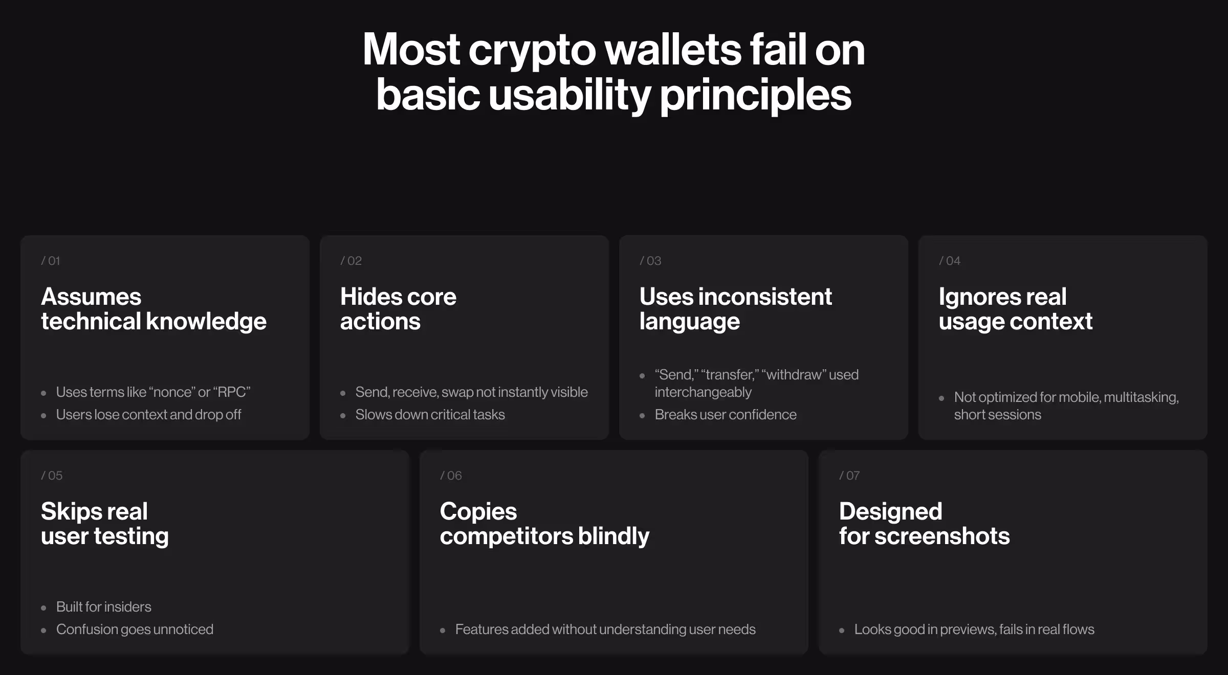
Where crypto wallet design consistently fails?
After working with crypto products, our AI design agency found clear patterns that cause failures (many of them rooted in weak AI UX design fundamentals):
- Assuming blockchain knowledge. "Nonce," "RPC endpoints," "EIP-1559", your users aren't Ethereum developers. The moment someone has to Google a term inside your app, you've already lost them.
- Burying core features in menus. Send, receive, swap are primary action. If users can't find them in three seconds, they won't look for four.
- Inconsistent terminology. "Send" on one screen, "transfer" on the next, "withdraw" somewhere else. Confusion destroys their confidence entirely.
- Forgetting mobile context. Nobody opens a crypto wallet at a desk with full focus. They're commuting, waiting in line, multitasking and your interface wasn't built for any of that.
- Skipping user testing. Your development team knows the product too well to see its flaws. The confusion of someone who has never seen your app reveals exactly what you're blind to.
- Copying competitors without understanding why. A feature existing elsewhere doesn't mean your users need it. Building without research means building the wrong thing, confidently.
- Optimizing for app store screenshots. Screenshots are static. Real experience flows and no one stays for a product that looks great in previews but breaks in practice.
How UX research guided our crypto wallet design process
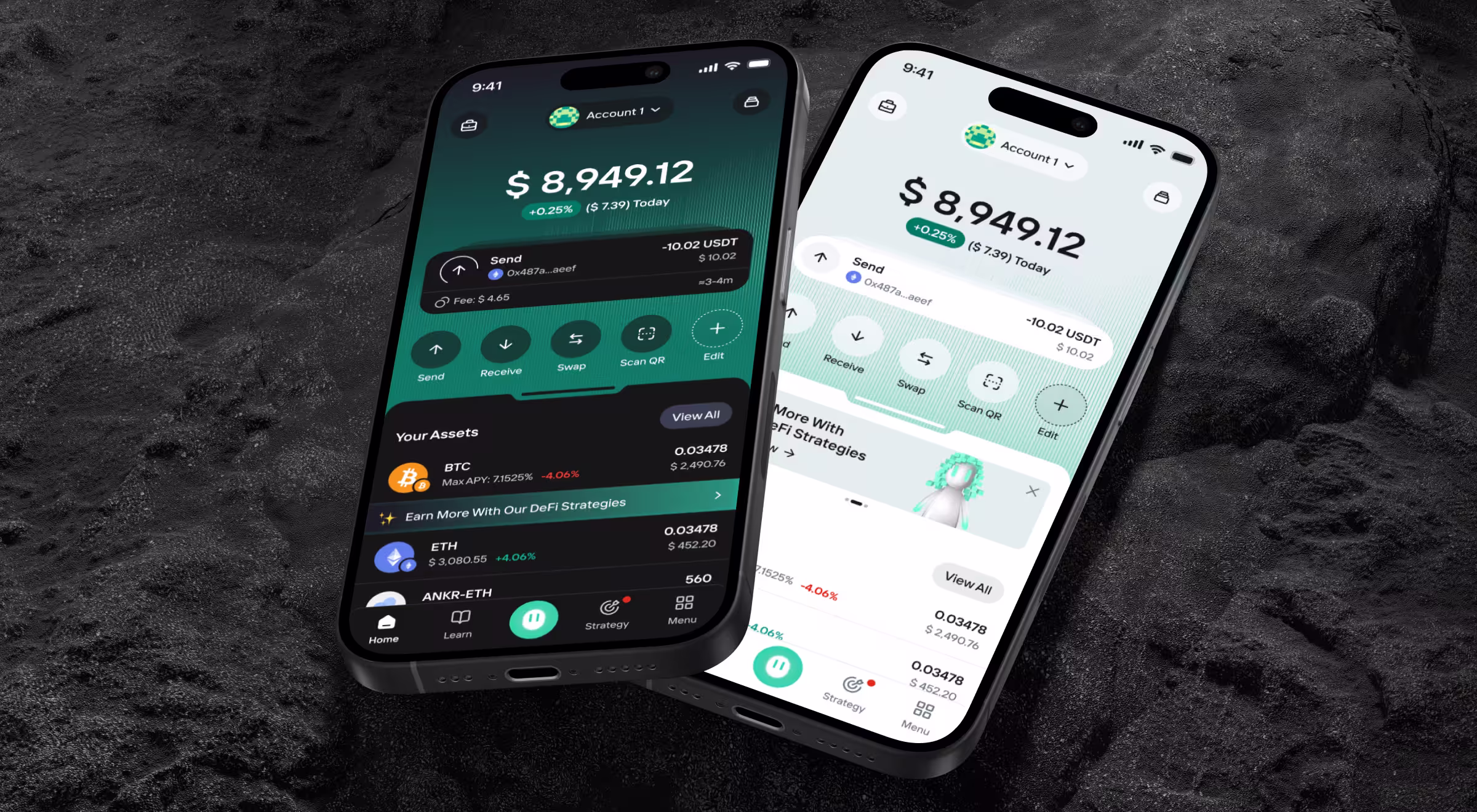
Dollet Wallet, a Web3 finance app, struggled to serve both beginners and experienced traders. They partnered with us to fully redesign their crypto wallet from the ground up.
Before touching any design tools, we run global UX research with 1,600 participants across three user groups: crypto newcomers, beginners, and experienced traders.
Our goal was to create a wallet that serves the mass market without sacrificing the advanced functionality professionals rely on.
"Research shows that what you assume is obvious breaks for 80% of users. Every team thinks their interface makes sense until you watch someone struggle for 10 minutes trying to send money."
{{Oleksandr Koshytskyi}}
The data contradicted everything the industry assumes about crypto wallet users:
This shaped every decision. Screen layouts. Word choices. Button placements. Nothing got designed without user data backing it.
3 reasons why onboarding destroys retention in crypto wallet app design based on the Dollet Wallet case
Week one decides if your wallet survives. Our research proved this.
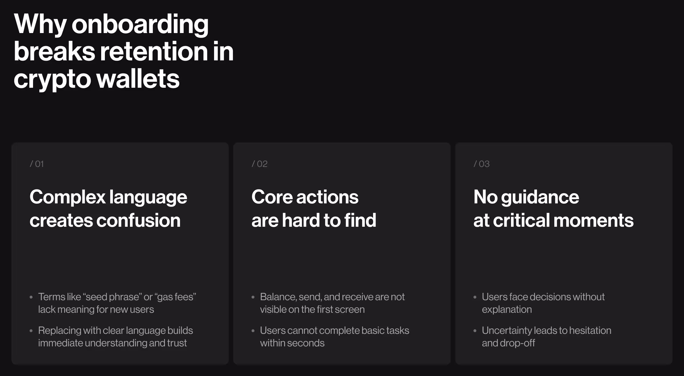
Problem 1: Jargon nobody understands
"Seed phrase." "Private key." "Gas optimization." "Slippage tolerance."
These terms mean nothing to someone downloading their first crypto wallet. Yet every app throws this language at users immediately, assumes they'll figure it out, wonders why retention tanks. We replaced every piece of jargon in Dollet:
- "Seed phrase" → "Recovery code"
- "Gas fees" → "Network fees"
- "Slippage tolerance" → "Price flexibility"
✅ Pro tip: Always test your terminology with real users before launch. If more than one person asks “What does this mean?” you need to simplify it. Clear language early prevents drop-offs and builds trust.
Problem 2: Hidden core functionality
Your balance is buried three taps deep. Send/receive buttons hide in menus. Transaction history requires navigation through multiple screens.
Users download a wallet to store and move money. If they can't immediately see their balance or find the send button, they leave. We redesigned Dollet's home screen to answer three questions instantly:
- How much money do I have? (Large, clear balance)
- What happened recently? (Transaction widgets)
- What should I do next? (Contextual quick actions)
🔎 Curious how we simplify blockchain interfaces and boost usability? Check out our full approach to blockchain UI/UX design here and see how thoughtful design improves user outcomes.
Problem 3: No guidance at decision points
"Should I back up my wallet now or later?"
"Which network do I use for this transfer?"
"Is this address format correct?"
Beginners hit these moments and freeze. They get no help or explanation. Just anxiety that one wrong choice means losing their money forever.
We added contextual tips in Dollet exactly when users need them. Just-in-time guidance at moments of confusion.
What happened after we redesigned Dollet
In a market where 53.2% projects fail, design quality is a survival advantage, and numbers prove this point.
🔎 Want to see how we crafted the mobile experience behind every one of these outcomes? Explore more about the Dollet Wallet case on Dribbble.
What really works in crypto wallet design?
Based on our Dollet redesign and 10+ years designing Web3 products, we have gathered pro tips for retention numbers.
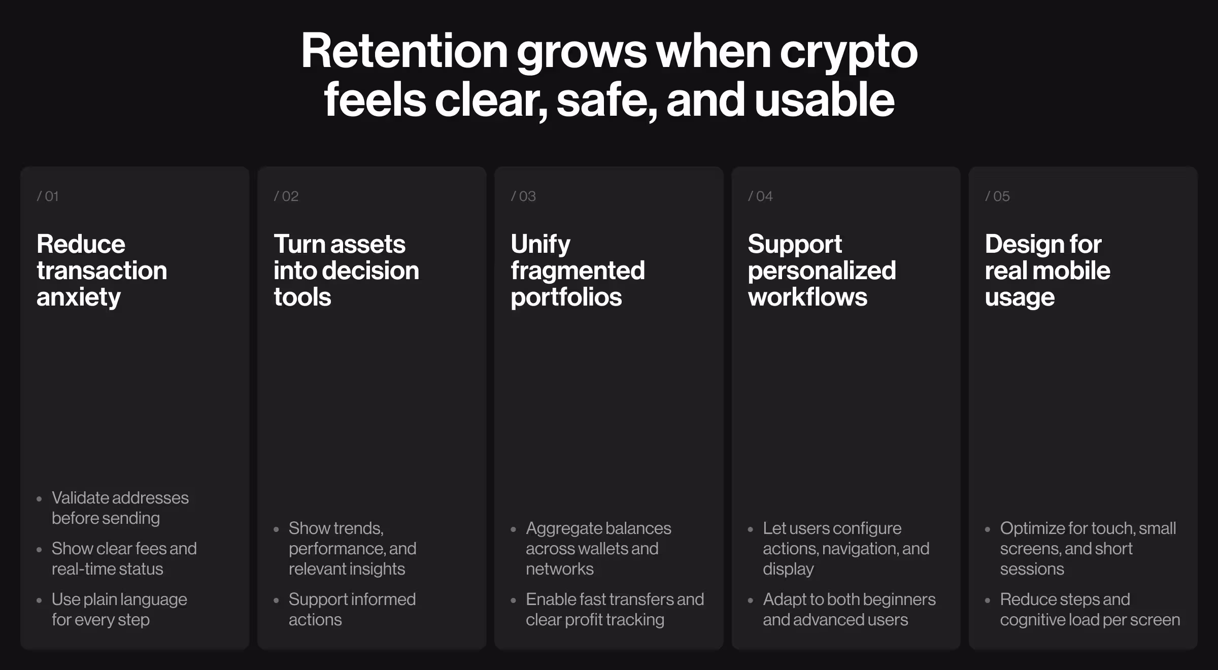
Make transactions less terrifying
Sending crypto scares beginners. One wrong address = permanent loss. This fear decreases usage. We built transaction flows to reduce anxiety:
- Address validation before confirmation (catches wrong network, invalid format)
- Clear fee breakdown in the user's preferred currency (no surprise costs)
- Real-time transaction status without leaving main screen (users see "pending," "confirming," "completed")
- Plain language for every state (no "awaiting block confirmation" nonsense)
Transaction volume among beginners increased after redesign, because it got less scary.
💡 Pro tip: Highlight errors and confirmations visually. Users process mistakes faster when you combine clear messaging with color cues, icons, or microanimations. It reduces fear and boosts successful transactions.
Turn asset pages into decision tools
Most wallets show assets like spreadsheet rows. Coin name → Balance → Percentage change. This is a terrible design, because it is making crypto management way harder than it is supposed to be. We rebuilt Dollet asset pages as information hubs:
- Market data with price trends and volume
- Performance tracking across multiple timeframes
- Curated news filtered by specific coin relevance
- Strategy suggestions based on current market conditions
🔎 Want to learn more about Web3 website design? Then check our breakdown on how to create next-gen Web3 design and simplify blockchain UX.
Solve the multi-account nightmare
Professional traders manage crypto across six wallets, four networks, two exchanges. Checking total holdings means opening everything, doing mental math, maintaining spreadsheets. We built Dollet's Portfolio section consolidating:
- Cross-account balance aggregation (see everything in one place)
- Profit/loss tracking per wallet and per asset
- Fast transfers between accounts (no app switching)
- Network switching for different blockchains
Let users configure their own workflow
Day traders need different tools than long-term holders. Forcing identical interfaces on everyone frustrates both groups. We added customization in Dollet:
- Quick actions users configure based on what they do most
- Navigation personalization hiding unused features
- Display currency switching between fiat and crypto values
- Theme selection for visual preference
💡 Pro tip: Offer guided defaults for new users, then let them personalize over time. This way, beginners aren’t overwhelmed, and power users can optimize workflows, boosting retention across the board.
Design for mobile because that's where crypto happens
Desktop wallet assumptions break on phones:
- No hover states
- Limited screen real estate
- Distracted usage context (checking while commuting, waiting, multitasking)
- Touch targets instead of mouse precision
We optimized Dollet for thumb-zone interactions, simplified multi-step flows, and reduced cognitive load per screen. Mobile completion rates matched desktop because we designed for actual usage patterns.
What's next for crypto wallets
According to Grand Review Research, Web 3.0 market size is projected to reach USD 33.53 billion by 2030. So, more people will enter crypto needing tools that don't require a computer science degree. Winning wallets will understand users want to:
- Store value safely
- Send money without anxiety
- Track portfolio performance
- Understand their holdings
- Access everything when needed
The design challenge is hiding technical complexity while providing professional functionality. Dollet proved this works. Mass market and power users coexist when you serve both thoughtfully instead of picking one.
"The future is progressive disclosure. Show simple by default. Reveal complexity when users need it. Everyone wins."
{{Kirill Lazarev}}
Stop losing users, redesign your crypto wallet
Most teams launch beautiful interfaces users abandon within a week. You're smarter than that.
If you're building a crypto wallet and need a team who understands Web3 users through research instead of assumptions, let's talk.
We'll show you exactly where your current approach loses users and how to fix it before you burn six months building the wrong thing.


.webp)


.avif)

