
Most products hit a standstill because new functionality never earns a permanent place in how users work. Releases go live, usage spikes for a short while, dashboards look promising, and then attention fades. What’s left is a roadmap full of theoretically valuable features and a product that feels oddly underused.
That gap is feature adoption. It’s where product ambition collides with user reality. When adoption holds, value compounds, and renewal becomes a rational decision. When it doesn’t, churn builds through indifference.
This article treats feature adoption as a system. We’ll take a look at why adoption stalls, how users move from first exposure to repeat use, and which product decisions make new features stick.
Key takeaways
- Feature adoption is a key user retention metric. Sustained usage reflects ongoing value recognition and predicts renewal behavior.
- Most adoption failures start before activation. Poor awareness, timing, and value framing undermine features long before users ever try them.
- Adoption follows a five-stage funnel. Awareness, consideration, activation, engagement, and repeat use must reinforce one another to multiply value.
What makes feature adoption a key user activation metric?
Feature adoption is the clearest signal that users are getting ongoing value from your product. Each feature a user adopts widens the surface area of value they experience. As that surface grows, walking away feels irrational. When that surface shrinks, churn gets easier to justify.
“The value-usage dynamic is especially visible in subscription-based products, where value is never delivered once and for all. Subscription revenue lives or dies on a simple chain reaction: perceived value stimulates usage, usage drives renewal, and renewal sustains business success. Break any link in that chain, and the system weakens.”
{{Anna Demianenko}}
Feature adoption is at the center of the loop Anna describes. When new functionality is understood and used repeatedly, users renew because the product keeps earning its place in their workflow.
The opposite is just as instructive. When features remain unexplored or poorly integrated, users don’t immediately leave. They linger. They rely on habit. They renew once or twice out of inertia. But inertia always expires.
Data insight: Grand View Research informs that the global subscription economy reached $492+ billion in 2024 and is projected to exceed $1.5 trillion by 2033. Zuora adds that subscription-based companies grew 3.7× faster than the S&P 500 over 11 years, indicating that retention-driven models outperform transactional ones. And feature adoption is the operational mechanism behind that advantage.
That scale and growth come from products that prove their value through use. That’s why improving feature adoption is a retention strategy, a value strategy, and ultimately a survival strategy all in one. And it starts with understanding why users adopt or ignore the features you launch.
Why feature adoption stalls?
“Many functional upgrades don’t reach their full potential because users never register the genuine value behind them. Relevance alone doesn’t fuel adoption — relevance paired with recognition does. If users don’t see, understand, or connect new functionality to a real outcome, the feature remains invisible, no matter how well it’s built.”
{{Ostap Oshurko}}
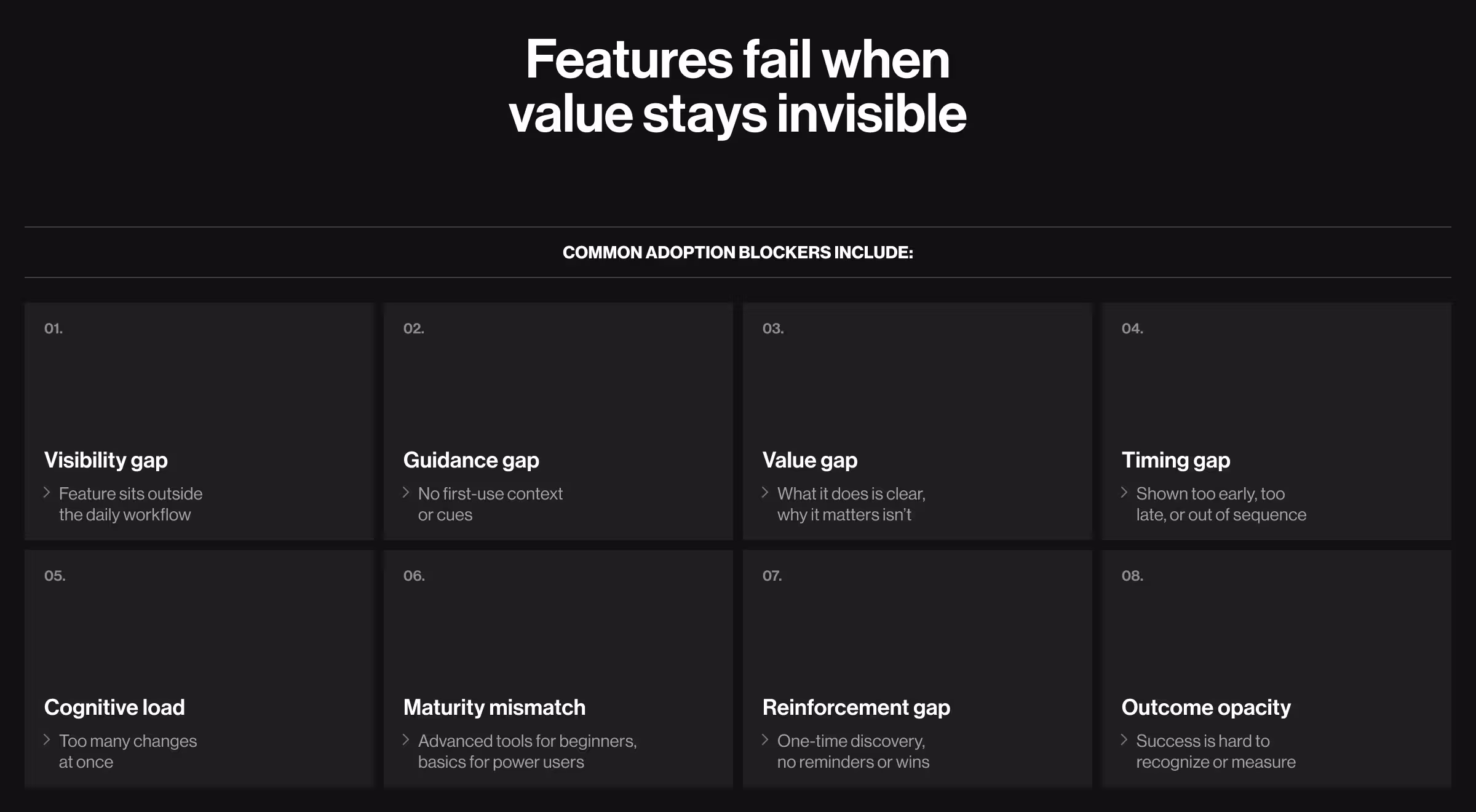
Below are the most common contributors to slow adoption. Each one lowers the odds that users see new functionality in terms of a clear, immediate payoff.
- Low feature visibility. The feature exists, but it lives outside the user’s routine workflow. If feature discovery depends on release notes or menu exploration, adoption is left to chance.
- Missing first-use guidance. Users encounter a new capability without a well-explained context. Without cues, exploration feels optional and, hence, is often skipped.
- Unclear value proposition. Users get what a new feature does, but not why it matters. When benefits aren’t explicit, your target audience defaults to existing habits.
- Poor timing of exposure. Features surface too early/ too late/ at the wrong moment in the user journey. Even strong functionality fails when introduced erratically.
- Cognitive overload. Too many changes arrive at once. Users drift back to familiar paths and ignore anything disruptive.
- Misalignment with user maturity. Advanced features are shown to early-stage users, while power users receive incremental updates. In both cases, relevance is lost.
- No reinforcement loop. Initial discovery happens once, then disappears. Without contextual reminders or visible wins, feature adoption won’t stick.
- Success is hard to recognize. Users activate a feature but never see a clear outcome. When success isn’t obvious, repetition doesn’t happen.
What are the stages of the adoption funnel?
Before discussing feature adoption strategies, it’s worth aligning on the underlying system you’re optimizing. Feature adoption doesn’t happen in a single moment. It unfolds through a sequence of user decisions, each either reinforcing perceived value or weakening it. This sequence is the feature adoption funnel.
Much like a SaaS sales funnel or any other conversion funnel, it’s a system designed to convert attention into behavior, and behavior into sustained value.
Attention ▶️ Behavior ▶️ Sustained value
Most teams focus on activation — the step between attention and habitual use. That’s a suboptimal approach. Adoption thrives when the experience supports users from first exposure to repeated use. When any stage is neglected, the funnel leaks value downstream.
Below is a clear view of the five stages users move through when adopting a feature.
Optimizing feature adoption means treating this funnel as a continuous system. Awareness without consideration creates confusion. Activation without repeat use yields false confidence. Sustainable adoption emerges when each stage reinforces the next.
The strategies that follow are designed to strengthen this funnel from the first stage to the last.
Strategies for reinforcing feature adoption
A feature adoption strategy is sustainable as long as it’s treated as a system spanning the entire adoption funnel. When each stage is deliberately designed, small usage gains compound into long-term retention.
Below, each strategy is mapped to its funnel stage and described in terms of what it addresses, why it works, and how to implement it.
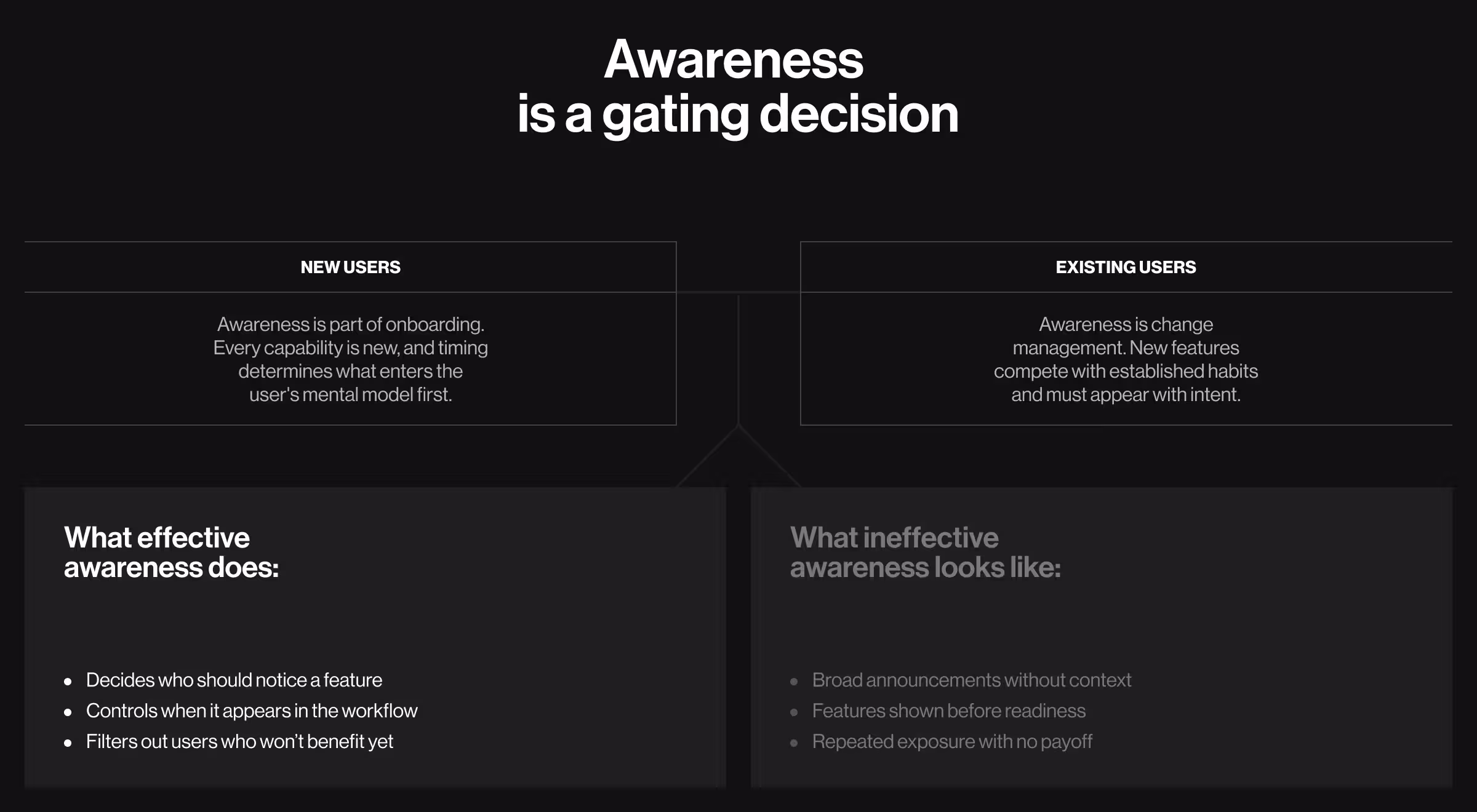
1. Awareness
For new customers, awareness must be embedded in onboarding. Every capability is effectively a new feature, regardless of how long it has existed. The question is not whether users should notice it, but when it should enter their mental model.
🔍 Explore our Lead Designer’s playbook for designing new customer onboarding that gets users to value fast.
For existing customers, awareness is about change management inside the product. New features compete with established habits. If they surface sporadically, users ignore them and become reluctant to re-engage later.
In both cases, awareness is a gating decision. It determines who should notice a feature and under what conditions.
1.1. Define feature-specific ICPs
Treating all features as universally relevant blurs adoption signals and triggers misleading conclusions about your product’s performance.
Feature-level ideal customer profiles (ICPs) isolate who the feature is designed to help and in what scenarios.
Why it works: Narrow relevance strengthens adoption signals and prevents false negatives caused by premature or misaligned exposure.
✅ Implementation tips:
- Define JTBD and success criteria at the feature level
- Anchor ICPs to observable value moments
- Develop UX personas tied to feature-level ICPs
1.2. Segment existing users by behavior and maturity
Adoption thrives when a feature aligns with how a user actually operates inside the product. Their underlying intent and observable usage patterns matter more than assumptions.
🔍 Without behavioral evidence, these assumptions go untested. Learn more about the risks of skipping UX research.
Why it works: When new functionality appears at the right moment, it encourages follow-through and increases the likelihood of repeat use.
✅ Implementation tips:
- Identify 2–3 prerequisite behaviors that indicate readiness
- Segment all your users by workflow depth (exploratory, operational, advanced)
- Continuously re-evaluate eligibility as behavior changes
- Start with exclusion rules before expanding visibility
1.3. Suppress promotion for low-fit users
Reducing irrelevant exposure is as strategic as increasing relevant exposure. When users repeatedly see features they can’t benefit from, they stop paying attention to guidance altogether.
Why it works: Selective exposure keeps in-product guidance meaningful and prevents feature fatigue. Users are more likely to engage when what they see is clearly relevant to their current workflow.
✅ Implementation tips:
- Apply suppression logic to in-app messaging
- Exclude users who lack the required behaviors or setup steps
- Monitor dismissals and avoidance as indicators of poor alignment
1.4. Introduce features when behavior supports them
Timing is one of the strongest predictors of feature uptake. Release-driven rollouts prioritize internal schedules over user readiness. The resulting low engagement is oftentimes mistaken for a lack of demand.
Why it works: Timing exposure to demonstrated readiness increases perceived relevance and initial engagement.
✅ Implementation tips:
- Trigger exposure after prerequisite actions are completed
- Replace global announcements with intent-based triggers
- Treat timing as a core UX decision
1.5. Define adoption hypotheses and success thresholds
If there’s time for theory, it’s now. Features rarely perform well without a clear understanding of the value they’re meant to create and how that value should appear in observed user behavior. Without defined thresholds, you fall back on gut feel and subjective definitions of success.
Why it works: Explicit hypotheses prevent teams from delivering features with no substantive path to value.
✅ Implementation tips:
- Define activation and repeat-use criteria before launch
- Set quantitative thresholds for success, e.g., time-to-activation or retention rates
- Review outcomes post-launch and adjust exposure rules accordingly
2. Consideration
With awareness spread, the adoption dilemma shifts from whether users will try a feature to whether the product makes successful usage the most natural course of action.

2.1. Reduce the effort-to-task ratio
Every extra step introduces hesitation. When effort outweighs perceived value, users disengage before reaching outcomes.
Why it works: Low-effort interactions are a win-win. When a feature requires minimal input, it fits into existing workflows and gives active users the confidence to keep going.
✅ Implementation tips:
- Minimize clicks, fields, and repetitive inputs
- Provide context-aware defaults to guide decisions
- Automate non-essential actions wherever possible
🔍 Leveraging the benefits of conversational UI is the shortcut to success here.
2.2. Use progressive disclosure
Introducing everything at once is overwhelming. Progressive disclosure lets users engage with essential functionality first, then explore advanced capabilities as their confidence grows.
Why it works: Gradual exposure keeps momentum intact and lowers early drop-off.
✅ Implementation tips:
- Reveal advanced options only when they’re contextually relevant
- Delay complex controls until users have proven value with simpler flows
- Favor expandable panels and overlays over cluttered screens
2.3. Design features as workflow extensions
Features adopted fastest feel like a natural continuation of existing behavior. Disconnected functionality increases hesitation.
Why it works: Embedding features into familiar workflows increases relevance and speeds adoption.
✅ Implementation tips:
- Integrate features into frequently used actions or dashboards
- Reuse interaction patterns already familiar to users
- Provide templates and guided setups to scaffold first-time success
3. Activation
Activation is where abstract value becomes experienced value. Teams often overestimate activation because early interaction might look like progress. In reality, every extra step between exposure and outcome introduces hesitation. And hesitation is where adoption starts to break down.

3.1. Focus onboarding on one core value action
Onboarding that attempts to explain everything often prevents users from experiencing anything that matters.
Why it works: Effective onboarding narrows focus to a single, high-leverage action. This aligns user effort with the feature’s core purpose and anchors their mental model in a concrete result.
✅ Implementation tips:
- Identify the shortest path to first value
- Remove secondary goals and optional actions from the onboarding flow
- Measure success by completion of the core action
3.2. Track activation thresholds
Early clicks and first-time usage are weak indicators of adoption. Many users interact once and never return, often because the interaction did not yield meaningful value.
Why it works: Activation thresholds define the point at which a user has engaged deeply enough to experience real benefit. These thresholds provide a more reliable signal of future retention and sustained usage.
✅ Implementation tips:
- Define activation based on meaningful depth and frequency of use
- Use activation data to refine onboarding sequences and remove low-impact steps
3.3. Assist with the take-off
Uncertainty hinders adoption. Users hesitate when the initial steps are ambiguous. Providing structured starting points through defaults or examples resolves the confusion and clarifies the path to value.
Why it works: Concrete starting points help users experience success early, which is critical for user trust and confidence.
✅ Implementation tips:
- Offer opinionated defaults to guide users toward the most likely success scenario
- Base examples on real use cases
- Allow customization after first success
3.4. Replace tours with task-driven guidance
Passive product tours favor visibility over understanding. Users see features, but not when or why to use them. Real learning happens through action.
Why it works: Task-driven guidance speeds up comprehension by tying instruction to outcomes.
✅ Implementation tips:
- Guide users through real tasks
- Trigger help at moments of need
- Eliminate generic walkthroughs
4. User engagement
User engagement signals that the feature has crossed a threshold from something users try to something they rely on.
If existing users have to relearn or recommit every time they interact with your product, engagement gets compromised. Sustained usage emerges when the feature fits into how users already operate, without demanding extra attention.
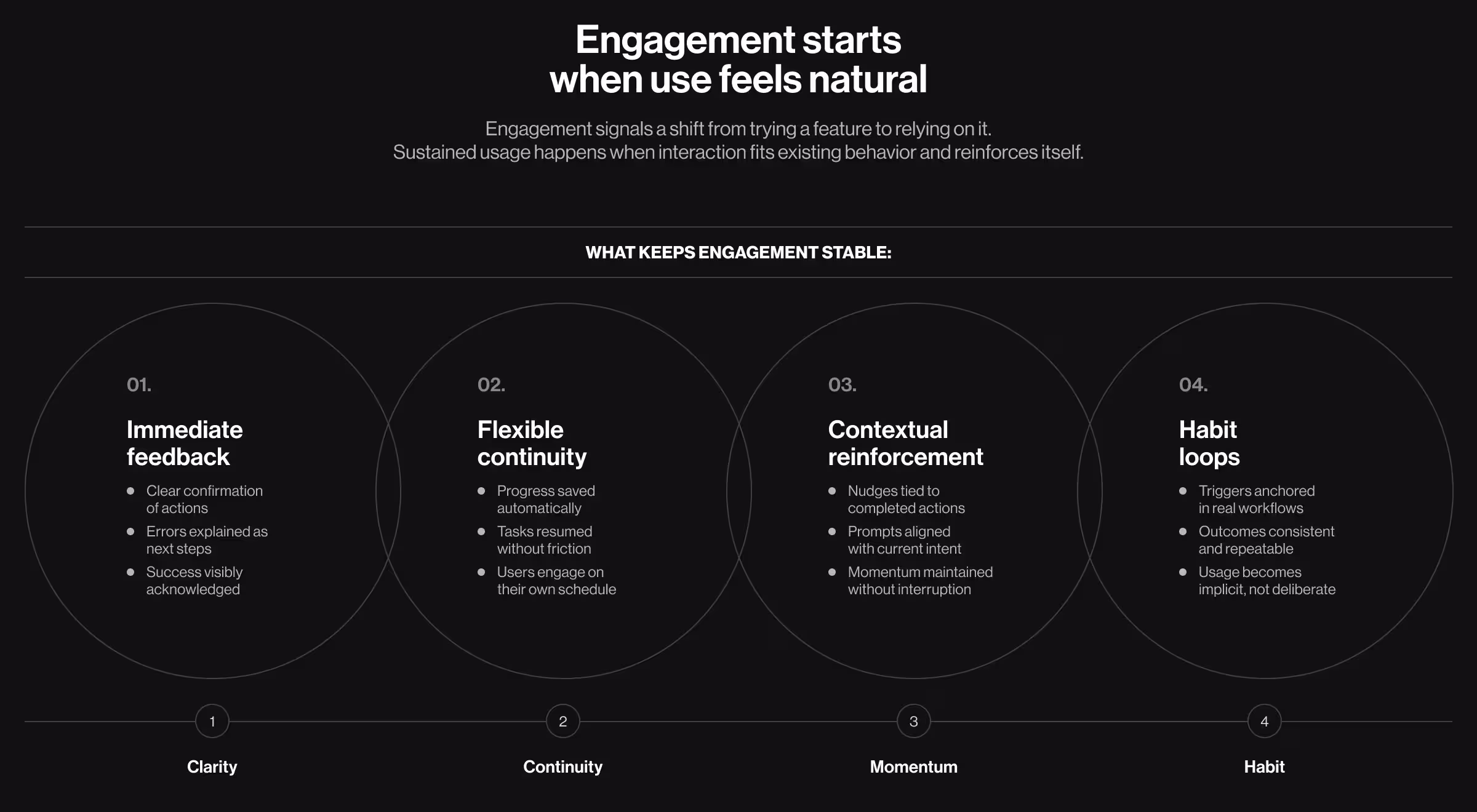
4.1. Provide immediate feedback
Feedback is the mechanism through which users understand whether their actions are achieving the intended outcome. Delayed or unclear feedback makes that process impossible. Immediate feedback, in contrast, creates a sense of control and reinforces smooth usage patterns.
Why it works: Real-time validation helps users internalize the feature’s value. Feedback is also an opportunity to surface additional capabilities or reinforce habits.
✅ Implementation tips:
- Validate inputs in-line to avoid post-submission surprises
- Explain errors in plain, actionable language to reduce frustration
- Signal success clearly with visual or textual confirmation
4.2. Enable save-and-resume flows
Users abandon tasks if they feel locked into completing a process in one sitting. Save-and-resume mechanisms handle this pressure and let users engage on their schedule.
Why it works: Save-and-resume flows signal respect for the user’s time, which, in turn, reinforces trust and perceived usability.
✅ Implementation tips:
- Auto-save progress without explicit action from users
- Communicate resumability clearly in the interface
- Prompt users contextually to return to unfinished tasks
4.3. Reinforce progress with behavior-linked nudges
Generic prompts interrupt users without helping them progress. Contextual prompts, by contrast, align with what the user is trying to accomplish in that moment.
Why it works: Progress-based reinforcement sustains momentum without feeling intrusive.
✅ Implementation tips:
- Trigger nudges after successful outcomes
- Reference specific actions the user has already completed
- Keep messaging tightly scoped to the next logical step
4.4. Stabilize usage through habit loops
When a feature becomes habitual, users no longer evaluate whether to use it. It becomes implicit. Habit loops emerge when triggers and outcomes remain consistent and valuable.
Why it works: Habitual usage outlasts novelty and reduces reliance on prompts.
✅ Implementation tips:
- Anchor triggers to existing workflows or routines
- Ensure each loop delivers a clear, repeatable outcome
- Avoid variable rewards that dilute predictability
5. Repeat adoption
Repeat adoption confirms that the feature has secured a permanent place in the user’s workflow. At this stage, users are deciding whether the feature delivers enough value to deserve ongoing attention compared with other options.
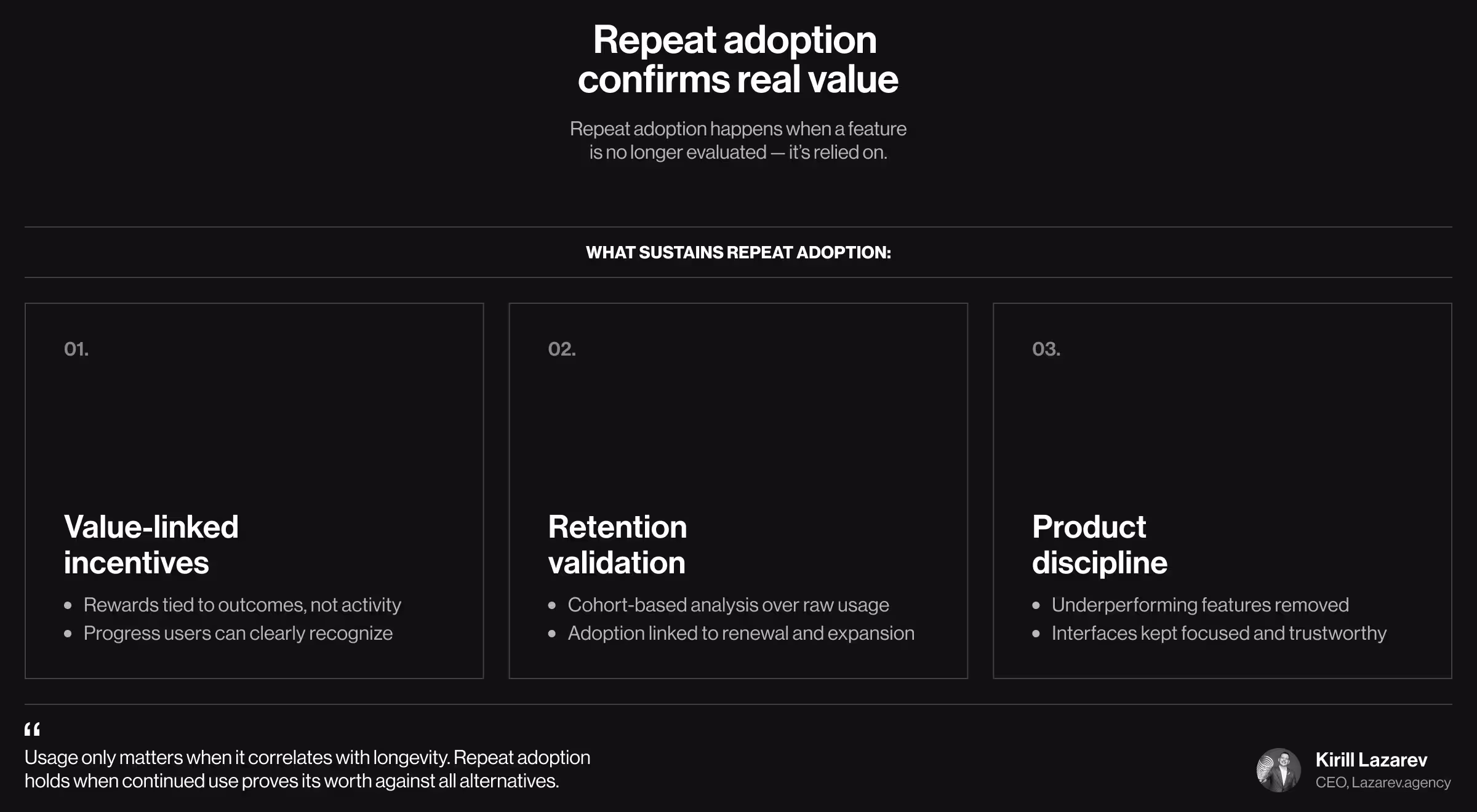
5.1. Tie incentives to retained value
By the time users reach repeat adoption, novelty has worn off. Incentives that reward raw activity inflate usage metrics without increasing commitment. What counts now is whether continued use delivers outcomes users recognize as meaningful progress.
Why it works: Tying incentives to tangible outcomes validates real value and prevents hollow engagement.
✅ Implementation tips:
- Link rewards to efficiency gains or goal completion
- Avoid symbolic or abstract rewards disconnected from impact
5.2. Use cohort analysis to validate retained adoption
Repeat usage matters only if it correlates with retention and long-term value. This is where cohort analysis comes in: by grouping users based on when they first adopted a feature or signed up, you can track how their behavior evolves and link it directly to business outcomes.
Cohorts let you see patterns that raw usage numbers hide, like which groups stick, which drop off, and why.
Why it works: Cohorts connect feature usage to renewal, expansion, and longevity.
✅ Implementation tips:
- Group users into cohorts based on adoption date or feature exposure
- Track and compare adopters versus non-adopters over time
- Feed insights directly into product roadmaps
5.3. Redesign worn-off features
Features that fail to earn repeat use don't remain neutral. They clutter interfaces, dilute trust in new releases, and complicate future adoption efforts. A phased redesign approach keeps the cleanup from disrupting workflows that still work.
Why it works: Removing underperforming features makes the customer experience smoother.
✅ Implementation tips:
- Define clear criteria for retention failure
- Communicate changes in terms of clarity and focus
- Reinvest learnings into higher-impact functionality
Feature adoption rate is the final arbiter of product value
Feature adoption breaks because the system around it is incomplete.
When awareness is indiscriminate, consideration is unclear, activation is slow, or engagement lacks reinforcement, usage fades away (even if the underlying capability is sound). Teams often misread this downward pattern as a lack of demand, when it’s really a lack of alignment.
This is usually where internal teams hit blind spots. At this stage, growth stops being a volume problem. This is where metrics expose product truth.
It’s also the point where many teams bring in outside perspectives to realign digital experience and outcomes — sometimes through a focused audit, sometimes through a time-boxed UX design sprint.
If you’re ready to make the right features stick, reach out to explore how experience-driven design turns usage into commitment.


.webp)


.avif)