
If you’re asking, “Why is my conversion rate so low?”, you’re trying to understand why qualified users hesitate, and why intent fades somewhere between landing and commitment.
Low conversion is a signal. It points to gaps between user expectations and experience, between what your intended audience needs and what the interface delivers. Optimizing conversion means looking deep into the system: traffic quality, lead generation, positioning, UX logic, trust signals, and behavioral flow.
In this article, we’ll cover the structural reasons for low conversion rates and how to fix the problem with strategic precision.
Key takeaways
- Low conversion is a system signal. When demand is stable but conversion plateaus, the issue lies somewhere in the funnel structure and/or UX.
- Benchmarks only matter in context. A “low” conversion rate can be healthy or alarming depending on industry, business model, and other performance metrics.
- Funnels fail when intent is assumed. MQL–SQL misalignment, vague value proposition, and diluted CTAs weaken progression long before users reach checkout.
- UX decides whether intent resolves or pauses. Generic experiences, mobile gaps, complex checkouts, and late reassurance delay decisions.
What do conversion rate benchmarks look like across different industries, and how should you read yours?
Before labeling a conversion rate as low, it needs context.
“Benchmarks vary by industry, price sensitivity, devices, and user intent. A number that signals underperformance in one market can represent healthy demand in another. The goal of benchmarks is to understand whether your rate aligns with the economics and decision patterns of your category.”
{{Kirill Lazarev}}
Conversion rate benchmarks vary by vertical
Even within B2C e-commerce, differences are significant. Statista highlights that skincare and beauty often convert at nearly twice the rate of electronics.
For a balanced perspective, we reviewed and cross-referenced data from a few sources, including Statista and Landmark Global.
Below is a snapshot comparison of average conversion rates for the online shopping market across selected verticals worldwide.
💡 Key insight: If your electronics store converts at 1.4%, that is not automatically “low”. However, if your skincare store converts at the same rate, it likely indicates unresolved issues in the value proposition or the website’s performance.
Benchmarks by business model: B2C, B2B, SaaS
Industry averages matter. Your business model does too. A B2B SaaS signup rate should never be compared to a retail checkout rate.
Based on our internal data at Lazarev.agency, here’s how conversion ranges differ by model:
💡 Key insight: Lower conversion rates in B2B or enterprise contexts are often healthy if downstream qualification and close rates are strong. Conversely, high conversion with poor lead quality is usually a warning sign.
How to determine whether your conversion rate is low, average, or strong
Before treating benchmarks as insights, analyze them alongside your product’s internal KPIs.
Anchor your conversion rate against 3 reference points:
- Your industry range: Are you materially below the expected band for your category?
- Your funnel progression: Is conversion flat because users never reach decision points, or because they hesitate at them?
- Your downstream metrics: Does a “low” conversion rate still produce strong revenue per user, close rate, or customer lifetime value (CLV)?
🔍 Learn more about how to improve customer lifetime value in our detailed blog.
Together, these 3 reference points establish a baseline of normal for your business. Once you’ve anchored your conversion rate against your industry and internal flow, a pattern starts to emerge. That pattern is what determines whether a number is a little underwhelming or structurally concerning.
A conversion rate crosses from “acceptable variance” into “action required” territory when multiple signals align. In practice, the metric becomes a problem when it:
- Declines while demand indicators remain stable
- Underperforms category benchmarks and your own historical baseline
- Fails to respond even as intent signals strengthen
When these conditions overlap, the issue usually points to a malfunctioning funnel structure or an unoptimized UX.
What are the most critical factors shaping conversion rates?
Understanding which structural and experiential factors are suppressing performance is key to spotting the root cause of low conversion rates.
The factors below will give you a clear lens on what to diagnose before deciding what to change.
1. Efficiency of the sales funnel
When conversion rates decline, the instinct is to inspect product pages or offers. In most cases, the fracture happens earlier and deeper — within the funnel’s structure itself.
“Every funnel is an Enigma machine. It deciphers user behavior to support optimal decisions. When that decoding system is off, early curiosity is mistaken for transactional intent, and commitment is requested before value is clear. These signs of misalignment make users pause to ponder whether their interaction with your product or service is worth it.”
{{Anna Demianenko}}
Simply put, an efficient funnel is a series of intent thresholds. Each stage (awareness — consideration — conversion — retention — loyalty + advocacy) answers a single user question: “Am I ready to move forward?”
If the funnel advances without resolving that question, don’t expect your target audience to stick around.
🔍 For a deeper structural breakdown, revisit the anatomy of a conversion funnel in our dedicated article on how to build conversion funnels the right way.
Below are 3 structural issues hindering the funnel performance. Until they’re fixed, improvements in conversion rates will likely remain purely incidental.

1.1. MQL–SQL misalignment
An MQL (marketing qualified lead) indicates sustained interest. An SQL (sales qualified lead) shows active evaluation.
When MQL and SQL collapse into a single concept, here’s what happens. Marketing hands off leads that haven’t yet crossed a decision threshold, while sales evaluates them as if they have.
This misalignment explains why early metrics look strong while later-stage progress steadily loosens up.
Common signals:
- High engagement at entry points with limited progression into later stages
- Strong visitor-to-lead conversion, but few leads complete the next meaningful step
- Inactive leads from high quality traffic
- Conversion rates fluctuate even though demand stays the same
🔍 Tackle misalignment once and for all with our dedicated guide on how to increase MQL to SQL conversion.
1.2. Unclear or diluted CTAs
CTAs do their job only if users are ready to act. Placed too early, they hit mere curiosity, also referred to as investigative intent. Placed too late, they miss the moment entirely.
Common indicators of ineffective CTAs:
- Repeated page views without progression
- High scroll depth with limited interaction
- Sessions end shortly after a CTA click, with no follow-up action
- Users switch between pages as if searching for confirmation
1.3. Vague value propositions
Value propositions should address hesitation at the critical consideration–to–conversion stage. If the value is abstract or indirect, your CTA loses its affirmative and motivational tone.
Signs your value proposition needs refinement:
- Drop-offs clustered immediately after pricing or commitment exposure
- Decision times stretch without higher completion rates
- Users consume guides or explanations instead of taking action
To understand where and why value degrades, map each funnel stage to the user’s mindset and the role your value proposition should play.
2. UX quality
UX quality determines whether intent moves smoothly through the funnel or breaks under its own weight.
“Think of UX as the vehicle carrying users from interest to commitment. A well-designed experience is a reliable car. It picks users up where they are, matches their pace, avoids detours, and makes the destination clear before asking them to step in. A poor user experience is jerky and full of unexpected tolls. It leaves users questioning if the journey is worth it.”
{{Kirill Lazarev}}
UX design determines how many decisions users have to make, and how confident they are to move forward. When the experience aligns with intent, progression is effortless. When it doesn’t, even high-intent users give up.
🔍 Explore Lazarev.agency’s head-to-toe guideline on UX optimization.

2.1. Generic experiences
Users arrive with context. They come with prior exposure, comparisons, assumptions about pricing, and expectations shaped by ads, search results, word of mouth, or past experiences with similar products.
When the interface ignores that pre-existing context, users have to ask themselves: Is this what I expected? Is this relevant to me? Where do I start? That internal processing is cognitive load.
Data snapshot: McKinsey’s research highlights that 71% of users consider personalized interactions a baseline expectation, and 76% disengage when experiences feel generic.
How lack of personalization shows up in conversion data:
- Nearly identical conversion rates across high- and low-intent segments ➡️ intent is not recognized or acted upon.
- Low responsiveness to personalization efforts ➡️ contextual cues are either too subtle or misplaced.
- Repeat visits without a higher likelihood of action ➡️ users hesitate to progress.
2.2. Trust and credibility gaps
Whenever you ask users to share personal information or enter payment details, you trigger a risk assessment. If trust signals are weak or placed too far from the action, uncertainty fills the gap.
Trust gaps surface in patterns like:
- Drop-offs around form submissions or payment steps
- Stronger conversion among returning visitors who have already validated your credibility
Trust is contextual, and it should appear where the user feels most exposed, e.g., security badges near payment fields and privacy assurances next to data inputs.
When reassurance arrives too late or too far from the decision point, users resort to reassessment. And reassessment is where conversion velocity drops.
2.3. Performance and loading time delays
Performance shapes how seriously users take what they see.
Data snapshot: Google reports that 53% of mobile visitors abandon a page that takes longer than three seconds to load. Site speed is a proxy for credibility.
On mobile especially, users equate responsiveness with competence. When attention is limited and alternatives are one tap away, even minor delays lower the willingness to proceed.
How performance drag surfaces in conversion data:
- Primary CTAs receive fewer interactions despite unchanged visibility
- Mobile conversion rates underperform desktop beyond expected variance
- Multi-step flows lose users progressively, not at a single failure point.
🔍 Learn more about the specifics of mobile UX design in our comprehensive guide.
2.4. Complex checkouts
Your product may already be valuable, and your brand may already have trust. But if the checkout obscures that value, you’re hiding a diamond under layers of rough stone.
Data snapshot: Baymard’s research shows that 18% of U.S. online shoppers abandon purchases because the checkout feels inadequate — either too long or too complicated.
Signals worth paying attention to:
- Completion time increases without higher completion rates
- Repeated backtracking between fields or steps
- Abandonment spikes after form validation or unexpected requirements
Checkout abandonment at this stage indicates that the effort required to finish the purchase no longer matches the perceived reward.
2.5. Unoptimized customer care
Customer care is not a post-conversion function. For a large share of users, it is part of the decision process itself.
Data snapshot: Statista reports that 58% of Americans contact customer service at some point in their journey. At the same time, Gartner projects that 80% of customer service organizations consider adopting generative AI to scale support capacity and responsiveness.
How this shows up in conversion data:
- Higher conversion rates only after direct contact with support
- Noticeably lower conversion among first-time or unfamiliar users
- Users exiting flows to search for answers elsewhere
If customer care is hard to access or detached from the decision flow, users pause the journey until reassurance becomes available.
How to optimize your sales funnel?
When conversion rates fall short of their potential, teams reach for what’s visible, like sharper headlines and cleaner layouts. On the surface, the introduced changes might look decisive and even stimulate some kind of user activity (usually window shopping with shallow brand interaction).
But adjustments like these pay off only if the underlying funnel is well-built. Should there be a misalignment anywhere in the customer journey, no headline will carry users forward.
Here are 5 optimization strategies to mend your sales funnel from within.

1. Re-anchor funnel stages to observable intent signals
Funnels break when stages advance without accounting for user behavior. To troubleshoot this, stage transitions must be tied to observable shifts in user intent.
🎯 What to focus on:
- Separate signals of interest (MQLs) from signals of evaluation (SQLs)
- Delay sales qualification until users demonstrate decision-oriented behavior
- Audit passive “qualified” leads to identify which intent signal was assumed (often incorrectly or prematurely)
2. Reduce action ambiguity at every transition
Each funnel stage should culminate in a single, unambiguous next action. When multiple actions compete, users stumble.
🎯 What to focus on:
- One primary CTA per stage, secondary actions should be clearly deprioritized
- Action language that reflects what happens next
- Consistent action hierarchy across pages within the same stage
3. Align value with commitment timing
Value propositions are time sensitive. Quite literally. Funnel optimization calls for synchronizing what is promised with what is being asked.
🎯 What to focus on:
- Early stages clarify relevance
- Mid stages articulate change
- Final stages confirm why commitment is justified now
4. Close the intent–to–validation gap
Funnels convert better when validation (like incorporating social proof and context-sensitive clarification) appears close to the decision point.
🎯 What to focus on:
- Surface evidence or clarifying details where hesitation peaks
- Reduce the need to navigate away from the primary flow
5. Treat funnel optimization as a sequencing problem
Conversion improves when the decision flow makes sense.
🎯 Before adding anything new, verify that:
- Each stage answers the user’s next question
- Progression reflects readiness
- Commitment is requested only after uncertainty has been resolved
How to optimize your UX
Now we move to the second half of the equation. UX optimization is non-negotiable if your users want to move forward, but the experience either intimidates them or slows them down.
Below are 3 strong UX optimization levers with a direct impact on conversion health.
1. Personalize the experience
Why it matters: When context is ignored, high-intent users slow down and low-intent users get overwhelmed. Personalized UX limits unnecessary steps and aligns messaging with user maturity for faster progression without extra cognitive pressure.
What to focus on:
- Different entry points should lead to different valuable content suggestions
- Returning users should progress faster than first-time visitors
- High-intent users should not be forced through exploratory paths
🔎 Practical insight: With the Streamingbar project, Lazarev.agency replaced a generic, one-size-fits-all interface with context-aware experiences driven by real user behavior. Viewing patterns and content preferences shaped what users saw first and what faded to the background.
Additionally, revamped information architecture guided high-intent users to relevant content without exploratory detours, while users less familiar with the platform received contextual cues to support discovery without pressure.

2. Simplify the checkout process
Why it matters: Late-stage abandonment happens when accumulated effort exposes unresolved doubt. When checkout design keeps effort proportional to perceived payoff, users complete actions they are already prepared to take.
Key principles to focus on:
- Reduce the number of steps users see, even if the backend process remains unchanged
- Show how close users are to finishing
- Frame progress around outcomes (“Almost done”) instead of mechanics (“Step 3 of 7”)
- Make forward movement feel inevitable
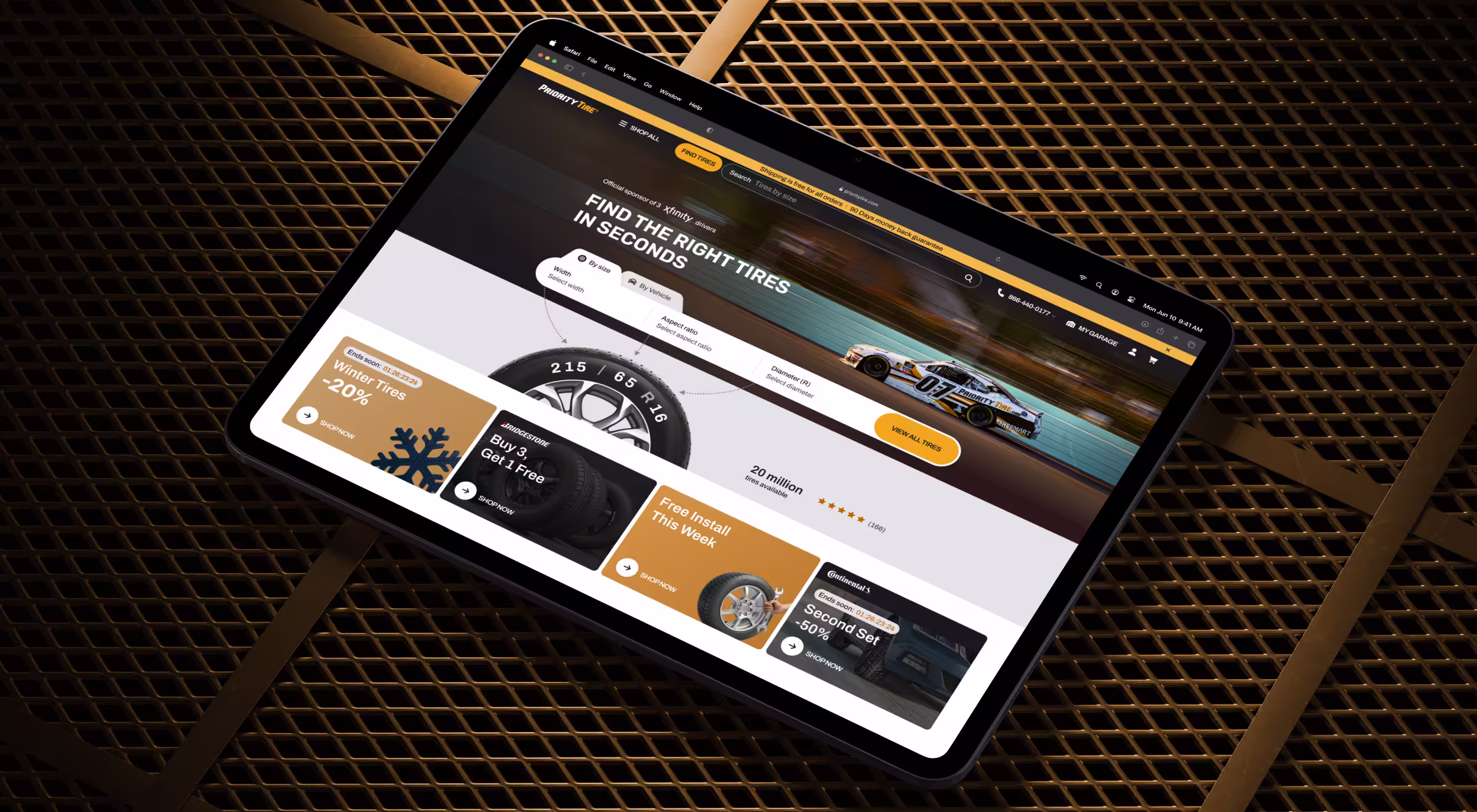
🔎 Practical insight: In Priority Tire’s checkout redesign, the “less is more” principle guided our strategy. Delivery options surfaced early and were explained in plain language. We minimized visible steps and reframed checkout as a short, predictable path. As a result, this approach led to a 25% lift in conversion.
3. Optimize for mobile devices
Why it matters: Desktop conversion rates consistently beat mobile. Desktop typically converts around 3.2%–3.9%, while mobile sits closer to 2%–3.5%.
While we can view this desktop–mobile conversion gap as a constraint, it’s to our advantage to perceive it as an opportunity.
Because mobile conversion rates lag behind desktop, mobile remains under-optimized by default. That means users are accustomed to tolerating suboptimal mobile experiences. When a product is genuinely optimized for mobile, it stands out immediately.
How to leverage the gap:
- Provide sufficient spacing to avoid accidental actions
- Minimal required input per step
- Clear progress so users can pick up where they left off
🔎 Practical insight: For Hedonism Wines, the original desktop-first experience overwhelmed mobile users. Lazarev.agency reworked it around thumb-friendly navigation and visible expert cues. Sommelier-curated collections surfaced early, and checkout steps were revamped for mobile use. The result was stronger engagement and a clear lift in progression from browsing to checkout.

Win conversion rate optimization with strategic UX
Low conversion is a matter of alignment between intent and timing, effort and confidence, promise and experience. When those elements work together, conversion becomes a natural outcome of a strong strategy.
If you suspect your UX is slowing down decisions, it may be time to step back and look at the system as a whole. At Lazarev.agency, we take a holistic approach to UX design, often through a phased redesign that fixes what's breaking without disrupting what's already working.
Reach out for a UX revamp that looks beyond screens and into how decisions happen.


.webp)


.avif)