
You’ve got solid traffic and an ambitious growth plan behind a genuinely strong product. Something isn’t clicking, though. Conversion rates lag, and your positioning isn’t as clear. The story you think your website tells is not what users seem to hear.
With over a decade of experience, we’ve seen this pattern time and again: businesses invest in redesigns without first understanding the real blockers. That’s a strategic misstep. And it’s costly.
In this article, we’ll lay out what website redesign goals should look like based on real-world outcomes. Consider it a way to diagnose what’s holding your business growth back before you dive into a redesign process.
Key takeaways
- Website redesign goals should diagnose where business growth stalls. The strongest goals expose where revenue, user trust, adoption, and other aspects of your website performance break down.
- High-performing redesigns don’t optimize pages in isolation. They align UX performance, messaging, and infrastructure around user behavior.
- Leading website redesign companies like Lazarev.agency align redesign goals with long-term business performance. The right partner knows how to combine UX redesign strategy, brand positioning, and technical execution into one cohesive system.
How do you know it’s time for a website redesign? 12-question reality check
If you’re searching for signs that it’s time for a website redesign, chances are something already feels off. Traffic might be steady and the product solid — yet the website isn’t pulling its weight.
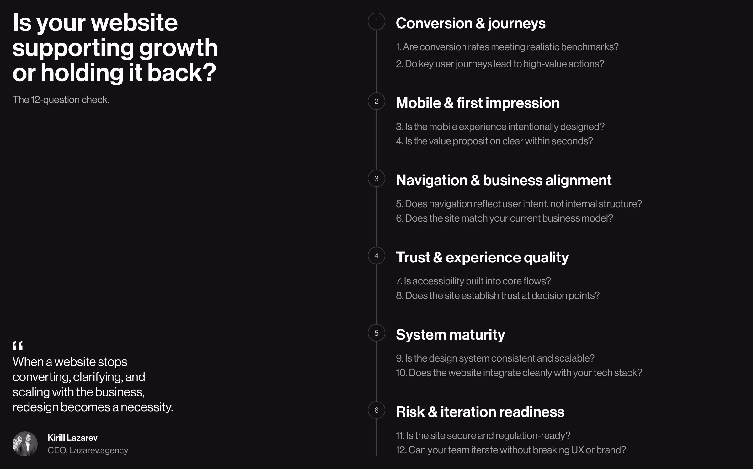
The 12-question reality check below helps pinpoint why your website might be holding growth back. Answering no/not sure too often is a clear signal that your concern about a redesign is legitimate.
1. Are current conversion rates meeting industry benchmarks?
Conversion rates are the first health indicator of a website that’s doing its job. If traffic is stable but results aren’t improving, the problem is experience.
What to look for:
- Compare your conversion rates against realistic benchmarks for your industry and funnel stage (lead generation, demo requests, signups).
- Segment by device, channel, and page type. Avoid averages, as they hide problems.
- Look for the slightest trends. Even a slow decline is insightful.
Ask your team:
- Which pages drive revenue and which quietly leak it?
- Do we know why users drop off, or are we trying to guess?
Hint: If conversions rely on heavy sales follow-up or discounts to close, your website may not be doing its share of the work.
🔍 Learn more about the importance of conversion rate optimization in turning traffic into revenue.
2. Do key user journeys support high-value actions?
Not all clicks are equally meaningful. High-value actions lead to downstream conversions and strategic growth.
Examples of high-value actions:
- Booking a sales call or demo
- Submitting a qualified lead form
- Starting a checkout or subscription
- Engaging with product-defining content
What to check:
- Are these actions logical and easy to reach?
- Does your target audience have to “hunt” for the next step?
- Are CTAs aligned with user intent or internal assumptions?
Reality check: If users scroll and leave without acting, the user journey is broken (even if the content is good).
3. Is the mobile experience designed intentionally?
Statista reports that over 62% of global website traffic came from mobile devices in 2025. Despite the solid data, many websites still treat mobile optimization as an additional functionality — a suboptimal decision, to say the least.
What to evaluate:
- Are primary actions reachable with one thumb?
- Does content hierarchy change meaningfully on mobile?
- Are forms, menus, and modals usable?
Ask bluntly:
- Was mobile designed, or just adapted?
Hint: If mobile conversion rates trail far behind desktop, mobile responsiveness has never been a priority.
🔍 Explore our mobile-first web design guide to find out more about the mobile optimization strategy that performs exceptionally well in the wild.
4. Is your value proposition immediately clear?
Users decide whether to stay in seconds. If your value proposition isn’t obvious, they won’t wait to figure it out.
Check the first screen:
- Can first-time website visitors grasp how to navigate your site, who it’s for, and why it matters?
- Is the language specific, or interchangeable with that of competitor websites?
Test this:
- Ask someone outside your company to describe your offering after 5 seconds on the homepage.
Red flag: If clarity requires explanation, your website is doing too much talking and not enough positioning.
5. Does the navigation reflect user intent?
Navigation is a strategy tool shaping how users understand your business. It frames priorities and signals value. When it mirrors internal structures and not user intent, that’s how user experience degrades fast.
What to look for:
- Does the menu reflect how users mentally model your offering or how teams are organized internally?
- Are critical paths (pricing, solutions, use cases) easy to find?
- Is navigation optimized for decision-making?
Ask:
- What decision should a user make on each page?
- Does navigation help or distract from that decision?
Hint: If analytics show frequent backtracking or repeated menu clicks, users are lost.
6. Does the site match your current business model?
Websites age faster than businesses, especially as your product strategy evolves. Misalignment is common when the site no longer reflects how you operate.
Common mismatches:
- Product-led growth site supporting an enterprise sales motion
- Service business positioning like a SaaS
- Multi-offer company using a single, generic funnel
Business models to sanity-check:
- B2B vs B2C
- Subscription vs transactional
- High-touch sales vs self-serve
Reality check: If your sales team constantly “explains around” the website, it’s likely misaligned.
7. Is accessibility built into the experience?
Treating accessibility as a late-stage enhancement is a strategic misstep. Accessibility is a foundational quality of a well-designed UI. It signals maturity and operational discipline.
What to evaluate:
- Can all core flows be completed using keyboard navigation alone?
- Do screen readers interpret content structure and labels correctly?
- Are focus states, validation, and error feedback consistent and forgiving?
Why this matters:
- Accessible interfaces are typically more predictable and easier to use for all users.
- Accessibility protects brand credibility as standards and enforcement tighten.
Signal to watch: When accessibility is treated as an afterthought, inconsistencies surface in interaction logic and sabotage overall user experience.
8. Does the site establish trust at critical decision points?
Trust is earned locally at moments of hesitation. Here’s where it matters most:
- Pricing and plan selection pages
- Forms, checkouts, and commitment-heavy interactions
- Comparison, evaluation, and “why us” decision moments
Trust signals to evaluate:
- Is social proof contextually relevant and specific?
- Are security and privacy cues visible where personal or financial data is requested?
- Do pages clearly explain outcomes and next steps?
Key question to ask: What reassurance does a user need at this exact moment to move forward with confidence?
9. Is the design system scalable and consistent across digital touchpoints?
Consistency means creating a system that teams can rely on as the product and business evolve. When patterns break down, both users and internal teams pay the price.
What to evaluate:
- Are interface components reused or repeatedly redesigned with slight variations?
- Do typography, spacing, and interaction patterns remain stable across pages and products?
- Can teams ship new pages or features using existing components without reinventing the wheel?
Operational consequences of inconsistency:
- Slower release cycles and delayed launches
- Rising design and development costs due to rework
- A fragmented brand experience
Signal to watch: If every update requires bespoke design decisions, the system isn’t scaling (or it never existed in the first place).
🔍 To test your business scalability, ask whether it's ready for AI-powered boost.
10. Does the website integrate with your tech stack?
A website is a central node in a broader system that spans marketing, sales, product, and analytics. When integrations are fragile or fragmented, inefficiency compounds.
Key integration points to evaluate:
- CRM and marketing automation platforms
- Analytics and tracking setups
- CMS workflows
- Payment, identity, and authentication tools
What to watch for:
- Manual handoffs or spreadsheet-driven workarounds
- Conflicting data across systems
- Performance degradation caused by loosely stitched third-party tools
Reality check: When a website is designed to integrate cleanly with your tech stack, it acts as a maestro setting the tempo for all operational systems.
🔍 To learn more about that level of strategic coordination, explore our guide on ERP design.
11. Is the site secure and regulation-ready?
Trust matters everywhere. But it becomes non-negotiable when a user has to share sensitive information. In these moments, design either reinforces confidence or triggers abandonment.
Especially critical for:
- Fintech, crypto, and online banking platforms
- Healthcare and life sciences products
- E-commerce and marketplace businesses
- Legal and B2B SaaS services
What to evaluate:
- HTTPS, data handling, and form security
- Compliance readiness (GDPR, accessibility standards, industry regulations)
- Transparency around data use
Signal to watch: Users rarely notice security when it’s done well. But the moment something feels unclear or risky, trust collapses, and so does conversion.
12. Can your team iterate without breaking UX or brand?
A website is a living and breathing ecosystem. It needs to evolve to sustain itself. The real test here is whether teams can improve it without destabilizing the experience.
Questions to assess internally:
- Can the team test and refine changes without triggering full redesign cycles?
- Do updates integrate smoothly or introduce some kind of regression?
- Is experimentation supported by the system, or avoided because the risk feels too high?
Red flag: When routine updates feel dangerous, the website isn’t flexible enough to support growth. Rigid systems slow learning and stall optimization.
How do goals for website redesign project look across industries? Practical insights from Lazarev.agency’s portfolio
Business owners often start product redesign with the same questions. What goals should we pursue? Do we need a complete website redesign, or will a few strategic tweaks suffice?
The short answer is that it depends on your industry and business model. A more practical approach is to look at how these goals play out in real products.
As a website redesign agency, we’ve guided businesses across industries in defining and achieving their key redesign objectives. Below, we outline successful website redesign goals drawn from our hands-on portfolio. Use these examples to evaluate your own priorities and identify areas in your digital strategy that might be under-optimized.
1. Drive qualified traffic
Driving traffic is easy. Driving the right traffic is the hard part and one of the most underestimated goals in a website redesign.
If your analytics show growing sessions but stagnant conversions, intent mismatch is the most likely culprit. A redesign aimed at qualified traffic focuses on attracting users who already have a reason to care.
What to pressure-test with your team:
- Does search traffic align with use cases?
- Can first-time site visitors quickly tell whether this product is meant for them?
- Does our content attract decision-makers or passive readers?
What this goal looks like in practice:
- Pages structured around search intent and user problems
- Clear topical authority
- Early positioning signals to qualify users before conversion points
- Information architecture to guide interested users deeper
✅ Case in point: In the VTnews.ai redesign, the objective was attracting users actively seeking unbiased news. By designing the website around AI-driven bias analysis, thematic filters, and intent-specific entry points, the platform naturally pulled in the right audience.
The outcome speaks for itself: 85,000 new users onboarded in the first month, with 90% confirming the platform helped them avoid information bubbles.

2. Boost user engagement
A drop in engagement rates is not always a sign of a broken website. In many cases, it indicates its passive nature. Users arrive, achieve a certain goal (or fail to), and leave without a reason to return. If boosting engagement is a redesign goal, the website must evolve into an active system that encourages repeat interaction.
What to pressure-test with your team:
- Do users know what to do next after their first interaction?
- Are users progressing, or do they have to start from zero?
- Where does engagement drop: after onboarding, after first use, over time?
What this goal looks like in practice:
- Clear engagement loops (discover → act → get user feedback → repeat)
- Personalized interaction
- Visible progress and time-based triggers
✅ Case in point: For WellSet, the challenge was low engagement and weak retention. The redesign turned a passive content library into a daily-use platform by introducing personalized home states, live session scheduling, progress cues, and easy access to relevant practices. What followed was 75% increase in engagement, a 30% boost in retention, and 500K+ active users.

3. Increase conversion rates
Conversion-focused redesigns aim to close the gap between intent and action.
This objective is common for e-commerce, SaaS, and direct-to-consumer brands where UX improvements compound into revenue gains.
What to pressure-test with your team:
- Where do users hesitate or abandon your website?
- Are product benefits immediately clear?
- How long does it take to move from first interaction to checkout or signup?
What this goal looks like in practice:
- Clear visual hierarchy that spotlights the product or offer first
- Content flows designed to answer buying questions in the right order
✅ Case in point: Riptide’s redesign restructured product discovery around side-by-side model comparisons and a step-based checkout that reduced time to purchase. By leading with the product’s real-world performance and eliminating barriers in the buying flow, the new site helped Riptide sell out $500K worth of skateboards in 2 months and rank among the top 10 skateboard brands in the U.S.

4. Increase customer onboarding
When onboarding fails, the product usually takes the blame. But more often than not, it’s the website where momentum is lost.
Redesigning for onboarding means treating the website as an active part of the product experience. Its role is to help users navigate the website, explain the value in context, and guide them toward the next step.
What to pressure-test with your team:
- Can a first-time visitor explain the product in one sentence after 30 seconds?
- Do users know the next concrete step they should take?
- Are we onboarding everyone the same way, regardless of intent or experience?
What this goal looks like in practice:
- Story-driven content flows to reveal value progressively
- Clear transitions from explanation → interest → commitment
✅ Case in point: For NODO, the challenge was onboarding users into a highly specialized camera control product. The redesigned website used an immersive, story-led content flow and detailed 3D product visuals to make the technology tangible before any signup. As a result, NODO generated 160 waitlist sign-ups within the first month, with 41% coming from entirely new customers.

5. Ensure performance optimization and security
Site performance and embedded security are rarely framed as redesign goals. That’s an oversight with costly consequences. Slow load times or weak security erode trust, and once it’s gone, no amount of cosmetic refinement can recover conversions.
What to pressure-test with your team:
- Where do users hesitate during critical actions like sign-up or transactions?
- Do users understand what’s happening when data or money moves?
What this goal looks like in practice:
- Predictable interactions across high-stakes flows
- Interfaces designed to support compliance without compromising usability
✅ Case in point: EllipX, a European crypto-finance platform operating under strict EU regulations, struggled with drop-offs due to confusing onboarding and verification. The redesign restructured dashboards, simplified deposits and withdrawals, and introduced transparent confirmations that made performance and security visible parts of the experience.
6. Improve mobile responsiveness
For most businesses today, mobile is the primary access channel. When mobile responsiveness emerges as a redesign goal, it usually signals that users are already on mobile, but the experience is holding them back.
Optimizing for mobile requires rethinking interactions for real-world use: on the move, one hand free, and attention scarce.
What to pressure-test with your team:
- Do mobile users convert at the same rate as desktop users?
- Can key actions be completed with one thumb and minimal scrolling?
- Are search, filters, and discovery optimized for small screens?
What this goal looks like in practice:
- Mobile-first content hierarchy
- Thumb-friendly navigation and tap targets
✅ Case in point: Hedonism Wines saw high organic traffic from mobile but low mobile conversions. The redesign reimagined the experience around mobile-first discovery, simplified navigation, sommelier-curated collections, and intuitive checkouts. By treating mobile as the primary experience, the new site delivered a 45% increase in add-to-basket actions and helped 2.8× more users progress from browsing to checkout.

🔍 Learn more about proven mobile site optimization practices and wins from Lazarev.agency’s portfolio.
7. Design for scalability and future growth
Many websites perform well until the business starts growing. New products launch, audiences expand, features multiply, and suddenly the site becomes rigid and inconsistent. Redesigning for scalability is about staying ahead of tomorrow’s bottlenecks.
What to pressure-test with your team:
- How hard is it to add a new product or feature?
- Does every new page feel like a one-off design decision?
- Can the website support multiple user roles or workflows?
What this goal looks like in practice:
- Modular layouts and reusable components
- Flexible information architecture
- Scalable design systems
✅ Case in point: For Accern, scalability was a prerequisite for growth. Our team introduced a hybrid GUI/prompt interface, adaptive input fields, modular report builders, and integrated dataset management to support the platform’s functional expansion. As a result, Accern raised $40M+ in funding and moved from Series B to acquisition.

🔍 Learn why and when hiring an AI UX designer would help you build scalable interface patterns for AI-driven products.
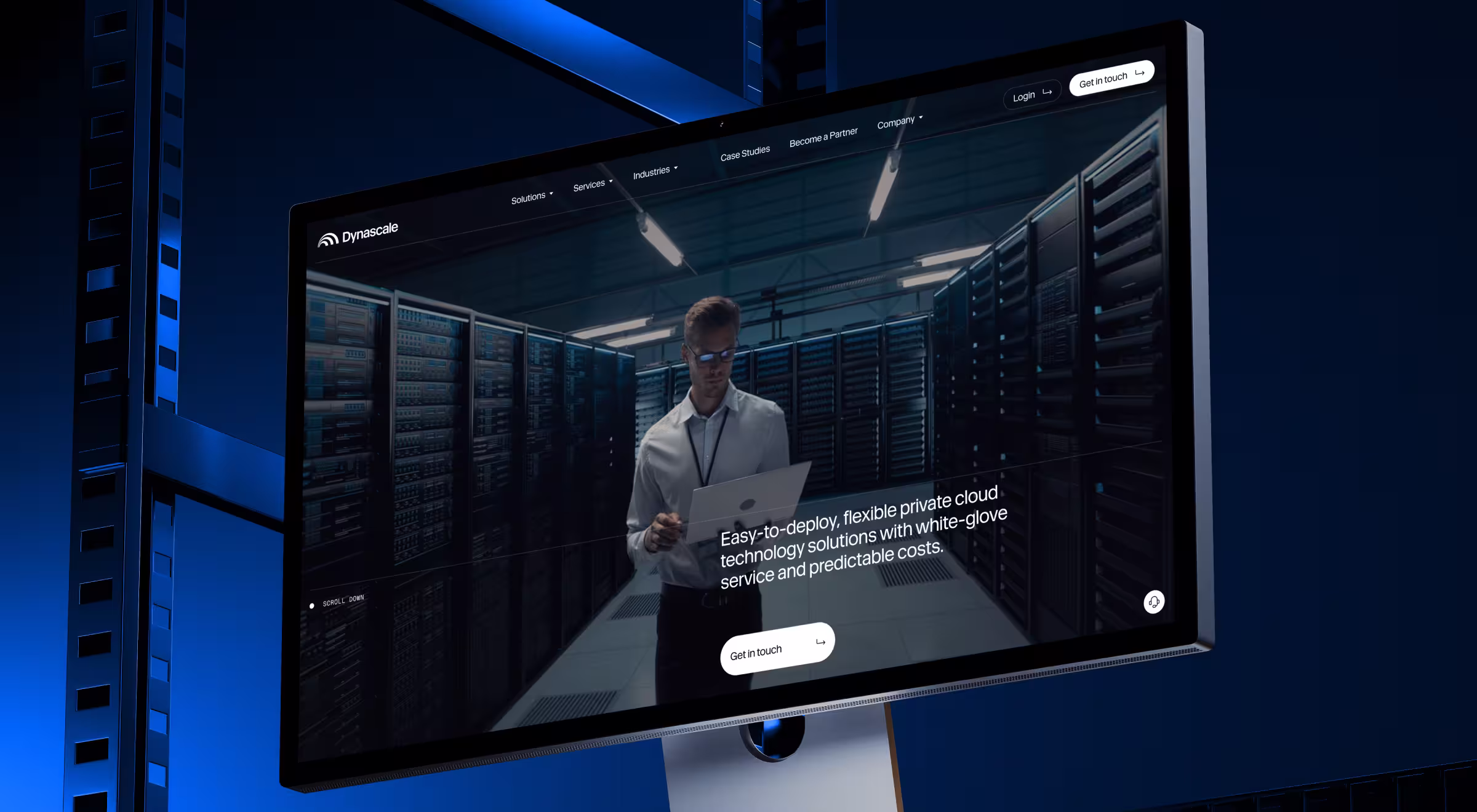
8. Strengthen brand positioning
Brand positioning becomes a redesign goal when the business has outgrown its current perception. Even with a strong product and a capable team, a website that feels small or generic undermines credibility and can cost deals in competitive markets.
What to pressure-test with your team:
- Can a first-time visitor describe our positioning in one sentence?
- Do we sound distinct or like everyone else in the category?
- Are we framed as a vendor or a strategic partner?
What this goal looks like in practice:
- Brand identity that signals maturity and industry expertise
- Consistent cues of trust, reliability, and authority across touchpoints
✅ Case in point: Though Dynascale delivered enterprise-grade cloud solutions, it was perceived as an invisible provider. The redesign redefined their brand narrative around trust and partnership, supported by a confident visual identity and a clear, human-first tone of voice. By aligning how Dynascale looked, spoke, and structured information with their real expertise, the website repositioned them from a technical vendor to a trusted enterprise partner.
Redesign your digital presence with an expert partner
A website redesign affects how your business attracts demand, earns trust, converts users, and scales. When goals are vague, redesigns drift. When goals are sharp and outcome-driven, design accelerates business growth.
That’s why hiring an experienced design agency makes the difference. A skilled team helps you define the right business goals and redesign objectives, challenge assumptions, and create systems that perform under industry pressure.
At Lazarev.agency, we approach website redesign strategically. Our team aligns UX performance, brand positioning, and technology to remove constraints that limit the potential of your business.
If you’re planning a website redesign or product relaunch and want to make sure your goals lead to tangible results, let’s talk. The right conversation early saves months down the road and multiplies business impact sooner than you expect.


.webp)


.avif)