The conversation about product redesign emerges on the horizon when business leaders notice a gap between the value they bestow on their product and the way users actually experience it. The dilemma here is strengthening the existing design base without disrupting the workflows that keep the business running.
“I’ve spoken with companies that have been in the market for 30 or 40 years. They communicate longevity and stability, but their product experience doesn’t convey innovation. They worry about being perceived as legacy tech — even when users genuinely value what they’ve built. Startup founders express a different version of the same problem. They aren’t constrained by history, but by something else: an incomplete understanding of their users. Their ambition is high, but their product doesn’t always reflect real workflows. Different stages. Same concern. The digital presence doesn’t match user reality.”
{{Kirill Lazarev}}
For established companies, redesign feels risky precisely because the system works: revenue flows, and users know the paths. Change threatens to unsettle habits formed over decades.
For startups, the risk is different. The system is still forming. Redesign becomes necessary to correct assumptions before they harden into structural flaws.
In both cases, the challenge is how to approach redesign without disrupting the workflows that sustain growth. That is where structure becomes critical.
In this article, we address that structure from head to toe, so you can take on a strategic product redesign project to boost performance.
Key takeaways
- Redesign without structure destabilizes workflows and erodes user trust.
- A phased Plan–Do–Check–Act model reduces risk and validates impact before scaling.
- Redesign low-traffic flows first; protect core workflows until metrics confirm improvement.
- Strategy and structure must reinforce each other to make product redesign sustainable.
Hazards of disruptive product redesigns
A digital presence is an ecosystem. Users build habits around it. Teams design processes support it. Revenue flows through defined paths. Sales decks reference specific screens. Support documentation mirrors existing flows. Integrations depend on current logic.
Over time, these elements form an interdependent network. Change a single node carelessly, and the impact travels far beyond the interface.
The risks of a disruptive “big bang” redesign are predictable:
- Users lose familiar navigation and workflow anchors.
- Support tickets spike due to confusion.
- Adoption drops in previously stable features.
- Internal teams scramble to update documentation and onboarding.
In B2B and B2C environments, power users rely on muscle memory. Admins build processes around existing structures. Removing or relocating critical flows forces retraining, which directly affects productivity and stretches resources.
Internally, engineering and product teams experience similar instability:
- Technical debt resurfaces when new UI layers sit on old infrastructure.
- Performance degrades when new visual systems clash with existing information architecture.
- Roadmaps derail because redesigns continuously disrupt the original product plan.
A redesign that shakes up existing workflows erodes trust. Trust is harder to rebuild than any UI component.
The safer path is controlled intervention.
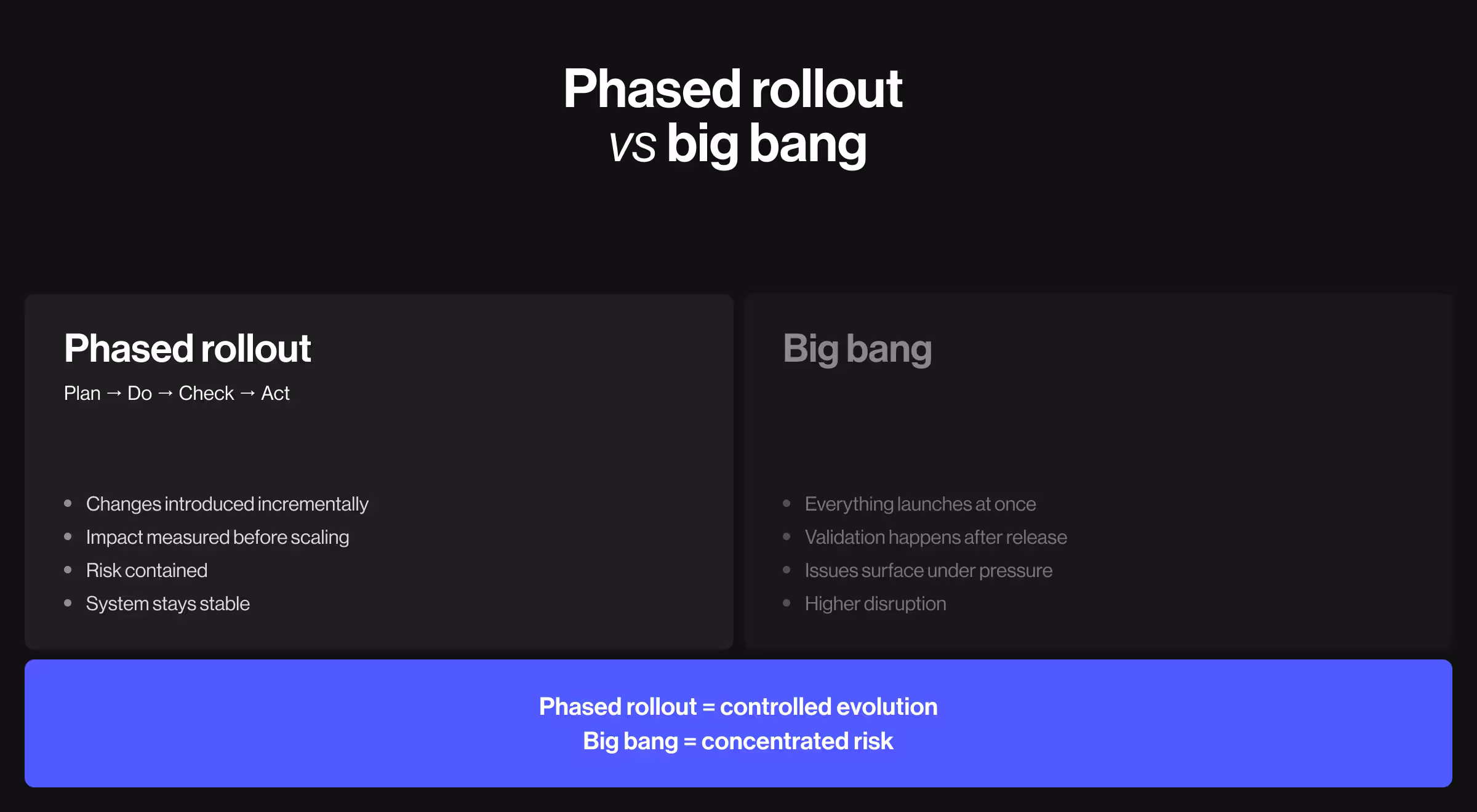
Why a phased rollout is safer than a big bang
“Some business owners and product managers see a phased rollout as a slowdown. In reality, it’s a stabilizer. Yes, research and strategy negotiation take time, but that time investment pays off. It surfaces hidden dependencies and avoidable risks and ensures the redesign strengthens the existing system.”
{{Kirill Lazarev}}
A phased rollout follows the logic of the Plan–Do–Check–Act paradigm:
- Plan: Define scope, key hypotheses, and success criteria.
- Do: Introduce changes incrementally.
- Check: Evaluate impact with data and user feedback.
- Act: Scale what works, refine what does not.
This model thrives on strategic research and disciplined execution. Your team should perceive redesign as a strategic initiative. It’s not a creative impulse with vague deadlines and flouting success benchmarks.
Two elements reinforce each other in a phased rollout: strategy + structure. Strategy defines where you are going and why. Structure defines how change enters the system without destabilizing it.
A phased approach provides:
- Risk containment
- Continuous validation
- Predictable performance tracking
- Reduced internal disruption
- Lower user shock
Only with this dual grounding your team can redeem a redesign as an evolutionary process.
How to intervene with a phased approach to product redesign
At Lazarev.agency, our team follows a phased approach when leading product redesign initiatives for venture-backed startups and enterprise platforms. The objective is always the same: modernize the product while protecting revenue streams and operational workflows.
Over time, we’ve refined this phased framework to maximize client outcomes and ensure sustainable business growth. Each phase must validate strategic intent, technical feasibility, and user impact before expansion.
Below is the structured progression we apply when intervening in live products.
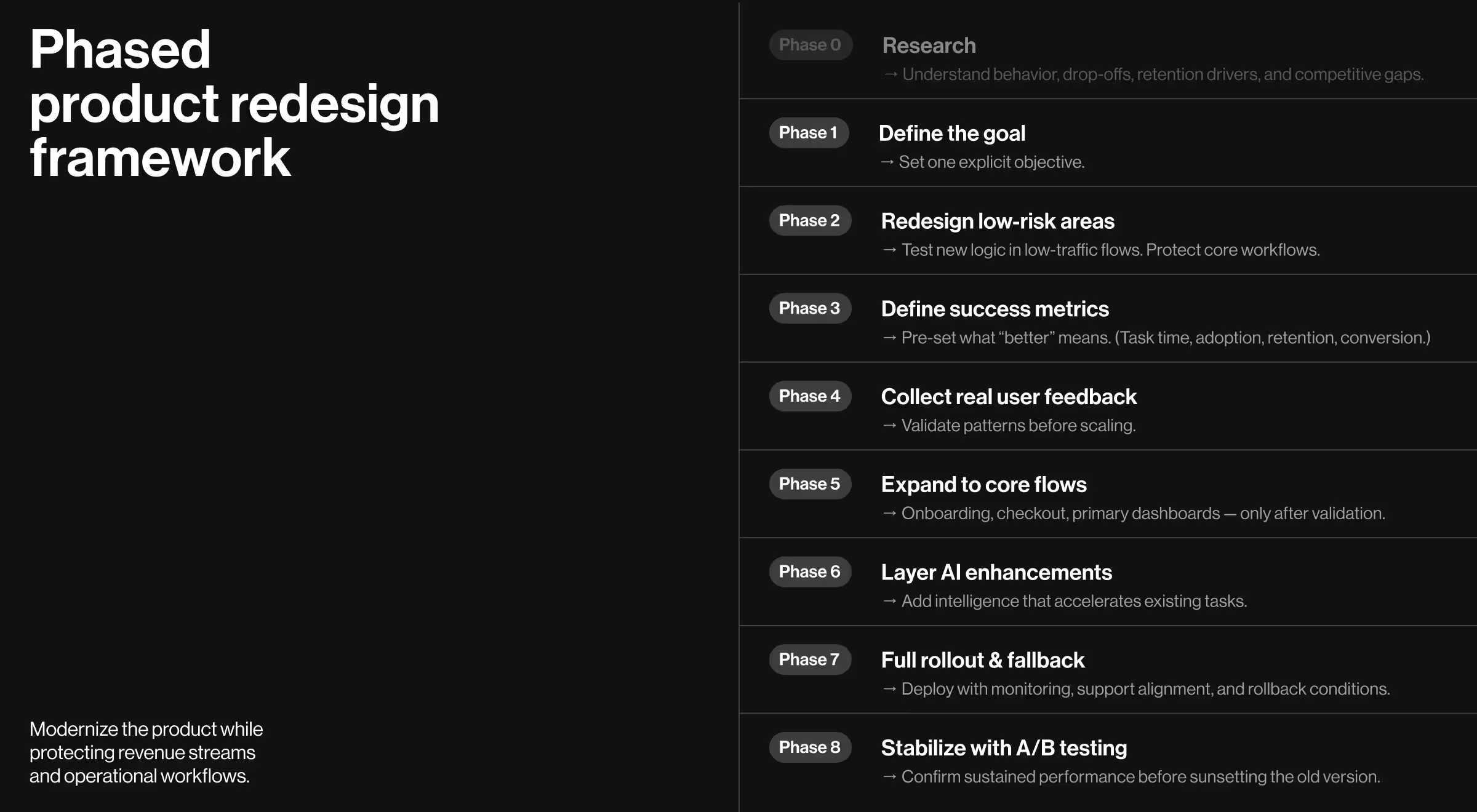
Phase 0. Start with market and user research
We call this step a Phase 0 because it’s non-negotiable.
Market research and UX research are a duo your product needs to succeed. Without a solid grasp of the environment your business operates in, planning and executing a product redesign is a wasted effort.
Research should answer:
- Has user behavior shifted?
- Where are drop-offs concentrated?
- Which features drive retention?
- Where does the product underperform its competitors?
- What workflows are mission-critical, and which distract users from the value proposition?
🔍 Explore our hub on the correlation between research and strategy as the backbone of every high-performance digital product.
Phase 1. Set your redesign goal
Research surfaces insights. Phase 1 converts those insights into a defined strategic direction. Without a crystal clear goal, teams either change too much or change the wrong things.
Clarify:
- Is the redesign aimed at improving retention?
- Boosting user engagement?
- Reducing onboarding drop-off?
- Increasing conversion rates?
- Refreshing brand perception?
- Supporting new market positioning?
- Preparing for AI integration?
The goal should be singular and explicit. For example:
- Reduce onboarding abandonment by 25%.
- Improve task completion efficiency in dashboard workflows.
- Increase discovery of high-margin features.
This phase aligns leadership, product, design, and engineering around a unified objective. It defines scope boundaries and prevents redesign sprawl.
Phase 2. Redesign low-traffic flows first
The first visible changes should occur where exposure risk is minimal. Treat Phase 2 as a controlled test environment inside your product.
The goal is to introduce new interaction logic and component structures without interfering with critical workflows.
Target:
- Secondary dashboards
- Informational pages
- Low-usage settings panels
- Non-core reporting views
While redesigning, preserve:
- Core interaction patterns
- Workflow sequencing
- Terminology users depend on
This stage tests new component systems and interaction logic without jeopardizing revenue-critical flows.
Phase 3. Identify success metrics
Redesign must be measured. Define metrics before rollout:
- Task completion time
- Feature adoption rate
- Session depth
- Retention impact
- Conversion performance
Success metrics show what “better” means for your project. They prevent subjective debates in the long run.
Phase 4. Integrate customer feedback into the assessment cycle
McKinsey reports that 75% of online customers expect support within 5 minutes of expressing concern, and over 60% are more inclined to purchase from businesses that offer personalized content.
Rising user expectations mean your team has to be on the lookout for changes in user behavior to ensure your business delivers a relevant experience. Collect:
- Structured usability testing
- In-product micro-surveys
- Support ticket analysis
- Power-user interviews
Customer feedback during redesign averts costly misjudgments. Users often articulate workflow disruptions before metrics start reflecting them. That’s why early signals matter.
🔍 Explore our Lead Designer’s insights about how to collect and interpret user feedback.
Phase 5. Expand to core flows after validation
Only after validation should your redesign extend to:
- Onboarding flows
- Checkout processes
- Primary dashboards
- Core operational workflows
Expanding your redesign to these four core flows too soon in the process escalates risks, whereas expanding confidently after validation is a strategic move.
🔍 Learn more about refining two critical flows: new customer onboarding and dashboard UX design.
Phase 6. Add AI-powered features
AI transformation has become a definitive force across most industries. Users now expect systems to anticipate and personalize on the spot.
Staying competitive means evaluating whether intelligence layers are required to keep pace with evolving standards.
Examples of AI-powered functionality include:
- Conversational UI within workflows: help users interact with complex systems through guided, contextual dialogue.
- Personalized AI-driven dashboards: adapt data visibility based on user behavior.
- Predictive recommendations embedded within existing workflows.
- Automated summaries of reports or activity logs.
- Context-aware filtering and decision assistance.
AI integration must respect established interaction models and accelerate existing tasks.
Phase 7. Full rollout with a fallback plan
This phase requires cross-functional alignment. Product, engineering, support, sales, and marketing must all be prepared for structural shifts in workflows and customer touchpoints. A redesign at this stage affects the entire operating system.
Before deployment:
- Confirm monitoring dashboards track previously defined success metrics
- Align support teams on expected user questions
- Update documentation and onboarding materials
- Define rollback conditions and technical reversion steps
Think of a fallback plan as a risk containment strategy. If performance indicators decline or critical workflows unexpectedly degrade, the ability to reverse suboptimal design patterns protects revenue and user trust.
Phase 8. Maintain A/B testing until stable performance is achieved
Initial improvements can be misleading. Early adopters may skew results, and power users may adapt faster than new users. A/B testing protects against premature conclusions.
Maintain A/B testing capability long enough to confirm:
- Sustained metric improvement
- Stable retention rates
- No operational regression
- Consistent behavioral patterns across user segments
This phase transforms redesign from a short-term experiment into a structurally verified upgrade. The previous version should only be fully sunset once comparative data confirms long-term stability.
Case studies proving the impact of strategic product redesign
Strategic product redesign is best understood in practice.
The following case studies are drawn from Lazarev.agency’s portfolio and reflect real redesigns across ecommerce, fintech, and data-heavy platforms. Each example follows the same logic: identify structural risk, intervene incrementally, validate impact, then expand.
These projects demonstrate how a phased approach protects workflows while boosting user experience.
1. Peel
🟥 Client concern: Peel is an advanced analytics platform built for Shopify merchants. As the product scaled, new features were added, but navigation became increasingly dense and difficult to parse. As a result, adoption lagged.
The redesign goal was clear: enhance usability and highlight Peel’s differentiation without disrupting merchant workflows or analytics logic.

📋 Our approach: We applied a structured, phased redesign focused on system-level clarity.
- Navigation re-architecture: Behavioral analysis revealed users were lost inside an expanding menu system. We regrouped the platform into 3 primary navigation categories and separated secondary features (search, training, settings). This established a predictable hierarchy and reduced cognitive strain.
- Pricing and account redesign: With the introduction of the Audiences feature, Peel evolved its pricing model. We redesigned account settings and plan selection pages with a comparison table to emphasize plan differentiation and position Audiences strategically.
- Standardized data tables: Tables are central to Peel’s analytics experience. We redesigned them with expanded functionality — search, sorting, filtering, and product image support — while ensuring consistency via a structured design system built on the Tailwind library.
- Responsiveness improvements: All redesign interventions were optimized for tablet and mobile environments to support analytics on the go.
- Unified filters and headers: Filters and headers were standardized across the platform. They were redesigned to remain pinned during scrolling.
Each intervention preserved core analytics workflows. Interaction patterns users relied on were retained, while navigation and overall structure were strengthened.
✅ Key outcomes:
- Faster access to insights through simplified navigation
- Improved discoverability of high-value features
- More interactive data tables
- Intuitive plan upgrades
- Consistent cross-device experience
💡 Strategic insight: Analytics platforms depend on structure. By re-architecting navigation and system components, Peel evolved into a more user-centered product without destabilizing merchant workflows.
2. Qore 8
🟥 Client concern: Qore8’s enterprise workflow optimization platform slowed engineering teams. Document conversion and approval processes were buried under navigation layers. Engineers navigated fragmented menus to complete routine tasks. Productivity decreased.
The objective of the redesign was to reduce task completion time and improve adoption across core engineering workflows.
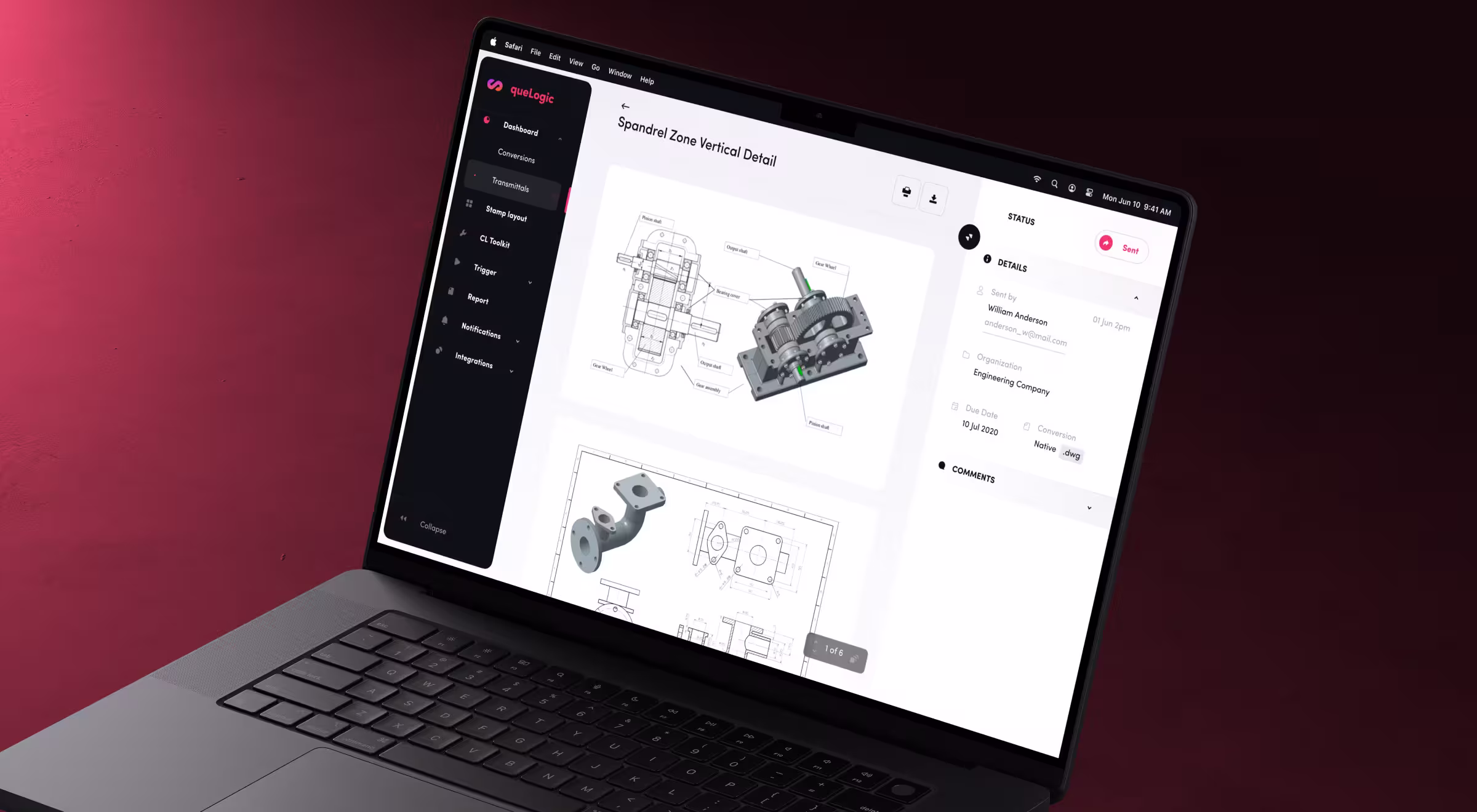
📋 Our approach:
- Rebuilt information architecture: We eliminated confusing navigation layers and introduced purpose-driven paths. Critical actions like drawing conversion and transmittal management became directly accessible.
- Implemented a scalable design system: We replaced the outdated user interface with a structured, cohesive workspace. Standardized UI components ensured consistency across modules and supported long-term scalability.
- Introduced role-based workflows: Interfaces adapted to engineers, project managers, and technical staff. Each role saw only relevant tools and data. Task focus improved.
✅ Key outcomes:
- 65% reduction in document conversion workflow time
- 3× faster stamp layout creation
- Improved adoption across engineering teams
💡 Strategic insight: Enterprise redesign succeeds when navigation mirrors user intent and interfaces reflect role structure.
3. Hedonism Wines
🟥 Client concern: Hedonism Wines, a premier fine wine retailer with over 6,500 wines and 3,000 spirits, faced a digital gap. While its London boutique signaled exclusivity, the website failed to reflect that.
Mobile users made up the majority of traffic, yet the experience was desktop-centric. Browsing was overwhelming, and the checkout was intricate. High bounce rates and abandoned carts limited revenue potential.

📋 Our approach:
- Mobile-first redesign: We rebuilt the platform around core principles of mobile UX design. Navigation became thumb-friendly. Search was prioritized. Curated collections surfaced early. The checkout flow was simplified to tackle abandonment.
- Navigation and discovery overhaul: We introduced a visual megamenu and enhanced search with intelligent suggestions. Sommelier-curated collections such as “100 Point Wines” and vintage-specific pages guided users toward premium selections.
- Conversion funnel simplification: The checkout experience was restructured with progress indicators, clearer labeling, product recommendations, and trust signals such as security badges and delivery timers.
- Brand and expertise elevation: We aligned the visual identity with Hedonism’s luxury positioning through premium typography, refined color systems, and expert ratings from sources like Robert Parker and Wine Spectator.
Throughout the redesign, we preserved established purchasing behavior while restructuring discovery and mobile usability.
✅ Key outcomes:
- 45% increase in add-to-basket actions across devices
- 2.8× more users progressed from browsing to checkout initiation
- 45% increase in completed checkouts
💡 Strategic insight: E-commerce redesign must strengthen discovery and fix mobile usability flaws without disrupting checkout logic. Revenue improves when hierarchy and trust signals are structurally embedded into the experience.
Redesign your existing product for success with a strategic approach
A product redesign is worth the effort when it aligns your brand identity, strategy, workflows, and user expectations without destabilizing what already sustains the business.
A well executed product redesign is a structured endeavour: research first, define a single strategic objective, intervene in controlled phases, validate with metrics and feedback, and scale only after you have proof it works.
If you are contemplating a product redesign for your business, reach out to our team for a professional debrief to assess risks, dependencies, and structural readiness before making changes.


.webp)