

What comes to mind when you think of crypto design? Eccentric visuals, bold typography, gamified interfaces packed with charts, or stats-heavy dashboards with numbers only seasoned traders can make sense of?
That image didn’t appear by accident. Web3 has been around long enough to hardwire a certain expectation of how crypto products should look and behave. And while bold visuals and dense dashboards still have their place, many of these features are giving way to more deliberate patterns.
Staying relevant in an industry undergoing changes every minute means designing systems that help users understand what’s happening and how to make informed decisions faster.
In this article, we’ll look at the key UI/UX trends shaping the next generation of crypto websites and explain how leading teams are using design to stay ahead.
Key takeaways
- Best crypto website design treats products as live systems. Web3 interfaces are now operational control rooms. They expose real-time state, enable fast context switching, and support complex workflows without overwhelming users.
- Wallet-first UX replaces traditional onboarding and personalization models. In crypto, the wallet is the user. Interfaces that adapt instantly to on-chain identity, assets, and permissions outperform those built around generic homepage-led flows.
- Leading design partners like Lazarev.agency assist in shifting crypto UX from monitoring to decision support. Best-in-class crypto websites use AI to interpret signals and display relevant information.
Why is the crypto market getting so crowded so fast?
No one sees crypto as an experiment anymore. What was once a niche ecosystem of early adopters is now a fast-scaling digital market attracting capital and users at an unprecedented pace. New protocols launch weekly. Wallets, marketplaces, analytics tools, and trading platforms compete side by side.
The data says it all:
- The global cryptocurrency market is expected to grow from $6.34 billion in 2025 to $18+ billion by 2033, according to Grand View Research.
- Digital currency ownership has already surpassed 560 million users worldwide, representing 6.8% of the global population, based on data from Triple-A.
- Even focused segments are scaling rapidly. NFT market revenue alone is forecasted to reach $489 million by 2026, per Statista.
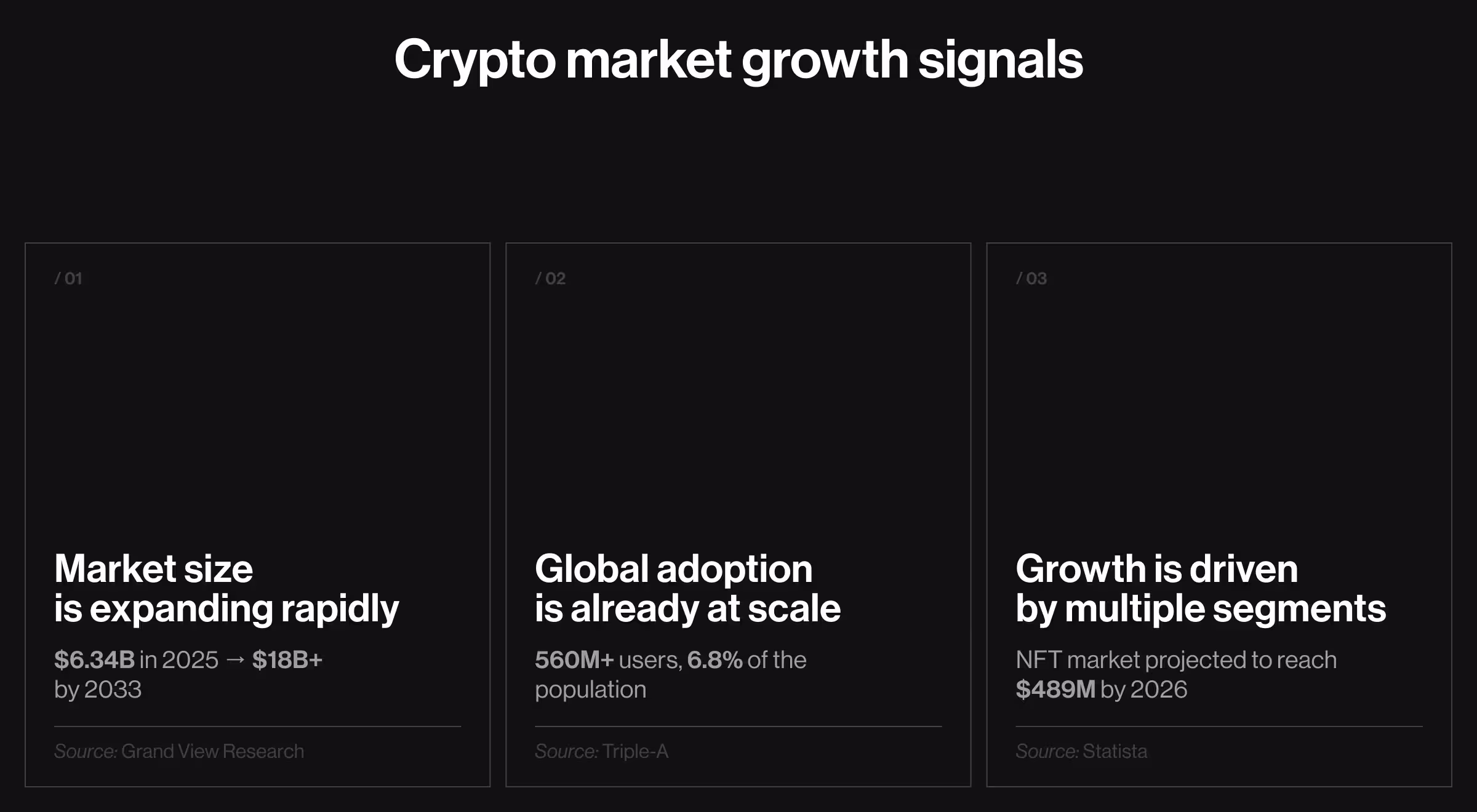
These figures highlight that growth is accelerating, and so is competition. More users mean more expectations. More capital means more products chasing the same attention. Feature innovations fade away quickly, and technical differentiation alone no longer guarantees traction.
This is where Web3’s defining trait comes into play.
“Crypto is a 100% digital industry. There are no physical touchpoints, no offline distribution channels, no traditional retail advantages. Competitive capacity is executed almost entirely through . Interfaces, flows, clarity of information, trust signals, and speed of understanding — all of it matters.”
{{Kirill Lazarev}}
The teams that lead the market are the ones who recognize emerging UI/UX patterns early and implement them before those patterns become expectations.
What are the top crypto web design trends to consider for your Web3 product?
At Lazarev.agency, a Web3 & blockchain design agency, we’ve witnessed firsthand how visionary web design solutions supercharge growth trajectories for DeFi companies, NFT startups, and crypto brands alike.
Three directions stand out as especially promising: operational interfaces, cognitive UX, and trust-native design.
Let’s have a look at each in turn.

Operational interfaces: crypto as a live system
“Next-gen Web3 design treats crypto products as densely inhabited ecosystems. Users live in them: tracking positions, managing risk, coordinating with peers, and reacting to multi-chain turbulence in real time. Your UX can’t be static. It has to keep up with how users work.”
{{Ostap Oshurko}}
Crypto interfaces are becoming operational control rooms. This category captures the transition toward UIs that expose system states, enable context switching, and support complex workflows without collapsing under their own weight.
In 2026, the best crypto websites will optimize for situational awareness, control, and uninterrupted execution.
Here’s how design reflects that conceptual shift.
1. Wallet-first interfaces
What’s changing: Crypto websites are abandoning homepage-first thinking. The wallet becomes the interface entry point, and everything else adapts around it.
Why this matters in crypto: In Web3, the wallet is the user. It holds identity, permissions, digital assets, and on-chain history. If you design flows without accounting for the wallet first, you’re effectively designing for a user that doesn’t exist. This mistake leads to broken assumptions and irrelevant UX.
How it shows up in best crypto website design:
- Immediate UI reconfiguration after wallet connection
- Role- and asset-aware dashboards
- No hard split between “marketing site” and “app”
💡 Practical insight from Lazarev.agency: A wallet connection is a state change that unlocks context. The moment a wallet connects to your app or protocol, the interface should re-prioritize navigation, surface relevant actions, and adjust data.
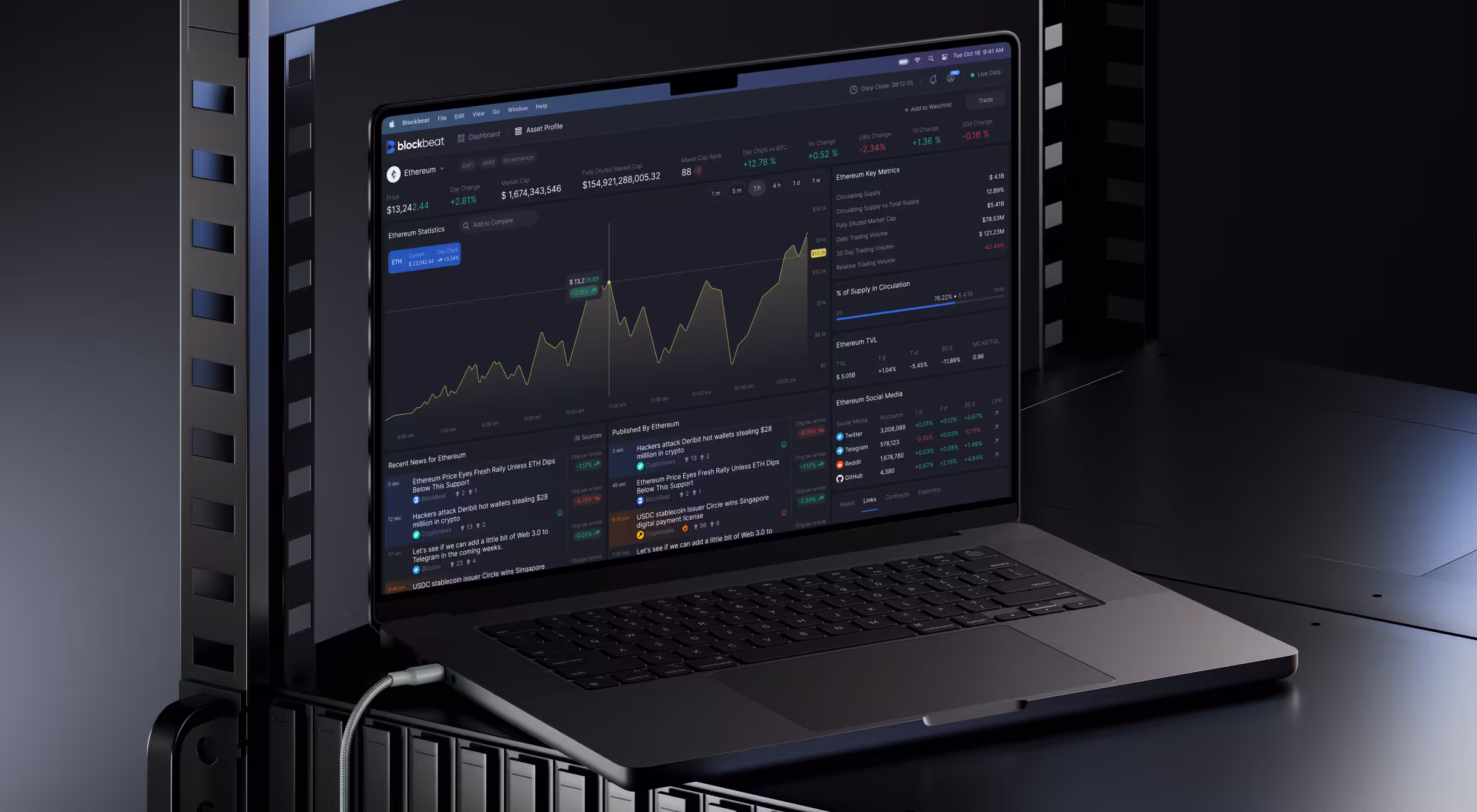
2. Crypto dashboard as a product control room
What’s changing: Dashboards evolve from portfolio summaries into operational command centers.
Why this matters in crypto: Crypto users operate in multi-variable environments. That’s why a multifunctional dashboard is non-negotiable. It helps users react to protocol changes and coordinate actions across systems.
How it shows up in CollectorCrypt:
- Dashboards are designed as operational hubs. Each module reflects a live system state and points directly to the next logical action.
- Widgets follow a strict label–value–action logic: what this is, what’s happening now, and what I can do next. Recent activity blocks surface transaction status and eliminate context-switching between monitoring and execution.
- Every tile is both informative and executable. If a widget can’t trigger a meaningful flow (trading, minting, payments, or deeper inspection), it doesn’t belong on the dashboard surface.

💡 Practical insight from Lazarev.agency: Before adding a dashboard widget, force a label–value–action test. Can the user name what it shows and act on it immediately? If any part is missing, that widget belongs deeper in the product.
🔍 Explore our field guide on how to create a crypto dashboard design your users will love and trust.
3. Multi-chain context switching as a core UX layer
What’s changing: Chain context becomes explicit and inseparable from every action.
Why this matters in crypto: Different chains imply different execution models, costs, finality guarantees, and risks. Treating chains as interchangeable UI settings hides critical context and leads to expensive errors.
How it shows up in best crypto website design:
- Always-visible network state indicators
- Outcome previews tied to the active chain
- Guardrails when users attempt cross-chain actions
💡 Practical insight from Lazarev.agency: Never allow chain context to disappear. The active network should be as visible as the user’s balance. Designers should assume that if the chain state is subtle, users will make assumptions. And assumptions are how funds get lost.
4. Team and DAO workflow optimization interfaces
What’s changing: Crypto products are moving beyond solo users and toward interfaces designed for decentralized autonomous organizations (DAOs).
Why this matters in crypto: Governance, treasury management, and daily operations are inherently collaborative. Designing for individuals alone breaks down as soon as multiple stakeholders are involved.
How it shows up in best crypto website design:
- Role-based permissions that reflect real governance and ops structures
- Shared dashboards for collective visibility and decision-making
- Multisig-aware workflows that support proposals, approvals, and execution
💡 Practical insight from Lazarev.agency: Design DAOs around roles. Start by mapping real operational roles (proposer, signer, observer, executor), then express them in the UI.
5. Real-time, state-aware update architecture
What’s changing: Interfaces explain state changes.
Why this matters in crypto: Markets, protocols, and positions change all the time.
How it shows up in best crypto website design:
- What has changed since the last time summaries
- Cause-and-effect explanations
- Event-driven UI updates
💡 Practical insight from Lazarev.agency: Whenever the interface updates automatically, it must explain what changed and why. Numbers or balances that get modified without context break trust, even if the data is accurate.
Cognitive UX: designing for intent
“For years, crypto UX rewarded technical literacy. Users had to have a solid grasp of chains, gas, contracts, and transaction flows to complete basic tasks. That model is far from scalable. In crypto web design ready for growth, the interface itself carries the cognitive load to help users navigate, reason, decide, and act.”
{{Danylo Dubrovsky}}
This category highlights trends that surface meaning over raw data and leverage AI as a decision-support layer.
6. AI-first dashboard design
What’s changing: AI shifts from an extra feature to a cognitive infrastructure.
Why this matters in crypto: Crypto overwhelms users with raw data. AI transformation shifts the experience from constant monitoring to assisted decision-making by automating actions and surfacing what matters most at the right moment.
How it shows up in Blockbeat:
- AI is embedded directly into the information architecture. It tags signals, ranks relevance, and explains market movement across the dashboard. That’s how users get to focus on insight.
- Dashboards are structured around cause-and-effect reasoning. News items are visually and interactively linked to asset performance, allowing traders to see how specific events influence price movement over time.
- Personalization is handled through AI-assisted filtering. Traders control the signal-to-noise ratio by refining filters and customizing watchlists.
💡 Practical insight from Lazarev.agency: AI earns trust when it explains before it suggests. An experienced AI UX designer always knows to pair AI-driven prioritization with lightweight reasoning cues.
7. Intent-based actions instead of technical steps
What’s changing: Interfaces allow users to act on intent rather than execute technical steps.
Why this matters in crypto: Most crypto users think in outcomes.
How it shows up in CoW Swap:
- Primary actions are framed around desired outcomes. Users express intent (“swap this for that under acceptable conditions”) while routing logic is handled behind the scenes.
- Technical information is abstracted by default but inspectable on demand. Execution details are available for review without interrupting the main flow.
- Failure states are communicated in intent-aware language. When an order can’t be fulfilled, users receive an explanation of why the intent failed.
💡 Practical insight from Lazarev.agency: Hide gas, routing, and solver logic by default. But never hide outcomes. The UI must make it easier to decide without making it harder to verify.
8. Conversational UI as a secondary interaction layer
What’s changing: Conversation UI augments navigation by enabling explanation and exploration.
Why this matters in crypto: Many questions users have are contextual. Why did this change? What happens if I proceed? Static UI elements struggle to respond to those on the spot.
How it shows up in best crypto website design:
- Conversational explanations of wallet, protocol, or transaction state
- Natural-language queries into portfolios, positions, or protocol mechanics
- Dialogue-triggered actions with clear confirmation and risk framing
💡 Practical insight from Lazarev.agency: Use chat to explain state changes and trade-offs.
9. AI-assisted transaction previews
What’s changing: AI-assisted transaction previews translate on-chain actions into clear, verifiable outcomes before execution.
When a user initiates a transaction, the system simulates it against the current network and protocol conditions. The preview shows exactly what will change, what it will cost, and what the risks are before the actual transaction.
Why this matters in crypto: Crypto transactions are irreversible. Users need clarity before committing value on-chain.
How it shows up in best-in-class crypto website design:
- Best- and worst-case outcome simulations
- Clear fee, slippage, and time estimates
- Visual summaries of balance, position, and permission changes
💡 Practical insight from Lazarev.agency: Design previews to guide decisions. If users never adjust their actions, the preview is useless.
10. Progressive disclosure UI
What’s changing: Interfaces expose complex steps only when they’re relevant to the user’s intent or experience level.
Why this matters in crypto: Crypto products must support new users and power users within the same system without fragmenting their digital experiences.
How it shows up in best crypto website design:
- Advanced options hidden by default
- Controls and data revealed contextually
- Clean primary flows optimized for common actions
💡 Practical insight from Lazarev.agency: Reveal advanced options only when the user's action depends on them. Showing power features too early trains users to ignore everything else, which is one of the most common reasons new features fail to stick. Explore our feature adoption strategy to scale complex workflows without overwhelming users.
11. On-chain identity–driven personalization
What’s changing: Personalization is inferred from wallet activity and credentials.
Why this matters in crypto: Privacy-first design and decentralization make traditional accounts, emails, and tracking unsuitable.
How it shows up in best-in-class crypto website design:
- Role-aware UI based on wallet holdings, permissions, or participation
- Dashboards that adapt to on-chain history and behavior
- Access gated by verifiable credentials or ownership proofs
💡 Practical insight from Lazarev.agency: Leverage wallet and on-chain data to simplify flows and suggest sensible defaults. Personalization should create shortcuts and clarity, never lock users into inferred personas they can’t control.
Trust-native design: making risk, security, and transparency visible
“While the crypto industry is continuously evolving, there are two constants. First, trust can’t be taken for granted. Second, mistakes are irreversible. This dual reality demands a fundamental reconsideration of how interfaces communicate risk and system integrity.”
{{Danylo Dubrovsky}}
In Web3, critical information can’t live in the background. It must be visible at every interaction.
This category brings together trends that treat transparency as a first-class UI function. Below is how structured data, verifiable signals, and calm, status-driven aesthetics play out in practical design solutions.
12. Structured data dashboards
What’s changing: Data is presented as structured, interpretable insights. Interfaces guide users through reasoning and help make sense of relationships between assets and potential outcomes of their actions.
Why this matters in crypto: On-chain data is dense and multi-dimensional. When poorly organized, it obscures meaning and undermines trust.
How it shows up in Metastaq:
- Data is organized around business intent. The dashboard centers on releases, NFT collections, and wallets.
- Information is broken into modular, purpose-driven blocks. Frequently used actions and states live at the center of the interface, while KPIs and system statuses are intentionally pushed to the periphery.
- Hierarchy is consistent across screens and states. Whether users are minting NFTs, managing collections, tracking finances, or setting up an e-store, the structural logic remains consistent.

💡 Practical insight from Lazarev.agency: Structure data around decisions. If users must mentally translate contracts, hashes, or IDs into business meaning, the dashboard has failed.
🔍 Learn more about how to structure an NFT dashboard.
13. Embedded risk and confidence signals
What’s changing: Risk indicators are integrated directly into the interface.
Why this matters in crypto: Users often face losses because potential risks like volatility or liquidation aren’t visible until it’s too late.
How it shows up in dYdX:
- Ambient indicators for market volatility or price swings. Account health, margin usage, and liquidation thresholds are persistently visible.
- Proximity warnings for liquidation or margin thresholds. As margin tightens, visual emphasis gradually increases.
- Subtle visual cues embedded in charts, balances, and transaction flows. Position size, leverage, and liquidation price coexist in the same visual field.
💡 Practical insight from Lazarev.agency: Risk should feel directional. Gradual visual emphasis (color, scale, proximity) teaches users to steer early instead of react late. If risk only appears at the edge, it’s already too late.
14. Transparent security UX
What’s changing: Transparent security is one of the pillars of blockchain UX design.
Why this matters in crypto: Transactions are irreversible. Users need to understand risk before they sign.
How it shows up in MetaMask:
- Clear permission scope before execution. When a dApp requests access, the platform explicitly shows what permissions are being granted, whether access is one-time or ongoing, and which assets or actions the contract can control.
- Contextual risk warnings within the confirmation UI in the format of flags for unverified or suspicious contracts, warnings for known scam patterns, and explanations when a transaction deviates from expected behavior.
- Real-time security feedback embedded in transaction flows.
💡 Practical insight from Lazarev.agency: Security UX must surface permission scope, duration, and blast radius in plain language.
🔍 Explore our practical insights on building crypto app design that wins trust, users, and investors.
15. Minimalist design
What’s changing: Visual design is a strategic communicative system, where every element exists to convey state or enable action.
Why this matters in crypto: Users make irreversible, high-stakes decisions. Inconsistencies in visual design increase cognitive load and anxiety.
How it shows up in best-in-class crypto website design:
- Dark-first palettes optimized for long sessions
- Color used strictly to signal status, risk, or primary action
- Motion applied sparingly to confirm changes
💡 Practical insight from Lazarev.agency: In crypto, visual restraint is a safety feature. Reserve color and motion exclusively for state changes and risk notifications.
Build a crypto experience users trust
The best crypto website design operationalizes clarity. It turns dashboards into control rooms, AI into decision support, and security into something users can verify. It anticipates mistakes instead of explaining them post factum. And it respects the reality that in Web3, every click can carry irreversible consequences.
This level of design requires a partner who understands crypto as a live system where UX, product strategy, and on-chain mechanics are inseparable. At Lazarev.agency, we work at that intersection. We embed effective design principles for crypto web design to develop platforms that earn trust through structure.
If your product needs confidence and a real competitive advantage, now is the moment to design it right. Get in touch and let’s build a crypto experience users trust when it matters most.


.webp)


.avif)


