

The better your AI operates, the less visible it becomes.
High-performing models automate decisions, compress workflows, remove manual steps, and solicit decision-making. Technically, it sounds ideal. From a user perspective, it can create distance.
This is the AI Visibility Paradox: the stronger the model, the easier it is for its reasoning to disappear behind the interface.
But effective AI cannot remain opaque. The principle is simple: strong AI is understandable AI. If users cannot see how conclusions are formed, or how their input shapes outcomes, confidence weakens.
In this article, we discuss why AI products plateau despite technical excellence, and what it takes to design intelligence-driven systems people trust.
Key takeaways
- Model performance doesn’t guarantee adoption. Users adopt AI when it is legible — clear, controllable, and credible.
- Visibility beats opacity. Comparative metrics and structured transparency make AI value clear.
- Trust increases when uncertainty is acknowledged. Surfacing limitations and failure states strengthens credibility more than hiding them.
- AI becomes valuable when it becomes collaborative. Human–AI workflows and embedded feedback loops transform automation into partnership.
Why your AI product adoption rates fail
“Most AI products entering PMF or post-PMF stages operate under the assumption that strong model performance will drive adoption by default. The logic seems sound: as users engage, the system learns. More real-world usage generates more use cases — what we at Lazarev.agency call a user-generated use case framework, and overall output accuracy improves.
Yet, what happens in real life is quite different: user activation and engagement unexpectedly go downhill. Why? Because your target audience doesn’t get your AI product fully.”
{{Kirill Lazarev}}
This system-level disconnect usually stems from one issue: intelligence, no matter how helpful and structurally cohesive, is not operationally legible to the user.
Users evaluate AI products through 3 lenses:
- Clarity — Do I understand what this system does for me right now?
- Control — Can I influence or refine the output?
- Credibility — Do I trust the result enough to act on it?
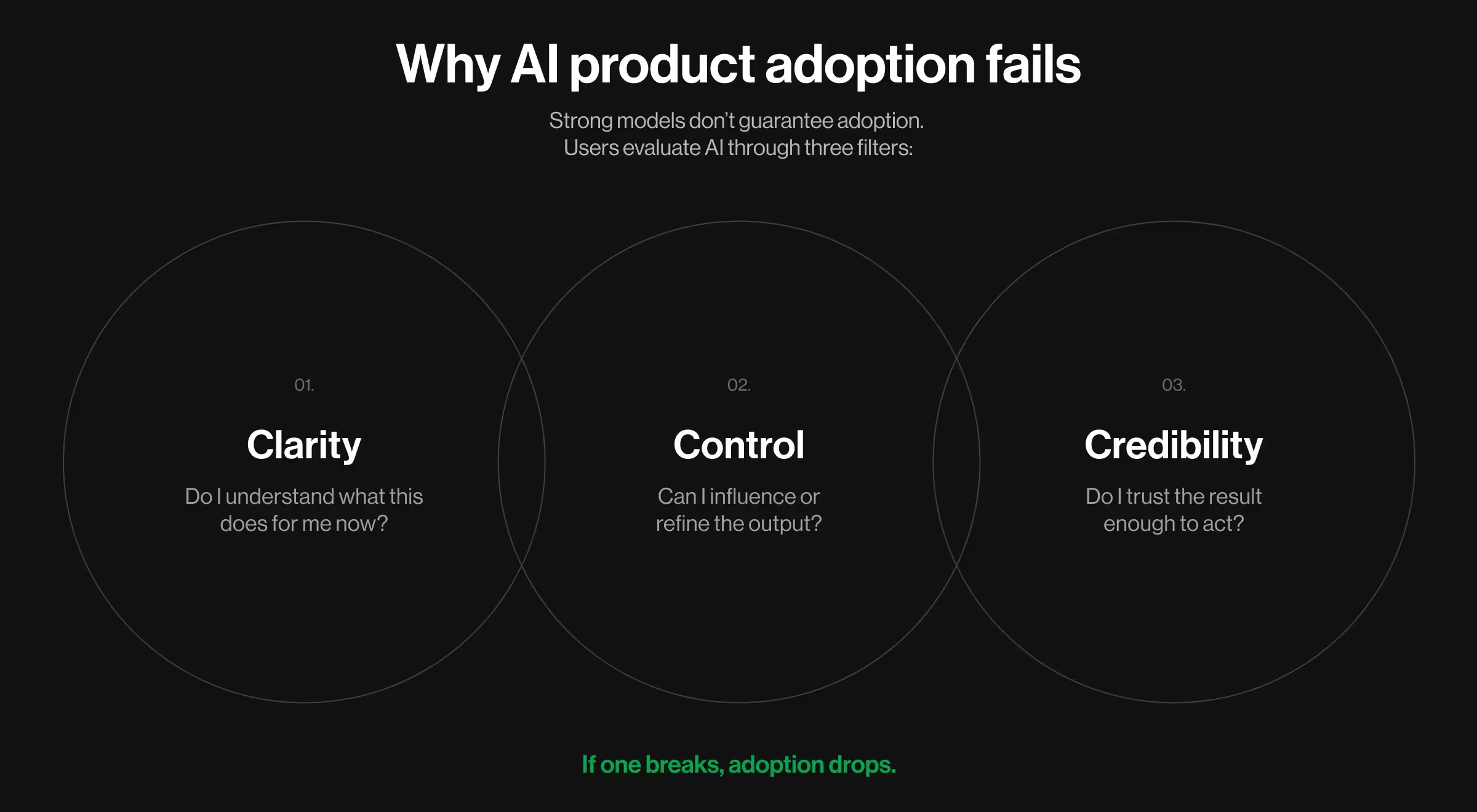
When any of these dimensions are under-designed, adoption weakens regardless of model quality.
The following structural gaps are the most common failure points observed across AI-driven products in growth and monetization stages.
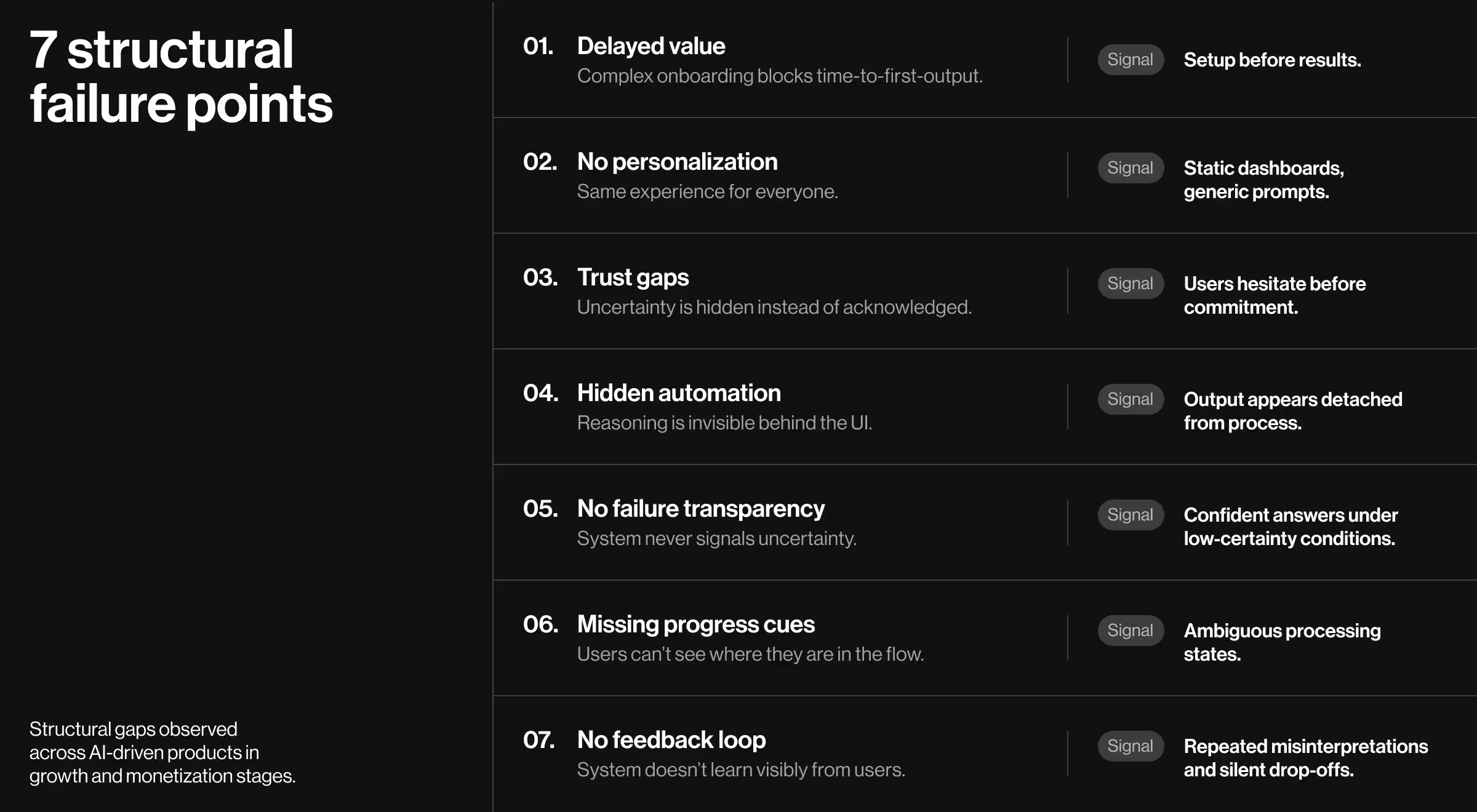
1. Unclear or delayed value proposition
When users encounter structural/cognitive barriers before recognizing real value, abandonment becomes far more likely.
Many AI products overload the first interaction with complex setups and data configurations. Users are expected to understand the system before the system earns the right to be understood.
What we’ve seen from auditing our clients’ performance is that the core of the problem sits within the onboarding architecture.
🟥 Signals your onboarding is blocking value for your product:
- Users must configure multiple fields before seeing output
- Explanations precede interaction
- First session does not deliver a concrete result
- Value requires completing several setup stages
AI products need a fast time-to-first-output. Users should see something useful asap. Because when value is delayed, adoption stalls.
🔍 Explore our Design Lead’s playbook on how to design new customer onboarding that guides users to value fast.
2. Lack of personalization
AI products with no personalization defeat the premise of intelligence. In AI-driven environments, personalization is the baseline expectation.
Data insight: According to McKinsey, 71% of customers expect personalized interactions, and 76% report frustration when personalization is absent.
Where personalization is commonly overlooked:
- Same dashboard for every role
- No adaptive prompts based on prior behavior
- Static recommendations
- Uniform email or notification flows
When personalization is absent, engagement declines. The system feels mechanical rather than intelligent.
3. Trust concerns
AI gets the benefit of the doubt as long as users keep it at arm’s length. When it’s time to share personal information or commit to a financial transaction, trust is what defines whether your users will stay.
Data insight: According to the Pew Research Center, a median of 34% of adults report being more concerned than excited about increased AI use, while 42% report feeling both concerned and excited.
This duality shapes user behavior. Users ask:
- How reliable is this output?
- What data is being used?
- Is confidentiality granted by default?
- Can this system be wrong? And if yes, how will that affect me?
If your interface does not address these concerns directly, users create their own assumptions.
5. Arrogance by default: ignoring failure states
“Trust doesn’t require perfection. It thrives on transparency. If your AI system never signals uncertainty, it’s perceived as infallible by design. That perception creates skepticism.”
{{Kirill Lazarev}}
Users know models are probabilistic. The problems emerge when the interface pretends otherwise.
There are predictable moments where the system is inclined to generate incomplete outputs.
Possible failure scenarios include:
- Ambiguous intent. The user’s request can be interpreted in more than one way. Yet, the system picks one path without clarifying why.
- Incomplete or outdated data. The model produces a confident answer based on partial context.
- Competing interpretations. Several valid outcomes exist, but only one is presented as definitive.
- Low confidence conditions. The system’s certainty drops, yet the UI communicates the result with equal authority.
Paradoxically, surfacing uncertainty boosts trust. When users see the system acknowledge context gaps or lower prediction strength, they are more willing to engage with it. They adjust their inputs and act on the system’s recommendations. And that iteration is how users start treating the interaction with your AI product as collaboration.
6. No progress clues
AI systems often assume progress is self-evident. It’s not.
When users cannot see where they are in a workflow or how close they are to completion, disorientation sets in.
When a user submits a query or initiates a task, they expect signals:
- Is the system processing correctly?
- Has it interpreted my objective accurately?
- Are we progressing toward the outcome I expect?
Without visible markers, AI is perceived as being detached from intent. Even correct outputs appear accidental.
Common symptoms of missing progress cues in design:
- Long processing states with no explanation or reassuring signals
- Multi-step flows presented as a single ambiguous action
- No confirmation that intent was parsed correctly
- No summary before final execution
Progress cues communicate alignment. They signal that the system understands the objective and is advancing methodically.
7. No feedback loops
AI products evolve through interaction. Without feedback, that evolution is impossible. Here’s what happens when user input is overlooked:
- Models stagnate in edge cases
- UX assumptions remain untested
- Misinterpretations go unnoticed
- Drop-offs happen without explanation
That’s why user feedback is the only reliable way to detect where hesitation occurs. It reveals moments where the output is irrelevant or the intent has been misunderstood.
Understanding these signals of misalignment between system logic and user expectation is the first controlled step toward improvement.
🔍 Feedback loops should be embedded into the interaction layer. Learn how to collect, analyze, and act on user feedback in our dedicated miniguide.
How to make AI value visible
“Many AI teams consider clarity a by-product of strong model performance. They believe that if the model is powerful enough — if it automates decisions and optimizes workflows — adoption will take care of itself. The thinking goes: the system works, and the metrics improve across the entire performance spectrum; thus, the user objective must have been fulfilled. But performance alone doesn’t communicate value. Design does.”
{{Kirill Lazarev}}
In practice, performance without structured visibility leaves room for questions. Not curiosity-led questions, but suspicion-driven ones. Users see outputs, but they don’t see the algorithmic logic behind them.
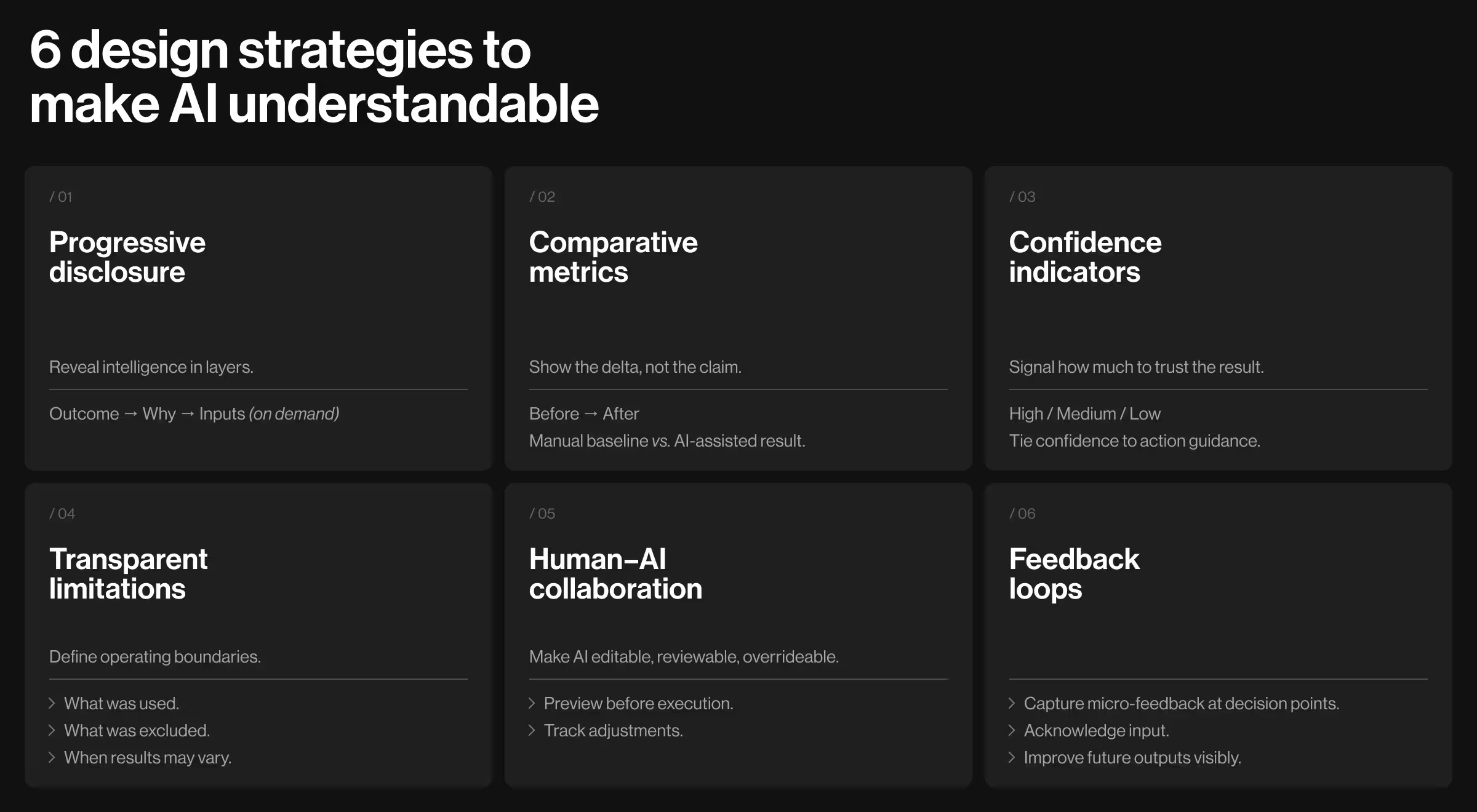
There are many strategic ways to embrace the value of your AI product. In most cases, all you need to do is to integrate visibility into the design layer. Below are 6 proven design strategies that will help you ensure the AI value of your product is understood.
1. Progressive disclosure
Take it step by step. Reveal intelligence in layers.
When you surface every capability at once, users feel overwhelmed. When you hide too much for too long, they may assume there’s nothing meaningful behind the interface. Both extremes weaken perceived value.
Progressive disclosure resolves this tension. It delivers immediate clarity — what the system did and why it matters — while making deeper logic, data signals, and advanced controls available on demand.
✅ Implementation insights:
- Default view: show outcome first (summary, recommendation, prediction).
- Secondary layer: allow users to expand into “Why this result?” panels.
- Tertiary layer: expose input variables, assumptions, or model constraints.
- Avoid presenting full reasoning chains by default.
- Allow inspection through toggles or expandable sections.
- Design disclosure states intentionally in your design system (consider collapsed, expanded, expert modes).
2. Comparative metrics
Don’t explain the value. Illustrate it.
Users understand value faster when they can compare the output of their interaction with your system to their starting point.
“Here’s what changed” beats “here’s what we do” every time. Comparative metrics turn AI from a black box into a visible delta: time saved, risk reduced, options narrowed, accuracy improved, workload reduced.
✅ Implementation insights:
- Show before → after. Compare manual baseline vs. AI-assisted outcome (time, steps, quality).
- Display side-by-side options. AI recommendation vs. next-best alternative.
- Quantify the delta. “1,240 items → 37 to review.” “12 anomalies flagged.”
- Place comparisons at decision points. Approve, publish, deploy, upgrade.
- Surface uncertainty. Use ranges or confidence bands instead of false precision.
3. Confidence indicators
AI outputs are probabilistic. Users don’t need a lecture about that. They need a signal that tells them how much to trust the result and when to verify. Confidence indicators help users make faster, safer decisions without feeling blind.
✅ Implementation insights:
- Use human-readable tiers (High / Medium / Low) alongside optional numeric detail.
- Tie confidence to recommended action:
- High: “You can proceed”
- Medium: “Review key inputs”
- Low: “Request more info / verify manually”
- Show what reduced confidence (missing data, low coverage, conflicting signals) in 1–2 bullets.
- Use consistent placement: same location across modules, same meaning across the product.
4. Transparency about limitations
Users trust systems that know what they cannot do. Limitations are not weaknesses when framed as operating boundaries. This prevents misinterpretation, reduces escalation when outputs are suboptimal, and protects adoption in higher-stakes workflows.
✅ Implementation insights:
- Add a contextual limitations panel: “This result excludes X, assumes Y.”
- Clarify data sources and coverage: what was used, what was not used, and why.
- Explain edge cases through examples: “If your data has fewer than N events, results may vary.”
- Surface constraints inline at the moment they matter.
- Distinguish “can’t” from “won’t”: privacy limits, permission limits, technical limits.
- Write limitations as operating rules users can act on.
5. Human–AI collaboration workflows
AI should function as a collaborator.
Users understand AI faster when they can shape it. Collaboration workflows give users structured control: edit, approve, reject, refine. That control does not reduce automation. It makes automation acceptable in real work.
✅ Implementation insights:
- Provide edit-and-approve steps for high-impact actions (publish, send, charge, change).
- Introduce override paths: “Use this instead,” “Exclude this input,” “Pin this rule.”
- Show what the AI will do next before it does it (preview before execution).
- Save user adjustments as preferences when repeatable.
- Make collaboration auditable: “AI suggested → user adjusted → final output.”
6. Feedback loops for model improvement
Users will teach your AI if you make it easy and worth their time. Feedback loops make the product feel alive and responsive, and they protect adoption when the model misses. The key is to capture feedback at the right moment, in the smallest possible form.
✅ Implementation insights:
- Use micro-feedback: thumbs, quick tags (“irrelevant,” “missing context,” “wrong assumption”).
- Trigger feedback contextually: after a decision, after an edit, after a rejection.
- Ask for one-step corrections: “What should it have considered?” with selectable options first.
- Close the loop with visible acknowledgment: “Saved. This improves future results.”
- Route feedback into product ops: dashboards for pattern detection, recurring failure clusters.
How to design an AI-first fintech platform users trust from day one:
When Accern partnered with us to build Rhea, an AI-powered research platform, the goal was clear: go beyond everyday chatbots and create a serious analytical instrument. The challenge was equally understandable: make advanced AI usable and trustworthy from the first interaction.
Here is how design made that possible.

The problem
Accern had a pre-trained AI model capable of deep financial analysis across massive datasets. But raw intelligence isn’t understandable by default.
🟥 The risks were structural:
- Financial research workflows are complex and multi-layered
- Analysts work with charts, datasets, references, and exports
- Pure chat interfaces collapse under data-driven tasks
- If users cannot understand how insights are formed, they hesitate to use them
Conclusion: The product could not afford to be a chatbot dressed up for finance. It had to offer a professional-grade research environment where AI augments expertise.
The solution
We approached Rhea as an AI-first platform. Our design team focused on 4 elements to achieve that.
1. A hybrid GUI + prompt interface
We designed a hybrid system that combined prompt-driven interaction with dynamic widgets.
- Split-screen layout for research and output
- Charts, tables, references, and controls surfaced contextually
- Widgets that adapt to the flow of conversation
2. An adaptive natural language system
A common trap AI systems fall into is context misinterpretation. When users phrase a query imperfectly, the system either produces a weak answer or doubles down on it.
We built an adaptive communication layer, so that when ambiguity appears, Rhea:
- Asks clarifying questions
- Suggests refinements
- Offers hints to sharpen intent
3. A multi-purpose command line
We transformed the prompt field into an advanced command line, so users could:
- Search files
- Configure alerts
- Manage automated emails
- Schedule notifications
4. Integrated datasets and file management
We designed a system of pre-configured datasets (“Lenses”) and custom data connections through Accern’s NLP platform. Users could upload, manage, and contextualize their own files.
This made reasoning traceable:
- Users knew which dataset shaped the result
- They could switch contexts deliberately
- They could inspect sources rather than assume
The outcomes
Rhea did more than launch successfully. The redesigned product played a pivotal role in Accern’s trajectory from Series B to acquisition, with over $40M raised during the partnership.
From a product perspective, the outcomes were equally important:
- Analysts could navigate complex research without feeling overwhelmed
- AI outputs were inspectable
- The system supported full workflows
- Advanced functionality felt structured
The result was a powerful and comprehensive AI tool with measurable business outcomes.
AI visibility is a strategic advantage. Make it intentional
When intelligence stays hidden behind the interface, people step back. They avoid committing to outcomes the system recommends. And slowly, usage plateaus.
Visibility changes that.
When users can see how a conclusion was formed, adjust it, challenge it, or inspect its limits, something shifts.
If you’re building or scaling an AI product, start with a question: Can my users clearly see why the system did what it did?
If the answer is “well, not quite” or any other shade of doubt or uncertainty, that’s a sign to consider a phased approach to AI product redesign.
At Lazarev.agency, we approach AI UX as the un-automated layer where AI products earn adoption. We construct systems where intelligence is woven into workflows, and where users clearly understand the why behind every output and decision.
If you’d like an expert perspective, reach out. Let’s create usable AI products that your customers keep coming back to.




.webp)