How B2B project management app design optimized task management and team collaboration
About the project
Challenge:
GoPingu is a centralized platform for creating, organizing, and managing tasks within structured workflows, designed to unite teams and drive productivity. While the MVP had a preliminary design, it lacked the polish and usability needed for enterprise adoption.
The client approached Lazarev.agency to elevate the platform through a full redesign, applying B2B project management app design principles to enhance user experience, improve team collaboration, and ensure the solution meets the needs of modern business operations.
Experience strategy
The essence of our UX design strategy was to redefine task management, shifting it from mundane routine to a delightful endeavor. This transformation was achieved through a symphony of automations that streamline processes and a design that invites interaction, establishes connections with workers and infuses a playful sense of enjoyment.
Staying on top of the projects
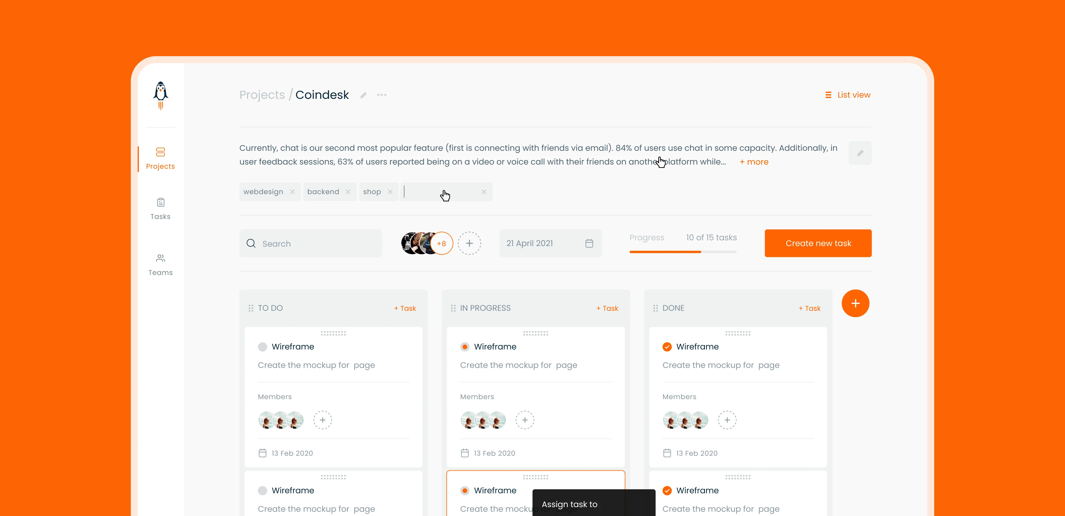
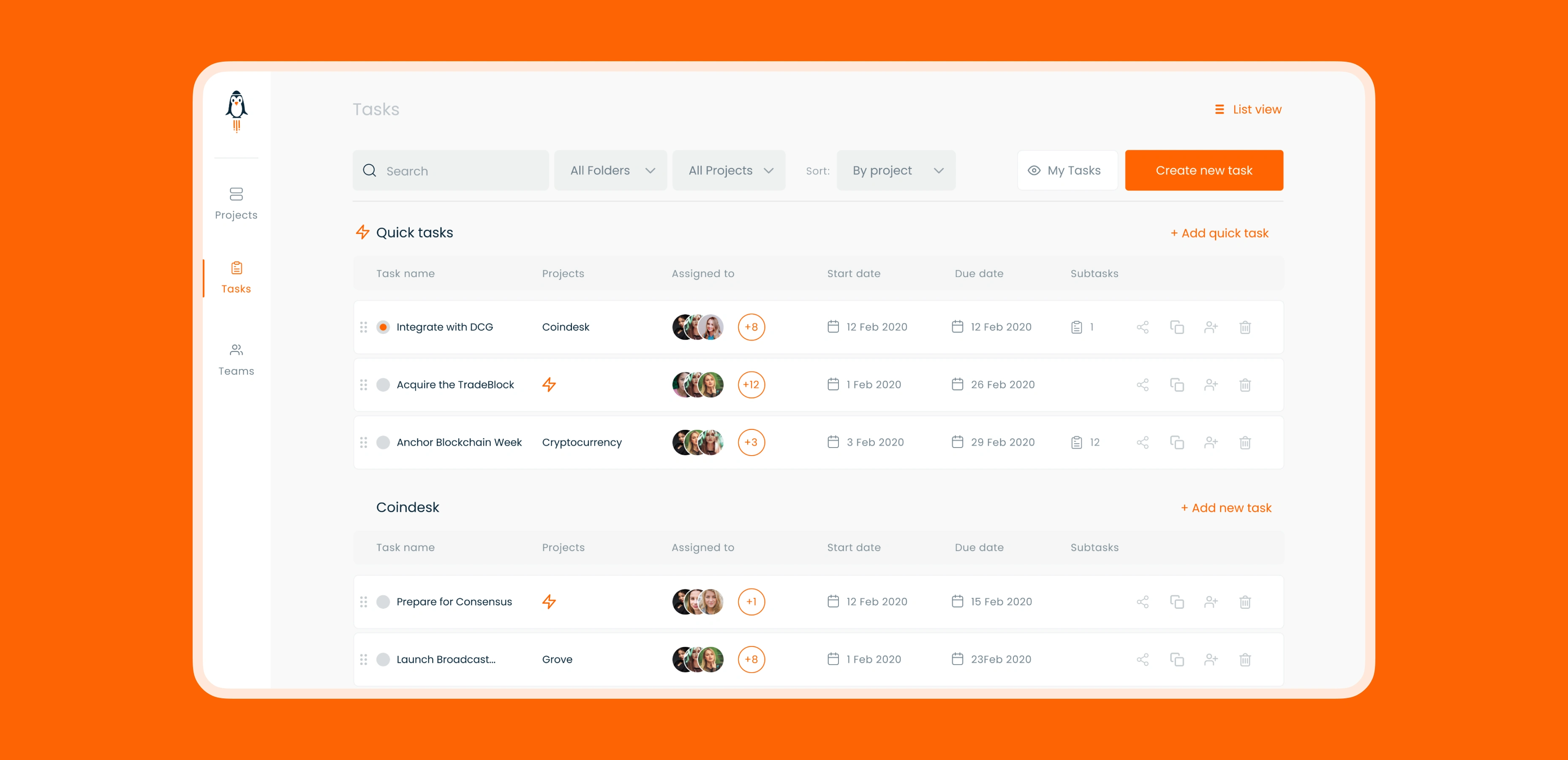
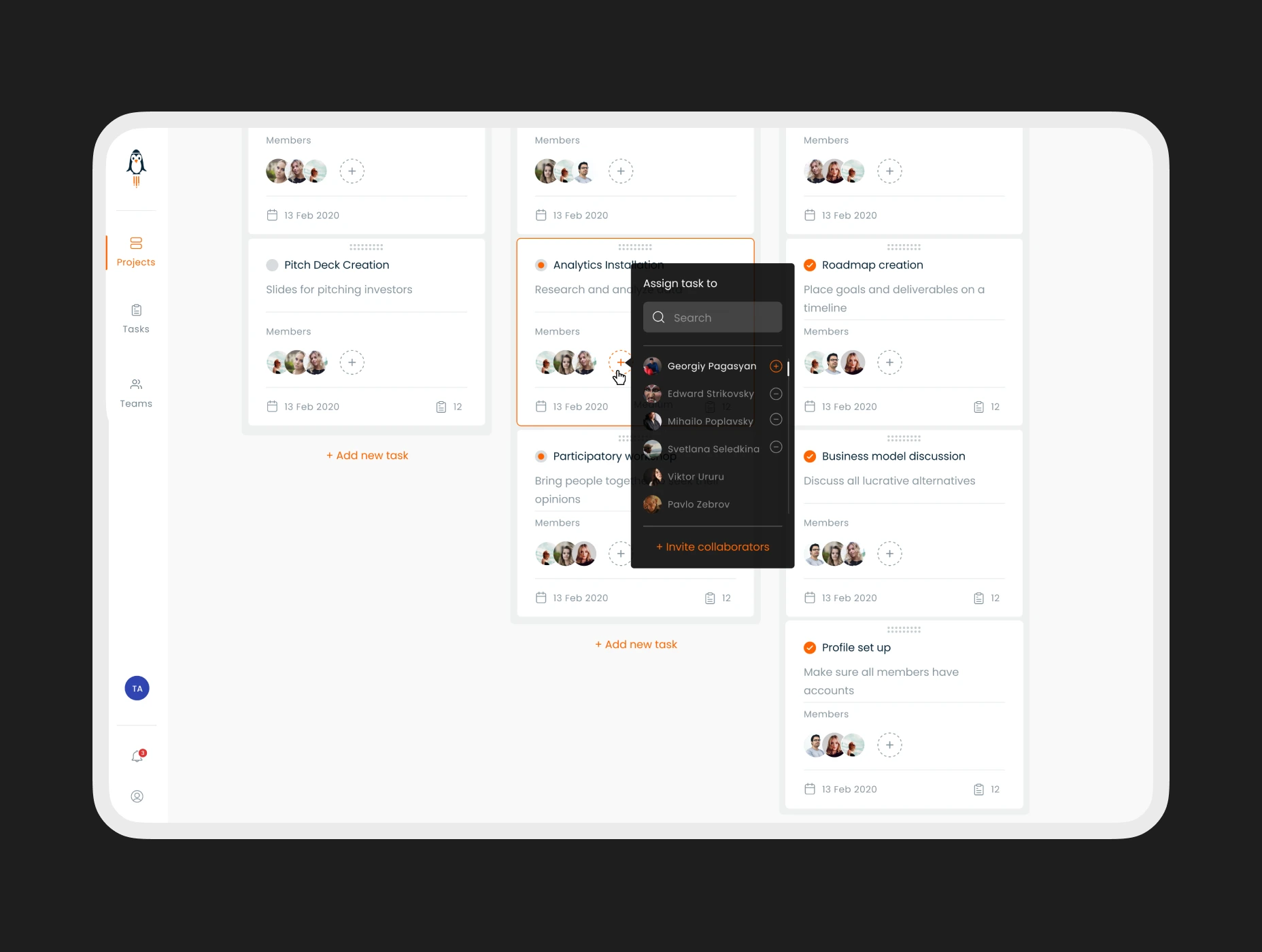
We empower workers to orchestrate tasks and subtasks seamlessly in a foolproof checklist format, ensuring they tackle the right task at the opportune moment. Employing a Kanban-inspired layout, a familiar sight for many, we expedite user familiarity with the interface, minimizing any potential bounce rate.
Design for series A funding: why your product is the problem
Effortlessly managing projects
Understanding the multitude of mundane tasks that burden project managers, our aim was to empower project managers to effortlessly track and manage projects without being weighed down by unnecessary actions.
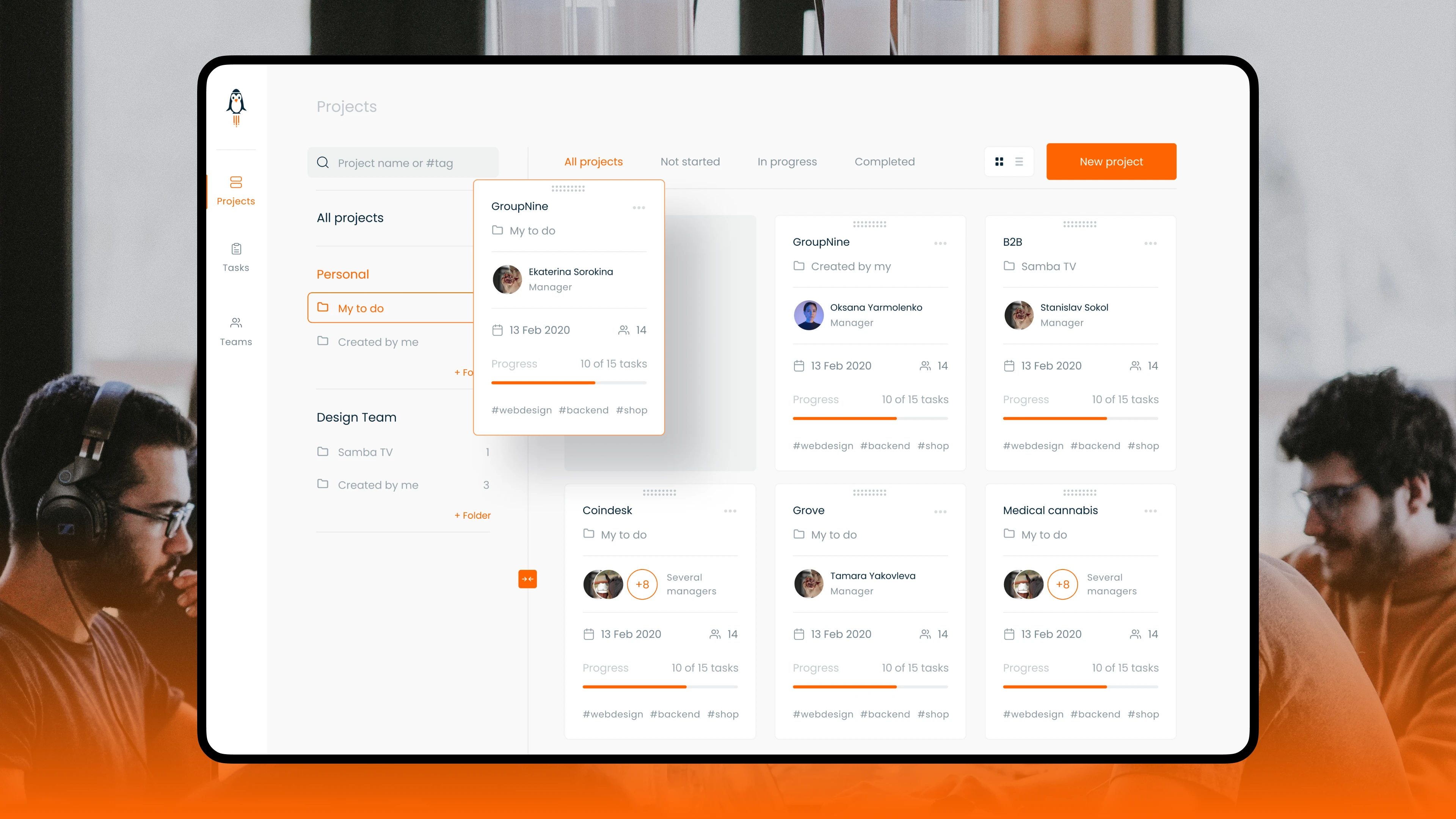
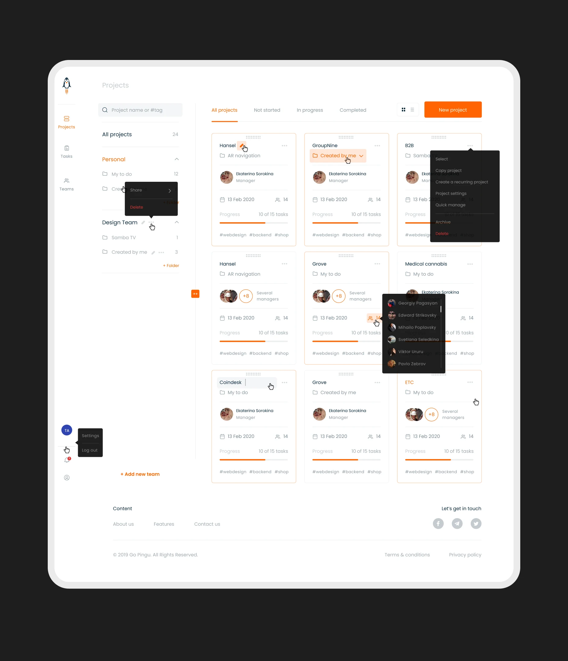
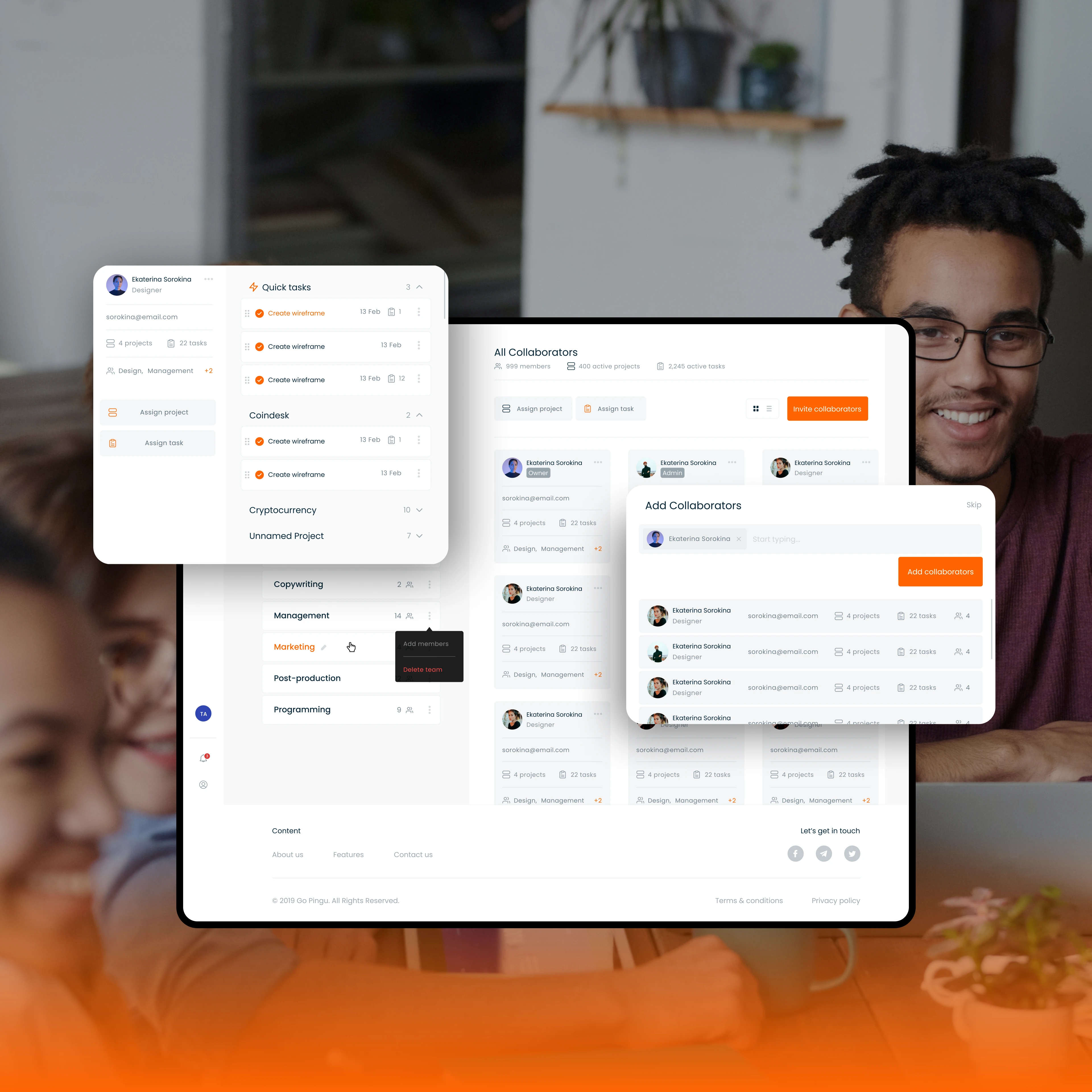
With this goal in mind, we consolidated all essential information, such as progress and deadlines, into the project card and provided an intuitive editing option right on the dashboard, through user-friendly pop-ups.
Surfing the project data hub
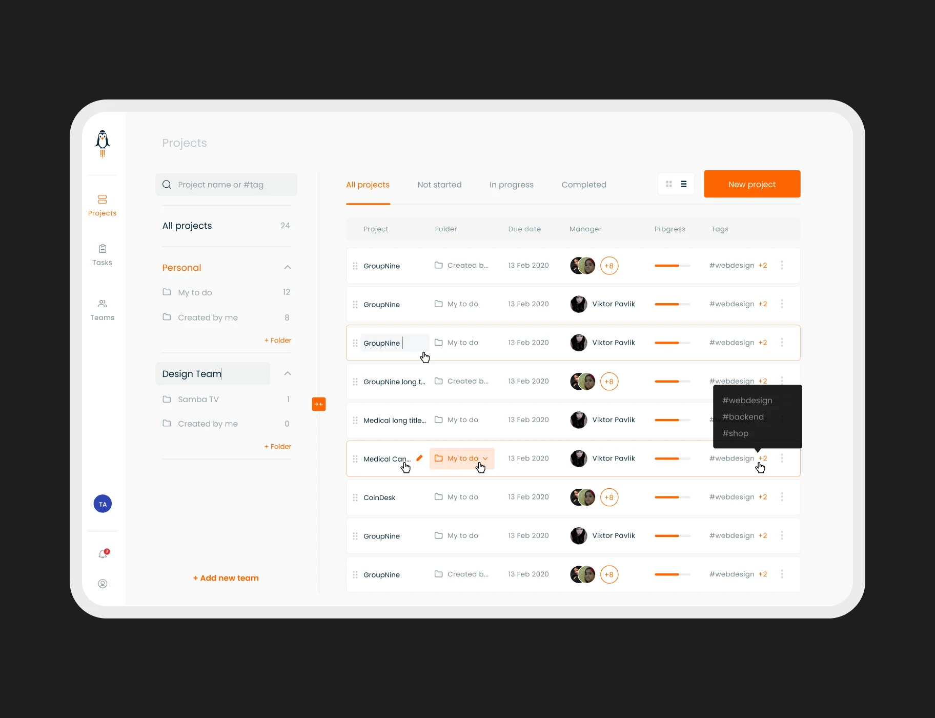
Our inner project page adheres to established UX principles, enhancing user acquisition. Within this interface, we offer two distinct views: kanban and list view. These views cater to diverse user personas with varying tasks to accomplish within the inner project page.
Managing team members
Considering the intricate nature of team management, particularly for projects involving the contributions of numerous experts, we introduced a Team module. It ensures an equitable distribution of workloads, leaving no project without designated team members. Managers gain the capability to seamlessly add or remove team members, assign specific roles, and perform other essential functions to optimize team efficiency.
Streamlining work operations on mobile
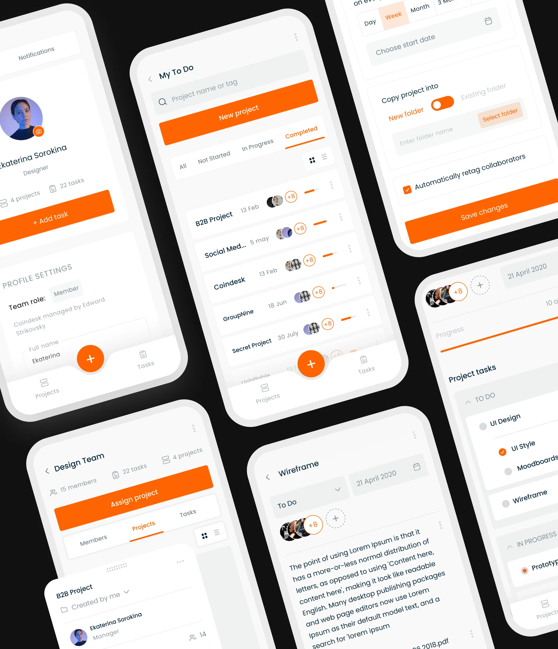
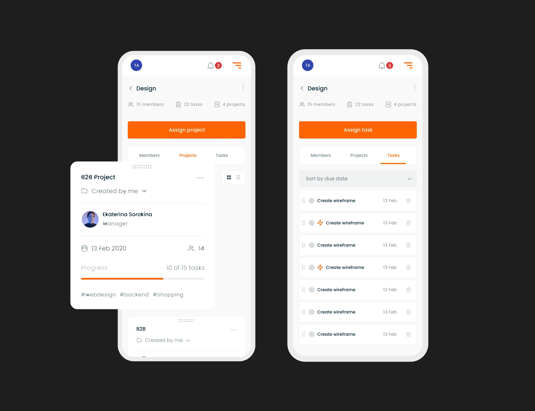
Given the widespread use of mobile devices, it became imperative for us to develop a mobile version of the GoPingu app. However, our goal was not only to adapt to this mobile landscape but also to make the transition smoother for users encountering new UX patterns.
To achieve this, we thoughtfully retained certain UX elements from the desktop interface and seamlessly integrated them with the standardized mobile UX, creating a harmonious user experience across platforms.
Frequently asked questions
Common questions
about this topic
How can B2B project management app design improve team productivity?
A thoughtful design streamlines task organization, clarifies workflows, and reduces friction, enabling teams to focus on high-value work and make collaboration more efficient.
How does design enhance workflow visibility for enterprises?
Intuitive dashboards and interactive interfaces give teams clear visibility into tasks, deadlines, and priorities, helping managers allocate resources efficiently and employees stay aligned on business goals.
What role does automation play in enterprise project management apps?
Automation simplifies repetitive tasks such as task assignment, reminders, and progress tracking. This reduces manual effort, lowers errors, and frees teams to focus on strategic initiatives.
How can a B2B project management app support cross-department collaboration?
Centralized workflows, shared boards, and real-time updates allow multiple teams, marketing, operations, finance, to coordinate seamlessly, improving alignment and accelerating project delivery.
How does user-centered design impact adoption of enterprise apps?
A design-focused approach ensures interfaces are intuitive and accessible, reducing training time, minimizing resistance, and encouraging consistent usage across departments and teams.
How can project management design drive measurable business outcomes?
By optimizing workflows, improving collaboration, and enabling faster decision-making, proper design directly impacts productivity, efficiency, and overall operational performance.
Why is it important to redesign legacy project management tools?
Redesigning outdated platforms removes complexity, modernizes visuals, and introduces smart features, helping enterprises keep pace with evolving workflows and maintain competitive advantage.
More cases like this
Related cases you
might find useful
How we helped Accern design an AI research product that powered $40M growth and acquisition
Discover how we helped Accern build a powerful AI research tool for analysts and VCs, setting new UX standards now used by AI leaders across industries.
How Lazarev.agency helped Dynascale attract new leads and build an engine for profit growth
See how Dynascale overcame growth challenges with strategic brand revamp & enterprise-grade UX by Lazarev.agency.
How we helped a complex AI SRE tool website boost customer acquisition
See how Lazarev.agency transformed Bacca AI's complex tech into a compelling story that boosts SRE platform sales.
Let's talk about your AI adoption challenge
Tell us where adoption stalls. You’ll hear back from a senior product and UX lead with a practical action plan.
.avif)