Skip to content
Let's talk
Home
Cases
Blavity House Party

How a festival event page redesign boosted Blavity’s ticket sales

About the project

A festival page built to convert browsers into ticket buyers

A festival competes for attention with every feed on a phone. When the lineup, dates, and pass options are hard to find, visitors leave before they reach checkout, and a sale slips away. For the 2024 House Party in Nashville, Blavity Inc. needed an event page that made the schedule, the tickets, and the energy of the festival immediately clear.

Lazarev.agency delivered that page. A bold, easy-to-navigate design put performances and pass options front and center, so attendees found what they needed and acted on it, driving more ticket sales, stronger engagement, and a packed turnout.
Watch Live

A bold event page to transform attention into ticket sales

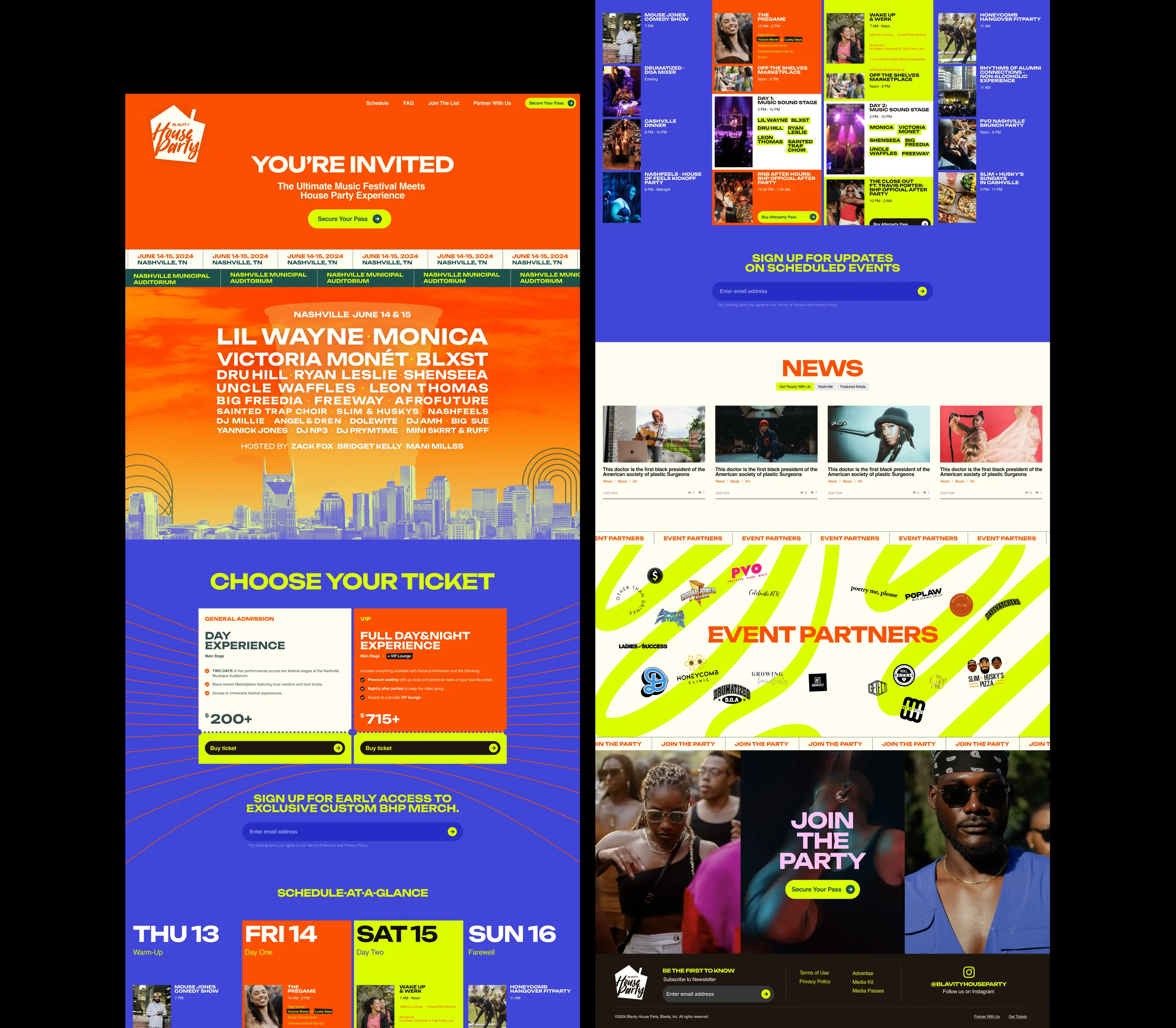
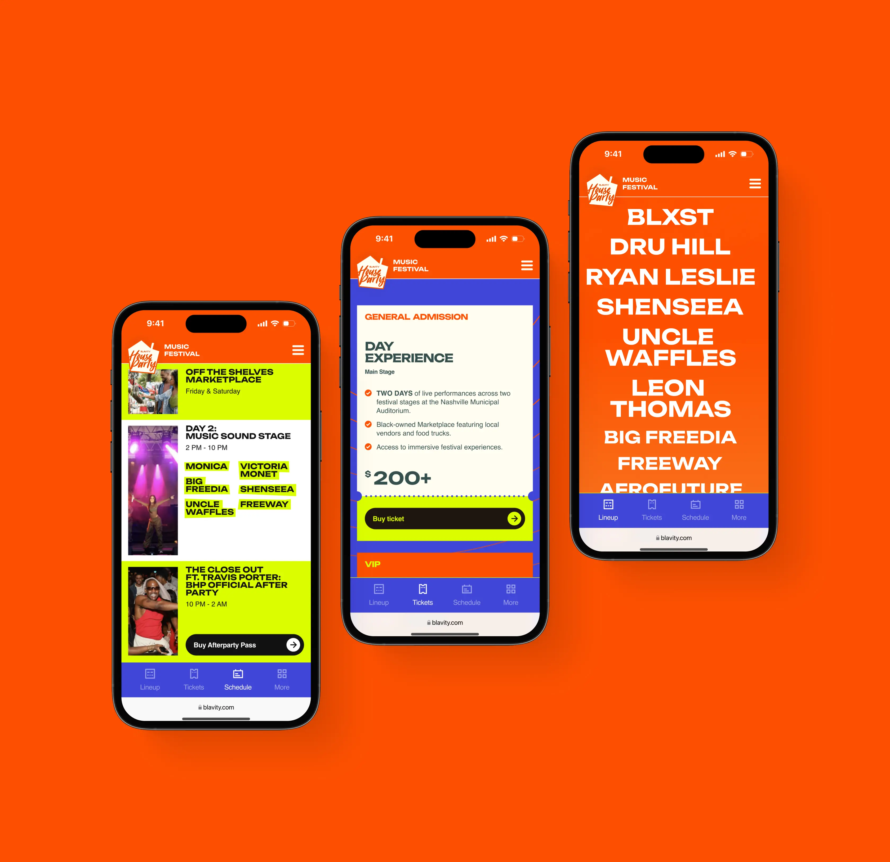
A visitor decides in seconds whether an event is worth their money. We gave that decision everything it needs up front: a lineup screen with headliners set large and unmissable, a schedule broken out by day and stage so attendees can see exactly what they'd be buying into, and ticket tiers laid side by side with plain pricing and a one-tap path to buy.

As a result, attendees could easily find what they came for, weigh a pass against the full schedule, and reach checkout without hunting — a shorter route from arrival to purchase, and the conversion lift that comes with it.

News and partner sections to sustain engagement and prove sponsor value

A lineup alone gives no one a reason to come back and leaves sponsors with nothing to point to. 

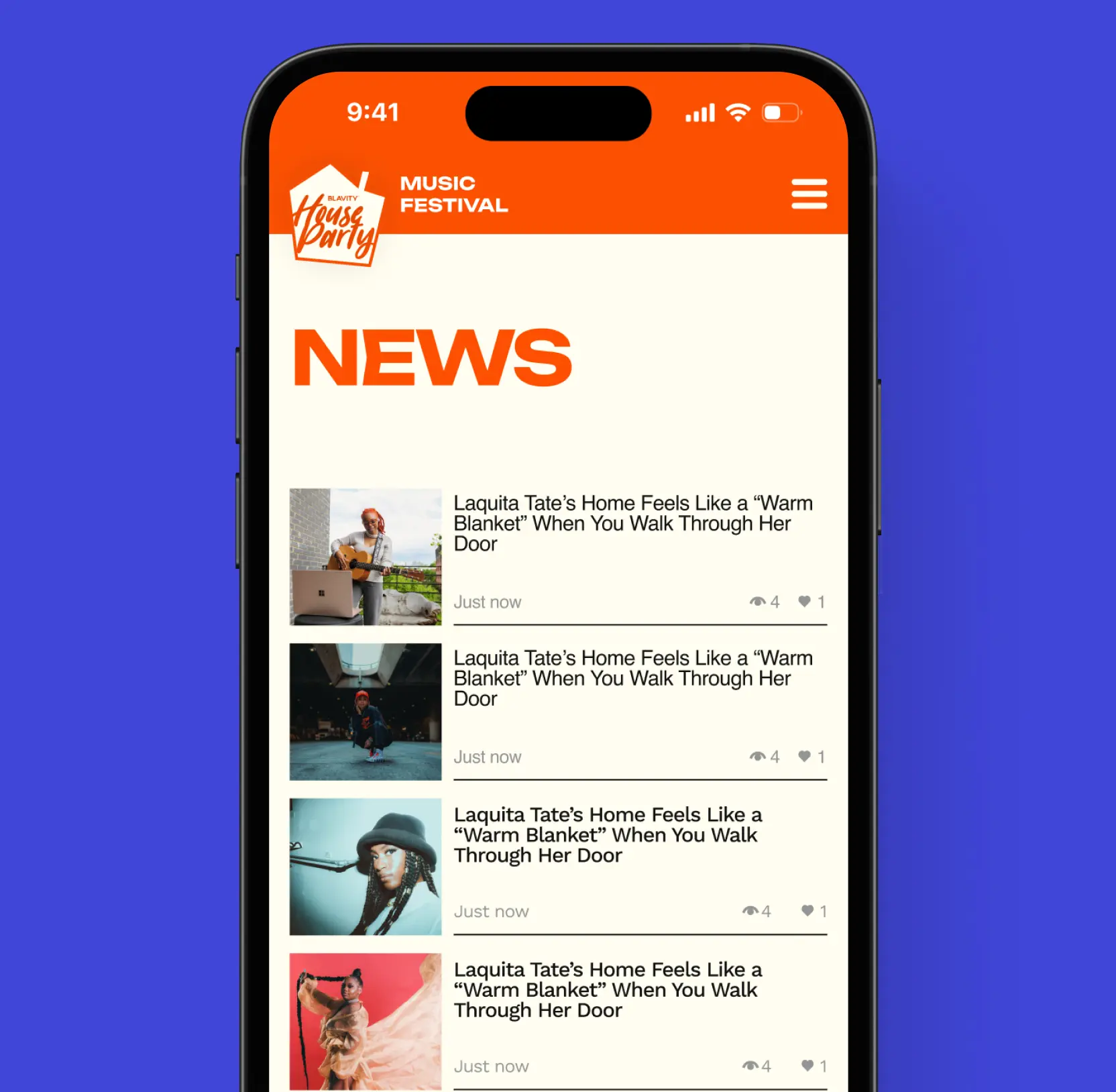
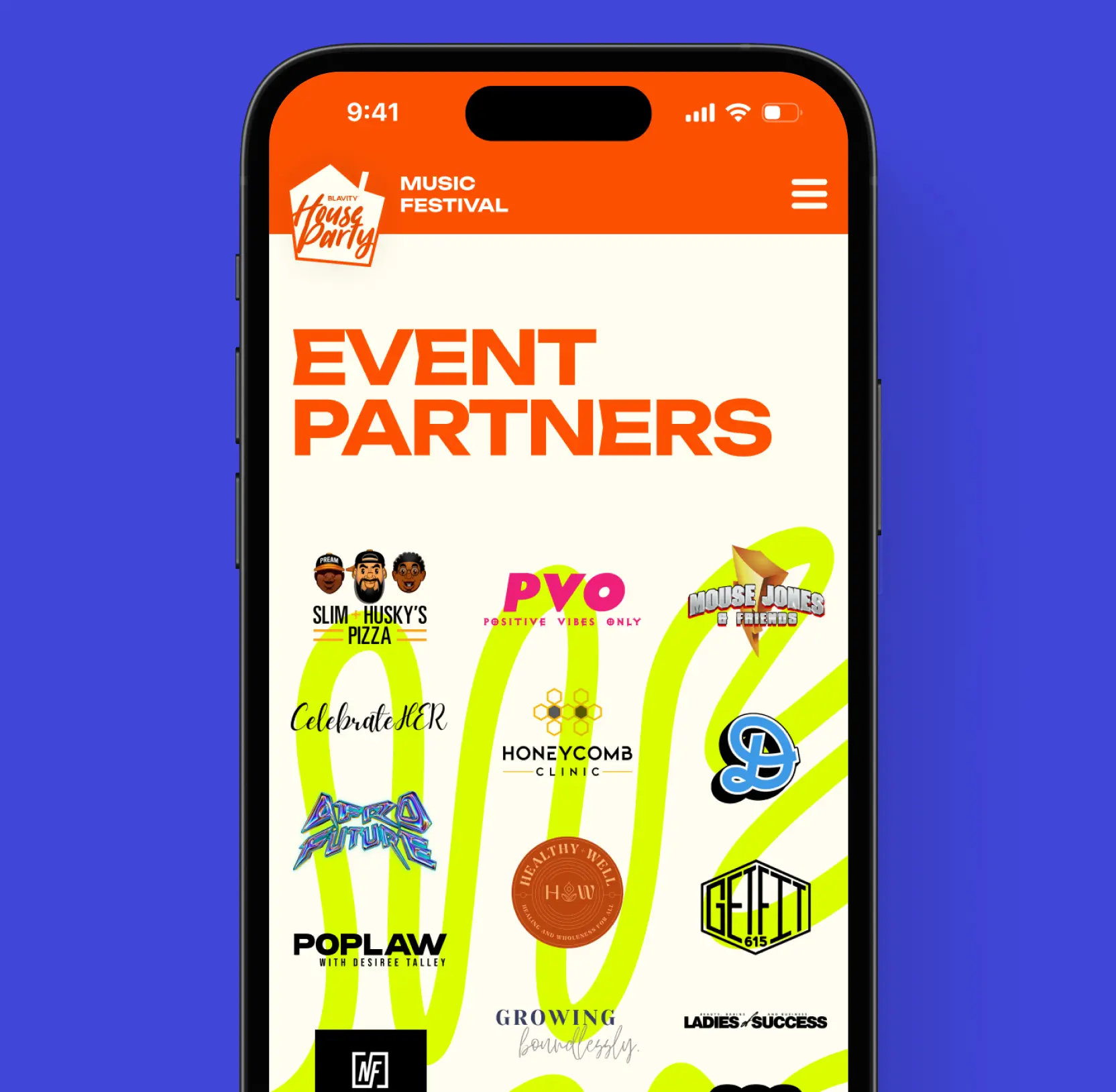
We built two sections to close those gaps. The News feed presents fresh stories as scannable cards — each with a thumbnail, a headline, a timestamp, and visible view and like counts that show attendees what's resonating. The Partners section gives every sponsor a prominent place in a bold logo showcase, putting the brands behind the festival in front of every visitor.

Together, these sections bring attendees back and give sponsors a reason to invest again, turning a one-time lineup page into a platform that keeps audiences and partners engaged.

Frequently asked questions

Common questions
about this topic

What are effective strategies to increase user engagement on event landing pages?

Creating a bold, visually striking design that reflects the event’s energy is key. Incorporating vibrant imagery, impactful typography, and an intuitive layout helps capture attention and guide users seamlessly through event details. Adding interactive sections like news updates, sponsor logos with CTA buttons, and FAQs can also keep attendees informed and engaged, ultimately boosting ticket sales and participation.

How can incorporating news, partner, and FAQ sections improve attendee experience?

These sections serve to inform and connect attendees more effectively. The News section provides timely updates with concise visuals, keeping visitors informed about important event details. Highlighting sponsors with logos and CTAs enhances visibility and engagement with partners. An accessible FAQ addresses common questions clearly, reducing confusion and encouraging attendees to explore more, leading to higher satisfaction and engagement.

What design elements help drive user engagement on event pages?

Using vibrant imagery, bold typography, and a streamlined, responsive layout creates an inviting atmosphere. Prioritizing easy navigation and visual cues ensures attendees can effortlessly find information such as schedules, ticket options, and performer details. These design choices foster a dynamic user experience that encourages interaction and increases conversions.

How does a well-structured FAQ page contribute to event success?

A clear and accessible FAQ minimizes attendee confusion by providing quick answers to common questions. Incorporating visual elements and strategically placed CTAs makes information easy to digest and actionable. This enhances trust, reduces support queries, and encourages attendees to engage confidently with the event, resulting in higher attendance and satisfaction.

What role do sponsor highlight sections play in increasing event engagement?

Showcasing sponsors prominently with logos and CTA buttons not only gives partners visibility but also fosters attendee trust and connection. When attendees can learn more about sponsors, it enriches their experience and encourages further interaction, increasing overall engagement and potential partnership benefits.

How can responsive design influence ticket sales and attendee engagement?

A mobile-friendly, responsive design ensures that users can access all event information seamlessly across devices. This accessibility increases meaningful engagement, as attendees can view schedules, explore tickets, and interact with content anytime, anywhere, ultimately leading to higher ticket sales and a more engaged audience.

What are best practices for creating an engaging event page that boosts attendance?

Best practices include developing a bold visual identity, simplifying navigation, and integrating interactive elements like news updates, sponsor features, and FAQs. Prioritizing user experience with fast-loading, mobile-optimized layouts encourages visitors to explore more, building excitement and trust, key factors that drive higher attendance and engagement.

More cases like this

Related cases you
might find useful

AI

Media

August 10, 2026

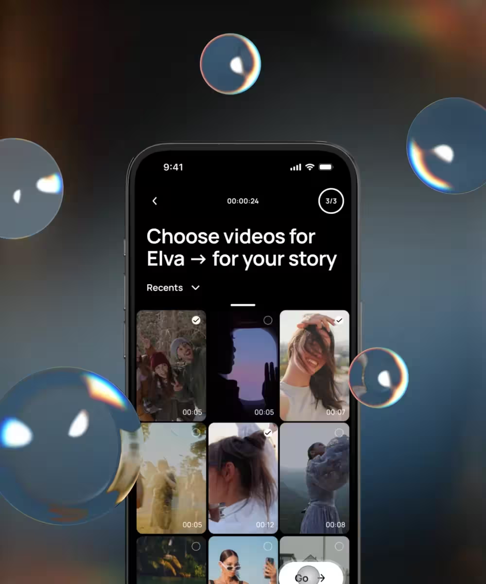
Voice AI video editor app design: how we shipped Elva's brand, onboarding, and agentic editing flow

Lazarev.agency designed Elva, a voice-first AI video editor — brand, UX, UI, onboarding, monetization — as one launch. Webby Winner, Best Visual UI in AI.

View case
Elva's video picker screen surrounded by floating glass bubbles with chromatic aberration

Edtech

August 6, 2026

How our redesign made Abu Dhabi University's depth clear for applicants and students

Abu Dhabi University had depth, but its digital experience hid it. Lazarev.agency redesigned the platform around the needs of applicants, students, and faculty, transforming a fragmented ecosystem into a unified digital campus where information, services, and opportunities are easier to find and act on.

View case
Minimalist green cover design featuring an abstract woven geometric emblem centered on a solid background.

Commerce

August 3, 2026

How we helped a premier fine wine retailer boost add-to-basket rate by 65% with a mobile-first redesign

Explore how Hedonism Wines boosted add-to-basket rates 65% with mobile-first redesign & improved UX.

View case
Logo of Hedonism Wines featuring a stylized figure enjoying wine amidst grapevine motifs, with the brand name prominently displayed.

Let's talk about your AI adoption challenge

Tell us where adoption stalls. You’ll hear back from a senior product and UX lead with a practical action plan.

Response within one business day

Talk to us
Explore our services